It looks like you're using an Ad Blocker.
Please white-list or disable AboveTopSecret.com in your ad-blocking tool.
Thank you.
Some features of ATS will be disabled while you continue to use an ad-blocker.

Mandela Effect - Ford Logo - Three New Strong Evidences Found
page: 1share:
The Ford brand is both iconic and historical. The logo is commonplace and a scrutinized collectors item for some. Needless to say the company has a
vast range of fans.
When the Mandela Effect occurred the logo became a strong indicator to those that knew the logo well.
Recently, three new examples of residual evidence came to light..
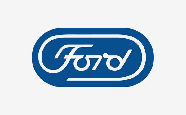
Here is the current logo for comparison:

For many (myself included), the 'curly q' or 'pigs tail' in the F is new.
Here are the three new pieces of residual evidence found. Click the link for full size.
Dealership Vinyl

OEM Vinyl

OEM Water Pump

Interestingly, Henry Ford's actual signature is closer to how many remember the logo, than what it is today.

So what do you think.. Does the "old" logo look more familiar?
-----
I anticipate based on other ME threads that these things will need to be said:
This is not a company changing it's logo.
Myself and others have checked the images for signs of tampering. Additionally the logo in vinyl on the truck bed is all one piece (not chipped). You're welcome to check yourself.
I don't know what caused the Mandela Effect. I don't advocate a theory.
The ME conversation has gone past faulty memory and common mistakes.
My primary goal is to get evidence to those interested via the OP.
With that said; I assume based on ATS skeptic culture that this thread will fill with jokes, jabs and reasoning based in a general misunderstanding of how the Mandela Effect works. Don't be surprised if I'm not responsive to comments of this nature.
Sources:
Dealership Vinyl
OEM Vinyl
OEM Water Pump
When the Mandela Effect occurred the logo became a strong indicator to those that knew the logo well.
Recently, three new examples of residual evidence came to light..
Here is the current logo for comparison:
For many (myself included), the 'curly q' or 'pigs tail' in the F is new.
Here are the three new pieces of residual evidence found. Click the link for full size.
Dealership Vinyl
OEM Vinyl
OEM Water Pump
Interestingly, Henry Ford's actual signature is closer to how many remember the logo, than what it is today.
So what do you think.. Does the "old" logo look more familiar?
-----
I anticipate based on other ME threads that these things will need to be said:
This is not a company changing it's logo.
Myself and others have checked the images for signs of tampering. Additionally the logo in vinyl on the truck bed is all one piece (not chipped). You're welcome to check yourself.
I don't know what caused the Mandela Effect. I don't advocate a theory.
The ME conversation has gone past faulty memory and common mistakes.
My primary goal is to get evidence to those interested via the OP.
With that said; I assume based on ATS skeptic culture that this thread will fill with jokes, jabs and reasoning based in a general misunderstanding of how the Mandela Effect works. Don't be surprised if I'm not responsive to comments of this nature.
Sources:
Dealership Vinyl
OEM Vinyl
OEM Water Pump
So are you saying the logo was the same except the curl on the F wasn't as pronounced?
I wouldn't notice a change in any logo unless it happened in front of me
I wouldn't notice a change in any logo unless it happened in front of me
edit on 26-8-2016 by johnb because: spelling
Well that's an interesting one. That logo with the curly q certainly looks odd, makes me wish I had been a little more of a ford fan. So many of these
Mandela things seem so vaguely possible but It allways seems to be things that I just never payed a lot of attention to.
Looking at the Ford logos throughout the years, it appears the "Pig tail" on the F came into existence in 1912.
From 1909, Ford started using the logo changed from "Ford Motor Co." to "Ford" and the 1909 logo doesn't have the pig tail on the F.
The first photo you have presented is the closest to the 1909 logo, the second photo doesn't look like any of the logos that I could find and the third has more of an oval on the F than a pig tail.
www.allcarbrandslist.com...
They changed it........no conspiracy. Companies do change logos, fonts and update brands.
Interesting. I have a lot of old Ford stuff around here. Most all of it is from late 60s and early 70s. Everything I just went to look at has no
curly q on the F. But then going to look at a 92 ford truck I have the logos on it have the curl. Not sure about that being Mandela or just a
change in the logo somewhere between those years.
edit on 26-8-2016 by Popeye1 because: Autocorrect
Do you think that companies do not change their logos?
Ford has changed their logo many times. The way a logo is imprinted, cut, stamped or put on has changed over time too:
Changing logos is what they do:
Ford has changed their logo many times. The way a logo is imprinted, cut, stamped or put on has changed over time too:
Changing logos is what they do:
a reply to: greencmp
Agreed, cursive no longer being taught is a tragedy. We're going to teach our children the skill at home - despite them.
With recent changes public standards, I wouldn't be surprised if home based early education becomes a lot more popular.
Agreed, cursive no longer being taught is a tragedy. We're going to teach our children the skill at home - despite them.
With recent changes public standards, I wouldn't be surprised if home based early education becomes a lot more popular.
originally posted by: Jonjonj
a reply to: Pearj
The evidence you give for the change of logo, by showing three slightly different previous logos, just shows that Ford changes its logos a bit sometimes.
Yep.
I did the old internet search for vintage Ford logos.
There's ones with Curl-i-ques and ones without Curl-i-ques.
With Curl-i-ques seems to be more numerous.
originally posted by: Popeye1
Interesting. I have a lot of old Ford stuff around here. Most all of it is from late 60s and early 70s. Everything I just went to look at has no curly q on the F. But then going to look at a 92 ford truck I have the logos on it have the curl. Not sure about that being Mandela or just a change in the logo somewhere between those years.
If it's not to much to ask, could you please take photos of the stuff you have without the curly q - and post them here?
a reply to: johnb
Theres the rub, lack of forensics. Not one actual Mandella (time shift) caught on video. I mean really? YouTube is filled with fake UFO stuff, wheres all the Mandella time warps?
C'mon psyops department!
I wouldn't notice a change in any logo unless it happened in front of me
Theres the rub, lack of forensics. Not one actual Mandella (time shift) caught on video. I mean really? YouTube is filled with fake UFO stuff, wheres all the Mandella time warps?
C'mon psyops department!
a reply to: Pearj
Maybe I'm not following you because I'm in the dark about the Mandela effect. I do know having worked as a graphic designer in the area of Advertising, company logos go through subtle changes over time. They do it for various reasons... improving the graphics so the logo doesn't look dated, to make it easier to reproduce at any scale or production method, to create a cleaner and crisp look, to add graphics or change it completely to help re-identify the brand, or explain more clearly what the company produces.
Ford has definitely gone through logo changes. As far as the absence of the curly "F" it could be surmised that they removed the curl due to reproduction problems such as casting. The may have realized they couldn't get the detail of the curl to reproduce so they eliminated it.
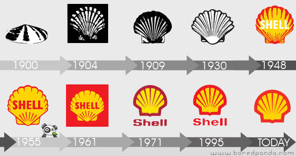
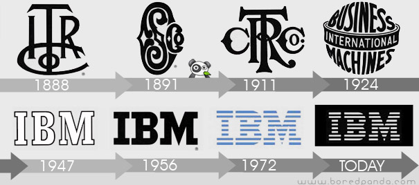
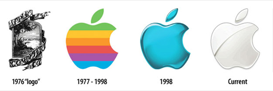
Here are some changes to Ford and some well known logo brands...


Maybe I'm not following you because I'm in the dark about the Mandela effect. I do know having worked as a graphic designer in the area of Advertising, company logos go through subtle changes over time. They do it for various reasons... improving the graphics so the logo doesn't look dated, to make it easier to reproduce at any scale or production method, to create a cleaner and crisp look, to add graphics or change it completely to help re-identify the brand, or explain more clearly what the company produces.
Ford has definitely gone through logo changes. As far as the absence of the curly "F" it could be surmised that they removed the curl due to reproduction problems such as casting. The may have realized they couldn't get the detail of the curl to reproduce so they eliminated it.
Here are some changes to Ford and some well known logo brands...
a reply to: Pearj
Okay, you have to take all of those iterations of the logo with a grain of salt. Most dealer decals are designed and installed by the dealer, often to include the pinstripe decal that you depict. Often times, they adjust things in a logo in order to make things more legible and "clean" at smaller sizes (both of those decals are quite small). Either that, or the company printing the decals adjusts them due to the tolerances of their capabilities in printing. So, those differences are negligible and mean nothing as far as "proof" of anything concerning a Mandela Effect.
Concerning the water pump--That is a small (very small) logo that was obviously hand-engraved (in the negative, mind you) into the mold for the water pumps. Those types of things, just like I noted above in the decals, generally get altered a bit for legibility and, quite frankly in this case, probably to speed up the production of the molds (there was no need for engraver perfection on a part like this, as it was also stamped with part numbers and such). Again, this is NOTHING close to proof of anything if you understand the process of these types of things. And I've seen this a few times, as I owned a '66 Mustang from 1995-2014 (the same one), and I noticed many engravings and things on original parts that looked odd compared to the actual logos. My dad also owned a 1930 Model 'A.' My guess is that the water pump is relatively old.
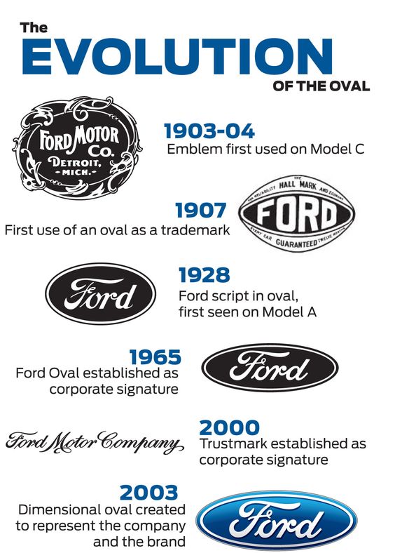
As far as the Ford logo goes, it's gone through a few different changes through its life, as depicted here below. Also--and in terrible fashion--Paul Rand (graphic designer...IBM logo, Westinghouse logo, old UPS logo, etc.) proposed an updated logo for Ford, and happily, Ford rejected it. See after the history of the Ford logo.
History of the logo
Paul Rand's proposed logo
ETA: Well, I'm a little late to the game on the examples, but at least I provided the Paul Rand logo, which I'm willing to be most people have never seen. I think that you're starting to understand that this is not "strong evidence" of anything.
Okay, you have to take all of those iterations of the logo with a grain of salt. Most dealer decals are designed and installed by the dealer, often to include the pinstripe decal that you depict. Often times, they adjust things in a logo in order to make things more legible and "clean" at smaller sizes (both of those decals are quite small). Either that, or the company printing the decals adjusts them due to the tolerances of their capabilities in printing. So, those differences are negligible and mean nothing as far as "proof" of anything concerning a Mandela Effect.
Concerning the water pump--That is a small (very small) logo that was obviously hand-engraved (in the negative, mind you) into the mold for the water pumps. Those types of things, just like I noted above in the decals, generally get altered a bit for legibility and, quite frankly in this case, probably to speed up the production of the molds (there was no need for engraver perfection on a part like this, as it was also stamped with part numbers and such). Again, this is NOTHING close to proof of anything if you understand the process of these types of things. And I've seen this a few times, as I owned a '66 Mustang from 1995-2014 (the same one), and I noticed many engravings and things on original parts that looked odd compared to the actual logos. My dad also owned a 1930 Model 'A.' My guess is that the water pump is relatively old.
As far as the Ford logo goes, it's gone through a few different changes through its life, as depicted here below. Also--and in terrible fashion--Paul Rand (graphic designer...IBM logo, Westinghouse logo, old UPS logo, etc.) proposed an updated logo for Ford, and happily, Ford rejected it. See after the history of the Ford logo.
History of the logo
Paul Rand's proposed logo
ETA: Well, I'm a little late to the game on the examples, but at least I provided the Paul Rand logo, which I'm willing to be most people have never seen. I think that you're starting to understand that this is not "strong evidence" of anything.
edit on 26-8-2016 by SlapMonkey because: (no
reason given)
a reply to: Pearj
As mentioned by eriktheawful logos change.
What you need to do is be able to compare 2 stone carvings of the Ford logo at least 50 years old.
Then in one 50's picture the Ford logo sculpted into granite at the entrance to a factory is distinctly different to a recent picture of the same logo at the same factory.
Multiple pictures of the same physical object showing differences can prove the ME.
One has to also keep in mind manufacturing and how it's done.
Unless a logo changes drastically, while it's very easy to go to a new logo for things printed on paper, stickers, posters, images, it's much harder to change the logo on things made of molded metal.
To do this, you'll have to change the machines that make those parts, be it either something that stamps or cuts the logo in, or if it's molded (normally see by the raised logo), you would have to change the entire mold.
This can cost very large amounts of money, and it is much easier to simply ensure that the next generation of moldings and machinery end up with the newer logo, as the older one will still be recognizable as what company it was manufactured from.
This is why a engine block can still have a much older logo by Ford (or Chevy, Dodge, Toyota, etc, etc), but have the newer logo in the owners manual for the car.
new topics
-
CIA is alleged to be operat social media troll frms in Kyiv
ATS Skunk Works: 7 minutes ago -
Rainbow : Stargazer
Music: 44 minutes ago -
I sleep no more.
Philosophy and Metaphysics: 3 hours ago -
Canada caught red-handed manipulating live weather data and make it warmer
Fragile Earth: 3 hours ago -
Why Files Our Alien Overlords | How We Secretly Serve The Tall Whites
Aliens and UFOs: 4 hours ago -
Curse of King Tuts Tomb Solved
Ancient & Lost Civilizations: 6 hours ago -
What allies does Trump have in the world?
ATS Skunk Works: 6 hours ago
top topics
-
BIDEN Admin Begins Planning For January 2025 Transition to a New President - Today is 4.26.2024.
2024 Elections: 14 hours ago, 10 flags -
Canada caught red-handed manipulating live weather data and make it warmer
Fragile Earth: 3 hours ago, 10 flags -
Big Storms
Fragile Earth: 16 hours ago, 9 flags -
Why Files Our Alien Overlords | How We Secretly Serve The Tall Whites
Aliens and UFOs: 4 hours ago, 8 flags -
Curse of King Tuts Tomb Solved
Ancient & Lost Civilizations: 6 hours ago, 6 flags -
What allies does Trump have in the world?
ATS Skunk Works: 6 hours ago, 3 flags -
I sleep no more.
Philosophy and Metaphysics: 3 hours ago, 1 flags -
Rainbow : Stargazer
Music: 44 minutes ago, 0 flags -
CIA is alleged to be operat social media troll frms in Kyiv
ATS Skunk Works: 7 minutes ago, 0 flags
active topics
-
University of Texas Instantly Shuts Down Anti Israel Protests
Education and Media • 343 • : Schmoe3755 -
CIA is alleged to be operat social media troll frms in Kyiv
ATS Skunk Works • 0 • : pianopraze -
BIDEN Admin Begins Planning For January 2025 Transition to a New President - Today is 4.26.2024.
2024 Elections • 26 • : bluesman023 -
Canada caught red-handed manipulating live weather data and make it warmer
Fragile Earth • 12 • : YourFaceAgain -
So this is what Hamas considers 'freedom fighting' ...
War On Terrorism • 274 • : FlyersFan -
Krystalnacht on today's most elite Universities?
Social Issues and Civil Unrest • 22 • : FlyersFan -
I sleep no more.
Philosophy and Metaphysics • 6 • : AcrobaticDreams1 -
Shocking Number of Voters are Open to Committing Election Fraud
US Political Madness • 8 • : Kaiju666 -
Definitive 9.11 Pentagon EVIDENCE.
9/11 Conspiracies • 430 • : Zanti Misfit -
Do you ever just get "bored" of everything?
Rant • 24 • : Cvastar