It looks like you're using an Ad Blocker.
Please white-list or disable AboveTopSecret.com in your ad-blocking tool.
Thank you.
Some features of ATS will be disabled while you continue to use an ad-blocker.

ALL MEMBERS: We may be launching ATS.5/3 today.
page: 7share:
Chamberf=6
Zaphod58
reply to post by Phage
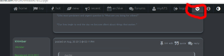
Click the little down arrow button next to Logout. Your settings, Profile, U2Us, Chat, are all in the submenu that drops down.
I clicked the arrow.
Saw no "Settings".
You have to go to "Account"
edit on 30-8-2013 by beezzer because: (no reason given)
reply to post by SkepticOverlord
Well, I am looking at the new UI, and I have to say, its smoother than a billiard ball covered in powdered graphite, rolling down a hill next to a Rolls Royce full of Irish cream liquer.
Taking me a few seconds to actually get where I am going when compared to the old version, but when I click, or move my mousepad slider, everything is much faster, sharper. My one issue so far, is that although the dark UI is grand, it appears as if when I enter a thread, that thread appears in black on white. The transition is eyeball gougingly painful
Other than that, top job. The site is looking damned sexy I have to say.
Phage
reply to post by DAZ21
Ok.
Where are settings?
Where's my profile?
Where am I?
Click here to access more menu:
You'll get a dropdown box:
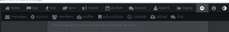
For those that want darker settings for the forum, click here:
Love the new upload features for pictures, especially the fact that the most recent uploads are at the top now and that I can bulk upload. Thanks!
sulaw
Forgive me Overlord.... But I have to vent for a second... Don't loose site that I love ATS...
4~ Seems like this was a premature launch, like the US attacking syria....
Again, forgive me but I had to say it... I hear members bawking that they won't be back because of these changes, though I am not one of them. These changes will take some getting used to and are very aggrevating.
Please dear overlord.... Fix this...
Someone just had to bring in Syria didn't they?
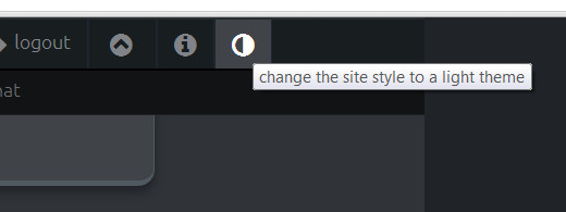
I liked it once I was able to use the half moon and dim the page. I dont know who in the world would want the bright white version.
reply to post by skitzspiricy
Now it's gone all "white" and not grey?
I always liked the dark version, not light.... is there an option for that?
Now it's gone all "white" and not grey?
I always liked the dark version, not light.... is there an option for that?
reply to post by Zaphod58
Ah, so no real way of "de-bubbling" or shrinking the "print for the farsighted" then.
Poop.
Ah, so no real way of "de-bubbling" or shrinking the "print for the farsighted" then.
Poop.
Is it designed for mobiles and tablets?
On pcs it's awful. It feels like going from Windows 7 to a Fisher Price toy.
On pcs it's awful. It feels like going from Windows 7 to a Fisher Price toy.
Please make the AMA thingy go away.
Let's all go to chat it is nice.
Let's all go to chat it is nice.
Well I like it, looks a lot more modern
Some folks just hate change.
Some folks just hate change.
The only thing I would say is... It seems like I'm looking at a black and white version of ATS. Looking at myats and all the thread options it just
feels like I'm in the 1950's ( how I'm on the internet in the 50's I'll never know)
blupblup
reply to post by skitzspiricy
Now it's gone all "white" and not grey?
I always liked the dark version, not light.... is there an option for that?
There's a half moon icon on the top right hand corner (next to the information icon). Click it and it should go dark.
reply to post by SkepticOverlord
I like the new layout. Very sleek. Mobile users should be loving this.
I like the new layout. Very sleek. Mobile users should be loving this.
reply to post by khimbar
I don't know what it's designed for - but on pc it is horrible - and the settings for 'desktop' changes nothing.
1/4 the left is all icons (ugly too) - so little actual space in the middle for posting - then all that empty space on the right?
Soooooo Fischer Price.
peace
I don't know what it's designed for - but on pc it is horrible - and the settings for 'desktop' changes nothing.
1/4 the left is all icons (ugly too) - so little actual space in the middle for posting - then all that empty space on the right?
Soooooo Fischer Price.
peace
edit on 30-8-2013 by silo13 because: never mind lol
Dumbass
Thank you for the desktop button in account settings you made my day
That button does nothing for me. Everything stays the same. And even though I press "desktop" or mobile", it always says "mobile" in large text.
Also, there definitely needs to be a way to change text size. The text size in my signature is at the smallest it can be and now it's huge, messing up my sig.
Also, we need new avatar/profile image size numbers so we can fix those images as well.
I'm loving the smoothness and quickness. Just need a few bugs worked out.
edit on 30-8-2013 by _BoneZ_ because: (no reason given)
reply to post by neo96
Neo...quite whining!
I know you commie socialists dont like changes....but this is pretty sweet!
Now if I could just find the ATS Radio banner......
ETA: The off-topic link is not working.
Neo...quite whining!
I know you commie socialists dont like changes....but this is pretty sweet!
Now if I could just find the ATS Radio banner......
ETA: The off-topic link is not working.
edit on 30-8-2013 by sheepslayer247 because: (no reason given)
reply to post by eriktheawful
WTF. I don't see any of those icons at ALL. I just see little tiny square boxes. I am in firefox and Windows 7 on pc. For me, this update just destroyed ATS. I am depressed. Hell I was already depressed. Now I am suicidal.
WTF. I don't see any of those icons at ALL. I just see little tiny square boxes. I am in firefox and Windows 7 on pc. For me, this update just destroyed ATS. I am depressed. Hell I was already depressed. Now I am suicidal.
skitzspiricy
There's a half moon icon on the top right hand corner (next to the information icon). Click it and it should go dark.
Yeah I guessed that, cheers mate.
Oh well, at least we look as "cool" as all the other sites now huh? That's the most important thing.
To always be on the cusp of new design and site interface and be constantly striving to find new ways to pointlessly mess with the site and change stuff that doesn't need changing.
Woooooo!!
Yay.
new topics
-
The 'Censorship-Industrial Complex'. It is coming to a nation state near you, any time now...
New World Order: 20 minutes ago -
BREAKING: Astrazeneca admits for the first time its vaccine can cause deaths and serious injuries
Medical Issues & Conspiracies: 3 hours ago -
New Bombshell Evidence Strongly Suggests Trump was Set Up in Classified Docs Saga
US Political Madness: 8 hours ago -
One More Night at the Pig and Blanket (Time 2024)
Short Stories: 11 hours ago
top topics
-
New Bombshell Evidence Strongly Suggests Trump was Set Up in Classified Docs Saga
US Political Madness: 8 hours ago, 26 flags -
Jim Biden Was in Business with Qatari Officials
US Political Madness: 16 hours ago, 13 flags -
Expert Says Parents Should Ask Babies Permission to Change Nappies.
General Chit Chat: 12 hours ago, 10 flags -
BREAKING: Astrazeneca admits for the first time its vaccine can cause deaths and serious injuries
Medical Issues & Conspiracies: 3 hours ago, 8 flags -
I may have had a talk with Pope Francis about his plans for our nation
The Gray Area: 17 hours ago, 6 flags -
One More Night at the Pig and Blanket (Time 2024)
Short Stories: 11 hours ago, 5 flags -
Do you name your cars ?
General Chit Chat: 14 hours ago, 4 flags -
Hard evidence of a Royal plot on the US....if only i had proof.
ATS Skunk Works: 13 hours ago, 2 flags -
The 'Censorship-Industrial Complex'. It is coming to a nation state near you, any time now...
New World Order: 20 minutes ago, 1 flags
active topics
-
New Bombshell Evidence Strongly Suggests Trump was Set Up in Classified Docs Saga
US Political Madness • 37 • : xuenchen -
Hard evidence of a Royal plot on the US....if only i had proof.
ATS Skunk Works • 31 • : andy06shake -
The 'Censorship-Industrial Complex'. It is coming to a nation state near you, any time now...
New World Order • 1 • : FlyInTheOintment -
SETI chief says US has no evidence for alien technology. 'And we never have'
Aliens and UFOs • 83 • : andy06shake -
I may have had a talk with Pope Francis about his plans for our nation
The Gray Area • 6 • : AlexandrosOMegas -
DONALD J. TRUMP - 2024 Candidate for President - His Communications to Americans and the World.
2024 Elections • 515 • : WeMustCare -
Candidate TRUMP Now Has Crazy Judge JUAN MERCHAN After Him - The Stormy Daniels Hush-Money Case.
Political Conspiracies • 818 • : WeMustCare -
Official denial
Diseases and Pandemics • 23 • : annonentity -
New whistleblower Jason Sands speaks on Twitter Spaces last night.
Aliens and UFOs • 77 • : gippo88 -
BREAKING: Astrazeneca admits for the first time its vaccine can cause deaths and serious injuries
Medical Issues & Conspiracies • 1 • : Markovian2