It looks like you're using an Ad Blocker.
Please white-list or disable AboveTopSecret.com in your ad-blocking tool.
Thank you.
Some features of ATS will be disabled while you continue to use an ad-blocker.

Is this new hotness here to stay this time?
page: 5share:
Oh ffs, this is horrid. Yet again I make a simple request, allow us to select an "ATS Classic" layout otherwise I'm off.
yourmaker
How can I make the font and everything smaller?
CTRL + MINUS
By minus I mean the - key. CTRL+0 to reset it.
yourmaker
How can I make the font and everything smaller?
Press ctrl and - at the same time.
I tried it, it made the text too small.
The most annoying thing about the new style is that it's like reading books made for kids, or some school learning page for under 5's.
Apart from that, it's smoother in some ways and faster.
So far its ok, But it will take time to get use to this layout. I see less info on the top stories and now require to scroll up and down more making
my large screen useless... thanks alot
New site design is DISGUSTING!
It actually hurts my eyes to read and when I do manage to concentrate on it I can barely find what I want.
The ATS team have majorly got this wrong in my opinion, lots of space has been wasted and it looks like a 14 year old designed the site. I don't mean to be rude or insulting just honest.
The old design had far more functionality.
PW229
Oh ffs, this is horrid. Yet again I make a simple request, allow us to select an "ATS Classic" layout otherwise I'm off.
Yeah, or at least put it up for a vote, I'm not liking this one bit.
Also where is BTS?
edit on 5-9-2013 by glast82 because: (no reason given)
reply to post by speculativeoptimist
Yeah, I was starting to think it was just me having that problem with posts going to the first page of the thread, instead of your actual post. I sent two messages to mods about this, but I see it hasn't been fixed.
Some threads have a very high number of pages in them and it's pretty close to impossible to find your posts in there.
I can finally read all my private messages here on my iPad that I couldn't do before and I'm getting used to the new format. Won't please everyone
but then again, it is here to stay...
As I said in my thread this isn't really pc-friendly. I did say that in the feedback when this layout was first introduced but apparently that
drowned into the other feedback. What I'd like is an option to switch back to similar layout we used to have. Smaller fonts, not wasted space
everywhere is far more ergonomic for a pc-user.
You would think that after months of research and testing- that they would at least get the basics down right.
Everytime I get used to a new ATS layout- they go and change it- and never for the better.
I have to scroll to reply- and I have to scroll for reading the entire texts in posts.
Not to mention its like trying to read posts in space. Theres so much space in between everything that you have to navigate more just to read those posts. The faces look like something that would appeal to 8 year olds...Where is the throw-up face? I could use it right about....now :::Blaaah::
One question that I have regarding this new design, what has happened to the star feature?
I don't see the need to "fix" something that wasn't broken in the 1st place.
ATS is going after new users with this design, instead of remembering it has a hardcore of members who have been here YEARS, if there isn't an option to use the old design then I will most likely be leaving this site for good! Because looking at it is now giving me a migrane, I also imagine I won't be alone with this.
Folks, can you imagine how frustrating it can be to have opened up the new site for any and all members to thoroughly test for just about a full
week... to see a slew of sometimes incredibly petty comments... and comments that should have happened during the open testing.
This is a massive redeployment, no bit of code was unchanged to the point where it was an entire recoding of both back and front ends --- by one person.
Everyone got a U2U urging them to test the new site and provide commentary in this thread:
Open Member Testing: ATS.5/3 Final Release Candidate
If you didn't care enough participate in an unprecedented open test and request for feedback, why are some of you doing so in such a petty manner after launch? You had lots of opportunity.
Please, if you have what you think to be an important issue, flag your post in this thread with something that will stand out... and do not open any more new threads.
Thank you.
And for the purpose of communicating, yet again, the rationale behind the redesign, here is what was posted in the open test thread...
By now everyone should have received a private message with the username/password that enables access to the Final Release Candidate version of the new ATS.5/3.
This is the fourth round of user testing (first being staff-only, second being invited beta-testers, and third being an open-beta test to all members) and is intended to accomplish the following:
1) final testing of the site UX (user experience) on a wider variety of user scenarios
2) final refinement of of the color scheme of the two UI (user interface) options
3) establish an understanding of the new interface/structure for a less jarring cut-over
4) begin the offered opportunity for a member collaboration on new smilies
This open test is not intended as an opportunity to offer significant alterations to the UI/UX in any way. Months of work, preceded by months of research, and that preceded by months of analysis of existing "upgrades" to so-called discussion board frameworks (XenForo being the best of a lackluster bunch).
The Primary Goal
What you are testing is not "change for the sake of change." Two massively important factors have been the driving force behind such a significant re-think of what a discussion board platform should be.
1) While the number of in-bound new users (roughly 85% of all daily traffic) has remained relatively flat, the user-engagement (content/thread pages viewed) has been falling off for months.
2) Across the Internet, nearly all discussion boards are experiencing a very similar phenomena. The decline in engagement is seen everywhere, even in large long-established video game forums.
The reason, is relatively simple: the audience has changed. The percentage of people comfortable with the rigid/tight discussion board format is decreasing, while the percentage of people accustomed to the more open sensibilities of contemporary flat design is increasing. It's a clearly quantified (and has been) fact of life for online operators.
Our mandate at AboveTopSecret.com, for more than ten years, has been to create and maintain a venue that showcases the quality content created by our members. A big part of that mandate has been consistent attention to search engine optimization. Another big part has been the delicate balance of advertising to provide the revenue needed to support big traffic, our own advertising, and growth. But the biggest part of that balance has always been finding ways to push the boundaries of a discussion board platform so that new users have the best possible chance to discover your content.
Right now, discovery is falling. Action is needed.
So every decision from font-size to color to mobile responsiveness has been from the vantage point of "what best highlights the content." The content is first. The content is second. And the content is third.
I'm not saying your input isn't important
That's why this is the third time we've opened the development site up to members. But if we didn't place a high priority on ensuring your content is both discovered and lingered-over, all we'd be doing is talking amongst ourselves and no one would have encountered the long-list of content that you created, that became important on thousands of other websites and hundreds of news sources.
This IS for you.
this thread is closed.
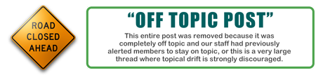
"Off topic post removed to prevent thread drift"???
Nice one ATS admins, either do as you say or get hit by that? Absolutely disgusting behaviour and the very behaviour this forum rallies against.
Nice one ATS admins, either do as you say or get hit by that? Absolutely disgusting behaviour and the very behaviour this forum rallies against.
It's very hard to see to read ,very blurry and too grey .
Go back to, out of the blue and into the black
No ribbon.
1%
Go back to, out of the blue and into the black
No ribbon.
1%
Resentedhalo08
what has happened to the star feature?
There is no starring ability in this, Board Business & Questions, forum. It's working in all other forums.
PW229
Oh ffs, this is horrid. Yet again I make a simple request, allow us to select an "ATS Classic" layout otherwise I'm off.
See ya
Needless to say there was a very popular website now owned by Justin Timberlake that decided to mess around with their design and site functionality
and we all know what happened to that.
ATS you will lose members if you don't make this site more pc friendly like it was, especially if there won't be an option to revert back to "classic" skin.
ATS you will lose members if you don't make this site more pc friendly like it was, especially if there won't be an option to revert back to "classic" skin.
new topics
-
President BIDEN's FBI Raided Donald Trump's Florida Home for OBAMA-NORTH KOREA Documents.
Political Conspiracies: 4 hours ago -
Maestro Benedetto
Literature: 6 hours ago -
Is AI Better Than the Hollywood Elite?
Movies: 6 hours ago -
Las Vegas UFO Spotting Teen Traumatized by Demon Creature in Backyard
Aliens and UFOs: 9 hours ago -
2024 Pigeon Forge Rod Run - On the Strip (Video made for you)
Automotive Discussion: 10 hours ago -
Gaza Terrorists Attack US Humanitarian Pier During Construction
Middle East Issues: 11 hours ago
top topics
-
President BIDEN's FBI Raided Donald Trump's Florida Home for OBAMA-NORTH KOREA Documents.
Political Conspiracies: 4 hours ago, 26 flags -
Krystalnacht on today's most elite Universities?
Social Issues and Civil Unrest: 16 hours ago, 9 flags -
Supreme Court Oral Arguments 4.25.2024 - Are PRESIDENTS IMMUNE From Later Being Prosecuted.
Above Politics: 15 hours ago, 8 flags -
Weinstein's conviction overturned
Mainstream News: 14 hours ago, 8 flags -
Gaza Terrorists Attack US Humanitarian Pier During Construction
Middle East Issues: 11 hours ago, 8 flags -
Massachusetts Drag Queen Leads Young Kids in Free Palestine Chant
Social Issues and Civil Unrest: 13 hours ago, 7 flags -
Las Vegas UFO Spotting Teen Traumatized by Demon Creature in Backyard
Aliens and UFOs: 9 hours ago, 6 flags -
Meadows, Giuliani Among 11 Indicted in Arizona in Latest 2020 Election Subversion Case
Mainstream News: 12 hours ago, 5 flags -
2024 Pigeon Forge Rod Run - On the Strip (Video made for you)
Automotive Discussion: 10 hours ago, 4 flags -
Is AI Better Than the Hollywood Elite?
Movies: 6 hours ago, 3 flags
active topics
-
President BIDEN's FBI Raided Donald Trump's Florida Home for OBAMA-NORTH KOREA Documents.
Political Conspiracies • 17 • : BingoMcGoof -
Gaza Terrorists Attack US Humanitarian Pier During Construction
Middle East Issues • 29 • : 19Bones79 -
Supreme Court Oral Arguments 4.25.2024 - Are PRESIDENTS IMMUNE From Later Being Prosecuted.
Above Politics • 90 • : Lumenari -
Las Vegas UFO Spotting Teen Traumatized by Demon Creature in Backyard
Aliens and UFOs • 12 • : KrustyKrab -
SHORT STORY WRITERS CONTEST -- April 2024 -- TIME -- TIME2024
Short Stories • 23 • : DontTreadOnMe -
Truth Social goes public, be careful not to lose your money
Mainstream News • 130 • : Astyanax -
Is AI Better Than the Hollywood Elite?
Movies • 13 • : Justoneman -
Hate makes for strange bedfellows
US Political Madness • 47 • : 19Bones79 -
-@TH3WH17ERABB17- -Q- ---TIME TO SHOW THE WORLD--- -Part- --44--
Dissecting Disinformation • 689 • : daskakik -
University of Texas Instantly Shuts Down Anti Israel Protests
Education and Media • 265 • : Astrocometus