It looks like you're using an Ad Blocker.
Please white-list or disable AboveTopSecret.com in your ad-blocking tool.
Thank you.
Some features of ATS will be disabled while you continue to use an ad-blocker.

New ATS front page ?
page: 16share:
reply to post by Kryties
It's come along way from day one launch that's for sure.. I seldom use the home page, but have been keeping up with it as folks have been chiming in here..
I think it's great to see the tweaks evolve in response to member feedback, makes this place feel like a big family..
Amazing people... this community..
Originally posted by JacKatMtn
A friendly reminder...
This thread is for comments, thoughts, opinions on the transition of the ATS home page...
not a Keyboard Kage Match!
Please be civil and avoid personal sparring matches..
Your cooperation is deeply appreciated
Hey, there is a suggestion, a forum for Keyboard Kage Matches.
reply to post by JacKatMtn
To be completely honest, I have used the front page more in the last few days than the entire 4ish years I've been here.
The button/window thingy style just works perfectly on my iPad.
To be completely honest, I have used the front page more in the last few days than the entire 4ish years I've been here.
The button/window thingy style just works perfectly on my iPad.
Originally posted by MidnightTide
Hey, there is a suggestion, a forum for Keyboard Kage Matches.
I'M IN!!
Oh, I said that out loud didn't I?
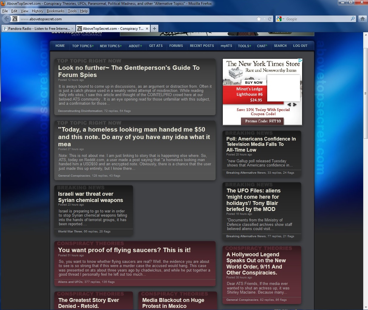
I also do not like the new front page.
I understand the goal is to make ATS view able on all screen sizes - but honestly can't you guys just do a DIV overlay or something that re-sizes the rendered web page to whatever resolution the browser is at? Or would that put to much strain on the servers? Either way, for users like me who have a widescreen at 1920x1440 resolution, there is a TON of side space left completely blank. I wish you guys could address that issue more then the front page
Anyway, the front page looks way to crowded. There isn't much order to it - lots of chaos. I for one prefer a set order to things - sections etc. The old page was pretty good. I didn't have any complaints.
Also to add - perhaps make a mobile app for ATS. The majority of internet users are either on desktops or mobile devices, and I have yet to find either an Iphone or an Android app for ATS (and I would LOVE one).
It's been a week and thought it would have grown on me but it has not. Booooooo. But I see the point of it. Easier for mobile conversion and also it
allows for more topics to be discussed. Anyways I use top topics and new topics sections anyways. Now those better not change
Originally posted by SkepticOverlord
We're experimenting with a bit more "modern" design. This is the first step to making all of ATS a "responsive" site that works well in all screen sizes.
Are you serious, a more modern design? Perhaps it will work better for ipads, iphones and such, but on a normal computer, in a browser, it looks horrible and unprofessional, and provides less information.
And given the negative response by most posters to this thread, I don't see how your claim of being "responsive" holds much water. But hey, it's you're website, you can wreck it if you want to.
While on the subject of ATS layout logistics, I'd just say that all the multiple threads on a single topic and the preponderance of pointless and/or inane replies makes perusing ATS nigh impossible. That all replies are in chronological order rather than put physically next to what they are referring to also makes it really hard to follow a thread; I think indented replies would work better.
Personally I like the change. Usually I'm one that hates changes in interface. I don't mind this change if that means anything. I really like it.
There's the reluctance of change that occurs due to the human nature of liking security; as knowing ones surroundings makes one feel basically happier. A Change in anything spatial, including something as arbitrary as a website design messes with that human subconscious need.
I think the trick is maintaining the functionality and improving the look but not totally changing it immediately but over time (the old frog in boiling water analogy), which has been done here. Kudos ATS!
I think the new page is pretty cool with the headline factor to it and like the recent color changes. I think it's a better way to draw in first time
viewers actually and I'm guessing it's quick to load as well. Gives a good idea of what the site is about and might help people check out topics
they wouldn't normally go to, thus delightfully quickening their descent into the madness we all enjoy.
You might want to consider the all-black background to it now though as I think the site's blue-gray gradient(especially the blue part) doesn't work well with it, but it looks real nice against the black footer. Plus, if you went with all-black background, you would have more color options for the headlines themselves.
I do still jump to the forums/topic pages rather than picking a topic from the front though. I think that's just a continued behavior thing though and I may start to check out the posts from there eventually.
Originally posted by MrInquisitive
Are you serious, a more modern design? Perhaps it will work better for ipads, iphones and such, but on a normal computer, in a browser, it looks horrible and unprofessional, and provides less information.
Which is exactly why they did it, statistics were showing more newcomers coming in from devices than PC's.
If you had have read the thread you would know this. Please don't give some form of ridiculous excuse like "Im not going to read through the whole thread, it's too long". NOT OUR PROBLEM.
And given the negative response by most posters to this thread, I don't see how your claim of being "responsive" holds much water. But hey, it's you're website, you can wreck it if you want to.
I think it's an even 50/50 mix. How can you say most people have given a negative response when you clearly haven't read the entire thread?
While on the subject of ATS layout logistics, I'd just say that all the multiple threads on a single topic and the preponderance of pointless and/or inane replies makes perusing ATS nigh impossible. That all replies are in chronological order rather than put physically next to what they are referring to also makes it really hard to follow a thread; I think indented replies would work better.
Mods do their best to shut down duplicate threads and redirect them to the original. They have been doing that since time immemorial.
Anyone can tell me how ATS select which articles deserve main page appearance? Are they hand picked or do you have a program for this? Because
sometimes i see topics with only 2-3 comments and 5-6 flags on main page while others have 50+ or 100+. And some of them are there for days. For
example in my timezone i saw the latest holocaust topic on the main page for 3 days while others come and go within hours.
Im just curious how it works.
Im just curious how it works.
reply to post by Solarize
Right now, the main page is 70% filled with the shooting incident at the movie theatre, and shooting related stuff. Seriously people, is there no other news ? So many topics/articles about the same thing.. I don't mind that they exist, but they don't all have to be on the home page.
Just my opinion..
reply to post by TommyD
Hey hey, look at my right hand so you won't see what my left hand is doing.
Get the picture?
The shooting incident is doing what it was ment to do, get peoples attention off other issues. I think main page stuff is popular topics, of course the main page will be full of the shooting.
Hey hey, look at my right hand so you won't see what my left hand is doing.
Get the picture?
The shooting incident is doing what it was ment to do, get peoples attention off other issues. I think main page stuff is popular topics, of course the main page will be full of the shooting.
edit on 21-7-2012 by MidnightTide because: (no reason given)
I like the new format. It took a bit getting used to it, however it is modern, and keeping up to the current "In your Face" first exposure to a
home page on other web sites.
That means it is keeping up to the current 'norm' of the internet, and that would be required by a site like ATS, as the younger generation pretty much dictates what it likes, and being a younger kid back in the 60's, well I have to agree with the intent. ATS wants this site to live in the all of our generations, and that is OK with me. Cool Move.
That means it is keeping up to the current 'norm' of the internet, and that would be required by a site like ATS, as the younger generation pretty much dictates what it likes, and being a younger kid back in the 60's, well I have to agree with the intent. ATS wants this site to live in the all of our generations, and that is OK with me. Cool Move.
The new layout is extremely unattractive and boring. Everything is grey and muted. It's not more modern, it's 10 steps backwards. It looks like a
website from the year 2000. Very cluttered and unorganized. ATS used to look sleek and modern, now it's ugly and outdated. You broke something that
was beautiful and perfect..
Usually changes are made to make things better.. but no improvements were made, it's almost as if it was changed just for the sake of changing it.. A bunch of grey boxes hurray.
Usually changes are made to make things better.. but no improvements were made, it's almost as if it was changed just for the sake of changing it.. A bunch of grey boxes hurray.
The front page has changed yet again, just when many might have gotten used to it.
What's up with that? Why did we go from the last design to yet another one?
It was perfect in my opinion, now it's back to a bland busyness with no order to it.
RIP, well designed front page.
What's up with that? Why did we go from the last design to yet another one?
It was perfect in my opinion, now it's back to a bland busyness with no order to it.
RIP, well designed front page.
Constructive Criticism... I hate the new look.
I like the dark .. and the old front page.
2 cents
I like the dark .. and the old front page.
2 cents
Originally posted by Kryties
Originally posted by MrInquisitive
Are you serious, a more modern design? Perhaps it will work better for ipads, iphones and such, but on a normal computer, in a browser, it looks horrible and unprofessional, and provides less information.
Which is exactly why they did it, statistics were showing more newcomers coming in from devices than PC's.
If you had have read the thread you would know this. Please don't give some form of ridiculous excuse like "Im not going to read through the whole thread, it's too long". NOT OUR PROBLEM.
And given the negative response by most posters to this thread, I don't see how your claim of being "responsive" holds much water. But hey, it's you're website, you can wreck it if you want to.
I think it's an even 50/50 mix. How can you say most people have given a negative response when you clearly haven't read the entire thread?
While on the subject of ATS layout logistics, I'd just say that all the multiple threads on a single topic and the preponderance of pointless and/or inane replies makes perusing ATS nigh impossible. That all replies are in chronological order rather than put physically next to what they are referring to also makes it really hard to follow a thread; I think indented replies would work better.
Mods do their best to shut down duplicate threads and redirect them to the original. They have been doing that since time immemorial.
I read enough of the thread to know why the change was done, i.e. for hand devices. And my point remains that it may be better for hand-held devices, but it looks like crap on a normal computer screen. As for more newcomers using hand-held devices than PC's, what about the current members? What is the device viewing stat for them? Seems like current members' preferences should be taken into consideration as well. And gawd forbid they have two choices for a home page, i.e. one for computers and one for hand-held devices. That would be really tough to just keep an adjunct old-style home page for those who prefer it.
But like I also said, its ATS's site so they can do whatever they want to, to louse up their site. I've seen other major websites go through iterations in their format, and it's generally never for the better.
I'll happily admit I didn't read through 20 pages of this thread to do a robust poll of commentor's opinions on the subject, but from what I saw, it seemed like a lot were unhappy. And if it is a 50/50 split, why not have two choices of front pages? I assume the layouts are done by a program, not manually. And if they are done manually, then it seems like it ought to be easy enough to write scripts do do the work.
I am not talking about duplicate threads. I am talking about all the blither blather in anyone thread -- this one, for instances is 21+ pages long. People with a life haven't the time to read -- or even skim -- through each comment. And many comments are inane/worthless. And why take up space with a little message saying this comment has been removed for violating TOCs? It just takes up more line space, thereby lengthening threads. To me, most threads become so long and so thin in pertinent content that I can't be bothered to thoroughly peruse even the few threads that look quite interesting. Too much work for too little content of worth. I really think this is a major problem with ATS.
And you clearly didn't get my point about it being hard to follow a thread because all comments are put in chronological order. If someone replies to a particular comment, it should come right after it and be indented, in order to keep it in context. Yeah, I know one can quote within a comment, but that relies on the later commenter doing a good job of keeping the quoting in context, and it is still hard to follow a train of thought, such as an ongoing discussion/argument between two posters.
Originally posted by Drezden
The new layout is extremely unattractive and boring. Everything is grey and muted. It's not more modern, it's 10 steps backwards. It looks like a website from the year 2000. Very cluttered and unorganized. ATS used to look sleek and modern, now it's ugly and outdated. You broke something that was beautiful and perfect..
Usually changes are made to make things better.. but no improvements were made, it's almost as if it was changed just for the sake of changing it.. A bunch of grey boxes hurray.
Couldn't agree with you more. In addition, the old homepage showed a more panoramic view of the site, whereas the new home/front page has a very limited number of articles. They may be the most current stories, but current isn't necessarily what people come here for.
And just now looking at the homepage it has evolved yet again. And up in one of the top headlines they have as THE UFO/Aliens story someone claiming some UFO is seen in an old Bill Nye video. In other words, the story choices for the new homepage are abysmal.
edit on 4-9-2012 by
MrInquisitive because: (no reason given)
new topics
-
Putin, Russia and the Great Architects of the Universe
ATS Skunk Works: 23 minutes ago -
A Warning to America: 25 Ways the US is Being Destroyed
New World Order: 4 hours ago -
President BIDEN's FBI Raided Donald Trump's Florida Home for OBAMA-NORTH KOREA Documents.
Political Conspiracies: 10 hours ago
top topics
-
President BIDEN's FBI Raided Donald Trump's Florida Home for OBAMA-NORTH KOREA Documents.
Political Conspiracies: 10 hours ago, 28 flags -
A Warning to America: 25 Ways the US is Being Destroyed
New World Order: 4 hours ago, 10 flags -
Gaza Terrorists Attack US Humanitarian Pier During Construction
Middle East Issues: 16 hours ago, 8 flags -
Las Vegas UFO Spotting Teen Traumatized by Demon Creature in Backyard
Aliens and UFOs: 15 hours ago, 6 flags -
2024 Pigeon Forge Rod Run - On the Strip (Video made for you)
Automotive Discussion: 16 hours ago, 4 flags -
Is AI Better Than the Hollywood Elite?
Movies: 12 hours ago, 3 flags -
Maestro Benedetto
Literature: 12 hours ago, 1 flags -
Putin, Russia and the Great Architects of the Universe
ATS Skunk Works: 23 minutes ago, 1 flags
active topics
-
A Warning to America: 25 Ways the US is Being Destroyed
New World Order • 9 • : Lazy88 -
President BIDEN's FBI Raided Donald Trump's Florida Home for OBAMA-NORTH KOREA Documents.
Political Conspiracies • 21 • : CriticalStinker -
Putin, Russia and the Great Architects of the Universe
ATS Skunk Works • 5 • : RussianTroll -
SETI chief says US has no evidence for alien technology. 'And we never have'
Aliens and UFOs • 75 • : Hecate666 -
Las Vegas UFO Spotting Teen Traumatized by Demon Creature in Backyard
Aliens and UFOs • 13 • : FlyersFan -
Mood Music Part VI
Music • 3105 • : BrucellaOrchitis -
The Acronym Game .. Pt.3
General Chit Chat • 7752 • : bally001 -
Is AI Better Than the Hollywood Elite?
Movies • 18 • : Hecate666 -
Hate makes for strange bedfellows
US Political Madness • 49 • : network dude -
Truth Social goes public, be careful not to lose your money
Mainstream News • 131 • : burritocat