It looks like you're using an Ad Blocker.
Please white-list or disable AboveTopSecret.com in your ad-blocking tool.
Thank you.
Some features of ATS will be disabled while you continue to use an ad-blocker.

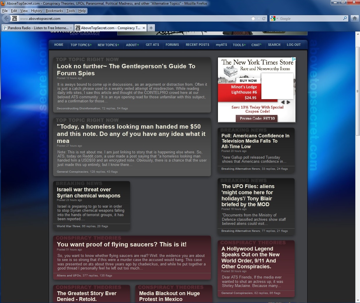
New ATS front page ?
page: 17share:
Originally posted by Sek82
The front page has changed yet again, just when many might have gotten used to it.
What's up with that? Why did we go from the last design to yet another one?
It was perfect in my opinion, now it's back to a bland busyness with no order to it.
RIP, well designed front page.

Yea i couldn't agree more! And I just made a thread about this too Navigating around the site is kinda weird now :/
Hmmm, I seldom use the front page, but yea, it's ugly, but I don't care, just my opinion.
reply to post by Stormdancer777
Funny. With the exception of a few minor alterations (more space at the top for top threads), it's almost exactly like the "previous" site home that many in this thread lamented the loss.
Funny. With the exception of a few minor alterations (more space at the top for top threads), it's almost exactly like the "previous" site home that many in this thread lamented the loss.
Originally posted by SkepticOverlord
reply to post by Stormdancer777
Funny. With the exception of a few minor alterations (more space at the top for top threads), it's almost exactly like the "previous" site home that many in this thread lamented the loss.
I never used the front page as a rule, but if I was surfing the net, a better choice of words would be, uninviting,
I prolly would want a floral motif.
It's all good.
reply to post by SkepticOverlord
I'll admit, I actually started using the home page more after the redesign.
Somehow, you got it to feature, not just the most flagged and most popular threads, but you also found a way to put up some of the most interesting ones as well, even though they didn't have a bunch of flags or replys.
I liked that; it allowed me to read some really cool threads that I might have missed otherwise.
The new redesign of the redesign is back to business as usual; top flagged and most responces.
If there is any way to feature the interesting threads on the home page again, I hope you find a way to bring it back. Maybe have the mods vote on some of the best threads that were passed over somehow and feature them on the homepage so we don't miss out.
I hate it.
You don’t have the time to read it all.
You should re set the page your self.
You don’t have the time to read it all.
You should re set the page your self.
Originally posted by FortAnthem
reply to post by SkepticOverlord
I'll admit, I actually started using the home page more after the redesign.
Somehow, you got it to feature, not just the most flagged and most popular threads, but you also found a way to put up some of the most interesting ones as well, even though they didn't have a bunch of flags or replys.
I liked that; it allowed me to read some really cool threads that I might have missed otherwise.
The new redesign of the redesign is back to business as usual; top flagged and most responces.
If there is any way to feature the interesting threads on the home page again, I hope you find a way to bring it back. Maybe have the mods vote on some of the best threads that were passed over somehow and feature them on the homepage so we don't miss out.
yea what he said!! is it possible to have a home pg were the member can set it to which home pg they prefer? like for those of us who are on computers can have the old one with the colored boxes while mobile users can use the current one? the reason i ask is because i simple can not find what i want to read unless i go through dozens of forums. the old pg saved me from searching. it was all right there ready to go. i'd read every post up there then go on my merry little way. now i read the 5 or 6 posts and i'm gone for the day
I'll be the first to admit I wasnt a fan of the revamp but it grew on me. As others have mentioned it was nice to see interesting article make the
front page.
I guess humans are programmed to be dissatisfied with change no matter what it is. must be part of our DNA. or more accurately if it wasnt part of our DNA it seems to be part of our psyche now.
I guess humans are programmed to be dissatisfied with change no matter what it is. must be part of our DNA. or more accurately if it wasnt part of our DNA it seems to be part of our psyche now.
It's back to the new "masonry" inspired layout... which initially was showing significantly improved performance.
Over time, however, the metrics slipped backwards and I wanted to do some A/B testing.
There's a few more threads covered in the return of ATS Masonry... and there will likely be some more changes and testing as we begin preparing for a "mobile-first" rethink of all of ATS.
Over time, however, the metrics slipped backwards and I wanted to do some A/B testing.
There's a few more threads covered in the return of ATS Masonry... and there will likely be some more changes and testing as we begin preparing for a "mobile-first" rethink of all of ATS.
Originally posted by SkepticOverlord
and there will likely be some more changes and testing as we begin preparing for a "mobile-first" rethink of all of ATS.
Mobile first as in easier access on our smart phones?
Or the site will become geared more towards smart phone use than standard desktop access?
Originally posted by SkepticOverlord
reply to post by Stormdancer777
Funny. With the exception of a few minor alterations (more space at the top for top threads), it's almost exactly like the "previous" site home that many in this thread lamented the loss.
Man, why did you guys change it back to those colors? The colors are so terrible on my eyes I had to quit viewing that page, then yesterday I accidentally clicked on the wrong "Favorite" and saw it was back to black, white, and gray, with nicely lined up and easy to read to read boxes. I nearly cheered. (And looked for a thread about it but didn't see one.)
Now you guys put the colors back in.
If I could do a bawling emoticon, I would.
Originally posted by SkepticOverlord
We're experimenting with a bit more "modern" design. This is the first step to making all of ATS a "responsive" site that works well in all screen sizes.
Tip 1: Get rid of all tables
Tip 2: Get hold of a responsive grid system, examples:
twitter.github.com...
www.responsivegridsystem.com...
responsive.gs...
www.getskeleton.com...
Tip 3: Hire a designer who knows what clean and structured design means. CSS3, HTML5 - this is what is considered "modern" on the web today: www.awwwards.com... ATS looks like something from 2004 maybe, not very modern.
Tip 4: Use common elements, and be consistent throughout the whole site.
Tip 5: Don't use gradients if you don't know how to use them, better do it flat than over-done gradients. Less images needed for less gradients. You can also use semi-transparent gradient images in black and white that can be re-used everywhere, on any color, as long as opacity is low such as 10%.
Tip 7: Stop using images for texts. I see it everywhere. Use css. @fontface or google fonts if you need some custom font. Must be massive server loads with all these unnecessary images everywhere.
Tip 6: Rebuild the site from the ground up - it looks like a mess to maintain and modify.
Tip 7: Use a specific color for each forum section, and always use the color somewhere in elements to easily separate them out from other categories/sections.
Tip 8: Fix text line heights, common heading sizes = Overall typography
Who is designing and doing the front-end on this site? I don't want to sound harsh but it's among the worst looking large sites I've seen when it comes to look and most of all structure. It's just a mess of elements, no consistency, over-done gradients, strange font colours, ugly hover effects, a TON of server requests are being made for all these images loaded - images which doesn't even need to be images (like text) etc.
So - be consistent, build a base with re-usable elements, use these elements only, use as little images as possible and as much CSS3, HTML5 as you can. Be consistent with colors, wether blue, green, greyscale or whatever. Create a palette with colors that you re-use throughout the site.
Refer to Bootstrap and GitHub to see how structure and elements should work.
Just some suggestions :-)
Edit: This doesn't look very "inviting". More like something grey and dead.
edit on 7-9-2012 by opnmind
because: (no reason given)
Originally posted by Ameilia
If I could do a bawling emoticon, I would.
: cryb:
Originally posted by opnmind
Tip 3: Hire a designer who knows what clean and structured design means. CSS3, HTML5
We're there.
The issue is a massive legacy of custom code that's difficult to refine quickly.
The current site home is using a responsive framework for the grid, however, it's contained within 5 year old system of dynamic inter-dependent templates.
And, the primary issue with many "quick start" responsive frameworks (and even not-so-quick-start) like Initializer and HTML5 boilerplate is that much of the SaSS/JavaScript is incompatible with all ad network tags that are mostly still stuck in an iFrame/XHTML legacy.
Turning this battleship into the right direction is hard. We're doing it, most certainly, but it ain't easy.
reply to post by opnmind
Just in case you don't believe me, here's the VERY UGLY page that has been used for testing some of the new responsive approach. (resize the window)
www.abovetopsecret.com...
No media queries yet, as we're looking at other aspects first.
Just in case you don't believe me, here's the VERY UGLY page that has been used for testing some of the new responsive approach. (resize the window)
www.abovetopsecret.com...
No media queries yet, as we're looking at other aspects first.
I see what you mean, and in which direction you are going with the site (or front page) with masonry/mobile. You may want to check out isotope if you
want users to be able to filter different categories: isotope.metafizzy.co...
I'd say there are two ways of building responsive layouts. You either do it fully responsive and only work with % widths (which may look bad on some resolutions), or you switch size in "jump-steps" when the browser window is either larger or smaller with mediaqueries. That means you have one version for 1024px, one for 768px(or 720px), one for 480px and one for 320px width (Common screen sizes). This is often a good approach as well, as you can specify the look a bit more, and make each version better looking. Allows a mix of px values and %.
I personally wouldn't scale the site up over 1024, as that is more than enough to fit the content on. And then focus on the 3 other sizes that you scale down to.
I don't know if this whole forum is custom code or based on a common platform - but have you ever thought of starting fresh and "doing it right" from the start? (and importing all old content+users of course) I can honestly say you'd probably be much better off in the long run, save a ton of server and maintenance costs. Not to metion a more modern feel of the whole forum. A big chunk of work to get going, but when you are up and running, it will be awesome.
Not sure how your dev environments are set up, but if you started fresh with a private repository on GitHub using a common forum script, and then setting up so devs can push to prod or local dev and test all changes locally (wamp+putty+turtoisegit etc), it would probably increase the workflow a ton. Building the whole forum from the ground up with a responsive base, common elements, structured css, few sprited images is superb to work with in the long run. You could setup like dev.abovetopsecret.com and have a copy run in full force, which you then would simply switch over to when all is ready.
Yeah, I can understand that. It is so incredibly many different sections with different looks and different code. A nightmare to redo, in its existing form, I can imagine.
I'd say there are two ways of building responsive layouts. You either do it fully responsive and only work with % widths (which may look bad on some resolutions), or you switch size in "jump-steps" when the browser window is either larger or smaller with mediaqueries. That means you have one version for 1024px, one for 768px(or 720px), one for 480px and one for 320px width (Common screen sizes). This is often a good approach as well, as you can specify the look a bit more, and make each version better looking. Allows a mix of px values and %.
I personally wouldn't scale the site up over 1024, as that is more than enough to fit the content on. And then focus on the 3 other sizes that you scale down to.
The issue is a massive legacy of custom code that's difficult to refine quickly.
I don't know if this whole forum is custom code or based on a common platform - but have you ever thought of starting fresh and "doing it right" from the start? (and importing all old content+users of course) I can honestly say you'd probably be much better off in the long run, save a ton of server and maintenance costs. Not to metion a more modern feel of the whole forum. A big chunk of work to get going, but when you are up and running, it will be awesome.
Not sure how your dev environments are set up, but if you started fresh with a private repository on GitHub using a common forum script, and then setting up so devs can push to prod or local dev and test all changes locally (wamp+putty+turtoisegit etc), it would probably increase the workflow a ton. Building the whole forum from the ground up with a responsive base, common elements, structured css, few sprited images is superb to work with in the long run. You could setup like dev.abovetopsecret.com and have a copy run in full force, which you then would simply switch over to when all is ready.
Turning this battleship into the right direction is hard. We're doing it, most certainly, but it ain't easy.
Yeah, I can understand that. It is so incredibly many different sections with different looks and different code. A nightmare to redo, in its existing form, I can imagine.
edit on 8-9-2012 by opnmind because: (no reason given)
reply to post by SkepticOverlord
Just today, I noticed that the home page is auto-refreshing every so often. It did it just as I was about to click on a thread.
One of the things I HATE the most about the Drudge Report page is how they auto-refresh WAY too often, not giving me enough time to look through all the headlines most of the time.
When I go there, I look through the headlines, open interesting stories in a new tab and get the HELL out of there as fast as I can to avoid the annoyance of their auto-refreshing. I try to spend as little time on that site as possible because of it.
If you have to auto-refresh, I think you should limit it to once an hour. New threads usually don't come in that fast and furious that you would need to refresh more than that, if at all.
Just my two cents.
Originally posted by opnmind
I don't know if this whole forum is custom code or based on a common platform
There are so many custom features, queries, optimizations, and database tweaks that migration to something else would be more trouble than rewriting from scratch.
The issue isn't so much the back-end, put the interdependent dynamic (HTML) templates that constitute the presentation layer.
And our methods are focused on media queries in CSS3 with multiple breakpoints for 1440, 1280, 1024, 728/0, 480, and 320 -- with likely some customizations for the oddities of 1280x600 Android screens in default Android browsers (madness). And that combined with some server-side intelligence so that we're not delivering all the content intended for a 1440 breakpoint, to a user on a smart phone.
(Tried Isotope, had some problems.)
And... I'm toying with wireframes where ATS is a (nearly) white site.
Wait...
There's a front page to this place?
Hang on, let me check....
...
Hey! There is! I just looked, and there it was...in big letters...
"ATS...The Best Stuff in Chicken since 1955".
It could use some pretty-ing up, but I'll bet it does work well on a smartphone.
In a few years, it will probably be like red leather jackets and parachute pants.
But it's a pretty new medium. You have to expect some growing pains.
ah the page has changed !
finaly the admin have listened to my advice on the first page of this thread
to level down the color contrast of the box
good decision to make it less color flashy it is less painfull for the eyes
thats why i like ATS .. everything is darker then most websites
try to stay on the cnn page for 10 min and then come back to ats
some website are designed to give you headaches
not here they do care about the members and visitors personal health lol
its like everything has been perfectly planned from the start
Is it Simon who though of that ? (having the dark contrast)
a big reason why ATS is so popular
edit on 9/8/2012 by Ben81 because: (no reason given)
new topics
-
University student disciplined after saying veganism is wrong and gender fluidity is stupid
Education and Media: 41 minutes ago -
Geddy Lee in Conversation with Alex Lifeson - My Effin’ Life
People: 1 hours ago -
God lived as a Devil Dog.
Short Stories: 2 hours ago -
Police clash with St George’s Day protesters at central London rally
Social Issues and Civil Unrest: 3 hours ago -
TLDR post about ATS and why I love it and hope we all stay together somewhere
General Chit Chat: 4 hours ago -
Hate makes for strange bedfellows
US Political Madness: 6 hours ago -
Who guards the guards
US Political Madness: 9 hours ago -
Has Tesla manipulated data logs to cover up auto pilot crash?
Automotive Discussion: 11 hours ago
top topics
-
Hate makes for strange bedfellows
US Political Madness: 6 hours ago, 14 flags -
Who guards the guards
US Political Madness: 9 hours ago, 13 flags -
whistleblower Captain Bill Uhouse on the Kingman UFO recovery
Aliens and UFOs: 16 hours ago, 11 flags -
Police clash with St George’s Day protesters at central London rally
Social Issues and Civil Unrest: 3 hours ago, 7 flags -
TLDR post about ATS and why I love it and hope we all stay together somewhere
General Chit Chat: 4 hours ago, 5 flags -
University student disciplined after saying veganism is wrong and gender fluidity is stupid
Education and Media: 41 minutes ago, 3 flags -
Has Tesla manipulated data logs to cover up auto pilot crash?
Automotive Discussion: 11 hours ago, 2 flags -
God lived as a Devil Dog.
Short Stories: 2 hours ago, 2 flags -
Geddy Lee in Conversation with Alex Lifeson - My Effin’ Life
People: 1 hours ago, 2 flags
active topics
-
University student disciplined after saying veganism is wrong and gender fluidity is stupid
Education and Media • 4 • : chiefsmom -
Police clash with St George’s Day protesters at central London rally
Social Issues and Civil Unrest • 34 • : Freeborn -
Europe declares war on Russia?
World War Three • 64 • : Consvoli -
Thousands Of Young Ukrainian Men Trying To Flee The Country To Avoid Conscription And The War
Other Current Events • 118 • : Consvoli -
-@TH3WH17ERABB17- -Q- ---TIME TO SHOW THE WORLD--- -Part- --44--
Dissecting Disinformation • 626 • : cherokeetroy -
Candidate TRUMP Now Has Crazy Judge JUAN MERCHAN After Him - The Stormy Daniels Hush-Money Case.
Political Conspiracies • 730 • : Lazy88 -
The Superstition of Full Moons Filling Hospitals Turns Out To Be True!
Medical Issues & Conspiracies • 19 • : FloridaManMatty -
Iranian Regime Escalates Hiijab Mandate Through Sexual Violence and Beatings of Women
Mainstream News • 166 • : purplemer -
They Killed Dr. Who for Good
Rant • 67 • : grey580 -
Remember These Attacks When President Trump 2.0 Retribution-Justice Commences.
2024 Elections • 44 • : Daughter2v2