It looks like you're using an Ad Blocker.
Please white-list or disable AboveTopSecret.com in your ad-blocking tool.
Thank you.
Some features of ATS will be disabled while you continue to use an ad-blocker.

ATS.5/3 24 Hour Member Beta Test
page: 3share:
Is it just me, or can you not jump to say page 5 of responses, like if I am in the Recent area, and I see a thread that I have read previously, and
want to go to the last page to see the new posts, on the old site you could click the page you wanted to go to. I don't see that option until I am
actually in the thread. Or am I just missing it?
reply to post by RedBeardRay
Since our analytics package showed a very low usage of those links, they've been removed in favor of a more clean look on recent posts.
Since our analytics package showed a very low usage of those links, they've been removed in favor of a more clean look on recent posts.
reply to post by SkepticOverlord
Answers that, thanks for the quick response. Also I really like the forever scroll feature.
Answers that, thanks for the quick response. Also I really like the forever scroll feature.
To me the text is really hard to read in dark mode, too similar in color, and I will probably only be using dark mode because the other is too bright
Everythings OK on my part.
Crucial question, there was ATS LIVE option, can we have it back?
eta: ooops, I meant to say the option which monitors activity in threads in real time, I forgot the name of it
Crucial question, there was ATS LIVE option, can we have it back?
eta: ooops, I meant to say the option which monitors activity in threads in real time, I forgot the name of it
edit on 20-8-2013 by
zilebeliveunknown because: (no reason given)
There are a number of revised/refined pages, as well as new features you all should test.
The archive in the main menu provides a way to look at the top threads for any month in ATS' existence.
The home page is also very different, as well as top-topics and hot-topics. And the "Firehose" and/or "New Topics" has been replaced by the "new" button in the main menu.
The site "information" pages are accessible under the "i" at the top right, next to the private messages alert.
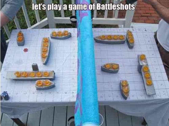
Battleshots anyone?
K so, I guess "gallery 3" is where we select pics from if we wanna select an image from the insert image button
I still cant get my correct time zone to set.
Maybe you can get to that also.
Maybe you can get to that also.
Senduko
Okay Site on the white scheme looks terrible, also Did u make this layout on a mac?
My desktop is a 27 inch 1920x1080 res and the fonts look way to big and choppy. Now i'm on my mackbook pro retina and the fonts looks really nice.
The dark scheme works out nice. But overall viewing it from my desktop the site feels like I'm looking at a zoomed in page if u get what I mean.
Edit: Also the emoticons... Maybe they are a bit to "over the edge" they don't feel like emoticons... they just feel like little scribbles between text.edit on 20-8-2013 by Senduko because: (no reason given)
Agree with all of this
reply to post by SkepticOverlord
Firefox 23.0. Windows XP
The general layout looks good. I could find my way about the various sections without any problem.
____
The light/dark button could perhaps be a little easier to find - those who have never had such an option may need a little more prompting.
Perhaps the default setting should be the dark mode - maybe my bias is showing - but it is a rather distinctive feature of ATS which I love and keeps me browsing well into the night.
______
The emoticons look a little odd - I thought this would be a good time for ATS to have introduced its own distinctive emoticons.
_______
I have adored the ATS colour scheme - very distinctive and classy ...... grey and charcoal yes but where is that gorgeous vibrant GREEN gone to - will it return ?
______
Hope that was of some use.
Cheers SkepticOverlord
edit on 20-8-2013 by UmbraSumus because: spelling error
Is there gonna be no more ribbon at the bottom anymore as well? If so damn.... I kinda liked that feature.
ValentineWiggin
To me the text is really hard to read in dark mode
All text? If not, which?
I tried to make it very readable under office lights while using it on the HP craptop.
There isn't enough definition between where the reply ends and the signature starts kind of runs together.
SkepticOverlord
ValentineWiggin
To me the text is really hard to read in dark mode
All text? If not, which?
I tried to make it very readable under office lights while using it on the HP craptop.
The home page
jaynkeel
Is there gonna be no more ribbon at the bottom anymore as well? If so damn.... I kinda liked that feature.
Given that the relevant friend/foe features have been dropped, combined with the persistent top-menu, the ribbon is no longer needed.
Some more conclusions after piloting around a bit...
I like the top nav bar and the drop down for my settings, messages, profile, etc...
The Forum ICONs are all grey on MY ATS in my Favorite Forums, I liked that they had some different colors is this by design for that screen? Makes this screen a bit too monotone.
The rest of this is fairly intuitive and I like the layout for messaging too. I work with developers so I am actually impressed (they like to fix when it aint broke and break when it was workin fine...)
I am on XP not that it really matters.
Wow, you even went so far as to provide evidence of time travelers. Damn cool.
Mark & Bill - Last Visit - 1969
Color me impressed.
Mark & Bill - Last Visit - 1969
Color me impressed.
reply to post by SkepticOverlord
Yeah I just noticed that everything needed is within the drop down arrow at the top...Clever. Again works great.
Yeah I just noticed that everything needed is within the drop down arrow at the top...Clever. Again works great.
new topics
-
Biden Administration Allows State Sponsor of Terrorism Cuba to Tour Miami Airport TSA
US Political Madness: 50 minutes ago -
Must Watch Interview: Illegal Alien Invasion of United States, Now Totals 52 Million
Political Issues: 2 hours ago -
Norway, Ireland and Spain say they will recognize a Palestinian state
Other Current Events: 3 hours ago -
Pyrography and Scrimshaw
Member Art: 3 hours ago -
Biden administration announces additional $7.7 billion in student debt relief
US Political Madness: 7 hours ago -
You "Inspiresing Erectionists"!
US Political Madness: 7 hours ago -
Our recent trip to Ukraine (Kyiv)
Other Current Events: 7 hours ago -
Rishi Sunak to announce UK General Election on July 4th?
Political Issues: 8 hours ago -
Is Lake Lanier Haunted or Cursed?
Paranormal Studies: 10 hours ago
top topics
-
Must Watch Interview: Illegal Alien Invasion of United States, Now Totals 52 Million
Political Issues: 2 hours ago, 20 flags -
Our recent trip to Ukraine (Kyiv)
Other Current Events: 7 hours ago, 13 flags -
You "Inspiresing Erectionists"!
US Political Madness: 7 hours ago, 9 flags -
Biden administration announces additional $7.7 billion in student debt relief
US Political Madness: 7 hours ago, 8 flags -
Rishi Sunak to announce UK General Election on July 4th?
Political Issues: 8 hours ago, 7 flags -
Pyrography and Scrimshaw
Member Art: 3 hours ago, 5 flags -
Biden Administration Allows State Sponsor of Terrorism Cuba to Tour Miami Airport TSA
US Political Madness: 50 minutes ago, 5 flags -
Is Lake Lanier Haunted or Cursed?
Paranormal Studies: 10 hours ago, 5 flags -
'Skeptics' Ridiculous Explanations Of The Rendlesham Forest Events
Aliens and UFOs: 13 hours ago, 5 flags -
Norway, Ireland and Spain say they will recognize a Palestinian state
Other Current Events: 3 hours ago, 3 flags
active topics
-
Must Watch Interview: Illegal Alien Invasion of United States, Now Totals 52 Million
Political Issues • 17 • : OdinnsPapa -
Ron DeSantis endorses 'deadly force' against migrants suspected of trafficking drugs
US Political Madness • 35 • : OdinnsPapa -
I'm convinced...now more than ever
General Conspiracies • 107 • : KKLOCO -
-@TH3WH17ERABB17- -Q- ---TIME TO SHOW THE WORLD--- -Part- --44--
Dissecting Disinformation • 1101 • : RookQueen2 -
ICC Apply for Arrest Warrants for Netanyahu and Hamas leader
Middle East Issues • 88 • : YourFaceAgain -
Our recent trip to Ukraine (Kyiv)
Other Current Events • 10 • : OdinnsPapa -
Androgeneous, Bisexual, Homosexual, or Heterosexual?
Health & Wellness • 85 • : DronesandUFOs -
Volcano Erupting in Greece
Dreams & Predictions • 8 • : Oldcarpy2 -
Elon Musk futurist?
Dreams & Predictions • 11 • : Andromerius -
Has anybody found some forms of mind-body medicine don't welcome outsiders
Philosophy and Metaphysics • 6 • : Compendium