It looks like you're using an Ad Blocker.
Please white-list or disable AboveTopSecret.com in your ad-blocking tool.
Thank you.
Some features of ATS will be disabled while you continue to use an ad-blocker.

Open Member Testing: ATS.5/3 Final Release Candidate
page: 21share:
A sixteen million star glitch? I just sent in a form about it.
Checked here to see if there's other members with similar issues.
Anyone else? lol
Apparently I am!
member stars: 16,889,572
ave. stars per post: 6021.24
Lady_Tuatha
Am I supposed to have this many stars???
Checked here to see if there's other members with similar issues.
Anyone else? lol
Dumbass
reply to post by Lady_Tuatha
Wow that is a lot
12.500 stars per post.... Are you the Antichrist?edit on 3-9-2013 by Dumbass because: (no reason given)
Apparently I am!
member stars: 16,889,572
ave. stars per post: 6021.24
edit on 3-9-2013 by dreamingawake because: (no reason given)
Originally posted by bigfatfurrytexan
reply to post by dreamingawake
your WATS is over 9000....
...did you assume your ultimate form?
Try 98,000.... nearly 100k
Originally posted by dreamingawake
Apparently I am!
member stars: 16,889,572
ave. stars per post: 6021.24
I sent SkepticOverlord a PM about the star issue....for you and Lady_Tuatha.
W 98543 K 90291
edit on Tue Sep 3 2013 by DontTreadOnMe because: (no reason given)
Any time frame for the release of this Top Secret new design? I'm dying to play with it.
reply to post by DontTreadOnMe
Least mine has moved down from the millions mark that it was earlier lol, still a tad high tho, im not complaining
Least mine has moved down from the millions mark that it was earlier lol, still a tad high tho, im not complaining
reply to post by Restricted
You should have gotten a PM with login info that allows you to access it right now.
You should have gotten a PM with login info that allows you to access it right now.
reply to post by SkepticOverlord
Looks really good. Also trying it from a Android phone right now also. Looks pretty-clean!
Correction: I just noticed on the mobile version, that the menu in the top/right corner, which drops down to show messages, etc. The envelop icon and the word "messages" next to it is too large to fit in the drop-down, causing the word "Messages" to wrap under the envelop icon - instead of next to it.
edit on 2013-9-3 by EnhancedInterrogator because: (no reason given)
Not sure if this has even been addressed, if it has ignore.
While I was editing in the new layout after I hit "edit" it just went to a blank white screen. It didn't take me to the thread and show the edit. I had to go to the original ATS layout to see that my edit too place.
While I was editing in the new layout after I hit "edit" it just went to a blank white screen. It didn't take me to the thread and show the edit. I had to go to the original ATS layout to see that my edit too place.
Oh nooo. Where be the new ATS go?
I've been fully inundated and now feel like i've fallen in a time warp. Really enjoy the new design, can't wait to see it as standard.
EDIT: Nevermind... it's back running. Man, i need to get me some ATherapyS
I've been fully inundated and now feel like i've fallen in a time warp. Really enjoy the new design, can't wait to see it as standard.
EDIT: Nevermind... it's back running. Man, i need to get me some ATherapyS
edit on 3-9-2013 by melancholiflower because: (no reason
given)
Login/logout won't be functioning properly for the next few hours in the new version.
I am using a Mac
Safari 5.1.9
Okay, so I went back and looked at the two "spacing" issues I had, the first being this, the "pressed together text" at the top right with "flags, etc.":

At the bottom of the page is this:
viewport: 1237 x 690 | document: 1237 x 1689
And the second being the "My Posts" section on my profile page (everything except the "My Threads" section, really)
At the bottom of the page, as requested is this:
viewport: 1237 x 690 | document: 1237 x 5812
I hope this helps!
Thank you!
Safari 5.1.9
Okay, so I went back and looked at the two "spacing" issues I had, the first being this, the "pressed together text" at the top right with "flags, etc.":
At the bottom of the page is this:
viewport: 1237 x 690 | document: 1237 x 1689
And the second being the "My Posts" section on my profile page (everything except the "My Threads" section, really)
At the bottom of the page, as requested is this:
viewport: 1237 x 690 | document: 1237 x 5812
I hope this helps!
Thank you!
SkepticOverlord
reply to post by Sublimecraft
The default avatar dimensions are the same.
The mini-profile is indeed 200 pixels wide, 580 pixels tall is a safe height for backgrounds.
Kilobyte recommendations have not changed.
First chance I've had to check it out... very nice, so far.
Glad to get the new avatar dimensions, we weren't sure in the Avatar creation thread, just kept getting little wisps of hints here and there. LOL.
Not sure about the new 'smilies' but that's trivial in the grand scheme of things.
Definitely a lot of time and hard work has been put into the new look.
Thanks for letting us have a sneak peak.
Much respect~
snarky
---------
ETA: Also, like the quickness when clicking a 'star' on some one's comment. No page refresh.
Very nice.....
Definitely will have to modify my avi as well as my quotes in the sig.....
edit on 4-9-2013 by snarky412 because: (no reason given)
What about searching for YouTube videos embedded in posts?
For example, in this post, there's a vid.. but much of the vid has 'other stuff'... which I might want to comment on. But I don't know specifically if anyone else has started a thread featuring said video.... Putting in the YouTube video address yields nothing at this point.
For example, in this post, there's a vid.. but much of the vid has 'other stuff'... which I might want to comment on. But I don't know specifically if anyone else has started a thread featuring said video.... Putting in the YouTube video address yields nothing at this point.
is it just me or has the issue of all that space on the right been fixed
might just be that i am using a different pc
but to me it looks like SO has expanded the post box to the right
if so can i just say that ATS 5.3 is now perfect, there is nothing left for me to compalin about so a massive thank you to SO for taking onboard all member feedback.
might just be that i am using a different pc
but to me it looks like SO has expanded the post box to the right
if so can i just say that ATS 5.3 is now perfect, there is nothing left for me to compalin about so a massive thank you to SO for taking onboard all member feedback.
edit on 4-9-2013 by OtherSideOfTheCoin because: (no reason given)
AboveBoard
I am using a Mac
Safari 5.1.9
Okay, so I went back and looked at the two "spacing" issues I had, the first being this, the "pressed together text" at the top right with "flags, etc.":
At the bottom of the page is this:
viewport: 1237 x 690 | document: 1237 x 1689
And the second being the "My Posts" section on my profile page (everything except the "My Threads" section, really)
At the bottom of the page, as requested is this:
viewport: 1237 x 690 | document: 1237 x 5812
I hope this helps!
Thank you!
From everything I am able to see, these issues have been fixed beautifully.
Thank you!
- AB
Improvement recommendation for user experience
When following the recent AMA threads, and trying to use the guests profile-->threads-->posts area (see attached poc below) to see the list of only his posts, I found that the information there can be expanded to provide more relevant information to the user. Also, I believe it would improve performance by reducing the needed clicks to load a thread to read a post you may have already read.
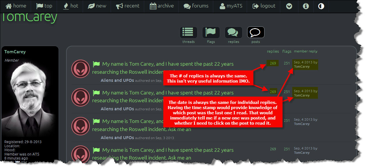
Adding a time stamp to the post (in the "member reply" column in addition to the date) would tell me immediately once the page is refreshed, whether I had already read the last reply. As it is now, I do not know, and still have to click on the post to load the thread only to see it was not a new thread post. That adds additional load to the system x users. If time stamp is not possible, perhaps the thread ID number could be added. Anything that would indicate to the user that the latest post is (or is not) new.
DEBUG INFO: viewport: 1264 x 614 | document: 1280 x 1572
When following the recent AMA threads, and trying to use the guests profile-->threads-->posts area (see attached poc below) to see the list of only his posts, I found that the information there can be expanded to provide more relevant information to the user. Also, I believe it would improve performance by reducing the needed clicks to load a thread to read a post you may have already read.
Adding a time stamp to the post (in the "member reply" column in addition to the date) would tell me immediately once the page is refreshed, whether I had already read the last reply. As it is now, I do not know, and still have to click on the post to load the thread only to see it was not a new thread post. That adds additional load to the system x users. If time stamp is not possible, perhaps the thread ID number could be added. Anything that would indicate to the user that the latest post is (or is not) new.
DEBUG INFO: viewport: 1264 x 614 | document: 1280 x 1572
edit on 4-9-2013 by Krakatoa because: added viewport info
new topics
-
A Warning to America: 25 Ways the US is Being Destroyed
New World Order: 2 hours ago -
President BIDEN's FBI Raided Donald Trump's Florida Home for OBAMA-NORTH KOREA Documents.
Political Conspiracies: 8 hours ago -
Maestro Benedetto
Literature: 9 hours ago -
Is AI Better Than the Hollywood Elite?
Movies: 9 hours ago
top topics
-
President BIDEN's FBI Raided Donald Trump's Florida Home for OBAMA-NORTH KOREA Documents.
Political Conspiracies: 8 hours ago, 27 flags -
Weinstein's conviction overturned
Mainstream News: 17 hours ago, 8 flags -
Gaza Terrorists Attack US Humanitarian Pier During Construction
Middle East Issues: 14 hours ago, 8 flags -
Massachusetts Drag Queen Leads Young Kids in Free Palestine Chant
Social Issues and Civil Unrest: 16 hours ago, 7 flags -
Las Vegas UFO Spotting Teen Traumatized by Demon Creature in Backyard
Aliens and UFOs: 13 hours ago, 6 flags -
A Warning to America: 25 Ways the US is Being Destroyed
New World Order: 2 hours ago, 6 flags -
Meadows, Giuliani Among 11 Indicted in Arizona in Latest 2020 Election Subversion Case
Mainstream News: 16 hours ago, 5 flags -
2024 Pigeon Forge Rod Run - On the Strip (Video made for you)
Automotive Discussion: 14 hours ago, 4 flags -
Is AI Better Than the Hollywood Elite?
Movies: 9 hours ago, 3 flags -
The functionality of boldening and italics is clunky and no post char limit warning?
ATS Freshman's Forum: 15 hours ago, 1 flags
active topics
-
King Charles 111 Diagnosed with Cancer
Mainstream News • 321 • : FlyersFan -
Is there a hole at the North Pole?
ATS Skunk Works • 41 • : burritocat -
Massachusetts Drag Queen Leads Young Kids in Free Palestine Chant
Social Issues and Civil Unrest • 16 • : FlyersFan -
President BIDEN's FBI Raided Donald Trump's Florida Home for OBAMA-NORTH KOREA Documents.
Political Conspiracies • 18 • : nugget1 -
Gaza Terrorists Attack US Humanitarian Pier During Construction
Middle East Issues • 33 • : FlyersFan -
Weinstein's conviction overturned
Mainstream News • 24 • : burritocat -
-@TH3WH17ERABB17- -Q- ---TIME TO SHOW THE WORLD--- -Part- --44--
Dissecting Disinformation • 690 • : burritocat -
University of Texas Instantly Shuts Down Anti Israel Protests
Education and Media • 266 • : SchrodingersRat -
New whistleblower Jason Sands speaks on Twitter Spaces last night.
Aliens and UFOs • 66 • : baablacksheep1 -
HORRIBLE !! Russian Soldier Drinking Own Urine To Survive In Battle
World War Three • 50 • : F2d5thCavv2