It looks like you're using an Ad Blocker.
Please white-list or disable AboveTopSecret.com in your ad-blocking tool.
Thank you.
Some features of ATS will be disabled while you continue to use an ad-blocker.

Using the new features and and functions of ATS.5/3
page: 1share:
The new ATS.5/3 site is a significant departure from prior versions of our site, and the most-recent ATS.2010 edition. The "5/3" indicates HTML5 and
CSS3 as well as adherence to contemporary open-standards for web applications. Now that the vast majority of users that come to ATS (98%+) are using
browsers that support these technologies, it made sense to both deploy a new version of ATS that takes advantage of the new capabilities as well as
bring the user experience up to contemporary standards.
An important note for people familiar with HTML5/CSS3: we're using a "hybrid" approach to responsive design. This means you can't "see" all the viewport versions simply by resizing your browser window. Code on the server senses the difference between desktop, tablet, and phone users, then adjusts the content and styles for a more efficient experience. This prevents content or sections that might be "hidden" via responsive design from occupying the bandwidth of mobile users.
Below is an overview of the important new attributes of the user experience for both desktop and mobile users.
But before we get to the more detailed instructions, this button:

Toggles the site UX (user experience) between the dark and light versions.
Using The New ATS.5/3
For desktop users, the most significant change is support of larger monitors with a standard site width of 1280 pixels. This has been widely adopted as the new default for information-rich websites. However, the site will "snap" down to the older size of 1024 pixels wide for desktop browser windows narrower than 1280.
The New Menu
The new menu:
Provides "sticky" access to all top-level features and site pages. It's sticky by remaining at the top of your browser winder when scrolling tall content.
The New Sub-Menu
To access member-specific features:

Click the downward-facing chevron to open the member sub-menu.
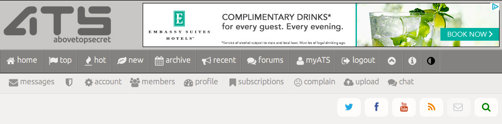
From here you can access all the features available to members.
Private Messages
For private messages:

Click this option, where a familiar looking, but updated UI for private messages will appear:
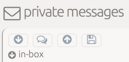
The down-arrow gives access to your in-box (the default)
The speech bubble button provides access to your reply notifications
The up-arrow gives access to your out-box
The diskette icon is for your saved messages
Account Settings
To access your account settings:
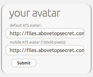
Where you'll find a few new settings/features. The first major addition is the ability to specify a 150x50 pixel avatar for the mobile version of ATS:
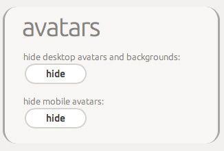
The ability to hide avatars in both the desktop/tablet and mobile phone versions of the site:
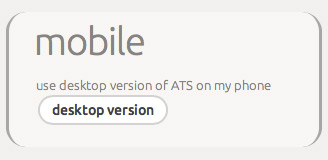
The ability to specify receiving the desktop version of the site on your smartphone:
And an improved color-picker for your mini-profile backgrounds and text colors.
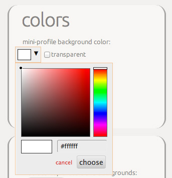
Image Uploads and Storage
The next significant change is a completely rewritten upload feature:

The new upload tool doesn't utilize Flash, and is compatible with current versions of Android and iOS for image uploads from your mobile devices.
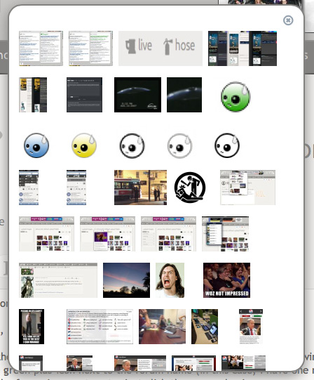
Click the upload button to open the image-selection palette:

In the palette, you can select multiple images to upload several in one batch:
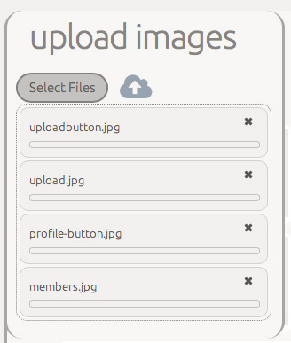
Click the cloud with the up-arrow to upload your selections. The page will refresh after the upload is initiated. Be aware that sometimes, when you upload multiple files, upload large files, or have a slow connection, the image(s) you upload may not be immediately visible.
Once uploaded, you have four folders to group your uploaded images:

The "uploaded" folder is where everything goes when you upload. You can move images to the other folders, and the "public" folder specifies the images available from the quick-select image palette when you create a post.
When you click an image in your uploads:
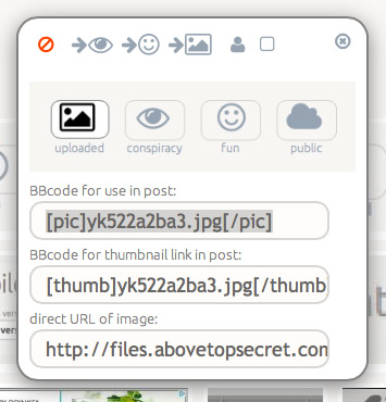
A pop-up image palette appears with buttons for managing your images.
Use the red circle to delete the image.
Use the arrowed-icons to move your image to one of the other folders.
Use the little-person icon to immediately assign the image as your avatar.
Use the little-square icon to immediately assign the image as your mini-profile background.
Member Profiles
Your full profile page has some significant changes as well. We've removed the potential for displaying personal information, and as a result, have now made the profiles available to non-member visitors.
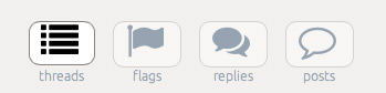
The three buttons at the top provide access to the four profile options…
The first gives access to the threads you've authored in chronological order.
The "flags" icon sorts your threads by the number of flags they've received.
The "replies" button sorts your threads by the number of replies.
The "posts" button provides a list of all your posts with quick access to each.
Search
The search function can be accessed by the green magnifying glass at the top right:

Clicking it opens the search box:

myATS
There have been some subtle but important changes to your myATS page as well. The default view for your favorite forums is "replies":
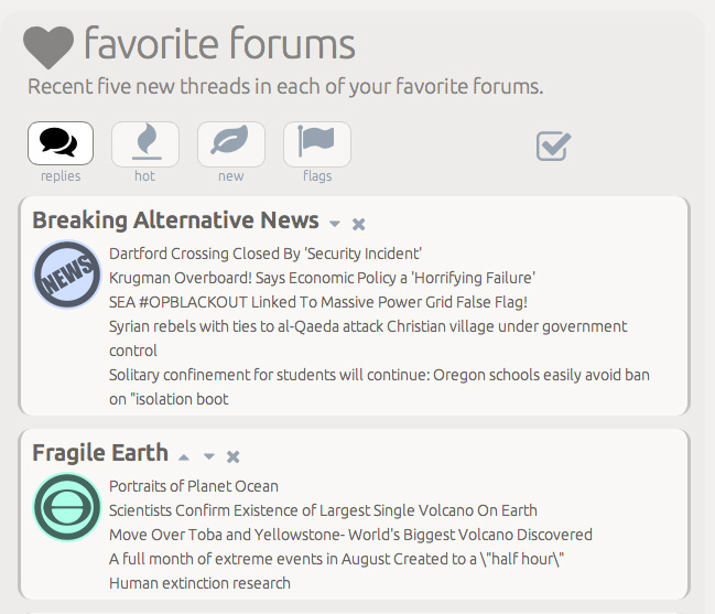
It shows the six threads with recent replies in that forum.
Clicking hot:
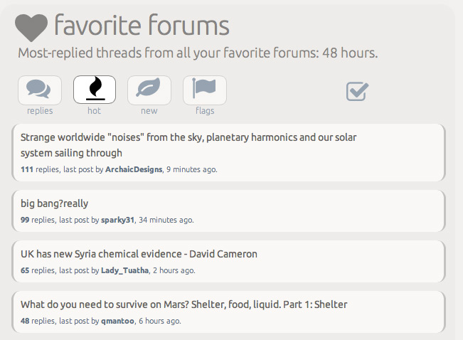
Shows the reply activity in all your favorite forums.
Clicking new:
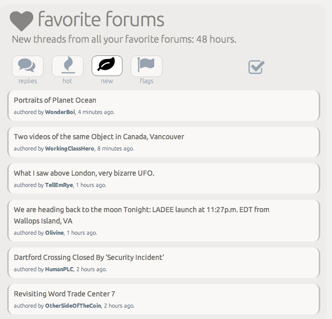
Shows new threads in all your favorite forums.
Clicking flags:
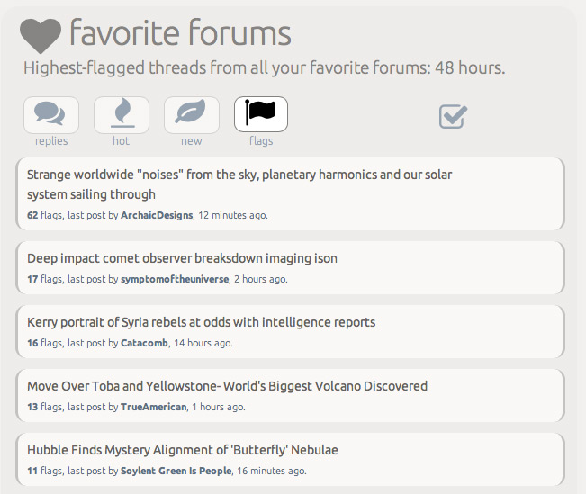
Shows the highest-flagged threads in your favorite forums that have recent reply activity.
Clicking the check-mark icon specifies the active view as your default view every time you visit the myATS page.
The All-New Archive Page
The archive page is a completely new addition in ATS.5/3
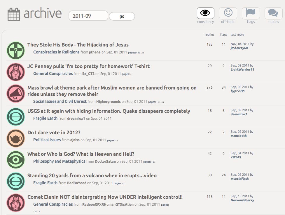
It replaces the old 30-day, 90-day, and so on pages that became too cumbersome as a means to discover some of the great threads in ATS's history.
When you click on the date field:
A handy date-selector pops-up so you can choose any month in ATS's history. Click go to see the threads from that month, initially sorted in chronological order.
Click the "conspiracy" button to limit the list to threads from ATS's conspiracy forums.
Click the "off-topic" button for threads from the off-topic forums.
Click the "flags" button to sort the threads by the number of flags.
Click the "replies" button to sort the threads by the number of replies.
.more in the next post...
An important note for people familiar with HTML5/CSS3: we're using a "hybrid" approach to responsive design. This means you can't "see" all the viewport versions simply by resizing your browser window. Code on the server senses the difference between desktop, tablet, and phone users, then adjusts the content and styles for a more efficient experience. This prevents content or sections that might be "hidden" via responsive design from occupying the bandwidth of mobile users.
Below is an overview of the important new attributes of the user experience for both desktop and mobile users.
But before we get to the more detailed instructions, this button:
Toggles the site UX (user experience) between the dark and light versions.
Using The New ATS.5/3
For desktop users, the most significant change is support of larger monitors with a standard site width of 1280 pixels. This has been widely adopted as the new default for information-rich websites. However, the site will "snap" down to the older size of 1024 pixels wide for desktop browser windows narrower than 1280.
The New Menu
The new menu:
Provides "sticky" access to all top-level features and site pages. It's sticky by remaining at the top of your browser winder when scrolling tall content.
The New Sub-Menu
To access member-specific features:
Click the downward-facing chevron to open the member sub-menu.
From here you can access all the features available to members.
Private Messages
For private messages:
Click this option, where a familiar looking, but updated UI for private messages will appear:
The down-arrow gives access to your in-box (the default)
The speech bubble button provides access to your reply notifications
The up-arrow gives access to your out-box
The diskette icon is for your saved messages
Account Settings
To access your account settings:
Where you'll find a few new settings/features. The first major addition is the ability to specify a 150x50 pixel avatar for the mobile version of ATS:
The ability to hide avatars in both the desktop/tablet and mobile phone versions of the site:
The ability to specify receiving the desktop version of the site on your smartphone:
And an improved color-picker for your mini-profile backgrounds and text colors.
Image Uploads and Storage
The next significant change is a completely rewritten upload feature:
The new upload tool doesn't utilize Flash, and is compatible with current versions of Android and iOS for image uploads from your mobile devices.
Click the upload button to open the image-selection palette:
In the palette, you can select multiple images to upload several in one batch:
Click the cloud with the up-arrow to upload your selections. The page will refresh after the upload is initiated. Be aware that sometimes, when you upload multiple files, upload large files, or have a slow connection, the image(s) you upload may not be immediately visible.
Once uploaded, you have four folders to group your uploaded images:
The "uploaded" folder is where everything goes when you upload. You can move images to the other folders, and the "public" folder specifies the images available from the quick-select image palette when you create a post.
When you click an image in your uploads:
A pop-up image palette appears with buttons for managing your images.
Use the red circle to delete the image.
Use the arrowed-icons to move your image to one of the other folders.
Use the little-person icon to immediately assign the image as your avatar.
Use the little-square icon to immediately assign the image as your mini-profile background.
Member Profiles
Your full profile page has some significant changes as well. We've removed the potential for displaying personal information, and as a result, have now made the profiles available to non-member visitors.
The three buttons at the top provide access to the four profile options…
The first gives access to the threads you've authored in chronological order.
The "flags" icon sorts your threads by the number of flags they've received.
The "replies" button sorts your threads by the number of replies.
The "posts" button provides a list of all your posts with quick access to each.
Search
The search function can be accessed by the green magnifying glass at the top right:
Clicking it opens the search box:
myATS
There have been some subtle but important changes to your myATS page as well. The default view for your favorite forums is "replies":
It shows the six threads with recent replies in that forum.
Clicking hot:
Shows the reply activity in all your favorite forums.
Clicking new:
Shows new threads in all your favorite forums.
Clicking flags:
Shows the highest-flagged threads in your favorite forums that have recent reply activity.
Clicking the check-mark icon specifies the active view as your default view every time you visit the myATS page.
The All-New Archive Page
The archive page is a completely new addition in ATS.5/3
It replaces the old 30-day, 90-day, and so on pages that became too cumbersome as a means to discover some of the great threads in ATS's history.
When you click on the date field:
A handy date-selector pops-up so you can choose any month in ATS's history. Click go to see the threads from that month, initially sorted in chronological order.
Click the "conspiracy" button to limit the list to threads from ATS's conspiracy forums.
Click the "off-topic" button for threads from the off-topic forums.
Click the "flags" button to sort the threads by the number of flags.
Click the "replies" button to sort the threads by the number of replies.
.more in the next post...
edit on 9-9-2013 by SkepticOverlord because: (no reason given)
edit on 9-9-2013 by SkepticOverlord
because: (no reason given)
edit on 9-9-2013 by SkepticOverlord because: (no reason given)
Forums (Board Home)
The redesigned forums page, previously known as "Board Home,"
Provides clear access to all the available forums on ATS. If you've negated a forum from showing in your recent posts view, you'll see a little green plus-icon next to the forum name (in this case, I have one next to Breaking Political News). To restore the forum in recent posts, just click the green plus-icon.
In the recent posts list:

The little red minus-icon is what you click to remove that forum from the list. When you click, the results are immediate.
The New Site Home
The new site home page:
Is even more news-ish than our previous home pages. The content is refreshed every hour, and shows the most currently active and highest-flagged threads started in the past few days. And for the first time, our off-topic forums are also included in the threads featured on the site home.
Top Topics
The new top topics page includes a way to focus on specific forum groups:

Click "news" to see the highest flagged threads started in the past few days in news forums.
Click "conspiracy" to see the highest flagged threads started in the past few days in the conspiracy forums.
Click "politics" to see the highest flagged threads started in the past few days in the politically focused forums.
Click "current" to see the highest flagged threads started in the past few days in the current events forums.
Click "mysteries" to see the highest flagged threads started in the past few days in the mysterious subjects forums.
Click "sci/tech" to see the highest flagged threads started in the past few days in the science and technology forums.
Click "off-topic" to see the highest flagged threads started in the past few days in the off-topic forums.
Thread-View
In thread-view, some changes to the mini-profile:
In order, the numbers are your posts, your flags, your stars, your Way Above Top Secret score, and your experimental karma score (a calculation that takes into account your posting activity with applause and warnings from staff). The background color, opacity, and border-color will change to be more prominent based on the WATS score (previously shown by colored borders around posts).
Click on the little person-icon at the lower left:
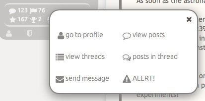
Reveals the member palette where you can:
Go to their profile page
Go directly to the threads page of their profile
Send a private message
Go directly to the posts page of their profile
See only their posts in the current thread
Or send staff an alert.
Adding Your Images to Posts
Within the BBcode buttons above the post form:

You'll find a revamped picture function that provides immediate access to the images that you've moved to your "public" folder (cloud icon) in the uploads/storage tool.
When creating your post, reply, or edit, simply place your cursor where you want to the image to appear, click the picture icon, and then click on the image you want. The custom ATS BBcode will automatically be inserted into your post.
The New LIVE and Firehose
Within the member sub-menu, you'll find two new options:
These provide access to completely revamped LIVE and Firehose functions.
Click the beer icon to open the LIVE palette in a new pop-up window.
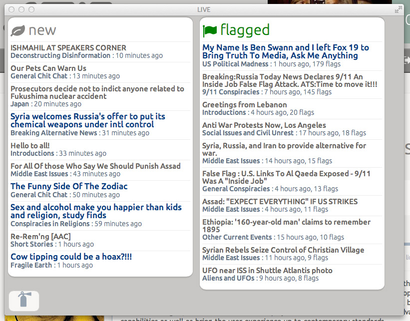
If you have the monitor space, simply keep this open and off to the site. It will automatically update with new threads and trending flagged threads as you continue using ATS. When you see a thread you lick, click it, and it will open in your main browser window while the palette continues to update.
At the bottom left, you'll see a fire extinguisher icon... that provides a way to toggle between the LIVE tool, and the Firehose tool.
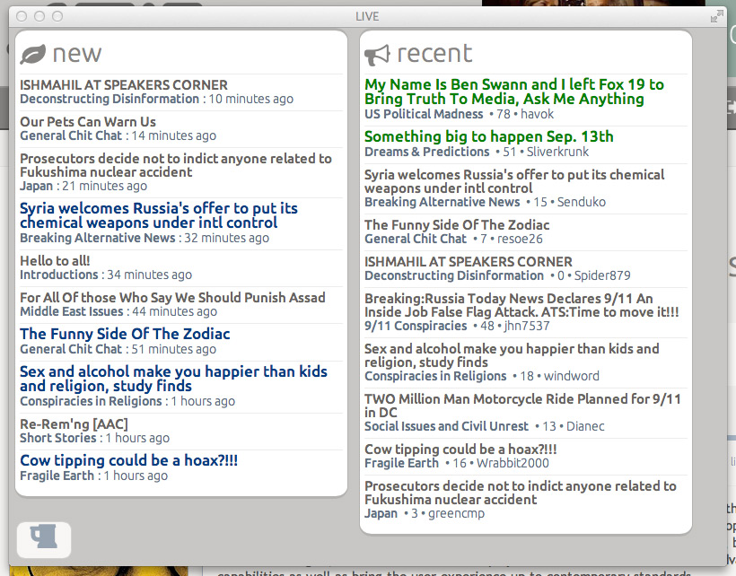
The Firehose shows new threads, plus the most recent replies to existing threads in real-time. The functionality is the same as the LIVE tool, and at the bottom left you can toggle back to LIVE whenever you like.
The redesigned forums page, previously known as "Board Home,"
Provides clear access to all the available forums on ATS. If you've negated a forum from showing in your recent posts view, you'll see a little green plus-icon next to the forum name (in this case, I have one next to Breaking Political News). To restore the forum in recent posts, just click the green plus-icon.
In the recent posts list:
The little red minus-icon is what you click to remove that forum from the list. When you click, the results are immediate.
The New Site Home
The new site home page:
Is even more news-ish than our previous home pages. The content is refreshed every hour, and shows the most currently active and highest-flagged threads started in the past few days. And for the first time, our off-topic forums are also included in the threads featured on the site home.
Top Topics
The new top topics page includes a way to focus on specific forum groups:
Click "news" to see the highest flagged threads started in the past few days in news forums.
Click "conspiracy" to see the highest flagged threads started in the past few days in the conspiracy forums.
Click "politics" to see the highest flagged threads started in the past few days in the politically focused forums.
Click "current" to see the highest flagged threads started in the past few days in the current events forums.
Click "mysteries" to see the highest flagged threads started in the past few days in the mysterious subjects forums.
Click "sci/tech" to see the highest flagged threads started in the past few days in the science and technology forums.
Click "off-topic" to see the highest flagged threads started in the past few days in the off-topic forums.
Thread-View
In thread-view, some changes to the mini-profile:
In order, the numbers are your posts, your flags, your stars, your Way Above Top Secret score, and your experimental karma score (a calculation that takes into account your posting activity with applause and warnings from staff). The background color, opacity, and border-color will change to be more prominent based on the WATS score (previously shown by colored borders around posts).
Click on the little person-icon at the lower left:
Reveals the member palette where you can:
Go to their profile page
Go directly to the threads page of their profile
Send a private message
Go directly to the posts page of their profile
See only their posts in the current thread
Or send staff an alert.
Adding Your Images to Posts
Within the BBcode buttons above the post form:
You'll find a revamped picture function that provides immediate access to the images that you've moved to your "public" folder (cloud icon) in the uploads/storage tool.
When creating your post, reply, or edit, simply place your cursor where you want to the image to appear, click the picture icon, and then click on the image you want. The custom ATS BBcode will automatically be inserted into your post.
The New LIVE and Firehose
Within the member sub-menu, you'll find two new options:
These provide access to completely revamped LIVE and Firehose functions.
Click the beer icon to open the LIVE palette in a new pop-up window.
If you have the monitor space, simply keep this open and off to the site. It will automatically update with new threads and trending flagged threads as you continue using ATS. When you see a thread you lick, click it, and it will open in your main browser window while the palette continues to update.
At the bottom left, you'll see a fire extinguisher icon... that provides a way to toggle between the LIVE tool, and the Firehose tool.
The Firehose shows new threads, plus the most recent replies to existing threads in real-time. The functionality is the same as the LIVE tool, and at the bottom left you can toggle back to LIVE whenever you like.
edit on 9-9-2013 by SkepticOverlord because: (no reason given)
There's a lot to cover. If anything has been missed (which I'm sure there is), it will be added to the above post.
I've been experimenting with the test sites and I must say.... I love it!
Its nice and clean and once you get used to it easy to use
Everyone evolved did a great job (and somehow make me even like a whitish page).
For everyone having a hard time adjusting to changes I would like to make a reference to this post of me made in a brilliant thread called Post A Funny, (T&C Friendly) Pic, I'm Bored..., (if that is ok with the mods)
Anyway nice job!
reply to post by SkepticOverlord
Just got to ask what is the whole karma thing? Is that good karma or bad karma? Also is this some thing new or just something that I missed?
Just got to ask what is the whole karma thing? Is that good karma or bad karma? Also is this some thing new or just something that I missed?
Some how missed this, will study it later, the OP was great just personally prefer your tutorial video's. To tell you the truth I would open it in
a separate window and then pause as I learned the basic's.
*Bump*
*Bump*
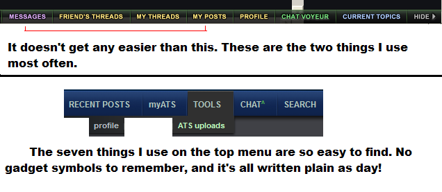
Thanks for explaining the switch that lightens / darkens ,I will try that ,hope it's better to read.
The rest may explain some things , but for people like me who are not computer smart it reads like a manual for a new vcr, lol just joking . Thanks for the tutorial 1%
The rest may explain some things , but for people like me who are not computer smart it reads like a manual for a new vcr, lol just joking . Thanks for the tutorial 1%
I initially thought I'd hit the DARK button and never look back but the Light version is growing on me!
Keep up the good work boss!
Keep up the good work boss!
edit on 7/9/2013 by Kryties because: (no reason given)
reply to post by antar
I think SO's explanation works pretty good. Without a second moniter I have a hard time following the videos. I should probably take notes, ya think?
By the third run of 5/3, I pretty much had it down thru trial and error. The only problem I really have with the new version is how much space each post takes up. And I miss the FireHose as well.
But I'll survive.
reply to post by SkepticOverlord
After reading the replies I have to ask if you are allowing only the positive comments to be posted here. Let's see if my comment will stand.
After reading a third of the way down of the OP I stopped reading. You didn't change a few things on ATS; you changed EVERYTHING to the point where it's mind boggling. It's changed to the point where you could've simply made a whole other site (ATSII) and left this one just as lovely and easy as it is.
I am very disappointed and probably won't be around once this site becomes mobile-device-dominated.
Still wish you the best though.
reply to post by jiggerj
It's not that hard mate, just click on things and find out what they do when the site goes live if you can't follow the OP.
If you're going to stop reading ATS because you couldn't be bothered clicking a few buttons and learning then I do have to wonder what you're doing here in the first place? Presumably you had to learn how to use this ATS when you first signed up? Could this not then be applied to the new site?
Originally posted by Kryties
reply to post by jiggerj
It's not that hard mate, just click on things and find out what they do when the site goes live if you can't follow the OP.
If you're going to stop reading ATS because you couldn't be bothered clicking a few buttons and learning then I do have to wonder what you're doing here in the first place? Presumably you had to learn how to use this ATS when you first signed up? Could this not then be applied to the new site?
Hey, like a lot of members here I am old enough to be set in my ways. I like words that tell me what I'm doing, not symbols. The new smileys suck and the whole new design invites people to use online shorthand and one-line comments.
Don't get me wrong, I admire the owners for taking a chance on a new design. No success story ever started out with the line: "I risked nothing." But I honestly fear that this change is going to bite them in the behind when all they had to do was leave this site alone and make a new site called ATS2.
The Internet has evolved mate, and websites should rightfully evolve to keep up.
The use of smileys and a bit of internet-lingo is acceptable these days - to a point. I think ATS is finding the right balance.
The use of smileys and a bit of internet-lingo is acceptable these days - to a point. I think ATS is finding the right balance.
edit on
7/9/2013 by Kryties because: (no reason given)
Originally posted by jiggerj
... I like words that tell me what I'm doing, not symbols. The new smileys suck ...
Can you see the irony in that?
Its all pretty straightforward. People can start threads and people can reply to them. Do you really read the words before pushing 'my posts' (as example)?
When I got a new message shown on my ribbon in the ATS old style so to say it only gets my attention when it's highlighted 'new messages'
Under normal circumstances I would agree that the proces to reach a goal is equally important as reaching a goal but if we are talking about posting and/or discussing info it seems ridiculous to withdraw from posting/discussing just because you don't like the look of buttons.
Originally posted by Kryties
The Internet has evolved mate, and websites should rightfully evolve to keep up.
I think ATS is finding the right balance.
Not even sure what this graph means, but it doesn't look good.
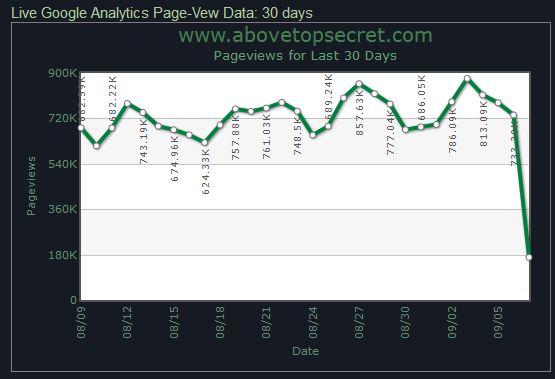
Mass exodus after switching to the new format for a little while?
edit on 9/7/2013 by jiggerj because: (no reason given)
TDawgRex
The only problem I really have with the new version is how much space each post takes up.
Seriously. I never understood this comment/complaint. Is there some kind of optical illusion going on?
The new ATS.5/3 design is TIGHTER in thread-view than the old ATS.2010!
------> CONFUSED
jiggerj
Mass exodus after switching to the new format for a little while?
Partial day total. As the day goes on, you'll see the last tick increase as the numbers come in.
reply to post by jiggerj
Can't stand mobile device shorthand. It just reeks of being ...uh, stupid. I can see it in some cases, but has gone over the top. Everyone I know who uses it has proven to me that they are a oxygen thief.
The emoticons are being looked at though and hopefully they will change.
Overall, it's not that hard to get used too though.
But if the shorthand takes over, chances are I'll be out of here as well. It's hard to have a intellegent conversation with someone who cannot speak well.
reply to post by SkepticOverlord
During the test runs, I saw a whole lot of space between posts on my PC.
Could it be my settings?
During the test runs, I saw a whole lot of space between posts on my PC.
Could it be my settings?
TDawgRex
Could it be my settings?
I don't know. While I have a robust test-bed, I don't have everything. The following is a list of what was used to test the new site:
Win8 with Chrome, Firefox, Opera, IE 9 and IE 10
WinXP with IE 9, Chrome
Netbook (forget OS version) with IE 8, Firefox
Mac desktop/Laptop with Safari, Opera, Chrome, Firefox
Windows Phone 8, Nokia Lumia
Samsung Galaxy 2 with default, Chrome, Dolphin browsers
iPhone 5 with Safari, Chrome, Dolphin
iPhone 4 with Safari
GalaxyTab 7" with default, Chrome, and Dolphin
Kindle Fire
new topics
-
Official denial
Diseases and Pandemics: 29 minutes ago -
MEGA - Let's Make Europe Great Again
Other Current Events: 33 minutes ago -
Hamas and Other Islamist Terrorist Groups Announce Support of US Campus Anti-Israel Protests
Education and Media: 1 hours ago -
Psychotronic Operation Rwanda Who Wants To Be A Refugee?
ATS Skunk Works: 1 hours ago -
AI phrenology
Science & Technology: 8 hours ago
top topics
-
4/27/24 New Jersey Earthquake
Fragile Earth: 14 hours ago, 8 flags -
CIA is alleged to be operat social media troll frms in Kyiv
ATS Skunk Works: 17 hours ago, 6 flags -
AI phrenology
Science & Technology: 8 hours ago, 4 flags -
Fun with extreme paints
Interesting Websites: 16 hours ago, 2 flags -
Psychotronic Operation Rwanda Who Wants To Be A Refugee?
ATS Skunk Works: 1 hours ago, 2 flags -
Hamas and Other Islamist Terrorist Groups Announce Support of US Campus Anti-Israel Protests
Education and Media: 1 hours ago, 2 flags -
Rainbow : Stargazer
Music: 17 hours ago, 1 flags -
MEGA - Let's Make Europe Great Again
Other Current Events: 33 minutes ago, 0 flags -
Official denial
Diseases and Pandemics: 29 minutes ago, 0 flags
active topics
-
MEGA - Let's Make Europe Great Again
Other Current Events • 2 • : PrivateAngel -
Killings of Palestinian children are soaring in the West Bank.
World War Three • 163 • : Terpene -
AI phrenology
Science & Technology • 13 • : BeyondKnowledge3 -
Hamas and Other Islamist Terrorist Groups Announce Support of US Campus Anti-Israel Protests
Education and Media • 5 • : FlyersFan -
Official denial
Diseases and Pandemics • 0 • : PrivateAngel -
Senator Ron Johnson Interview - PART 1: Mishandling Pandemic To What Ends?
Diseases and Pandemics • 5 • : PrivateAngel -
Why Files Our Alien Overlords | How We Secretly Serve The Tall Whites
Aliens and UFOs • 18 • : TheValeyard -
Supreme Court Oral Arguments 4.25.2024 - Are PRESIDENTS IMMUNE From Later Being Prosecuted.
Above Politics • 123 • : xuenchen -
Biden Banning Menthol Cigarettes - Good Health Move or Government Overreach?
US Political Madness • 92 • : FlyersFan -
Psychotronic Operation Rwanda Who Wants To Be A Refugee?
ATS Skunk Works • 1 • : TimBurr