It looks like you're using an Ad Blocker.
Please white-list or disable AboveTopSecret.com in your ad-blocking tool.
Thank you.
Some features of ATS will be disabled while you continue to use an ad-blocker.

Secrets behind 'Logos'
page: 4share:
reading this thread i see alot of dots being connected wrongly like going from 1 straight to 5 then to 9 if you understand, so according to some of
these posts im never allowed to use the color red again or i will be a masonic satanist?!?!
i agree that some logos are either tributes or have a specific meaning, but through my own observations of the logos in a busy city centre the main similarity between major corporations and their logos seem to be 99% of them utilize a triangle or triangles in their logo and most have them blatant masonic symbolism in them i.e. the 2 right angles on top of each other.
i agree that some logos are either tributes or have a specific meaning, but through my own observations of the logos in a busy city centre the main similarity between major corporations and their logos seem to be 99% of them utilize a triangle or triangles in their logo and most have them blatant masonic symbolism in them i.e. the 2 right angles on top of each other.
I think the basic point is that an understanding of the historical nature of symbols and what their meaning is to some individuals and groups can be
useful "awareness". It does not represent proof or that a particular symbol was deliberately done for a particular reason. But is can be an
indicator of a possible inclination going with those behind that institution.
edit: double post
[edit on 29-1-2010 by technical difficulties]
[edit on 29-1-2010 by technical difficulties]
reply to post by December_Rain
Interseting thread . I always thought the NASA Mission Patches had alot of hidden meanings behind them . Some Esoteric , others Overtly Suggestive . Here are a few , what Symbolisms do you see in these ?
i297.photobucket.com...
i297.photobucket.com...
i297.photobucket.com...
[edit on 29-1-2010 by Zanti Misfit]
[edit on 29-1-2010 by Zanti Misfit]
[edit on 29-1-2010 by Zanti Misfit]
That S From Hell video is hilarious. If you take it seriously, you need to lighten up...
Of course symbols will try to project a meaning, though. That's the point. Claiming it's some vast conspiracy seems like going a bit too far for me. Unless the conspiracy = the obvious fact that the symbol-maker wants you to quickly recall their logo.
Of course symbols will try to project a meaning, though. That's the point. Claiming it's some vast conspiracy seems like going a bit too far for me. Unless the conspiracy = the obvious fact that the symbol-maker wants you to quickly recall their logo.
Originally posted by Zanti Misfit
reply to post by December_Rain
Interseting thread . I always thought the NASA Mission Patches had alot of hidden meanings behind them . Some Esoteric , others Overtly Suggestive . Here are a few , what Symbolisms do you see in these ?
i297.photobucket.com...
i297.photobucket.com...
i297.photobucket.com...
[edit on 29-1-2010 by Zanti Misfit]
[edit on 29-1-2010 by Zanti Misfit]
[edit on 29-1-2010 by Zanti Misfit]
Wow I have never seen those NASA patches. I wouldn't mind getting someone with some occult knowledges read on them. Thanks man.
Originally posted by davesidious
Interesting, but without any actual evidence to suggest these claimed meanings are the actual meanings of the symbols, it's just conjecture.
Interesting, but vapid.
A robot reading the bible? Why the bible? Why not Playboy? The amount of straw-grasping is incredible It's almost as if whoever came up with these different "explanations" wanted some sinister plot behind them.
Couldn't have said it better myself!
reply to post by Zanti Misfit
i297.photobucket.com/albums/mm228/stem50/Apollo13.jpg
Three brown horses salient, galloping left to right (as imaged) from earth to beyond the moon. The phrase "From the moon, knowledge" in latin on the bottom. "Apollo 13" written on top. Sol shown in orange with eight rays.
There are a few ways you could possibly stretch the intent, but overall this looks rather straightforward to me. I think it's simply conveying the idea of leaping forth in knowledge from the moon landing project. The 13, the 8, the masculine sun, the feminine moon, the "king and country" of the horses...I think all of this is fairly irrelevant. Basically this one is Exactly what it says it is: "Apollo 13: Ex luna, scientia." It's remotely possible that the artist chose to depict the sun in orange along with the horses in three to convey the idea of the extension of earthly power triumphing over more base matter, and that interpretation would be generally consistent with the overall intent of the patch, but I get the impression that the artist got that accidentally correct rather than deliberately intending it.
I'm reminded of Sigmund Freud having been credited as having once said that "Sometimes a cigar is really just a cigar." Stars, moons, space, the sun...these are elements heavily connected to genders, Gods, history and all sorts of mystical symbolism. But when you're dealing with NASA, an organization that actually deal with real travel through real space, well...sometimes a star really is just a star.
i297.photobucket.com/albums/mm228/stem50/Apollo17.jpg
This was a proposed patch that was rejected. Not very interesting to me. Wasted masculine/feminine imagery like the previous one, but presumably rejected because of the depiction of stonehenge-like monoliths on the moon.
i297.photobucket.com/albums/mm228/stem50/AresPatch.jpg
11 stars, upwards facing triangle, darkened sphere connecting to single star via a red/white beam of light. This can be interpreted a couple ways. The first question that must be asked is whether the beam of light is coming from, or heading towards the star. My first impression is that the dark sphere is not a "black sun" but is instead a sillouette of the earth, and that the light is a ray of light (or possibly a craft launch plume) heading from earth "to the stars." Alternate interpretations might see the "black sun" siphoning light amidst the direction of Ares, the God of war...but I don't think that's the actual intent. To me it seems more likely that an artist was asked to create a patch, and Ares had already been established as the name of the project. If you wanted to be more certain of the intent, identify the star cluster being depicted. I don't recognize the formation, but it's very possible that it's a particular constellation. Identify the constellation and you'll have more information.
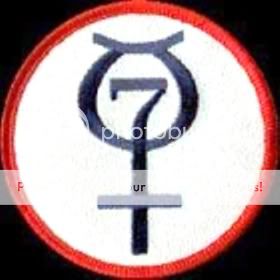
Fourth image, no link given
I find this one the most interesting. It contains synchronous elements. At first glance the primary elements seem to be a Venus symbol containing number 7 and an upward slanted line on top, which can appear either as "within a house" or possibly a pair of devil horns. My first impression was the interpet it as "Divine knowledge enshrined within the heart of the feminine." However...the Venus symbol + slanted line combined is the symbol for mercury. My own perspective of alchemical mercury identifies it with the non-resistive primal essence, which again gives essentially a similar interpretation as initially given: "Divine knowledge within the heart of mercury." A more Paracelsusian view of alchemical mercury might give an overall meaning to the symbol of roughly "enlightenment where the spiritual and physical meet." Or possibly a more direct "impregnation by the masculine of divinity into the womb of the feminine, symbolized as that place which above and below meet." Alternately, if you want to go with a more astrological rather than alchemical view of mercury, your feminine or above/below elements become more of a messenger/intellect/trickster element. But even so, the overall meaning is esentially the same "divine knowledge conveyed" or possibly "he who conveys knowledge." A number of interpretations, but you'll see that they're all generally synchronous.
Out of curiosity, what's the origin of that last symbol? It's the only one that looks like a real symbol rather than an artist throwing together some pretty things.
[edit on 30-1-2010 by LordBucket]
what Symbolisms do you see in these ?
i297.photobucket.com/albums/mm228/stem50/Apollo13.jpg
Three brown horses salient, galloping left to right (as imaged) from earth to beyond the moon. The phrase "From the moon, knowledge" in latin on the bottom. "Apollo 13" written on top. Sol shown in orange with eight rays.
There are a few ways you could possibly stretch the intent, but overall this looks rather straightforward to me. I think it's simply conveying the idea of leaping forth in knowledge from the moon landing project. The 13, the 8, the masculine sun, the feminine moon, the "king and country" of the horses...I think all of this is fairly irrelevant. Basically this one is Exactly what it says it is: "Apollo 13: Ex luna, scientia." It's remotely possible that the artist chose to depict the sun in orange along with the horses in three to convey the idea of the extension of earthly power triumphing over more base matter, and that interpretation would be generally consistent with the overall intent of the patch, but I get the impression that the artist got that accidentally correct rather than deliberately intending it.
I'm reminded of Sigmund Freud having been credited as having once said that "Sometimes a cigar is really just a cigar." Stars, moons, space, the sun...these are elements heavily connected to genders, Gods, history and all sorts of mystical symbolism. But when you're dealing with NASA, an organization that actually deal with real travel through real space, well...sometimes a star really is just a star.
i297.photobucket.com/albums/mm228/stem50/Apollo17.jpg
This was a proposed patch that was rejected. Not very interesting to me. Wasted masculine/feminine imagery like the previous one, but presumably rejected because of the depiction of stonehenge-like monoliths on the moon.
i297.photobucket.com/albums/mm228/stem50/AresPatch.jpg
11 stars, upwards facing triangle, darkened sphere connecting to single star via a red/white beam of light. This can be interpreted a couple ways. The first question that must be asked is whether the beam of light is coming from, or heading towards the star. My first impression is that the dark sphere is not a "black sun" but is instead a sillouette of the earth, and that the light is a ray of light (or possibly a craft launch plume) heading from earth "to the stars." Alternate interpretations might see the "black sun" siphoning light amidst the direction of Ares, the God of war...but I don't think that's the actual intent. To me it seems more likely that an artist was asked to create a patch, and Ares had already been established as the name of the project. If you wanted to be more certain of the intent, identify the star cluster being depicted. I don't recognize the formation, but it's very possible that it's a particular constellation. Identify the constellation and you'll have more information.
Fourth image, no link given
I find this one the most interesting. It contains synchronous elements. At first glance the primary elements seem to be a Venus symbol containing number 7 and an upward slanted line on top, which can appear either as "within a house" or possibly a pair of devil horns. My first impression was the interpet it as "Divine knowledge enshrined within the heart of the feminine." However...the Venus symbol + slanted line combined is the symbol for mercury. My own perspective of alchemical mercury identifies it with the non-resistive primal essence, which again gives essentially a similar interpretation as initially given: "Divine knowledge within the heart of mercury." A more Paracelsusian view of alchemical mercury might give an overall meaning to the symbol of roughly "enlightenment where the spiritual and physical meet." Or possibly a more direct "impregnation by the masculine of divinity into the womb of the feminine, symbolized as that place which above and below meet." Alternately, if you want to go with a more astrological rather than alchemical view of mercury, your feminine or above/below elements become more of a messenger/intellect/trickster element. But even so, the overall meaning is esentially the same "divine knowledge conveyed" or possibly "he who conveys knowledge." A number of interpretations, but you'll see that they're all generally synchronous.
Out of curiosity, what's the origin of that last symbol? It's the only one that looks like a real symbol rather than an artist throwing together some pretty things.
[edit on 30-1-2010 by LordBucket]
reply to post by LordBucket
Interesting Interpitations there . The one Pictured is NASA's Mercury Program Patch . The one shown as Ares is a Patch that might be used by astronauts for future Moon and Mars programs .
Interesting Interpitations there . The one Pictured is NASA's Mercury Program Patch . The one shown as Ares is a Patch that might be used by astronauts for future Moon and Mars programs .
reply to post by December_Rain
hey can you find any satanic symbols in the coke-a-cola logo? also have you noticed that the chigago bulls robot has a sad face?
hey can you find any satanic symbols in the coke-a-cola logo? also have you noticed that the chigago bulls robot has a sad face?
reply to post by Zanti Misfit
...ahh.
Like I said, that's kind of the problem with doing symbolic analysis of patches produced by an organization like NASA. Sure, there's all sorts of interesting alchemical ideas conveyed by that patch but...well...mecury is also a planet.
And apparently The Mercury Seven was the name given to the very first group of seven NASA astronauts chosen for the very first human spaceflight program...Project Mercury.
So...apparently that symbol is simply a combining of the established symbol for Mercury with the number seven of the membership. Very simply, "Mecury Seven."
Interesting Interpitations there .
The one Pictured is NASA's Mercury Program Patch
...ahh.
Like I said, that's kind of the problem with doing symbolic analysis of patches produced by an organization like NASA. Sure, there's all sorts of interesting alchemical ideas conveyed by that patch but...well...mecury is also a planet.
And apparently The Mercury Seven was the name given to the very first group of seven NASA astronauts chosen for the very first human spaceflight program...Project Mercury.
So...apparently that symbol is simply a combining of the established symbol for Mercury with the number seven of the membership. Very simply, "Mecury Seven."
Something I've never understood about people that notice 666 in artwork is that they seem to think that the company itself intentionally put the
message there. But never question if it might have just been the artist, completely non-affiliated with the company's intentions. If it is
intentional, how do you know it wasn't just the artist being clever or even worse...the artist just so happens to be a satanist!
reply to post by LordBucket
yeah thats exactly why i clicked the link i though it was about LOGOS NOT LOGO's. and as a side note i think its your interpretation of the symbol that gives it power not the actual symbol itself. just like a swear word is only negative to someone who understands what it means. swear at someone in a language they dont understand and they will just look at you with a blank expression. obviously if you do so in an aggressive manner, body language will convey most of the message but in the written format, which is what we are discussing they wouldn't be the wiser..ok that's enough out of me carry on..
yeah thats exactly why i clicked the link i though it was about LOGOS NOT LOGO's. and as a side note i think its your interpretation of the symbol that gives it power not the actual symbol itself. just like a swear word is only negative to someone who understands what it means. swear at someone in a language they dont understand and they will just look at you with a blank expression. obviously if you do so in an aggressive manner, body language will convey most of the message but in the written format, which is what we are discussing they wouldn't be the wiser..ok that's enough out of me carry on..
Originally posted by soot black
reply to post by December_Rain
hey can you find any satanic symbols in the coke-a-cola logo? also have you noticed that the chigago bulls robot has a sad face?
I do remember an instance when Coca Cola had to recall it's products due to a 'hidden message' in it's logo which depicted a woman performing oral sex. You can read it here: Source
Also there is conspiracy related to the Coca Cola brand name:
Infact there is 666 on Coca Cola logo
[edit on 30-1-2010 by December_Rain]
reply to post by TroyB
Excellent thanx for the addition, I couldn't add all the symbols and logos as it would take weeks if not months.
Excellent thanx for the addition, I couldn't add all the symbols and logos as it would take weeks if not months.
I gave up on you (again) when I saw the NATO symbol turning into a swastika. Here we go again ...
And BTW, the Screen Gems logo just looks like "69" to me. So what?
[edit on 1/30/2010 by centurion1211]
And BTW, the Screen Gems logo just looks like "69" to me. So what?
[edit on 1/30/2010 by centurion1211]
It is a coincedence that all these logos have some reference to something 'outside' of the box. I have alaways thought that logos of TPTB have some
for of message, but my question is who are they for?
Why have secret messages on a logo that nobody will understand?
* Also one small question about the first logo in your thread, HOW ON EARTH do they know that its a bible the robot is holding and not 'war and peace' by leo tolstoy?
[edit on 30-1-2010 by franspeakfree]
Why have secret messages on a logo that nobody will understand?
* Also one small question about the first logo in your thread, HOW ON EARTH do they know that its a bible the robot is holding and not 'war and peace' by leo tolstoy?
[edit on 30-1-2010 by franspeakfree]
reply to post by December_Rain
Absolutely, Jordon Maxwell goes into detail on logos and their meanings.
video.google.com...=-531528635175150 7601
Good post!
This is a real conspiracy
[edit on 30-1-2010 by ofhumandescent]
Absolutely, Jordon Maxwell goes into detail on logos and their meanings.
video.google.com...=-531528635175150 7601
Good post!
This is a real conspiracy
[edit on 30-1-2010 by ofhumandescent]

new topics
-
President BIDEN's FBI Raided Donald Trump's Florida Home for OBAMA-NORTH KOREA Documents.
Political Conspiracies: 3 hours ago -
Maestro Benedetto
Literature: 5 hours ago -
Is AI Better Than the Hollywood Elite?
Movies: 5 hours ago -
Las Vegas UFO Spotting Teen Traumatized by Demon Creature in Backyard
Aliens and UFOs: 8 hours ago -
2024 Pigeon Forge Rod Run - On the Strip (Video made for you)
Automotive Discussion: 9 hours ago -
Gaza Terrorists Attack US Humanitarian Pier During Construction
Middle East Issues: 10 hours ago -
The functionality of boldening and italics is clunky and no post char limit warning?
ATS Freshman's Forum: 11 hours ago -
Meadows, Giuliani Among 11 Indicted in Arizona in Latest 2020 Election Subversion Case
Mainstream News: 11 hours ago -
Massachusetts Drag Queen Leads Young Kids in Free Palestine Chant
Social Issues and Civil Unrest: 11 hours ago
top topics
-
President BIDEN's FBI Raided Donald Trump's Florida Home for OBAMA-NORTH KOREA Documents.
Political Conspiracies: 3 hours ago, 25 flags -
Krystalnacht on today's most elite Universities?
Social Issues and Civil Unrest: 14 hours ago, 9 flags -
University of Texas Instantly Shuts Down Anti Israel Protests
Education and Media: 17 hours ago, 8 flags -
Weinstein's conviction overturned
Mainstream News: 13 hours ago, 8 flags -
Supreme Court Oral Arguments 4.25.2024 - Are PRESIDENTS IMMUNE From Later Being Prosecuted.
Above Politics: 14 hours ago, 8 flags -
Massachusetts Drag Queen Leads Young Kids in Free Palestine Chant
Social Issues and Civil Unrest: 11 hours ago, 7 flags -
Gaza Terrorists Attack US Humanitarian Pier During Construction
Middle East Issues: 10 hours ago, 7 flags -
Las Vegas UFO Spotting Teen Traumatized by Demon Creature in Backyard
Aliens and UFOs: 8 hours ago, 6 flags -
Meadows, Giuliani Among 11 Indicted in Arizona in Latest 2020 Election Subversion Case
Mainstream News: 11 hours ago, 5 flags -
2024 Pigeon Forge Rod Run - On the Strip (Video made for you)
Automotive Discussion: 9 hours ago, 4 flags
active topics
-
President BIDEN's FBI Raided Donald Trump's Florida Home for OBAMA-NORTH KOREA Documents.
Political Conspiracies • 14 • : WeMustCare -
Hate makes for strange bedfellows
US Political Madness • 47 • : 19Bones79 -
-@TH3WH17ERABB17- -Q- ---TIME TO SHOW THE WORLD--- -Part- --44--
Dissecting Disinformation • 689 • : daskakik -
University of Texas Instantly Shuts Down Anti Israel Protests
Education and Media • 265 • : Astrocometus -
Gaza Terrorists Attack US Humanitarian Pier During Construction
Middle East Issues • 27 • : ToneD -
Reason of the Existence
The Gray Area • 21 • : BingoMcGoof -
Supreme Court Oral Arguments 4.25.2024 - Are PRESIDENTS IMMUNE From Later Being Prosecuted.
Above Politics • 85 • : Sookiechacha -
Chris Christie Wishes Death Upon Trump and Ramaswamy
Politicians & People • 24 • : nugget1 -
New whistleblower Jason Sands speaks on Twitter Spaces last night.
Aliens and UFOs • 63 • : pianopraze -
SETI chief says US has no evidence for alien technology. 'And we never have'
Aliens and UFOs • 74 • : Justoneman