It looks like you're using an Ad Blocker.
Please white-list or disable AboveTopSecret.com in your ad-blocking tool.
Thank you.
Some features of ATS will be disabled while you continue to use an ad-blocker.

wierd Covid graph from Kansas
page: 2share:
originally posted by: Blaine91555
originally posted by: 00018GE
Can someone explain this graph of daily new cases from Kansas? There is a large spike every few days, but only for one day each time. It's almost like two graphs laid on top of each other. No other state's graph looks like this. I think the data has been monkeyed with.
www.worldometers.info...
Those big spikes are likely the days when test results are returned.
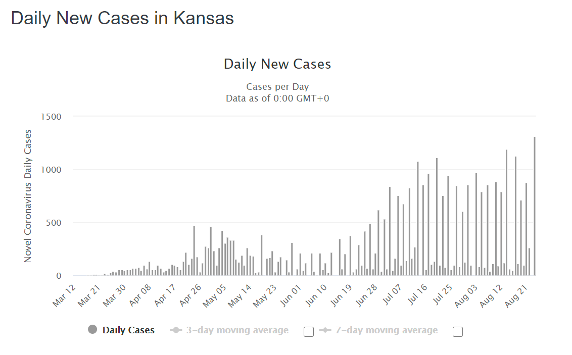
Bingo. You see that same effect with deaths as well, in every state.
With deaths, most Saturday Sunday and Monday figures are not updated until Tuesday. You will most likely always see a spike in deaths every Tuesday.
In fact, today is Tuesday... and look at the number of American deaths shown, compared to Saturday Sunday and Monday.
www.worldometers.info...
It has to do with administrative offices being closed on Saturday and Sunday..and on Monday they start tallying up everything and report it to the federal government on Monday night... which is reflected in Tuesday's report.
Guys if you have any doubts or questions on corona of any sort ask me.
I will supply you with weaponry (info).
We actually can win this but I need y'all to use me more because I am gifted and need to share my bounty.
I just want to live and die free.
That's it.
Nothing more or less.
This is an armory and I build weapons to kill lies. It's for free too. Fill up on ammo boys, this is War.
originally posted by: Agit8dChop
originally posted by: incoserv
originally posted by: LookingAtMars
a reply to: 00018GE
... I know, it doesn't prove lockdowns don't work. ...
I've seen nothing yet that proves to me that lockdowns do work.
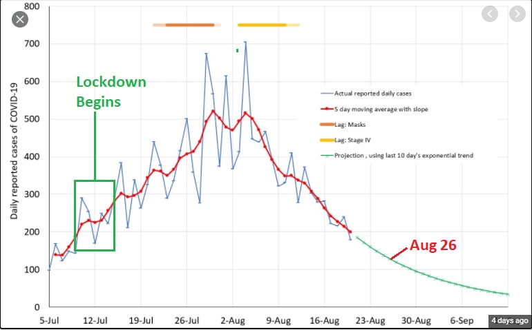
Melbourne Australia had a 2nd outbreak. 700+ daily infections was the peak. The city locked down 4 weeks ago, now they are getting 150 infections per day and its falling rapidly.
An infectious respiratory virus cannot spread if there are not people interacting.
This lockdown has worked
Incorrect.
You delay the inevitable.
Everyone's getting it.
Most wont know cuz Corona is so mild so they'll never report those few coughs or sneezes that one day...
originally posted by: chr0naut
a reply to: 00018GE
Yes, there are a number of weird graphs like this that I would take to indicate some sort of systematic error in reporting.
But it could also be because of mass contact events and variations in testing, especially in places that have smaller populations overall but with high population densities concentrated in places.
When it's contracted, incubation time, and severity of symptoms all contribute.
These daily graphs are stupid when testing isn't done daily. It makes for more sense to use a 14, 20, or 30 day moving average to track case numbers on a macro scale. Even better if there's daily with a short moving average and long moving average. Unfortunately these numbers are being used for propaganda rather than providing real info.
a reply to: Agit8dChop
These charts show definitively that when ppl came outside it got going strong.
The cold will never go away. Its integral to our biology actually. We need viruses and they need us.
Lockdown only delays.
And in fact all this isolation and overuse of disinfectants is making everyone more susceptible to all disease as their immune systems have little to work with.
This apply to every respiratory attacking highly infectious pathogen.
Once they come outside, they're weaker and then boom huge disease spike.
a reply to: Ksihkehe
I suggest we return to 2019 policy.
Testing tracking any cold virus is too expensive, doesnt help stop it cuz it's unstoppable, and in fact they didnt bother building statistical data either.
Cuz its all pointless and doesn't tell us hardly anything at all.
Can we go back to sanity please and stop all this wasteful economy crashing nonsense?
I'll repeat it:
There is no value in testing for Corona in our current paradigm.
It actually hurts us in various ways.
It's a huge waste of money, it promotes lies, and it allows us to create a Nazi-era Jewish class of infected that can be violated at will for our safety even tho they were us.
There is no value in testing for Corona in our current paradigm.
It actually hurts us in various ways.
It's a huge waste of money, it promotes lies, and it allows us to create a Nazi-era Jewish class of infected that can be violated at will for our safety even tho they were us.
originally posted by: muzzleflash
a reply to: Ksihkehe
I suggest we return to 2019 policy.
Testing tracking any cold virus is too expensive, doesnt help stop it cuz it's unstoppable, and in fact they didnt bother building statistical data either.
Cuz its all pointless and doesn't tell us hardly anything at all.
Can we go back to sanity please and stop all this wasteful economy crashing nonsense?
I don't think we can, because this was never about the virus IMO.
a reply to: LookingAtMars
Of course it isn't about the virus.
Sleight of hand 101.
The other hand is printing money on a scale that no one would EVER agree to - but look we're begging them to print it and more more MORE!!!
Its always about money cuz money is power.
Of course it isn't about the virus.
Sleight of hand 101.
The other hand is printing money on a scale that no one would EVER agree to - but look we're begging them to print it and more more MORE!!!
Its always about money cuz money is power.
a reply to: 00018GE
I only look at moving averages (typically the 7-day) It seems the very regular peaks and valleys probably have to do with when reporting happens, and when more testing happens (ie, people tending to save the trip to get the test for the weekend.)
I only look at moving averages (typically the 7-day) It seems the very regular peaks and valleys probably have to do with when reporting happens, and when more testing happens (ie, people tending to save the trip to get the test for the weekend.)
a reply to: 00018GE
Here's Illinois. Peaks and valleys, 3-day moving average a bit "smoothed" out, but still lumpy. 7-day moving average and the bumps basically disappear. This suggests to me that it has to do with weekly reporting cycles.
I don't know why my pics won't embed anymore.
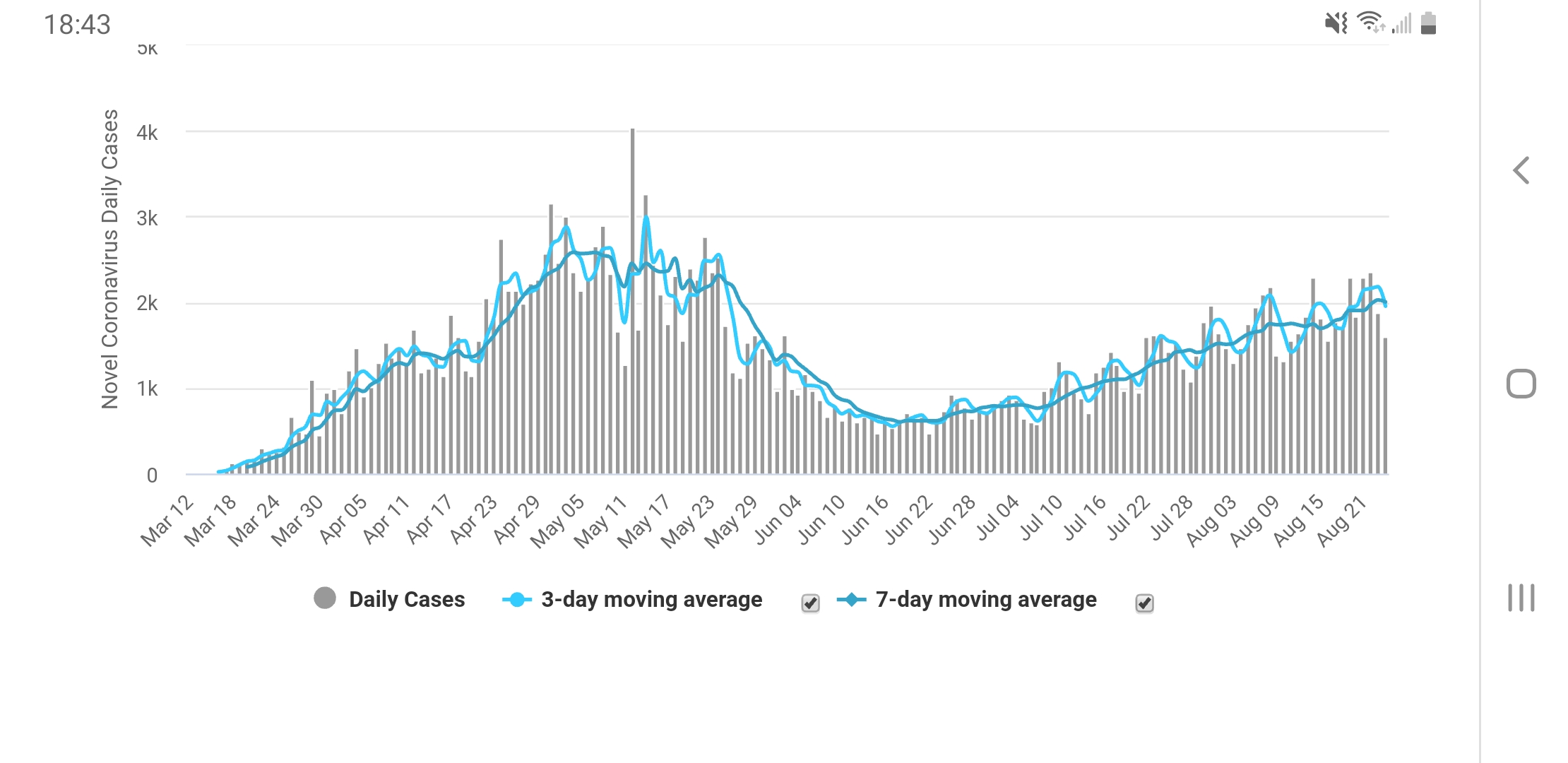
Here's Illinois. Peaks and valleys, 3-day moving average a bit "smoothed" out, but still lumpy. 7-day moving average and the bumps basically disappear. This suggests to me that it has to do with weekly reporting cycles.
I don't know why my pics won't embed anymore.
edit on 8/25/2020 by dogstar23 because: (no reason given)
originally posted by: Ksihkehe
originally posted by: chr0naut
a reply to: 00018GE
Yes, there are a number of weird graphs like this that I would take to indicate some sort of systematic error in reporting.
But it could also be because of mass contact events and variations in testing, especially in places that have smaller populations overall but with high population densities concentrated in places.
When it's contracted, incubation time, and severity of symptoms all contribute.
These daily graphs are stupid when testing isn't done daily. It makes for more sense to use a 14, 20, or 30 day moving average to track case numbers on a macro scale. Even better if there's daily with a short moving average and long moving average. Unfortunately these numbers are being used for propaganda rather than providing real info.
I think, however, that daily graphs do have some utility especially as there are short-term events that can be identified as primary indicators of an outbreak or cluster.
The spikiness of the graphs don't invalidate the overall numbers in instances where the data is not fully recorded in the timeframe in which it is collected.
originally posted by: chr0naut
originally posted by: Ksihkehe
originally posted by: chr0naut
a reply to: 00018GE
Yes, there are a number of weird graphs like this that I would take to indicate some sort of systematic error in reporting.
But it could also be because of mass contact events and variations in testing, especially in places that have smaller populations overall but with high population densities concentrated in places.
When it's contracted, incubation time, and severity of symptoms all contribute.
These daily graphs are stupid when testing isn't done daily. It makes for more sense to use a 14, 20, or 30 day moving average to track case numbers on a macro scale. Even better if there's daily with a short moving average and long moving average. Unfortunately these numbers are being used for propaganda rather than providing real info.
I think, however, that daily graphs do have some utility especially as there are short-term events that can be identified as primary indicators of an outbreak or cluster.
The spikiness of the graphs don't invalidate the overall numbers in instances where the data is not fully recorded in the timeframe in which it is collected.
That's not really how epidemiology works. You do a derived date based on symptom onset which can then, maybe, be connected to other known cases. Daily testing numbers show how many people test positive on that day. After interviews happen they can do a derived date graph, but people are incredibly unreliable in remembering their own activities in my experience.
There are too many unknown variables for all this testing to be worth much except for quarantine, isolation, and treatment. Most of this data won't be all that valuable for a year or more after everything is pooled and analysed.
ETA: This has nothing to do with how severe a disease either of us thinks it is, how best to stop it, or any other opinion. It's just the harsh reality of how nearly impossible it is to track a disease like this.
edit on 8/25/20 by Ksihkehe because: (no reason given)
originally posted by: muzzleflash
a reply to: Agit8dChop
These charts show definitively that when ppl came outside it got going strong.
The cold will never go away. Its integral to our biology actually. We need viruses and they need us.
Lockdown only delays.
And in fact all this isolation and overuse of disinfectants is making everyone more susceptible to all disease as their immune systems have little to work with.
This apply to every respiratory attacking highly infectious pathogen.
Once they come outside, they're weaker and then boom huge disease spike.
Except, this isn't a cold.
This is a virus tampered with in a lab.
The long term ailments people are suffering shows this goes far beyond the initial respiratory illness - they also get reinfected..
www.abc.net.au...
theconversation.com...
www.sciencemag.org...
Lock-downs isn't about eradicating the virus, its about holding out until proper treatment is worked out - of which has happened recently.
I have no doubt hospitals, doctors and the media are not being honest about this virus, but it is real, it is deadly, it spreads like nothing we' have ever seen and the long term effects are scary as hell.
However, I go back to the original comment
'' Lock downs do not work ''
Wrong, lockdowns were not designed to cure the virus - they were designed to stop spread and buy time and save lives.
they worked!
edit on 25/8/20 by Agit8dChop because: (no reason given)
edit on 25/8/20 by Agit8dChop because: (no reason given)
a reply to: Agit8dChop
You cant tamper with Corona very much currently. We are primitive geneticists.
I don't believe the Wuhan story anymore.
I think Covid 19 is in reality Corona every other year.
You cant tamper with Corona very much currently. We are primitive geneticists.
I don't believe the Wuhan story anymore.
I think Covid 19 is in reality Corona every other year.
Looks like they're combining two days of cases at a time in order to "puff up" the graph and make it look like there are far more cases.
originally posted by: muzzleflash
a reply to: Agit8dChop
You cant tamper with Corona very much currently. We are primitive geneticists.
I don't believe the Wuhan story anymore.
I think Covid 19 is in reality Corona every other year.
There are scientists who have located the edited sequences -
I've never seen a common cold that removes peoples sense of smell, taste, that damages the heart, kidney, leaves them with cognitive decline, has their hair fall out or spreads so easily.
Oh and its absolutely the common cold.
No one will ever undo that fact.
Just no!
Question,
Why would Iran, Russia, China, Venezuela all help the USA/West with this hoax?
What are they trying to achieve?
What are they getting out of it?
Are all the people vblogging, writing reports, giving statements across the globe - are they all crisis actors?
What does anyone gain from shutting down the global work force? Is this ALL for the US election?
originally posted by: Ksihkehe
originally posted by: chr0naut
originally posted by: Ksihkehe
originally posted by: chr0naut
a reply to: 00018GE
Yes, there are a number of weird graphs like this that I would take to indicate some sort of systematic error in reporting.
But it could also be because of mass contact events and variations in testing, especially in places that have smaller populations overall but with high population densities concentrated in places.
When it's contracted, incubation time, and severity of symptoms all contribute.
These daily graphs are stupid when testing isn't done daily. It makes for more sense to use a 14, 20, or 30 day moving average to track case numbers on a macro scale. Even better if there's daily with a short moving average and long moving average. Unfortunately these numbers are being used for propaganda rather than providing real info.
I think, however, that daily graphs do have some utility especially as there are short-term events that can be identified as primary indicators of an outbreak or cluster.
The spikiness of the graphs don't invalidate the overall numbers in instances where the data is not fully recorded in the timeframe in which it is collected.
That's not really how epidemiology works. You do a derived date based on symptom onset which can then, maybe, be connected to other known cases. Daily testing numbers show how many people test positive on that day. After interviews happen they can do a derived date graph, but people are incredibly unreliable in remembering their own activities in my experience.
There are too many unknown variables for all this testing to be worth much except for quarantine, isolation, and treatment. Most of this data won't be all that valuable for a year or more after everything is pooled and analysed.
ETA: This has nothing to do with how severe a disease either of us thinks it is, how best to stop it, or any other opinion. It's just the harsh reality of how nearly impossible it is to track a disease like this.
I quite agree.
I think that the idea of using proximity logging of enabled 'phones (probably via Bluetooth or Near Field Communication, neither of which are really optimal) is going to provide more relevant and specific data to guide testing.
Unfortunately, that is also a massive invasion of privacy.
A connundrum.
new topics
-
America's Greatest Ally
General Chit Chat: 3 minutes ago -
President BIDEN's FBI Raided Donald Trump's Florida Home for OBAMA-NORTH KOREA Documents.
Political Conspiracies: 5 hours ago -
Maestro Benedetto
Literature: 6 hours ago -
Is AI Better Than the Hollywood Elite?
Movies: 6 hours ago -
Las Vegas UFO Spotting Teen Traumatized by Demon Creature in Backyard
Aliens and UFOs: 10 hours ago -
2024 Pigeon Forge Rod Run - On the Strip (Video made for you)
Automotive Discussion: 11 hours ago -
Gaza Terrorists Attack US Humanitarian Pier During Construction
Middle East Issues: 11 hours ago
top topics
-
President BIDEN's FBI Raided Donald Trump's Florida Home for OBAMA-NORTH KOREA Documents.
Political Conspiracies: 5 hours ago, 26 flags -
Krystalnacht on today's most elite Universities?
Social Issues and Civil Unrest: 16 hours ago, 9 flags -
Gaza Terrorists Attack US Humanitarian Pier During Construction
Middle East Issues: 11 hours ago, 8 flags -
Supreme Court Oral Arguments 4.25.2024 - Are PRESIDENTS IMMUNE From Later Being Prosecuted.
Above Politics: 16 hours ago, 8 flags -
Weinstein's conviction overturned
Mainstream News: 14 hours ago, 8 flags -
Massachusetts Drag Queen Leads Young Kids in Free Palestine Chant
Social Issues and Civil Unrest: 13 hours ago, 7 flags -
Las Vegas UFO Spotting Teen Traumatized by Demon Creature in Backyard
Aliens and UFOs: 10 hours ago, 6 flags -
Meadows, Giuliani Among 11 Indicted in Arizona in Latest 2020 Election Subversion Case
Mainstream News: 13 hours ago, 5 flags -
2024 Pigeon Forge Rod Run - On the Strip (Video made for you)
Automotive Discussion: 11 hours ago, 4 flags -
Is AI Better Than the Hollywood Elite?
Movies: 6 hours ago, 3 flags
active topics
-
Is AI Better Than the Hollywood Elite?
Movies • 15 • : 5thHead -
America's Greatest Ally
General Chit Chat • 0 • : 19Bones79 -
President BIDEN's FBI Raided Donald Trump's Florida Home for OBAMA-NORTH KOREA Documents.
Political Conspiracies • 17 • : BingoMcGoof -
Gaza Terrorists Attack US Humanitarian Pier During Construction
Middle East Issues • 29 • : 19Bones79 -
Supreme Court Oral Arguments 4.25.2024 - Are PRESIDENTS IMMUNE From Later Being Prosecuted.
Above Politics • 90 • : Lumenari -
Las Vegas UFO Spotting Teen Traumatized by Demon Creature in Backyard
Aliens and UFOs • 12 • : KrustyKrab -
SHORT STORY WRITERS CONTEST -- April 2024 -- TIME -- TIME2024
Short Stories • 23 • : DontTreadOnMe -
Truth Social goes public, be careful not to lose your money
Mainstream News • 130 • : Astyanax -
Hate makes for strange bedfellows
US Political Madness • 47 • : 19Bones79 -
-@TH3WH17ERABB17- -Q- ---TIME TO SHOW THE WORLD--- -Part- --44--
Dissecting Disinformation • 689 • : daskakik