It looks like you're using an Ad Blocker.
Please white-list or disable AboveTopSecret.com in your ad-blocking tool.
Thank you.
Some features of ATS will be disabled while you continue to use an ad-blocker.

wierd Covid graph from Kansas
page: 3share:
a reply to: 00018GE
Because I really fear to infect my family, friends and other people of course I weanted to know if I am a carrier of the virus...before the second wave will lock us all up again. So what I did was making an appointment for a swap. The lady on the phone told me to go to an other town which is some 50 miles from my home town. That was weird becasuse I l;ive in a big city... I asked the lady what was going on because how can that be.. She said there is no room for an appointment in my town the coming two weeks...the agenda is full all days in the week in my town. That must be a lie.. Almost each day I pass that location in my town where these swaps are taken and I do not see much activity there. This personal experience ffeds right into the suspicion I had before that something doesn't feel right with this whole covid-19 "attack" worldwide.
just saying..
originally posted by: chr0naut
originally posted by: Ksihkehe
originally posted by: chr0naut
originally posted by: Ksihkehe
originally posted by: chr0naut
a reply to: 00018GE
Yes, there are a number of weird graphs like this that I would take to indicate some sort of systematic error in reporting.
But it could also be because of mass contact events and variations in testing, especially in places that have smaller populations overall but with high population densities concentrated in places.
When it's contracted, incubation time, and severity of symptoms all contribute.
These daily graphs are stupid when testing isn't done daily. It makes for more sense to use a 14, 20, or 30 day moving average to track case numbers on a macro scale. Even better if there's daily with a short moving average and long moving average. Unfortunately these numbers are being used for propaganda rather than providing real info.
I think, however, that daily graphs do have some utility especially as there are short-term events that can be identified as primary indicators of an outbreak or cluster.
The spikiness of the graphs don't invalidate the overall numbers in instances where the data is not fully recorded in the timeframe in which it is collected.
That's not really how epidemiology works. You do a derived date based on symptom onset which can then, maybe, be connected to other known cases. Daily testing numbers show how many people test positive on that day. After interviews happen they can do a derived date graph, but people are incredibly unreliable in remembering their own activities in my experience.
There are too many unknown variables for all this testing to be worth much except for quarantine, isolation, and treatment. Most of this data won't be all that valuable for a year or more after everything is pooled and analysed.
ETA: This has nothing to do with how severe a disease either of us thinks it is, how best to stop it, or any other opinion. It's just the harsh reality of how nearly impossible it is to track a disease like this.
I quite agree.
I'll use this date on my next lottery ticket.
I think that the idea of using proximity logging of enabled 'phones (probably via Bluetooth or Near Field Communication, neither of which are really optimal) is going to provide more relevant and specific data to guide testing.
Unfortunately, that is also a massive invasion of privacy.
A connundrum.
That would be way too invasive, but I don't think it matters much. COVID isn't going away and no vaccine is going to offer anything except temporary immunity. In a year or two COVID will likely no longer be a mandated reportable disease. Influenza is only reportable in the case of novel strains. COVID will end up on an intermittent surge pattern like the flu and most people will have some level of resistance. They may incorporate COVID into seasonal flu vaccines when surveillance indicates spikes.
originally posted by: Blaine91555
originally posted by: 00018GE
Can someone explain this graph of daily new cases from Kansas? There is a large spike every few days, but only for one day each time. It's almost like two graphs laid on top of each other. No other state's graph looks like this. I think the data has been monkeyed with.
www.worldometers.info...
Those big spikes are likely the days when test results are returned.
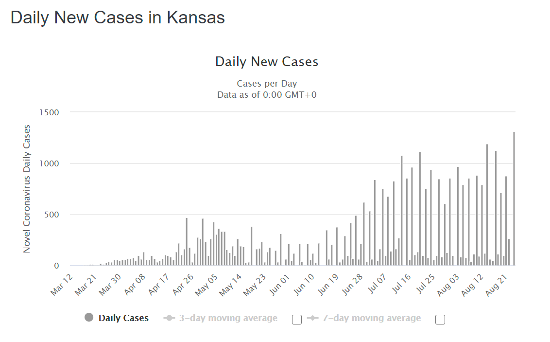
and if that is the case, daily numbers, like all the rest of the numbers with covid, are not at all accurate in any way.
Are they still counting car accidents, gunshots, and alcohol poisoning as covid deaths?
originally posted by: Vector99
originally posted by: Blaine91555
originally posted by: 00018GE
Can someone explain this graph of daily new cases from Kansas? There is a large spike every few days, but only for one day each time. It's almost like two graphs laid on top of each other. No other state's graph looks like this. I think the data has been monkeyed with.
www.worldometers.info...
Those big spikes are likely the days when test results are returned.
and if that is the case, daily numbers, like all the rest of the numbers with covid, are not at all accurate in any way.
Are they still counting car accidents, gunshots, and alcohol poisoning as covid deaths?
Yes...the leeway coroners have is incredible.
Source: www.cdc.gov...
In cases where a definite diagnosis of COVID–19
cannot be made, but it is suspected or likely, it
is acceptable to report COVID–19 on a death
certificate as “probable” or “presumed.”
Given the political atmosphere in this nation (stop Trump by any means necessary!), and Federal Dollars paid to medical facilities for Covid19-related care and deaths, I'm surprised we don't have 500,000 Covid19-related deaths by now.
Dr. Birx says 25% of what we do have, are probably FAKE Covid-19 deaths.
edit on 8/26/2020 by carewemust because: (no reason given)
originally posted by: Agit8dChop
originally posted by: muzzleflash
a reply to: Agit8dChop
You cant tamper with Corona very much currently. We are primitive geneticists.
I don't believe the Wuhan story anymore.
I think Covid 19 is in reality Corona every other year.
There are scientists who have located the edited sequences -
I've never seen a common cold that removes peoples sense of smell, taste
BTDT, many times, and starting YEARS ago. Colds absolutely CAN cause you to lose your sense of taste and smell. Just because you've never tangoed with that particular strain doesn't mean it hasn't been around for effing ages already.
Spoiler Alert: Taste and smell comes back, took mine about 6 months to get back to full speed. Food was tasteless & VERY boring for the duration beforehand.
that damages the heart, kidney, leaves them with cognitive decline, has their hair fall out or spreads so easily.
I find it equally suspicious that for all the claims of Covid deaths plastered all over the news every day, not a whole hell of a lot of people actually know anyone who's A.) Been sick at all, let alone B.) Died. Our extreme minority examples on ATS are not the norm. They're just the extremes exception -- every set of odds has 'em. IMO, any new superflu could have easily wiped out the same people.
I suspect in the future, when we're substantially better at genetic analysis, we're going to dig 'em all up to test again, and find a hell of a lot (if not all) of these claimed dead people who weren't already medically fragile, terminal or extremely old lived with silent defects in their own genes that aren't yet detectable, and they simply drew the short straw this year.
new topics
-
Is the origin for the Eye of Horus the pineal gland?
General Conspiracies: 1 hours ago -
Man sets himself on fire outside Donald Trump trial
Mainstream News: 1 hours ago -
Biden says little kids flip him the bird all the time.
2024 Elections: 1 hours ago -
The Democrats Take Control the House - Look what happened while you were sleeping
US Political Madness: 2 hours ago -
Sheetz facing racial discrimination lawsuit for considering criminal history in hiring
Social Issues and Civil Unrest: 2 hours ago -
In an Historic First, In N Out Burger Permanently Closes a Location
Mainstream News: 4 hours ago -
MH370 Again....
Disaster Conspiracies: 5 hours ago -
Are you ready for the return of Jesus Christ? Have you been cleansed by His blood?
Religion, Faith, And Theology: 7 hours ago -
Chronological time line of open source information
History: 8 hours ago -
A man of the people
Medical Issues & Conspiracies: 9 hours ago
top topics
-
In an Historic First, In N Out Burger Permanently Closes a Location
Mainstream News: 4 hours ago, 14 flags -
The Democrats Take Control the House - Look what happened while you were sleeping
US Political Madness: 2 hours ago, 9 flags -
A man of the people
Medical Issues & Conspiracies: 9 hours ago, 8 flags -
Thousands Of Young Ukrainian Men Trying To Flee The Country To Avoid Conscription And The War
Other Current Events: 15 hours ago, 7 flags -
Biden says little kids flip him the bird all the time.
2024 Elections: 1 hours ago, 6 flags -
Man sets himself on fire outside Donald Trump trial
Mainstream News: 1 hours ago, 5 flags -
12 jurors selected in Trump criminal trial
US Political Madness: 17 hours ago, 4 flags -
4 plans of US elites to defeat Russia
New World Order: 11 hours ago, 4 flags -
Are you ready for the return of Jesus Christ? Have you been cleansed by His blood?
Religion, Faith, And Theology: 7 hours ago, 3 flags -
Sheetz facing racial discrimination lawsuit for considering criminal history in hiring
Social Issues and Civil Unrest: 2 hours ago, 3 flags
active topics
-
Thousands Of Young Ukrainian Men Trying To Flee The Country To Avoid Conscription And The War
Other Current Events • 27 • : Xtrozero -
Is the origin for the Eye of Horus the pineal gland?
General Conspiracies • 2 • : nugget1 -
12 jurors selected in Trump criminal trial
US Political Madness • 86 • : ImagoDei -
911 emergency lines are DOWN across multiple states
Breaking Alternative News • 8 • : nugget1 -
Marjorie Taylor Greene Files Motion to Vacate Speaker Mike Johnson
US Political Madness • 64 • : interupt42 -
The Democrats Take Control the House - Look what happened while you were sleeping
US Political Madness • 20 • : CriticalStinker -
Man sets himself on fire outside Donald Trump trial
Mainstream News • 17 • : FlyersFan -
Biden says little kids flip him the bird all the time.
2024 Elections • 8 • : Astrocometus -
Are you ready for the return of Jesus Christ? Have you been cleansed by His blood?
Religion, Faith, And Theology • 18 • : mysterioustranger -
Israeli Missile Strikes in Iran, Explosions in Syria + Iraq
World War Three • 101 • : CarlLaFong