It looks like you're using an Ad Blocker.
Please white-list or disable AboveTopSecret.com in your ad-blocking tool.
Thank you.
Some features of ATS will be disabled while you continue to use an ad-blocker.

High ranking Global Warming scientist whistleblows on manipulated data ...
page: 11share:
a reply to: TiredofControlFreaks
There was no pause.
Here's your satellite SST chart, btw.
www.livescience.com...
www.livescience.com...
There was no pause.
Here's your satellite SST chart, btw.
www.livescience.com...
www.livescience.com...
a reply to: TiredofControlFreaks
BTW - that is the Pausebuster study graph you just posted. How very scientific of you with no intention to mislead at all, right?
BTW - that is the Pausebuster study graph you just posted. How very scientific of you with no intention to mislead at all, right?
a reply to: TiredofControlFreaks
d3a5ak6v9sb99l.cloudfront.net...
advances.sciencemag.org...
news.berkeley.edu...
Why start at 1998? Why not go back to 1970? Would that make you happy, you think? "The latest" probably wasn't available at the time the paper was being written. Do you think it would have changed the trend much? Here's the CCI (radiometer) data from 1997 onward.
you think that the graph should at least show 1998 /97 before the El Nino and the lastest global temperature anomaly of 0.34 degrees.
d3a5ak6v9sb99l.cloudfront.net...
advances.sciencemag.org...
False. The chart is from Hausfather.
BTW - that is the Pausebuster study graph you just posted.
A new UC Berkeley analysis of ocean buoy (green) and satellite data (orange) show that ocean temperatures have increased steadily since 1999, as NOAA concluded in 2015 (red) after adjusting for a cold bias in buoy temperature measurements. NOAA’s earlier assessment (blue) underestimated sea surface temperature changes, falsely suggesting a hiatus in global warming. The lines show the general upward trend in ocean temperatures. (Zeke Hausfather graphic)
news.berkeley.edu...
edit on 2/10/2017 by Phage because: (no reason given)
a reply to: Phage
Now you are showing me ERSST v. 4.0 data after it has been adjusted by the Pausebuster data.
Phage -please - its would be hard to show the Pause to Greven with data that has been "adjusted" to "erase" the Pause.
As for discussing the Pausebuster study and any changes in the global record by ERSST v. 4.0 data - i would rather wait for the congressional investigation
a reply to: TiredofControlFreaks
The graph shows you the difference; "Old NOAA", "New NOAA", "Buoy", "Satellite". You know, the homogenous data that was independently looked at by Hausfather?
what is the difference between the graph from the Pausebuster study and the Hausfather study?
That is the amount that buoy data was reduced in every grid.
By the way - you had posted that the buoy data was cooled by -0.12 degrees. Do you know what the accuracy of that calculation was?
Yes. Along with ATSR data and buoy data. That's what the different colors mean. You know, the homogenous data that was independently looked at by Hausfather? That's the satellite data you were asking for.
Now you are showing me ERSST v. 4.0 data after it has been adjusted by the Pausebuster data.
Ok.
i would rather wait for the congressional investigation
edit on 2/10/2017 by Phage because: (no reason given)
a reply to: TiredofControlFreaks
Apparently they went and checked the temperature readings in all the ships engine rooms and the average was .012 C too high.
Apparently they went and checked the temperature readings in all the ships engine rooms and the average was .012 C too high.
I think this is how NOAA is explaining the pause;
Old ship based data is trending in red.
Modern buoys trend in green, just a bit cooler.
As more buoys replace ships, there is a pause created by switching trend lines. The duration of the pause is directly related to the duration of the transition of ship to buoy readings.
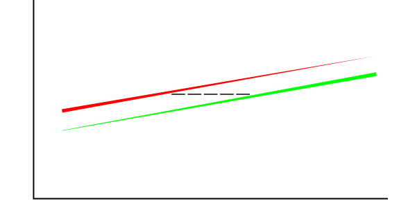
Apparently Bates is adamant that there was bias in correcting the data, and plans to present evidence. I'm not sure why the Hausfather data shows the old NOAA data as being cooler than the new buoy data, that contradicts the whole explanation of the pause. Their data for satellites and buoys should not have been corrected upwards to match non-calibrated ship data. They should have been corrected down to the more accurate buoy data, which would be below the blue old NOAA graph. Ship data would keep the same graph line as new NOAA. That wouldn't change any overall trend lines, but it would highlight the fact that all previous ship data is suspect, due to the variables that went unnoticed for so long. Unless of course, all ships and engine rooms are the same.
http ://www.foxnews.com/science/2017/02/07/federal-scientist-cooked-climate-change-books-ahead-obama-presentation-whistle-blower-charges.html
Old ship based data is trending in red.
Modern buoys trend in green, just a bit cooler.
As more buoys replace ships, there is a pause created by switching trend lines. The duration of the pause is directly related to the duration of the transition of ship to buoy readings.
Apparently Bates is adamant that there was bias in correcting the data, and plans to present evidence. I'm not sure why the Hausfather data shows the old NOAA data as being cooler than the new buoy data, that contradicts the whole explanation of the pause. Their data for satellites and buoys should not have been corrected upwards to match non-calibrated ship data. They should have been corrected down to the more accurate buoy data, which would be below the blue old NOAA graph. Ship data would keep the same graph line as new NOAA. That wouldn't change any overall trend lines, but it would highlight the fact that all previous ship data is suspect, due to the variables that went unnoticed for so long. Unless of course, all ships and engine rooms are the same.
http ://www.foxnews.com/science/2017/02/07/federal-scientist-cooked-climate-change-books-ahead-obama-presentation-whistle-blower-charges.html
edit on 10-2-2017 by AutonomousMeatPuppet because: missed a letter
edit on 10-2-2017 by AutonomousMeatPuppet because: (no reason
given)
a reply to: AutonomousMeatPuppet
can you please better explain your statement
"I'm not sure why the Hausfather data shows the old NOAA data as being cooler than the new buoy data, that contradicts the whole explanation of the pause."
can you please better explain your statement
"I'm not sure why the Hausfather data shows the old NOAA data as being cooler than the new buoy data, that contradicts the whole explanation of the pause."
a reply to: AutonomousMeatPuppet
Nice to see that the issue has reached Congress and has been debated on the floor. Also very nice that NOAA is going to "review" the allegations and that Washington Post has finally published something after refusing the first offer from Dr. John Bates.
www.washingtontimes.com...
Nice to see that the issue has reached Congress and has been debated on the floor. Also very nice that NOAA is going to "review" the allegations and that Washington Post has finally published something after refusing the first offer from Dr. John Bates.
www.washingtontimes.com...
a reply to: AutonomousMeatPuppet
Considering that buoys had reasonable spatial coverage back to 1950, I still can't think of a reason why they chose to adjust the "good" buoy data to the "bad" ship data.
Considering that buoys had reasonable spatial coverage back to 1950, I still can't think of a reason why they chose to adjust the "good" buoy data to the "bad" ship data.
a reply to: TiredofControlFreaks
Yes, it's a pity there are so many inadequate 'thinkers' who continue to push the opposite agenda without so much as entertaining any kind of Critical Thinking at all.
Sad really.
Yes, it's a pity there are so many inadequate 'thinkers' who continue to push the opposite agenda without so much as entertaining any kind of Critical Thinking at all.
Sad really.
originally posted by: TiredofControlFreaks
a reply to: Greven
Greven
why are you posting more useless graphs. If you are going to post graphs at least post the right one - the satellite graph please.
Compared to you who make assertions without posting jack squat?
That graph shows the differences between the 'pausebuster' adjusted NOAA data and Hadley data. It is quite similar.
One more time:
Why don't you share with us all what you think the "pause" is then, if you think I'm misunderstanding something?
If you do not elaborate, I can only assume you are engaging in a personal attack, so please do clarify for us all what you believe the "pause" to be.
You disagreed with my data on the first page, which included satellite data.
Prove your point, or retract your statement. Now.
edit on 19Fri, 10 Feb 2017 19:00:29 -0600America/ChicagovAmerica/Chicago2 by Greven because:
(no reason given)
a reply to: TiredofControlFreaks
It was more of a question really. But I see it's not proper to compare old NOAA data to separated buoy data.
It looks like the New NEW NOAA data will be adjusted down to buoy level and the trend line downgraded, according to the OP article. (Did DailyMail just add a bunch of new information??)
Plus, I saw that a Senator will be bringing in a bunch of scientists who have been defunded for disagreeing with NOAA.
new topics
-
Big Storms
Fragile Earth: 1 hours ago -
Where should Trump hold his next rally
2024 Elections: 3 hours ago -
Shocking Number of Voters are Open to Committing Election Fraud
US Political Madness: 4 hours ago -
Gov Kristi Noem Shot and Killed "Less Than Worthless Dog" and a 'Smelly Goat
2024 Elections: 5 hours ago -
Falkville Robot-Man
Aliens and UFOs: 5 hours ago -
James O’Keefe: I have evidence that exposes the CIA, and it’s on camera.
Whistle Blowers and Leaked Documents: 6 hours ago -
Australian PM says the quiet part out loud - "free speech is a threat to democratic dicourse"...?!
New World Order: 6 hours ago -
Ireland VS Globalists
Social Issues and Civil Unrest: 7 hours ago -
Biden "Happy To Debate Trump"
2024 Elections: 8 hours ago -
RAAF airbase in Roswell, New Mexico is on fire
Aliens and UFOs: 8 hours ago
top topics
-
A Warning to America: 25 Ways the US is Being Destroyed
New World Order: 17 hours ago, 21 flags -
Blast from the past: ATS Review Podcast, 2006: With All Three Amigos
Member PODcasts: 10 hours ago, 13 flags -
James O’Keefe: I have evidence that exposes the CIA, and it’s on camera.
Whistle Blowers and Leaked Documents: 6 hours ago, 13 flags -
Biden "Happy To Debate Trump"
2024 Elections: 8 hours ago, 12 flags -
Australian PM says the quiet part out loud - "free speech is a threat to democratic dicourse"...?!
New World Order: 6 hours ago, 12 flags -
Mike Pinder The Moody Blues R.I.P.
Music: 10 hours ago, 8 flags -
What is the white pill?
Philosophy and Metaphysics: 9 hours ago, 6 flags -
Shocking Number of Voters are Open to Committing Election Fraud
US Political Madness: 4 hours ago, 5 flags -
Ireland VS Globalists
Social Issues and Civil Unrest: 7 hours ago, 5 flags -
RAAF airbase in Roswell, New Mexico is on fire
Aliens and UFOs: 8 hours ago, 5 flags
active topics
-
Definitive 9.11 Pentagon EVIDENCE.
9/11 Conspiracies • 427 • : Zanti Misfit -
So this is what Hamas considers 'freedom fighting' ...
War On Terrorism • 266 • : ToneD -
Big Storms
Fragile Earth • 8 • : charlest2 -
SHORT STORY WRITERS CONTEST -- April 2024 -- TIME -- TIME2024
Short Stories • 24 • : argentus -
Gov Kristi Noem Shot and Killed "Less Than Worthless Dog" and a 'Smelly Goat
2024 Elections • 35 • : nugget1 -
Ireland VS Globalists
Social Issues and Civil Unrest • 7 • : boatguy12 -
"We're All Hamas" Heard at Columbia University Protests
Social Issues and Civil Unrest • 292 • : TheWoker -
I am beholden to my truth, of which I share with you now.
Dreams & Predictions • 24 • : BrotherKinsMan -
Starburst galaxy M82 - Webb Vs Hubble
Space Exploration • 11 • : Arbitrageur -
Candidate TRUMP Now Has Crazy Judge JUAN MERCHAN After Him - The Stormy Daniels Hush-Money Case.
Political Conspiracies • 817 • : RazorV66