It looks like you're using an Ad Blocker.
Please white-list or disable AboveTopSecret.com in your ad-blocking tool.
Thank you.
Some features of ATS will be disabled while you continue to use an ad-blocker.

Ebola - my visual charts & projections based on WHO data
page: 10share:
a reply to: soficrow
a reply to: jadedANDcynical
You're welcome! It is indeed good to know that one's contributions are worthwhile.
FYI, WHO posted a new situation report on September 5th, they just tucked it away on a different page from their typical updates. At the beginning of that report, they reference the numbers they reported on September 4, which covered data through August 31, 2014. But later in the report, they have the data through September 5, 2014 on page 4 (for Guinea, Liberia, and Sierra Leone) and page 6 (for Nigeria and Senegal). That's the data I used to do the last updates on the charts. Here is a direct link to the situation report PDF:
WHO: Ebola Response Roadmap Situation Report 2, 5 September 2014
It's probably worth noting that they also separated out Nigeria and Senegal numbers in the previous update. Since then, most news reports are only reporting the numbers that were actually only for Guinea, Liberia, and Sierra Leone (the three hardest hit countries) and which did not include the numbers for Nigeria and Senegal.
It does make me wonder how many other countries have Ebola cases that are not included in these numbers. For example, are the known cases that were flown to the USA and Europe included in the numbers for the countries where they contracted Ebola? Or are they not included in any of these numbers? It's not at all clear, nor is it clear whether there are any other known cases anywhere else that are not being reported.
a reply to: jadedANDcynical
You're welcome! It is indeed good to know that one's contributions are worthwhile.
originally posted by: soficrow
....5 days since the WHO has posted a report. Means it's getting bad, right?
FYI, WHO posted a new situation report on September 5th, they just tucked it away on a different page from their typical updates. At the beginning of that report, they reference the numbers they reported on September 4, which covered data through August 31, 2014. But later in the report, they have the data through September 5, 2014 on page 4 (for Guinea, Liberia, and Sierra Leone) and page 6 (for Nigeria and Senegal). That's the data I used to do the last updates on the charts. Here is a direct link to the situation report PDF:
WHO: Ebola Response Roadmap Situation Report 2, 5 September 2014
It's probably worth noting that they also separated out Nigeria and Senegal numbers in the previous update. Since then, most news reports are only reporting the numbers that were actually only for Guinea, Liberia, and Sierra Leone (the three hardest hit countries) and which did not include the numbers for Nigeria and Senegal.
It does make me wonder how many other countries have Ebola cases that are not included in these numbers. For example, are the known cases that were flown to the USA and Europe included in the numbers for the countries where they contracted Ebola? Or are they not included in any of these numbers? It's not at all clear, nor is it clear whether there are any other known cases anywhere else that are not being reported.
a reply to: ikonoklast
Interesting they stopped doing DON's though, don't you think? ....Anyway, enough numbers for the moment. Here's the human face, the confusion, the trying-to-make sense of the nonsensical.
Interesting they stopped doing DON's though, don't you think? ....Anyway, enough numbers for the moment. Here's the human face, the confusion, the trying-to-make sense of the nonsensical.
Ebola death toll rise to 2,100; Red Cross zips 50 bodies a day
….“We are here only to pick up bodies. Before you call us make sure the person is dead. Those who are responsible for the sick people are different,” Friday chides Yarngroble.
Yarngroble is trying to be polite and professional but tears run down his cheeks as he responds.
“OK, sir. When they die we will call you again. Thank you for coming.”
Liberia: 'Ebola Deaths, Situation in Lofa Underreported'
…."Given the nature of the roads, the health team will go and take a sick man and leave the wife saying she is not yet showing signs and symptoms so they can't take her along. Within a while, the woman falls sick and they will go and take the woman, leaving the baby behind and the grandmother taking care of the baby and other people get sick. Because giving the mode of transmission of the virus I do not have to be a doctor to know that when the mother is sick and breastfeed the baby, the baby will get the virus. So from one man you will have more people contracting the virus, so the response is so poor", he lamented.
I just ran across this...
"A team of students and alumni at the University of North Carolina at Chapel Hill have launched an Ebola tracking website for Liberia that displays real-time information about the health crisis."-wfmy news
UNC students chart
"A team of students and alumni at the University of North Carolina at Chapel Hill have launched an Ebola tracking website for Liberia that displays real-time information about the health crisis."-wfmy news
UNC students chart
WHO came with some new numbers. Almost 2300 deaths, but this data is only until the 6th of September. Is this on purpose?
a reply to: lottealma
Thanks. They are usually behind, and that's been increasing. I don't know whether it's on purpose or just that things are changing fast and they are stretching to keep up. But I notice they also seem to be making new reports harder to find also, so it may be on purpose. I finally found the new numbers here:
WHO: Ebola Response Roadmap Update September 8, 2014
I will be busy until late, but will update the charts when I get a little spare time late tonight or tomorrow.
WHO came with some new numbers. Almost 2300 deaths, but this data is only until the 6th of September. Is this on purpose?
Thanks. They are usually behind, and that's been increasing. I don't know whether it's on purpose or just that things are changing fast and they are stretching to keep up. But I notice they also seem to be making new reports harder to find also, so it may be on purpose. I finally found the new numbers here:
WHO: Ebola Response Roadmap Update September 8, 2014
I will be busy until late, but will update the charts when I get a little spare time late tonight or tomorrow.
Thank you so much for all the work you put in this. I come to read this thread like 50 times a day! Been interested in ebola for like 20 years, and
the best info I find here a reply to: ikonoklast
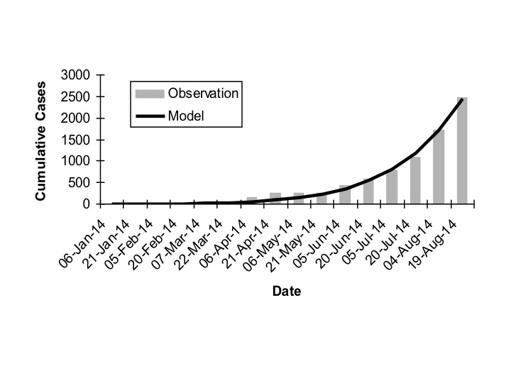
Looks like you're ahead of the curve. More info on this particular outbreak (R0 is looked at again) and some charts with which to compare your
work.
This shows their mode compared to reported cases:
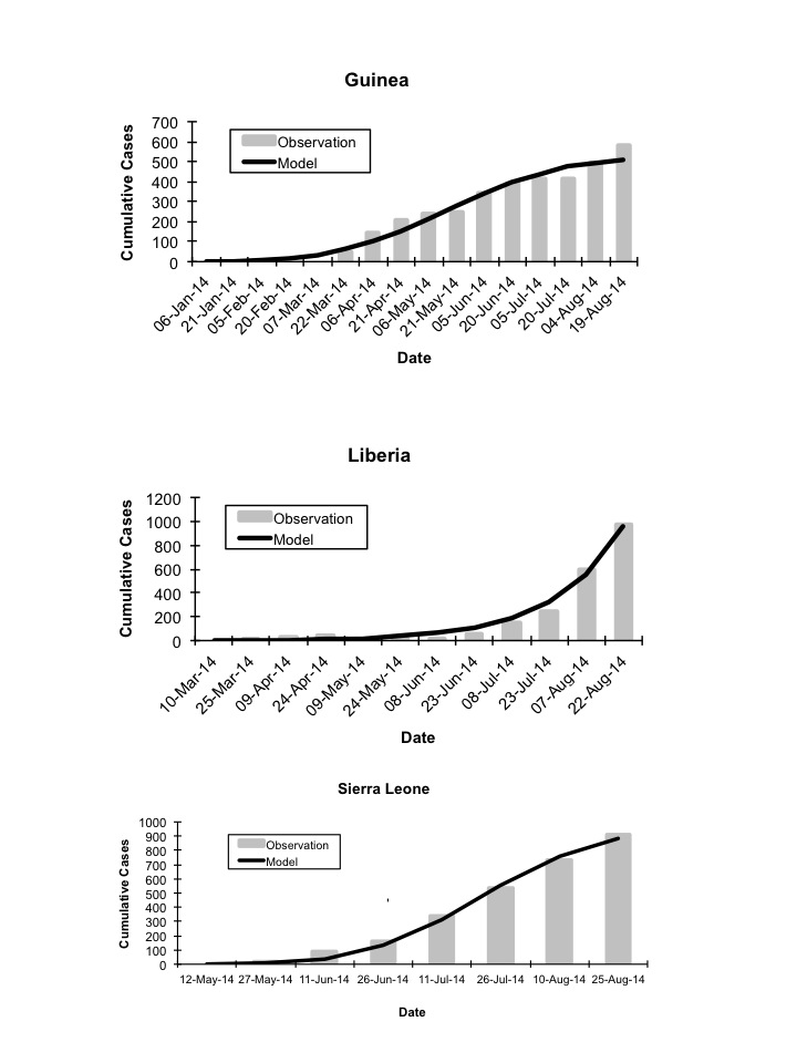
This breaks it out by the 3 main countries:
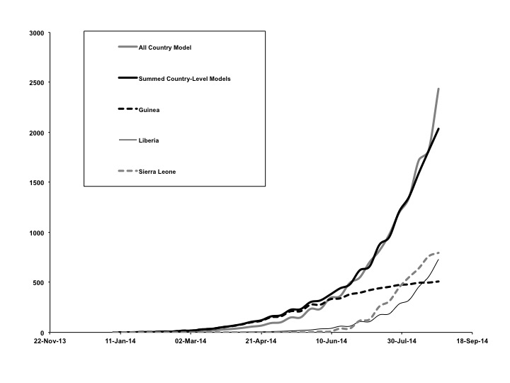
Another on for the three main countries and then sums them:
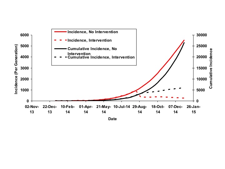
And finally thier projection chart:
Regarding R0:
This R0 is fairly consistent with other sources I have linked. However, this can be affected by intervention which is built in to their modelling. If no intervention takes place, R0 goes up significantly; not even taking into account whatever changes mutations might make.
Early Epidemic Dynamics of the West African 2014 Ebola Outbreak: Estimates Derived with a Simple Two-Parameter Model
This shows their mode compared to reported cases:
This breaks it out by the 3 main countries:
Another on for the three main countries and then sums them:
And finally thier projection chart:
Regarding R0:
Overall basic reproductive number (R0) for the epidemic was estimated to be between 1.6 and 2.0, consistent with prior outbreaks. However, we identified only weak evidence for the occurrence of epidemic control in West Africa as a whole, and essentially no evidence for control in Liberia (though slowing of growth was seen in Guinea and Sierra Leone).
This R0 is fairly consistent with other sources I have linked. However, this can be affected by intervention which is built in to their modelling. If no intervention takes place, R0 goes up significantly; not even taking into account whatever changes mutations might make.
Early Epidemic Dynamics of the West African 2014 Ebola Outbreak: Estimates Derived with a Simple Two-Parameter Model
edit on 10-9-2014 by jadedANDcynical because: (no reason given)
a reply to: lottealma
I'm glad the thread is useful for you!
Here are the latest Ebola outbreak charts updated with the newest data from WHO that was released on September 8, 2014 (covering through September 6, 2014). I'm splitting the charts over five posts since there are a lot of different charts now. This is post 1 of 5.
Click any graphic below to see it full-size.
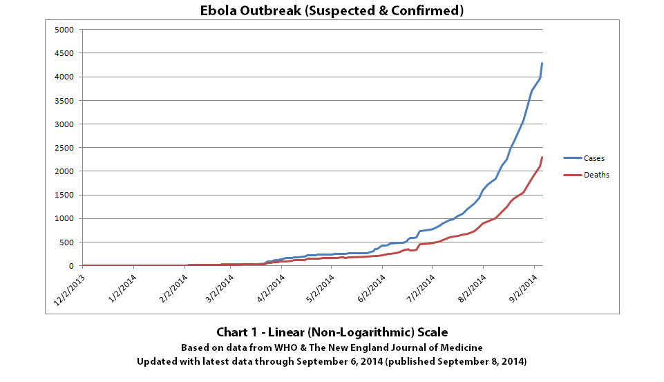
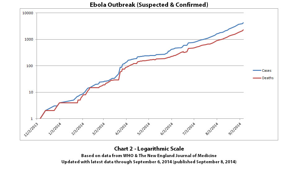
Chart 3 still has the unchanged line projections but with the new known data added.
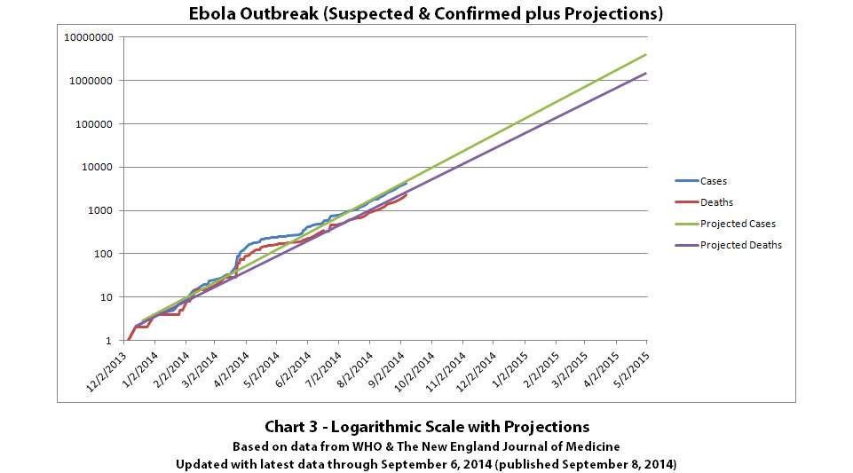
The same disclaimers and references apply to all of these charts:
Charts and future projections were done by me, not by WHO. I am not an Ebola expert, epidemiologist, virologist, or MD, but I manually compiled the data used to create these graphs from news updates on the following WHO and New England Journal of Medicine websites:
SOURCE: WHO website 1
SOURCE: WHO website 2
SOURCE: WHO website 3
SOURCE: WHO website 4
SOURCE: The New England Journal of Medicine
Please do not do anything you might regret based on charts or projections. Hopefully efforts to contain, quarantine, treat, prevent, or cure Ebola will eventually be successful, and hopefully sooner rather than later.
The numbers do not yet include the Ebola outbreak in the Congo. Currently that is believed to be unrelated to this outbreak. If that situation changes or if the Congo outbreak is not contained, I may add it to these charts or create separate charts.
Previous post in series of 5: ikonoklast
More of the Ebola outbreak charts with the newest data from WHO that was released on September 8, 2014 (covering through September 6, 2014). I'm splitting the charts over five posts since there are a lot of different charts now. This is post 2 of 5.
Click any graphic below to see it full-size.
Chart 4 is the same case projection range as previously but with the known data updated.
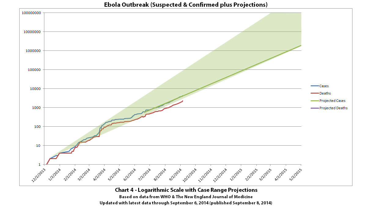
Charts 4B-4E are new projections generated automatically from known data through September 6, 2014.
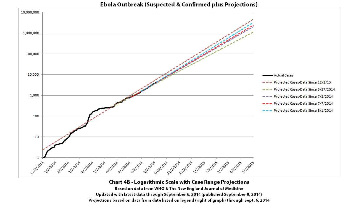
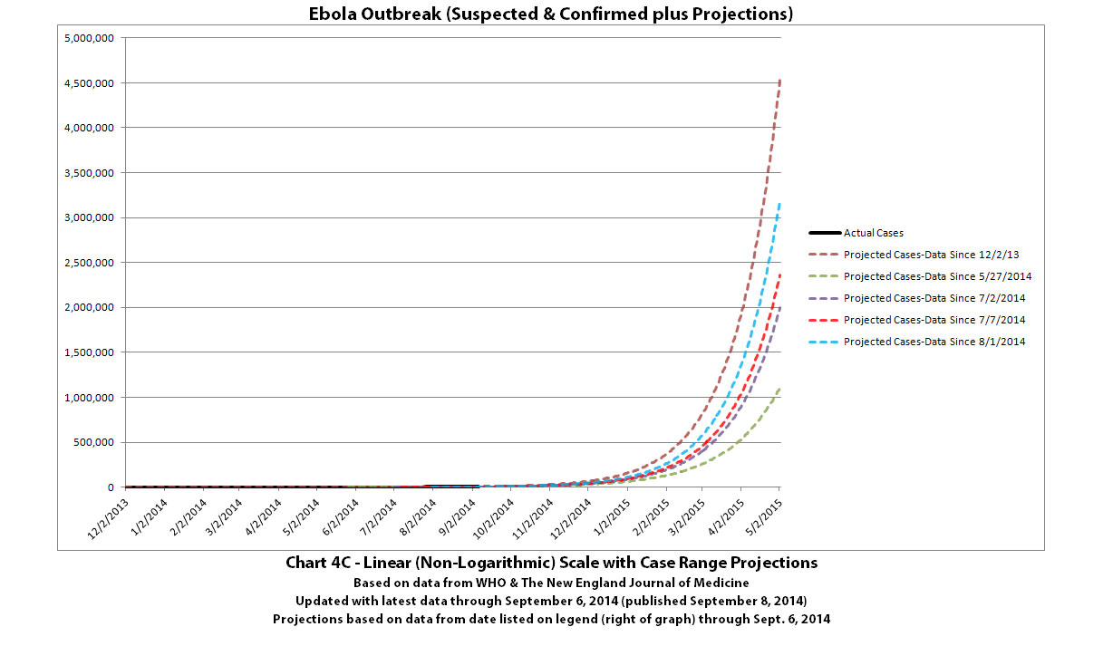
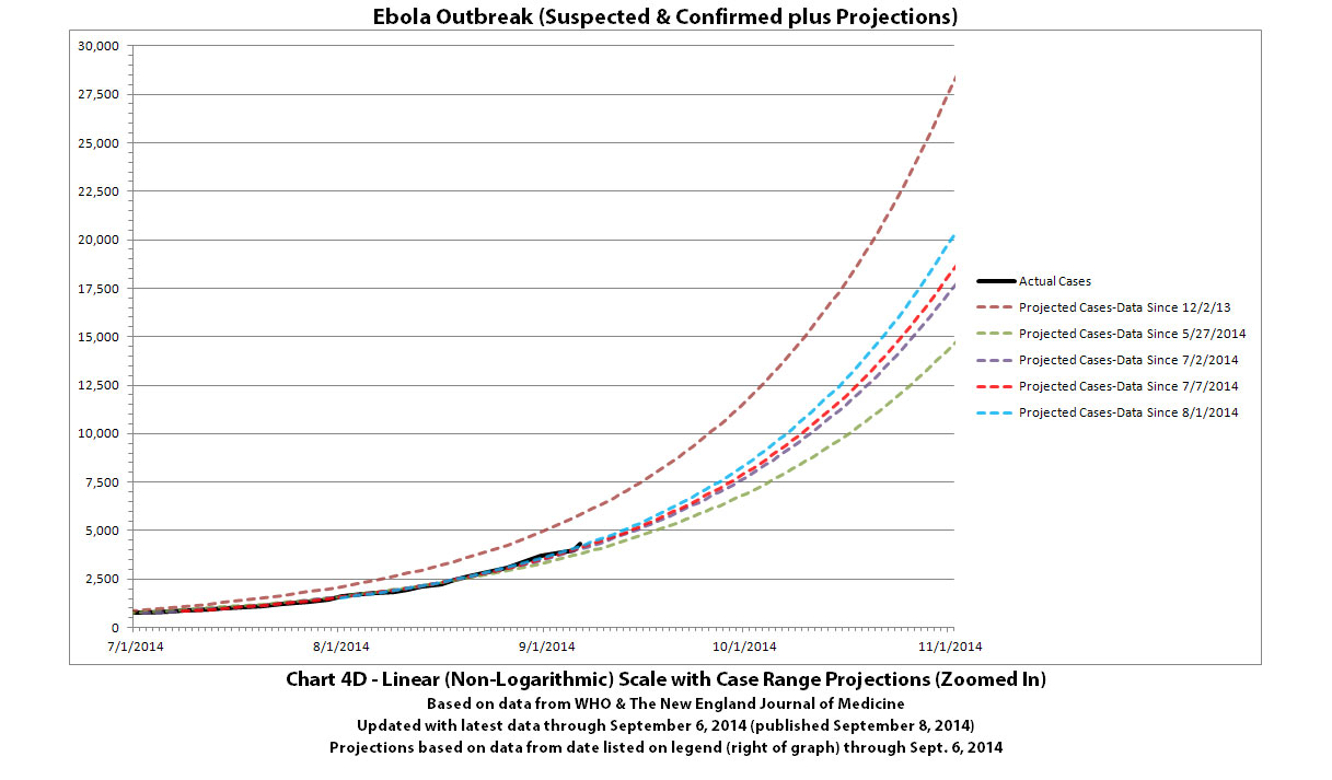
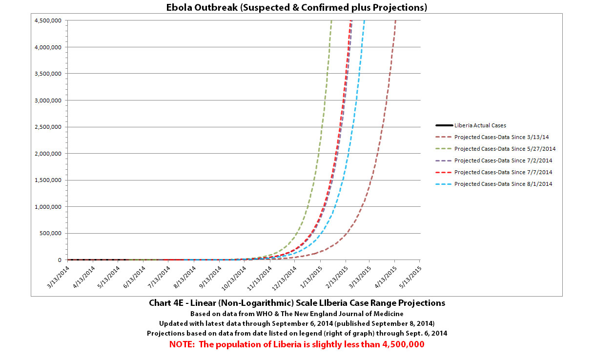
See the post above with Charts 1-3 for the standard disclaimers and references that apply to all of these charts.
More of the Ebola outbreak charts with the newest data from WHO that was released on September 8, 2014 (covering through September 6, 2014). I'm splitting the charts over five posts since there are a lot of different charts now. This is post 2 of 5.
Click any graphic below to see it full-size.
Chart 4 is the same case projection range as previously but with the known data updated.

Charts 4B-4E are new projections generated automatically from known data through September 6, 2014.


See the post above with Charts 1-3 for the standard disclaimers and references that apply to all of these charts.
Previous post in series of 5: ikonoklast
More of the Ebola outbreak charts with the newest data from WHO that was released on September 8, 2014 (covering through September 6, 2014). I'm splitting the charts over five posts since there are a lot of different charts now. This is post 3 of 5.
Click any graphic below to see it full-size.
Chart 5 is the same deaths projection range as previously but with the known data updated.
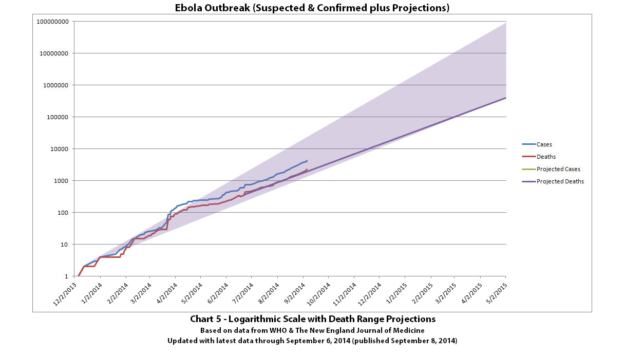
Charts 5B-5E are new death projections generated automatically from known data through September 6, 2014.
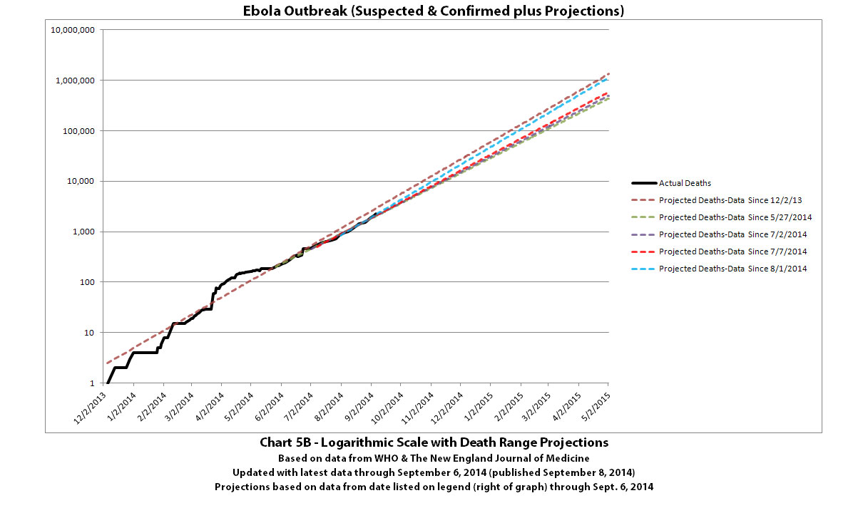
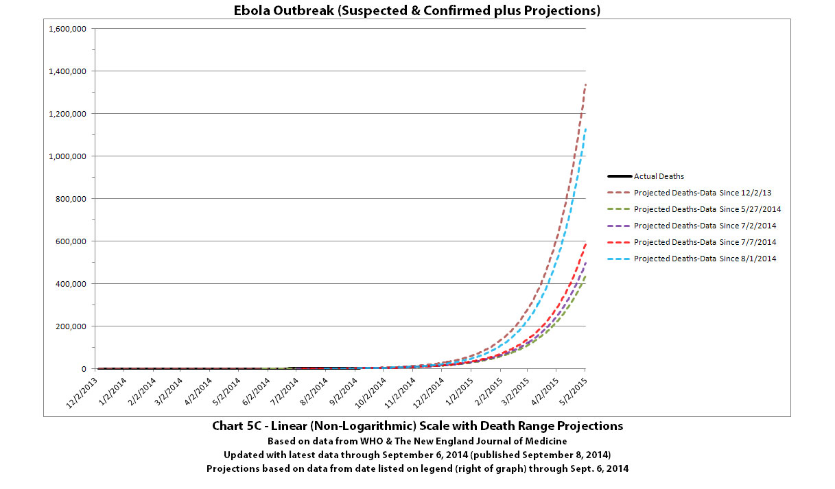
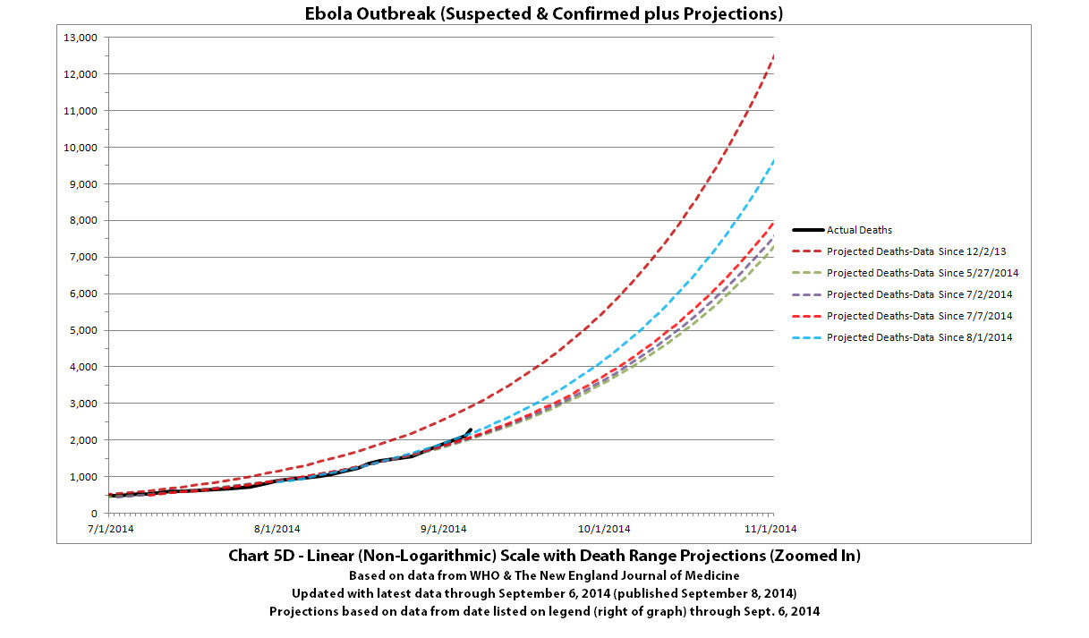
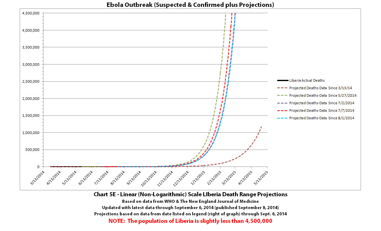
See the post above with Charts 1-3 for the standard disclaimers and references that apply to all of these charts.
More of the Ebola outbreak charts with the newest data from WHO that was released on September 8, 2014 (covering through September 6, 2014). I'm splitting the charts over five posts since there are a lot of different charts now. This is post 3 of 5.
Click any graphic below to see it full-size.
Chart 5 is the same deaths projection range as previously but with the known data updated.

Charts 5B-5E are new death projections generated automatically from known data through September 6, 2014.


See the post above with Charts 1-3 for the standard disclaimers and references that apply to all of these charts.
Previous post in series of 5: ikonoklast
More of the Ebola outbreak charts with the newest data from WHO that was released on September 8, 2014 (covering through September 6, 2014). I'm splitting the charts over five posts since there are a lot of different charts now. This is post 4 of 5.
Click any graphic below to see it full-size.
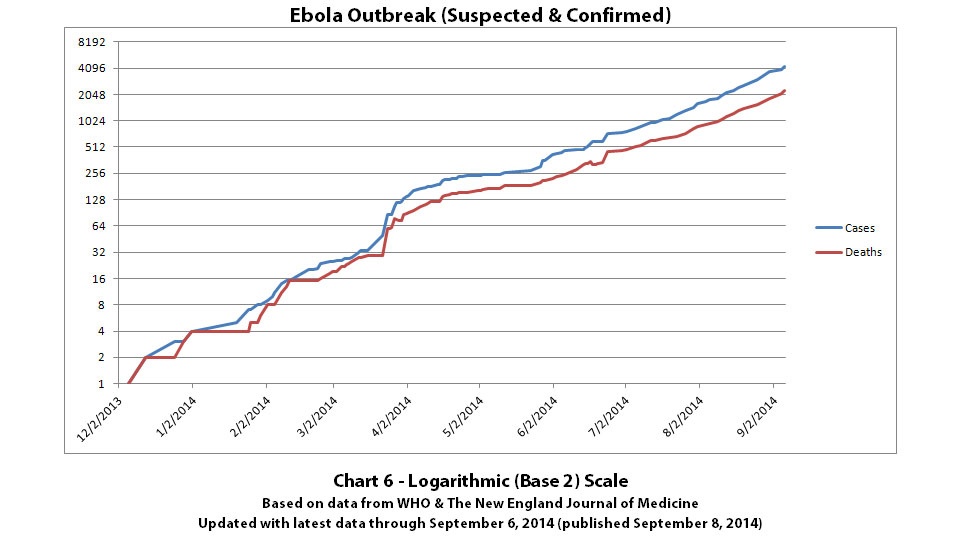
Chart 6 has the y-axis in powers of 2 so you can see the rate at which total cases and total deaths are doubling.
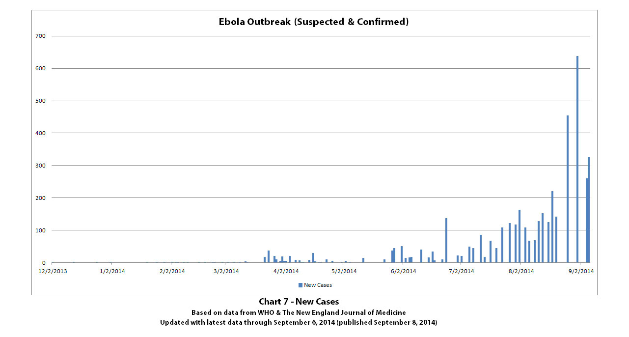
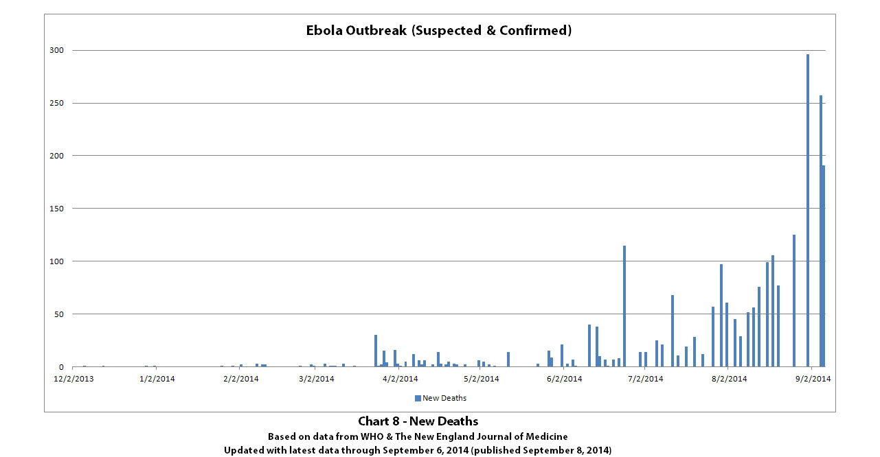
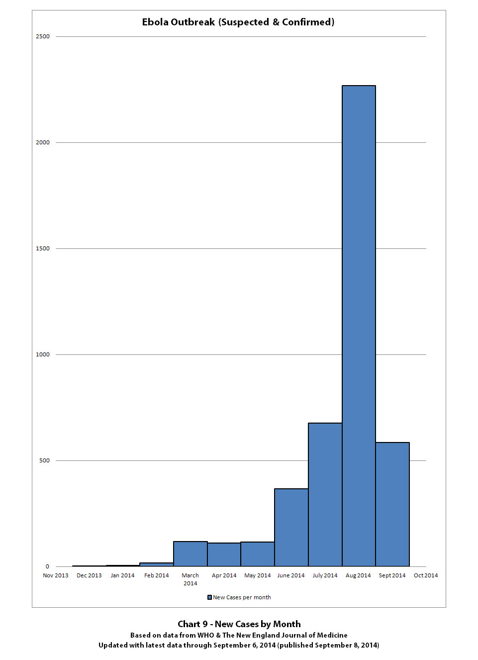
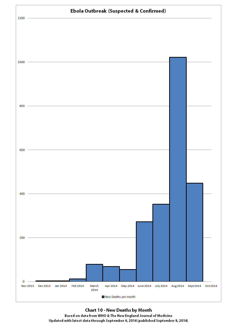
Charts 7-10 show new cases and new deaths.
See the post above with Charts 1-3 for the standard disclaimers and references that apply to all of these charts.
More of the Ebola outbreak charts with the newest data from WHO that was released on September 8, 2014 (covering through September 6, 2014). I'm splitting the charts over five posts since there are a lot of different charts now. This is post 4 of 5.
Click any graphic below to see it full-size.
Chart 6 has the y-axis in powers of 2 so you can see the rate at which total cases and total deaths are doubling.

Charts 7-10 show new cases and new deaths.


See the post above with Charts 1-3 for the standard disclaimers and references that apply to all of these charts.
Previous post in series of 5: ikonoklast
These are the last of this batch of the Ebola outbreak charts (5th post of 5) with the newest data from WHO that was released on September 8, 2014 (covering through September 6, 2014). The charts have been split over five posts since there are a lot of different charts now.
Charts 11 and 12 were not updated, as they would not have really had any new useful information until there is more data for this new month.
Click any graphic below to see it full-size.
Charts 13-14 show total cases and deaths by country.
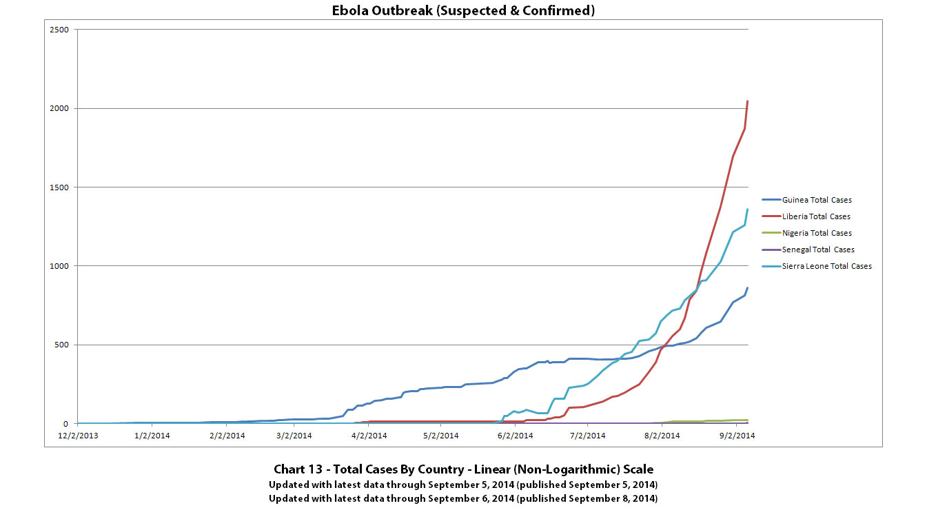
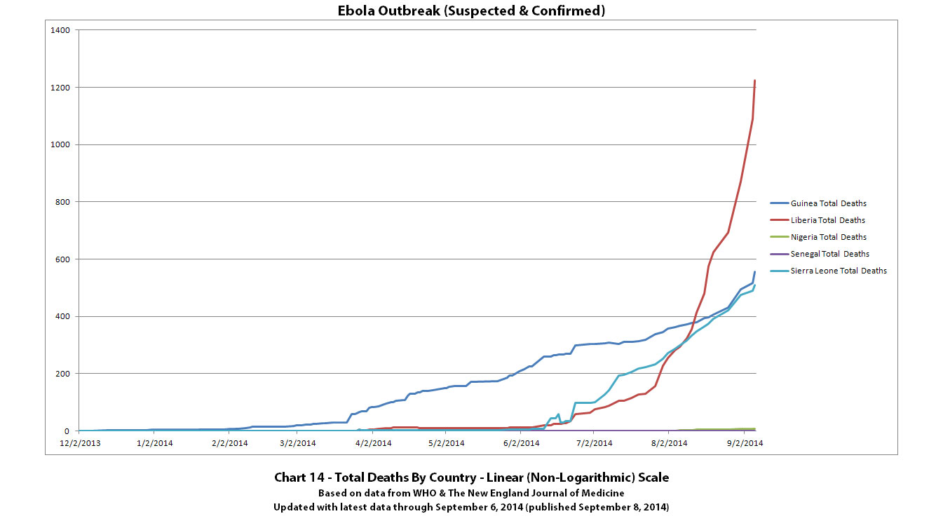
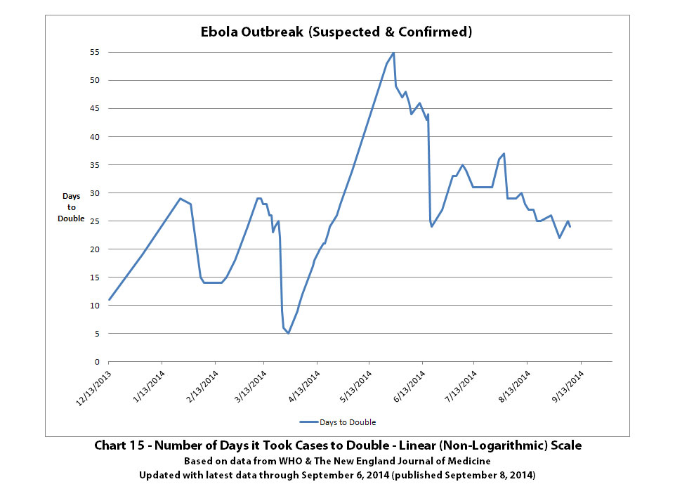
Chart 15 shows how the doubling rate has varied over time. The y-axis shows how many days it took for cases to double for any given date on the x-axis. So reading this chart is essentially the opposite of other charts - high spikes are good (it's not doubling as fast), low spikes are bad (it's doubling faster).
See the post above with Charts 1-3 for the standard disclaimers and references that apply to all of these charts.
These are the last of this batch of the Ebola outbreak charts (5th post of 5) with the newest data from WHO that was released on September 8, 2014 (covering through September 6, 2014). The charts have been split over five posts since there are a lot of different charts now.
Charts 11 and 12 were not updated, as they would not have really had any new useful information until there is more data for this new month.
Click any graphic below to see it full-size.
Charts 13-14 show total cases and deaths by country.


Chart 15 shows how the doubling rate has varied over time. The y-axis shows how many days it took for cases to double for any given date on the x-axis. So reading this chart is essentially the opposite of other charts - high spikes are good (it's not doubling as fast), low spikes are bad (it's doubling faster).

See the post above with Charts 1-3 for the standard disclaimers and references that apply to all of these charts.
originally posted by: Eliyahu
I just ran across this...
"A team of students and alumni at the University of North Carolina at Chapel Hill have launched an Ebola tracking website for Liberia that displays real-time information about the health crisis."-wfmy news
UNC students chart
Thanks for the link!
a reply to: jadedANDcynical
Thanks for the additional graphs and data, it's good to see other perspectives.
Their projections are quite low for the curve that they said is with no intervention. It's interesting that they cite Christian Althaus as one of their sources. Althaus's projections are much higher, even higher than mine apparently. He recently told Science magazine:
SOURCE
I guess we should all be hoping that their lower projections are the correct ones.
Thanks for the additional graphs and data, it's good to see other perspectives.
Their projections are quite low for the curve that they said is with no intervention. It's interesting that they cite Christian Althaus as one of their sources. Althaus's projections are much higher, even higher than mine apparently. He recently told Science magazine:
“If the epidemic in Liberia were to continue in this way until the 1st of December, the cumulative number of cases would exceed 100,000,” Althaus predicts.
SOURCE
I guess we should all be hoping that their lower projections are the correct ones.
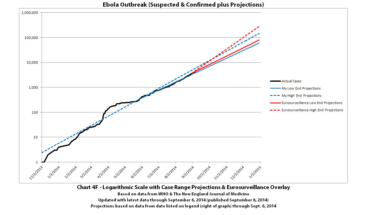
Some more Ebola case projections have come out in Eurosurveillance, an online communicable disease publication:
The authors noted that there were 3707 cases at the time their paper was written. Since their numbers were for additional cases, this puts their "worst-case hypothetical scenario" projection at 80,888 to 280,831 total cases by the end of 2014.
Comparing this to the data tables that generate the graphs in my charts 4B and 4C, my projections (if nothing changes the current rate of growth) suggest a range between 60,540 to 149,336 total cases by the end of 2014. So my projection range mostly overlaps and falls within their projection range, although mine goes down to as much as 25% lower on the low end and theirs goes up to as much as 88% higher on the high end.
In a worst-case hypothetical scenario, should the outbreak continue with recent trends, the case burden could gain an additional 77,181 to 277,124 cases by the end of 2014. Although such numbers must be interpreted with caution (as they rest on an assumption of continued exponential growth within 2014, which is unlikely)...
Source:
Nishiura H, Chowell G. Early transmission dynamics of Ebola virus disease (EVD), West Africa, March to August 2014. Euro Surveill. 2014;19(36):pii=20894. Available online: www.eurosurveillance.org...
Date of submission: 23 August 2014
The authors noted that there were 3707 cases at the time their paper was written. Since their numbers were for additional cases, this puts their "worst-case hypothetical scenario" projection at 80,888 to 280,831 total cases by the end of 2014.
Comparing this to the data tables that generate the graphs in my charts 4B and 4C, my projections (if nothing changes the current rate of growth) suggest a range between 60,540 to 149,336 total cases by the end of 2014. So my projection range mostly overlaps and falls within their projection range, although mine goes down to as much as 25% lower on the low end and theirs goes up to as much as 88% higher on the high end.
a reply to: ikonoklast
I'd love to see some graphical overlays comparing your projections with theirs if you've the time and inclination.
That your ranges are lower than this "professional" range of projections really frightens me because of how serious yours are and gives them even more validity than they already have.
Kruphix, if you're still around, I would absolutely love to hear what utter drivel you might concoct.
Just a thought.... excuse me for my bad English. I'm afraid that at some point the R0 will start to increase, because the more people are sick less
healthcareworkers will be available to stop the spreading right?
Sorry for my stupid question, you already discussed that part.
From your link Eurosurveillance there is a link to another article called
Asses
sing the International Spreading Risk Associated With the 2014 West African Ebola Outbreak
Ikonoklast you may find this interesting? Their models are based on the Democratic Republic of the Congo outbreak of 1995 and wonder if this one is just a little different than previous outbreaks.
Ikonoklast you may find this interesting? Their models are based on the Democratic Republic of the Congo outbreak of 1995 and wonder if this one is just a little different than previous outbreaks.
edit on 9/12/2014 by whatnext21 because: (no reason given)
a reply to: jadedANDcynical
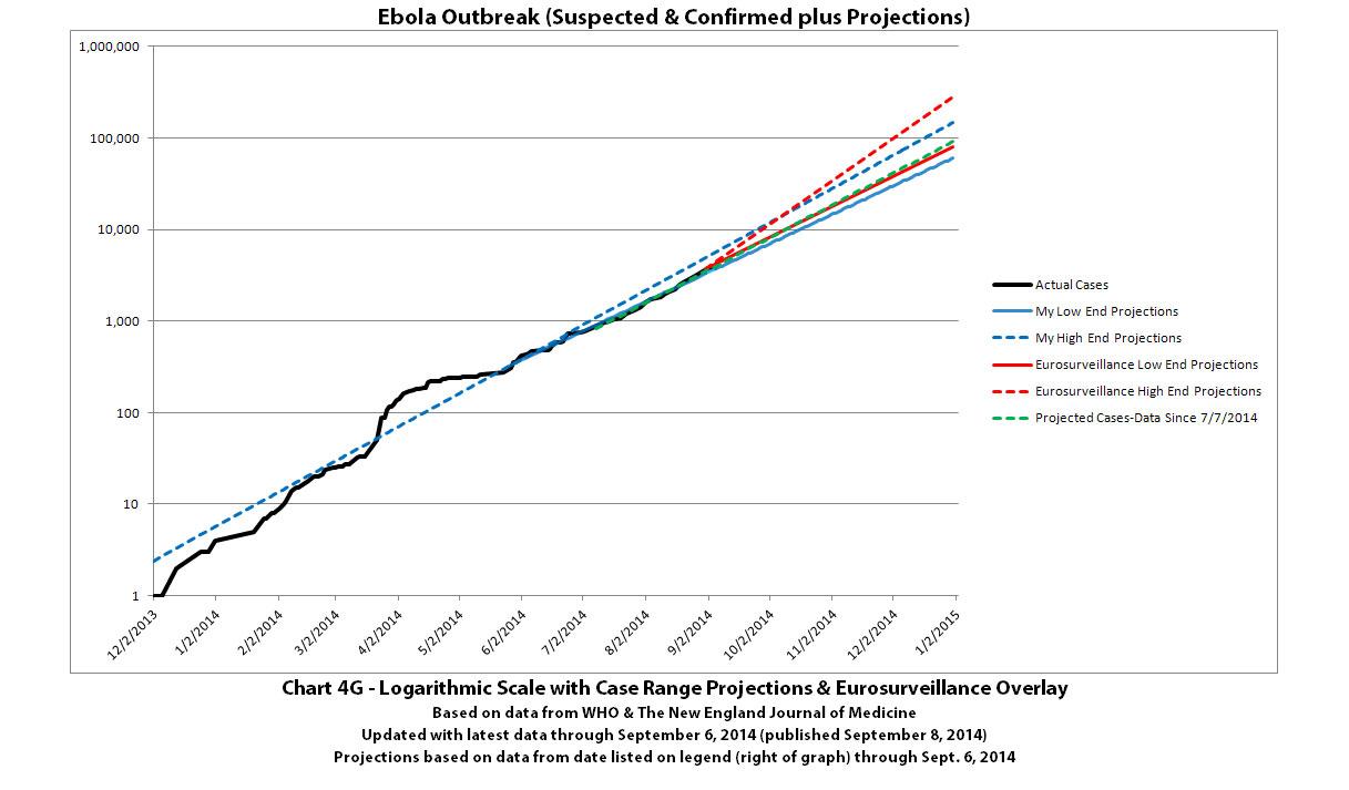
Here you go. The high/low range projected by the article in Eurosurveillance is between the red lines. The high/low range projected in my most recent update of chart 4B (my latest projections) is between the blue lines.
Click to view full-size.
The dotted blue line is calculated based on all data from December 2, 2013 (the presumed first case) through September 6, 2014. The solid blue line is calculated based on all data from May 27, 2014 (about the point the exponential growth became more of a straight line) through September 6, 2014.
My current 'most likely' projection is calculated based on all data from July 7, 2014 (some virologists suggested this date as a good date to start the projections from) through September 6, 2014. I generated a chart with a line for this too. It matches so closely with the Eurovision low end projection line that they mostly overlay each other except for a slight difference in the last month of the projection. It's hard to see much difference unless you have a big enough screen, but I thought I would include it for you and Kruphix. It's the dotted green line in this graph:
Click to view full-size.
Thanks so much for your support, jaded, and for all you have been contributing on the Ebola threads!
Here you go. The high/low range projected by the article in Eurosurveillance is between the red lines. The high/low range projected in my most recent update of chart 4B (my latest projections) is between the blue lines.
Click to view full-size.

The dotted blue line is calculated based on all data from December 2, 2013 (the presumed first case) through September 6, 2014. The solid blue line is calculated based on all data from May 27, 2014 (about the point the exponential growth became more of a straight line) through September 6, 2014.
My current 'most likely' projection is calculated based on all data from July 7, 2014 (some virologists suggested this date as a good date to start the projections from) through September 6, 2014. I generated a chart with a line for this too. It matches so closely with the Eurovision low end projection line that they mostly overlay each other except for a slight difference in the last month of the projection. It's hard to see much difference unless you have a big enough screen, but I thought I would include it for you and Kruphix. It's the dotted green line in this graph:
Click to view full-size.

Thanks so much for your support, jaded, and for all you have been contributing on the Ebola threads!
new topics
-
President BIDEN's FBI Raided Donald Trump's Florida Home for OBAMA-NORTH KOREA Documents.
Political Conspiracies: 4 hours ago -
Maestro Benedetto
Literature: 5 hours ago -
Is AI Better Than the Hollywood Elite?
Movies: 6 hours ago -
Las Vegas UFO Spotting Teen Traumatized by Demon Creature in Backyard
Aliens and UFOs: 9 hours ago -
2024 Pigeon Forge Rod Run - On the Strip (Video made for you)
Automotive Discussion: 10 hours ago -
Gaza Terrorists Attack US Humanitarian Pier During Construction
Middle East Issues: 10 hours ago -
The functionality of boldening and italics is clunky and no post char limit warning?
ATS Freshman's Forum: 11 hours ago
top topics
-
President BIDEN's FBI Raided Donald Trump's Florida Home for OBAMA-NORTH KOREA Documents.
Political Conspiracies: 4 hours ago, 25 flags -
Krystalnacht on today's most elite Universities?
Social Issues and Civil Unrest: 15 hours ago, 9 flags -
Supreme Court Oral Arguments 4.25.2024 - Are PRESIDENTS IMMUNE From Later Being Prosecuted.
Above Politics: 15 hours ago, 8 flags -
Weinstein's conviction overturned
Mainstream News: 14 hours ago, 8 flags -
Massachusetts Drag Queen Leads Young Kids in Free Palestine Chant
Social Issues and Civil Unrest: 12 hours ago, 7 flags -
Gaza Terrorists Attack US Humanitarian Pier During Construction
Middle East Issues: 10 hours ago, 7 flags -
Las Vegas UFO Spotting Teen Traumatized by Demon Creature in Backyard
Aliens and UFOs: 9 hours ago, 6 flags -
Meadows, Giuliani Among 11 Indicted in Arizona in Latest 2020 Election Subversion Case
Mainstream News: 12 hours ago, 5 flags -
2024 Pigeon Forge Rod Run - On the Strip (Video made for you)
Automotive Discussion: 10 hours ago, 4 flags -
Is AI Better Than the Hollywood Elite?
Movies: 6 hours ago, 3 flags
active topics
-
Supreme Court Oral Arguments 4.25.2024 - Are PRESIDENTS IMMUNE From Later Being Prosecuted.
Above Politics • 88 • : Irishhaf -
SHORT STORY WRITERS CONTEST -- April 2024 -- TIME -- TIME2024
Short Stories • 23 • : DontTreadOnMe -
President BIDEN's FBI Raided Donald Trump's Florida Home for OBAMA-NORTH KOREA Documents.
Political Conspiracies • 16 • : Astyanax -
Truth Social goes public, be careful not to lose your money
Mainstream News • 130 • : Astyanax -
Las Vegas UFO Spotting Teen Traumatized by Demon Creature in Backyard
Aliens and UFOs • 11 • : AwakeNotWoke -
Is AI Better Than the Hollywood Elite?
Movies • 13 • : Justoneman -
Hate makes for strange bedfellows
US Political Madness • 47 • : 19Bones79 -
-@TH3WH17ERABB17- -Q- ---TIME TO SHOW THE WORLD--- -Part- --44--
Dissecting Disinformation • 689 • : daskakik -
University of Texas Instantly Shuts Down Anti Israel Protests
Education and Media • 265 • : Astrocometus -
Gaza Terrorists Attack US Humanitarian Pier During Construction
Middle East Issues • 27 • : ToneD