It looks like you're using an Ad Blocker.
Please white-list or disable AboveTopSecret.com in your ad-blocking tool.
Thank you.
Some features of ATS will be disabled while you continue to use an ad-blocker.

BTS : Avatar Creations
page: 23share:
reply to post by NewAgeMan
I think the issue has to do with contrast.
I tried putting the other image (the 12% one) into it, and then just sizing it up properly. It comes out about the same.
If i fade it slightly to match the tone and texture of the santa hat, this is about where it comes out at:
Would you like to see more red, even though its faded some? I can change the hue a little towards red.
I am working on the conjunction.
I think the issue has to do with contrast.
I tried putting the other image (the 12% one) into it, and then just sizing it up properly. It comes out about the same.
If i fade it slightly to match the tone and texture of the santa hat, this is about where it comes out at:

Would you like to see more red, even though its faded some? I can change the hue a little towards red.
I am working on the conjunction.
Originally posted by bigfatfurrytexan
nm...ill be right back
edit on 22-12-2012 by bigfatfurrytexan because: (no reason given)
Take your time, don't rush..
Originally posted by bigfatfurrytexan
reply to post by NewAgeMan
I think the issue has to do with contrast.
I tried putting the other image (the 12% one) into it, and then just sizing it up properly. It comes out about the same.
If i fade it slightly to match the tone and texture of the santa hat, this is about where it comes out at:
Would you like to see more red, even though its faded some? I can change the hue a little towards red.
I am working on the conjunction.
Hey, that's almost perfect! Can you fade it 1 point less but still have it just slightly faded, and, can you situate it right in the center of that space meaning from the horizon to the window frame all around (just slightly lower).
Then, the same thing for the moon-rise, and we're good. Aside from the hidden hatballstar, which is just an added luxury to complete the self-referencial exoteric esoterica - that's everything I was wanting (for Christmas).
edit on 22-12-2012 by NewAgeMan because: (no reason given)
edit on 22-12-2012 by NewAgeMan because: (no reason given)
reply to post by NewAgeMan
Here is the conjunction applied. No change in size, only in position of each relative to the other, and rotation of venus. I did have to wash out the ambience a little to make it less blackish.
Here is the conjunction applied. No change in size, only in position of each relative to the other, and rotation of venus. I did have to wash out the ambience a little to make it less blackish.

reply to post by bigfatfurrytexan
Yeah yeah that's it, very close - just a little bit more visible maybe for the middle and top ray. Then if the blue in between can be blended to match daVinci's sky a bit more (not absolutely neccessary). Looks good! The only problem is that no one can SEE it quite yet unless they really scrutinize it, so I'd like it just a little more apparent, so it's obvious there's a star hidden behind his hatball (sounds funny).
We're almost done here (said while wiping nervous and slightly embarassed sweat from his brow).
So, with the hidden hatball star, and the moon in the two positions, I'll be needing three backgrounds total, for no moon, moon rising and moon risen (and I'm sure you realize that and don't need me to remind you..lol)
P.S. Take your time we're almost there, and you'll be blessed for this in more ways than one I promise (I'll never forget your help on this).
edit on 22-12-2012 by NewAgeMan because: (no reason given)

reply to post by bigfatfurrytexan
Yes, close, even the baby blue you've set it to for the contrast sphere looks like clearing sky, where the rest as per da Vinci's painting looks like light cloud cover, that's very VERY good, I really like that, how you handled the contrast issue, it's PERFECT. Edit: If you like, for even more contrast and blending you could even go lighter by picking up the blue in the upper right of the sky, but it looks good already, just thinking always of how to make something good even better.
For the star, and I presume there's an "arm" of Venus combined with Jupiter in there somewhere, I'd like just the best three rays (and three alone) to perhaps jut out a bit more clearly, with that one, they seem to be overlapping a bit in a tree-like manner, and what we're wanting to render here is perfect order, and a perfect union.
That moon is good but doesn't appear as a perfect circle (maybe that's not doable). For the moon I was wondering if you could replicate your excellent result with the 12 pointer (on the transparent background), with the 13 one while if needed shaving off a pixal all around so as to preclude any black ie: pump up it's detail and in the photo, even the minimized one there's this glowy orangey-red in the highlands (not the craters), which has a kind of haunting look to it, it would be nice if could catch that glow in the moon, which plays a very central role in this little "drama". So maybe it's best to put it in like that just about as is, and if fading, only by the smallest fraction.
Edit: However, with the slightest cutting into the hat (which is fine and VERY good for this purpose, to get in more of a circular star "raying" to denote a hatball hidden star), we would have room for 4 rays, but they should be more delineated, like very elongated arrows if you know what I mean - so you could just use the best "arms" of both stars together, and do four rays, maybe even a tiny point of Venus here and there, but all spaced out, like a star-flare. It's VERY close.
P.S. I want you to know that what you're doing here in terms of this work might actually be considered a type of alchemy if there's any sort of transformative or enlightened meaning in the entire context and frame of reference..
Edit: As to the star's positional centerpoint, not only should we be referring to the center of the hat (eclipse), but also the projected horizon - whereby that star-sun is JUST breaking over the horizon - so it's not just situated relative to the hatball but also to the horizon. Just thought I'd mention that.
Don't worry I'm not going to continue on and on interminably - we really are almost there to the end of the project in time for both Christmas and New Years. It's very meaningful to me, I know sounds silly, but I think the sharing that goes on here makes a difference - and a little exoteric esoterica can't hurt in terms of getting people to really think and imagine in new ways, and in the process help crack them open to at least the possibility of a "new world".
edit on 23-12-2012 by NewAgeMan because: (no reason given)
edit on 23-12-2012 by NewAgeMan because: (no reason given)
So at some point in the next while - with all that said and done, feel free to lay the final product on me in the form of three backgrounds, and I
will accept it.
So don't post anything beyond this until you're done, because we've covered everything now, and you're no dummy like you said.
So I wait patiently, and with faith.
How's that.
So please don't rush it - put your heart into it like a true alchemist.
Give me your best, and that is good enough for me.
I can wait a day or two or three if need be - just PM me if you like.
Best Regards,
NAM
aka Robert
nm
edit on 23-12-2012 by bigfatfurrytexan because: (no reason given)
Originally posted by bigfatfurrytexan
reply to post by bigfatfurrytexan
One more before i do some family stuff.

I'm liking it! Is it possible to make it a little longer time-wise or are there restrictions on that?
reply to post by bigfatfurrytexan
Looks the same as the one up above, if you need to move the star arms around from perfect hatball center that's ok (the parts are still "co-mingled") just wanted them to be more prominent, more ordered, and more of a simulation of a starflare. The blue sphere (I'll call that the clearing) is good, but could even be bluer like the sky in the upper right, but that's no biggie.
As to the moon and everything else I've given you everything in terms of what's needed. Just do a quick re-read over these last two pages and then like I said in the post above, just give me your best in the form of the finished product and I'll like it. Please take another day, and I'll check back in Monday am to see the finished three backgrounds, k?
If need be, PM me, but what you do, based on what you've already been doing, and all the info we've covered here will be entirely sufficient I'm sure.
Just do a quick scan back over all this info, fool around with it a bit more, and then give me the best of the best both in terms of the moon, and the hidden star-rise.
Isn't it way past your bedtime? - you're in Texas timezone. Set it aside and try to get some sleep instead of rushing it - like I said, it's a form of alchemy what we're trying to do here. You can't rush such a thing. Take some time based on everything we've discussed here, and what you end up presenting in the end will be just GREAT!
edit on 23-12-2012 by NewAgeMan because: (no reason given)
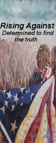
reply to post by Sublimecraft
[atsimg]http://files.abovetopsecret.com/files/img/qa50d49bac.jpg[/atsimg]
Honestly, they were all awesome, and I'm talking about what everyone posted in reply to me. Genuinely, all awesome. But, the above really did stick out for me. I like it a lot - this theme.
I was wondering though if we can run with it a little bit. I'd love for it to be able to say "Rising Against" centered t the top, instead of Rise Against. Maybe a tagline somewhere saying "Searching for the truth.." as that's what I used to have under my username too.
I'm not sure what else. Go nuts with it I guess, lol. But yeah, an 'Endgame' themed avatar would be really cool, especially since this is my favourite band and my username is a play on their band name.
Thanks again guys!
edit on 23-12-2012 by Rising Against because: (no reason given)
reply to post by Rising Against
Glad you liked it RA.
I will have to leave to one of the experts (Agarta, BFFT, Zarniwoop, I'm a Marty, Ottobot, 74Templar, Fort, Big Liz, Just Chris, Heff, Druid42, L8RT8TRZ and my sincere apologies for anyone I've missed) here to tweak it up for you as you have described, which I'm certain they can do.
Here is the original painting of the album cover and a link as to how the picture came to be

How this image came to be
Glad you liked it RA.
I will have to leave to one of the experts (Agarta, BFFT, Zarniwoop, I'm a Marty, Ottobot, 74Templar, Fort, Big Liz, Just Chris, Heff, Druid42, L8RT8TRZ and my sincere apologies for anyone I've missed) here to tweak it up for you as you have described, which I'm certain they can do.
Here is the original painting of the album cover and a link as to how the picture came to be
How this image came to be


reply to post by bigfatfurrytexan
You're a star.
Thanks guys. You're all very talented and I'm grateful for your time. Genuinely.
You're a star.
Thanks guys. You're all very talented and I'm grateful for your time. Genuinely.
Ok I need some help big time. 24 pack of stars for anyone who can do the great art that you all have been doing... Take a look at my avatar.... Id
like to keep my pic, or have some kind of artist rendering of it... With some kind of LOST theme to it for the background. Id like the ATS logo
somewhere there with The John Locke of above the ATS logo...
Edit to add, maybe 'The John Locke of' above the ATS logo at the bottom of the avatar, and underneath the ats logo, the LOST number 4-8-15-16-23-42 . and the numbers in bold green in like 70's sci fi computer font?
Very crude thoughts now.. Maybe someone can help me out with organizing my ideas on this?
edit on 23-12-2012 by bknapple32 because: (no reason
given)
edit on 23-12-2012 by bknapple32 because: (no reason given)

reply to post by bigfatfurrytexan
Thats great, were on the right track.. But I was thinking maybe more of something like this in the background ? Not the hurley part, just the beach and water with LOST in it
Do you think maybe it would look better if my face was cartooned?
Thats great, were on the right track.. But I was thinking maybe more of something like this in the background ? Not the hurley part, just the beach and water with LOST in it
Do you think maybe it would look better if my face was cartooned?
edit on 23-12-2012 by bknapple32 because: (no reason given)
new topics
-
DEI is dead at UNC!
US Political Madness: 3 hours ago -
US Defense (DIA) Officer Maj. Harrison M. resigned in protest of killing Palestinian civilians
Politicians & People: 4 hours ago -
Frances Scott Key Bridge Demolition To Free Dali Scheduled For 5PM Eastern Standard Time.
Other Current Events: 4 hours ago -
"I Want Mercy Not Sacrifice"
Conspiracies in Religions: 4 hours ago -
San Francisco Program To Give Free Booze to the Homeless
Social Issues and Civil Unrest: 5 hours ago -
Avatar Crucifix in my baked potato! Before surgery + more. Palestinian nurse, Christian patient.
General Chit Chat: 6 hours ago -
Senator Karim Bianchi, from Chile, telling was abducted 2012.
Aliens and UFOs: 8 hours ago -
Gaza Genocide Real or Propaganda
Middle East Issues: 9 hours ago
top topics
-
DEI is dead at UNC!
US Political Madness: 3 hours ago, 12 flags -
Avatar Crucifix in my baked potato! Before surgery + more. Palestinian nurse, Christian patient.
General Chit Chat: 6 hours ago, 8 flags -
Akkabadori: history of tolerant euthanasia
History: 13 hours ago, 7 flags -
Gaza Genocide Real or Propaganda
Middle East Issues: 9 hours ago, 7 flags -
Don Trump-Quixote
Political Issues: 15 hours ago, 7 flags -
San Francisco Program To Give Free Booze to the Homeless
Social Issues and Civil Unrest: 5 hours ago, 6 flags -
Senator Karim Bianchi, from Chile, telling was abducted 2012.
Aliens and UFOs: 8 hours ago, 4 flags -
Frances Scott Key Bridge Demolition To Free Dali Scheduled For 5PM Eastern Standard Time.
Other Current Events: 4 hours ago, 4 flags -
Paranoia that will tear apart Russia and China
World War Three: 16 hours ago, 4 flags -
"I Want Mercy Not Sacrifice"
Conspiracies in Religions: 4 hours ago, 2 flags
active topics
-
-@TH3WH17ERABB17- -Q- ---TIME TO SHOW THE WORLD--- -Part- --44--
Dissecting Disinformation • 994 • : daskakik -
Christianity superior to other faiths for very specific reasons. Awaken to true FREEDOM..!!
Conspiracies in Religions • 43 • : jofafot -
Gaza Genocide Real or Propaganda
Middle East Issues • 135 • : charlest2 -
Senator Karim Bianchi, from Chile, telling was abducted 2012.
Aliens and UFOs • 6 • : pianopraze -
Trump Record Breaking Campaign Rally 5/11 in New Jersey Draws 100,000 People
2024 Elections • 153 • : JadedGhost -
Don Trump-Quixote
Political Issues • 22 • : Zanti Misfit -
Slow moving ufo over Mexico volcano Popocatepetl 8 May 2024
Aliens and UFOs • 14 • : jofafot -
NASA Black Hole Visualization - Go Beyond the Brink
Space Exploration • 20 • : DragonGod77 -
San Francisco Program To Give Free Booze to the Homeless
Social Issues and Civil Unrest • 35 • : budzprime69 -
Russia Ukraine Update Thread - part 3
World War Three • 5785 • : gortex