It looks like you're using an Ad Blocker.
Please white-list or disable AboveTopSecret.com in your ad-blocking tool.
Thank you.
Some features of ATS will be disabled while you continue to use an ad-blocker.

Strange rocks found on the Moon!
page: 3share:
Armap, If you can download the full sized tif from the web, let me know. I found it at one website (U. Of AZ., i think), downloaded it but no program
I have or can find to try will even open it. I have now dowloaded it 3 times. It has stunning detail but could benefit from some contrast enhancement
for purposes of this thread.I will see today if I can get it from some other site. Thanks.
reply to post by Malkuth
I downloaded the TIF file and I can open it with Irfanview and GIMP, both free.
I downloaded the TIF file and I can open it with Irfanview and GIMP, both free.
This was the best I could, by just adjusting the levels without any loss of detail.
In the image above, I tried to put the brightest shade at 255 and the darkest at 0, so all the shades of grey were distributed across the 0-255 range of a 8 bits image, but, as far as I could see, the shades range from 3 to 254, so, although not the best possible it was very close.
This image was taken from the 16 bits per pixel IMG file, available here.
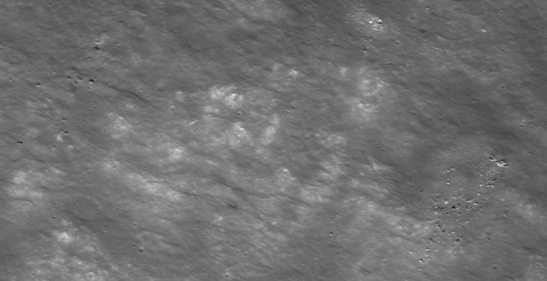
The view shown above was resized to 4000 pixels wide and a section was selected for cropping. As the sectional crop was more than 1000 pixels wide it
was resized to the standard size. Observing the image carefully many shapes can be seen with rectilinear form.

Direct link: i985.photobucket.com...
Direct link: i985.photobucket.com...
reply to post by arianna
To me it looks like the more linear features are introduced by the resizing of the image.
Could you post an unresized version?
To me it looks like the more linear features are introduced by the resizing of the image.
Could you post an unresized version?
To ArMaP, Thank you for taking time to look at the view.
If you have Photshop, try using the 'burn' tool and select 3% 'shadow' with a size of 100. Apply in strips using a circular motion. See if that helps to 'bring out' some of the detail.
If you have Photshop, try using the 'burn' tool and select 3% 'shadow' with a size of 100. Apply in strips using a circular motion. See if that helps to 'bring out' some of the detail.
Originally posted by ArMaP
reply to post by arianna
To me it looks like the more linear features are introduced by the resizing of the image.
Could you post an unresized version?
With respect ArMaP, the resizing of the image has no effect on the detail. It only makes the image larger which is an ideal method for making a close crop.
As requested, here is the unresized image the crop was made from.

Direct link: i985.photobucket.com...
I have carried out some more work on this image and colorized it to assist with recognition of the small surface features. Take note of the detail in
the lighter areas.

Direct link: i985.photobucket.com...
Direct link: i985.photobucket.com...
Originally posted by arianna
If you have Photshop, try using the 'burn' tool and select 3% 'shadow' with a size of 100. Apply in strips using a circular motion. See if that helps to 'bring out' some of the detail.
By using the "burn" tool we may see some things better, while losing detail in other areas, that's why I usually limit my alterations the area I am looking at and only change the levels in a non-destructive way.
With respect ArMaP, the resizing of the image has no effect on the detail. It only makes the image larger which is an ideal method for making a close crop.
That's right, the resizing doesn't really change things, but when we look at a resized image we do not know how big the pixels were originally, so a straight line looks just like that, a straight line, while in the original, unresized version we could see that it was only two pixels side by side, too little to be considered a real straight line, so it may change our perception of the image.
Now, I would like to ask you something: could you take the image below and apply the same process you did to the other images? I am trying to see how much the processes you use change the image.
If you accept this test please save the resulting image as a PNG, to avoid JPEG compression problems.
Thanks in advance.
To ArMaP,
I have just spent an hour and a half on the png image you provided. The result can be seen below. It's a shame you could not have provided a larger image that covered a greater surface area. The associated direct link is a resized png version of the enhancement.

Direct link: i985.photobucket.com...
I have just spent an hour and a half on the png image you provided. The result can be seen below. It's a shame you could not have provided a larger image that covered a greater surface area. The associated direct link is a resized png version of the enhancement.
Direct link: i985.photobucket.com...
Gosh, you guys are getting ahead of me. Thank you, both, for being so helpful and cooperative. Having spent time doing very similar work to many
other images I am familiar with the sort of "false" detail which gets introduced very easily by image manipulation software. If anything, I am not
seeing much of that false detail showing up here.Are you?
Armap, I use Irfan and that had trouble with my file. I am now going to assume that my 35meg file is corrupt and I will redownload it today. If that goes as it should I can spend time tinoght doing more work on this.as I said I would.
As I look at the larger area photos and see the boulders that have rolled down the inside of (Rowland) crater, it reminds me there is some image which shows a place where a boulder appeared to have rolled UP the embankment, against the slope of the crater wall, against gravity. I will snoop around to see if this is the locale of that particular anomaly.
Thanbks, agin, to both of you. THIS is how I had hoped this forum would function when I first joined. m.
Which section was selected for cropping? upper right? Lower left?
Originally posted by arianna
The view shown above was resized to 4000 pixels wide and a section was selected for cropping.
It would be nice if you could give at least a general idea. The post you made before showing exactly where in the strip you were looking was very helpful.
But when you just crop a section and don't say where, and it's not obvious, it's kind of hard to follow where you're looking at.
Originally posted by Arbitrageur
Which section was selected for cropping? upper right? Lower left?
Originally posted by arianna
The view shown above was resized to 4000 pixels wide and a section was selected for cropping.
It would be nice if you could give at least a general idea. The post you made before showing exactly where in the strip you were looking was very helpful.
But when you just crop a section and don't say where, and it's not obvious, it's kind of hard to follow where you're looking at.
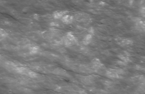
This view shows the area of the image (red rectangle) that was selected for cropping. (Direct link)
i985.photobucket.com...
Thanks that helped a lot.
Originally posted by arianna
This view shows the area of the image (red rectangle) that was selected for cropping.
I looked at the colorized version along with the others you posted, and it seems to me like over-processing is creating the appearance of features which aren't present in the original image. This link provides an example of how to overprocess an image to create things that aren't in the original, and I see some similarities with the processed images you posted:
Strange Things On The Moon or Bad Photographic Processing?
And when the photos aren't over processed, they look completely different. The point of processing the image should be to enhance it, not create features that don't really appear in the original image.
I have taken a NASA photo AS10 - 32 - 4845 and subjected it to intensive photo processing. As each section was cropped more photo processing was applied.
....
I cropped more of the structure and reprocessed brightness, contrast, sharpness, color enhancement and gamma. I also applied a slight magnification. Notice how the shadows appeared causing shapes to appear. It would be very easy to see something in this photo that was never in the original. For example one might say that the objects on the left of the photo seem to be higher in elevation than those on the right side. This photo is so deformed that it might as well be the head of an ant which it resembles.
Photos that are treated this way and then used as evidence are useless. I think many of us have see those over processed photos of claimed abnormalities on the moon. Some are so enlarged, cropped and enlarged again and again that there is no way to tell what they really look like....
Just one word to the wise, if you have to over process the photo to prove your point you have lost your point already.


Are the circled objects and features in this image telling us something?
Do you have any thoughts as to why there are so many recognizable features showing when viewed from a distance. Enhancement of the original image has revealed that most of the terrain appears to have been artistically terraformed to an intelligent design..

Do you have any thoughts as to why there are so many recognizable features showing when viewed from a distance. Enhancement of the original image has revealed that most of the terrain appears to have been artistically terraformed to an intelligent design..
edit on 2-11-2011 by arianna because: added
text
edit on 2-11-2011 by arianna because: (no reason given)
reply to post by arianna
Thanks for posting that version.
One difference between your version and the original is that the original has only 161 shades of grey, while yours has 256, the maximum possible.
Having said that, does your version show more detail than mine? No, it doesn't, as we can see in the following areas cropped from both images.
From the original
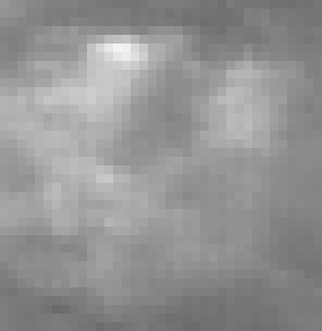
From your version
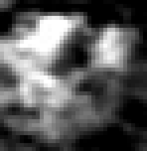
The original looks "washed out" when compared with your version, and it only has 109 shades of grey, while your version has 243, but we can see that the brightest areas on the original almost disappeared in your version, where the white areas look "bloated" when compared with the original.
Another difference is that the original, with its 109 shades of grey, still has "room" for improvement, so if I adjust the levels (without removing any shade), this is what I get.
Your version may look better, but we can see that that better look was achieved by increasing the difference between the darker and lighter areas and by filling the middle tones with a nice gradient. It may look better, but some detail was lost.
That's why the first thing I do is to change the levels, and then, if I need to look at some specific area, I change the levels for that area only, and only after I start making destructive changes. I once made three versions of a photo, showing the best possible highlights, midtones and shadows, and then I merged them all into one. The result was not as good as the three independent images, but was better (the details were more visible) than with just one version.
So, what I meant with all this, was to say that, while enhancements are good (and needed, most of the times), we should always be aware that we may be removing information from the photo, and that what's best for the highlights is not for the shadows or midtones.
Thanks for posting that version.
One difference between your version and the original is that the original has only 161 shades of grey, while yours has 256, the maximum possible.
Having said that, does your version show more detail than mine? No, it doesn't, as we can see in the following areas cropped from both images.
From the original
From your version
The original looks "washed out" when compared with your version, and it only has 109 shades of grey, while your version has 243, but we can see that the brightest areas on the original almost disappeared in your version, where the white areas look "bloated" when compared with the original.
Another difference is that the original, with its 109 shades of grey, still has "room" for improvement, so if I adjust the levels (without removing any shade), this is what I get.
Your version may look better, but we can see that that better look was achieved by increasing the difference between the darker and lighter areas and by filling the middle tones with a nice gradient. It may look better, but some detail was lost.
That's why the first thing I do is to change the levels, and then, if I need to look at some specific area, I change the levels for that area only, and only after I start making destructive changes. I once made three versions of a photo, showing the best possible highlights, midtones and shadows, and then I merged them all into one. The result was not as good as the three independent images, but was better (the details were more visible) than with just one version.
So, what I meant with all this, was to say that, while enhancements are good (and needed, most of the times), we should always be aware that we may be removing information from the photo, and that what's best for the highlights is not for the shadows or midtones.
ArMaP, Thank you for spending time on the two different versions of the sample. I am grateful and appreciate your analysis. I would agree with you
that enhancements do tend to lose some of the detail, especially in the darker areas, but the procedure can also reveal detail that cannot normally be
observed in the original.
The main reason I apply an enhancement procedure to images is either to improve a view where the original is 'flat' or 'washed out' or to highlight specific features. The detail showing in the enhanced images in this thread show that there is much more to be observed on the surface than can be realized in the 'flat' original.
ArMaP asked, "What are the recognizable features?"
The features ringed in red all have something in common about them. I'll leave it to members to fathom out what these features have in common. After viewing the image for a while the link between them may register and become apparent. The features ringed in yellow would appear to be structures. In this view we have to remember that the viewpoint is far above the surface. For members who wish to see more a larger version of the view, I suggest to download the file and observe in a suitable photo-editing program that has either a 'zoom' or magnify capability.
To Arbitrageur and ArMap
I hope a good number of people are monitoring this thread. I feel both of you are making great points here. Overprocessing of imagery can either introduce the suggestion of features or it can obliterate legitimate features. Almost as soon as one begins to do work of this kind one can quickly see the great care with which images must be managed so as to not taint legitimate data.
Just as one example, in this particular image, the process of trying to brighten up the darkest areas to try an flush out anything that might be obscured by the particularly deep shadows of the moon can cause things which look like 'features' to appear.
Without resizing the image at all, one can better define detail just be making minor improvements to lighting.And for me, that is about as far as I like to go with it . The only time, so far, that I ever use extreme contrast is to help flush out places where it appears there may be a repeating feature or some otherwise difficult to observe symmetry. At present I have about 40 crops which may help validate the presence of several features.I am still working with them and I will post what I think is the best subset of images when I feel I am done.
As an aside, I will say that without a doubt, this exact kind of work has produced very obvious signs of intelligent activity on the moon. Again, I will refer the curious reader to spend some time at Keith Laney's website. He has done some fantastic work along with some of the subscribers to his forum.
To Arbitrageur,
Thank you for you contribution to the thread and the reference link.
I believe one of the main problems when dealing with images that contain all sorts of curiosities is when one has zoomed in too close. I find a more distant view is better for examination and for recognition should there be anything of interest to observe on the terrain.
I am going to examine the area immediately adjacent to the image posted above to see if there are any similarities. When viewing the colorized version (above) it would appear there are many objects and features showing that should not be dismissed as just being "rocks" or natural geological formations.
edit on 3-11-2011 by arianna because: text correction
edit on 3-11-2011 by arianna because: (no reason
given)
new topics
-
What is the white pill?
Philosophy and Metaphysics: 53 minutes ago -
Mike Pinder The Moody Blues R.I.P.
Music: 1 hours ago -
Putin, Russia and the Great Architects of the Universe
ATS Skunk Works: 4 hours ago -
A Warning to America: 25 Ways the US is Being Destroyed
New World Order: 9 hours ago
top topics
-
President BIDEN's FBI Raided Donald Trump's Florida Home for OBAMA-NORTH KOREA Documents.
Political Conspiracies: 14 hours ago, 33 flags -
A Warning to America: 25 Ways the US is Being Destroyed
New World Order: 9 hours ago, 18 flags -
Is AI Better Than the Hollywood Elite?
Movies: 16 hours ago, 4 flags -
Mike Pinder The Moody Blues R.I.P.
Music: 1 hours ago, 4 flags -
What is the white pill?
Philosophy and Metaphysics: 53 minutes ago, 4 flags -
Putin, Russia and the Great Architects of the Universe
ATS Skunk Works: 4 hours ago, 2 flags -
Maestro Benedetto
Literature: 16 hours ago, 1 flags
active topics
-
Massachusetts Drag Queen Leads Young Kids in Free Palestine Chant
Social Issues and Civil Unrest • 18 • : ToneD -
Mood Music Part VI
Music • 3109 • : TheWoker -
Candidate TRUMP Now Has Crazy Judge JUAN MERCHAN After Him - The Stormy Daniels Hush-Money Case.
Political Conspiracies • 791 • : matafuchs -
Meadows, Giuliani Among 11 Indicted in Arizona in Latest 2020 Election Subversion Case
Mainstream News • 22 • : xuenchen -
President BIDEN's FBI Raided Donald Trump's Florida Home for OBAMA-NORTH KOREA Documents.
Political Conspiracies • 28 • : TzarChasm -
Gaza Terrorists Attack US Humanitarian Pier During Construction
Middle East Issues • 64 • : DBCowboy -
So this is what Hamas considers 'freedom fighting' ...
War On Terrorism • 263 • : ToneD -
What is the white pill?
Philosophy and Metaphysics • 1 • : Astyanax -
A Warning to America: 25 Ways the US is Being Destroyed
New World Order • 21 • : MetalThunder -
Truth Social goes public, be careful not to lose your money
Mainstream News • 133 • : Astyanax