It looks like you're using an Ad Blocker.
Please white-list or disable AboveTopSecret.com in your ad-blocking tool.
Thank you.
Some features of ATS will be disabled while you continue to use an ad-blocker.

The Obama Economy
page: 3share:
Typical of a lib to change the argument they started when they're proven to be very wrong.
originally posted by: Indigo5
originally posted by: Bilk22
Oh and instead of just regurgitating a chart with little reference to the true economy and population, it's useless and really false.
originally posted by: Indigo5
originally posted by: SpaDe_
As far as taking credit for the GDP increase, why don't we wait for January 30 when the 4th quarter numbers get released before we get all excited about the "growth".
Right..wait for January numbers before declaring a trend! Ignore the last 60 months! The GOP CHEERING FOR THE US ECONOMY TO FAIL
Here this should help you.
The Fiscal and Economic Impact of Immigration on the United States
Thanks for answering my question about how the GOP are going face the significant economic gains under a Democratic Administration in 2016....They will derail and talk about Immigration!
Hey Mitt...what do you think about President Obama's economic policies exceeding your own goals when you last ran for President?....Uh....I think our borders need to be secure!!
originally posted by: Bilk22
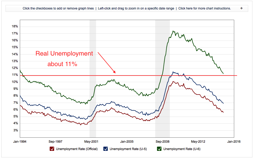
This looks pretty real and the way the data is collected and the parameters haven't changed.
originally posted by: ISawItFirst
Any chart or graph that does not show its math on either side, is propaganda. They have changed the formula so many times no two pieces of data are apples to apples. There is no factual argument to be had here, it's all disinformation and zealotry.
????
Did you just drop a flat, arbitrary line across all three unemployment measures..Spanning 20 years...and declare it "Real" Unemployment?
Now you are just being funny? Or desperate?...I'll give you funny..
Do you know how to read a chart. I'll help. They read left to right and from bottom to top. The terminus at the right is where the red line I drew, meets the plotted data. That is pretty much at 11%. Hope that helps.
originally posted by: Indigo5
originally posted by: Bilk22
This looks pretty real and the way the data is collected and the parameters haven't changed.
originally posted by: ISawItFirst
Any chart or graph that does not show its math on either side, is propaganda. They have changed the formula so many times no two pieces of data are apples to apples. There is no factual argument to be had here, it's all disinformation and zealotry.
????
Did you just drop a flat, arbitrary line across all three unemployment measures..Spanning 20 years...and declare it "Real" Unemployment?
Now you are just being funny? Or desperate?...I'll give you funny..
originally posted by: Bilk22
Typical of a lib to change the argument they started when they're proven to be very wrong.
originally posted by: Indigo5
originally posted by: Bilk22
Oh and instead of just regurgitating a chart with little reference to the true economy and population, it's useless and really false.
originally posted by: Indigo5
originally posted by: SpaDe_
As far as taking credit for the GDP increase, why don't we wait for January 30 when the 4th quarter numbers get released before we get all excited about the "growth".
Right..wait for January numbers before declaring a trend! Ignore the last 60 months! The GOP CHEERING FOR THE US ECONOMY TO FAIL
Here this should help you.
The Fiscal and Economic Impact of Immigration on the United States
Thanks for answering my question about how the GOP are going face the significant economic gains under a Democratic Administration in 2016....They will derail and talk about Immigration!
Hey Mitt...what do you think about President Obama's economic policies exceeding your own goals when you last ran for President?....Uh....I think our borders need to be secure!!
There is no "there" there in that post...so...not sure what you are looking for in a response?
Or is this the point where derail and baiting are what's left?
edit on 14-1-2015 by Indigo5 because: (no reason given)
originally posted by: Bilk22
Do you know how to read a chart. I'll help. They read left to right and from bottom to top. The terminus at the right is where the red line I drew, meets the plotted data. That is pretty much at 11%. Hope that helps.
originally posted by: Indigo5
originally posted by: Bilk22
This looks pretty real and the way the data is collected and the parameters haven't changed.
originally posted by: ISawItFirst
Any chart or graph that does not show its math on either side, is propaganda. They have changed the formula so many times no two pieces of data are apples to apples. There is no factual argument to be had here, it's all disinformation and zealotry.
????
Did you just drop a flat, arbitrary line across all three unemployment measures..Spanning 20 years...and declare it "Real" Unemployment?
Now you are just being funny? Or desperate?...I'll give you funny..
You do realize that chart is not some guy drawing lines? Like you did? There are actual formula's and data involved. Otherwise anyone could just draw lines?? can't believe I am explaining this? And spanning 20 years? You do realize the current President hasn't been in office for 20 years?
a reply to: neo96
The Zero Hedge source details how the rather large number is arrived at:
It also goes on to point out that the much more relevant statistic — the employment-population ratio — has been steady throughout. What I take issue with is the selection of data which is deliberately misleading:
March 2008: 62.7 percent
March 2009: 59.9 percent
OMG IT DROPPED 2.8 PERCENT IN THE FIRST THREE MONTHS OF THE OBAMA ADMINISTRATION!
or did it...
The remainder of 2008 saw a 1.7 percent drop from 62.7 to 61.0 percent. In fact, if you look at the tables at the source, you'll see that there was a very regular decrease from Jan '08 onward, slowing under Obama and more or less holding "remarkably steady" until 2014 (update your sources), which saw a reverse in the trend. The last three months it's been at 59.2 percent.
I'm not saying that the recovery has been anything to write home about — everyone is familiar with the shifts in the types of employment — but lets not cherry pick.
You may also want to check out the what the CBO has to say about lower labor force participation. It estimates that long-term trends (most notably retiring baby boomers) is a much larger factor (about twice as large) than people who aren't looking or work.
The Zero Hedge source details how the rather large number is arrived at:
When you add 11,742,000 working age Americans that are officially unemployed to the 89,967,000 working age Americans that are "not in the labor force", you come up with a grand total of 101,709,000 working age Americans that do not have a job.
It also goes on to point out that the much more relevant statistic — the employment-population ratio — has been steady throughout. What I take issue with is the selection of data which is deliberately misleading:
March 2008: 62.7 percent
March 2009: 59.9 percent
OMG IT DROPPED 2.8 PERCENT IN THE FIRST THREE MONTHS OF THE OBAMA ADMINISTRATION!
or did it...
The remainder of 2008 saw a 1.7 percent drop from 62.7 to 61.0 percent. In fact, if you look at the tables at the source, you'll see that there was a very regular decrease from Jan '08 onward, slowing under Obama and more or less holding "remarkably steady" until 2014 (update your sources), which saw a reverse in the trend. The last three months it's been at 59.2 percent.
I'm not saying that the recovery has been anything to write home about — everyone is familiar with the shifts in the types of employment — but lets not cherry pick.
You may also want to check out the what the CBO has to say about lower labor force participation. It estimates that long-term trends (most notably retiring baby boomers) is a much larger factor (about twice as large) than people who aren't looking or work.
edit on 2015-1-14 by theantediluvian because: (no reason given)
You've proven you really have no idea what you're talking about. Here's pick the numbers that you believe sell your flawed argument the best.
originally posted by: Indigo5
originally posted by: Bilk22
Do you know how to read a chart. I'll help. They read left to right and from bottom to top. The terminus at the right is where the red line I drew, meets the plotted data. That is pretty much at 11%. Hope that helps.
originally posted by: Indigo5
originally posted by: Bilk22
This looks pretty real and the way the data is collected and the parameters haven't changed.
originally posted by: ISawItFirst
Any chart or graph that does not show its math on either side, is propaganda. They have changed the formula so many times no two pieces of data are apples to apples. There is no factual argument to be had here, it's all disinformation and zealotry.
????
Did you just drop a flat, arbitrary line across all three unemployment measures..Spanning 20 years...and declare it "Real" Unemployment?
Now you are just being funny? Or desperate?...I'll give you funny..
You do realize that chart is not some guy drawing lines? Like you did? There are actual formula's and data involved. Otherwise anyone could just draw lines?? can't believe I am explaining this? And spanning 20 years? You do realize the current President hasn't been in office for 20 years?
Table A-15
You can't sell crap in a bathroom. There's always plenty to go around. There are other measures that show the economy is still in the toilet. People are not better off and if you try to sell that idea, most will laugh at you.
This is the real picture. From your CBO report.
originally posted by: theantediluvian
a reply to: neo96
The Zero Hedge source details how the rather large number is arrived at:
When you add 11,742,000 working age Americans that are officially unemployed to the 89,967,000 working age Americans that are "not in the labor force", you come up with a grand total of 101,709,000 working age Americans that do not have a job.
It also goes on to point out that the much more relevant statistic — the employment-population ratio — has been steady throughout. What I take issue with is the selection of data which is deliberately misleading:
March 2008: 62.7 percent
March 2009: 59.9 percent
OMG IT DROPPED 2.8 PERCENT IN THE FIRST THREE MONTHS OF THE OBAMA ADMINISTRATION!
or did it...
The remainder of 2008 saw a 1.7 percent drop from 62.7 to 61.0 percent. In fact, if you look at the tables at the source, you'll see that there was a very regular decrease from Jan '08 onward, slowing under Obama and more or less holding "remarkably steady" until 2014 (update your sources), which saw a reverse in the trend. The last three months it's been at 59.2 percent.
I'm not saying that the recovery has been anything to write home about — everyone is familiar with the shifts in the types of employment — but lets not cherry pick.
You may also want to check out the what theCBO has to say about lower labor force participation. It estimates that long-term trends (most notably retiring baby boomers) is a much larger factor (about twice as large) than people who aren't looking or work.
Other Indicators of Labor Market Slack
Another manifestation of slack in the labor market is the number of people who are employed but are not working as many hours as they would prefer. The incidence of part-time employment for economic reasons (resulting from slack work or business conditions or a worker’s inability to find full-time employment) remains much higher than it was before the recession (see the figure below). Consequently, the Bureau of Labor Statistics’ U-6 measure of underutilization in the labor market stood at 12.2 percent in the second quarter, down from a peak of 17.1 percent in fourth quarter of 2009 but still well above its value of 8.5 percent in the fourth quarter of 2007. (The U-6 measure combines the number of unemployed people with numbers for two other groups of people: those who are “marginally attached” to the labor force—that is, who are not currently looking for work but are willing and able to work and who have looked for work in the past 12 months—and those who are employed part-time for economic reasons.) Consistent with the trends in the U-6 measure, average hours worked per worker fell substantially during the recession and remain below their prerecession level.
a reply to: Bilk22
Check the numbers for the last 10 years. You can do that here.
U-6 will be at the bottom once you generate the tables. Starting with 8.4 in July of 2007, that figure either stayed the same or raised each month for quite some time. In fact, by December of 2008 it was 13.6% and 14.2% in January of 2009 when Obama was sworn in. It's been falling more or less steadily from a high of 17.1% (last seen in April of 2010).
By the beginning of 2014, it had fallen to 12.7 and it's been down each month since.
edit on 2015-1-14 by theantediluvian because: (no reason
given)
I always laugh, because it really does happen a lot, when gas prices were up...it was of course Obama's fault to all of my republican friends and
relatives...but now that Gas prices are down it's not his doing? LOL It probably isn't his doing on either direction, but you see why Fox News and
talk radio make people stupid. They blame the president for everything yet give him credit for nothing. That's not how real life works people.
Stop drinking the Koolaid!
a reply to: Bilk22
There's no debating that the 8.5% value in the fourth quarter of 2007 (prior to the recession) is better than the 11.2% seen in December 2014. As I stated (and you quoted) in my post:
Which of the measures of unemployment do you think Mitt Romney was referring to in this statement from his campaign page:
"We project the unemployment rate to be about 5.9 percent by the end of his first term in office"
It's actually impossible to tell but I think we can safely assume it was something middle of the road like the seasonally adjusted unemployment rate the BLS puts on the first page of unemployment statistics. In either case, Obama didn't actually meet the Romney promise (not in his first term) but then again we don't know what the numbers would have been under Romney either.
There's no debating that the 8.5% value in the fourth quarter of 2007 (prior to the recession) is better than the 11.2% seen in December 2014. As I stated (and you quoted) in my post:
I'm not saying that the recovery has been anything to write home about — everyone is familiar with the shifts in the types of employment — but lets not cherry pick.
Which of the measures of unemployment do you think Mitt Romney was referring to in this statement from his campaign page:
"We project the unemployment rate to be about 5.9 percent by the end of his first term in office"
It's actually impossible to tell but I think we can safely assume it was something middle of the road like the seasonally adjusted unemployment rate the BLS puts on the first page of unemployment statistics. In either case, Obama didn't actually meet the Romney promise (not in his first term) but then again we don't know what the numbers would have been under Romney either.
edit on 2015-1-14 by theantediluvian because: (no reason given)
originally posted by: boymonkey74
a reply to: Bilk22
Tongue in cheek dude tongue in cheek...
At the end of the day the financial crash happened and the economy has been getting better since then.
Do you deny this?.
Since the big international corporations really had little to do with the financial crash of 08, it would make sense that those big corporations would be the ones to dig themselves out after being victimized by the big banks and government policies that actually caused the crash in the first place.
Not to mention that the smaller businesses were not even involved in the mortgage securities manipulations and mortgage defaults that caused the crash.
But the small businesses dug themselves out pretty well without government help.
Obama is still way off the mark because Bush and a Republican Congress got unemployment way down to 4.4% before Democrats re-gained control of
Congress in 2007 to accelerate the crash scenario.
The real recovery may have actually started in 2011 when the Democrats lost full control.
Hard to argue with facts isn't it.
The real recovery may have actually started in 2011 when the Democrats lost full control.
Hard to argue with facts isn't it.
a reply to: Bilk22
LOL!
Can't sell crap at a bathroom!
Hey everyone the economy is doing great in one breathe. Then they turn around and say income inequality has never been greater!
You can't make this stuff up.
You can't sell crap in a bathroom. There's always plenty to go around. There are other measures that show the economy is still in the toilet. People are not better off and if you try to sell that idea, most will laugh at you.
LOL!
Can't sell crap at a bathroom!
Hey everyone the economy is doing great in one breathe. Then they turn around and say income inequality has never been greater!
You can't make this stuff up.
a reply to: neo96
besides the site ; 'shadow stats . com' will realistically contest all those fraudulent figures of Employment/GDP the OP pawns off as true & factual and un-manipulated...
hey OP, apply for a SPIN position with the Dems or the WH... you got a knack where reality does not stick to the SPIN...
see: ..Indigo5 stated:
"Mitt Romney promised by the end of his first term (December 2016) he would achieve... )
~~ reality being that IF Romney were elected back in his nomination cycle... his 1st term would have ended in 2012 !!!!
not 2016, as your spin wrongfully tells us
thanks for the balancing list of items there, Mr. neo96
edit on th31142126919714592015 by St Udio because: (no reason given)
Wow, this is great news! I'll go tell all my unemployed friends that the economy is doing super! They will be so happy!
a reply to: St Udio
I will expand on the Stock Market gains.
The Federal Reserves artificial manipulation of the interest rates kill other investment opportunities.
Checking with interest.
Savings accounts.
CD's.
Money markets.
Bonds.
To name a few.
Stocks are the only thing paying half way decent, and that is where people are putting their money.
I think we're on the same page. I just think it's very disingenuous by some here to paint a rosy picture of the economy. If anything, it's teetering on the razors edge and can fall precipitously should something rattle it in any way.
originally posted by: theantediluvian
a reply to: Bilk22
There's no debating that the 8.5% value in the fourth quarter of 2007 (prior to the recession) is better than the 11.2% seen in December 2014. As I stated (and you quoted) in my post:
I'm not saying that the recovery has been anything to write home about — everyone is familiar with the shifts in the types of employment — but lets not cherry pick.
Which of the measures of unemployment do you think Mitt Romney was referring to in this statement from his campaign page:
"We project the unemployment rate to be about 5.9 percent by the end of his first term in office"
It's actually impossible to tell but I think we can safely assume it was something middle of the road like the seasonally adjusted unemployment rate the BLS puts on the first page of unemployment statistics. In either case, Obama didn't actually meet the Romney promise (not in his first term) but then again we don't know what the numbers would have been under Romney either.
Some what to cite the stock market as a measure of success. It's a false measure of success and rather a measure of uncertainty as investors have no confidence of placing their investments in anything else. It also shows how week the rest of the global economies truly are. The US is actually considered a safe haven, comparatively. So the US broad markets moved up significantly, but this is going to change with the Fed abandoning QE.
new topics
-
President BIDEN's FBI Raided Donald Trump's Florida Home for OBAMA-NORTH KOREA Documents.
Political Conspiracies: 4 hours ago -
Maestro Benedetto
Literature: 6 hours ago -
Is AI Better Than the Hollywood Elite?
Movies: 6 hours ago -
Las Vegas UFO Spotting Teen Traumatized by Demon Creature in Backyard
Aliens and UFOs: 9 hours ago -
2024 Pigeon Forge Rod Run - On the Strip (Video made for you)
Automotive Discussion: 10 hours ago -
Gaza Terrorists Attack US Humanitarian Pier During Construction
Middle East Issues: 10 hours ago
top topics
-
President BIDEN's FBI Raided Donald Trump's Florida Home for OBAMA-NORTH KOREA Documents.
Political Conspiracies: 4 hours ago, 26 flags -
Krystalnacht on today's most elite Universities?
Social Issues and Civil Unrest: 15 hours ago, 9 flags -
Supreme Court Oral Arguments 4.25.2024 - Are PRESIDENTS IMMUNE From Later Being Prosecuted.
Above Politics: 15 hours ago, 8 flags -
Weinstein's conviction overturned
Mainstream News: 14 hours ago, 8 flags -
Gaza Terrorists Attack US Humanitarian Pier During Construction
Middle East Issues: 10 hours ago, 8 flags -
Massachusetts Drag Queen Leads Young Kids in Free Palestine Chant
Social Issues and Civil Unrest: 12 hours ago, 7 flags -
Las Vegas UFO Spotting Teen Traumatized by Demon Creature in Backyard
Aliens and UFOs: 9 hours ago, 6 flags -
Meadows, Giuliani Among 11 Indicted in Arizona in Latest 2020 Election Subversion Case
Mainstream News: 12 hours ago, 5 flags -
2024 Pigeon Forge Rod Run - On the Strip (Video made for you)
Automotive Discussion: 10 hours ago, 4 flags -
Is AI Better Than the Hollywood Elite?
Movies: 6 hours ago, 3 flags
active topics
-
Supreme Court Oral Arguments 4.25.2024 - Are PRESIDENTS IMMUNE From Later Being Prosecuted.
Above Politics • 90 • : Lumenari -
Las Vegas UFO Spotting Teen Traumatized by Demon Creature in Backyard
Aliens and UFOs • 12 • : KrustyKrab -
Gaza Terrorists Attack US Humanitarian Pier During Construction
Middle East Issues • 28 • : firerescue -
SHORT STORY WRITERS CONTEST -- April 2024 -- TIME -- TIME2024
Short Stories • 23 • : DontTreadOnMe -
President BIDEN's FBI Raided Donald Trump's Florida Home for OBAMA-NORTH KOREA Documents.
Political Conspiracies • 16 • : Astyanax -
Truth Social goes public, be careful not to lose your money
Mainstream News • 130 • : Astyanax -
Is AI Better Than the Hollywood Elite?
Movies • 13 • : Justoneman -
Hate makes for strange bedfellows
US Political Madness • 47 • : 19Bones79 -
-@TH3WH17ERABB17- -Q- ---TIME TO SHOW THE WORLD--- -Part- --44--
Dissecting Disinformation • 689 • : daskakik -
University of Texas Instantly Shuts Down Anti Israel Protests
Education and Media • 265 • : Astrocometus