It looks like you're using an Ad Blocker.
Please white-list or disable AboveTopSecret.com in your ad-blocking tool.
Thank you.
Some features of ATS will be disabled while you continue to use an ad-blocker.

SEEKING MEMBER INPUT: ATS.5/3 - give your feedback -- UPDATES May 28, 2013
page: 2share:
I am using Firefox version 15.0.1. It looks, in my opinion a little monotone, but I understand it is for streamlining content for the browsers. I am
really going to miss the fading blue top to the pages, I really liked that. I noticed a couple of replies mentioned the colored font and wanted to
note they look fine to me at least on my browser. They are not too bold nor too set back from the white text, however, I did notice instead of red it
appears to be more of a burn sienna color which I like as a dull off color to distinguish headlines but there is a sky or baby blue used as well. I
would standardize the coloring to be all "bright and vibrant" or duller "burnt" colors to set uniformity.
I would really like to see what a "MyATS" page and or others, like a thread page, for a comparison.
There is my opinion such as it is.
Edit to add: I am not sure if I am missing something or not but I see all the comments about it being full screen and wonder. I have a blank section down my right side about the width of a column, Is this for a sidebar or is something not showing right?
Edit to add a second time: I wish that it was not the sites responsibility to conform to suit all the different device formats. These devices should be set to conform to what is there. Just like when you go out and buy a lamp the plug conforms regardless of the brand, you don't need to get an adapter for such. Internet access should be uniform on all devices. Again just my opinion such as it is.
edit on 12-9-2012 by Agarta because:
(no reason given)
Not trying to take up too much room on the thread but posting these for comparing, I think the format of the outlining is better.
I think it looks good but maybe just maybe darken the background colour just one shade or two.
We don't do smart phones or whatever here but I find it just a bit hard on the eyes.
You asked and I said, I could probably be totally wrong but that is how I see it.
Thanks for keeping this site up to date with the latest and greatest, change is good as long as most agree.
Regards, Iwinder
We don't do smart phones or whatever here but I find it just a bit hard on the eyes.
You asked and I said, I could probably be totally wrong but that is how I see it.
Thanks for keeping this site up to date with the latest and greatest, change is good as long as most agree.
Regards, Iwinder
reply to post by SkepticOverlord
It looks good SkepticOverlord, but like someone suggested, the "purple / red" headers on some are a bit hard to read. Perhaps a different shade of "purple / red"? I like how it adjusts to the different screen sizes.
Good job!
It looks good SkepticOverlord, but like someone suggested, the "purple / red" headers on some are a bit hard to read. Perhaps a different shade of "purple / red"? I like how it adjusts to the different screen sizes.
Good job!
I really don't enjoy the look.
It looks very bland.
I understand the need for the redesign to suit devices, but there needs to be a little more contrast in appearance.
Then again I understand that you need a quick loading time and you need to stand out as unique at the same time.
It's not very appealing to me. The content all blends.
I don't know how possible it is... but what if you could make the font color of the titles equate to the color code of a particular thread topic? Is there a program that would allow you to do that? Much like how you have the topics somewhat color coded now?
A little color here would go a long way towards making it bust out.
But I will enjoy ATS based on the information more than the colors I suppose!
It looks way better than the boxy looking front page we have now
But please can we get the mouse over box back on the forums page , the one that when you put your mouse on a forum it would popup and let you sort by newest threads etc
But please can we get the mouse over box back on the forums page , the one that when you put your mouse on a forum it would popup and let you sort by newest threads etc
reply to post by SkepticOverlord
I'm old. I don't like change on gadgets and high tech stuff. It's hard for me to learn.
That being said ... I like how it is now. If it's not broken then don't fix it.
(if anyone cares what I think)
I'm old. I don't like change on gadgets and high tech stuff. It's hard for me to learn.
That being said ... I like how it is now. If it's not broken then don't fix it.
(if anyone cares what I think)
reply to post by SkepticOverlord
It APPEARS to me that the biggest change is no left column, avatars etc.
That's fine with me. At least I'd prefer to be able to close out the left column and not see avatars as an option. I prefer the real estate to be available for reading the text etc.
In general, I appreciate sites more that allow some customization of the major features.
I'd prefer to be able to choose a dull soft blue background, for example, to read text against.
Otherwise the template example seems clean enough; straightforward enough; full of plenty of information.
Thanks for asking.
Originally posted by FlyersFan
If it's not broken then don't fix it.
Well, that's just it... it's "broken."
The current front-end of ATS is not compatible with the evolution of browsers and devices.
reply to post by BO XIAN
If you go nito your Tools section:
www.abovetopsecret.com...
You can actually set it so that Avatars and Backgrounds do not appear.
~Tenth
If you go nito your Tools section:
www.abovetopsecret.com...
You can actually set it so that Avatars and Backgrounds do not appear.
~Tenth
Originally posted by BO XIAN
It APPEARS to me that the biggest change is no left column, avatars etc.
What you're seeing is the design concept applied to the SITE HOME only. Everything you've come to expect from ATS -- avatars, mini-profile backgrounds, etc., will still be part of the new design.
reply to post by SkepticOverlord
DRATS! Okay .. well then ... I guess ya'll have to fix it.
I'll just have to figure it out. (wish I wasn't so untech-ish)
DRATS! Okay .. well then ... I guess ya'll have to fix it.
I'll just have to figure it out. (wish I wasn't so untech-ish)
Originally posted by pillock
But please can we get the mouse over box back on the forums page , the one that when you put your mouse on a forum it would popup and let you sort by newest threads etc
That has been redesigned... the feature is just in a different place now, and more obvious.
Originally posted by SkepticOverlord
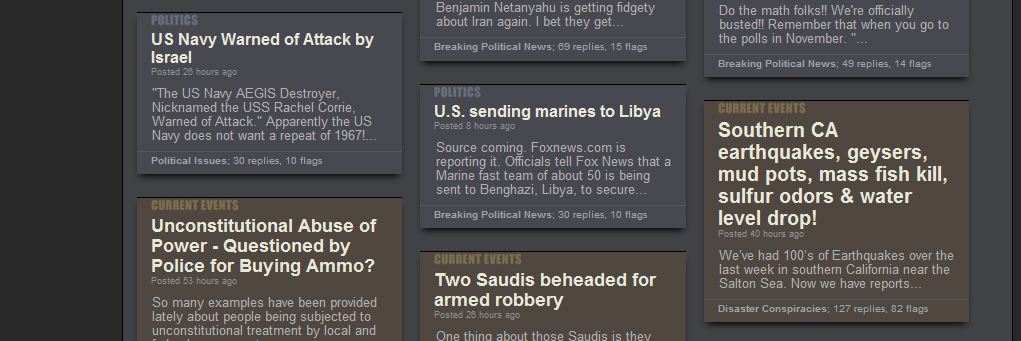
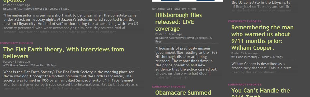
So here we are again, just about 3 years since we began our last redesign, and it's time to push the mothership into this decade with a completely new "front end" that's compatible with modern browsers, and much more efficient.
I'm beginning a massive overhaul of ATS so that we end up with what's commonly known as a "Responsive Web Application" -- or -- a website that works normally on your desktop/laptop, yet gracefully scales down to run like a app on your smart phone and tablet.
Here's a look at a functioning preliminary design concept...
www.abovetopsecret.com...
Many structural ideas are borrowed from our existing site home, but the colors are a bit less dark, the content can be wider, and the overall User Experience is much more clean and obvious.
This version has not been reliably tested on all browsers yet. But you should see something close to this image (which is scaled 50%)

Since this is a significant redesign effort, I'm checking in on our members to get your feedback as I begin work on the rest of the pages.
Thoughts?
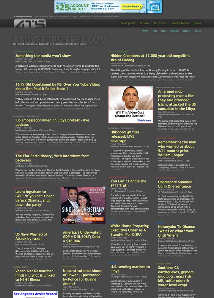
looks nice but i'm not seeing the two images on firefox that you show in the example above.
Some of the colors have been refined a bit.
I'm on a big lovely, color-calibrated new Mac monitor -- then I opened my PC craptop.
I'm on a big lovely, color-calibrated new Mac monitor -- then I opened my PC craptop.
reply to post by SkepticOverlord
I edited my above post to pose a question about the right side of the page and fear it might have been missed. I don't mean to seem pushy about it so if it is a non issue please do not feel you must reply. Thank you.
Agarta
P.S. My second edit is more of a stated rant and can be ignored lol sorry.
I edited my above post to pose a question about the right side of the page and fear it might have been missed. I don't mean to seem pushy about it so if it is a non issue please do not feel you must reply. Thank you.
Agarta
P.S. My second edit is more of a stated rant and can be ignored lol sorry.
Hmm, usually the first impression of these things is always negative, so it will probably grow on me with time, but..
its hard to distinguish between topics of interest and everything else. Apart from the very insignificant color labels its basically just grey, dark grey and doe-skin.
Maybe you could better identify the topics around the headings? for example the light blue of fragile earth,i like these topics and when looking at the recent posts scan for this color. I think you need to emphasize topics as well as threat titles.
I've been browsing ATS for at least a good 12 years now, and I must say the current site design is my favorite. I like the colored backgrounds to the
topics that differentiate the subforums as it keeps everything from flowing together into one big mess.
I don't mind the simple layout you are proposing. Simple, clean, easy to use, and quick is always better. In my opinion if you are going to go with that, keep the varied colored topic backgrounds. It just looks better than all gray.
Also I have a fun suggestion. How about a topic randomizer? Phones and tablets these days have movement sensors for things such as screen orientation and these are used in apps for fun things like digital dice. I think having the ability to "shake" your phone and have a slew of random topics pop-up in place of the homepage could be fun and would encourage delving into other topics that wouldn't otherwise get attention without all the stars and flags. Heck this could be done with a simple button at the bottom. Just a suggestion on a fun feature.
EDIT: Also I prefer the current blue banner at the top that contains the Home, Forums, myATS, etc buttons. On the new design again it just kinda blends in with all that gray. I like the cleaner set up, but would like to see a splash of color. IMO the blue/gray scheme you have going on now is nice on they eyes.
edit on 12-9-2012 by WhiteSpectralMirror because: (no reason given)
I like it...will have to try it on the i phone later. May just need to brighten the fonts up a little for when you are on a mobile device outside on a
sunny day.
As they say, everyone has an opinion and I am no different.
The dark gray background has always been in my opinion a plus over other sites who go with bright white and black letters.
I know it may sound mundane to some, but being able to read a thread with a gray background is ideal and being able to read a thread with such a background in my opinion has benefited ATS members ability to read, search and post.
Going to white and too bright is to me a big mistake. Just offering an opinion about the only area that I feel would upset me to see you change. All the rest is eye candy, but ATS sets a mood with its background used for reading and posting and that to me has been a big part of my historical participation.
A good site with a good background is hard to find. Don't change it just for the sake of change, especially when its working well.
Thanks for the heads up.
new topics
-
W.H.O when this is signed it is over.
US Political Madness: 3 hours ago -
The Great Mosaic of God Unfolding Before Our Eyes
Religion, Faith, And Theology: 10 hours ago
top topics
-
Silent Weapons
General Conspiracies: 13 hours ago, 7 flags -
New Whistleblower: "I worked on a team that dealt with with NHI technology and left in 2018."
Aliens and UFOs: 17 hours ago, 6 flags -
The Great Mosaic of God Unfolding Before Our Eyes
Religion, Faith, And Theology: 10 hours ago, 4 flags -
W.H.O when this is signed it is over.
US Political Madness: 3 hours ago, 3 flags
active topics
-
It's all Kicking off at Eurovision 2024
Music • 13 • : Hellmutt -
Breaking--Hamas Accepts New Cease Fire
Middle East Issues • 488 • : jofafot -
Mood Music Part VI
Music • 3191 • : Hellmutt -
Need help understanding the evolution of WHO as a power structure. Shades of the NWO...?
New World Order • 5 • : Station27 -
15.6 Percent of US Population Now Foreign Born - 51.6 Million
Social Issues and Civil Unrest • 51 • : EnzoTrent -
Gaza Genocide Real or Propaganda
Middle East Issues • 360 • : bastion -
According to Wiki, HAMAS is the same as "Palestinians"
US Political Madness • 38 • : bastion -
The biggest problem with the Hush money trial
US Political Madness • 210 • : Annee -
Pastor Congratulates Women For Following Scripture - No Jewelry and No Braided Hair.
Conspiracies in Religions • 127 • : WeMustCare -
W.H.O when this is signed it is over.
US Political Madness • 3 • : annonentity