It looks like you're using an Ad Blocker.
Please white-list or disable AboveTopSecret.com in your ad-blocking tool.
Thank you.
Some features of ATS will be disabled while you continue to use an ad-blocker.

SEEKING MEMBER INPUT: ATS.5/3 - give your feedback -- UPDATES May 28, 2013
page: 3share:
Looks okay but I prefer the look of the current design.
Stick with darker background colours. Reduces energy costs and overall carbon footprint.
Also, will the new design have any impact on bandwidth? Does the new design involve developing any built-in future-proofing?
Stick with darker background colours. Reduces energy costs and overall carbon footprint.
Also, will the new design have any impact on bandwidth? Does the new design involve developing any built-in future-proofing?
reply to post by SkepticOverlord
With the current layout my mind can access a large number of threads back and forth which makes it easier for me to target those that are of interest to me in a mentally efficient way. The amount of choice and easy accessability is appealing and the ease in which you can navigate back and forth from various threads is great while not missing out on all the new threads. It is great for how quickly the mind naturally works with the current style. It is appealling for the number of choices one has in every direction possible right there in front of the eye which is pleasing to a hungry mind.
The new one proposed appears to me at least, not efficient nor indepthly user friendly in terms of quantity and efficiency of use. It seems like the dumbdown version of the typical ATS presentation which allows one's mind to wander in all different directions all at once in order to centralize a pick. It reminds of bifocals really, targetting a smaller quantity of threads making it more time consuming to delve into various threads in a seemingly simultaneous fashion reading and researching on a back and forth basis.
So basically while one is more complex and appealling to the complexity of the brain in all it's choices the other is simply more simple.
It does however seem to be more user friendly in a more simplistic form. That is if you like less thread choices which limit your quick eye access and less time effeciency for researching threads quickly back and forth. But like all things, we will acknowledge your hard work and appreciate it, maybe even growing to like what is new even moreso.
edit on 12-9-2012 by Egyptia because: (no reason given)
looks good ... only thing can think to add is make it so can upload pics / vid from android mobiles as not everyone has pc / laptops... plus if people
out and about they can upload pics of them with bigfoot ... nessie.. m.i.b.s or those elusive u.f.o's ... then is no excuse for no pics...
I use rooted android with ucweb or maxthon browser ats works well now aside from not being able to upload pics / vids...
I use rooted android with ucweb or maxthon browser ats works well now aside from not being able to upload pics / vids...
edit on 12/9/12 by
Expat888 because: minor correction...
Im confused, the design, from an aesthetic stand point isnt changing and that is disappointing. it is disappointing to me atleast.
The dark, the grey, i think there should be 2 versions you can choose from. the dark and the light. you can totally revamp this site and i would be willing to design them for free. i am no good at webdesign beyond the design aspect, putting it into practice would be harder. i am a print designer and could make something beautiful but ut would take a web developer to put it into the physical.
The dark, the grey, i think there should be 2 versions you can choose from. the dark and the light. you can totally revamp this site and i would be willing to design them for free. i am no good at webdesign beyond the design aspect, putting it into practice would be harder. i am a print designer and could make something beautiful but ut would take a web developer to put it into the physical.
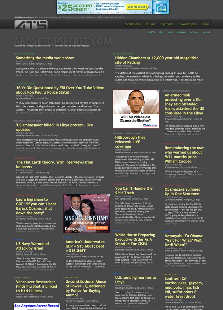
Originally posted by SkepticOverlord
So here we are again, just about 3 years since we began our last redesign, and it's time to push the mothership into this decade with a completely new "front end" that's compatible with modern browsers, and much more efficient.
I'm beginning a massive overhaul of ATS so that we end up with what's commonly known as a "Responsive Web Application" -- or -- a website that works normally on your desktop/laptop, yet gracefully scales down to run like a app on your smart phone and tablet.
Here's a look at a functioning preliminary design concept...
www.abovetopsecret.com...
Many structural ideas are borrowed from our existing site home, but the colors are a bit less dark, the content can be wider, and the overall User Experience is much more clean and obvious.
This version has not been reliably tested on all browsers yet. But you should see something close to this image (which is scaled 50%)

Since this is a significant redesign effort, I'm checking in on our members to get your feedback as I begin work on the rest of the pages.
Thoughts?
Not too sure yet, it feels like a big run on sentence to me... No true area(s) to focus on, all I want to do is skim for some reason....
I like dashboard views.....
edit on 12-9-2012 by syrinx2112 because: (no reason given)
If you don't regularly update technology. You fall behind.
Can't have that.
Can't have that.
I'm anxious to see what all is being considered for the redesign efforts. I'm also excited about fully functional pages for mobile devices! Great
move on expanding the functionality!
In looking at the first offering for opinions, I have to say it looks great. I love the open and borderless nature of the story headlines as they sit in relation to each other. It makes it a lot easier on the eyes and quicker to scan the page as a whole.
If I might offer one suggesting at this stage though, I think it would add to the ability to more easily read the headlines at a glance or a small screen, if not carrying it to the text below as well. It's technical in nature, but if the design/coding people could play with the typography a bit and specifically the tracking. I'd love to see what the front page headlines look like with tracking set to +25 and +50. I'm thinking +50 or so would have a subtle change in literal spacing but may bring a rather dramatic difference to the eyes. Just my offering on an idea.
Thanks for throwing this out for Member feedback. I've got to say, that's a very rare thing to see done on a large scale site.
There's also a slight imbalance in the top part. The "abovetopsecret.com/the internet's most popular etc..." graphic is a titch too far down
compared with the top of the container it's in, and it makes the myATS/tools/etc menu seem a little too high up. Of course, I have design OCD, so
uhhh. Yeah.
There could also be a bit better delineation between each different thread and its blurb, perhaps just a link color with more pop.
Other than that, the functionality seems pretty good, and I can definitely see that this setup would provide a better user experience for those on tablets and other mobile devices.
I like the new design, it looks streamlined.
I would have to agree with people saying a darker shade of background would be good.
I have to ask as well, I remember when I first started contributing here and the big contributors never haadd ons on their pages, can we bring that back? I love the site but hate seeing adds, and maybe we could eliminate them for WATS people.
Thanks and can't wait to see the revamp.
Pred...
edit on 12-9-2012 by predator0187 because: (no reason given)
edit on 12-9-2012 by predator0187 because: (no reason
given)
reply to post by SkepticOverlord
I suppose that a lot of people have Ipads and other devices that rely on apps. I don't have one myself. That page was difficult for me to read because the letters were too tiny.
What I like is the easy access to topics. They are categorized so the search for topics is easily understood. I don't like to have to search through endless links of pictures to find what I want. Facebook ruined everything when it came to the timeline and this looks like a timeline. But maybe I am wrong. I like ATS as it is now and will have no use for mobile apps. Perhaps those who do have mobile apps will find it appealing.
I like categorization, it makes the experience so much better.
Originally posted by lycosa
There's also a slight imbalance in the top part. The "abovetopsecret.com/the internet's most popular etc..." graphic is a titch too far down compared with the top of the container it's in, and it makes the myATS/tools/etc menu seem a little too high up. Of course, I have design OCD, so uhhh. Yeah.
There could also be a bit better delineation between each different thread and its blurb, perhaps just a link color with more pop.
Other than that, the functionality seems pretty good, and I can definitely see that this setup would provide a better user experience for those on tablets and other mobile devices.
Yes, I agree. There was little dileanation between the threads. I hate going to websites to find what I need and each link is not clearly marked for what it should be. The way ATS is now on the web browser for the pc is fine. Just do the other for mobile apps.
Originally posted by blackmetalmist
I love it ! Except for the red color in the letters. Maybe you guys can choose another color. The red against the grey kinda makes it not stand out.
Agree. The color used for MyATS, Chat, and Tools, stands out much better than the red and the green. Other than that, the page looks good.
reply to post by SkepticOverlord
Looks fine, though I rarely use that page, and just access things from MyATS.
That said, I found a thread on William Cooper, which I enjoyed, via your new page, so maybe I should be reading that one instead
Looks fine, though I rarely use that page, and just access things from MyATS.
That said, I found a thread on William Cooper, which I enjoyed, via your new page, so maybe I should be reading that one instead
Bring back the old site. You (ATS) have force members to leave since the "Main ats Home" is completely dull and boring.
What happen to the ats girls?
I dont know, these format changes tend to make people leave instead of register. ATS has been dull as hell since the "home" thread change.
Shameful
What happen to the ats girls?
I dont know, these format changes tend to make people leave instead of register. ATS has been dull as hell since the "home" thread change.
Shameful
was of topic, removed it.
edit on 12-9-2012 by Destinyone because: (no reason given)
Originally posted by Jordan River
reply to post by Destinyone
I thought this was a member input, not sarcasm 101
You are right, I apologize and deleted my previous post.
Des
I mostly like it, the only thing I wasn't crash hot about is the home screen example and it's vague subject/forum sections. It looks like it's a whole
page with yellow writing all over it? You could have colours that denote priority i.e. "Breaking News" could be red etc BUT BOLD AND MUCH
LARGER
Perhaps you could box out sections...? Just to group things slightly rather than a page of text?
Just a thought, other than that.......nice.
Perhaps you could box out sections...? Just to group things slightly rather than a page of text?
Just a thought, other than that.......nice.
edit on 12-9-2012 by CaptainBeno because: (no reason given)
Originally posted by FlyersFan
reply to post by SkepticOverlord
I'm old. I don't like change on gadgets and high tech stuff. It's hard for me to learn.
That being said ... I like how it is now. If it's not broken then don't fix it.
(if anyone cares what I think)
I agree,
I like the way it is now. I can zip around the site quickly and to me it's classy the way it is. The new one looks too cluttered and I've never liked ads in my face when looking for content.
I believe a function like many forums have that allow the user to change color schemes to their liking might go a long way in convincing a lot of members to accept the change tho.
2 cents.
Peace
edit on 12-9-2012 by jude11 because: (no reason given)
new topics
-
Supreme Court Oral Arguments 4.25.2024 - Are PRESIDENTS IMMUNE From Later Being Prosecuted.
Above Politics: 1 hours ago -
Krystalnacht on today's most elite Universities?
Social Issues and Civil Unrest: 1 hours ago -
Chris Christie Wishes Death Upon Trump and Ramaswamy
Politicians & People: 1 hours ago -
University of Texas Instantly Shuts Down Anti Israel Protests
Education and Media: 3 hours ago -
Any one suspicious of fever promotions events, major investor Goldman Sachs card only.
The Gray Area: 6 hours ago -
God's Righteousness is Greater than Our Wrath
Religion, Faith, And Theology: 10 hours ago
top topics
-
VP's Secret Service agent brawls with other agents at Andrews
Mainstream News: 14 hours ago, 11 flags -
Nearly 70% Of Americans Want Talks To End War In Ukraine
Political Issues: 15 hours ago, 6 flags -
Sunak spinning the sickness figures
Other Current Events: 15 hours ago, 5 flags -
Supreme Court Oral Arguments 4.25.2024 - Are PRESIDENTS IMMUNE From Later Being Prosecuted.
Above Politics: 1 hours ago, 4 flags -
Electrical tricks for saving money
Education and Media: 13 hours ago, 4 flags -
Krystalnacht on today's most elite Universities?
Social Issues and Civil Unrest: 1 hours ago, 3 flags -
Late Night with the Devil - a really good unusual modern horror film.
Movies: 17 hours ago, 3 flags -
Any one suspicious of fever promotions events, major investor Goldman Sachs card only.
The Gray Area: 6 hours ago, 2 flags -
University of Texas Instantly Shuts Down Anti Israel Protests
Education and Media: 3 hours ago, 2 flags -
Chris Christie Wishes Death Upon Trump and Ramaswamy
Politicians & People: 1 hours ago, 1 flags
active topics
-
University of Texas Instantly Shuts Down Anti Israel Protests
Education and Media • 83 • : FlyersFan -
The Reality of the Laser
Military Projects • 49 • : 5thHead -
British TV Presenter Refuses To Use Guest's Preferred Pronouns
Education and Media • 154 • : PorkChop96 -
Nearly 70% Of Americans Want Talks To End War In Ukraine
Political Issues • 73 • : Vermilion -
Supreme Court Oral Arguments 4.25.2024 - Are PRESIDENTS IMMUNE From Later Being Prosecuted.
Above Politics • 2 • : xuenchen -
President BIDEN Vows to Make Americans Pay More Federal Taxes in 2025 - Political Suicide.
2024 Elections • 142 • : xuenchen -
Chris Christie Wishes Death Upon Trump and Ramaswamy
Politicians & People • 6 • : mysterioustranger -
"We're All Hamas" Heard at Columbia University Protests
Social Issues and Civil Unrest • 282 • : 5thHead -
Candidate TRUMP Now Has Crazy Judge JUAN MERCHAN After Him - The Stormy Daniels Hush-Money Case.
Political Conspiracies • 745 • : network dude -
-@TH3WH17ERABB17- -Q- ---TIME TO SHOW THE WORLD--- -Part- --44--
Dissecting Disinformation • 664 • : 777Vader