It looks like you're using an Ad Blocker.
Please white-list or disable AboveTopSecret.com in your ad-blocking tool.
Thank you.
Some features of ATS will be disabled while you continue to use an ad-blocker.

Ebola - my visual charts & projections based on WHO data
page: 27share:
a reply to: soficrow
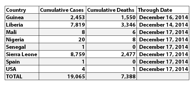
You're welcome, and thank you too. I may be a little slower with the updates on the charts over the holidays, but will try to update them at least once a week or so. Since your post a few days ago, some more numbers have been released.
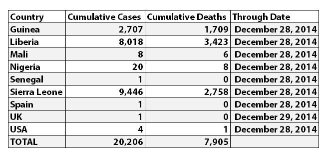
According to WHO, the latest reported numbers for Ebola cases and deaths were:
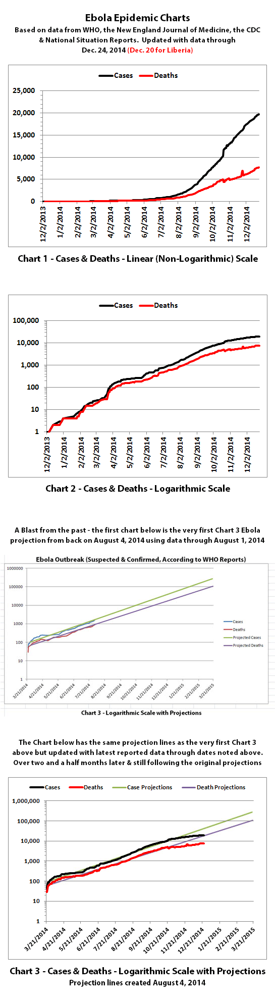
I've updated the Ebola charts with the latest data. Explanations of the charts are below.


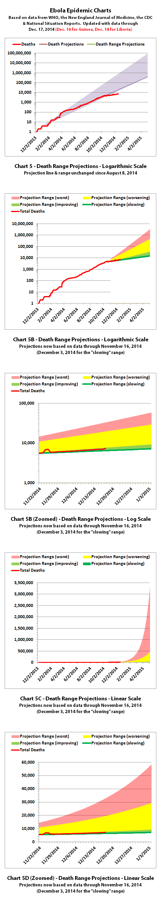

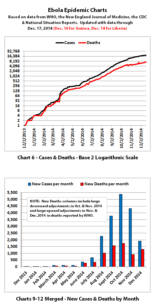

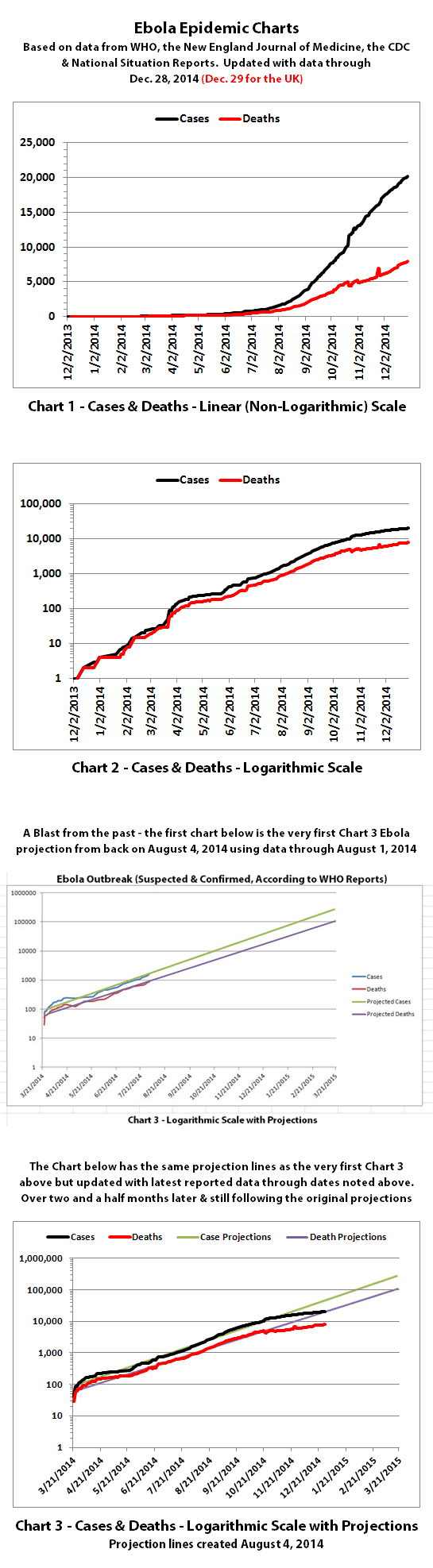
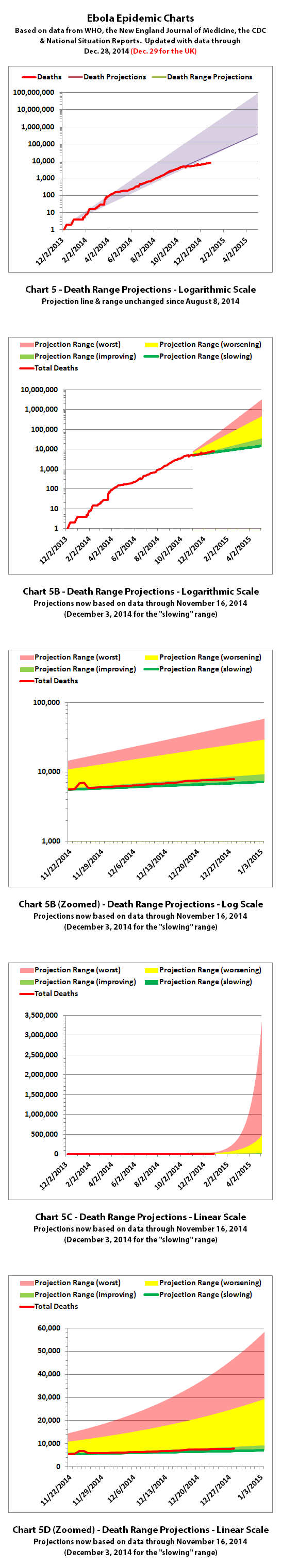
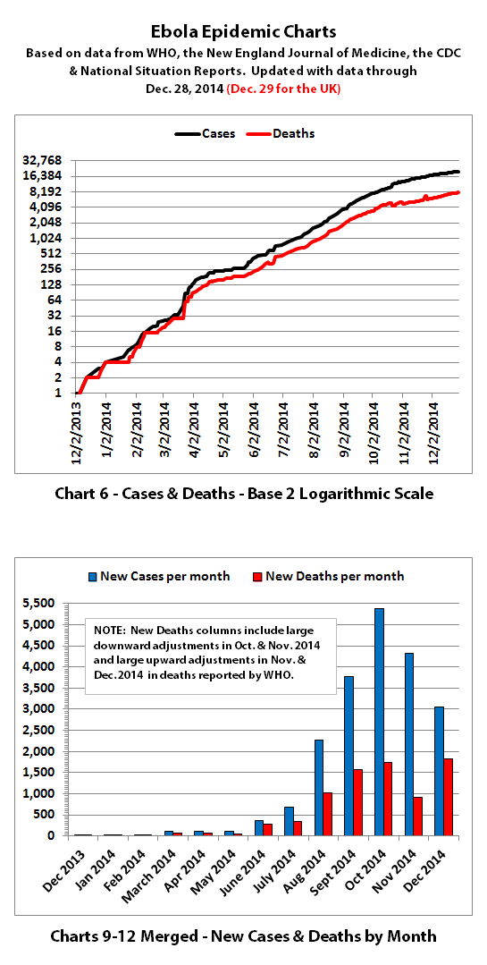
Charts 1, 2, and 6 show the cumulative numbers of reported cases and deaths so far. In Chart 1, the y (left) axis is linear. In Chart 2, the y axis is a logarithmic scale where major divisions of the axis increase by powers of 10 (the base is 10). Chart 6 has the y axis in powers of 2 (the base is 2, so 1, 2, 4, 8, etc.), so each major division represents a doubling of the numbers.
Exponential growth will look like a rapidly escalating curve on a linear scale but like a straight line on a logarithmic scale (base 10 or base 2 in these charts). Linear growth will look like a straight line on a linear scale and like a curve approaching a flat horizontal line on an exponential scale.
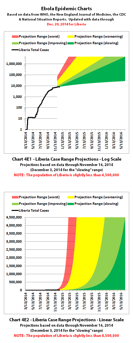
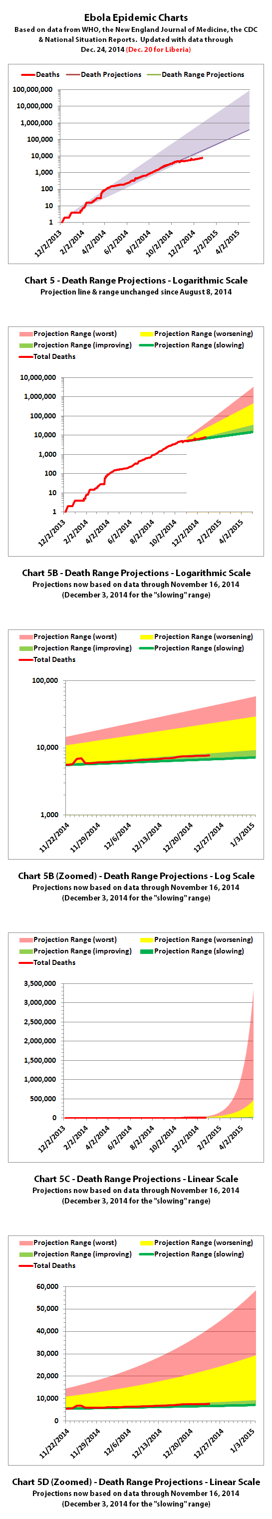
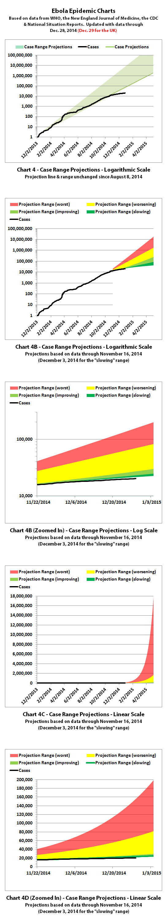
Charts 3, 4, and 5 are historical projections that would have been most likely if nothing changed to slow or stop the spread. For quite a while, reported cases and deaths followed these projections closely. But reported numbers have finally been dropping below these historical projections for the last couple months. That may be temporary, or it may be due to problems in collecting or reporting data, or it may (hopefully!) be a real improvement that will continue.
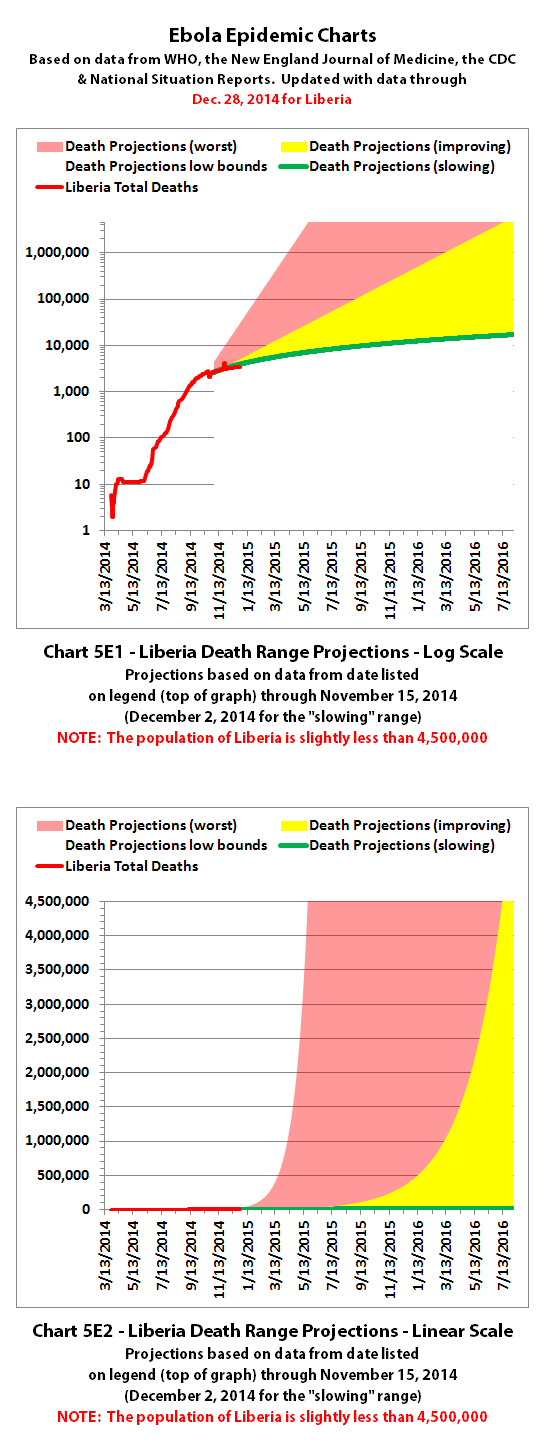
Charts 4B-4E and 5B-5E include more recently updated projections. For charts with color coded ranges, the green ranges are the projection if the spread continues as it has over recent weeks. The darker green in the lower part of some ranges would be expected if the spread continues to trend away from exponential growth toward linear growth (toward the bottom of the shaded areas).
The yellow range would be expected if the trend goes back to spreading at previous faster rates. And the red range would be expected if it starts growing again at the worst rates experienced so far during this epidemic.
Charts 7-8 were discontinued quite a while back.
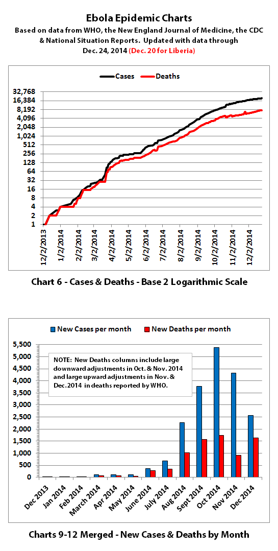
Charts 9-12 were merged previously, and the combined chart shows monthly new cases and deaths reported.
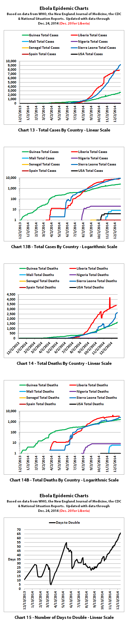
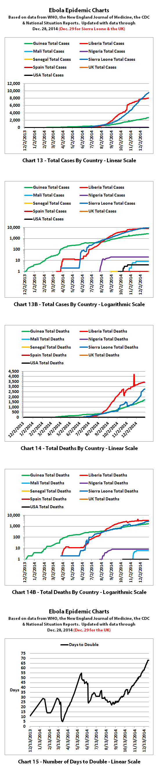
Charts 13-14B show cumulative cases and deaths by country.
Chart 15 shows how many days it has taken for the cumulative number of cases to double over time. Higher points in the chart are good, they mean it is taking longer to double. Lower points are bad, they mean it is doubling faster. Previously cases doubled every 3 to 4 weeks. But for the last several months, the doubling rate has been slowing down. Currently, cases are doubling in about 2 months according to reported numbers.
The charts do not include the Congo, as that was allegedly an unrelated outbreak and it has been declared over.
These charts rely on 'official' reported numbers and can only be as accurate as that data. Reported Ebola data is subject to change as cases and deaths are reclassified, or as data sources or reporting methods change. I do not know how accurate 'official' reported numbers are, but there are a number of possible issues:
1. WHO,the CDC, Doctors Without Borders (MSF), etc. have in the past stated that actual cases and deaths "vastly" outnumber reported figures, possibly by at least 2 to 5 times.
2. There have been sudden large decreases or increases over the last several months in officially reported cases and deaths. It is unclear whether decreases represent improvements. The decreases and increase may all be due to an inability to keep up with data tracking and recording.
3. Many countries have clamped down on Ebola news. At least one journalist has been arrested and at least one newspaper has been closed in west Africa. In the USA, an 'Ebola Czar' with a reputation as a political/public relations 'fixer' (and with no medical experience) was appointed to lead the US Ebola effort.
4. There are theories regarding Ebola that differ from the 'official' reports. Some believe there is no such thing as Ebola or that what is spreading is not Ebola. Some believe there is no outbreak at all. Some believe people are purposely being infected for economic or depopulation plans. I do not know if there is any truth to any of these beliefs, it can be a strange world.
The same disclaimers and references apply to all of these charts:
Charts and future projections were done by me, not by WHO, except in cases where it is stated that a chart includes WHO projections. I am not an Ebola expert, epidemiologist, virologist, or MD, but I manually compiled the data used to create these graphs from news updates on the following websites:
SOURCE: WHO website 1
SOURCE: WHO website 2
SOURCE: WHO website 3
SOURCE: WHO website 4
SOURCE: WHO website 5
SOURCE: CDC website 1
SOURCE: The New England Journal of Medicine
SOURCE: Guinea Situation Reports (posted on Humanitarian Response)
[NOTE: Situation Reports from Guinea are in French.]
SOURCE: Liberia Situation Reports
Mali Ministry of Sanitation and Hygiene
[NOTE: Situation Reports from Mali are in French.]
SOURCE: Sierra Leone Situation Reports
Please do not do anything you might regret based on charts or projections. Hopefully efforts to contain, quarantine, treat, prevent, or cure Ebola will eventually be successful, and hopefully sooner rather than later.
You're welcome, and thank you too. I may be a little slower with the updates on the charts over the holidays, but will try to update them at least once a week or so. Since your post a few days ago, some more numbers have been released.
According to WHO, the latest reported numbers for Ebola cases and deaths were:
I've updated the Ebola charts with the latest data. Explanations of the charts are below.
Charts 1, 2, and 6 show the cumulative numbers of reported cases and deaths so far. In Chart 1, the y (left) axis is linear. In Chart 2, the y axis is a logarithmic scale where major divisions of the axis increase by powers of 10 (the base is 10). Chart 6 has the y axis in powers of 2 (the base is 2, so 1, 2, 4, 8, etc.), so each major division represents a doubling of the numbers.
Exponential growth will look like a rapidly escalating curve on a linear scale but like a straight line on a logarithmic scale (base 10 or base 2 in these charts). Linear growth will look like a straight line on a linear scale and like a curve approaching a flat horizontal line on an exponential scale.
Charts 3, 4, and 5 are historical projections that would have been most likely if nothing changed to slow or stop the spread. For quite a while, reported cases and deaths followed these projections closely. But reported numbers have finally been dropping below these historical projections for the last couple months. That may be temporary, or it may be due to problems in collecting or reporting data, or it may (hopefully!) be a real improvement that will continue.
Charts 4B-4E and 5B-5E include more recently updated projections. For charts with color coded ranges, the green ranges are the projection if the spread continues as it has over recent weeks. The darker green in the lower part of some ranges would be expected if the spread continues to trend away from exponential growth toward linear growth (toward the bottom of the shaded areas).
The yellow range would be expected if the trend goes back to spreading at previous faster rates. And the red range would be expected if it starts growing again at the worst rates experienced so far during this epidemic.
Charts 7-8 were discontinued quite a while back.
Charts 9-12 were merged previously, and the combined chart shows monthly new cases and deaths reported.
Charts 13-14B show cumulative cases and deaths by country.
Chart 15 shows how many days it has taken for the cumulative number of cases to double over time. Higher points in the chart are good, they mean it is taking longer to double. Lower points are bad, they mean it is doubling faster. Previously cases doubled every 3 to 4 weeks. But for the last several months, the doubling rate has been slowing down. Currently, cases are doubling in about 2 months according to reported numbers.
The charts do not include the Congo, as that was allegedly an unrelated outbreak and it has been declared over.
These charts rely on 'official' reported numbers and can only be as accurate as that data. Reported Ebola data is subject to change as cases and deaths are reclassified, or as data sources or reporting methods change. I do not know how accurate 'official' reported numbers are, but there are a number of possible issues:
1. WHO,the CDC, Doctors Without Borders (MSF), etc. have in the past stated that actual cases and deaths "vastly" outnumber reported figures, possibly by at least 2 to 5 times.
2. There have been sudden large decreases or increases over the last several months in officially reported cases and deaths. It is unclear whether decreases represent improvements. The decreases and increase may all be due to an inability to keep up with data tracking and recording.
3. Many countries have clamped down on Ebola news. At least one journalist has been arrested and at least one newspaper has been closed in west Africa. In the USA, an 'Ebola Czar' with a reputation as a political/public relations 'fixer' (and with no medical experience) was appointed to lead the US Ebola effort.
4. There are theories regarding Ebola that differ from the 'official' reports. Some believe there is no such thing as Ebola or that what is spreading is not Ebola. Some believe there is no outbreak at all. Some believe people are purposely being infected for economic or depopulation plans. I do not know if there is any truth to any of these beliefs, it can be a strange world.
The same disclaimers and references apply to all of these charts:
Charts and future projections were done by me, not by WHO, except in cases where it is stated that a chart includes WHO projections. I am not an Ebola expert, epidemiologist, virologist, or MD, but I manually compiled the data used to create these graphs from news updates on the following websites:
SOURCE: WHO website 1
SOURCE: WHO website 2
SOURCE: WHO website 3
SOURCE: WHO website 4
SOURCE: WHO website 5
SOURCE: CDC website 1
SOURCE: The New England Journal of Medicine
SOURCE: Guinea Situation Reports (posted on Humanitarian Response)
[NOTE: Situation Reports from Guinea are in French.]
SOURCE: Liberia Situation Reports
Mali Ministry of Sanitation and Hygiene
[NOTE: Situation Reports from Mali are in French.]
SOURCE: Sierra Leone Situation Reports
Please do not do anything you might regret based on charts or projections. Hopefully efforts to contain, quarantine, treat, prevent, or cure Ebola will eventually be successful, and hopefully sooner rather than later.
Thought i'd drop in with the latest figures:
economictimes.indiatimes.com...
Grown to 7.5k now but is declining in 'Liberia'. This increase is due to 'Sierra Leone' mainly.
GENEVA: More than 7,500 people have now died from the Ebola virus, as the number of cases climbs towards 20,000, the World Health Organisation said today. Read more at: economictimes.indiatimes.com...
economictimes.indiatimes.com...
Grown to 7.5k now but is declining in 'Liberia'. This increase is due to 'Sierra Leone' mainly.
Definately at the bottom of the slowing range. Which is great.
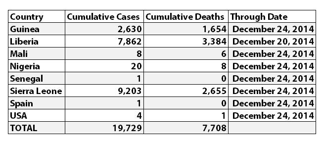
According to WHO, the latest reported numbers for Ebola cases and deaths were:
I've updated the Ebola charts with the latest data. Explanations of the charts are below.


Charts 1, 2, and 6 show the cumulative numbers of reported cases and deaths so far. In Chart 1, the y (left) axis is linear. In Chart 2, the y axis is a logarithmic scale where major divisions of the axis increase by powers of 10 (the base is 10). Chart 6 has the y axis in powers of 2 (the base is 2, so 1, 2, 4, 8, etc.), so each major division represents a doubling of the numbers.
Exponential growth will look like a rapidly escalating curve on a linear scale but like a straight line on a logarithmic scale (base 10 or base 2 in these charts). Linear growth will look like a straight line on a linear scale and like a curve approaching a flat horizontal line on an exponential scale.
Charts 3, 4, and 5 are historical projections that would have been most likely if nothing changed to slow or stop the spread. For quite a while, reported cases and deaths followed these projections closely. But reported numbers have finally been dropping below these historical projections for the last couple months. That may be temporary, or it may be due to problems in collecting or reporting data, or it may (hopefully!) be a real improvement that will continue.
Charts 4B-4E and 5B-5E include more recently updated projections. For charts with color coded ranges, the green ranges are the projection if the spread continues as it has over recent weeks. The darker green in the lower part of some ranges would be expected if the spread continues to trend away from exponential growth toward linear growth (toward the bottom of the shaded areas).
The yellow range would be expected if the trend goes back to spreading at previous faster rates. And the red range would be expected if it starts growing again at the worst rates experienced so far during this epidemic.
Charts 7-8 were discontinued quite a while back.
Charts 9-12 were merged previously, and the combined chart shows monthly new cases and deaths reported.
Charts 13-14B show cumulative cases and deaths by country.
Chart 15 shows how many days it has taken for the cumulative number of cases to double over time. Higher points in the chart are good, they mean it is taking longer to double. Lower points are bad, they mean it is doubling faster. Previously cases doubled every 3 to 4 weeks. But for the last several months, the doubling rate has been slowing down. Currently, cases are doubling in about 66 days according to reported numbers.
The charts do not include the Congo, as that was allegedly an unrelated outbreak and it has been declared over.
These charts rely on 'official' reported numbers and can only be as accurate as that data. Reported Ebola data is subject to change as cases and deaths are reclassified, or as data sources or reporting methods change. I do not know how accurate 'official' reported numbers are, but there are a number of possible issues:
1. WHO,the CDC, Doctors Without Borders (MSF), etc. have in the past stated that actual cases and deaths "vastly" outnumber reported figures, possibly by at least 2 to 5 times.
2. There have been sudden large decreases or increases over the last several months in officially reported cases and deaths. It is unclear whether decreases represent improvements. The decreases and increase may all be due to an inability to keep up with data tracking and recording.
3. Many countries have clamped down on Ebola news. At least one journalist has been arrested and at least one newspaper has been closed in west Africa. In the USA, an 'Ebola Czar' with a reputation as a political/public relations 'fixer' (and with no medical experience) was appointed to lead the US Ebola effort.
4. There are theories regarding Ebola that differ from the 'official' reports. Some believe there is no such thing as Ebola or that what is spreading is not Ebola. Some believe there is no outbreak at all. Some believe people are purposely being infected for economic or depopulation plans. I do not know if there is any truth to any of these beliefs, it can be a strange world.
The same disclaimers and references apply to all of these charts:
Charts and future projections were done by me, not by WHO, except in cases where it is stated that a chart includes WHO projections. I am not an Ebola expert, epidemiologist, virologist, or MD, but I manually compiled the data used to create these graphs from news updates on the following websites:
SOURCE: WHO website 1
SOURCE: WHO website 2
SOURCE: WHO website 3
SOURCE: WHO website 4
SOURCE: WHO website 5
SOURCE: CDC website 1
SOURCE: The New England Journal of Medicine
SOURCE: Guinea Situation Reports (posted on Humanitarian Response)
[NOTE: Situation Reports from Guinea are in French.]
SOURCE: Liberia Situation Reports
Mali Ministry of Sanitation and Hygiene
[NOTE: Situation Reports from Mali are in French.]
SOURCE: Sierra Leone Situation Reports
Please do not do anything you might regret based on charts or projections. Hopefully efforts to contain, quarantine, treat, prevent, or cure Ebola will eventually be successful, and hopefully sooner rather than later.
I've updated the Ebola charts with the latest data. Explanations of the charts are below.
Charts 1, 2, and 6 show the cumulative numbers of reported cases and deaths so far. In Chart 1, the y (left) axis is linear. In Chart 2, the y axis is a logarithmic scale where major divisions of the axis increase by powers of 10 (the base is 10). Chart 6 has the y axis in powers of 2 (the base is 2, so 1, 2, 4, 8, etc.), so each major division represents a doubling of the numbers.
Exponential growth will look like a rapidly escalating curve on a linear scale but like a straight line on a logarithmic scale (base 10 or base 2 in these charts). Linear growth will look like a straight line on a linear scale and like a curve approaching a flat horizontal line on an exponential scale.
Charts 3, 4, and 5 are historical projections that would have been most likely if nothing changed to slow or stop the spread. For quite a while, reported cases and deaths followed these projections closely. But reported numbers have finally been dropping below these historical projections for the last couple months. That may be temporary, or it may be due to problems in collecting or reporting data, or it may (hopefully!) be a real improvement that will continue.
Charts 4B-4E and 5B-5E include more recently updated projections. For charts with color coded ranges, the green ranges are the projection if the spread continues as it has over recent weeks. The darker green in the lower part of some ranges would be expected if the spread continues to trend away from exponential growth toward linear growth (toward the bottom of the shaded areas).
The yellow range would be expected if the trend goes back to spreading at previous faster rates. And the red range would be expected if it starts growing again at the worst rates experienced so far during this epidemic.
Charts 7-8 were discontinued quite a while back.
Charts 9-12 were merged previously, and the combined chart shows monthly new cases and deaths reported.
Charts 13-14B show cumulative cases and deaths by country.
Chart 15 shows how many days it has taken for the cumulative number of cases to double over time. Higher points in the chart are good, they mean it is taking longer to double. Lower points are bad, they mean it is doubling faster. Previously cases doubled every 3 to 4 weeks. But for the last several months, the doubling rate has been slowing down. Currently, cases are doubling in about 66 days according to reported numbers.
The charts do not include the Congo, as that was allegedly an unrelated outbreak and it has been declared over.
These charts rely on 'official' reported numbers and can only be as accurate as that data. Reported Ebola data is subject to change as cases and deaths are reclassified, or as data sources or reporting methods change. I do not know how accurate 'official' reported numbers are, but there are a number of possible issues:
1. WHO,the CDC, Doctors Without Borders (MSF), etc. have in the past stated that actual cases and deaths "vastly" outnumber reported figures, possibly by at least 2 to 5 times.
2. There have been sudden large decreases or increases over the last several months in officially reported cases and deaths. It is unclear whether decreases represent improvements. The decreases and increase may all be due to an inability to keep up with data tracking and recording.
3. Many countries have clamped down on Ebola news. At least one journalist has been arrested and at least one newspaper has been closed in west Africa. In the USA, an 'Ebola Czar' with a reputation as a political/public relations 'fixer' (and with no medical experience) was appointed to lead the US Ebola effort.
4. There are theories regarding Ebola that differ from the 'official' reports. Some believe there is no such thing as Ebola or that what is spreading is not Ebola. Some believe there is no outbreak at all. Some believe people are purposely being infected for economic or depopulation plans. I do not know if there is any truth to any of these beliefs, it can be a strange world.
The same disclaimers and references apply to all of these charts:
Charts and future projections were done by me, not by WHO, except in cases where it is stated that a chart includes WHO projections. I am not an Ebola expert, epidemiologist, virologist, or MD, but I manually compiled the data used to create these graphs from news updates on the following websites:
SOURCE: WHO website 1
SOURCE: WHO website 2
SOURCE: WHO website 3
SOURCE: WHO website 4
SOURCE: WHO website 5
SOURCE: CDC website 1
SOURCE: The New England Journal of Medicine
SOURCE: Guinea Situation Reports (posted on Humanitarian Response)
[NOTE: Situation Reports from Guinea are in French.]
SOURCE: Liberia Situation Reports
Mali Ministry of Sanitation and Hygiene
[NOTE: Situation Reports from Mali are in French.]
SOURCE: Sierra Leone Situation Reports
Please do not do anything you might regret based on charts or projections. Hopefully efforts to contain, quarantine, treat, prevent, or cure Ebola will eventually be successful, and hopefully sooner rather than later.
a reply to: ikonoklast
Its definately in decline then.
Panic over!
Until I read an article which tells us deaths are rising exponentially, I'm going to leave this thread.
But well done ikonoklast for your charts!
Its definately in decline then.
Panic over!
Until I read an article which tells us deaths are rising exponentially, I'm going to leave this thread.
But well done ikonoklast for your charts!
a reply to: ikonoklast
Thanks again. Can you extrapolate a long term trend yet? Or do we need to wait until February-May to see where this really is going? ....Looks like cases stopped increasing in Sierra Leone. A good thing - or just a blip like previous ones?
I'm hoping the (delayed) global response might be paying off though.
It looks like the spread has stalled at about a hundred or so cases of new infections per day. It seams that new cases outside of the hot zone have
been stamped out fairly quickly. I was terrified by the cases in Lagos and again worried about the spread into Mali. But coupled with the quail in
Senegal and the fact that there isn't an outbreak anywhere else in Africa or the rest of the world it looks like the outbreak isn't going global.
Outside of a mutation by the virus it looks like the "bell curve" I keep reading about is about to start falling.
I wish we could trust the acuracy of reporting!
Thanks again for all of your work with the charts! It sure makes this information easier to find/understand!!!
I wish we could trust the acuracy of reporting!
Thanks again for all of your work with the charts! It sure makes this information easier to find/understand!!!
a reply to: Roudy1111
You and me may have spoken too soon. A nurse has been admitted to a Hospital in Glasgow, UK with it and soon to be moved to the Isolation unit at a London hospital:
news.sky.com...
And this news I just found on 'Liberia':
www.nbcnews.com...
And this:
www.ibtimes.co.uk...
You and me may have spoken too soon. A nurse has been admitted to a Hospital in Glasgow, UK with it and soon to be moved to the Isolation unit at a London hospital:
news.sky.com...
A female healthcare worker who returned to Glasgow from Sierra Leone last night has been confirmed as having Ebola. They returned to Scotland via Casablanca and London Heathrow, arriving into Glasgow Airport on a British Airways flight at around 11.30pm. The patient was admitted to hospital early this morning after feeling unwell and was placed into isolation at 7.50am. The individual has been isolated and is receiving treatment in the specialist Brownlee Unit for Infectious Diseases on the Gartnavel Hospital campus, but will be taken to the Royal Free Hospital in London imminently. Anyone who is at risk through contact with the patient is to be contacted and closely monitored.
And this news I just found on 'Liberia':
Liberia — Authorities in Liberia said Monday there have been dozens of new Ebola cases erupting along the border with Sierra Leone. The announcement by Assistant Health Minister Tolbert Nyenswah on Monday marks a setback for Liberia, which has seen the number of cases stabilize somewhat after having been the hardest hit country in West Africa.
www.nbcnews.com...
And this:
A Japanese man is being tested for Ebola after returning from Sierra Leone and developing a fever. If he tests positive, it will be the first case of the deadly virus in Japan. The man, who is in his thirties, returned from Sierra Leone on 23 December after spending eight days in the African country. The purpose of his visit is unknown but he is not believed to be a health worker, NTV reported. Health ministry officials said the virus might not have been detected when he first arrived because of the early stage of the infection – signs and symptoms normally begin appearing within five to 10 days of contracting the disease. Japan Today reports that the man told health officials he had not come into contact with any Ebola sufferers to the best of his knowledge. He did, however, say he had touched a bag containing the body of an Ebola victim before the burial on 17 December.
www.ibtimes.co.uk...
edit on CSTMon, 29 Dec 2014 13:52:32 -0600u3101x032x0 by TruthxIsxInxThexMist because: (no reason given)
a reply to: soficrow
I would say it's on 'simmer' at the moment, but could go back to a 'strong boil' at any time. As Roudy1111 said, it seems to have settled down to around hundred new cases a day, give or take.
If you look at the projection charts that show the colored ranges, cases are trending just a little below the bottom of the current green range but deaths are trending around the top of the green range near the yellow range.
The doubling rate continues to slow down. Instead of doubling every 3-4 weeks, it's currently doubling every 9-10 weeks. That should mean the R0 rate must be less than 1 now, which means that on average each new case spreads it to less than one new person. This is what is necessary for the epidemic to slow towards zero growth over time.
Realistically, with so many cases Ebola is unlikely to die out completely. But hopefully it will approach zero growth over time. This all could change though, especially if people stop taking the steps that have helped slow it down. Complacence would be dangerous.
Just a wee update...the Glasgow case is confirmed, and there is another unconfirmed case in Aberdeen this morning, although it's said to be extremely
low risk. I think both are health workers with recent links to Sierra Leone. Will dig up some links.
Press and Journal report, Aberdeen
Press and Journal report, Aberdeen
edit on 30-12-2014 by caitlinfae because: (no reason given)
I had heard somewhere that Tokyo confirmed a case last week, but haven't found a reliable source yet. Has anyone else heard this?
a reply to: ikonoklast
Do we actually know the how many tests they are capable of doing a day?
They must have a maximum per day and i really do want to know what that is before i decide if it is slowing down peaking and such.
I know for a fact they can not handle the actual numbers up till now or the official number would be higher.
So it really begs the question what is the maximum they are capable of testing.
edit on 31-12-2014 by joho99 because: (no reason given)
a reply to: joho99
I don't know how many tests they can do per day, but the
WHO Situation Report for December 31, 2014 at least has some updated info regarding access to "laboratory support:"
I think there are other related issues as well, perhaps especially outside of Guinea, Liberia, and Sierra Leone. For example:
Do we actually know the how many tests they are capable of doing a day?
I don't know how many tests they can do per day, but the
WHO Situation Report for December 31, 2014 at least has some updated info regarding access to "laboratory support:"
All 53 EVD-affected districts (those that have ever reported a probable or confirmed case) have access to laboratory support (figure 6). Access is defined as having the logistical capacity to transport a sample to a laboratory by road within 24 hours of sample collection.
As of 29 December 2014, 23 laboratories have the capacity to confirm EVD cases: 4 in Guinea, 8 in Liberia and 11 in Sierra Leone. These laboratories currently serve 24 affected districts in Guinea, 15 in Liberia and 11 in Sierra Leone. It is anticipated that in coming weeks, additional laboratories will have the capacity to confirm EVD cases including 1 laboratory in Guinea, 1 in Liberia and 2 in Sierra Leone.
I think there are other related issues as well, perhaps especially outside of Guinea, Liberia, and Sierra Leone. For example:
- How often the 'test' is just screening questions rather than an actual laboratory test,
- The criteria for determining whether someone should be laboratory tested,
- The test can initially be negative, so all suspected or probable cases need to be tested at least 2-3 times several days apart but it's not clear
this is always done, and
- Labs without proven experience in interpreting Ebola test results are supposed to have another lab with proven experience confirm the results but
it's not clear this is always done.
According to WHO, the latest reported numbers for Ebola cases and deaths were:
Some things to note:
I've updated the Ebola charts with the latest 'official' data. Explanations of the charts are below.

Charts 1, 2, and 6 show the cumulative numbers of reported cases and deaths so far. In Chart 1, the y (left) axis is linear. In Chart 2, the y axis is a logarithmic scale where major divisions of the axis increase by powers of 10 (the base is 10). Chart 6 has the y axis in powers of 2 (the base is 2, so 1, 2, 4, 8, etc.), so each major division represents a doubling of the numbers.
Exponential growth will look like a rapidly escalating curve on a linear scale but like a straight line on a logarithmic scale (base 10 or base 2 in these charts). Linear growth will look like a straight line on a linear scale and like a curve approaching a flat horizontal line on an exponential scale.
Charts 3, 4, and 5 are historical projections that would have been most likely if nothing changed to slow or stop the spread. For quite a while, reported cases and deaths followed these projections closely. But reported numbers have finally been dropping below these historical projections for the last couple months. That may be temporary, or it may be due to problems in collecting or reporting data, or it may (hopefully!) be a real improvement that will continue.
Charts 4B-4E and 5B-5E include more recently updated projections. For charts with color coded ranges, the green ranges are the projection if the spread continues as it has over recent weeks. The darker green in the lower part of some ranges would be expected if the spread continues to trend away from exponential growth toward linear growth (toward the bottom of the shaded areas).
The yellow range would be expected if the trend goes back to spreading at previous faster rates. And the red range would be expected if it starts growing again at the worst rates experienced so far during this epidemic.
Charts 7-8 were discontinued quite a while back.
Charts 9-12 were merged previously, and the combined chart shows monthly new cases and deaths reported.
Charts 13-14B show cumulative cases and deaths by country.
Chart 15 shows how many days it has taken for the cumulative number of cases to double over time. Higher points in the chart are good, they mean it is taking longer to double. Lower points are bad, they mean it is doubling faster. Previously cases doubled every 3 to 4 weeks. But for the last several months, the doubling rate has been slowing down. Currently, cases are doubling in about 66 days according to reported numbers.
The charts do not include the Congo, as that was allegedly an unrelated outbreak and it has been declared over.
These charts rely on 'official' reported numbers and can only be as accurate as that data. Reported Ebola data is subject to change as cases and deaths are reclassified, or as data sources or reporting methods change. I do not know how accurate 'official' reported numbers are, but there are a number of possible issues:
1. WHO,the CDC, Doctors Without Borders (MSF), etc. have in the past stated that actual cases and deaths "vastly" outnumber reported figures, possibly by at least 2 to 5 times.
2. There have been sudden large decreases or increases over the last several months in officially reported cases and deaths. It is unclear whether decreases represent improvements. The decreases and increase may all be due to an inability to keep up with data tracking and recording.
3. Many countries have clamped down on Ebola news. At least one journalist has been arrested and at least one newspaper has been closed in west Africa. In the USA, an 'Ebola Czar' with a reputation as a political/public relations 'fixer' (and with no medical experience) was appointed to lead the US Ebola effort.
4. There are theories regarding Ebola that differ from the 'official' reports. Some believe there is no such thing as Ebola or that what is spreading is not Ebola. Some believe there is no outbreak at all. Some believe people are purposely being infected for economic or depopulation plans. I do not know if there is any truth to any of these beliefs, it can be a strange world.
The same disclaimers and references apply to all of these charts:
Charts and future projections were done by me, not by WHO, except in cases where it is stated that a chart includes WHO projections. I am not an Ebola expert, epidemiologist, virologist, or MD, but I manually compiled the data used to create these graphs from news updates on the following websites:
SOURCE: WHO website 1
SOURCE: WHO website 2
SOURCE: WHO website 3
SOURCE: WHO website 4
SOURCE: WHO website 5
SOURCE: CDC website 1
SOURCE: The New England Journal of Medicine
SOURCE: Guinea Situation Reports (posted on Humanitarian Response)
[NOTE: Situation Reports from Guinea are in French.]
SOURCE: Liberia Situation Reports
Mali Ministry of Sanitation and Hygiene
[NOTE: Situation Reports from Mali are in French.]
SOURCE: Sierra Leone Situation Reports
Please do not do anything you might regret based on charts or projections. Hopefully efforts to contain, quarantine, treat, prevent, or cure Ebola will eventually be successful, and hopefully sooner rather than later.
Some things to note:
- The numbers include the new confirmed case in the United Kingdom.
- The suspected case in Tokyo has allegedly tested negative so is not included.
- And the two alleged new confirmed cases in Mosul, Iraq amongst
IS/ISIS/ISIL members are not included. WHO says the cases are not actually confirmed, and there is some question whether IS/ISIS/ISIL has the
capability to test for Ebola or whether the story might be propaganda or disinformation from the Iraqi government.
I've updated the Ebola charts with the latest 'official' data. Explanations of the charts are below.
Charts 1, 2, and 6 show the cumulative numbers of reported cases and deaths so far. In Chart 1, the y (left) axis is linear. In Chart 2, the y axis is a logarithmic scale where major divisions of the axis increase by powers of 10 (the base is 10). Chart 6 has the y axis in powers of 2 (the base is 2, so 1, 2, 4, 8, etc.), so each major division represents a doubling of the numbers.
Exponential growth will look like a rapidly escalating curve on a linear scale but like a straight line on a logarithmic scale (base 10 or base 2 in these charts). Linear growth will look like a straight line on a linear scale and like a curve approaching a flat horizontal line on an exponential scale.
Charts 3, 4, and 5 are historical projections that would have been most likely if nothing changed to slow or stop the spread. For quite a while, reported cases and deaths followed these projections closely. But reported numbers have finally been dropping below these historical projections for the last couple months. That may be temporary, or it may be due to problems in collecting or reporting data, or it may (hopefully!) be a real improvement that will continue.
Charts 4B-4E and 5B-5E include more recently updated projections. For charts with color coded ranges, the green ranges are the projection if the spread continues as it has over recent weeks. The darker green in the lower part of some ranges would be expected if the spread continues to trend away from exponential growth toward linear growth (toward the bottom of the shaded areas).
The yellow range would be expected if the trend goes back to spreading at previous faster rates. And the red range would be expected if it starts growing again at the worst rates experienced so far during this epidemic.
Charts 7-8 were discontinued quite a while back.
Charts 9-12 were merged previously, and the combined chart shows monthly new cases and deaths reported.
Charts 13-14B show cumulative cases and deaths by country.
Chart 15 shows how many days it has taken for the cumulative number of cases to double over time. Higher points in the chart are good, they mean it is taking longer to double. Lower points are bad, they mean it is doubling faster. Previously cases doubled every 3 to 4 weeks. But for the last several months, the doubling rate has been slowing down. Currently, cases are doubling in about 66 days according to reported numbers.
The charts do not include the Congo, as that was allegedly an unrelated outbreak and it has been declared over.
These charts rely on 'official' reported numbers and can only be as accurate as that data. Reported Ebola data is subject to change as cases and deaths are reclassified, or as data sources or reporting methods change. I do not know how accurate 'official' reported numbers are, but there are a number of possible issues:
1. WHO,the CDC, Doctors Without Borders (MSF), etc. have in the past stated that actual cases and deaths "vastly" outnumber reported figures, possibly by at least 2 to 5 times.
2. There have been sudden large decreases or increases over the last several months in officially reported cases and deaths. It is unclear whether decreases represent improvements. The decreases and increase may all be due to an inability to keep up with data tracking and recording.
3. Many countries have clamped down on Ebola news. At least one journalist has been arrested and at least one newspaper has been closed in west Africa. In the USA, an 'Ebola Czar' with a reputation as a political/public relations 'fixer' (and with no medical experience) was appointed to lead the US Ebola effort.
4. There are theories regarding Ebola that differ from the 'official' reports. Some believe there is no such thing as Ebola or that what is spreading is not Ebola. Some believe there is no outbreak at all. Some believe people are purposely being infected for economic or depopulation plans. I do not know if there is any truth to any of these beliefs, it can be a strange world.
The same disclaimers and references apply to all of these charts:
Charts and future projections were done by me, not by WHO, except in cases where it is stated that a chart includes WHO projections. I am not an Ebola expert, epidemiologist, virologist, or MD, but I manually compiled the data used to create these graphs from news updates on the following websites:
SOURCE: WHO website 1
SOURCE: WHO website 2
SOURCE: WHO website 3
SOURCE: WHO website 4
SOURCE: WHO website 5
SOURCE: CDC website 1
SOURCE: The New England Journal of Medicine
SOURCE: Guinea Situation Reports (posted on Humanitarian Response)
[NOTE: Situation Reports from Guinea are in French.]
SOURCE: Liberia Situation Reports
Mali Ministry of Sanitation and Hygiene
[NOTE: Situation Reports from Mali are in French.]
SOURCE: Sierra Leone Situation Reports
Please do not do anything you might regret based on charts or projections. Hopefully efforts to contain, quarantine, treat, prevent, or cure Ebola will eventually be successful, and hopefully sooner rather than later.
a reply to: ikonoklast
I am not trying to be argumentative just my predicament is a slowing down and reaching a plateau in testing would give the same results.
I am not trying to be argumentative just my predicament is a slowing down and reaching a plateau in testing would give the same results.
a reply to: joho99
Hi Everybody,
Much respect and props to Ikon, once again. I got involved the first week in August. (DPD - deaths per day, was my stat. I like doubling rate better though) That was a bad month with the # of deaths starting at 800 and ending over 2,000. That continued into September when Obama and gov't started to wake up.
Last week of September Obama said at a press conference "This crisis is rapidly spiralling out of control". That got my attention, to say the least, a) because my poker "tell" on him was that he was scared and b) because to my knowledge no American president has said that about ANYTHING ever before.
Segue to the response of sending military personnel to a country that needed health care workers > segue to growing panic in the US after Dallas in October > October 12, I believe was the peak. Rate of growth was unabated - a continuum from Patient Zero in December 2013 UNABATED to mid-October 2014. People were freaking out with good cause. Obama and the ppl at Emory told us how well prepared every hospital was. Then in a complete collapse of protocol the nurse from Dallas flew not once, but twice. Doors slammed as schools closed and the jet engines weren't roaring like before because workers refused to clean them.
That was not going to fly. So I remember Obama doing 2 things. #1 appointing an Ebola Czar who waved his magic wand and cured the disease in Monrovia, the first large city ever affected by this plague in history. #2 - Obama told the sheep (the hypnotized never lie) that starting on that day and forever forward HOSPITALS WOULD NOT REPORT SUSPECTED CASES. That concerned me greatly. Why? Because that is so so so the first cousin to "we aren't reporting real cases either".
From virtual hysteria in Liberia fast forward in a couple daze to "plenty of empty beds here".
FWIW, also at that moment the WHO had just increased the fatality rate from 50 to 70%.
The previous 30 days from Oct 12 ..... 2,500 dead. The next 30.....500 dead. 30 days after the press and public were panicing I was hard pressed to find ANY Ebola stories.
I had taken solace in the math. Good or bad, it was science. Take out the emotion. The panic. The denial of what the figures showed. I didn't buy it for a second. And I WANT it to burn out, to peter out. I have NO idea what is really going on but NO WAY I am buying what they are selling.
Love to hear everybody's - esp Ikon's - opinion about this. BTW, you've all been beautiful. I would be wading through the stats and one of you would insert a really funny line, that helped.
Last marriage, ex kept telling me she wasn't cheating on me. I WANTED to believe her ;-)
Peace, Alex
originally posted by: Lexman55
a reply to: joho99
The previous 30 days from Oct 12 ..... 2,500 dead. The next 30.....500 dead. 30 days after the press and public were panicing I was hard pressed to find ANY Ebola stories.
I had taken solace in the math. Good or bad, it was science. Take out the emotion. The panic. The denial of what the figures showed. I didn't buy it for a second. And I WANT it to burn out, to peter out. I have NO idea what is really going on but NO WAY I am buying what they are selling.
Love to hear everybody's - esp Ikon's - opinion about this. BTW, you've all been beautiful. I would be wading through the stats and one of you would insert a really funny line, that helped.
Last marriage, ex kept telling me she wasn't cheating on me. I WANTED to believe her ;-)
Peace, Alex
I agree... Math can be a cruel mistress, but she doesn't lie. The hospitals are taking down their ebola "if you have been to... and have the signs off..." warning signs because they "haven't heard about anything for so long". I have seen this myself and even asked about it. They all came down with the xmas decorations. If you go to a doctor they don't bother asking if you've been to any places where it is rampant anymore. I admit I can become pretty desensitized... things like the Georgia Guidestones theories do not even phase me... bring it on.... but something is not quite right about all of this. Especially since there are thousands more with ebola now than there where when people were freaking out. Maybe this new Nebraska patient will put the spark back in the fire. Now, if you'll excuse me, I need to go find a bow tie for my kitteh Mr. Begemot... all of this waiting around makes him anxious.
edit on 4-1-2015 by Volund because: (no reason given)
edit on 4-1-2015 by Volund because: (no reason
given)
edit on 4-1-2015 by Volund because: (no reason given)
a reply to: joho99
No problem, we're all just trying to figure out what the reported numbers really mean - and it's very difficult to tell.
Hopefully the spread of Ebola really is slowing down. But it may very well be that the reported numbers are actually due to problems keeping up with testing or data reporting. It must be a monumental task to keep up with testing, contact tracing, record keeping, and data reporting alone - especially while minimizing risk and spread. And that's not even considering the human element of dealing with people every day and with the effects on communities, families, orphaned children, etc.
Then there is also the concern that some people in certain positions might possibly conceal or alter data to calm fear and social unrest and to maintain regional and even national control within areas hard hit by Ebola. Many leaders in these areas have expressed serious concerns about the continued existence of their countries as nation states. And some of the countries have seriously clamped down on journalists reporting on Ebola and on medical personnel talking with journalists.
Personally, I figure at best the reported numbers at this point may approximate cases and deaths. At best. But I also think if it is far worse than reported numbers, it will become more and more obvious if we keep paying attention.
new topics
-
Where should Trump hold his next rally
2024 Elections: 42 minutes ago -
Shocking Number of Voters are Open to Committing Election Fraud
US Political Madness: 1 hours ago -
Gov Kristi Noem Shot and Killed "Less Than Worthless Dog" and a 'Smelly Goat
2024 Elections: 2 hours ago -
Falkville Robot-Man
Aliens and UFOs: 2 hours ago -
James O’Keefe: I have evidence that exposes the CIA, and it’s on camera.
Whistle Blowers and Leaked Documents: 3 hours ago -
Australian PM says the quiet part out loud - "free speech is a threat to democratic dicourse"...?!
New World Order: 3 hours ago -
Ireland VS Globalists
Social Issues and Civil Unrest: 4 hours ago -
Biden "Happy To Debate Trump"
2024 Elections: 4 hours ago -
RAAF airbase in Roswell, New Mexico is on fire
Aliens and UFOs: 5 hours ago -
What is the white pill?
Philosophy and Metaphysics: 6 hours ago
top topics
-
A Warning to America: 25 Ways the US is Being Destroyed
New World Order: 14 hours ago, 21 flags -
Blast from the past: ATS Review Podcast, 2006: With All Three Amigos
Member PODcasts: 7 hours ago, 11 flags -
Mike Pinder The Moody Blues R.I.P.
Music: 7 hours ago, 8 flags -
Biden "Happy To Debate Trump"
2024 Elections: 4 hours ago, 8 flags -
Australian PM says the quiet part out loud - "free speech is a threat to democratic dicourse"...?!
New World Order: 3 hours ago, 7 flags -
James O’Keefe: I have evidence that exposes the CIA, and it’s on camera.
Whistle Blowers and Leaked Documents: 3 hours ago, 6 flags -
What is the white pill?
Philosophy and Metaphysics: 6 hours ago, 5 flags -
Ireland VS Globalists
Social Issues and Civil Unrest: 4 hours ago, 4 flags -
RAAF airbase in Roswell, New Mexico is on fire
Aliens and UFOs: 5 hours ago, 4 flags -
Putin, Russia and the Great Architects of the Universe
ATS Skunk Works: 10 hours ago, 3 flags
active topics
-
Where should Trump hold his next rally
2024 Elections • 5 • : DontTreadOnMe -
University of Texas Instantly Shuts Down Anti Israel Protests
Education and Media • 306 • : Xtrozero -
Biden "Happy To Debate Trump"
2024 Elections • 38 • : JadedGhost -
Russia Ukraine Update Thread - part 3
World War Three • 5737 • : Arbitrageur -
Gov Kristi Noem Shot and Killed "Less Than Worthless Dog" and a 'Smelly Goat
2024 Elections • 26 • : CarlLaFong -
James O’Keefe: I have evidence that exposes the CIA, and it’s on camera.
Whistle Blowers and Leaked Documents • 8 • : Athetos -
Weinstein's conviction overturned
Mainstream News • 29 • : Xtrozero -
Shocking Number of Voters are Open to Committing Election Fraud
US Political Madness • 2 • : xuenchen -
Candidate TRUMP Now Has Crazy Judge JUAN MERCHAN After Him - The Stormy Daniels Hush-Money Case.
Political Conspiracies • 810 • : Annee -
Do you ever just get "bored" of everything?
Rant • 22 • : JonnyC555