It looks like you're using an Ad Blocker.
Please white-list or disable AboveTopSecret.com in your ad-blocking tool.
Thank you.
Some features of ATS will be disabled while you continue to use an ad-blocker.

Ebola - my visual charts & projections based on WHO data
page: 28share:
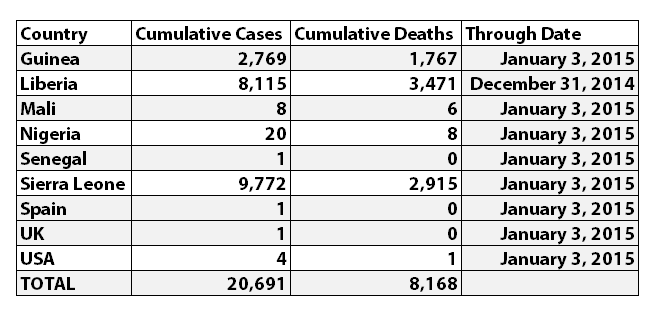
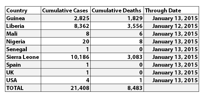
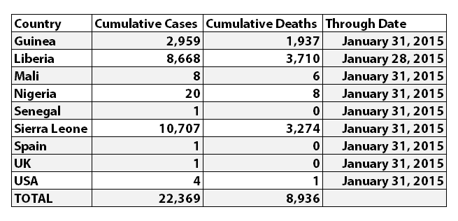
According to WHO, the latest reported numbers for Ebola cases and deaths were:
I've updated the Ebola charts with the latest WHO data. Explanations of the charts are below.
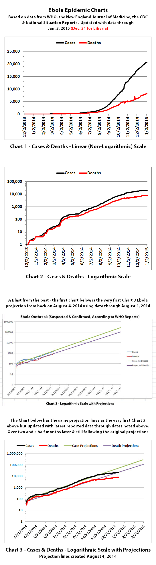
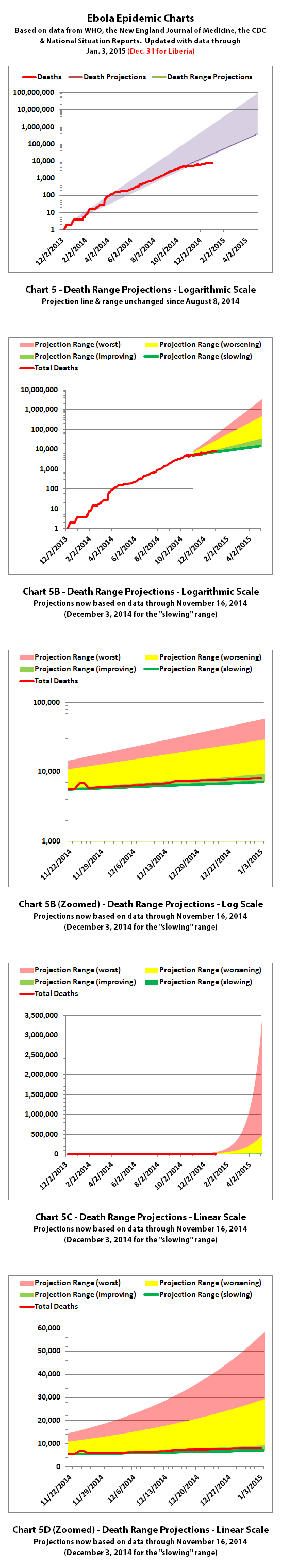
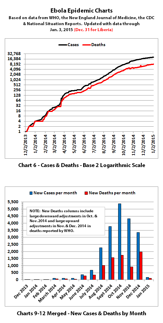
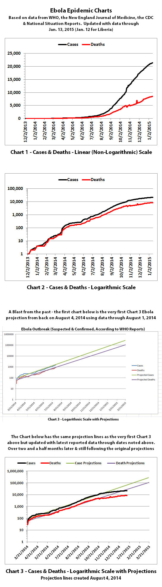
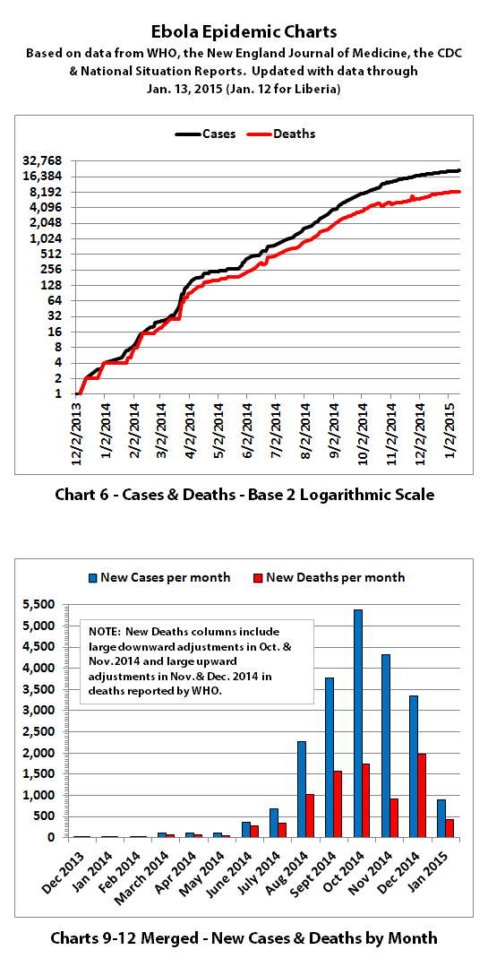
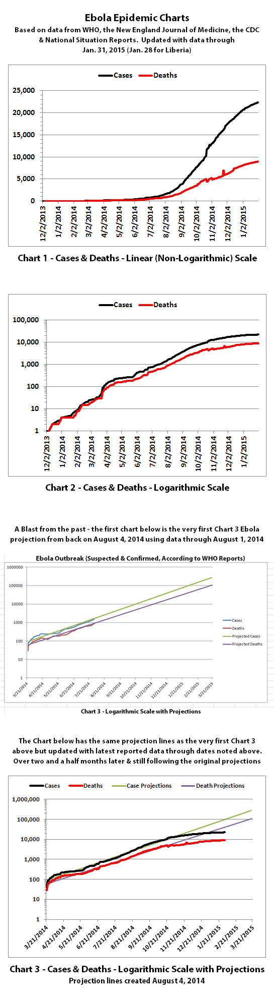
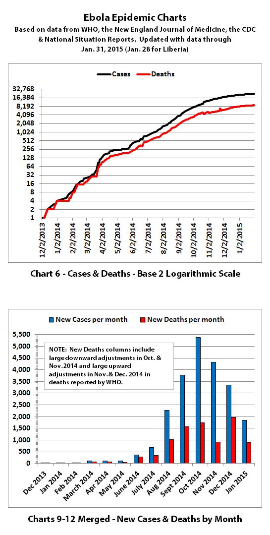
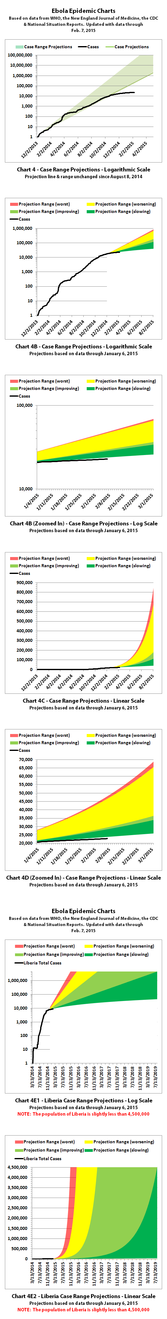
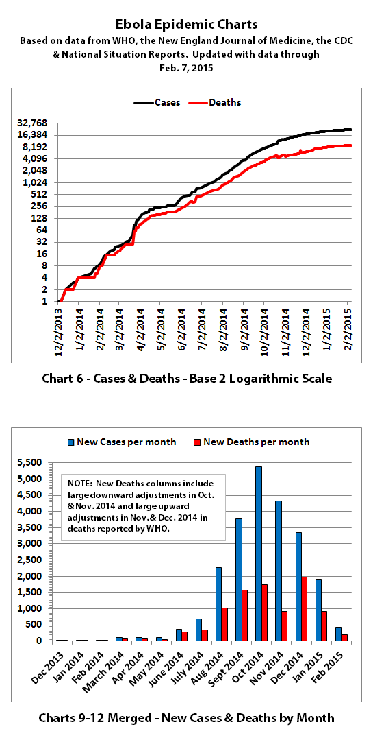
Charts 1, 2, and 6 show the cumulative numbers of reported cases and deaths so far. In Chart 1, the y (left) axis is linear. In Chart 2, the y axis is a logarithmic scale where major divisions of the axis increase by powers of 10 (the base is 10). Chart 6 has the y axis in powers of 2 (the base is 2, so 1, 2, 4, 8, etc.), so each major division represents a doubling of the numbers.
Exponential growth will look like a rapidly escalating curve on a linear scale but like a straight line on a logarithmic scale (base 10 or base 2 in these charts). Linear growth will look like a straight line on a linear scale and like a curve approaching a flat horizontal line on an exponential scale.
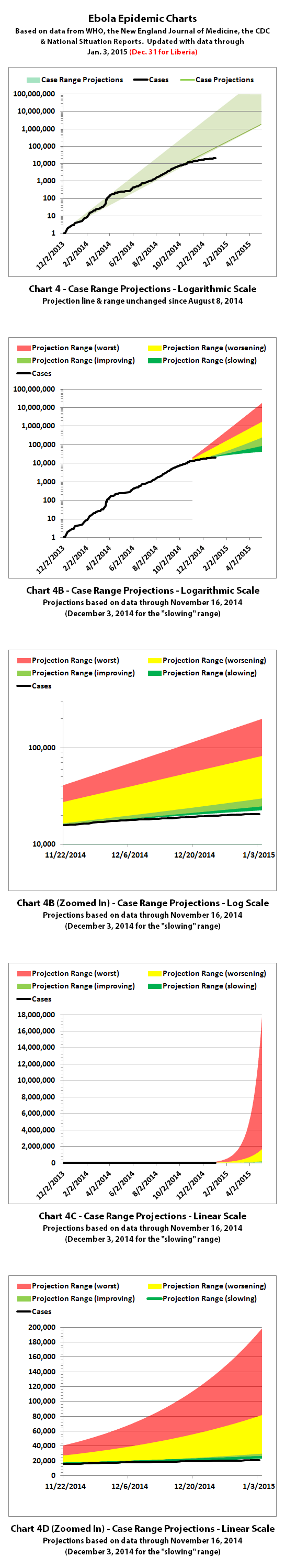
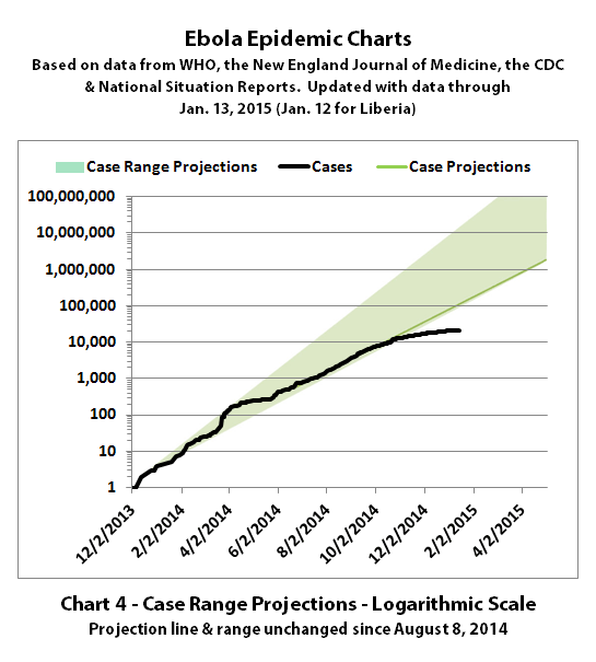
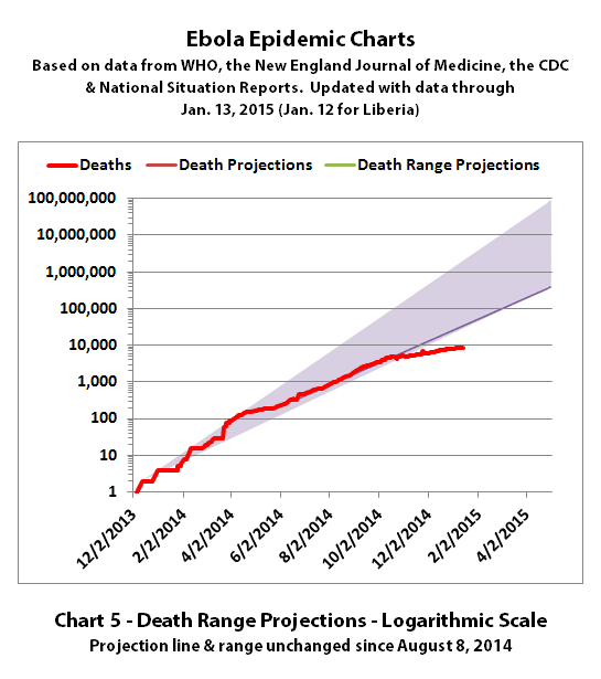
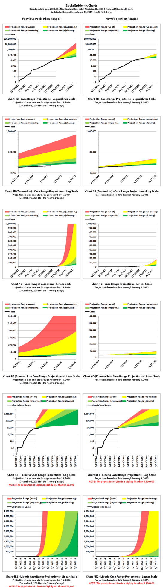
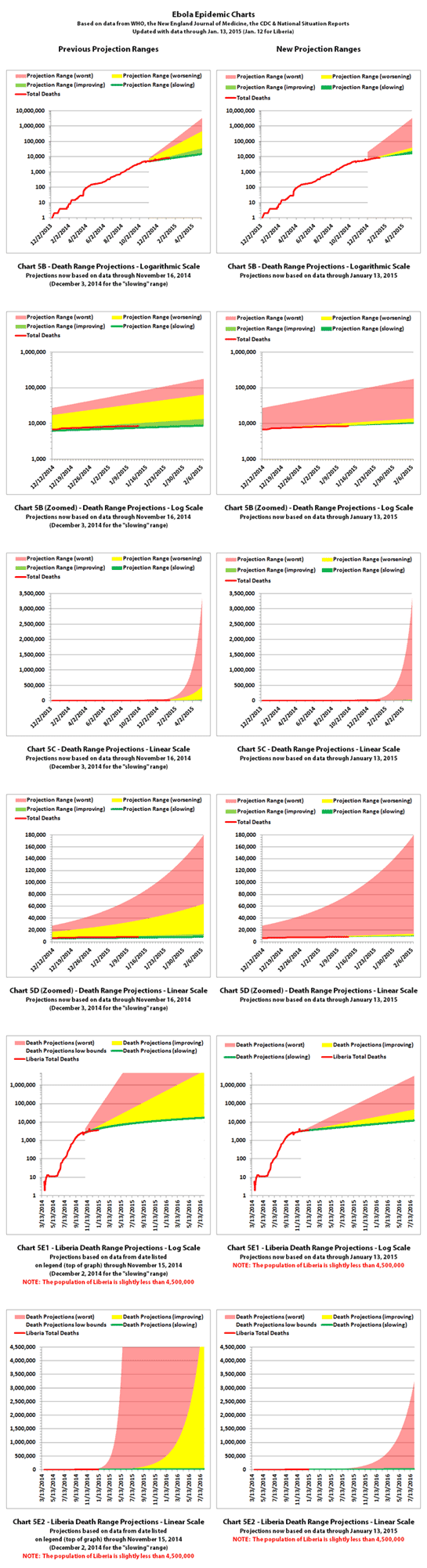
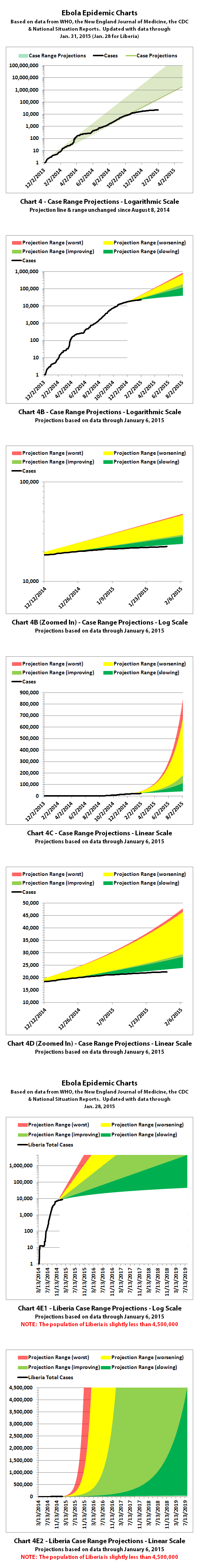
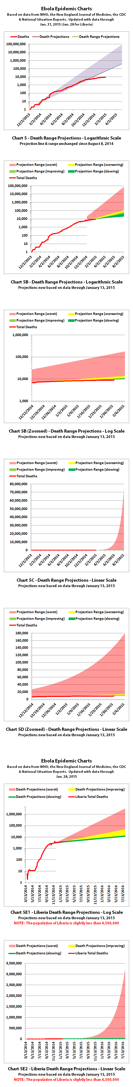
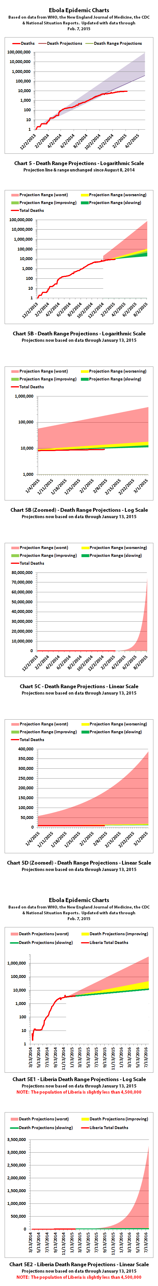
Charts 3, 4, and 5 are historical projections that would have been most likely if nothing changed to slow or stop the spread. For quite a while, reported cases and deaths followed these projections closely. But reported numbers finally started dropping below these historical projections several months ago. That may be temporary, or it may be due to problems in collecting or reporting data, or it may (hopefully!) be a real improvement that will continue.
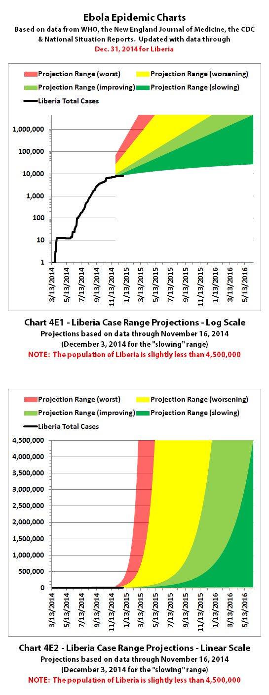
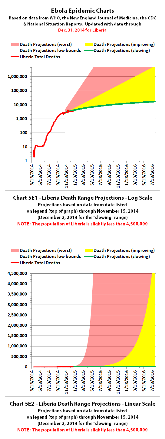
Charts 4B-4E and 5B-5E include more recently updated projections. For charts with color coded ranges, the green ranges are the projection if the spread continues as it has over recent weeks. The darker green in the lower part of some ranges would be expected if the spread continues to trend away from exponential growth toward linear growth (toward the bottom of the shaded areas).
The yellow range would be expected if the trend goes back to spreading at previous faster rates. And the red range would be expected if it starts growing again at the worst rates experienced so far during this epidemic.
Interestingly, reported cases have been gradually dropping below these more recent projection ranges as well, but reported deaths have continued to fall within the projection ranges. I will be updating these range projections when I get some spare time this month.
Charts 7-8 were discontinued quite a while back.
Charts 9-12 were merged previously, and the combined chart shows monthly new cases and deaths reported.
Interestingly, new cases reported continued to decline in December but new deaths reported showed the largest increase yet in December. It's hard to tell whether that is significant or whether it is due to a number of large downward and upward adjustments in reported deaths over the last two months.
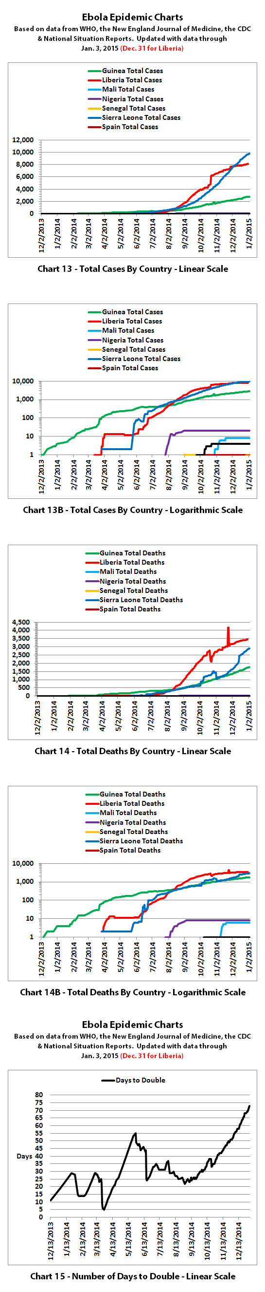
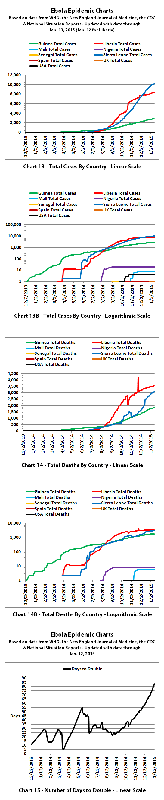
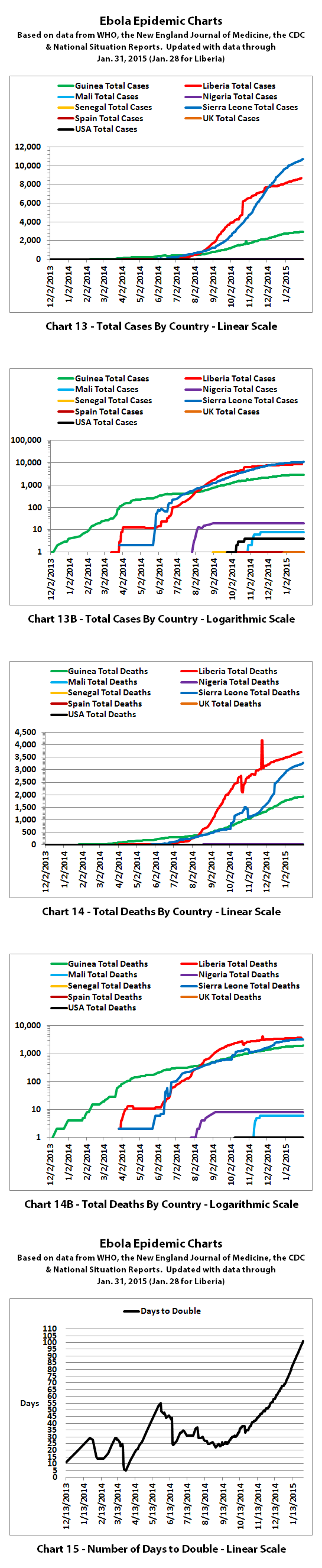
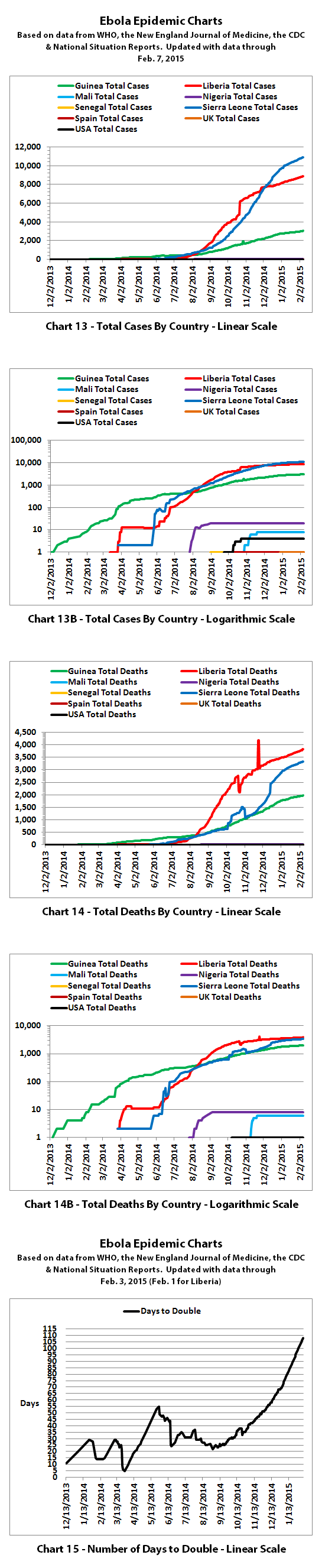
Charts 13-14B show cumulative cases and deaths by country.
Chart 15 shows how many days it has taken for the cumulative number of cases to double over time. Higher points in the chart are good, they mean it is taking longer to double. Lower points are bad, they mean it is doubling faster. Previously cases doubled every 3 to 4 weeks. But for the last several months, the doubling rate has been slowing down. Currently, cases are doubling in about 10 to 10.5 weeks according to reported numbers and the doubling rate has been steadily slowing down.
The charts do not include the Congo, as that was allegedly an unrelated outbreak and it has been declared over.
These charts rely on 'official' reported numbers and can only be as accurate as that data. Reported Ebola data is subject to change as cases and deaths are reclassified, or as data sources or reporting methods change. I do not know how accurate 'official' reported numbers are, but there are a number of possible issues:
1. WHO,the CDC, Doctors Without Borders (MSF), etc. have in the past stated that actual cases and deaths "vastly" outnumber reported figures, possibly by at least 2 to 5 times.
2. There have been sudden large decreases or increases over the last several months in officially reported cases and deaths. It is unclear whether decreases represent improvements. The decreases and increases may all be due to an inability to keep up with data tracking and recording.
3. Many countries have clamped down on Ebola news. At least one journalist has been arrested and at least one newspaper has been closed in west Africa. In the USA, an 'Ebola Czar' with a reputation as a political/public relations 'fixer' (and with no medical experience) was appointed to lead the US Ebola effort.
4. There are theories regarding Ebola that differ from the 'official' reports. Some believe there is no such thing as Ebola or that what is spreading is not Ebola. Some believe there is no outbreak at all. Some believe people are purposely being infected for economic or depopulation plans. I do not know if there is any truth to any of these beliefs, it can be a strange world.
The same disclaimers and references apply to all of these charts:
Charts and future projections were done by me, not by WHO, except in cases where it is stated that a chart includes WHO projections. I am not an Ebola expert, epidemiologist, virologist, or MD, but I manually compiled the data used to create these graphs from news updates on the following websites:
SOURCE: WHO website 1
SOURCE: WHO website 2
SOURCE: WHO website 3
SOURCE: WHO website 4
SOURCE: WHO website 5
SOURCE: CDC website 1
SOURCE: The New England Journal of Medicine
SOURCE: Guinea Situation Reports (posted on Humanitarian Response)
[NOTE: Situation Reports from Guinea are in French.]
SOURCE: Liberia Situation Reports
Mali Ministry of Sanitation and Hygiene
[NOTE: Situation Reports from Mali are in French.]
SOURCE: Sierra Leone Situation Reports
Please do not do anything you might regret based on charts or projections. Hopefully efforts to contain, quarantine, treat, prevent, or cure Ebola will eventually be successful, and hopefully sooner rather than later.
I've updated the Ebola charts with the latest WHO data. Explanations of the charts are below.
Charts 1, 2, and 6 show the cumulative numbers of reported cases and deaths so far. In Chart 1, the y (left) axis is linear. In Chart 2, the y axis is a logarithmic scale where major divisions of the axis increase by powers of 10 (the base is 10). Chart 6 has the y axis in powers of 2 (the base is 2, so 1, 2, 4, 8, etc.), so each major division represents a doubling of the numbers.
Exponential growth will look like a rapidly escalating curve on a linear scale but like a straight line on a logarithmic scale (base 10 or base 2 in these charts). Linear growth will look like a straight line on a linear scale and like a curve approaching a flat horizontal line on an exponential scale.
Charts 3, 4, and 5 are historical projections that would have been most likely if nothing changed to slow or stop the spread. For quite a while, reported cases and deaths followed these projections closely. But reported numbers finally started dropping below these historical projections several months ago. That may be temporary, or it may be due to problems in collecting or reporting data, or it may (hopefully!) be a real improvement that will continue.
Charts 4B-4E and 5B-5E include more recently updated projections. For charts with color coded ranges, the green ranges are the projection if the spread continues as it has over recent weeks. The darker green in the lower part of some ranges would be expected if the spread continues to trend away from exponential growth toward linear growth (toward the bottom of the shaded areas).
The yellow range would be expected if the trend goes back to spreading at previous faster rates. And the red range would be expected if it starts growing again at the worst rates experienced so far during this epidemic.
Interestingly, reported cases have been gradually dropping below these more recent projection ranges as well, but reported deaths have continued to fall within the projection ranges. I will be updating these range projections when I get some spare time this month.
Charts 7-8 were discontinued quite a while back.
Charts 9-12 were merged previously, and the combined chart shows monthly new cases and deaths reported.
Interestingly, new cases reported continued to decline in December but new deaths reported showed the largest increase yet in December. It's hard to tell whether that is significant or whether it is due to a number of large downward and upward adjustments in reported deaths over the last two months.
Charts 13-14B show cumulative cases and deaths by country.
Chart 15 shows how many days it has taken for the cumulative number of cases to double over time. Higher points in the chart are good, they mean it is taking longer to double. Lower points are bad, they mean it is doubling faster. Previously cases doubled every 3 to 4 weeks. But for the last several months, the doubling rate has been slowing down. Currently, cases are doubling in about 10 to 10.5 weeks according to reported numbers and the doubling rate has been steadily slowing down.
The charts do not include the Congo, as that was allegedly an unrelated outbreak and it has been declared over.
These charts rely on 'official' reported numbers and can only be as accurate as that data. Reported Ebola data is subject to change as cases and deaths are reclassified, or as data sources or reporting methods change. I do not know how accurate 'official' reported numbers are, but there are a number of possible issues:
1. WHO,the CDC, Doctors Without Borders (MSF), etc. have in the past stated that actual cases and deaths "vastly" outnumber reported figures, possibly by at least 2 to 5 times.
2. There have been sudden large decreases or increases over the last several months in officially reported cases and deaths. It is unclear whether decreases represent improvements. The decreases and increases may all be due to an inability to keep up with data tracking and recording.
3. Many countries have clamped down on Ebola news. At least one journalist has been arrested and at least one newspaper has been closed in west Africa. In the USA, an 'Ebola Czar' with a reputation as a political/public relations 'fixer' (and with no medical experience) was appointed to lead the US Ebola effort.
4. There are theories regarding Ebola that differ from the 'official' reports. Some believe there is no such thing as Ebola or that what is spreading is not Ebola. Some believe there is no outbreak at all. Some believe people are purposely being infected for economic or depopulation plans. I do not know if there is any truth to any of these beliefs, it can be a strange world.
The same disclaimers and references apply to all of these charts:
Charts and future projections were done by me, not by WHO, except in cases where it is stated that a chart includes WHO projections. I am not an Ebola expert, epidemiologist, virologist, or MD, but I manually compiled the data used to create these graphs from news updates on the following websites:
SOURCE: WHO website 1
SOURCE: WHO website 2
SOURCE: WHO website 3
SOURCE: WHO website 4
SOURCE: WHO website 5
SOURCE: CDC website 1
SOURCE: The New England Journal of Medicine
SOURCE: Guinea Situation Reports (posted on Humanitarian Response)
[NOTE: Situation Reports from Guinea are in French.]
SOURCE: Liberia Situation Reports
Mali Ministry of Sanitation and Hygiene
[NOTE: Situation Reports from Mali are in French.]
SOURCE: Sierra Leone Situation Reports
Please do not do anything you might regret based on charts or projections. Hopefully efforts to contain, quarantine, treat, prevent, or cure Ebola will eventually be successful, and hopefully sooner rather than later.
a reply to: ikonoklast
Thankfully this disease is dying out or so it seems. It was touch and go for awhile and even governments bought into the hype. They estimated millions by this point infected. Go's to show no one can predict the future.
Thankfully this disease is dying out or so it seems. It was touch and go for awhile and even governments bought into the hype. They estimated millions by this point infected. Go's to show no one can predict the future.
edit on 5-1-2015 by SubTruth because: (no reason given)
Given my thread on big scary numbers....
And hold on, I'm not slamming anyone here
Although I do see these numbers as being small....the idea of the probably vectors from intercontinental airtraffic is what truly scares me enough to the point where my bowels want to take things into their own hands...
Thanks for the post!
-NF
And hold on, I'm not slamming anyone here
Although I do see these numbers as being small....the idea of the probably vectors from intercontinental airtraffic is what truly scares me enough to the point where my bowels want to take things into their own hands...
Thanks for the post!
-NF
According to WHO, the latest reported numbers for Ebola cases and deaths were:
I've updated most of the Ebola charts with the latest WHO data. Some of the projection charts are still in progress. I am working on updating some of the projection ranges based on newer data and that is considerable more time consuming.
Explanations of the charts are below.
Charts 1, 2, and 6 show the cumulative numbers of reported cases and deaths so far. In Chart 1, the y (left) axis is linear. In Chart 2, the y axis is a logarithmic scale where major divisions of the axis increase by powers of 10 (the base is 10). Chart 6 has the y axis in powers of 2 (the base is 2, so 1, 2, 4, 8, etc.), so each major division represents a doubling of the numbers.
Exponential growth will look like a rapidly escalating curve on a linear scale but like a straight line on a logarithmic scale (base 10 or base 2 in these charts). Linear growth will look like a straight line on a linear scale and like a curve approaching a flat horizontal line on an exponential scale.
Charts 3, 4, and 5 are historical projections that would have been most likely if nothing changed to slow or stop the spread. For quite a while, reported cases and deaths followed these projections closely. But reported numbers finally started dropping below these historical projections in October 2014. That may be temporary, or it may be due to problems in collecting or reporting data, or it may (hopefully!) be a real improvement that will continue.
Charts 4B-4E and 5B-5E are not included in this update because I am still working on updating some of the projection ranges based on newer data and will be updating these some time this month.
Charts 7-8 were discontinued quite a while back.
Charts 9-12 were merged previously, and the combined chart shows monthly new cases and deaths reported.
As others have noted, one would expect to see a bell curve shape to the epidemic over time. Looking at Charts 9-12 (which are merged into one chart), that appears to be what we are seeing. Barring a resurgence, the spread of Ebola cases peaked in October 2014 and has been declining since then - IF reported numbers are reasonably accurate or have at least been consistently proportional to reality. WHO and various health authorities have previously estimated actual cases and deaths to be 2-5 times higher than reported numbers.
Charts 13-14B show cumulative cases and deaths by country.
Chart 15 shows how many days it has taken for the cumulative number of cases to double over time. Higher points in the chart are good, they mean it is taking longer to double. Lower points are bad, they mean it is doubling faster. Previously cases doubled every 3 to 4 weeks. But for the last several months, the doubling rate has been slowing down. Currently, cases are doubling in about 12 weeks according to reported numbers, and the doubling rate has been steadily slowing down.
The charts do not include the Congo, as that was allegedly an unrelated outbreak and it has been declared over.
These charts rely on 'official' reported numbers and can only be as accurate as that data. Reported Ebola data is subject to change as cases and deaths are reclassified, or as data sources or reporting methods change. I do not know how accurate 'official' reported numbers are, but there are a number of possible issues:
1. WHO,the CDC, Doctors Without Borders (MSF), etc. have in the past stated that actual cases and deaths "vastly" outnumber reported figures, possibly by at least 2 to 5 times.
2. There have been sudden large decreases or increases over the last several months in officially reported cases and deaths. It is unclear whether decreases represent improvements. The decreases and increases may all be due to an inability to keep up with data tracking and recording.
3. Many countries have clamped down on Ebola news. At least one journalist has been arrested and at least one newspaper has been closed in west Africa. In the USA, an 'Ebola Czar' with a reputation as a political/public relations 'fixer' (and with no medical experience) was appointed to lead the US Ebola effort.
4. There are theories regarding Ebola that differ from the 'official' reports. Some believe there is no such thing as Ebola or that what is spreading is not Ebola. Some believe there is no outbreak at all. Some believe people are purposely being infected for economic or depopulation plans. I do not know if there is any truth to any of these beliefs, it can be a strange world.
The same disclaimers and references apply to all of these charts:
Charts and future projections were done by me, not by WHO, except in cases where it is stated that a chart includes WHO projections. I am not an Ebola expert, epidemiologist, virologist, or MD, but I manually compiled the data used to create these graphs from news updates on the following websites:
SOURCE: WHO website 1
SOURCE: WHO website 2
SOURCE: WHO website 3
SOURCE: WHO website 4
SOURCE: WHO website 5
SOURCE: CDC website 1
SOURCE: The New England Journal of Medicine
SOURCE: Guinea Situation Reports (posted on Humanitarian Response)
[NOTE: Situation Reports from Guinea are in French.]
SOURCE: Liberia Situation Reports
Mali Ministry of Sanitation and Hygiene
[NOTE: Situation Reports from Mali are in French.]
SOURCE: Sierra Leone Situation Reports
Please do not do anything you might regret based on charts or projections. Hopefully efforts to contain, quarantine, treat, prevent, or cure Ebola will eventually be successful, and hopefully sooner rather than later.
I'm still working on the updated Ebola death range projections, but here are the old and new Ebola case range projections compared side by side. On
the left are the last previous projections. On the right are the newest projections. I kept the scales the same for this update so that you can
easily see that the new projection ranges are considerably lower than previously.
Explanations of the charts are below, and you can click on the graphic to open up a full-sized version.
The green ranges are the projection if the spread continues as it has over recent weeks. The darker green would be expected if the spread continues to slow down as it has been.
The yellow range would be expected if the trend goes back to spreading at previous rates. And the red range would be expected if it starts taking even more of a turn for the worse.
The charts do not include the Congo, as that was allegedly an unrelated outbreak and it has been declared over.
These charts rely on 'official' reported numbers and can only be as accurate as that data. Reported Ebola data is subject to change as cases and deaths are reclassified, or as data sources or reporting methods change. I do not know how accurate 'official' reported numbers are, but there are a number of possible issues:
1. WHO,the CDC, Doctors Without Borders (MSF), etc. have in the past stated that actual cases and deaths "vastly" outnumber reported figures, possibly by at least 2 to 5 times.
2. There have been sudden large decreases or increases over the last several months in officially reported cases and deaths. It is unclear whether decreases represent improvements. The decreases and increases may all be due to an inability to keep up with data tracking and recording.
3. Many countries have clamped down on Ebola news. At least one journalist has been arrested and at least one newspaper has been closed in west Africa. In the USA, an 'Ebola Czar' with a reputation as a political/public relations 'fixer' (and with no medical experience) was appointed to lead the US Ebola effort.
4. There are theories regarding Ebola that differ from the 'official' reports. Some believe there is no such thing as Ebola or that what is spreading is not Ebola. Some believe there is no outbreak at all. Some believe people are purposely being infected for economic or depopulation plans. I do not know if there is any truth to any of these beliefs, it can be a strange world.
The same disclaimers and references apply to all of these charts:
Charts and future projections were done by me, not by WHO, except in cases where it is stated that a chart includes WHO projections. I am not an Ebola expert, epidemiologist, virologist, or MD, but I manually compiled the data used to create these graphs from news updates on the following websites:
SOURCE: WHO website 1
SOURCE: WHO website 2
SOURCE: WHO website 3
SOURCE: WHO website 4
SOURCE: WHO website 5
SOURCE: CDC website 1
SOURCE: The New England Journal of Medicine
SOURCE: Guinea Situation Reports (posted on Humanitarian Response)
[NOTE: Situation Reports from Guinea are in French.]
SOURCE: Liberia Situation Reports
Mali Ministry of Sanitation and Hygiene
[NOTE: Situation Reports from Mali are in French.]
SOURCE: Sierra Leone Situation Reports
Please do not do anything you might regret based on charts or projections. Hopefully efforts to contain, quarantine, treat, prevent, or cure Ebola will eventually be successful, and hopefully sooner rather than later.
Explanations of the charts are below, and you can click on the graphic to open up a full-sized version.

The green ranges are the projection if the spread continues as it has over recent weeks. The darker green would be expected if the spread continues to slow down as it has been.
The yellow range would be expected if the trend goes back to spreading at previous rates. And the red range would be expected if it starts taking even more of a turn for the worse.
The charts do not include the Congo, as that was allegedly an unrelated outbreak and it has been declared over.
These charts rely on 'official' reported numbers and can only be as accurate as that data. Reported Ebola data is subject to change as cases and deaths are reclassified, or as data sources or reporting methods change. I do not know how accurate 'official' reported numbers are, but there are a number of possible issues:
1. WHO,the CDC, Doctors Without Borders (MSF), etc. have in the past stated that actual cases and deaths "vastly" outnumber reported figures, possibly by at least 2 to 5 times.
2. There have been sudden large decreases or increases over the last several months in officially reported cases and deaths. It is unclear whether decreases represent improvements. The decreases and increases may all be due to an inability to keep up with data tracking and recording.
3. Many countries have clamped down on Ebola news. At least one journalist has been arrested and at least one newspaper has been closed in west Africa. In the USA, an 'Ebola Czar' with a reputation as a political/public relations 'fixer' (and with no medical experience) was appointed to lead the US Ebola effort.
4. There are theories regarding Ebola that differ from the 'official' reports. Some believe there is no such thing as Ebola or that what is spreading is not Ebola. Some believe there is no outbreak at all. Some believe people are purposely being infected for economic or depopulation plans. I do not know if there is any truth to any of these beliefs, it can be a strange world.
The same disclaimers and references apply to all of these charts:
Charts and future projections were done by me, not by WHO, except in cases where it is stated that a chart includes WHO projections. I am not an Ebola expert, epidemiologist, virologist, or MD, but I manually compiled the data used to create these graphs from news updates on the following websites:
SOURCE: WHO website 1
SOURCE: WHO website 2
SOURCE: WHO website 3
SOURCE: WHO website 4
SOURCE: WHO website 5
SOURCE: CDC website 1
SOURCE: The New England Journal of Medicine
SOURCE: Guinea Situation Reports (posted on Humanitarian Response)
[NOTE: Situation Reports from Guinea are in French.]
SOURCE: Liberia Situation Reports
Mali Ministry of Sanitation and Hygiene
[NOTE: Situation Reports from Mali are in French.]
SOURCE: Sierra Leone Situation Reports
Please do not do anything you might regret based on charts or projections. Hopefully efforts to contain, quarantine, treat, prevent, or cure Ebola will eventually be successful, and hopefully sooner rather than later.
Here are the old and new Ebola death range projections compared side by side. As with the new case projections, on the left are the last previous
projections. On the right are the newest projections. And I kept the scales the same for this update so that you can easily see that most of the new
projection ranges are considerably lower than previously.
Explanations of the charts are below, and you can click on the graphic to open up a full-sized version.
The green ranges are the projection if the spread continues as it has over recent weeks. The darker green would be expected if the spread continues to slow down as it has been.
The yellow range would be expected if the trend goes back to spreading at previous rates. And the red range would be expected if it starts taking even more of a turn back towards the worst.
The charts do not include the Congo, as that was allegedly an unrelated outbreak and it has been declared over.
These charts rely on 'official' reported numbers and can only be as accurate as that data. Reported Ebola data is subject to change as cases and deaths are reclassified, or as data sources or reporting methods change. I do not know how accurate 'official' reported numbers are, but there are a number of possible issues:
1. WHO,the CDC, Doctors Without Borders (MSF), etc. have in the past stated that actual cases and deaths "vastly" outnumber reported figures, possibly by at least 2 to 5 times.
2. There have been sudden large decreases or increases over the last several months in officially reported cases and deaths. It is unclear whether decreases represent improvements. The decreases and increases may all be due to an inability to keep up with data tracking and recording.
3. Many countries have clamped down on Ebola news. At least one journalist has been arrested and at least one newspaper has been closed in west Africa. In the USA, an 'Ebola Czar' with a reputation as a political/public relations 'fixer' (and with no medical experience) was appointed to lead the US Ebola effort.
4. There are theories regarding Ebola that differ from the 'official' reports. Some believe there is no such thing as Ebola or that what is spreading is not Ebola. Some believe there is no outbreak at all. Some believe people are purposely being infected for economic or depopulation plans. I do not know if there is any truth to any of these beliefs, it can be a strange world.
The same disclaimers and references apply to all of these charts:
Charts and future projections were done by me, not by WHO, except in cases where it is stated that a chart includes WHO projections. I am not an Ebola expert, epidemiologist, virologist, or MD, but I manually compiled the data used to create these graphs from news updates on the following websites:
SOURCE: WHO website 1
SOURCE: WHO website 2
SOURCE: WHO website 3
SOURCE: WHO website 4
SOURCE: WHO website 5
SOURCE: CDC website 1
SOURCE: The New England Journal of Medicine
SOURCE: Guinea Situation Reports (posted on Humanitarian Response)
[NOTE: Situation Reports from Guinea are in French.]
SOURCE: Liberia Situation Reports
Mali Ministry of Sanitation and Hygiene
[NOTE: Situation Reports from Mali are in French.]
SOURCE: Sierra Leone Situation Reports
Please do not do anything you might regret based on charts or projections. Hopefully efforts to contain, quarantine, treat, prevent, or cure Ebola will eventually be successful, and hopefully sooner rather than later.
Explanations of the charts are below, and you can click on the graphic to open up a full-sized version.

The green ranges are the projection if the spread continues as it has over recent weeks. The darker green would be expected if the spread continues to slow down as it has been.
The yellow range would be expected if the trend goes back to spreading at previous rates. And the red range would be expected if it starts taking even more of a turn back towards the worst.
The charts do not include the Congo, as that was allegedly an unrelated outbreak and it has been declared over.
These charts rely on 'official' reported numbers and can only be as accurate as that data. Reported Ebola data is subject to change as cases and deaths are reclassified, or as data sources or reporting methods change. I do not know how accurate 'official' reported numbers are, but there are a number of possible issues:
1. WHO,the CDC, Doctors Without Borders (MSF), etc. have in the past stated that actual cases and deaths "vastly" outnumber reported figures, possibly by at least 2 to 5 times.
2. There have been sudden large decreases or increases over the last several months in officially reported cases and deaths. It is unclear whether decreases represent improvements. The decreases and increases may all be due to an inability to keep up with data tracking and recording.
3. Many countries have clamped down on Ebola news. At least one journalist has been arrested and at least one newspaper has been closed in west Africa. In the USA, an 'Ebola Czar' with a reputation as a political/public relations 'fixer' (and with no medical experience) was appointed to lead the US Ebola effort.
4. There are theories regarding Ebola that differ from the 'official' reports. Some believe there is no such thing as Ebola or that what is spreading is not Ebola. Some believe there is no outbreak at all. Some believe people are purposely being infected for economic or depopulation plans. I do not know if there is any truth to any of these beliefs, it can be a strange world.
The same disclaimers and references apply to all of these charts:
Charts and future projections were done by me, not by WHO, except in cases where it is stated that a chart includes WHO projections. I am not an Ebola expert, epidemiologist, virologist, or MD, but I manually compiled the data used to create these graphs from news updates on the following websites:
SOURCE: WHO website 1
SOURCE: WHO website 2
SOURCE: WHO website 3
SOURCE: WHO website 4
SOURCE: WHO website 5
SOURCE: CDC website 1
SOURCE: The New England Journal of Medicine
SOURCE: Guinea Situation Reports (posted on Humanitarian Response)
[NOTE: Situation Reports from Guinea are in French.]
SOURCE: Liberia Situation Reports
Mali Ministry of Sanitation and Hygiene
[NOTE: Situation Reports from Mali are in French.]
SOURCE: Sierra Leone Situation Reports
Please do not do anything you might regret based on charts or projections. Hopefully efforts to contain, quarantine, treat, prevent, or cure Ebola will eventually be successful, and hopefully sooner rather than later.
I heard this morning on NPR that scientists have discovered the virus has mutated since last year making it less deadly but more contagious (a track
many viruses take in order to spread more effectively). I googled the story as well and this BBC article makes it seem they have not yet officially
drawn the conclusion on the mutation.
www.bbc.com...
www.bbc.com...
Ikonoklast, you are absolutely golden for keeping up with these charts and keeping us all informed. Thank you for all the work you put into this.
a reply to: stardust22
Thanks for the feedback, and you're welcome. I'm about to post the latest updates now...
Thanks for the feedback, and you're welcome. I'm about to post the latest updates now...
According to WHO, the latest reported numbers for Ebola cases and deaths were:
I've updated the Ebola charts with the latest WHO data. Explanations of the charts are below.
Charts 1, 2, and 6 show the cumulative numbers of reported cases and deaths so far. In Chart 1, the y (left) axis is linear. In Chart 2, the y axis is a logarithmic scale where major divisions of the axis increase by powers of 10 (the base is 10). Chart 6 has the y axis in powers of 2 (the base is 2, so 1, 2, 4, 8, etc.), so each major division represents a doubling of the numbers.
Exponential growth will look like a rapidly escalating curve on a linear scale but like a straight line on a logarithmic scale (base 10 or base 2 in these charts). Linear growth will look like a straight line on a linear scale and like a curve approaching a flat horizontal line on an exponential scale.
Charts 3, 4, and 5 are historical projections that would have been most likely if nothing changed to slow or stop the spread. For quite a while, reported cases and deaths followed these projections closely. But reported numbers finally started dropping below these historical projections back in October 2014. Hopefully this is a real improvement that is not due to problems in collecting or reporting data.
Charts 4B-4E and 5B-5E include more recently updated projections. For charts with color coded ranges, the green ranges are the projection if the spread continues as it has over recent weeks. The darker green in the lower part of some ranges would be expected if the spread continues to trend away from exponential growth toward linear growth (toward the bottom of the shaded areas).
The yellow range would be expected if the trend goes back to spreading at previous faster rates. And the red range would be expected if it starts growing again at the worst rates experienced so far during this epidemic.
Charts 7-8 were discontinued quite a while back.
Charts 9-12 were merged previously, and the combined chart shows monthly new cases and deaths reported.
Charts 13-14B show cumulative cases and deaths by country.
Chart 15 shows how many days it has taken for the cumulative number of cases to double over time. Higher points in the chart are good, they mean it is taking longer to double. Lower points are bad, they mean it is doubling faster. Previously cases doubled every 3 to 4 weeks. But for the last several months, the doubling rate has been slowing down. Currently, cases are doubling in about 101 days according to reported numbers.
The charts do not include the Congo, as that was allegedly an unrelated outbreak and it has been declared over.
These charts rely on 'official' reported numbers and can only be as accurate as that data. Reported Ebola data is subject to change as cases and deaths are reclassified, or as data sources or reporting methods change. I do not know how accurate 'official' reported numbers are, but there are a number of possible issues:
1. WHO,the CDC, Doctors Without Borders (MSF), etc. have in the past stated that actual cases and deaths "vastly" outnumber reported figures, possibly by at least 2 to 5 times.
2. There have been sudden large decreases or increases in recent months in officially reported cases and deaths. It is unclear why, but the sudden decreases and increases may indicate an inability to keep up with data tracking and recording.
3. Many countries have clamped down on Ebola news. At least one journalist has been arrested and at least one newspaper has been closed in west Africa. In the USA, an 'Ebola Czar' with a reputation as a political/public relations 'fixer' (and with no medical experience) was appointed to lead the US Ebola effort.
4. There are theories regarding Ebola that differ from the 'official' reports. Some believe there is no such thing as Ebola or that what is spreading is not Ebola. Some believe there is no outbreak at all. Some believe people are purposely being infected for economic or depopulation plans. I do not know if there is any truth to any of these beliefs, it can be a strange world.
The same disclaimers and references apply to all of these charts:
Charts and future projections were done by me, not by WHO, except in cases where it is stated that a chart includes WHO projections. I am not an Ebola expert, epidemiologist, virologist, or MD, but I manually compiled the data used to create these graphs from news updates on the following websites:
SOURCE: WHO website 1
SOURCE: WHO website 2
SOURCE: WHO website 3
SOURCE: WHO website 4
SOURCE: WHO website 5
SOURCE: CDC website 1
SOURCE: The New England Journal of Medicine
SOURCE: Guinea Situation Reports (posted on Humanitarian Response)
[NOTE: Situation Reports from Guinea are in French.]
SOURCE: Liberia Situation Reports
Mali Ministry of Sanitation and Hygiene
[NOTE: Situation Reports from Mali are in French.]
SOURCE: Sierra Leone Situation Reports
Please do not do anything you might regret based on charts or projections. Hopefully efforts to contain, quarantine, treat, prevent, or cure Ebola will eventually be successful, and hopefully sooner rather than later.
According to WHO, through February 7. 2015 the reported
numbers for Ebola cases and deaths were:
I've updated the Ebola charts with this WHO data. Explanations of the charts are below.
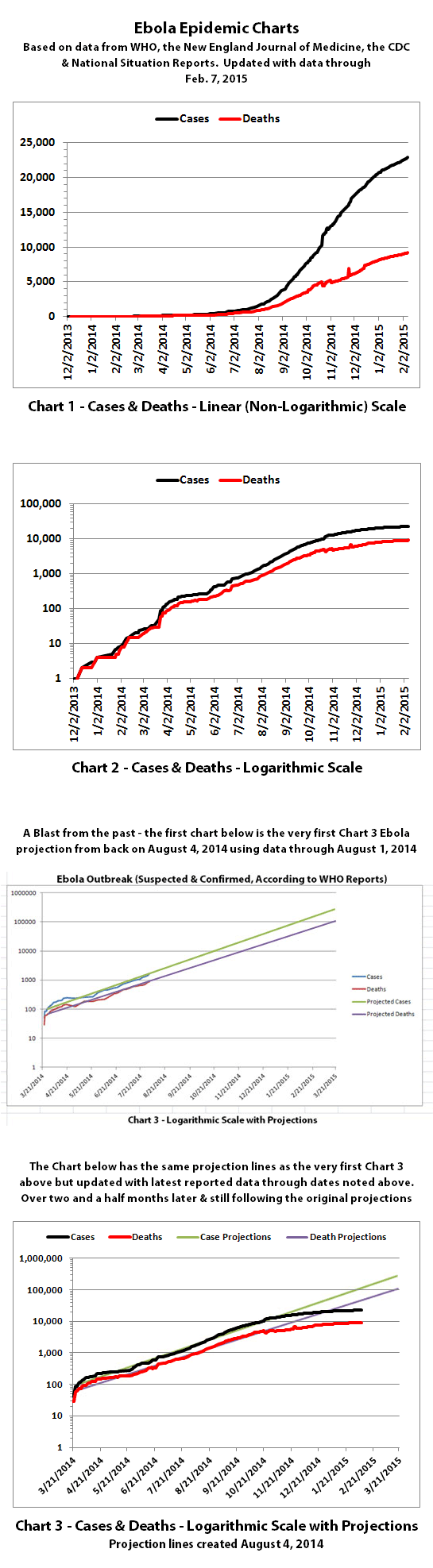
Charts 1, 2, and 6 show the cumulative numbers of reported cases and deaths so far. In Chart 1, the y (left) axis is linear. In Chart 2, the y axis is a logarithmic scale where major divisions of the axis increase by powers of 10 (the base is 10). Chart 6 has the y axis in powers of 2 (the base is 2, so 1, 2, 4, 8, etc.), so each major division represents a doubling of the numbers.
Exponential growth will look like a rapidly escalating curve on a linear scale but like a straight line on a logarithmic scale (base 10 or base 2 in these charts). Linear growth will look like a straight line on a linear scale and like a curve approaching a flat horizontal line on an exponential scale.
Charts 3, 4, and 5 are historical projections that would have been most likely if nothing changed to slow or stop the spread. For quite a while, reported cases and deaths followed these projections closely. But reported numbers finally started dropping below these historical projections back in October 2014. Hopefully this is a real improvement that is not due to problems in collecting or reporting data.
Charts 4B-4E and 5B-5E include more recently updated projections. For charts with color coded ranges, the green ranges are the projection if the spread continues as it has over recent weeks. The darker green in the lower part of some ranges would be expected if the spread continues to trend away from exponential growth toward linear growth (toward the bottom of the shaded areas).
The yellow range would be expected if the trend goes back to spreading at previous faster rates. And the red range would be expected if it starts growing again at the worst rates experienced so far during this epidemic.
Charts 7-8 were discontinued quite a while back.
Charts 9-12 were merged previously, and the combined chart shows monthly new cases and deaths reported.
Charts 13-14B show cumulative cases and deaths by country.
Chart 15 shows how many days it has taken for the cumulative number of cases to double over time. Higher points in the chart are good, they mean it is taking longer to double. Lower points are bad, they mean it is doubling faster. Previously cases doubled every 3 to 4 weeks. But for the last several months, the doubling rate has been slowing down. Currently, cases are doubling in about 108 days according to reported numbers.
The charts do not include the Congo, as that was allegedly an unrelated outbreak and it has been declared over.
These charts rely on 'official' reported numbers and can only be as accurate as that data. Reported Ebola data is subject to change as cases and deaths are reclassified, or as data sources or reporting methods change. I do not know how accurate 'official' reported numbers are, but there are a number of possible issues:
1. WHO,the CDC, Doctors Without Borders (MSF), etc. have in the past stated that actual cases and deaths "vastly" outnumber reported figures, possibly by at least 2 to 5 times.
2. There have been sudden large decreases or increases in recent months in officially reported cases and deaths. It is unclear why, but the sudden decreases and increases may indicate an inability to keep up with data tracking and recording.
3. Many countries have clamped down on Ebola news. At least one journalist has been arrested and at least one newspaper has been closed in west Africa. In the USA, an 'Ebola Czar' with a reputation as a political/public relations 'fixer' (and with no medical experience) was appointed to lead the US Ebola effort.
4. There are theories regarding Ebola that differ from the 'official' reports. Some believe there is no such thing as Ebola or that what is spreading is not Ebola. Some believe there is no outbreak at all. Some believe people are purposely being infected for economic or depopulation plans. I do not know if there is any truth to any of these beliefs, it can be a strange world.
The same disclaimers and references apply to all of these charts:
Charts and future projections were done by me, not by WHO, except in cases where it is stated that a chart includes WHO projections. I am not an Ebola expert, epidemiologist, virologist, or MD, but I manually compiled the data used to create these graphs from news updates on the following websites:
SOURCE: WHO website 1
SOURCE: WHO website 2
SOURCE: WHO website 3
SOURCE: WHO website 4
SOURCE: WHO website 5
SOURCE: CDC website 1
SOURCE: The New England Journal of Medicine
SOURCE: Guinea Situation Reports (posted on Humanitarian Response)
[NOTE: Situation Reports from Guinea are in French.]
SOURCE: Liberia Situation Reports
Mali Ministry of Sanitation and Hygiene
[NOTE: Situation Reports from Mali are in French.]
SOURCE: Sierra Leone Situation Reports
Please do not do anything you might regret based on charts or projections. Hopefully efforts to contain, quarantine, treat, prevent, or cure Ebola will eventually be successful, and hopefully sooner rather than later.
I've updated the Ebola charts with this WHO data. Explanations of the charts are below.
Charts 1, 2, and 6 show the cumulative numbers of reported cases and deaths so far. In Chart 1, the y (left) axis is linear. In Chart 2, the y axis is a logarithmic scale where major divisions of the axis increase by powers of 10 (the base is 10). Chart 6 has the y axis in powers of 2 (the base is 2, so 1, 2, 4, 8, etc.), so each major division represents a doubling of the numbers.
Exponential growth will look like a rapidly escalating curve on a linear scale but like a straight line on a logarithmic scale (base 10 or base 2 in these charts). Linear growth will look like a straight line on a linear scale and like a curve approaching a flat horizontal line on an exponential scale.
Charts 3, 4, and 5 are historical projections that would have been most likely if nothing changed to slow or stop the spread. For quite a while, reported cases and deaths followed these projections closely. But reported numbers finally started dropping below these historical projections back in October 2014. Hopefully this is a real improvement that is not due to problems in collecting or reporting data.
Charts 4B-4E and 5B-5E include more recently updated projections. For charts with color coded ranges, the green ranges are the projection if the spread continues as it has over recent weeks. The darker green in the lower part of some ranges would be expected if the spread continues to trend away from exponential growth toward linear growth (toward the bottom of the shaded areas).
The yellow range would be expected if the trend goes back to spreading at previous faster rates. And the red range would be expected if it starts growing again at the worst rates experienced so far during this epidemic.
Charts 7-8 were discontinued quite a while back.
Charts 9-12 were merged previously, and the combined chart shows monthly new cases and deaths reported.
Charts 13-14B show cumulative cases and deaths by country.
Chart 15 shows how many days it has taken for the cumulative number of cases to double over time. Higher points in the chart are good, they mean it is taking longer to double. Lower points are bad, they mean it is doubling faster. Previously cases doubled every 3 to 4 weeks. But for the last several months, the doubling rate has been slowing down. Currently, cases are doubling in about 108 days according to reported numbers.
The charts do not include the Congo, as that was allegedly an unrelated outbreak and it has been declared over.
These charts rely on 'official' reported numbers and can only be as accurate as that data. Reported Ebola data is subject to change as cases and deaths are reclassified, or as data sources or reporting methods change. I do not know how accurate 'official' reported numbers are, but there are a number of possible issues:
1. WHO,the CDC, Doctors Without Borders (MSF), etc. have in the past stated that actual cases and deaths "vastly" outnumber reported figures, possibly by at least 2 to 5 times.
2. There have been sudden large decreases or increases in recent months in officially reported cases and deaths. It is unclear why, but the sudden decreases and increases may indicate an inability to keep up with data tracking and recording.
3. Many countries have clamped down on Ebola news. At least one journalist has been arrested and at least one newspaper has been closed in west Africa. In the USA, an 'Ebola Czar' with a reputation as a political/public relations 'fixer' (and with no medical experience) was appointed to lead the US Ebola effort.
4. There are theories regarding Ebola that differ from the 'official' reports. Some believe there is no such thing as Ebola or that what is spreading is not Ebola. Some believe there is no outbreak at all. Some believe people are purposely being infected for economic or depopulation plans. I do not know if there is any truth to any of these beliefs, it can be a strange world.
The same disclaimers and references apply to all of these charts:
Charts and future projections were done by me, not by WHO, except in cases where it is stated that a chart includes WHO projections. I am not an Ebola expert, epidemiologist, virologist, or MD, but I manually compiled the data used to create these graphs from news updates on the following websites:
SOURCE: WHO website 1
SOURCE: WHO website 2
SOURCE: WHO website 3
SOURCE: WHO website 4
SOURCE: WHO website 5
SOURCE: CDC website 1
SOURCE: The New England Journal of Medicine
SOURCE: Guinea Situation Reports (posted on Humanitarian Response)
[NOTE: Situation Reports from Guinea are in French.]
SOURCE: Liberia Situation Reports
Mali Ministry of Sanitation and Hygiene
[NOTE: Situation Reports from Mali are in French.]
SOURCE: Sierra Leone Situation Reports
Please do not do anything you might regret based on charts or projections. Hopefully efforts to contain, quarantine, treat, prevent, or cure Ebola will eventually be successful, and hopefully sooner rather than later.
I read a Dutch article about 500 new cases in tho weeks in Guinee! I
a reply to: lottealma
link
link
link
In the last two weeks, new Ebola diagnosed cases are on the rise again in West Africa after the numbers had gone down. In Sierra Leone, there were 63 new confirmed cases in the last seven days.
With this development, President Ernest Bai Koroma brought back curfews and other travel restrictions to cut or prevent close contact between travelers on vessels, cabs and other forms of public transportation.
link
Ebola has been out of the U.S. headlines as the new cases have declined, but it still remains a deadly force in West Africa with nearly 400 new cases in the past three weeks. As the number of deaths from this outbreak of the Ebola virus approach 10,000, it still remains a serious threat impacting daily lives, including that of the Sierra Leone Vice President who just put himself in quarantine after one of his bodyguards died.
While the Ebola epidemic is no longer spiraling out of control like last summer or as widespread, it is still killing people weekly. Nearly 100 new cases were confirmed last week in Guinea, Sierra Leone, and Liberia, bringing the total of new Ebola infections to 397 in the last 21 days (the disease’s incubation period). During the year-long battle against this outbreak, approximately 23, 700 people have caught the virus, according to the World Health Organization (WHO).
Read more at guardianlv.com...
My friend who is a nurse has had continued Ebola preparation training, which didn't make much sense to me because all the numbers this year suggested
the virus was in decline. Today, however, I saw this article about a resurgence in cases in Sierra Leone.
www.nytimes.com...
www.nytimes.com...
It's been over a month since the last Ebola chart updates. Partly that's because the growth rate has significantly slowed down since October 2014
(at least according to reported data) and partly it's because life has been pretty busy. I will probably be updating the charts roughly monthly now
unless there are significant changes such as new countries affected or a sudden increase in growth again.
According to WHO, through March 22. 2015 the reported numbers for Ebola cases and deaths were:
I've updated some of the Ebola charts with this WHO data. Explanations of the charts are below.
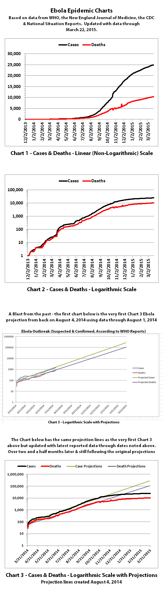
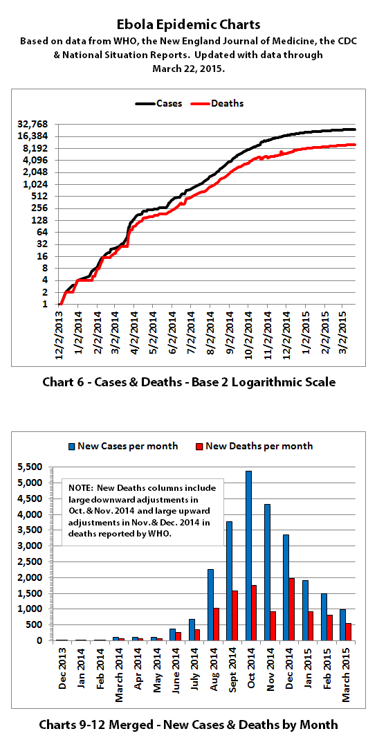
Charts 1, 2, and 6 show the cumulative numbers of reported cases and deaths so far. In Chart 1, the y (left) axis is linear. In Chart 2, the y axis is a logarithmic scale where major divisions of the axis increase by powers of 10 (the base is 10). Chart 6 has the y axis in powers of 2 (the base is 2, so 1, 2, 4, 8, etc.), so each major division represents a doubling of the numbers.
Exponential growth will look like a rapidly escalating curve on a linear scale but like a straight line on a logarithmic scale (base 10 or base 2 in these charts). Linear growth will look like a straight line on a linear scale and like a curve approaching a flat horizontal line on an exponential scale.
Chart 3 shows actual cases and deaths versus projections that were made back in early August 2014 when I first started doing the charts. You can clearly see exactly when reported data started deviating down from these early projections.
I haven't had a chance to update charts 4-4E and 5-5E yet because updating and creating new projections is extremely time consuming. But it looks like the trend has continued to be in the lowest range of previous projections in the last versions of these charts or below (thank goodness!).
Charts 7-8 were discontinued quite a while back.
Charts 9-12 were merged previously, and the combined chart shows monthly new cases and deaths reported.
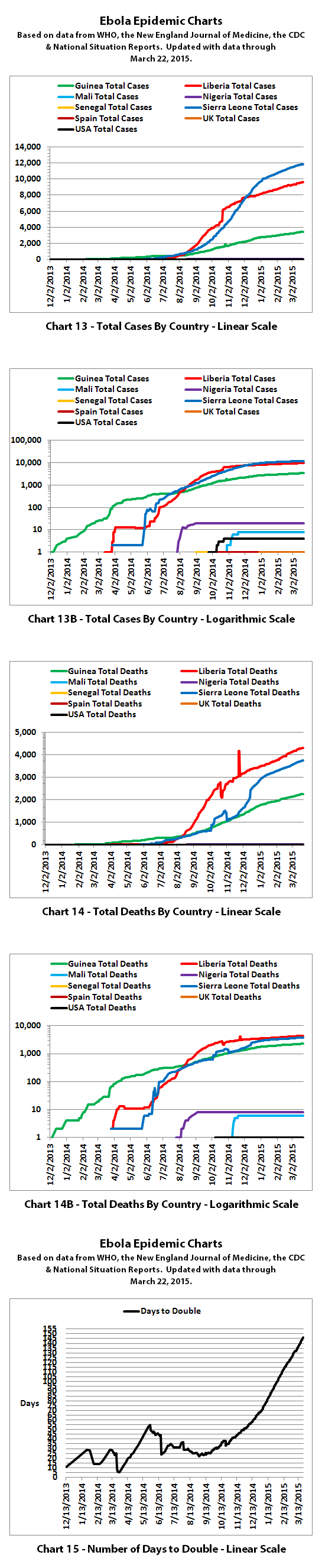
Charts 13-14B show cumulative cases and deaths by country.
Chart 15 shows how many days it has taken for the cumulative number of cases to double over time. Higher points in the chart are good, they mean it is taking longer to double. Lower points are bad, they mean it is doubling faster. Before the growth rate slowed down, cases doubled every 3 to 4 weeks. Currently, cases are doubling in about 146 days according to reported numbers.
The charts do not include the Congo, as that was allegedly an unrelated outbreak and it has been declared over.
These charts rely on 'official' reported numbers and can only be as accurate as that data. Reported Ebola data is subject to change as cases and deaths are reclassified, or as data sources or reporting methods change. I do not know how accurate 'official' reported numbers are, but there are a number of possible issues:
1. WHO,the CDC, Doctors Without Borders (MSF), etc. have in the past stated that actual cases and deaths "vastly" outnumber reported figures, possibly by at least 2 to 5 times.
2. There have been sudden large decreases or increases at times in officially reported cases and deaths. It is unclear why, but the sudden decreases and increases may indicate an inability to keep up with data tracking and recording or testing.
3. Many countries have clamped down on Ebola news. At least one journalist has been arrested and at least one newspaper has been closed in west Africa. In the USA, an 'Ebola Czar' with a reputation as a political/public relations 'fixer' (and with no medical experience) was appointed for a time to lead the US Ebola effort.
4. There are theories regarding Ebola that differ from the 'official' reports. Some believe there is no such thing as Ebola or that what is spreading is not Ebola. Some believe there is no outbreak at all. Some believe people are purposely being infected for economic or depopulation plans. I do not know if there is any truth to any of these beliefs, it can be a strange world.
The same disclaimers and references apply to all of these charts:
Charts and future projections were done by me, not by WHO, except in cases where it is stated that a chart includes WHO projections. I am not an Ebola expert, epidemiologist, virologist, or MD, but I manually compiled the data used to create these graphs from news updates on the following websites:
SOURCE: WHO website 1
SOURCE: WHO website 2
SOURCE: WHO website 3
SOURCE: WHO website 4
SOURCE: WHO website 5
SOURCE: CDC website 1
SOURCE: The New England Journal of Medicine
SOURCE: Guinea Situation Reports (posted on Humanitarian Response)
[NOTE: Situation Reports from Guinea are in French.]
SOURCE: Liberia Situation Reports
Mali Ministry of Sanitation and Hygiene
[NOTE: Situation Reports from Mali are in French.]
SOURCE: Sierra Leone Situation Reports
Please do not do anything you might regret based on charts or projections. Hopefully efforts to contain, quarantine, treat, prevent, or cure Ebola will eventually be successful, and hopefully sooner rather than later.
According to WHO, through March 22. 2015 the reported numbers for Ebola cases and deaths were:
I've updated some of the Ebola charts with this WHO data. Explanations of the charts are below.
Charts 1, 2, and 6 show the cumulative numbers of reported cases and deaths so far. In Chart 1, the y (left) axis is linear. In Chart 2, the y axis is a logarithmic scale where major divisions of the axis increase by powers of 10 (the base is 10). Chart 6 has the y axis in powers of 2 (the base is 2, so 1, 2, 4, 8, etc.), so each major division represents a doubling of the numbers.
Exponential growth will look like a rapidly escalating curve on a linear scale but like a straight line on a logarithmic scale (base 10 or base 2 in these charts). Linear growth will look like a straight line on a linear scale and like a curve approaching a flat horizontal line on an exponential scale.
Chart 3 shows actual cases and deaths versus projections that were made back in early August 2014 when I first started doing the charts. You can clearly see exactly when reported data started deviating down from these early projections.
I haven't had a chance to update charts 4-4E and 5-5E yet because updating and creating new projections is extremely time consuming. But it looks like the trend has continued to be in the lowest range of previous projections in the last versions of these charts or below (thank goodness!).
Charts 7-8 were discontinued quite a while back.
Charts 9-12 were merged previously, and the combined chart shows monthly new cases and deaths reported.
Charts 13-14B show cumulative cases and deaths by country.
Chart 15 shows how many days it has taken for the cumulative number of cases to double over time. Higher points in the chart are good, they mean it is taking longer to double. Lower points are bad, they mean it is doubling faster. Before the growth rate slowed down, cases doubled every 3 to 4 weeks. Currently, cases are doubling in about 146 days according to reported numbers.
The charts do not include the Congo, as that was allegedly an unrelated outbreak and it has been declared over.
These charts rely on 'official' reported numbers and can only be as accurate as that data. Reported Ebola data is subject to change as cases and deaths are reclassified, or as data sources or reporting methods change. I do not know how accurate 'official' reported numbers are, but there are a number of possible issues:
1. WHO,the CDC, Doctors Without Borders (MSF), etc. have in the past stated that actual cases and deaths "vastly" outnumber reported figures, possibly by at least 2 to 5 times.
2. There have been sudden large decreases or increases at times in officially reported cases and deaths. It is unclear why, but the sudden decreases and increases may indicate an inability to keep up with data tracking and recording or testing.
3. Many countries have clamped down on Ebola news. At least one journalist has been arrested and at least one newspaper has been closed in west Africa. In the USA, an 'Ebola Czar' with a reputation as a political/public relations 'fixer' (and with no medical experience) was appointed for a time to lead the US Ebola effort.
4. There are theories regarding Ebola that differ from the 'official' reports. Some believe there is no such thing as Ebola or that what is spreading is not Ebola. Some believe there is no outbreak at all. Some believe people are purposely being infected for economic or depopulation plans. I do not know if there is any truth to any of these beliefs, it can be a strange world.
The same disclaimers and references apply to all of these charts:
Charts and future projections were done by me, not by WHO, except in cases where it is stated that a chart includes WHO projections. I am not an Ebola expert, epidemiologist, virologist, or MD, but I manually compiled the data used to create these graphs from news updates on the following websites:
SOURCE: WHO website 1
SOURCE: WHO website 2
SOURCE: WHO website 3
SOURCE: WHO website 4
SOURCE: WHO website 5
SOURCE: CDC website 1
SOURCE: The New England Journal of Medicine
SOURCE: Guinea Situation Reports (posted on Humanitarian Response)
[NOTE: Situation Reports from Guinea are in French.]
SOURCE: Liberia Situation Reports
Mali Ministry of Sanitation and Hygiene
[NOTE: Situation Reports from Mali are in French.]
SOURCE: Sierra Leone Situation Reports
Please do not do anything you might regret based on charts or projections. Hopefully efforts to contain, quarantine, treat, prevent, or cure Ebola will eventually be successful, and hopefully sooner rather than later.
a reply to: ikonoklast
Great work as always, and thanks. ...I hope we're not going to see a second wave.
Great work as always, and thanks. ...I hope we're not going to see a second wave.
In Guinea, patient numbers are again rising. In Sierra Leone, many people are presenting with the virus who were not previously on lists of known Ebola contacts. On 20 March, a patient tested positive for Ebola in Monrovia, the first confirmed case in more than two weeks after the last known case was discharged in Liberia.
edit on 27/3/15 by soficrow because: link
new topics
-
Where should Trump hold his next rally
2024 Elections: 2 hours ago -
Shocking Number of Voters are Open to Committing Election Fraud
US Political Madness: 2 hours ago -
Gov Kristi Noem Shot and Killed "Less Than Worthless Dog" and a 'Smelly Goat
2024 Elections: 3 hours ago -
Falkville Robot-Man
Aliens and UFOs: 3 hours ago -
James O’Keefe: I have evidence that exposes the CIA, and it’s on camera.
Whistle Blowers and Leaked Documents: 4 hours ago -
Australian PM says the quiet part out loud - "free speech is a threat to democratic dicourse"...?!
New World Order: 5 hours ago -
Ireland VS Globalists
Social Issues and Civil Unrest: 5 hours ago -
Biden "Happy To Debate Trump"
2024 Elections: 6 hours ago -
RAAF airbase in Roswell, New Mexico is on fire
Aliens and UFOs: 6 hours ago -
What is the white pill?
Philosophy and Metaphysics: 7 hours ago
top topics
-
A Warning to America: 25 Ways the US is Being Destroyed
New World Order: 16 hours ago, 21 flags -
James O’Keefe: I have evidence that exposes the CIA, and it’s on camera.
Whistle Blowers and Leaked Documents: 4 hours ago, 12 flags -
Blast from the past: ATS Review Podcast, 2006: With All Three Amigos
Member PODcasts: 8 hours ago, 12 flags -
Australian PM says the quiet part out loud - "free speech is a threat to democratic dicourse"...?!
New World Order: 5 hours ago, 10 flags -
Biden "Happy To Debate Trump"
2024 Elections: 6 hours ago, 10 flags -
Mike Pinder The Moody Blues R.I.P.
Music: 8 hours ago, 8 flags -
Ireland VS Globalists
Social Issues and Civil Unrest: 5 hours ago, 5 flags -
RAAF airbase in Roswell, New Mexico is on fire
Aliens and UFOs: 6 hours ago, 5 flags -
What is the white pill?
Philosophy and Metaphysics: 7 hours ago, 5 flags -
Putin, Russia and the Great Architects of the Universe
ATS Skunk Works: 11 hours ago, 4 flags
active topics
-
Where should Trump hold his next rally
2024 Elections • 9 • : visitedbythem -
President BIDEN's FBI Raided Donald Trump's Florida Home for OBAMA-NORTH KOREA Documents.
Political Conspiracies • 35 • : Threadbarer -
Candidate TRUMP Now Has Crazy Judge JUAN MERCHAN After Him - The Stormy Daniels Hush-Money Case.
Political Conspiracies • 813 • : WeMustCare -
University of Texas Instantly Shuts Down Anti Israel Protests
Education and Media • 309 • : cherokeetroy -
Remember These Attacks When President Trump 2.0 Retribution-Justice Commences.
2024 Elections • 58 • : WeMustCare -
2024 Pigeon Forge Rod Run - On the Strip (Video made for you)
Automotive Discussion • 8 • : WhitewaterSquirrel -
Gov Kristi Noem Shot and Killed "Less Than Worthless Dog" and a 'Smelly Goat
2024 Elections • 28 • : cherokeetroy -
Shocking Number of Voters are Open to Committing Election Fraud
US Political Madness • 5 • : AwakeNotWoke -
The Acronym Game .. Pt.3
General Chit Chat • 7756 • : bally001 -
RAAF airbase in Roswell, New Mexico is on fire
Aliens and UFOs • 8 • : Skinnerbot