It looks like you're using an Ad Blocker.
Please white-list or disable AboveTopSecret.com in your ad-blocking tool.
Thank you.
Some features of ATS will be disabled while you continue to use an ad-blocker.

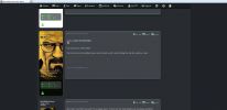
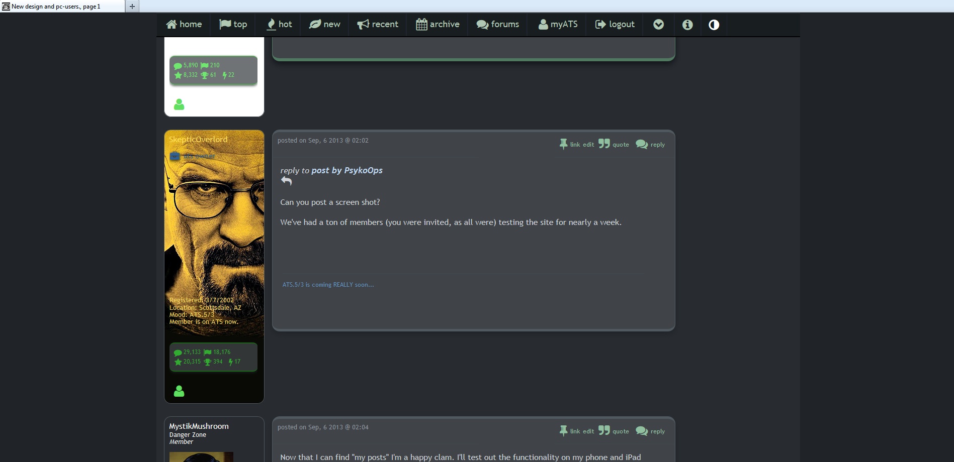
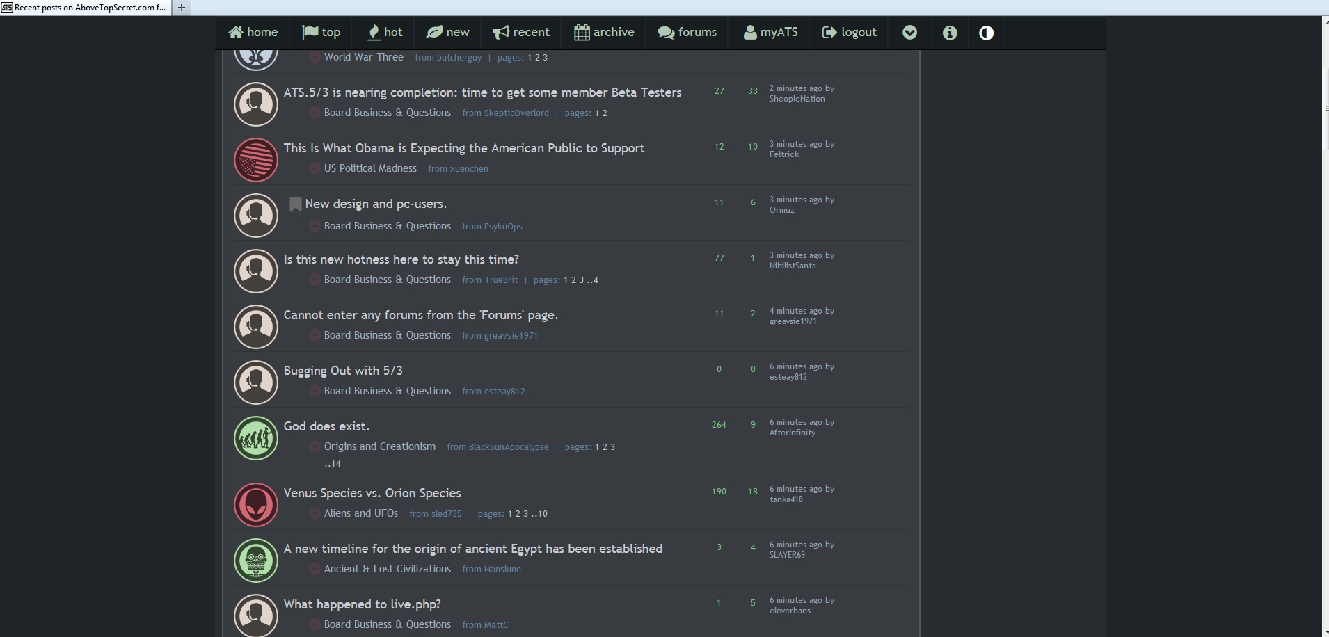
New design and pc-users.
page: 1share:
I fully understand that these days many people use tablets and phones to surf online. I and I'm sure many others use a pc. As such this new design
doesn't work at all. Fonts are way too big. Loads of empty space. This is just not pc-friendly at all. Can we at least get an option for a
pc-friendly layout?
reply to post by PsykoOps
Can you post a screen shot?
We've had a ton of members (you were invited, as all were) testing the site for nearly a week.
Can you post a screen shot?
We've had a ton of members (you were invited, as all were) testing the site for nearly a week.
Now that I can find "my posts" I'm a happy clam. I'll test out the functionality on my phone and iPad later tonight...
The site looks fine for me using Chrome, haven't tried it using any other browsers yet.
Definitely more "Jobs'ish" looking, however.
Definitely more "Jobs'ish" looking, however.
I do not like the new site at all I think it looks hideous. I will not be using my tablet for this site anymore at all. I really think they should
leave the old one up with the new one and let the user select which one they want to use.
The only thing that bugs me is that the box where your post is should extend to the bottom of the avatar like it did on the old one
while i do agree it is somewhat goofy compared to what we are used to.
I'd say give em a little time to settle it down.
I'm sure the guys have a plan for there solid PC based members.
personally, the new shiny look, while is visually appealing, kind of detracts from the theme of what the site is about, i guess what i mean to say is i miss the grungy dark looking "conspiracy theory feel".
Its all just to shiny and new to be a conspiracy theory related site now hah.
but hey that's just my 2 cent worth.
Muzz
desertguy
I do not like the new site at all I think it looks hideous. I will not be using my tablet for this site anymore at all. I really think they should leave the old one up with the new one and let the user select which one they want to use.
At first I thought it was ok, but the old one was better, imho.
reply to post by SkepticOverlord
The font is gigantic. The old one was perfect. Also sorry I skipped the test cause I hated the change on the first go around
My monitor resolution is 1920x1080.
The font is gigantic. The old one was perfect. Also sorry I skipped the test cause I hated the change on the first go around
My monitor resolution is 1920x1080.
edit on 5/9/2013 by PsykoOps because: (no reason given)
reply to post by PsykoOps
yeah thats the same on mine too bud,
alot of space, and yeah i have to agree the smileys are about the only hidious thing so far .. see what i mean DOH
Muzz
yeah thats the same on mine too bud,
alot of space, and yeah i have to agree the smileys are about the only hidious thing so far .. see what i mean DOH
Muzz
OMG if there's no ribbon then at least make the new topic pages automatically update.
It's like all the functionality of ATS that I actually used has now disappeared.
*curls up into fetal position*
It's like all the functionality of ATS that I actually used has now disappeared.
*curls up into fetal position*
reply to post by PsykoOps
I don't mind the changes in ATS I have been through many in my years as a member, but the new trend of adding all the "APPs" and links to what is for me useless site like Twitter, facebook and your tube among others is what gets to me. I do not subscribe to any, I don't even connect to the internet with my phone, that is what my Laptop is for.
Sorry to say that I will never, ever, belong to any social media is a matter of security issues, and that ATS is the only board I post when it comes to issues I care the most.
I agree with you the page lay out is too big, too bulky and is a lot of empty spaces in between.
But I still like changes and will never rob anybody from having their technical site enhanced.
+1 for the old layout. The old firehose section was a much better alternative to this new look. Could you please keep at least the old firehose page
format around, because many of us used it regularly. The newer version of this requires way too much scrolling to view the same amount of threads vs.
the old trusty firehose page.
This is where it shows most easily. On the old design you had 3 times as much topic visible at once.
This may look nicer and more tuned but the old one was more ergonomic.
This may look nicer and more tuned but the old one was more ergonomic.
I'm not one to complain about forum format changes. Many times it's for the better.
This however looks considerably worse. Not very PC friendly. This site was built on PC users I'm surprised ATS is catering to those on tablets/phones.
This however looks considerably worse. Not very PC friendly. This site was built on PC users I'm surprised ATS is catering to those on tablets/phones.
When visiting the site (not logged in) the empty space at the top of each thread fills the whole screen. Once logged in it isn't as bad. I dont think
this is attractive to new visitors.
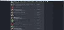
new topics
-
They say justice is blind.
Religion, Faith, And Theology: 17 minutes ago -
Liberal Democrats to Table a Motion of No Confidence in the government Tomorrow
Regional Politics: 1 hours ago -
Time Traveler Caught on Camera?
Paranormal Studies: 2 hours ago -
Trump legal cases are falling apart at break neck speeds
US Political Madness: 2 hours ago -
We are screwed
Global Meltdown: 2 hours ago -
Medvedev: “No one can hide, a global catastrophe is coming”
World War Three: 3 hours ago -
Russians And Americans At Same Airbase In Niger But Not Sharing Restrooms
World War Three: 6 hours ago -
US Air Force Secretary Kendall flies in cockpit of plane controlled by AI
Aircraft Projects: 11 hours ago
top topics
-
Trump legal cases are falling apart at break neck speeds
US Political Madness: 2 hours ago, 11 flags -
Medvedev: “No one can hide, a global catastrophe is coming”
World War Three: 3 hours ago, 10 flags -
We are screwed
Global Meltdown: 2 hours ago, 9 flags -
The BEAST System of Revelation has been awoken and has assumed control, at least since COVID.
New World Order: 16 hours ago, 7 flags -
Time Traveler Caught on Camera?
Paranormal Studies: 2 hours ago, 4 flags -
Messages of Hope – Unity through AI
Dreams & Predictions: 12 hours ago, 3 flags -
Liberal Democrats to Table a Motion of No Confidence in the government Tomorrow
Regional Politics: 1 hours ago, 3 flags -
Russians And Americans At Same Airbase In Niger But Not Sharing Restrooms
World War Three: 6 hours ago, 2 flags -
Happy Cinco de mayo.
General Chit Chat: 12 hours ago, 2 flags -
US Air Force Secretary Kendall flies in cockpit of plane controlled by AI
Aircraft Projects: 11 hours ago, 1 flags
active topics
-
Medvedev: “No one can hide, a global catastrophe is coming”
World War Three • 39 • : ufoorbhunter -
-@TH3WH17ERABB17- -Q- ---TIME TO SHOW THE WORLD--- -Part- --44--
Dissecting Disinformation • 817 • : cherokeetroy -
SC Jack Smith is Using Subterfuge Tricks with Donald Trumps Upcoming Documents Trial.
Dissecting Disinformation • 131 • : WeMustCare -
Time Traveler Caught on Camera?
Paranormal Studies • 8 • : CarlLaFong -
Modern Mind Control
General Conspiracies • 41 • : Dreftenq -
The BEAST System of Revelation has been awoken and has assumed control, at least since COVID.
New World Order • 13 • : Cvastar -
They say justice is blind.
Religion, Faith, And Theology • 0 • : BrotherKinsMan -
We are screwed
Global Meltdown • 5 • : Cvastar -
Mysterious Spiral 'UFO' Sightings Reported Across US, Europe
Aliens and UFOs • 21 • : pianopraze -
Liberal Democrats to Table a Motion of No Confidence in the government Tomorrow
Regional Politics • 3 • : pianopraze