It looks like you're using an Ad Blocker.
Please white-list or disable AboveTopSecret.com in your ad-blocking tool.
Thank you.
Some features of ATS will be disabled while you continue to use an ad-blocker.

Mandela Effect - Ford Logo - Three New Strong Evidences Found
page: 11share:
Obviously logos change guys, come on let's not assume he's cognitively impared. I remember the modern logo not having that curly q. That change is
what alerted me to the ME to begin with
a reply to: Pearj
If this were a genuine Mandela Effect, ie a shift in realities, there would be no residual evidence for what the logo had looked like in the past. You might remember the thing as being different from how it is now, but all physical traces for what you remember will have vanished. In fact, it's not that the physical traces have vanished, it's simply that they never existed in this branch of reality in the first place.
If this were a genuine Mandela Effect, ie a shift in realities, there would be no residual evidence for what the logo had looked like in the past. You might remember the thing as being different from how it is now, but all physical traces for what you remember will have vanished. In fact, it's not that the physical traces have vanished, it's simply that they never existed in this branch of reality in the first place.
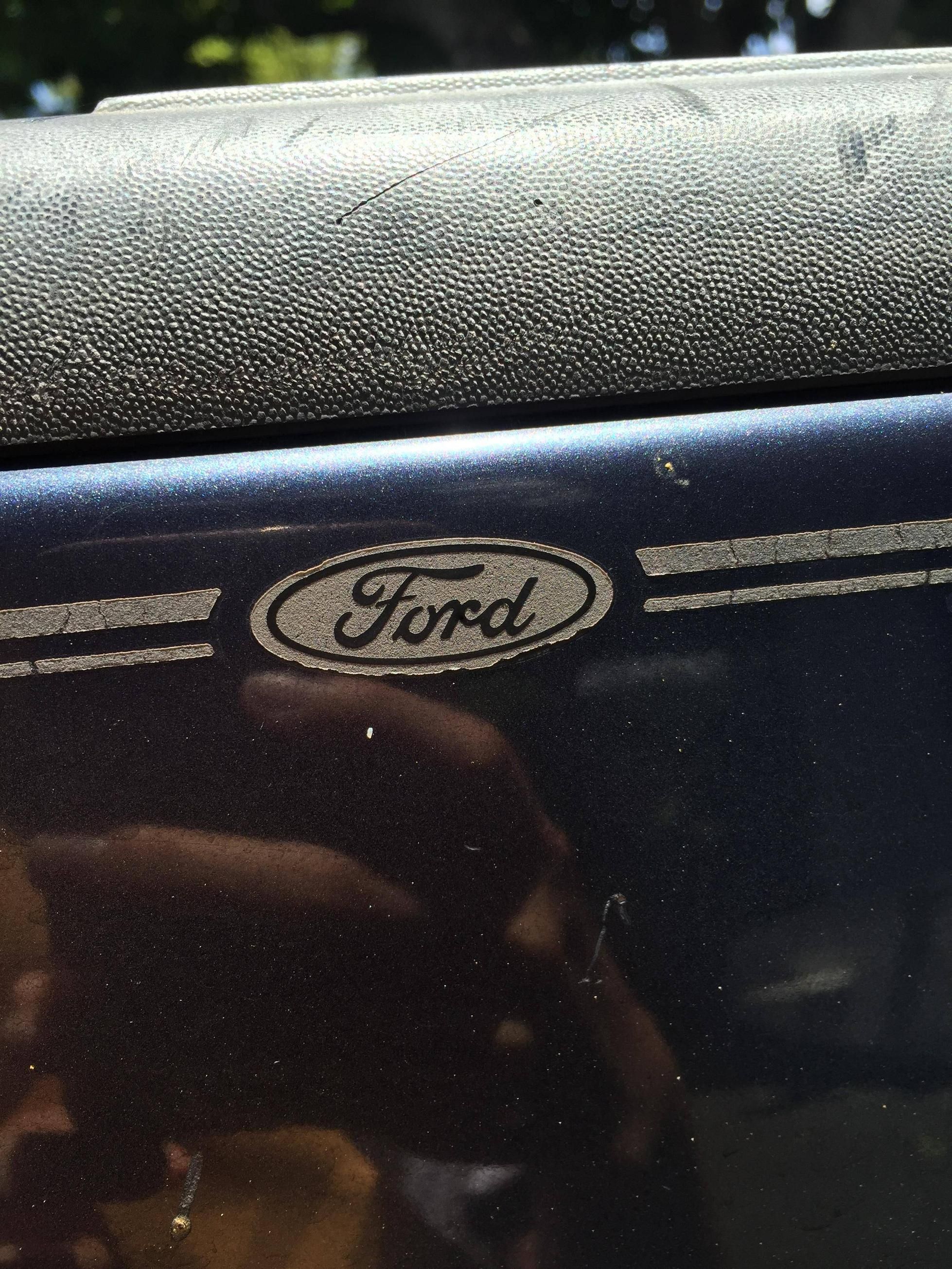
I've owned fords my whole life and my Grandfather did too and i am now 57.
I have spent hours and hours working on them and I DO NOT remember a Curly pig tail on the letter F.
I had to go outside and look at my Ford truck in the driveway right now and look at the F and sure enough, there is the curly thingy.
Not sure what is happening but my wife says she notices small things changing in this/our timeline too.
That being said, if it's some form of timeline shift then it would have always been like this in THIS timeline and no one knows how to explain how it is happening.
And Volkswagen never had a split between the V and W either...lol...goofy
The main point is those affected remember the logos like vw and ford being different starting out. Now theyve been this way since almost the
beginning and it doesnt make sense.
Pre-2004 logo read FORD or Ford
CURRENT logo reads Fluxd
Most peculiarly, 1912 variant reads Flnuxd
How did they get Flnuxd from Ford Motor Co.?!
CURRENT logo reads Fluxd
Most peculiarly, 1912 variant reads Flnuxd
How did they get Flnuxd from Ford Motor Co.?!
When googling the Ford logo in connection with the Mandela effect, this particular image is linked with this thread:
It should be noted, however, that upon close examination of the image, there is evidence of digital manipulation in the specific area around where the Ford F-swirl should be, indicating that it has been removed, and covered using a clone stamp tool of the pixels around it.
Therefore, this is not a reasonable piece of evidence.
edit on 26-2-2019 by Nyx13 because: clarity, removed unnecessary verbage
the F has too many pigtails, and the r is more like an x now. overall, it looks like the Ford logo somehow accommodated having 3 sixes into it.
likewise, the VW logo now reads vv and v due to the line thru the middle. that makes 3 v's which is 666 in Hebrew. who invented VW?
volvo has a masculine Mars arrow.
those are the 3 car logos that transformed to me around 2012, and theres very little residue left as to how they looked, except in artwork.
new topics
-
4/27/24 New Jersey Earthquake
Fragile Earth: 43 minutes ago -
Fun with extreme paints
Interesting Websites: 2 hours ago -
CIA is alleged to be operat social media troll frms in Kyiv
ATS Skunk Works: 3 hours ago -
Rainbow : Stargazer
Music: 4 hours ago -
I sleep no more.
Philosophy and Metaphysics: 6 hours ago -
Canada caught red-handed manipulating live weather data and make it warmer
Fragile Earth: 6 hours ago -
Why Files Our Alien Overlords | How We Secretly Serve The Tall Whites
Aliens and UFOs: 8 hours ago -
Curse of King Tuts Tomb Solved
Ancient & Lost Civilizations: 9 hours ago -
What allies does Trump have in the world?
ATS Skunk Works: 9 hours ago
top topics
-
Canada caught red-handed manipulating live weather data and make it warmer
Fragile Earth: 6 hours ago, 15 flags -
Why Files Our Alien Overlords | How We Secretly Serve The Tall Whites
Aliens and UFOs: 8 hours ago, 9 flags -
Curse of King Tuts Tomb Solved
Ancient & Lost Civilizations: 9 hours ago, 7 flags -
What allies does Trump have in the world?
ATS Skunk Works: 9 hours ago, 4 flags -
CIA is alleged to be operat social media troll frms in Kyiv
ATS Skunk Works: 3 hours ago, 3 flags -
4/27/24 New Jersey Earthquake
Fragile Earth: 43 minutes ago, 3 flags -
I sleep no more.
Philosophy and Metaphysics: 6 hours ago, 2 flags -
Fun with extreme paints
Interesting Websites: 2 hours ago, 1 flags -
Rainbow : Stargazer
Music: 4 hours ago, 0 flags
active topics
-
University of Texas Instantly Shuts Down Anti Israel Protests
Education and Media • 349 • : marg6043 -
James O’Keefe: I have evidence that exposes the CIA, and it’s on camera.
Whistle Blowers and Leaked Documents • 23 • : fringeofthefringe -
4/27/24 New Jersey Earthquake
Fragile Earth • 2 • : FlyersFan -
Gov Kristi Noem Shot and Killed "Less Than Worthless Dog" and a 'Smelly Goat
2024 Elections • 86 • : budzprime69 -
President BIDEN's FBI Raided Donald Trump's Florida Home for OBAMA-NORTH KOREA Documents.
Political Conspiracies • 44 • : ADVISOR -
Supreme Court Oral Arguments 4.25.2024 - Are PRESIDENTS IMMUNE From Later Being Prosecuted.
Above Politics • 120 • : Zanti Misfit -
Manor Lords - Medieval City Builder with RTS Combat - Early Access 26th April
Video Games • 8 • : gortex -
Definitive 9.11 Pentagon EVIDENCE.
9/11 Conspiracies • 433 • : Lazy88 -
Ireland VS Globalists
Social Issues and Civil Unrest • 9 • : GeorgeVanTassel -
Hate makes for strange bedfellows
US Political Madness • 58 • : Terpene