It looks like you're using an Ad Blocker.
Please white-list or disable AboveTopSecret.com in your ad-blocking tool.
Thank you.
Some features of ATS will be disabled while you continue to use an ad-blocker.
share:
So...here is Hillary's campaign logo designed by Michael Bierut:
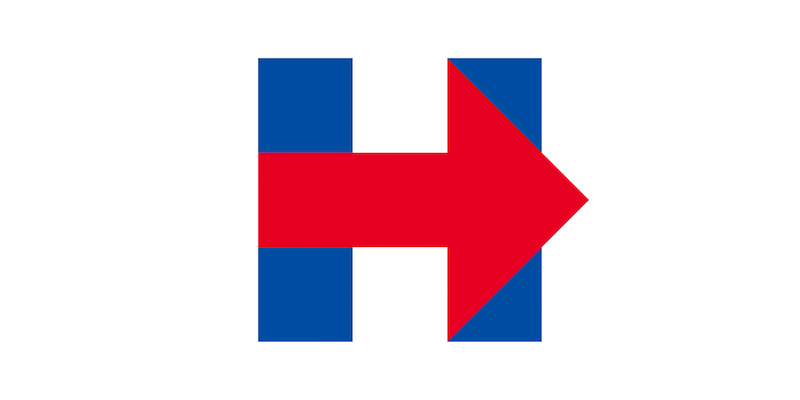
I have already started reading some odd buzz on this logo and I, myself, find it interesting. I am wondering if she is trying to play to the conservative side with it, possibly trying to pick up some of the liberal conservatives and this is her way of saying she is going to be a bit more conservative to them? Odd there is more red than blue in it to me.....I know they are the flag colors as well, but I would think the typical democratic candidate would have the blue more prominent than this......especially Hillary.
One interesting thing to note is that the design firm of Michael Bierut is named Pentagram.....Pentagram
Here are some of the comments I have read on it:
Source
Source
Either way, I find it a very boring logo for a presidential campaign. I know there are meanings in a lot of the logo's, so what is your take on this one?

I have already started reading some odd buzz on this logo and I, myself, find it interesting. I am wondering if she is trying to play to the conservative side with it, possibly trying to pick up some of the liberal conservatives and this is her way of saying she is going to be a bit more conservative to them? Odd there is more red than blue in it to me.....I know they are the flag colors as well, but I would think the typical democratic candidate would have the blue more prominent than this......especially Hillary.
One interesting thing to note is that the design firm of Michael Bierut is named Pentagram.....Pentagram
Here are some of the comments I have read on it:
Source
When considering the range of work for the Obama campaign — from Andy Keene’s logo (done as part of Sol Sender’s team), to Scott Thomas’ applications, to Shepard Fairey’s plagiarized poster — we see room for creativity within a managed system. But so far, for Hillary, all I’ve seen are missed opportunities. All the arrow applications are flat and simplistic. A pointing finger rather than a metaphor for progress. A visual tic rather than a passionate call for action.
Source
Here are three questions I see in cyberspace regarding Mrs. Clinton's logo:
Does it use white space in a dynamic way?
Is the color value of the red and blue too close?
Should the arrow be pointing to the left (Democratic)? Does the red read 'Republican'?
Either way, I find it a very boring logo for a presidential campaign. I know there are meanings in a lot of the logo's, so what is your take on this one?
edit on 4/22/15 by Vasa Croe because: (no reason given)
originally posted by: cancerslug
looks like a hospital parking sign to me.
Yes..it does. I find it odd that it is so plain and boring for a logo for a presidential campaign.
A triangle with the twin towers behind it symbolizing that the Illuminati is moving forward.
originally posted by: vonspurter
a reply to: Vasa Croe
Twin towers with a right wing arrow displaying who did it
Now that is an interesting thought. Trying to put the blame on the Republican party. Can't say I would have ever come up with that. I guess it could also be implying that both sides had a part.
The road to hell is this way.
Such a crummy logo, with billions of dollars stashed away you'd think she could have afforded a real graphic artist and not a kid with MSPaint.
Such a crummy logo, with billions of dollars stashed away you'd think she could have afforded a real graphic artist and not a kid with MSPaint.
edit on 22-4-2015 by Gully because: typo
originally posted by: FearYourMind
A triangle with the twin towers behind it symbolizing that the Illuminati is moving forward.
Yeah..the triangle was the most obvious symbolism in this to me. I would love to hear Hillary's reasoning behind going with this logo, as well as Bierut's reason for making this logo in particular.
I find the name of the company Bierut works for, Pentagram, to be oddly unsettling as well.
originally posted by: Gully
The road to hell is this way.
Such a crummy logo, with billions of dollars stashed away you'd think she could have afforded a real graphic artist and not a kid with MSPaint.
Sad thing is that she probably spent a couple hundred thousand to get this done and the spiel that went along with it to help sell her on using this one.
a reply to: Vasa Croe
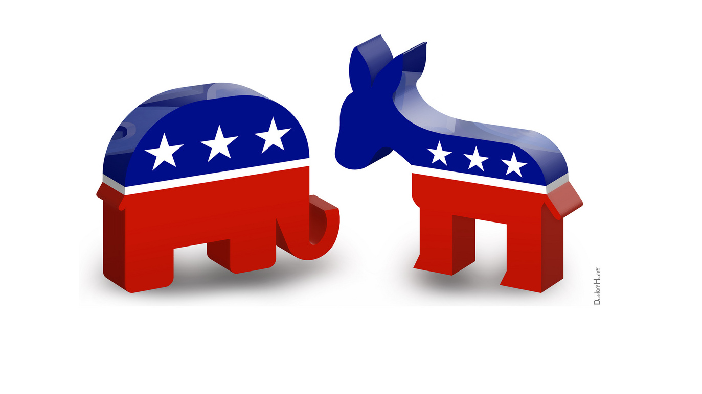
So, the sly bitch is using subtle tactics of the RED and BLUE of the democratic donkey and republican elephant to gain maximum votes and the arrow is pointing to the right, which could suggest giving the right the flick.
Either way, when I saw it I immediately saw "Hillary - piss off that way"
So, the sly bitch is using subtle tactics of the RED and BLUE of the democratic donkey and republican elephant to gain maximum votes and the arrow is pointing to the right, which could suggest giving the right the flick.

Either way, when I saw it I immediately saw "Hillary - piss off that way"
Pentagram, Penta meaningn of course, Five. Lets see. The 4 corners of the uppercase H and the protruding arrow out the rigyt side, creating a 5th
point, or angle, if one were to outline it using straight lines only.
You migyt think the arrow would point left, corresponding to her political leanings, but my guess is they thought people would see it as a vote for her is like taking a step backwards, when today everyone is about Forward, Progress, whatever...
The use of red and blue I'm guessing they are hoping people will imagine that she will work with the other party to get things done for once instead of the bipartisan gridlock we've seen in the past...
It is very tacky looking. Which is good. I don't want anything that's going to help her even a little.
Actually there are three triangles which could represent the Trilateral Commission, Bilderberg and CFR who together are the New World Order globalist
or "Illuminati".
Let's be honest. She will say it means "Hillary moving our country forward" or something in those terms. Which it very well may have been intended to
mean, but when I see a giant red triangle it definitely raises the red flag.
edit on 22-4-2015 by FearYourMind because: (no reason
given)
originally posted by: FearYourMind
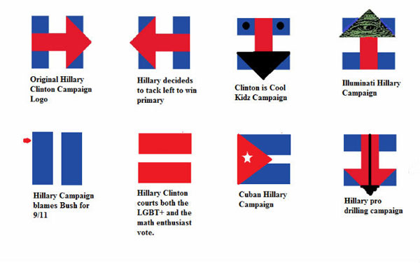
Some other options they considered.
Ha! Now those are good! I think the Cuba one is dead on.
Been saying for year or two that it would be a Hill vs Bush fight and a hill is bigger than a bush (maybe they should have been called tree - now
there's a thought! What or which tree!) Hilly billy's (under the table) Clinton is going to pay bill back and try out the Whitehouse table for
herself.
Whoever the US Sheeple elect will make little difference because they are all puppets and crooks (make for a good satirical show that title).
Hill will for Bill! And Bush will be mush!
Its rigged and the US folk are frigged!
Good luck
Whoever the US Sheeple elect will make little difference because they are all puppets and crooks (make for a good satirical show that title).
Hill will for Bill! And Bush will be mush!
Its rigged and the US folk are frigged!
Good luck
originally posted by: 3n19m470
Pentagram, Penta meaningn of course, Five. Lets see. The 4 corners of the uppercase H and the protruding arrow out the rigyt side, creating a 5th point, or angle, if one were to outline it using straight lines only.
You migyt think the arrow would point left, corresponding to her political leanings, but my guess is they thought people would see it as a vote for her is like taking a step backwards, when today everyone is about Forward, Progress, whatever...
The use of red and blue I'm guessing they are hoping people will imagine that she will work with the other party to get things done for once instead of the bipartisan gridlock we've seen in the past...
It is very tacky looking. Which is good. I don't want anything that's going to help her even a little.
Yeah....it is very tacky.
I did read that some interpret the arrow to the right meaning just that....progress. I am sure she saw the Republican symbolism in it and wondering how, if it comes up, she will play it off.
new topics
-
This is adorable you guys!
General Chit Chat: 4 hours ago -
Reprehensible Behavior
US Political Madness: 5 hours ago -
Defending the need for adherence to Old Testament commandments under the new covenant of Christ
Conspiracies in Religions: 6 hours ago -
Those Drones over NJ and elsewhere
Aliens and UFOs: 10 hours ago -
South Korean coup was an attempt to start WW3
World War Three: 11 hours ago -
Archer aviation and the NJ drones
Aircraft Projects: 11 hours ago
top topics
-
Those Drones over NJ and elsewhere
Aliens and UFOs: 10 hours ago, 8 flags -
Reprehensible Behavior
US Political Madness: 5 hours ago, 8 flags -
South Korean coup was an attempt to start WW3
World War Three: 11 hours ago, 7 flags -
This is adorable you guys!
General Chit Chat: 4 hours ago, 7 flags -
Archer aviation and the NJ drones
Aircraft Projects: 11 hours ago, 5 flags -
Defending the need for adherence to Old Testament commandments under the new covenant of Christ
Conspiracies in Religions: 6 hours ago, 5 flags
active topics
-
Could rampant land speculation have caused the Civil War?
History • 35 • : matafuchs -
George Stephanopoulos and ABC agree to pay $15 million to settle Trump defamation suit
Mainstream News • 23 • : Brotherman -
The Acronym Game .. Pt.4
General Chit Chat • 1015 • : JJproductions -
Pelosi injured in Luxembourg
Other Current Events • 45 • : rickymouse -
Nov 2024 - Former President Barack Hussein Obama Has Lost His Aura.
US Political Madness • 19 • : Connector -
Post A Funny (T&C Friendly) Pic Part IV: The LOL awakens!
General Chit Chat • 7911 • : KrustyKrab -
Sky Intruders - Drones, Deception & One Weird UFO Video : Weaponizes : Episode #62
Aliens and UFOs • 7 • : DontTreadOnMe -
They Know
Aliens and UFOs • 97 • : DontTreadOnMe -
Will all hell break out? Jersey drones - blue beam
Aliens and UFOs • 69 • : DontTreadOnMe -
The Mystery Drones and Government Lies --- Master Thread
Political Conspiracies • 103 • : Zaphod58

