It looks like you're using an Ad Blocker.
Please white-list or disable AboveTopSecret.com in your ad-blocking tool.
Thank you.
Some features of ATS will be disabled while you continue to use an ad-blocker.

!!!Mars Blue Sky & Water!!!
page: 23share:
Originally posted by zorgon
And if a stray camel came along who would ever notice missing image numbers in a data set when there are 100,000 images from each Rover?
It is quite funny that most do not take notice of that fact. 5 years of taking pictures should amount to even more than 100 thousand.
But as you stated, its right there in front of everyone, right on NASA's site, clearly visible, verifiable, of the missing data sets.
Never Any Substantial Amount
Cheers!!!!
Originally posted by ArMaP
reply to post by Aeons
I know that I am nitpicking once more, but that site does not tell the truth when it says that the L4L5L5L5L6 images are true colour, because there is no way of having a true colour image without the whole visible spectrum, any combination of image from the rovers (even the radiometrically corrected ones) can not make a true colour, only approximate true colour, at best.
PS: he even says that it "approximate true colors sufficiently", so they cannot be true colour.
[edit on 26/3/2009 by ArMaP]
We dont need 100th decimal place filters to get a close representation of what the color is on Mars.
Viking had full RGB spectrum analog cameras and captured pretty darned accurate color images of Mars. But of course, NASA cranks up the RED channel on their published images. Basic layiering of those RGB raw image sets results in images that are not all RED.
This silly argument over true/not true color is just that..silly. Obviously those limited bandwidth filters on the MER rovers were deliberately made narrow to instigate this nonsense debate about true color, to give them and the doubters more to argue with, but they all forget one thing....the Viking raw data.
Careful combination of those data sets can reveal a 99 percent accuracy to what it looks like on Mars.
The MER images, because of the diliberate narrow designed filters, only gives an approximation.
Making full spectrum RGB filters would not have added any more weight, or any more significant cost of each filter. Each is a simple lens fitted into a wheel with holes for each filter lens that rotates in front of the camera apperature. They would not have taken up any more room on that wheel as the narrow filters.
If the approximation clearly shows Mars is NOT a red saturated planet, that is good enough to know that Mars is NOT a red saturated planet.
"Blue skies...nothing but blue skies....do I see" Humm hummm.
Cheers!!!!
reply to post by RFBurns
Are you talking about images like these?
[atsimg]http://files.abovetopsecret.com/images/member/6e6579ae57fc.png[/atsimg]
[atsimg]http://files.abovetopsecret.com/images/member/2b960d471572.png[/atsimg]
Yes, they look great, but we cannot be sure of the accuracy of the combination of the three images for each channel, as I said before in another thread, the problem is not the bandwidth, it's the way the photos are taken, taking three photos for each channel with automatic adjustments will not give the same results as taking a full visible spectrum colour photo, so some adjustments are needed, and those adjustments are the responsible for the reddish hue on Mars photos.
But maybe we can see in our lifetimes real colour photos from Mars, I have patience enough to wait.
PS: RFBurns, are you following me, you had not posted on this thread until I made my previous post.
PPS: I forgot to add that I like decimal places.
[edit on 26/3/2009 by ArMaP]
reply to post by ArMaP
Wouldnt you say that even a 5 percent tolorance from center would be close enough to know that Mars is not entirely red?
I mean really....how much decimal place accuracy does there have to be to say "oh look, Mars does have a blue sky, its not always so red like NASA shows it to be, and even rocks and the dirt look more natural than in those red saturated images"?
I dont mind decimal places either but I dont need to nit pick it down to the millionth place to see the obvious either.
Trying to go so far past the point tends to make a person overlook the simplistic when simplistic is all that is needed.
Now even in your example photos above, neither one of them are red saturated.
Even the white on the probe looks white, not all reddish pink like that in NASA's images.
If you got those channels balanced out so that your white is white, regardless of light saturation, your going to get pretty darned close to the actual scene.
Its called "white balance"...and when you got proper white balance, that means you got all 3 channels of RGB properly balanced.
On a vectorscope, properly adjusted RGB channels will make the vectorscope dot hit dead center when looking at a white chart.
The chart on the Viking probe is just that, a white balance chart.
You adjust those channels for proper white balance, then your red, green, blue, grey, and black, will be correct.
Then everything else in the image will also be correct, or at the very least, within 1 percent.
Cheers!!!!
[edit on 26-3-2009 by RFBurns]
reply to post by RFBurns
What happens when the white chart is being illuminated by a coloured light?
Doesn't it become coloured by that light? What would the vectorscope show in a case like that? The target chart is still white, but the image is not; correcting the image to make the white target look white will show the object (the white chart) as it is, but not as it can be seen on that scene, illuminated by a coloured light.
PS: I have never seen a vectorscope, so I cannot say what happens, but my knowledge in other areas makes me think that my interpretation of what would happen is probably correct.
I posted the following information in another thread, but I think it is relevant for this thread also, so I will repost it here.
As promised, I made some tests to see if there is a difference between a normal photo taken with the visible spectrum and a photo made with three photos, one for each channel (red, green and blue).
My sister got me some samples of filters (they are not filters for cameras, they are light filters), and I chose the ones closest to the ones used by the Rover's cameras.
These are the characteristics of the three filters, showing what wavelenghts they let through them.
Red
Green
Blue
Combination of all three filters
It's noticeable that they are not narrow-band filters, so if the differences may be stronger with narrow-band filters I do not have any way of knowing it, at least for now.
First, a colour target from a HP scanner.
Photo taken with sunlight and "auto levels" applied on Photoshop.
Same conditions, but composite made with three photos from each channel.
The colours on the composite look stronger, and they are farther from what I see than the visible light photo.
Same colour target, under artificial light, giving it a more yellow tint.
Same conditions, but composite.
There is a bigger difference between these two photos than between those taken under sunlight, and that is probably because the blue filter, when using the artificial light, gave a very dark photo, so the auto levels did not had as many data to work as with the other channels, making a yellowish image.
Now, a photo from a sunlit, outdoor view (what I see from my dinning-room window)

(click for full size)
And the composite for the same view, some seconds after.
(click for full size)
Some things that are visible on this comparison:
1. the clouds were too fast.
2. the blues are stronger, both the sky and a building on the background in the right side are bluer
3. all reds are weaker, the reflected light on the wall on the left side, for example, is not as red on the composite as it is on the "real" photo
4. the more neutral tones become a little weird, probably because of the lack of red, but I am not sure
One thing that is not visible (and that only I can see) is that the "real" photo is much closer to the true look of that scene, although it was a little darker than in "real.
Considering this, I think (even more than before) that just making composites with the Rover's photos creates images with too many blue and little red. That does not mean that the reddish NASA photos are correct (I have no way of knowing) but it makes me think that they are really closer to what can be seen on Mars.
The camera was on automatic for all photos.
I used the camera's black and white (greyscale) feature for the three different channels' photos.
I used auto levels in the colour photos and on each channel to make it the most automatic possible, and closer to what we do with the Rovers' photos.
As promised, I made some tests to see if there is a difference between a normal photo taken with the visible spectrum and a photo made with three photos, one for each channel (red, green and blue).
My sister got me some samples of filters (they are not filters for cameras, they are light filters), and I chose the ones closest to the ones used by the Rover's cameras.
These are the characteristics of the three filters, showing what wavelenghts they let through them.
Red
Green
Blue
Combination of all three filters
It's noticeable that they are not narrow-band filters, so if the differences may be stronger with narrow-band filters I do not have any way of knowing it, at least for now.
Photo taken with sunlight and "auto levels" applied on Photoshop.
Same conditions, but composite made with three photos from each channel.
The colours on the composite look stronger, and they are farther from what I see than the visible light photo.
Same conditions, but composite.
There is a bigger difference between these two photos than between those taken under sunlight, and that is probably because the blue filter, when using the artificial light, gave a very dark photo, so the auto levels did not had as many data to work as with the other channels, making a yellowish image.
(click for full size)
And the composite for the same view, some seconds after.
(click for full size)
Some things that are visible on this comparison:
1. the clouds were too fast.
2. the blues are stronger, both the sky and a building on the background in the right side are bluer
3. all reds are weaker, the reflected light on the wall on the left side, for example, is not as red on the composite as it is on the "real" photo
4. the more neutral tones become a little weird, probably because of the lack of red, but I am not sure
One thing that is not visible (and that only I can see) is that the "real" photo is much closer to the true look of that scene, although it was a little darker than in "real.
Considering this, I think (even more than before) that just making composites with the Rover's photos creates images with too many blue and little red. That does not mean that the reddish NASA photos are correct (I have no way of knowing) but it makes me think that they are really closer to what can be seen on Mars.
I used the camera's black and white (greyscale) feature for the three different channels' photos.
I used auto levels in the colour photos and on each channel to make it the most automatic possible, and closer to what we do with the Rovers' photos.
Hi to everyone!
I saw that there are several interesting discussions about "real" color of Mars: really well made this little guide www.abovetopsecret.com...
However after all these years that the rovers are on Mars, we can make some little observation.
Personally, I think there is no a cover-up about the color, but perhaps there is control over the issue of filters.
In most cases we have all the filters available when the rover photographed himself and rarely (but not for large portions of land) we have available combinations L4, L5 and L6. The filters more released are L2, L5, L6 or L2, L5, L7.
Now, look what happens to the various combinations (note in particular the colored bands on the right). In practice, for the most frequent combinations, shades are to approach. The result is that we have not less information but our eyes are unable to perceive details.
[atsimg]http://files.abovetopsecret.com/images/member/a873a33ad0ad.jpg[/atsimg]
Enlarge: www.flickr.com...
In the following scene we managed to turn the color to obtain a sundial very close to how it should be (note the box at the bottom left image). The filters were issued for this panorama are L2, L5 and L7: the result of their combination is visible in the lower left.
[atsimg]http://files.abovetopsecret.com/images/member/6533d3892307.jpg[/atsimg]
Enlarge: www.flickr.com...
Well, after processing, there's green in the picture! If the conditions are correct, this green is very interesting: I'm not saying it must necessarily be something organic, minerals may be ... but it's very interesting!
reply to post by 2_of_7
Hi,
Intresting information. I don't know much on this subject the main reason for my reply was to ask is this nnew information that has not been posted in the main forums? If so why not post it there rather than in a skunk works thread?
`
You more than likely will get a better response.
Just an idea, and good luck.
Thanks
EDIT: Changed hoax to skunk works as I thought I was in the hoax forum, also removed comment about thread being debunked.
[edit on 8/4/2010 by TheDon]
I'd like to add my own thoughts on the martian sky. Whether there's water or not I couldn't say, there probably is. But as far as the martian sky
being blue, I used to think that it may have been true until I thought a bit about it. Here's my debunk.
As light travels through an atmosphere, the molecules and atoms of that atmosphere block some frequencies of light more than others, resulting in a particular hue unique to each atmosphere. That's why the sky is blue from the surface of the earth, and also from orbit.
In fact, if you're far away from the earth, you will still see the same blue-white color.
That's because the light would have to travel to a cloud or to the earth's surface in order to reflect back to your position, and in doing so they would travel through the color-filtering atmosphere of earth.
Given that we can establish what kind of color the sky would look from the perspective of a planet surface, by observing it from afar and noting the current color that we see, what kind of color do we see coming from the atmosphere of mars as we distantly observe it?
If the atmosphere of mars is too thin to filter much light, then looking up from the surface, the sky would be mostly black. If this were the case, then the rocks/dirt on mars would be the primary source of the reflected color.
But it turns out we can see there is an atmosphere on mars that is thick enough to filter colors from light. The horizon here is not darker than the landscape by any means.
reply to post by ArMaP
s12.photobucket.com... I would like the URL for the Viking image with the green line showing grids on the lander itself. See what I found.
[img]http://s12.photobucket.com/albums/a221/jlehane3/?action=view¤t=LargeViking1970sFaces-10.jpg/img]
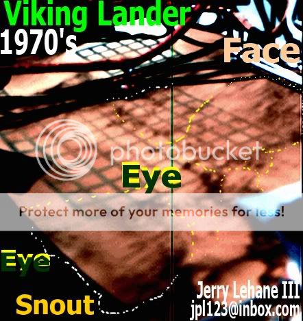
s12.photobucket.com... I would like the URL for the Viking image with the green line showing grids on the lander itself. See what I found.
[img]http://s12.photobucket.com/albums/a221/jlehane3/?action=view¤t=LargeViking1970sFaces-10.jpg/img]
reply to post by Tenko
Discussing the "sky", and sunlight refraction as it occurs on Earth.
Versus Mars....Mars' atmosphere is quite thin, and therefore the sunlight will be affected differently, as perceived by human eyes, in visible light spectrum.
Just visited the NASM (National Air and Space Museum) in D.C. recently, and an exhibit is up displaying all sorts of wonderful photos, compiled from various space probes, from around the Solar System. One was a panorama compiled from some Rover "Opportunity" images of a sunset, on Mars. Because of the low angle, the depth of atmosphere is thicker, as the sunlight travels through. Causes a distinct blue glow, compared to what we see here, with thicker atmosphere, where the light frequencies shift to more reddish.
So, that photo caused me to do a quick Google, and I found one similar to what's on display at the museum:
[atsimg]http://files.abovetopsecret.com/images/member/1639e38f362c.jpg[/atsimg]
I have also heard that blue sky appears on Mars only near sunrise and sunset for that reason. By and large clouds would appear usually as white and
there are dust storms of various thickness and intensity of winds.That would be a very good reason to move underground avoiding the terrible dust
storms.DANGER DANGER Will Robinson!... yes THAT scary.The Lost in Space music might sound a little different on Mars in the thin air.
Originally posted by Dont Hate Rats
ear you go, 3 little martians...
Originally posted by magicmushroom
Dont can you point out where the other two figures are because I cannot see/find them.
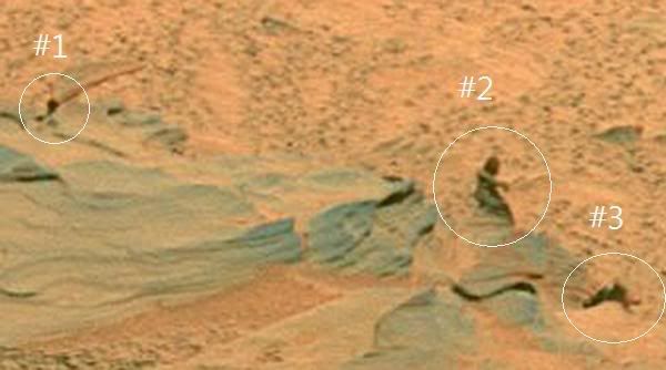
It looks like statues to me. Also, we all know that NASA tampers with images before public release. Is it possible that they ADDED this statue to cause more disinfo and debate? I really doubt they would leave something that significant in if it were truly a statue or Martian.
I'm sorry.
I am a new member to this site and respect it's credibility to the mission of debunking lies and finding the truth behind "truth", but
I personally think that whatever this may be a photo of whether it is on the Martian surface and the terrain looks like so or this is taken on our home planet, that body of water oddly enough like a formation of sand dunes with an altered color scheme. This is a simple task to make look good to those with a lowly developed sense of perception with the mastery of Adobe Photoshop.
I myself would love to believe that this is legitimate evidence of a hidden truth to the environment on whatever part of Mars's surface this is located, but it truly looks almost too good to be true.
Let me add that I am in no way an expert of any kind in the areas of photo-analysis and environmental studies including the behavior and properties of water and bodies of.
I do however pride myself on really opening my eyes and taking in whilst self-analyzing what I percieve.
This all be based on a mixture of common sense and secular logic, but also add in the extents of knowledge ever-so expanding.
This is of course just an opinion as I am not currently paying land taxes on Mars.
Mix well and shake!
You've got yourself a cocktail that will not necessarily make you seem as you cannot be wrong, but will prevent you from fooling yourself from inventing the most desirable truth.
And for the love of the cosmos, i can't w8 till i can start posting my own threads because I got some zingers awaiting the community here at Above Top Secret!
reply to post by WereWolfWoody
Welcome.
The image in the OP is an image of Mars -- but it's a "False Color" image.
NASA often uses false color to make it easier to see different types of materials in a photograph, so they can better analyze that photograph. Different materials look different (have different intensities) in different wavelengths of light.
NASA typically uses multiple images taken in different wavelengths and overlays all those images to create a single image. Sometimes when they want the differences in intensities to be more prominent, they will assign false colors to those different intensities. Most of Mars looks reddish-yellowish-orangeish brown, so they often assign the false color blue to certain intensities of light to accent those materials of that intensity.
Therefore, the blue you see isn't really blue. It's probably some shade of orangeish brown.
*
*
*
Not to confuse the issue (but this is related to what we are talking about)...
The cameras on the Mars rovers are essentially color-blind. They don't "really" see in color. For NASA to get a "True Color" image, the images are taken in grayscale, and EACH actually three images taken three times through three filters (red-green-blue) at three wavelengths. This returns three grayscle images, but with each having different grayscales for each color (i.e., each grayscale wuold look different depending on the color filter used). Each grayscale pixel in each of those images is then assigned a what NASA believes the true color to be based on what science knows about what different colors look like in grayscale and in different wavelengths.
Blue is a false color that is often assigned to these various materials/grayscale intensities because it contrasts so well against the reddish browns and yellows of Mars -- the contrasting color is easier to see.
And from that, they get what they call a "true color" image (although it was really made from grayscale images).
You may ask "why would NASA do it like that (using grayscales) -- why not just use a color digital camera like I have"....
...You may be surprised to find out that your consumer digital camera is also basically "color blind", and it uses a similar method to give you pictures that are in color. Your digital camera also essentially takes each image seen through three filters (most consumer cameras actually use a single three-color filter called a "bayer filer") to get a grayscale image that is translated in your camera into a color image -- based on what imaging science knows about how grayscale relates to color. This is all done inside of your camera, and takes less than one second. You never know that the camera is doing this.
The Mars cameras are essentially doing the same thing, but instead of combining the information from the three filters inside the camera, it keeps the three grayscale images separate and transmits them back to Earth so imaging scientists here can combine them and assign the colors. This is done because more imformation can be found by analyzing the three separate grayscale images. If they would be combined prior to transmitting to Earth, information would be lost.
That's why all of the raw images sent to earth from the Mars Rovers are in grayscale. The color images iaren't created until after the images get to Earth. And sometimes (as in the OP's image) the manipulate the colors in false ways to bring out different details.
edit on 10/1/2011 by Soylent Green Is People because: (no reason given)
reply to post by Soylent Green Is People
Wow.
I learned quite a bit about the way picture capturing technology works by reading your post.
So all these photos that people are finding could be quite legit, but they are cataloging only the photos that have only one or two of those filters.
I was wondering one thing though and this might be a very ignorant question, but her it goes anyway.
Does this same method of visual color filtering work the same way for capturing video?
Originally posted by Soylent Green Is People
The Mars cameras are essentially doing the same thing, but instead of combining the information from the three filters inside the camera, it keeps the three grayscale images separate and transmits them back to Earth so imaging scientists here can combine them and assign the colors. This is done because more imformation can be found by analyzing the three separate grayscale images. If they would be combined prior to transmitting to Earth, information would be lost.
Depends of how you "combine" it! They could be merged on spot without information loss, but it's a lot easier to transmit to Earth, of course, where computing power is unlimited.
I also have a different angle on this (pun intended): filtering in "ordinary" cameras is done by applying a filter with a higher proportion of green elements, to play along with peculiarities of human eye (how it perceives brightness). The color is then corrected in software.
So by any account, what you see in a consumer or pro camera is already highly artificial. Sending that to Mars would be no better (and of course worse) than what they did with proper change of filters "in situ".
reply to post by Jibbs
Its not the sunset. They painted out the sky color in an image editor. You could see highlights throughout the horizon. Its image tampering from NASA. If you look closely the ground, there are numerous anomalies. Smudged, cloned surfaces appear in the middle. The transition from small rocks to the dunes doesn't make any sense. Its completely messed up.
Its not the sunset. They painted out the sky color in an image editor. You could see highlights throughout the horizon. Its image tampering from NASA. If you look closely the ground, there are numerous anomalies. Smudged, cloned surfaces appear in the middle. The transition from small rocks to the dunes doesn't make any sense. Its completely messed up.
new topics
-
A Warning to America: 25 Ways the US is Being Destroyed
New World Order: 3 hours ago -
President BIDEN's FBI Raided Donald Trump's Florida Home for OBAMA-NORTH KOREA Documents.
Political Conspiracies: 8 hours ago -
Maestro Benedetto
Literature: 10 hours ago -
Is AI Better Than the Hollywood Elite?
Movies: 10 hours ago
top topics
-
President BIDEN's FBI Raided Donald Trump's Florida Home for OBAMA-NORTH KOREA Documents.
Political Conspiracies: 8 hours ago, 28 flags -
Gaza Terrorists Attack US Humanitarian Pier During Construction
Middle East Issues: 15 hours ago, 8 flags -
Massachusetts Drag Queen Leads Young Kids in Free Palestine Chant
Social Issues and Civil Unrest: 17 hours ago, 7 flags -
Las Vegas UFO Spotting Teen Traumatized by Demon Creature in Backyard
Aliens and UFOs: 14 hours ago, 6 flags -
A Warning to America: 25 Ways the US is Being Destroyed
New World Order: 3 hours ago, 6 flags -
Meadows, Giuliani Among 11 Indicted in Arizona in Latest 2020 Election Subversion Case
Mainstream News: 16 hours ago, 5 flags -
2024 Pigeon Forge Rod Run - On the Strip (Video made for you)
Automotive Discussion: 14 hours ago, 4 flags -
Is AI Better Than the Hollywood Elite?
Movies: 10 hours ago, 3 flags -
The functionality of boldening and italics is clunky and no post char limit warning?
ATS Freshman's Forum: 16 hours ago, 1 flags -
Maestro Benedetto
Literature: 10 hours ago, 1 flags
active topics
-
Victoria government has cancelled the commmonwealth games, no money.
Regional Politics • 3 • : nazaretalazareta -
A Warning to America: 25 Ways the US is Being Destroyed
New World Order • 2 • : Disgusted123 -
President BIDEN's FBI Raided Donald Trump's Florida Home for OBAMA-NORTH KOREA Documents.
Political Conspiracies • 19 • : ADVISOR -
When an Angel gets his or her wings
Religion, Faith, And Theology • 22 • : AcrobaticDreams1 -
King Charles 111 Diagnosed with Cancer
Mainstream News • 321 • : FlyersFan -
Is there a hole at the North Pole?
ATS Skunk Works • 41 • : burritocat -
Massachusetts Drag Queen Leads Young Kids in Free Palestine Chant
Social Issues and Civil Unrest • 16 • : FlyersFan -
Gaza Terrorists Attack US Humanitarian Pier During Construction
Middle East Issues • 33 • : FlyersFan -
Weinstein's conviction overturned
Mainstream News • 24 • : burritocat -
-@TH3WH17ERABB17- -Q- ---TIME TO SHOW THE WORLD--- -Part- --44--
Dissecting Disinformation • 690 • : burritocat