It looks like you're using an Ad Blocker.
Please white-list or disable AboveTopSecret.com in your ad-blocking tool.
Thank you.
Some features of ATS will be disabled while you continue to use an ad-blocker.

Climate Change Denial, Anyone?
page: 23share:
a reply to: Greven
Hey Greven - you are the one who posted a graph of CO2 with no comparisons to temperature whatsoever to prove....what?
I am not conflating ice core data with literal data. I posted the article to prove that even AGW supporters recognize that CO2 lags temperature.
Where is your data to prove it does not
Tired of Control Freaks
a reply to: TiredofControlFreaks
Hi. Read the thread. Nathan-D asked what adjusted values I was referring to. By posting the unaltered values, you can clearly see the these changes.
Clearly a transformation has modified things, since CO2 is fluctuating back and forth over decades in his chart, but not in reality. This is fairly cut and dry.
You ignore the actual publication but pick and choose from parts you like. Here's what the article that Scientific American article was written about says:
It also explains about gas movement and CO2. There are very large margins of error associated with CO2 dating in ice cores - frequently hundreds of years, not infrequently surpassing the lag or lead time.
The instrument-recorded temperature and CO2 record, on the other hand, are fairly precise.
Hi. Read the thread. Nathan-D asked what adjusted values I was referring to. By posting the unaltered values, you can clearly see the these changes.
Clearly a transformation has modified things, since CO2 is fluctuating back and forth over decades in his chart, but not in reality. This is fairly cut and dry.
You ignore the actual publication but pick and choose from parts you like. Here's what the article that Scientific American article was written about says:
We find no significant asynchrony between them, indicating that Antarctic temperature did not begin to rise hundreds of years before the concentration of atmospheric CO2, as has been suggested by earlier studies.
It also explains about gas movement and CO2. There are very large margins of error associated with CO2 dating in ice cores - frequently hundreds of years, not infrequently surpassing the lag or lead time.
The instrument-recorded temperature and CO2 record, on the other hand, are fairly precise.
edit on 12Sun, 17 Jul 2016 12:31:07
-0500America/ChicagovAmerica/Chicago7 by Greven because: (no reason given)
a reply to: [post=21003232]Greven[/post
With such wide margins of error in the ice core data - I refuse to accept ice core data to prove anything about past, present or future proof of temperature, CO2 or proof of AGW.
As far as I am concerned - the only temperature record that exists is from 1880 forward.
Where did you get your graph from?
Tired of Control Freaks
a reply to: TiredofControlFreaks
Then why are you talking about lag times? That only happens in ice core data, like that article you quoted:
Ice Core Data Help Solve a Global Warming Mystery
The graph came from here. The data there comes from here.
Then why are you talking about lag times? That only happens in ice core data, like that article you quoted:
Ice Core Data Help Solve a Global Warming Mystery
The graph came from here. The data there comes from here.
a reply to: TiredofControlFreaks
CO2 lags temperature
principia-scientific.org...
Tired of Control Freaks
CO2 lags temperature
principia-scientific.org...
Man-made global warming promoters claim the high correlation between carbon dioxide (CO2) and atmospheric temperature (T) in the 420,000 year ice core record proves CO2 causes T to change. Herein is demonstrated how the evidence conflicts with that belief. CO2 fraud Basics. First, correlation alone only proves correlation, not cause and effect. Physics is required to describe and prove cause and effect. Second if increasing CO2 did cause T to increase, there must be some physical lag or delay in the response of T to CO2; average T of whole atmosphere, oceans and land masses cannot respond instantaneously to CO2, no matter how strong the cause.
Tired of Control Freaks
a reply to: TiredofControlFreaks
Oh look, going back to the ice core stuff again when you claim you don't believe it.
Also, Principa-Scientific is a sham website:
Even your compatriots agree.
Oh look, going back to the ice core stuff again when you claim you don't believe it.
Also, Principa-Scientific is a sham website:
As readers may know, Dr. Roy Spencer and I have had a long running disagreement with the group known as “Principia Scientific International” aka the Sky Dragon Slayers after the title of their book. While I think these people mean well, they tend to ignore real world measurements in favor of self-deduced science.
-Anthony Watts, of Watts Up With That
Even your compatriots agree.
edit on 13Sun, 17 Jul 2016 13:07:27 -0500America/ChicagovAmerica/Chicago7 by Greven because: (no reason
given)
originally posted by: TiredofControlFreaks
a reply to: Greven
You are posting a graph of CO2 that interpolated and just the mean. No wonder it has such a nice even sawtooth.
So the tree data is crap - the ice core data is crap. Exactly what are you basing the AGW theory on
Tired of Control Freaks
What are you talking about? The sawtooth is demonstrable and well-understood annual fluctuations in the CO2 content of the troposphere because of seasonal changes in the Northern Hemisphere. You can setup a CO2 monitoring station yourself and get the same damn thing.
What am I basing AGW theory on? Physics.
a reply to: TiredofControlFreaks
Again, physics.
If there were no greenhouse effect, we wouldn't have weather.
Because there is a greenhouse effect, additional greenhouse gases means additional greenhouse effect.
Man is adding a substantial amount of greenhouse gases to the atmosphere.
Again, physics.
If there were no greenhouse effect, we wouldn't have weather.
Because there is a greenhouse effect, additional greenhouse gases means additional greenhouse effect.
Man is adding a substantial amount of greenhouse gases to the atmosphere.
a reply to: TiredofControlFreaks
You tell us. You post a lot on here, this has been explained over and over, are you telling us your reading comprehension is not all there?
Do you have any evidence, real world observations that tell us that the excessive CO2 is coming from anywhere else? The CO2 and the correlation to humans burning fossil fuels is really obvious.
What are you talking about? The sawtooth is demonstrable and well-understood annual fluctuations in the CO2 content of the troposphere because of seasonal changes in the Northern Hemisphere. You can setup a CO2 monitoring station yourself and get the same damn thing
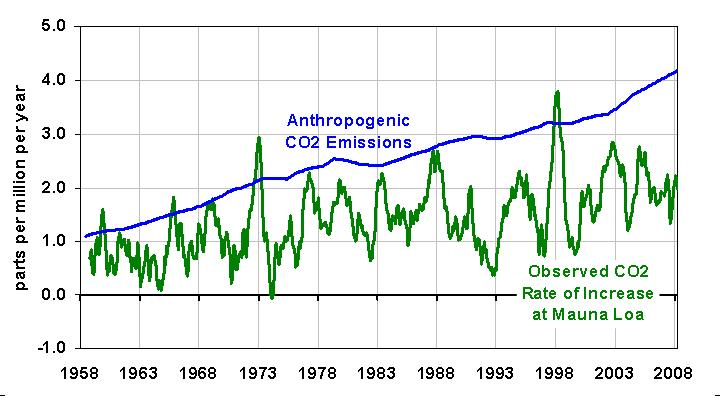
The measurements at Mauna Loa do show CO2 changing annually by as much as 3.5ppmv to 4ppmv and do fluctuate wildly and such fluctuations do not seem to be evident in your graph showing a smooth geometrical increase and constant CO2 increments of around 2ppmv. I suspect your graph is probably showing the mean (5 year or 10 year mean?). The graph below shows the increase in CO2 as ppmv per year as opposed to the total accumulated increase, as your graph shows.
edit on 17-7-2016 by Nathan-D because: (no reason given)
originally posted by: TiredofControlFreaks
a reply to: Greven
Hey Greven - you are the one who posted a graph of CO2 with no comparisons to temperature whatsoever to prove....what?
I am not conflating ice core data with literal data. I posted the article to prove that even AGW supporters recognize that CO2 lags temperature.
It used to, as in prior to human civilization, (even though it was also a cause of global warming), but not any more since humans have been digging up fossil fuels and burning them. Recently, more CO2 preceded higher temperatures.
originally posted by: TiredofControlFreaks
a reply to: Greven
The graph that Nathan-D posted is in parts per million. The graph you posted seems to be in deviations from 0. They cannot be compared.
Tired of Control Freaks
Uh, no.
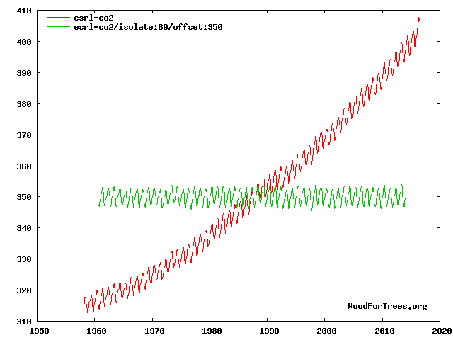
The graph I posted is the steadily climbing amount of CO2 in the atmosphere in parts per million.
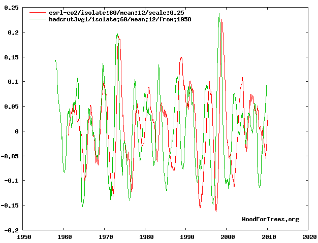
Nathan-D's graph is misleading - and probably not his, because if you do a search for www.woodfortrees.org/plot/e srl-co2/isolate:60/mean:12/scale:0.25/plot/hadcrut3vgl/isolate:60/mean:12/from:1958 you find it thrown about elsewhere as proof that CO2 lags temperature. It is nothing of the sort.
What it does is show noise by removing the trend:
edit on 19Mon, 18 Jul 2016 19:13:04 -0500America/ChicagovAmerica/Chicago7 by Greven because: ugh it isn't even curve
fitting, just noise
originally posted by: TiredofControlFreaks
a reply to: mbkennel
Well that settles it! but wait - maybe more than an opinion might be offerred?
Tired of Control Freaks
Do you want a graph?:
www.climatecentral.org...
Another point: the paleo temperature records often record Antarctic temperatures, not global temperatures---Antarctica may lag in temperature because it is surrounded entirely by a large ocean with a high heat capacity.
I seem to have not answered this post very well previously.
Nope.
Go look at the raw data. Plug it into Excel and chart it yourself. Or trust NOAA. The annual cycle is pretty consistent in recording CO2 declining starting with from June (save for 1979, when it was July) mean measurement and increasing with the October/November mean measurement. These are pretty smooth peaks and valleys, too.
That chart you posted is highlighting the fluctuations; this may be using 'weekly' data, where the data above is monthly mean. When the difference is ± 4 ppm on a chart ranging from 310 ppm to 410 ppm, it doesn't look particularly big. You can still see it on the chart - look just a bit short of 2000 on my previous post, and you can see a slightly bigger fluctuation in ppm around 1998.
originally posted by: Nathan-D
The measurements at Mauna Loa do show CO2 changing annually by as much as 3.5ppmv to 4ppmv and do fluctuate wildly and such fluctuations do not seem to be evident in your graph showing a smooth geometrical increase and constant CO2 increments of around 2ppmv. I suspect your graph is probably showing the mean (5 year or 10 year mean?). The graph below shows the increase in CO2 as ppmv per year as opposed to the total accumulated increase, as your graph shows.
Nope.
Go look at the raw data. Plug it into Excel and chart it yourself. Or trust NOAA. The annual cycle is pretty consistent in recording CO2 declining starting with from June (save for 1979, when it was July) mean measurement and increasing with the October/November mean measurement. These are pretty smooth peaks and valleys, too.
That chart you posted is highlighting the fluctuations; this may be using 'weekly' data, where the data above is monthly mean. When the difference is ± 4 ppm on a chart ranging from 310 ppm to 410 ppm, it doesn't look particularly big. You can still see it on the chart - look just a bit short of 2000 on my previous post, and you can see a slightly bigger fluctuation in ppm around 1998.
edit on 20Mon, 18 Jul 2016 20:25:01
-0500America/ChicagovAmerica/Chicago7 by Greven because: (no reason given)
new topics
-
Where should Trump hold his next rally
2024 Elections: 2 hours ago -
Shocking Number of Voters are Open to Committing Election Fraud
US Political Madness: 3 hours ago -
Gov Kristi Noem Shot and Killed "Less Than Worthless Dog" and a 'Smelly Goat
2024 Elections: 3 hours ago -
Falkville Robot-Man
Aliens and UFOs: 4 hours ago -
James O’Keefe: I have evidence that exposes the CIA, and it’s on camera.
Whistle Blowers and Leaked Documents: 4 hours ago -
Australian PM says the quiet part out loud - "free speech is a threat to democratic dicourse"...?!
New World Order: 5 hours ago -
Ireland VS Globalists
Social Issues and Civil Unrest: 5 hours ago -
Biden "Happy To Debate Trump"
2024 Elections: 6 hours ago -
RAAF airbase in Roswell, New Mexico is on fire
Aliens and UFOs: 6 hours ago -
What is the white pill?
Philosophy and Metaphysics: 8 hours ago
top topics
-
A Warning to America: 25 Ways the US is Being Destroyed
New World Order: 16 hours ago, 21 flags -
Blast from the past: ATS Review Podcast, 2006: With All Three Amigos
Member PODcasts: 8 hours ago, 13 flags -
James O’Keefe: I have evidence that exposes the CIA, and it’s on camera.
Whistle Blowers and Leaked Documents: 4 hours ago, 12 flags -
Australian PM says the quiet part out loud - "free speech is a threat to democratic dicourse"...?!
New World Order: 5 hours ago, 11 flags -
Biden "Happy To Debate Trump"
2024 Elections: 6 hours ago, 10 flags -
Mike Pinder The Moody Blues R.I.P.
Music: 8 hours ago, 8 flags -
Ireland VS Globalists
Social Issues and Civil Unrest: 5 hours ago, 5 flags -
RAAF airbase in Roswell, New Mexico is on fire
Aliens and UFOs: 6 hours ago, 5 flags -
What is the white pill?
Philosophy and Metaphysics: 8 hours ago, 5 flags -
Putin, Russia and the Great Architects of the Universe
ATS Skunk Works: 11 hours ago, 4 flags
active topics
-
Mood Music Part VI
Music • 3111 • : TheWoker -
Where should Trump hold his next rally
2024 Elections • 12 • : StudioNada -
University of Texas Instantly Shuts Down Anti Israel Protests
Education and Media • 310 • : SchrodingersRat -
Candidate TRUMP Now Has Crazy Judge JUAN MERCHAN After Him - The Stormy Daniels Hush-Money Case.
Political Conspiracies • 815 • : Annee -
President BIDEN's FBI Raided Donald Trump's Florida Home for OBAMA-NORTH KOREA Documents.
Political Conspiracies • 35 • : Threadbarer -
Remember These Attacks When President Trump 2.0 Retribution-Justice Commences.
2024 Elections • 58 • : WeMustCare -
2024 Pigeon Forge Rod Run - On the Strip (Video made for you)
Automotive Discussion • 8 • : WhitewaterSquirrel -
Gov Kristi Noem Shot and Killed "Less Than Worthless Dog" and a 'Smelly Goat
2024 Elections • 28 • : cherokeetroy -
Shocking Number of Voters are Open to Committing Election Fraud
US Political Madness • 5 • : AwakeNotWoke -
The Acronym Game .. Pt.3
General Chit Chat • 7756 • : bally001