It looks like you're using an Ad Blocker.
Please white-list or disable AboveTopSecret.com in your ad-blocking tool.
Thank you.
Some features of ATS will be disabled while you continue to use an ad-blocker.

5 Graphs That Will Make Your Mouth Drop!
page: 1share:
The graph below is the amount of money in circulation. Notice how the money supply is Inverting

Notice the point when the Weimar Republic started Hyperinflating, we are not to far way from that point

This picture below is the average duration the public is unemployed

This Graph represents the overall percentage of people working in the US

And last but not least, this graph shows the unemployment percentage. Red being the “official” number provided by the government. The Gray is the overall unemployment, those underemployed and such, and the blue is a 3rd party calculation of unemployment.

Pictures say a thousand words!
Notice the point when the Weimar Republic started Hyperinflating, we are not to far way from that point
This picture below is the average duration the public is unemployed
This Graph represents the overall percentage of people working in the US
And last but not least, this graph shows the unemployment percentage. Red being the “official” number provided by the government. The Gray is the overall unemployment, those underemployed and such, and the blue is a 3rd party calculation of unemployment.
Pictures say a thousand words!
I am sorry to tell you this but I was bored and made those pictures in paint.
What the graphs don't say is that there is no end in sight for the rise of money in circulation and the rising amount of underemployed. The graph
wasn't there, but there's no end in sight for the growing wealthy gap between the rich and everyone else.
I'd be interested to see similar charts for comparison in showing Germany before Hitler when their economy imploded. Argentina when they were trying
spending their way out of trouble...and Zimbabwe when they thought the printing press would save them. Perhaps by looking at 3 other fairly recent
(modern times anyway) examples of nations that did continue right on going where these graphs stop, we can get a better idea of what the future holds
for us. Those charts can't lead to good places off the right edge though.
edit on 2-12-2011 by Wrabbit2000 because: minor correction.
reply to post by Wrabbit2000
Well here is Germany and Zimbabwe's charts for ya and they do not look good.
German Hyperinflation
Zimbabwe
Also here is a good video from Chris Martenson to also explain what we are going through right now.
Well here is Germany and Zimbabwe's charts for ya and they do not look good.
German Hyperinflation
Zimbabwe
Also here is a good video from Chris Martenson to also explain what we are going through right now.
edit on 2-12-2011
by relyt because: (no reason given)
edit on 2-12-2011 by relyt because: misspell of video author
Where is your source please.
I am not doubting anything there, it seem to be factual, i was just hoping to see the source.
I am not doubting anything there, it seem to be factual, i was just hoping to see the source.
Can you resize the graphs as to show the last decade?
All of them seem cut off around 2000.
Just a suggestion...then I'll comment.
All of them seem cut off around 2000.
Just a suggestion...then I'll comment.
Its not looking too good is it.. Better get those vegtable planted in the garden in spring time.....
Originally posted by KingAtlas
Where is your source please.
I am not doubting anything there, it seem to be factual, i was just hoping to see the source.
all sources are noted on the charts
Originally posted by havok
Can you resize the graphs as to show the last decade?
All of them seem cut off around 2000.
Just a suggestion...then I'll comment.
Us the scroll bar below
Originally posted by camaro68ss
The graph below is the amount of money in circulation. Notice how the money supply is Inverting
Notice the point when the Weimar Republic started Hyperinflating, we are not to far way from that point
The fact that these charts appear similar is irrelevant.
The first is money in circulation vs time.
The second is value vs time.
They don't relate.
reply to post by peck420
Their one in the same. More money on the market, less the value will become. the fact that the Quantity is growing expediential should scare everyone. High quantity, lower value
Their one in the same. More money on the market, less the value will become. the fact that the Quantity is growing expediential should scare everyone. High quantity, lower value
edit on 2-12-2011 by camaro68ss because: (no reason given)
Originally posted by relyt
reply to post by Wrabbit2000
Well here is Germany and Zimbabwe's charts for ya and they do not look good.
German Hyperinflation
Zimbabwe
Thanks. I'm not sure I should have asked now that I had a chance to look and think about what the Weimar Republic and Zimbabwe charts show. It looks like it starts well before it's readily apparent to everyone that isn't even happening. If I am reading the charts and comments correctly, by the time the public in both situations fully understood what was starting to occur, it as so far advanced and into a self-feeding cycle that stopping it was simply impossible.
In particular, I grabbed these two images as real attention getters:

This man seems to redefine the term 'heavy lifting' when it comes to paying the dinner tab. Lets just hope those bundles aren't made up of these:
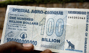
I recall reading USA Today stories about Zimbabwe while it was in progress and softly chuckling at the truck stop restaurant table I was at while doing so. It never even crossed my mind as a possibility that I might someday watch the same thing transpire in the nation I live in.
reply to post by Wrabbit2000
heres an artical of zimbabwe bashing bernanke on inflation!
finance.yahoo.com...;_ylt=Akpe2C1.f10CiM6DN256RoiiuYdG;_ylu=X3o'___'Q0MDNwMDNiBG1pdANGaW5hb mNlIEZQIFRvcCBTdG9yeSBSaWdodARwa2cDZThmOTllYzgtMjBlZS0zNzFlLWJjZjEtYjU0ZGRhODBlYzJkBHBvcwMyBHNlYwN0b3Bfc3RvcnkEdmVyA2ZhNTkyNTgwLTFkMjQtMTFlMS1iZmRmLTF kOTBhZjA0MmQ0Yg--;_ylg=X3o'___'FvdnRqYzJoBGludGwDdXMEbGFuZwNlbi11cwRwc3RhaWQDBHBzdGNhdANob21lBHB0A3NlY3Rpb25zBHRlc3QD;_ylv=3
edit on
2-12-2011 by camaro68ss because: (no reason given)
edit on 2-12-2011 by camaro68ss because: (no reason given)
reply to post by camaro68ss
They are not one in the same.
You can not use a graph analysing quantity as a direct comparison to a graph analysing inflation (gold benchmark vs mark).
Although the two are definitely related, they are not directly comparable.
For an accurate comparison you would need to evaluate USD vs gold for the same fixed period (6 years)...which is here:

Not even close to what Germany experienced.
Edit to embed...yay!
They are not one in the same.
You can not use a graph analysing quantity as a direct comparison to a graph analysing inflation (gold benchmark vs mark).
Although the two are definitely related, they are not directly comparable.
For an accurate comparison you would need to evaluate USD vs gold for the same fixed period (6 years)...which is here:
Not even close to what Germany experienced.
Edit to embed...yay!
edit on 2-12-2011 by peck420 because: (no reason given)
Imagine the collapse of the Euro-zone, except the central economies probably France and Germany what would happen to the rest especially to the
PIIGS,
Grace is almost a goner, Spain has gained a breath because of Italy, Ireland has faced the problem heads on and pro-actively but unlike most of the others its production was already strong, Portugal has made some gymnast but still does not have a sustainable economy. Italy would just sink because of its level of debt.
The ejection from the Euro of any of this countries would generate an hyperinflation immediately, and the USA and UK would finally get the attention focus they deserve.
What options are left for the common citizen?
Debts would not be a problem since a change in the value of money would affect both sides of the equation.
But services and especially good would suffer a heavy increase in cost.
Money would not be easily accessible as governments would restrict its movement, and state functions would came under huge stress no pensions payment (or delayed) etc...
Before the crisis hits it would best to spend the fiat money in goods (gold and silver, are already out of the picture, price is highly inflated already), in some nations homes could be a safe haven (not in Spain or UK). What would or will you do in such a situation?
What would be the best way out for any nation isolated in that situation?
War? (Can a nation that suffers an hyper inflation of 30/40% suffer silently, we certainly see the increase in tension toward Germany and France)
Adopt another currency or index to it ? Best solution would be selecting one from the BRIC, since the dollar is in even worst situation.
If there are any planning being made about this situation, the public has no clue, this will collapse any state and social institutions.
Originally posted by peck420
reply to post by camaro68ss
They are not one in the same.
You can not use a graph analysing quantity as a direct comparison to a graph analysing inflation (gold benchmark vs mark).
Although the two are definitely related, they are not directly comparable.
For an accurate comparison you would need to evaluate USD vs gold for the same fixed period (6 years)...which is here:
Not even close to what Germany experienced.
Edit to embed...yay!edit on 2-12-2011 by peck420 because: (no reason given)
yes, Technically the graphs are different but there nearly one in the same. The quantity of dollars on the market “WILL”, later, have an adverse affect on inflation.
Originally posted by camaro68ss
yes, Technically the graphs are different but there nearly one in the same. The quantity of dollars on the market “WILL”, later, have an adverse affect on inflation.
Not necessarily.
If the US dollar drops, it could reinvigorate the manufacturing sector, which could negate the increase in dollars.
There are many possible outcomes for the US in the future, I would say that it is really 50/50 from here.
That may seem bad to most Americans, but it is the norm for the majority of the world.
new topics
-
There is no such thing as moonlight.
Space Exploration: 10 minutes ago -
Breaking: 5 probed after 18-year old girl dies as a result of having the COVID jab
Diseases and Pandemics: 1 hours ago -
Official denial
Diseases and Pandemics: 4 hours ago -
MEGA - Let's Make Europe Great Again
Other Current Events: 4 hours ago -
Hamas and Other Islamist Terrorist Groups Announce Support of US Campus Anti-Israel Protests
Education and Media: 5 hours ago -
Psychotronic Operation Rwanda Who Wants To Be A Refugee?
ATS Skunk Works: 5 hours ago
top topics
-
AI phrenology
Science & Technology: 12 hours ago, 4 flags -
Psychotronic Operation Rwanda Who Wants To Be A Refugee?
ATS Skunk Works: 5 hours ago, 4 flags -
Hamas and Other Islamist Terrorist Groups Announce Support of US Campus Anti-Israel Protests
Education and Media: 5 hours ago, 4 flags -
Official denial
Diseases and Pandemics: 4 hours ago, 3 flags -
Breaking: 5 probed after 18-year old girl dies as a result of having the COVID jab
Diseases and Pandemics: 1 hours ago, 3 flags -
MEGA - Let's Make Europe Great Again
Other Current Events: 4 hours ago, 2 flags -
There is no such thing as moonlight.
Space Exploration: 10 minutes ago, 0 flags
active topics
-
What is the white pill?
Philosophy and Metaphysics • 27 • : kwaka -
Breaking: 5 probed after 18-year old girl dies as a result of having the COVID jab
Diseases and Pandemics • 5 • : Lochid -
Canada caught red-handed manipulating live weather data and make it warmer
Fragile Earth • 31 • : Justoneman -
"We're All Hamas" Heard at Columbia University Protests
Social Issues and Civil Unrest • 303 • : network dude -
There is no such thing as moonlight.
Space Exploration • 0 • : BrotherKinsMan -
Hate makes for strange bedfellows
US Political Madness • 60 • : network dude -
CIA is alleged to be operat social media troll frms in Kyiv
ATS Skunk Works • 26 • : TheValeyard -
MEGA - Let's Make Europe Great Again
Other Current Events • 14 • : watchitburn -
Krystalnacht on today's most elite Universities?
Social Issues and Civil Unrest • 25 • : TheSingleBillie -
Psychotronic Operation Rwanda Who Wants To Be A Refugee?
ATS Skunk Works • 7 • : Lochid