It looks like you're using an Ad Blocker.
Please white-list or disable AboveTopSecret.com in your ad-blocking tool.
Thank you.
Some features of ATS will be disabled while you continue to use an ad-blocker.
7
share:
Greetings ATS. We all have heard the political rhetoric that government spending is out of control. I think a visualization of the current
administration's economic record can assist in understanding how ridiculous it has become.
I found an article with some charts based on the government's own data. Here's the link:
The three most important charts in America
Check out the Presidential budget requests of the Obama administration:
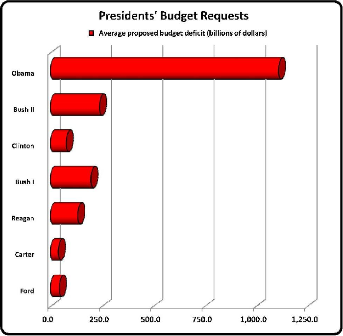
You know, looking at the chart, it doesn't take an economist or a mathematician to see that there's a problem with this administration's fiscal and economic policies, especially with regard to spending.
Here's another chart that helps put it in perspective (scroll right to see the good stuff):

The great thing about looking at data is that it doesn't lie unless the data is erroneous. I'm not looking to start a big partisan debate here, so let's stick to the data that was provided by the government.
Is there anyone that does not see a significant spike in budget requests and spending by the Obama administration? Is there anyone that thinks this is good for our country, regardless of partisan affiliation?
Of particular note, the only candidate in the 2012 Presidential race who has committed to cutting spending by 1 Trillion dollars in the first year is Ron Paul. What are the other candidates going to do if they win? My guess is spend more and more and more... until it ends.
You can visit the article for the third chart, but it's just a more detailed spin-off of the first summary chart.
Peace
I found an article with some charts based on the government's own data. Here's the link:
The three most important charts in America
Check out the Presidential budget requests of the Obama administration:

You know, looking at the chart, it doesn't take an economist or a mathematician to see that there's a problem with this administration's fiscal and economic policies, especially with regard to spending.
Here's another chart that helps put it in perspective (scroll right to see the good stuff):

The great thing about looking at data is that it doesn't lie unless the data is erroneous. I'm not looking to start a big partisan debate here, so let's stick to the data that was provided by the government.
Is there anyone that does not see a significant spike in budget requests and spending by the Obama administration? Is there anyone that thinks this is good for our country, regardless of partisan affiliation?
Of particular note, the only candidate in the 2012 Presidential race who has committed to cutting spending by 1 Trillion dollars in the first year is Ron Paul. What are the other candidates going to do if they win? My guess is spend more and more and more... until it ends.
You can visit the article for the third chart, but it's just a more detailed spin-off of the first summary chart.
Peace
edit on 5-6-2012 by InTheFlesh1980 because: I like cookies
Those charts simply illustrate what Obama is trying to do (and succeeding, so far).. He is trying to bankrupt the United States so that he can save us
all from certain doom with his magic solution - socialism.
Of course, when I say "Obama", I mean his NWO masters. He is just their consigliere.
Wakey wakey people - it's right there in the charts.
And I don't mean to start in with the partisan stuff, but what else could the data mean? How can any president be THAT clueless and reckless?
Of course, when I say "Obama", I mean his NWO masters. He is just their consigliere.
Wakey wakey people - it's right there in the charts.
And I don't mean to start in with the partisan stuff, but what else could the data mean? How can any president be THAT clueless and reckless?
edit on 5-6-2012 by AwakeinNM because: (no reason given)
Even Ron Paul can not save us now.
Not looking good for Barry though. Gunna get fired.
Not looking good for Barry though. Gunna get fired.
Military spending by country is more important imo
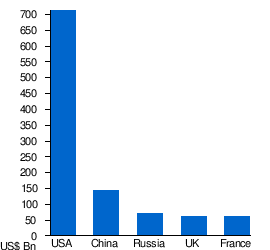
Maybe this one
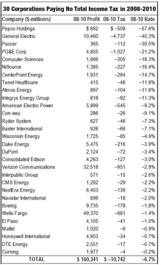

Maybe this one

edit on 5-6-2012 by RealSpoke because: (no reason given)
reply to post by AwakeinNM
I certainly wish more Americans were aware of how bad the economic outlook is. How could people see data like this and not demand a major change?
Charts like this should be a mandatory part of high school curriculum. Our country obviously cannot sustain the current pace of the debt.
It has to change soon or the system is going to fall apart. Maybe you are right, maybe that's what Obama is trying to do.
reply to post by RealSpoke
So by showing the chart of companies and their income taxes, you are suggesting that more taxation might possibly put a dent in the nation's debt?
Run some numbers... you can tax until you're blue in the face and you can't even come close to touching what this administration is spending.
You could tax those companies at 70 percent for years and it would only be a drop in the bucket. The "higher tax" argument that Barry keeps touting ("People need to pay their fair share") is a partisan dodge --- he knows it wouldn't help anything.
edit on 5-6-2012 by InTheFlesh1980 because: (no reason given)
Originally posted by RealSpoke
Military spending by country is more important imo
Maybe the countries who aren't paying their "fair share" need to start?
Maybe this one
OK, so we take all $160 billion in their profits; that pays for about 1/10th of Obama's $1.4Trillion annual deficit.
I notice that your list leaves-out GM, which got a $45billion tax break from the Obama Treasury, but it includes his economic advisor's holding co., GE.
Still leaves out GE Capital and GMAC/Ally, other Billion-dollar beneficiaries of Obama's crony-capitalism.
edit on 5-6-2012 by jdub297 because:
(no reason given)
reply to post by InTheFlesh1980
I linked the corporate graph to show the corrupt loopholes we have in this country.
The nations debt is statistically unable to ever be paid back. (Allegedly?) I've never done the math but I've heard RP say it. Nothing we do really matters as long as we have unregulated derivatives that help grow the debt like a cancer.
theeconomiccollapseblog.com...
reply to post by jdub297
I'm sure theres multiple other corporations that have paid no taxes, that was only 30 of them.
www.detroitnews.com...
Calling it Obama's-crony capitalism is just lying to this country, cronyism has been going on for ages in the US.
I'm sure theres multiple other corporations that have paid no taxes, that was only 30 of them.
www.detroitnews.com...
Calling it Obama's-crony capitalism is just lying to this country, cronyism has been going on for ages in the US.
Everyone has charts:
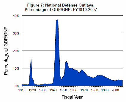
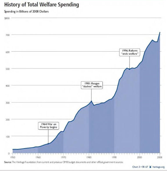
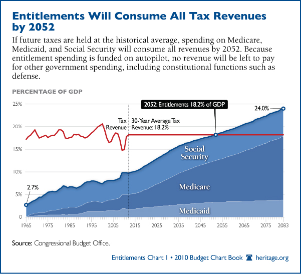
I See the ops charts and others and raise with these.
This nation is broke and it can not continue


I See the ops charts and others and raise with these.
This nation is broke and it can not continue
Yep, Democrats want lots of free stuff.
Cloward/Piven at work in the O admin
Cloward/Piven at work in the O admin
edit on 6-6-2012 by ThirdEyeofHorus because: (no reason given)
Your administration proposes to spend it's way out of debt, while proposing to cut debt in the long run. Long after the tax payer funded court
battles over healthcare and other ridiculous "battles" that only appeal to a tiny minority.
Are you guys coherent or??
Please rise up americans. The world is counting on you
Are you guys coherent or??
Please rise up americans. The world is counting on you
It's not about Democrats wanting free stuff, or Obama wanting to implement Socialism.
It's simply about paying for the policies and appropriations that were already in place when Obama took office.
Yes, that includes paying for the bank bailout legislation that were approved by George Bush.
Most of President Obama's spending has been modest, considering the mess that Bush left him.


It's simply about paying for the policies and appropriations that were already in place when Obama took office.
Yes, that includes paying for the bank bailout legislation that were approved by George Bush.
Most of President Obama's spending has been modest, considering the mess that Bush left him.


edit on 6/6/2012 by muse7 because: (no reason given)
Originally posted by InTheFlesh1980
Here's another chart that helps put it in perspective (scroll right to see the good stuff):
You see that big Spike to the right?
That is the end of the Bush Presidency - not Obama
Obama's policies did not become practice until September of 2009
FYI
Originally posted by ThirdEyeofHorus
Yep, Democrats want lots of free stuff.
Cloward/Piven at work in the O adminedit on 6-6-2012 by ThirdEyeofHorus because: (no reason given)
Cloward Piven
FOX NEWS?
Oh yes, spread the propaganda
Originally posted by Beanskinner
You see that big Spike to the right?
That is the end of the Bush Presidency - not Obama
Obama's policies did not become practice until September of 2009
FYI
You see the remaining big spikes to the right of that one? Those are the largest in history. Need a ruler, or maybe a theodolite to measure it? How about a telescope?
/TOA
Now I know why I was supposed to get a college education -
So I could understand all these charts telling us how badly we're screwed.
I'm pretty sure wherever it is we are is completely off the charts in unknown territory.
A situation where a psychic is as valuable as an economist.
So I could understand all these charts telling us how badly we're screwed.
I'm pretty sure wherever it is we are is completely off the charts in unknown territory.
A situation where a psychic is as valuable as an economist.
new topics
-
President BIDEN's FBI Raided Donald Trump's Florida Home for OBAMA-NORTH KOREA Documents.
Political Conspiracies: 1 hours ago -
Maestro Benedetto
Literature: 2 hours ago -
Is AI Better Than the Hollywood Elite?
Movies: 3 hours ago -
Las Vegas UFO Spotting Teen Traumatized by Demon Creature in Backyard
Aliens and UFOs: 6 hours ago -
2024 Pigeon Forge Rod Run - On the Strip (Video made for you)
Automotive Discussion: 7 hours ago -
Gaza Terrorists Attack US Humanitarian Pier During Construction
Middle East Issues: 7 hours ago -
The functionality of boldening and italics is clunky and no post char limit warning?
ATS Freshman's Forum: 8 hours ago -
Meadows, Giuliani Among 11 Indicted in Arizona in Latest 2020 Election Subversion Case
Mainstream News: 9 hours ago -
Massachusetts Drag Queen Leads Young Kids in Free Palestine Chant
Social Issues and Civil Unrest: 9 hours ago -
Weinstein's conviction overturned
Mainstream News: 11 hours ago
top topics
-
President BIDEN's FBI Raided Donald Trump's Florida Home for OBAMA-NORTH KOREA Documents.
Political Conspiracies: 1 hours ago, 12 flags -
Krystalnacht on today's most elite Universities?
Social Issues and Civil Unrest: 12 hours ago, 9 flags -
University of Texas Instantly Shuts Down Anti Israel Protests
Education and Media: 15 hours ago, 8 flags -
Supreme Court Oral Arguments 4.25.2024 - Are PRESIDENTS IMMUNE From Later Being Prosecuted.
Above Politics: 12 hours ago, 8 flags -
Gaza Terrorists Attack US Humanitarian Pier During Construction
Middle East Issues: 7 hours ago, 7 flags -
Weinstein's conviction overturned
Mainstream News: 11 hours ago, 7 flags -
Massachusetts Drag Queen Leads Young Kids in Free Palestine Chant
Social Issues and Civil Unrest: 9 hours ago, 7 flags -
Meadows, Giuliani Among 11 Indicted in Arizona in Latest 2020 Election Subversion Case
Mainstream News: 9 hours ago, 5 flags -
Las Vegas UFO Spotting Teen Traumatized by Demon Creature in Backyard
Aliens and UFOs: 6 hours ago, 4 flags -
2024 Pigeon Forge Rod Run - On the Strip (Video made for you)
Automotive Discussion: 7 hours ago, 3 flags
active topics
-
One Flame Throwing Robot Dog for Christmas Please!
Weaponry • 11 • : Therealbeverage -
British TV Presenter Refuses To Use Guest's Preferred Pronouns
Education and Media • 167 • : WakeUpBeer -
University of Texas Instantly Shuts Down Anti Israel Protests
Education and Media • 257 • : DBCowboy -
HORRIBLE !! Russian Soldier Drinking Own Urine To Survive In Battle
World War Three • 48 • : Therealbeverage -
The Good News According to Jesus - Episode 1
Religion, Faith, And Theology • 3 • : Therealbeverage -
Weinstein's conviction overturned
Mainstream News • 23 • : Therealbeverage -
Supreme Court Oral Arguments 4.25.2024 - Are PRESIDENTS IMMUNE From Later Being Prosecuted.
Above Politics • 82 • : Lumenari -
President BIDEN's FBI Raided Donald Trump's Florida Home for OBAMA-NORTH KOREA Documents.
Political Conspiracies • 2 • : Boomer1947 -
Is AI Better Than the Hollywood Elite?
Movies • 6 • : Therealbeverage -
Mood Music Part VI
Music • 3103 • : TheDiscoKing
7
