It looks like you're using an Ad Blocker.
Please white-list or disable AboveTopSecret.com in your ad-blocking tool.
Thank you.
Some features of ATS will be disabled while you continue to use an ad-blocker.

Head's Up: Some design updates are happening shortly....
page: 5share:
a reply to: SkepticOverlord
I dunno but a few minutes before posting that reply the site was all squiggly like this >.<
Then it wouldn't load and kept timing out like this =.=
So, I kept hitting refresh like this Click Click Click Click and the site was like ZZZZzzzzZZZZZzzzzZZZZZ
I dunno but a few minutes before posting that reply the site was all squiggly like this >.<
Then it wouldn't load and kept timing out like this =.=
So, I kept hitting refresh like this Click Click Click Click and the site was like ZZZZzzzzZZZZZzzzzZZZZZ
Better. Crisper. Like the background images.
Can we have the old smileys back?
Can we have the old smileys back?
Don't really like the background images--I mean, they are cool looking, but I like a dark non-distracting color, like it was. Maybe make it an option
to turn off background images?
After getting in trouble for trying to get away with a full sized animated background. And then I was spending days trying to align an animated
avatar version to sit perfectly on the background to make it look like it was a fully animated background. It is(was?) still just able to be spotted
that the edges were not animated....
Anyway, I'm scared to post this because I get a horrid feeling that it's all going to be stuffed up. I like the squared off look SO, can we just keep the avatar format the same, repeating images looks pretty icky on an otherwise tidy site (except the complaint I posted about the non-functional down arrow).
Edit.... My avatar seems fine.... but the post wasn't very long...
So adding a little more..
here
and some here...
To see what happens....
Edit 2...
Yeah. I thought that would happen. Say NO to repeating backgrounds!!!
Anyway, I'm scared to post this because I get a horrid feeling that it's all going to be stuffed up. I like the squared off look SO, can we just keep the avatar format the same, repeating images looks pretty icky on an otherwise tidy site (except the complaint I posted about the non-functional down arrow).
Edit.... My avatar seems fine.... but the post wasn't very long...
So adding a little more..
here
and some here...
To see what happens....
edit on 12-3-2016 by Qumulys because: (no reason given)
Edit 2...
Yeah. I thought that would happen. Say NO to repeating backgrounds!!!
edit on 12-3-2016 by Qumulys because: (no reason given)
I thought it was site vandalism by hackers, or at least i hoped it was, apart from looking amateurish and an example of graphic design gone wrong,
it's also the case that a different image briefly seen in full every time a page is loaded creates stress at the subliminal level with regards to the
mind trying to evaluate the briefly seen entire image, thus to browse this site now would be to put oneself through a torture session, it's all about
not being able to see the bigger picture.
edit on Kam33171vAmerica/ChicagoSaturday1231 by Kantzveldt because: (no reason given)
Uh, just got on this morning to find these new background images.
Really hate them.
What the hell ARE most of them? Are these well known media images that people in the US will recognize?
What is that building? I don't know. I find it extremely distracting and makes it difficult to focus.
Not that I think my opinion matters especially, just throwing my feedback out there on the table. If I am the only one that feels that way, then I guess it is irrelevant.
Just sayin'.
a reply to: SkepticOverlord
Hmmm.. Honestly would have to respectfully disagree with you here. While it may be 'fun' for some types of images it really is a nightmare for those of us who like to keep a certain image nicely adjusted and set with colours and size etc.
But a long post now places the post count stats technically right in the center now in a longer post, which I find to be very off-putting. We might find a really nice pic to use, but it will now either have to repeat it which looks a 'geocities' era repeating background.
Or, if we want to use a long tall image, it would be good on a long post, but in a shorter post it will now suffer from;
1. Being annoyingly cropped off at a 'standard' background size, making the rest of the image messy and unreadable, a nice mountain scape pic would just show a sky for example.
2. In the mountain scape example scene idea, we get the posts stats right in the middle.
Yeah, maybe a long cartoon - which might be funny only once in a blue moon when somebody posts more than one paragraph... I just am struggling to see where this forced change on end users is of any benefit.
To be honest, I'd even prefer an AD to be jammed under the avatar on longer posts.
I can see the problem, your redesign is trying to tie the boxes together, what else do you put there when there is a long posts?? How about a small box that says "Staff Picks" with a link to some good threads, then if the space can only fit one link, great. 5 links, no problem.
But yeah, to make us have to deal with the box=post length problem with a huge backdrop thing is really getting me triggered... I can see what you are trying but please rethink this decision!
(And while your at it, the down-arrow issue is still a bug bear of mine that all the official mods ignored sadly )
EDIT.
Or, Make the whole name-avatar section kept at the standard size - but in the case of a longer post CENTER it relative to the length of the post. Perhaps have the posters name appear in text only at the top in the case of a very long post, otherwise that would be left blank. This would keep everything consistent and cohesive.
edit on 12-3-2016 by Qumulys because: (no reason given)
a reply to: Qumulys
I'm not really impressed here. I remember when we had squared boxes - nobody knew how to display anything else. Then somebody figured out how to make a rounded box (a complex matter with tables and transparant images, CSS was not really there in those days) and yes, suddenly that was hot and if you could do that you were seen as some kind of Master of the Dark Art of Higher Webdesign. But after a while it became part of the HTML/CSS standards. Suddenly it wasn't that hot anymore to have rounded boxes. So, now we're innovating - back to the future: it's suddenly hip to be square again. Oh, well.
Another observation: you seem to test your code in your production environment. I'm flabbergasted, normally professionals have a test system, and a test suite and only if they have tested their new design - on all supported platforms - and found nothing wrong, only then will they introduce their changes on the production site. Why don't you?
Also, normally I'd expect you warn us, the users, well in advance. I found the thread in which you discuss this (I'm posting in it, duh) - but only AFTER you started to change things and I started to look for explanations.
Yesterday the site became sluggish, avatars were suddenly repeating themselves, an overly unimpressive background image flashed before us - some of us may even have thought the site was hacked. Next time, I'd appreciate it if you would give us a timely heads up.
The repeating avatars: I don't see what they add to the quality of your site. And again: such changes should be coordinated, not just parachuted on us. If I had known that you would fiddle with the way the avatar was displayed and had know in advance what to do to maintain a pleasing display of my avatar on your site i would have. As it is now, I more or less suspect that I am supposed to upload a new 1200 pixels high avatar - or am I?
originally posted by: SkepticOverlord
And a surprise for desktop users.
Excellent backgrounds SkepticOverlord
a reply to: ForteanOrg
I'm guessing you meant all that more aimed at SO?
I see what he is trying to accomplish, but I really dislike this solution and think it could reworked in a few ways. I would assume that SO does test this on another system, he does know what he is doing. But I think that his problem is actually connecting with and knowing what the audience wants.
Microsoft suffers from this problem, with god awful things like the boxes, and games for windows live, and the new games for windows live (or whatever the hell they want to call it). Good in theory, but they need to actually find out what the users want first and work that into their new ideas. But forcing users to bend all the time leads to people snapping.
At least SO will converse with us, that is a good step and a big plus. But would he be willing to reflect on the changes and consider to be flexible enough to take on board criticisms and willing to make changes to improve ATS. I applaud SO's tough stance on some issues, and most of the time it has lead to a great website that I enjoy, but at times I fear he puts up walls when it comes to design decisions. (such as the smilie complaints)
Please SO, hear your ATS family! I'll even buy you a beer or six if you ever come to Australia!
(EDIT - I'm talking about the avatars and backgrounds with them. I Actually like the desktop users backgrounds down the sides, I think that is a pretty flashy and tidy and modern look. However, I'd consider only changing them every 24 hours rather than every refresh. Also, it would not be hard to have an option to turn them off for users that do not like it. )
I'm guessing you meant all that more aimed at SO?
I see what he is trying to accomplish, but I really dislike this solution and think it could reworked in a few ways. I would assume that SO does test this on another system, he does know what he is doing. But I think that his problem is actually connecting with and knowing what the audience wants.
Microsoft suffers from this problem, with god awful things like the boxes, and games for windows live, and the new games for windows live (or whatever the hell they want to call it). Good in theory, but they need to actually find out what the users want first and work that into their new ideas. But forcing users to bend all the time leads to people snapping.
At least SO will converse with us, that is a good step and a big plus. But would he be willing to reflect on the changes and consider to be flexible enough to take on board criticisms and willing to make changes to improve ATS. I applaud SO's tough stance on some issues, and most of the time it has lead to a great website that I enjoy, but at times I fear he puts up walls when it comes to design decisions. (such as the smilie complaints)
Please SO, hear your ATS family! I'll even buy you a beer or six if you ever come to Australia!
edit on 12-3-2016 by Qumulys because: (no
reason given)
(EDIT - I'm talking about the avatars and backgrounds with them. I Actually like the desktop users backgrounds down the sides, I think that is a pretty flashy and tidy and modern look. However, I'd consider only changing them every 24 hours rather than every refresh. Also, it would not be hard to have an option to turn them off for users that do not like it. )
edit on 12-3-2016 by Qumulys because: (no reason given)
OMG, I absolutely hate the background thing on every page! On the home page it's awesome, but on every thread it is just horribly distracting.
Just wanted to let someone know what the site is looking like on my Chrome.
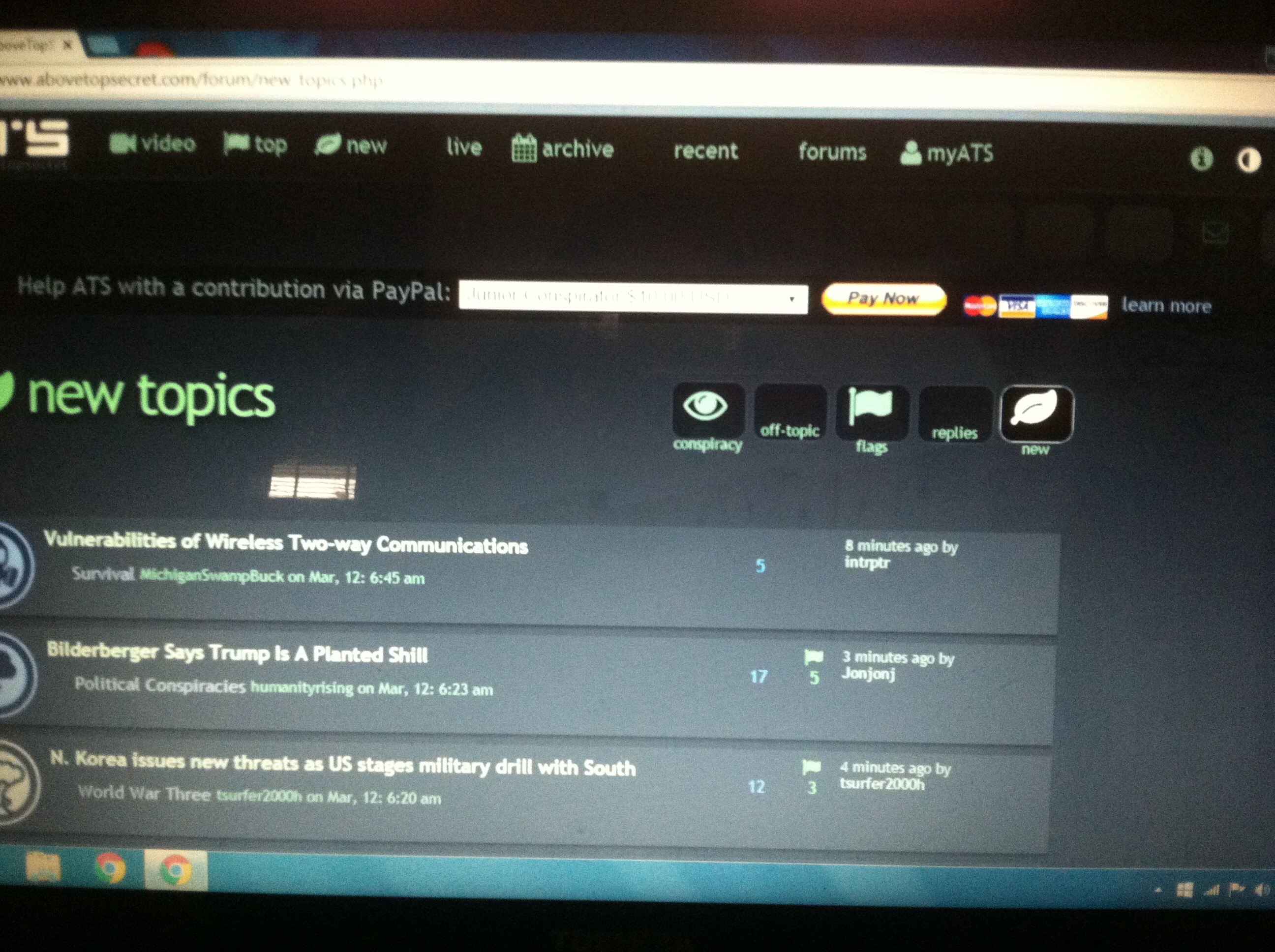
Apologies for the crappy pic I took it with my crappy phone!
I logged into the site using IE and so far, everything seems okay...
Also, with chrome the mail tabs (inbox, outbox, save, etc.) are missing.
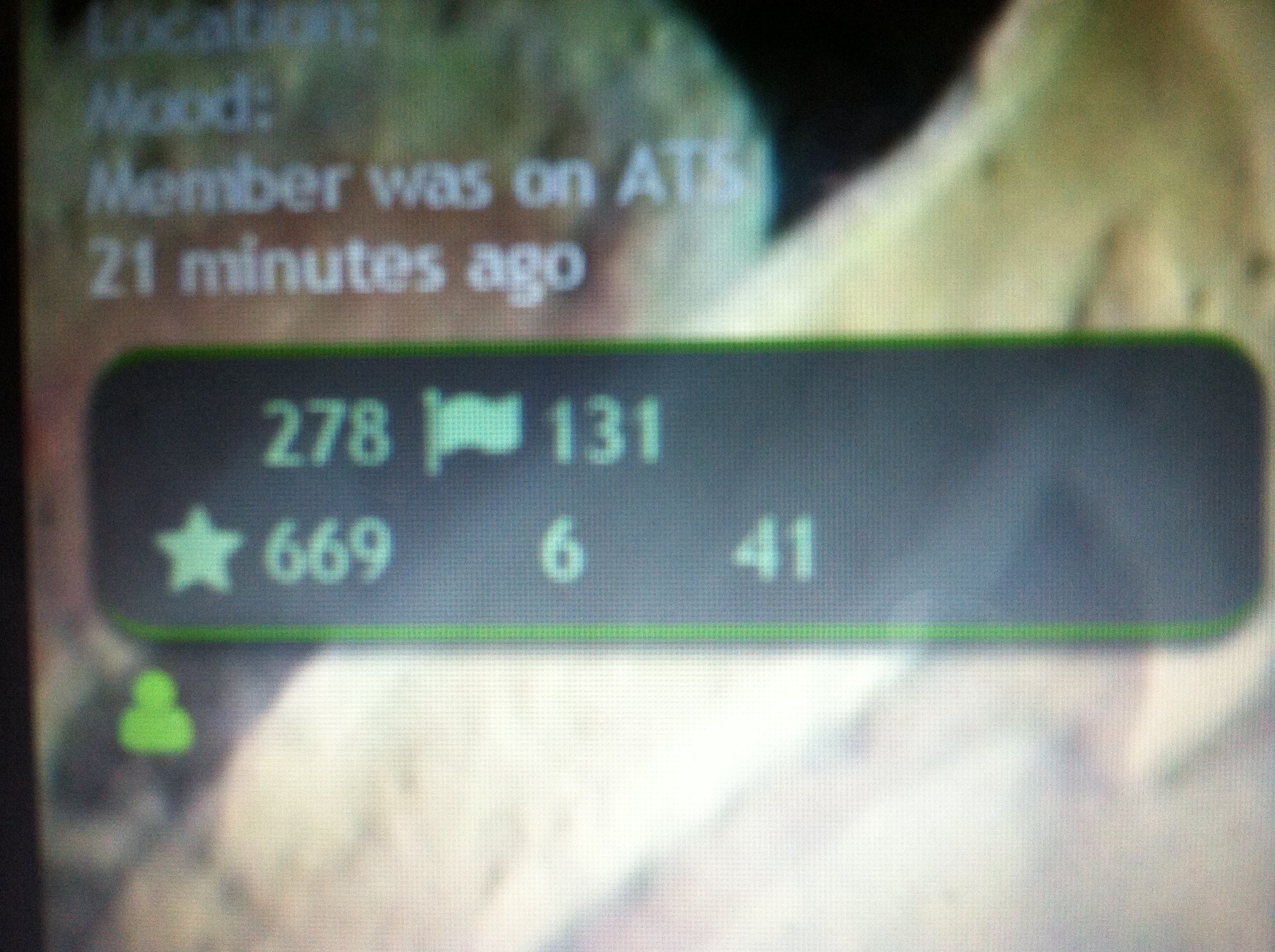
This is a member's stats...
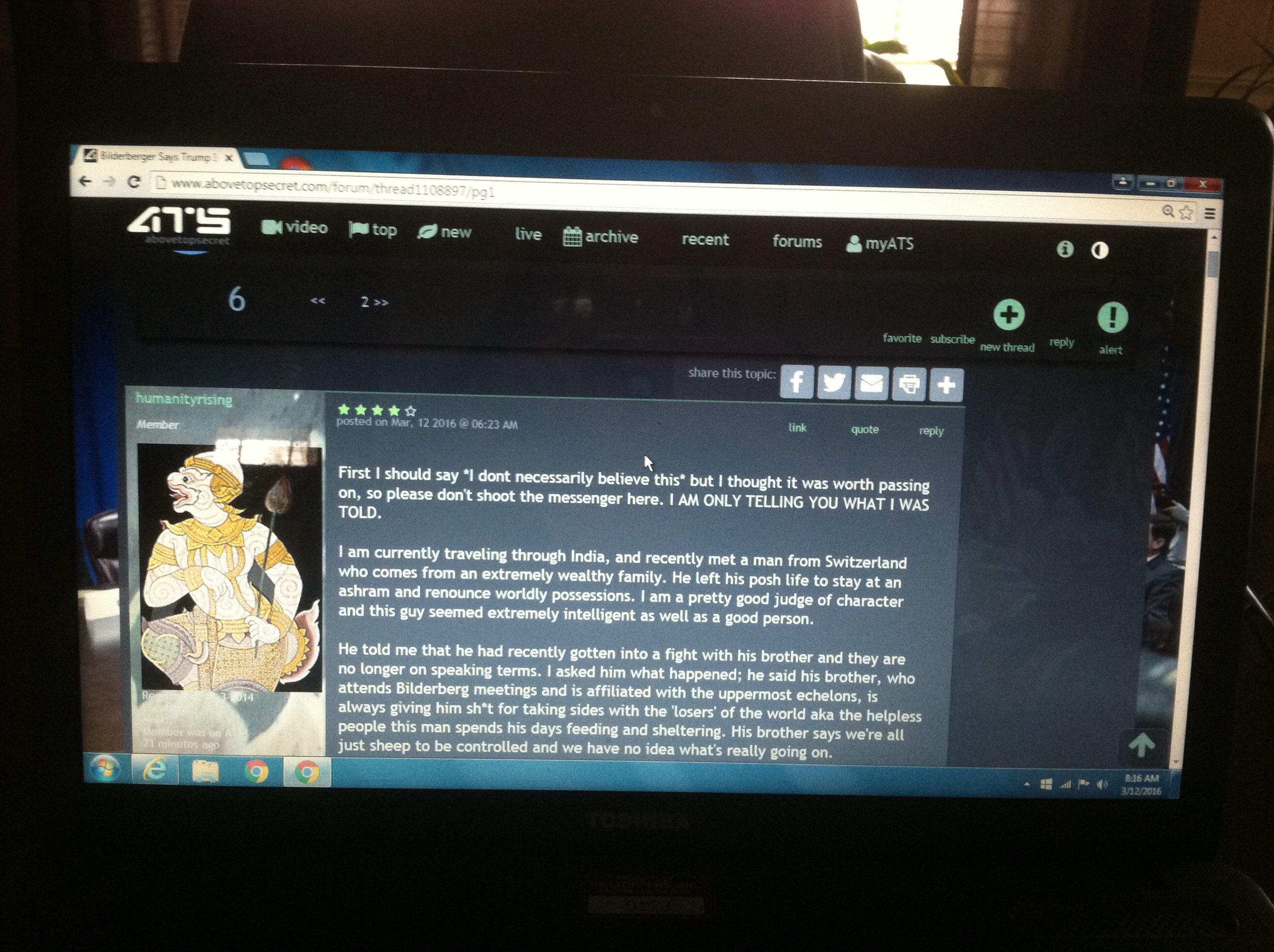
This is the top page when viewing their thread.
Apologies for the crappy pic I took it with my crappy phone!
I logged into the site using IE and so far, everything seems okay...
Also, with chrome the mail tabs (inbox, outbox, save, etc.) are missing.
This is a member's stats...
This is the top page when viewing their thread.
edit on 12-3-2016 by TNMockingbird because: add photos...sorry for the poor quality!
For some weird reason....
everytime i post, my reply box is much larger than the rest... still havent figured out why!
ETA... ah ok.... i see why!
everytime i post, my reply box is much larger than the rest... still havent figured out why!
ETA... ah ok.... i see why!
edit on 2016-03-12T07:43:02-06:00201603bam3103am0231 by combatmaster because: (no reason given)
originally posted by: Qumulys
a reply to: ForteanOrg
...
(EDIT - I'm talking about the avatars and backgrounds with them. I Actually like the desktop users backgrounds down the sides, I think that is a pretty flashy and tidy and modern look. However, I'd consider only changing them every 24 hours rather than every refresh. Also, it would not be hard to have an option to turn them off for users that do not like it. )
There is already an option to turn them off, isn't there? In the Account Profile page?
originally posted by: Bluesma
Uh, just got on this morning to find these new background images.
It's not like this has been a big surprise.
A very popular thread: Member Photoshop Contest: Forum Backgrounds and Sharing; Show Off Your Talent!, has been signaling the arrival of such background for a long time. Based mostly on the very positive response to the new backgrounds on the site home and forums home, and member's asking if we can have a unique image for each forum.
new topics
-
Maestro Benedetto
Literature: 44 minutes ago -
Is AI Better Than the Hollywood Elite?
Movies: 53 minutes ago -
Las Vegas UFO Spotting Teen Traumatized by Demon Creature in Backyard
Aliens and UFOs: 4 hours ago -
2024 Pigeon Forge Rod Run - On the Strip (Video made for you)
Automotive Discussion: 5 hours ago -
Gaza Terrorists Attack US Humanitarian Pier During Construction
Middle East Issues: 5 hours ago -
The functionality of boldening and italics is clunky and no post char limit warning?
ATS Freshman's Forum: 6 hours ago -
Meadows, Giuliani Among 11 Indicted in Arizona in Latest 2020 Election Subversion Case
Mainstream News: 7 hours ago -
Massachusetts Drag Queen Leads Young Kids in Free Palestine Chant
Social Issues and Civil Unrest: 7 hours ago -
Weinstein's conviction overturned
Mainstream News: 8 hours ago -
Supreme Court Oral Arguments 4.25.2024 - Are PRESIDENTS IMMUNE From Later Being Prosecuted.
Above Politics: 10 hours ago
top topics
-
Krystalnacht on today's most elite Universities?
Social Issues and Civil Unrest: 10 hours ago, 9 flags -
Supreme Court Oral Arguments 4.25.2024 - Are PRESIDENTS IMMUNE From Later Being Prosecuted.
Above Politics: 10 hours ago, 8 flags -
Weinstein's conviction overturned
Mainstream News: 8 hours ago, 7 flags -
Gaza Terrorists Attack US Humanitarian Pier During Construction
Middle East Issues: 5 hours ago, 7 flags -
University of Texas Instantly Shuts Down Anti Israel Protests
Education and Media: 13 hours ago, 6 flags -
Massachusetts Drag Queen Leads Young Kids in Free Palestine Chant
Social Issues and Civil Unrest: 7 hours ago, 6 flags -
Meadows, Giuliani Among 11 Indicted in Arizona in Latest 2020 Election Subversion Case
Mainstream News: 7 hours ago, 5 flags -
Las Vegas UFO Spotting Teen Traumatized by Demon Creature in Backyard
Aliens and UFOs: 4 hours ago, 4 flags -
2024 Pigeon Forge Rod Run - On the Strip (Video made for you)
Automotive Discussion: 5 hours ago, 2 flags -
Any one suspicious of fever promotions events, major investor Goldman Sachs card only.
The Gray Area: 15 hours ago, 2 flags
active topics
-
University of Texas Instantly Shuts Down Anti Israel Protests
Education and Media • 225 • : Xtrozero -
VP's Secret Service agent brawls with other agents at Andrews
Mainstream News • 59 • : ByeByeAmericanPie -
SETI chief says US has no evidence for alien technology. 'And we never have'
Aliens and UFOs • 72 • : yuppa -
My Poor Avocado Plant.
General Chit Chat • 77 • : JonnyC555 -
New whistleblower Jason Sands speaks on Twitter Spaces last night.
Aliens and UFOs • 61 • : Ophiuchus1 -
Is AI Better Than the Hollywood Elite?
Movies • 2 • : 5thHead -
Gaza Terrorists Attack US Humanitarian Pier During Construction
Middle East Issues • 25 • : CarlLaFong -
Mood Music Part VI
Music • 3102 • : Hellmutt -
Las Vegas UFO Spotting Teen Traumatized by Demon Creature in Backyard
Aliens and UFOs • 9 • : Ophiuchus1 -
British TV Presenter Refuses To Use Guest's Preferred Pronouns
Education and Media • 164 • : Annee