It looks like you're using an Ad Blocker.
Please white-list or disable AboveTopSecret.com in your ad-blocking tool.
Thank you.
Some features of ATS will be disabled while you continue to use an ad-blocker.

Reminiscing the \"old\" ATS
page: 1share:
Well, the new design has now arrived and ATS has finally been reduced to a simple forum without any elaborate extra functionality. There were times
when ATS had all sorts of weird and wonderful contraptions, such as a Podcast and a TinWIKI, what ever that is supposed to be. *insert laughing smiley
here*

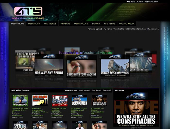
We even had an entire video and media center. Anyone remember the conspiracy chicks? There was all sorts of crazy stuff hidden in that labyrinth, we could upload not only images but other sorts of media as well like video and audio files, and even pdf documents. There were so many thing it could do, but I can't remember everything.
If you go even further back in time, ATS once had its own advanced search engine with direct database access. It wasn't a custom google search engine (like the last search engine) or an affiliated external search engine (like the current samuru engine)... it was a true inbuilt search function which searched the ATS database directly.
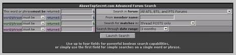
What that meant was, unlike Google or any other such search engine, it wouldn't miss anything because it was searching the database directly (assuming you used the right search terms). It also meant that we could search by member name, or we could search a specific forum, or a specific time frame, and get precise results.
Now I really don't want to start ranting but there is a point to this thread. While the look and feel of the website has gotten better, I would argue that the functionality has gotten worse in some aspects. For example, without the ribbon, how does one view a live updating feed of top, hot, and new topics all in one window? Or a live feed of any of those things for that matter?
We even had an entire video and media center. Anyone remember the conspiracy chicks? There was all sorts of crazy stuff hidden in that labyrinth, we could upload not only images but other sorts of media as well like video and audio files, and even pdf documents. There were so many thing it could do, but I can't remember everything.
If you go even further back in time, ATS once had its own advanced search engine with direct database access. It wasn't a custom google search engine (like the last search engine) or an affiliated external search engine (like the current samuru engine)... it was a true inbuilt search function which searched the ATS database directly.
What that meant was, unlike Google or any other such search engine, it wouldn't miss anything because it was searching the database directly (assuming you used the right search terms). It also meant that we could search by member name, or we could search a specific forum, or a specific time frame, and get precise results.
Now I really don't want to start ranting but there is a point to this thread. While the look and feel of the website has gotten better, I would argue that the functionality has gotten worse in some aspects. For example, without the ribbon, how does one view a live updating feed of top, hot, and new topics all in one window? Or a live feed of any of those things for that matter?
edit on 5/9/2013 by ChaoticOrder because: (no reason
given)
I agree with most of what you wrote, BUT I do not think the new look is better. It is much worse imo. This is like ATS lite. Let me have the full
version back.
reply to post by darthmuerte
Really....I HATE this new look. Especially the lame "emoticons".....WHY did they do this? It doesn't FEEL like ATS now.....*sniff sniff* (won't bother to put sad emoticon here because they look STUPID)
Really....I HATE this new look. Especially the lame "emoticons".....WHY did they do this? It doesn't FEEL like ATS now.....*sniff sniff* (won't bother to put sad emoticon here because they look STUPID)
edit on 9/5/2013 by StealthyKat because: added content
I loved the podcasts. they were great.
It is just a website now. Nothing too special to set it apart from the rest apart from the membership. It felt like more of a community then.
The new ATS is even more basic. Wont be long I guess when there will be serious competition to ATS. Good for us but not so for the staff here.
I always wondered why the podcasts finished, they were great. Johnny Anonymous and erm was it Dave Rabbit?
Oh, the good old days.
darthmuerte
I agree with most of what you wrote, BUT I do not think the new look is better. It is much worse imo. This is like ATS lite. Let me have the full version back.
Should be called 'ATS mobile'.
reply to post by ChaoticOrder
Go back to the old format of ATS, this one is just annoying IMO. Please...
Go back to the old format of ATS, this one is just annoying IMO. Please...
I do not think much of the new smiles. I miss the yellow guys.
I like the look but can't navigate as well, like going to a members posts doesn't take me to it.
I suppose it just needs some getting used to. Might need some tweaking.
I suppose it just needs some getting used to. Might need some tweaking.
violet
I like the look but can't navigate as well, like going to a members posts doesn't take me to it.
I noticed that when I click on one of my recent posts in my profile it takes me to the first page in that thread instead of the actual post... kind of annoying. Is that what you're talking about?
Looks don't bother so so much on the new design, the navigation is what is going to drive me insane
reply to post by ChaoticOrder
I noticed that. Like it needs to display that before displaying what you want. Wait a bit and from the top of the page it will (eventually) go to the post you want. I don't want to speculate on why it needs to "wait one".
I noticed that when I click on one of my recent posts in my profile it takes me to the first page in that thread instead of the actual post... kind of annoying.
I noticed that. Like it needs to display that before displaying what you want. Wait a bit and from the top of the page it will (eventually) go to the post you want. I don't want to speculate on why it needs to "wait one".
I agree, OP. The new layout makes me feel like I'm on MySpace, or some other place where teenagers share Justin Bieber vids.
This just no longer feels like a place you can take seriously.
Furthermore, it seems ATS has just emulated stuff from a bunch of other sites. The layout doesn't flow like old ATS used to. Give me a "New Topics" page where I can see everything, not this junk where I have to view each feed separately.
Sorry, ATS. This new layout is a fail.
Personally I didn't like the new design very much when I first tried it but it has grown on me quickly. It always takes a while for people to adjust
to a new look. As a web developer myself I can appreciate the use of modern HTML components and a less bulky layout. I get the feeling that maybe some
of you are using the white them and not the dark theme? Click the very last icon in the menu (half dark circle thing) and it should switch to the dark
theme.
I hate all the wasted space at the top of every thread where you have to scroll down just to see the first post. AND...Most members names are not
seen, just their avatars if they even have one.
AND...the smilies are just ridiculous! I could go on, but I'll shut up now.
AND...the smilies are just ridiculous! I could go on, but I'll shut up now.
Night Star
I hate all the wasted space at the top of every thread where you have to scroll down just to see the first post. AND...Most members names are not seen, just their avatars if they even have one.
AND...the smilies are just ridiculous! I could go on, but I'll shut up now.
wow u never bitch.
Wow, I didn't know about that search function. Why on earth would anyone get rid of something that concise? I'd be all for bringing that back and
dumping this useless current search engine!
Night Star
AND...Most members names are not seen, just their avatars
I don't understand this. I'm using the latest version of Firefox and I can see every member's name. Can you take a screen shot of what you're talking about and post it?
You may want to make sure you browser is updated to the latest and greatest, or try a different browser. I have no problems with Firefox, or Boat Browser on my Android phone and tablet.
reply to post by ChaoticOrder
I've been using the dark theme since the failed launch a few days ago. My choice was remembered.
It feels.. childish to me. Like stickers on a notebook. And a lot of functionality has been lost...
ETA: Buried, not lost. Just buried.
I've been using the dark theme since the failed launch a few days ago. My choice was remembered.
It feels.. childish to me. Like stickers on a notebook. And a lot of functionality has been lost...
ETA: Buried, not lost. Just buried.
edit on 5-9-2013 by TinkerHaus because: (no reason given)
new topics
-
Prize or Zonk
General Chit Chat: 2 hours ago -
I've realized something about Politics recently.
US Political Madness: 3 hours ago -
France bans head coverings but allows Christianity to be mocked at Olympics.
Political Conspiracies: 5 hours ago -
Woo time it aint over yet
Paranormal Studies: 6 hours ago -
BIDEN-HARRIS Preparing to Also Make Us Pay For Illegal-Aliens to Attend College Prep Programs.
Political Ideology: 9 hours ago -
The Main Question and A Bonus Question
General Conspiracies: 11 hours ago
top topics
-
The Main Question and A Bonus Question
General Conspiracies: 11 hours ago, 13 flags -
Is Kamala Good for America ?
Political Issues: 12 hours ago, 12 flags -
BIDEN-HARRIS Preparing to Also Make Us Pay For Illegal-Aliens to Attend College Prep Programs.
Political Ideology: 9 hours ago, 9 flags -
Brazil UFO July 2024
Aliens and UFOs: 16 hours ago, 9 flags -
The Most Crime Ridden Games Ever
World Sports: 12 hours ago, 6 flags -
Did Russia just attack a NATO nation?
The Gray Area: 15 hours ago, 6 flags -
A Preliminary Question
General Conspiracies: 12 hours ago, 3 flags -
Olympics France 2024 Opening Ceremony
World Sports: 13 hours ago, 3 flags -
Woo time it aint over yet
Paranormal Studies: 6 hours ago, 3 flags -
France bans head coverings but allows Christianity to be mocked at Olympics.
Political Conspiracies: 5 hours ago, 2 flags
active topics
-
Prediction watch how fast the war in Ukraine ends.
Dreams & Predictions • 63 • : kwaka -
JD Vance Is the Least Liked VP Nominee in Decades, According to Polls
2024 Elections • 340 • : andy06shake -
I've realized something about Politics recently.
US Political Madness • 4 • : andy06shake -
Newsweek states Trump was not shot - cites FBI Director Wray
US Political Madness • 118 • : daskakik -
Over 1,100 Migrants Arrived in First 10 Days of Labour Government
Social Issues and Civil Unrest • 191 • : SecretKnowledge2 -
The Acronym Game .. Pt.4
General Chit Chat • 144 • : bally001 -
BIDEN-HARRIS Preparing to Also Make Us Pay For Illegal-Aliens to Attend College Prep Programs.
Political Ideology • 43 • : ElitePlebeian2 -
Remember that picture of Trumps fist in the air and blood on his face?
Education and Media • 236 • : wAnchorofCarp -
Shots Fired At Trump Rally Trump Looks Wounded
US Political Madness • 1844 • : daskakik -
France bans head coverings but allows Christianity to be mocked at Olympics.
Political Conspiracies • 18 • : bastion