It looks like you're using an Ad Blocker.
Please white-list or disable AboveTopSecret.com in your ad-blocking tool.
Thank you.
Some features of ATS will be disabled while you continue to use an ad-blocker.

New ATS front page ?
page: 10share:
Originally posted by W3RLIED2
reply to post by bhornbuckle75
Originally posted by Romekje
reply to post by Ben81
I hate it, it sux.
It's so.... crowded.
See what I mean?
I don't understand your problem dude. The reply was short and to the point. I appreciate that.
The site made a bad decision and for whatever reason won't back off.
Can you explain why you are so invested in this anyway? I bet not.
Originally posted by The GUT
I dig it. A step in the right direction. Makes it easier for me to scan fast and efficiently.
Some advantages to consider...but...IMHO...needs a bit of refinement!
I'm a web designer as well and I feel like it's a step in 'the right direction', but really.. just a step.
If you were after user function-ability I would have aimed first of changing the color theme. White backgrounds always do better and make any design less complicated, dark themes are never a good choice.
Also, the box idea isn't bad it's just severely flawed. For instance, the top two highlighted boxes: they shouldn't be that big (you have to accommodate for users with all type of screen sizes) I'm on my 12 inch mac and it practically takes up the whole screen. Also the font is just awful, and way too big as well. And the columns really should be more symmetrical as the brain will process it quicker and want to move on.
I literally spent a good minute trying to absorb it all. It was messy and difficult to keep track of where I was (kind of like the difference between the new topic sections, and new topic firehouse).
Just my opinion
I understand people are upset, but the site is free. You're not paying to read the forums. You're not paying to post or use them. Yea, there are ads
here and there, but it's still free. Let's play nice, keep it calm, voice concerns, but keep it civil. Again, brand new guy here... Don't have to
listen or agree with me, but we can be adults.
I didn't even notice the entire page until the one poster posted the screen with the entire site thumb-nailed. A main page should be someone compact to allow easy navigation.
I didn't even notice the entire page until the one poster posted the screen with the entire site thumb-nailed. A main page should be someone compact to allow easy navigation.
reply to post by Yosemite Sam
I am still trying to figure out how you have been a member for so long.
Your replies on this thread are
I am still trying to figure out how you have been a member for so long.
Your replies on this thread are
How about giving us the freedom to customize our own Main Page when we logon? For non-members they get what they get and if they don't like it, they
can register to become a member.
I would love to be able to customize a home page with topics I'm interested in and if I want to dig deeper on a new topic, I will use the Forums link on the toolbar above.
I would love to be able to customize a home page with topics I'm interested in and if I want to dig deeper on a new topic, I will use the Forums link on the toolbar above.
Originally posted by liejunkie01
reply to post by Yosemite Sam
I am still trying to figure out how you have been a member for so long.
Your replies on this thread are
Not quite sure how you don't know that he comes out and about once in awhile...and as an such an advanced member yourself...do I have your permission to chime in?
See what a bit of assumption can do?
Simply sharing...is that okay?
Originally posted by liejunkie01
reply to post by Yosemite Sam
I am still trying to figure out how you have been a member for so long.
Your replies on this thread are
Please help and be a bit more specific.
Originally posted by jerryznv
Originally posted by liejunkie01
reply to post by Yosemite Sam
I am still trying to figure out how you have been a member for so long.
Your replies on this thread are
Not quite sure how you don't know that he comes out and about once in awhile...and as an such an advanced member yourself...do I have your permission to chime in?
See what a bit of assumption can do?
Simply sharing...is that okay?
Yup, of course.
edit on 7/6/2012 by Yosemite Sam because: Re positioning my non-answer. lol
This is awesome.... We as adults can't use bad language in our posts due to Terms and Conditions, but on the new main Page there is a Advertisement
with a direct link for an Adult Store called Adam & Eve.
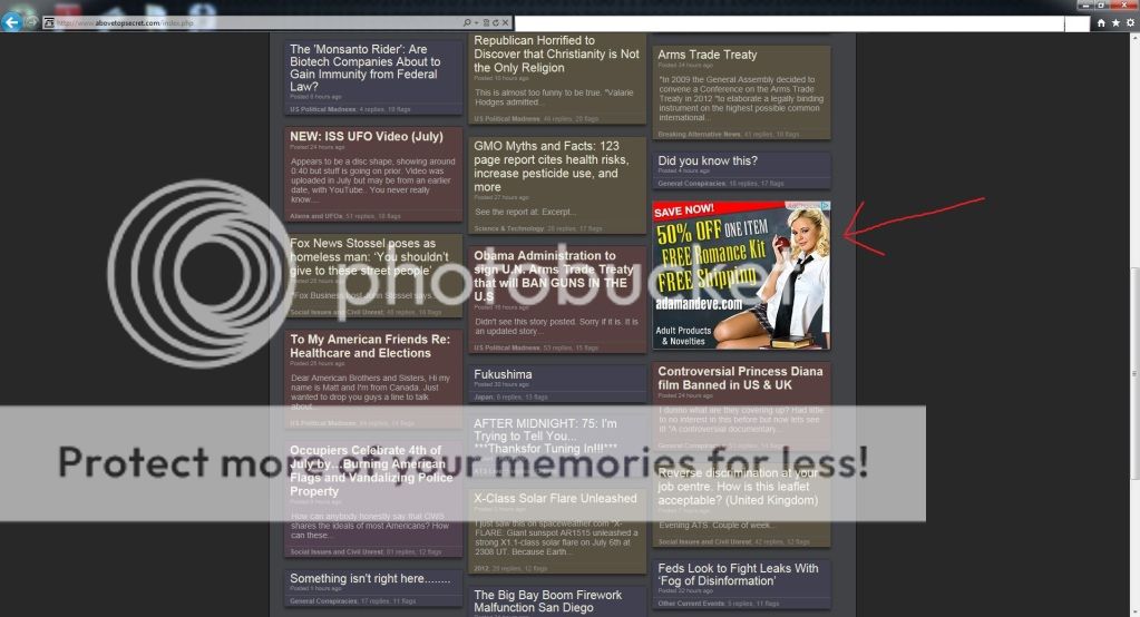
Scroll to the right.
Scroll to the right.
edit on 6-7-2012 by KnightFire because: (no reason given)
I don't see it.
Although I must admit I am a regular customer.
Although I must admit I am a regular customer.
reply to post by Yosemite Sam
The page has different ads that cycle through everytime the page is refreshed. It just so happened to pop-up when I accessed the main page again.
The page has different ads that cycle through everytime the page is refreshed. It just so happened to pop-up when I accessed the main page again.
Originally posted by jerryznv
Originally posted by liejunkie01
reply to post by Yosemite Sam
I am still trying to figure out how you have been a member for so long.
Your replies on this thread are
Not quite sure how you don't know that he comes out and about once in awhile...and as an such an advanced member yourself...do I have your permission to chime in?
See what a bit of assumption can do?
Simply sharing...is that okay?
Have you even read any of this guys replies?
I find them quite offensive. I would say borderline if not totally T&C violation. I have been gigged for less.
Here are a few examples.
From Yosemite himself.
Network engineer for almost 30 years and I still say it sucks. You're a dope.
This one I believe was a reply to Skeptic himself.
Who the hell are you that shouls say who clicks on what??? Are you kidding me???
Just popping in to say screw you!
What was I assuming again?
Like I said I have made comments of lesser volitility and I got docked. I was not assuming anything I was observing, is that ok?
edit on
7-7-2012 by liejunkie01 because: (no reason given)
The numbers are in, and after 24 hours of data, the results are encouraging.
Home Page Bounce Rate
Before the redesign: 43.21%
After the redesign: 21.17%
This metric has been filtered to first-time visitors in the previous 30 days with metics on menu links negated. "Bounce Rate" is the percentage of visitors who come to the page, then leave -- they don't click a link.
The bounce rate of our previous home page design hovered around 35% soon after it was launched, but was moving above 40% over the past few months. This indicates a stale design.
With a lower bounce rate (at least in the past 24 hours) among first-time visitors, this means more people are clicking through to threads in the new design.
Page Load Time
Before the redesign: 9.88 seconds
After the redesign: 3.07 seconds
A massive increase here. The overall "weight" of the page in kilobytes is one-third of the previous design, so of course it loads three times faster.
Average Engagement Time
Before the redesign: 27.91 seconds
After the redesign: 18.37 seconds
Again, filtered for first-time visitors with menu clicks negated. The engagement time is the measure of time between the page fully loads, and a link is clicked. This comparison means that first-time visitors are finding a topic of interest 10 seconds faster in the new design.
We've also seen a comparative rise in overall site utilization today. We've received our first "high traffic" alert from ChartBeat in a long, long time.
I know many of you are indicated various levels of hatred for the new design ( ) and to be honest, until I started using Windows phones I didn't like the metro interface... and was quite negative about it for some time. After some research, and seeing other implementations, I get it.
We're still refining. But preliminary data is encouraging.
Explanation: Uhmmm?
OK ... In the 2nd beginning there was ATS ...
And it was mostly [re]written by SO on his Mac!
Now since 2010 upgrade ... SO got an Ipad tablet and LOVES it!
Steve Jobs hated flash and loved java ... and here are some of SO's comments to this thread confirming the obvious "Apple (TM)" influence and bias ...
Note skins = flash ...
This IS about ad revenue and ATS future and the future of TAN [which owns and runs ATS].
Steve Jobs called it "Cloud Computing" and it is just a junk jargon term for a mainframe with wifi connected dumb terminals.
The tablets etc will have LESS onboard functionality.
The mainframe will know where you are and what you have on your dumb terminal thanks to the wifi functionality.
The mainframe will centralize and monopolize all the information.
This is another hint from SO about the future ... similar to how youtube is dropping support for IE7 users ...
Therefor to stay concurrent with ATS one will have to ...
... lose the older browser ... move to a tablet using java based apps ... avoid flash like the plague and fully realize future websites will be surfed using a finger tap on a touch screen and one will quickly realize that ATS future is now a tabloid on a tablet.
Personal Disclosure: ATS is in an online war for the future and even though steve jobs is dead ... his influence reaches far beyond the grave.
This gives me grave concern for ATS future.
SO .. would you please disclose the target demographic of the future that you are aiming this at?
OK ... In the 2nd beginning there was ATS ...
And it was mostly [re]written by SO on his Mac!
Now since 2010 upgrade ... SO got an Ipad tablet and LOVES it!
Steve Jobs hated flash and loved java ... and here are some of SO's comments to this thread confirming the obvious "Apple (TM)" influence and bias ...
Also, if you have JavaScript disabled... the page WILL look like ass.
This is the first, tentative step in a responsive direction. We still have many advertisers anticipating a "skin" around the fixed width format. Once we make it known skins are no longer an advertising vehicle, we can go more fully responsive.
Note skins = flash ...
This IS about ad revenue and ATS future and the future of TAN [which owns and runs ATS].
Steve Jobs called it "Cloud Computing" and it is just a junk jargon term for a mainframe with wifi connected dumb terminals.
The tablets etc will have LESS onboard functionality.
The mainframe will know where you are and what you have on your dumb terminal thanks to the wifi functionality.
The mainframe will centralize and monopolize all the information.
This is another hint from SO about the future ... similar to how youtube is dropping support for IE7 users ...
The "boxes," while emerging as a structural convention (especially when photos are used), might be showing differently in some browsers, and making things much worse for those on older browsers.
Therefor to stay concurrent with ATS one will have to ...
... lose the older browser ... move to a tablet using java based apps ... avoid flash like the plague and fully realize future websites will be surfed using a finger tap on a touch screen and one will quickly realize that ATS future is now a tabloid on a tablet.
Personal Disclosure: ATS is in an online war for the future and even though steve jobs is dead ... his influence reaches far beyond the grave.
This gives me grave concern for ATS future.
SO .. would you please disclose the target demographic of the future that you are aiming this at?
edit on 7-7-2012 by OmegaLogos because: Edited to fix spelling.
Originally posted by W3RLIED2
reply to post by bhornbuckle75
Thats all fine and dandy. My point was, there is a more constructive way of doing it than popping in with an " hey it sucks! Change it back.".
If you cant understand my amusement at people complaining about too much text while patronizing a text based forum I guess you just arent going to get it.
Change is good. Dont fight it, embrace it
Honestly if you thought people were complaining that there was "too much text" then I'm afraid that it's you who wasn't understanding why people are complaining about the new layout.
Also if there is a "more constructive way" to try to get ATS to change back to the old layout, other than letting them know that we don't like it, in their forums then I'm all ears to hear what that would be!
reply to post by SkepticOverlord
That is a major difference in loading times.
I have to say that after reading this I have no complaints.
Page Load Time
Before the redesign: 9.88 seconds
After the redesign: 3.07 seconds
A massive increase here. The overall "weight" of the page in kilobytes is one-third of the previous design, so of course it loads three times faster.
Average Engagement Time
Before the redesign: 27.91 seconds
After the redesign: 18.37 seconds
That is a major difference in loading times.
I have to say that after reading this I have no complaints.

Brilliant brother. You bring in 10 new members while 100 walk out the back door.
reply to post by liejunkie01
I don't see the problem. You're scared of making comments to the powers that be? That says everything.
I don't see the problem. You're scared of making comments to the powers that be? That says everything.
new topics
-
Zionists of ATS assemble
Political Issues: 2 hours ago -
For Votes - President BIDEN Opens ObamaCare Health Ins to Illegal Aliens Eff Nov 1st 2024.
2024 Elections: 7 hours ago -
EPA sues San Francisco for dumping billions of gallons of sewage into Pacific Ocean
US Political Madness: 7 hours ago -
Prophets versus priests; - Getting God's help
Religion, Faith, And Theology: 9 hours ago -
UN Estimates Rebuilding Gaza Will Cost Up To 40 Billion Dollars
Middle East Issues: 11 hours ago -
Study Finds The More Covid Vaccine Doses You Have, the More Likely You Are to Get Covid
Medical Issues & Conspiracies: 11 hours ago
top topics
-
Wounded Orangutan seen using a Plant as Medicine for the First Time
Fragile Earth: 12 hours ago, 17 flags -
Study Finds The More Covid Vaccine Doses You Have, the More Likely You Are to Get Covid
Medical Issues & Conspiracies: 11 hours ago, 13 flags -
Farmers jailed without due process
General Conspiracies: 13 hours ago, 9 flags -
EPA sues San Francisco for dumping billions of gallons of sewage into Pacific Ocean
US Political Madness: 7 hours ago, 8 flags -
UN Estimates Rebuilding Gaza Will Cost Up To 40 Billion Dollars
Middle East Issues: 11 hours ago, 8 flags -
For Votes - President BIDEN Opens ObamaCare Health Ins to Illegal Aliens Eff Nov 1st 2024.
2024 Elections: 7 hours ago, 7 flags -
Democratic Rep. Henry Cuellar and wife indicted on federal bribery charges
US Political Madness: 12 hours ago, 6 flags -
Poll - Catholic Support Swings to Trump By Significant Margin
2024 Elections: 17 hours ago, 5 flags -
SEC shuts down Trump Media auditor, BF Borgers, over fraud
Mainstream News: 13 hours ago, 5 flags -
An AI-controlled fighter jet took the Air Force leader for a historic ride
Military Projects: 13 hours ago, 4 flags
active topics
-
Wounded Orangutan seen using a Plant as Medicine for the First Time
Fragile Earth • 23 • : SprocketUK -
Zionists of ATS assemble
Political Issues • 6 • : Degradation33 -
California Must Spend 20 Billion on Power Grid Upgrades If It Wants EVs
Fragile Earth • 28 • : glen200376 -
UFO Filmed By Pilot Model Valentina Rueda From Cockpit Of Private Plane. April 4, 2023
Aliens and UFOs • 153 • : gigirome -
Alien language: If we met extraterrestrials, could we talk to them?
Aliens and UFOs • 62 • : gigirome -
Are you ready for the return of Jesus Christ? Have you been cleansed by His blood?
Religion, Faith, And Theology • 28 • : TheGoodNews -
SEC shuts down Trump Media auditor, BF Borgers, over fraud
Mainstream News • 48 • : glen200376 -
Bigger than Covid
US Political Madness • 60 • : 19Bones79 -
German city in chaos as 'extremist' march sees calls for 'caliphate' and ISIS-style flags
Mainstream News • 44 • : TheMisguidedAngel -
For Votes - President BIDEN Opens ObamaCare Health Ins to Illegal Aliens Eff Nov 1st 2024.
2024 Elections • 15 • : WeMustCare