It looks like you're using an Ad Blocker.
Please white-list or disable AboveTopSecret.com in your ad-blocking tool.
Thank you.
Some features of ATS will be disabled while you continue to use an ad-blocker.

What the Font? (Otherwise Known as WTF in Design)
page: 18
share:
Ok. Since I get asked a LOT what "really cool looking font" I use in a lot of my stuff, I'll answer the question here and now, and hopefully make
everyone understand WHY.
First let's understand some history. I first learned typesetting on a Linotype machine, my school had one that had been donated. When we didn't use the Linotype, we used the old fashioned dry transfer and a ruler made line to line it all up. After school and before the advent of desktop publishing we also used Phototype machines, these were more like the old word processors that had an LCD screen that showed what you were typing, and no proofreading/spellcheck options. But you could make the fonts different sizes up to 24 point.
ABC/CBS/NBC used phototype machines for their ad's in TV guide and on screen graphics for years (along with the original Chyron's) And that is where my love affair with fonts came from, looking at all those cool letters in the ad's.
Before I go on, I'm just going to say this, Times New Roman / Arial / and Comic Sans are the worlds MOST OVERUSED fonts. With thousands of variations and designs to choose from , one should never limit themselves to just those three, it's really boring.
Anyhow, there are 5 fonts I use a LOT.
Friz Quadrada, if I need a nice Serif font (Serifs being those little doodads on the letters)
Eurostyle, if I want to do some longer text, a nice Sans Serif that is actually been in use for years (Microgramma D)
ITC Kabel, another Sans Serif one I use a lot for longer lines of text
Kaufman, if I need a script font.
and
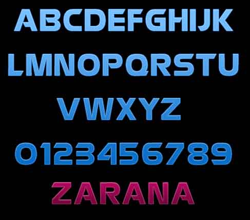
Zarana, for the title and sub heading.
Zarana is an odd font, it's never been officially available for the computers, and it was made by a company for a phototype machine that no longer is in business, but if you were alive in 1977/78 and saw any ABC on screen ad or print ad, you saw Zarana in use. Someone along the way painstakingly copied all of the phototype matrices of Zarana to a TTF and made it available. All I know is that the last known real sighting of it in the wild outside of niche users, is in 1989 before Compugraphics went under after being bought out by a European company.
Why do I not use the standard Windows/Mac fonts you ask?
Good question. Because seriously, they are boring. I can bring out more of my eccentric personality by finding the right font, even to use as a captioning font. You should too.
With that being said, if there's a font you see somewhere and want to know the name or how to find it, post a sample here, I'm sure If I don't know the font, someone does, most people know them without even knowing they do.
Here's Zarana by the way, if you look you can see that it was also the basis for all the lettering fonts for Battlestar Galactica both in 78 and the reboot in 2003.
First let's understand some history. I first learned typesetting on a Linotype machine, my school had one that had been donated. When we didn't use the Linotype, we used the old fashioned dry transfer and a ruler made line to line it all up. After school and before the advent of desktop publishing we also used Phototype machines, these were more like the old word processors that had an LCD screen that showed what you were typing, and no proofreading/spellcheck options. But you could make the fonts different sizes up to 24 point.
ABC/CBS/NBC used phototype machines for their ad's in TV guide and on screen graphics for years (along with the original Chyron's) And that is where my love affair with fonts came from, looking at all those cool letters in the ad's.
Before I go on, I'm just going to say this, Times New Roman / Arial / and Comic Sans are the worlds MOST OVERUSED fonts. With thousands of variations and designs to choose from , one should never limit themselves to just those three, it's really boring.
Anyhow, there are 5 fonts I use a LOT.
Friz Quadrada, if I need a nice Serif font (Serifs being those little doodads on the letters)
Eurostyle, if I want to do some longer text, a nice Sans Serif that is actually been in use for years (Microgramma D)
ITC Kabel, another Sans Serif one I use a lot for longer lines of text
Kaufman, if I need a script font.
and
Zarana, for the title and sub heading.
Zarana is an odd font, it's never been officially available for the computers, and it was made by a company for a phototype machine that no longer is in business, but if you were alive in 1977/78 and saw any ABC on screen ad or print ad, you saw Zarana in use. Someone along the way painstakingly copied all of the phototype matrices of Zarana to a TTF and made it available. All I know is that the last known real sighting of it in the wild outside of niche users, is in 1989 before Compugraphics went under after being bought out by a European company.
Why do I not use the standard Windows/Mac fonts you ask?
Good question. Because seriously, they are boring. I can bring out more of my eccentric personality by finding the right font, even to use as a captioning font. You should too.
With that being said, if there's a font you see somewhere and want to know the name or how to find it, post a sample here, I'm sure If I don't know the font, someone does, most people know them without even knowing they do.
Here's Zarana by the way, if you look you can see that it was also the basis for all the lettering fonts for Battlestar Galactica both in 78 and the reboot in 2003.
I can get obsessed with fonts when working on a project. Nothing though is more frustrating than taking hours to select a font and the client or boss
going they love it but can you change the font.
originally posted by: putnam6
I can get obsessed with fonts when working on a project. Nothing though is more frustrating than taking hours to select a font and the client or boss going they love it but can you change the font.
I just hate when someone says:
What's that font, Rome Times or something? Why don't we use that, it's nice isn't it?
AHHHHHHHHHHHHHHHHHHHHHHHHHHHHHHHHHHHHHH
A teen's science project found by changing the font it can save money.
"First, he charted how often each character was used in four different typefaces: Garamond, Times New Roman, Century Gothic and Comic Sans. Then he measured how much ink was used for each letter, using a commercial tool called APFill® Ink Coverage Software.
From this analysis, Suvir figured out that by using Garamond with its thinner strokes, his school district could reduce its ink consumption by 24%, and in turn save as much as $21,000 annually."
Font Change
originally posted by: BelleEpoque
From this analysis, Suvir figured out that by using Garamond with its thinner strokes, his school district could reduce its ink consumption by 24%, and in turn save as much as $21,000 annually."
Dang, not bad at all!
I'm remembering this for our next corporate cost-saving meeting, when "that person" recommends cutting back on paperclips and turning off (LED) lights...
a reply to: BelleEpoque
Footlight MT Light has even smaller strokes than Garamond with the same overall feel. It is also included with Word free of charge . I noticed that if I do out proposals in it it takes far less ink than even the old Monospaced fonts with their 1pt strokes.
Just an aside..
Footlight MT Light has even smaller strokes than Garamond with the same overall feel. It is also included with Word free of charge . I noticed that if I do out proposals in it it takes far less ink than even the old Monospaced fonts with their 1pt strokes.
Just an aside..
a reply to: vkey08
Fonts are fascinating, aren't they?
I like Cala for work that should have a solid, factual look.
The fonts that emulate old telegraph type are fun for some things.
Other "specials" that can be at times useful are the DIN fonts used for German street signs and at the train stations. Easy to read, yet with a distinctive look.
Cheers
edit on 10-4-2022 by F2d5thCavv2 because: (no reason given)
originally posted by: vkey08
originally posted by: putnam6
I can get obsessed with fonts when working on a project. Nothing though is more frustrating than taking hours to select a font and the client or boss going they love it but can you change the font.
I just hate when someone says:
What's that font, Rome Times or something? Why don't we use that, it's nice isn't it?
AHHHHHHHHHHHHHHHHHHHHHHHHHHHHHHHHHHHHHH
Exactly, LOL
When I can I'll do 3-4 versions and usually one is a Times or Helvetica, sometimes people just have a hard time visualizing what looks better.
a reply to: vkey08
You know I once installed hundreds of fonts on my PC long time ago and whenever I opened a word editor like MS Word or any Office software, it took a long time to load, and it drive me nuts waiting for it to load on my old PC that runs on Pentium or something while I need to type out something urgently. I don't know though whether it was because of too many fonts or my PC had very less RAM (about 2 GB I think) or the CPU was weak.
I ever since decided not to install that many fonts even though they may be pretty to look at because in the end I ended up not using a majority of them.
I think like you I need to select a few fonts that I like to use on a daily basis. And if i find some fonts which I like but I do not know what it's called, I'll come back to this thread and post it so that i can get it.
Phototype (a kind of Typography)
Someone asked me what "Phototype" was off to the side, so I figured a small explanation of what it was would be in order.
Phototyping is where you use a machine, that has a negative image of the glyphs (fonts) you want to use stored on a plate inside it. When you type a letter that font matrix is used to put an image of the letter or mark on a plate that you would then be able to use for either on screen writing, or offset printing.
Think of it like a negative and a final picture. a camera takes a picture and makes a negative, the negative is then projected upon a bit of paper that's been coated with a chemical, after a small bath, the picture appears. Same concept, except it's a specially coated bit of what looks like Aluminum foil and the negative is burned or etched onto that and only certain areas hold the ink.
Phototyping had one major advantage over Linotype (Hot metal printing), and that was that. you could make the fonts different sizes.
Here's a bit of trivia for you, the Font Foundry "Linotype" actually means something. The machine, a Linotype machine, literally made a LINE OF TYPE hence the name LINeOTYPE.
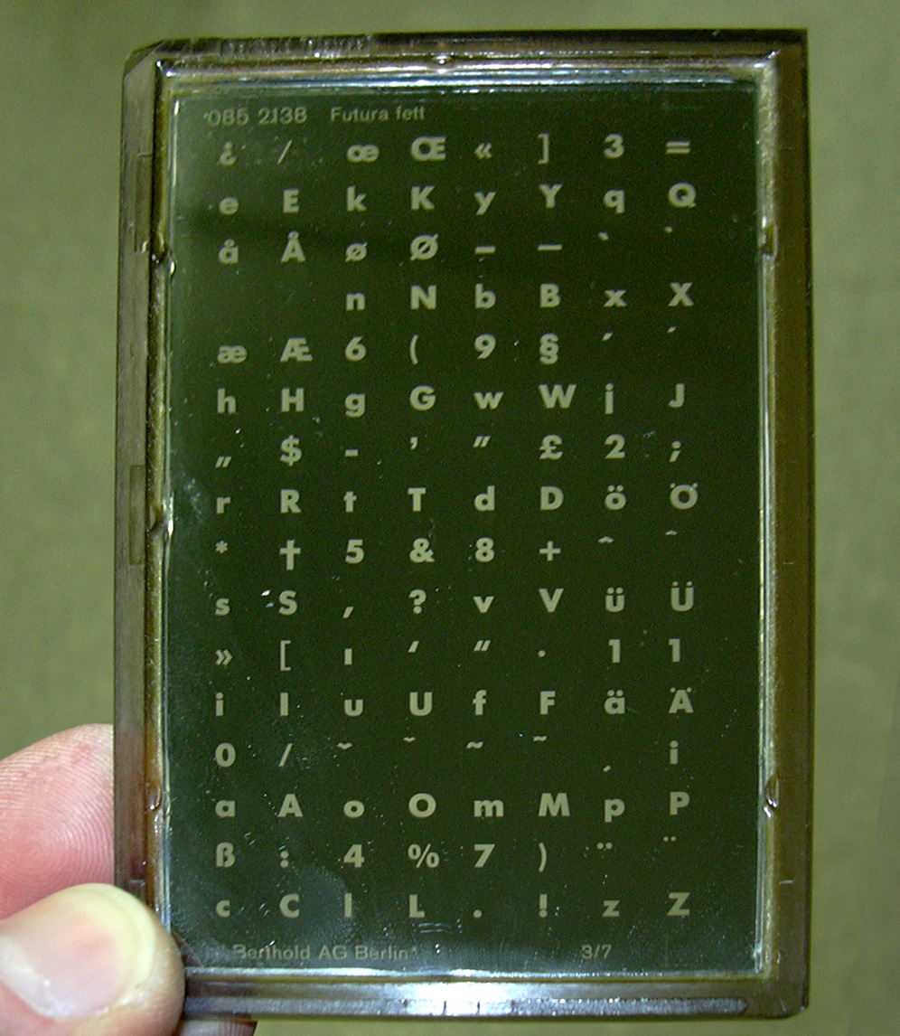
A Font Matrix from a Computype machine
Someone asked me what "Phototype" was off to the side, so I figured a small explanation of what it was would be in order.
Phototyping is where you use a machine, that has a negative image of the glyphs (fonts) you want to use stored on a plate inside it. When you type a letter that font matrix is used to put an image of the letter or mark on a plate that you would then be able to use for either on screen writing, or offset printing.
Think of it like a negative and a final picture. a camera takes a picture and makes a negative, the negative is then projected upon a bit of paper that's been coated with a chemical, after a small bath, the picture appears. Same concept, except it's a specially coated bit of what looks like Aluminum foil and the negative is burned or etched onto that and only certain areas hold the ink.
Phototyping had one major advantage over Linotype (Hot metal printing), and that was that. you could make the fonts different sizes.
Here's a bit of trivia for you, the Font Foundry "Linotype" actually means something. The machine, a Linotype machine, literally made a LINE OF TYPE hence the name LINeOTYPE.
A Font Matrix from a Computype machine
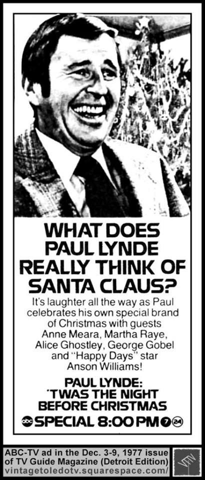
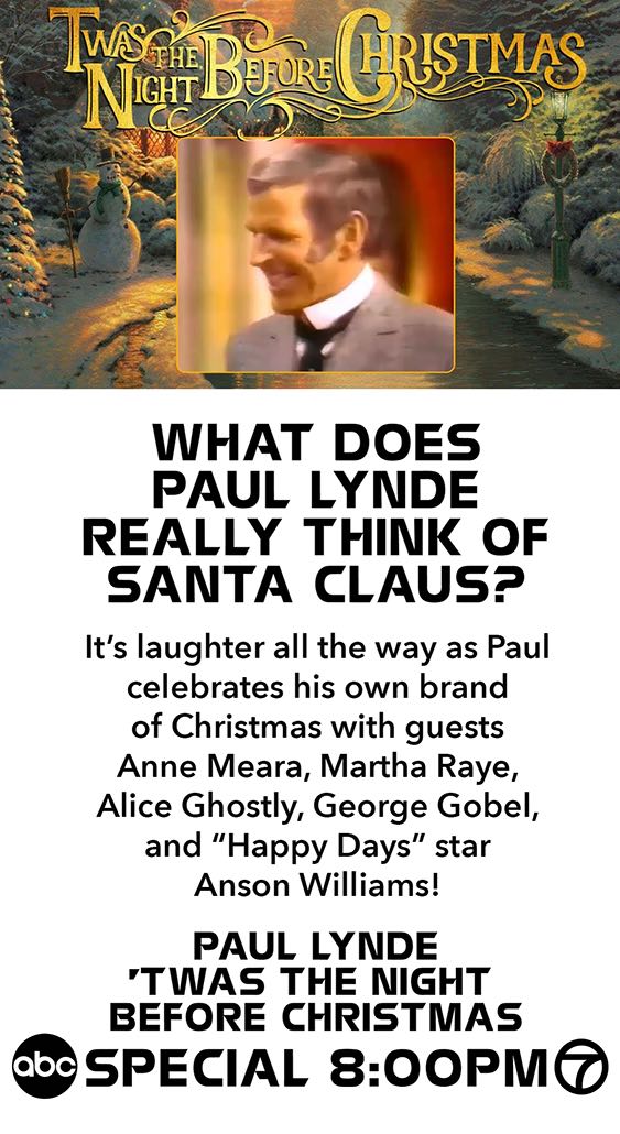
1977 Original Compugraphics made print ad by ABC Televison for a Paula Lynde special and then my 2021 redo in Illustrator and Photoshop what I could
envision today's ad looking like. the Zarana font is used in both.
Never have I wanted to type in Comic Sans on ATS more than I do right now.
On topic I've been using a font called Gadugi for the past several years. I like it but have never come across anyone else who uses it as well. Then again "What's your font" is probably not anything that's said outside of very specific environments anyway - so who knows.
On topic I've been using a font called Gadugi for the past several years. I like it but have never come across anyone else who uses it as well. Then again "What's your font" is probably not anything that's said outside of very specific environments anyway - so who knows.
originally posted by: Hefficide
Never have I wanted to type in Comic Sans on ATS more than I do right now.
On topic I've been using a font called Gadugi for the past several years. I like it but have never come across anyone else who uses it as well. Then again "What's your font" is probably not anything that's said outside of very specific environments anyway - so who knows.
HEFFFFFFF!!!
OMGOMGOMGOMGOMGOMG. And this is so off topic..... so back to topic...
For everyday uses, I use a font called Kabel. it's pretty straightforward and looks good on the printer, has all the weights and obliqes. That or if I need it to look a wee bit more elegant, Friz Quadrada.
If you can’t pen it by hand you shouldn’t be allowed to use it on a computer. How’s about those apples 🍎
new topics
-
Putin, Russia and the Great Architects of the Universe
ATS Skunk Works: 1 hours ago -
A Warning to America: 25 Ways the US is Being Destroyed
New World Order: 5 hours ago -
President BIDEN's FBI Raided Donald Trump's Florida Home for OBAMA-NORTH KOREA Documents.
Political Conspiracies: 11 hours ago
top topics
-
President BIDEN's FBI Raided Donald Trump's Florida Home for OBAMA-NORTH KOREA Documents.
Political Conspiracies: 11 hours ago, 28 flags -
A Warning to America: 25 Ways the US is Being Destroyed
New World Order: 5 hours ago, 10 flags -
Gaza Terrorists Attack US Humanitarian Pier During Construction
Middle East Issues: 17 hours ago, 8 flags -
Las Vegas UFO Spotting Teen Traumatized by Demon Creature in Backyard
Aliens and UFOs: 16 hours ago, 7 flags -
2024 Pigeon Forge Rod Run - On the Strip (Video made for you)
Automotive Discussion: 17 hours ago, 4 flags -
Is AI Better Than the Hollywood Elite?
Movies: 13 hours ago, 3 flags -
Maestro Benedetto
Literature: 12 hours ago, 1 flags -
Putin, Russia and the Great Architects of the Universe
ATS Skunk Works: 1 hours ago, 1 flags
active topics
-
Gaza Terrorists Attack US Humanitarian Pier During Construction
Middle East Issues • 37 • : brodby -
The Acronym Game .. Pt.3
General Chit Chat • 7754 • : bally001 -
Nearly 70% Of Americans Want Talks To End War In Ukraine
Political Issues • 96 • : andy06shake -
Rupert Murdoch engaged at 92
People • 8 • : brodby -
University of Texas Instantly Shuts Down Anti Israel Protests
Education and Media • 267 • : FlyersFan -
"We're All Hamas" Heard at Columbia University Protests
Social Issues and Civil Unrest • 287 • : FlyersFan -
Skinwalker Ranch and the Mystery 1.6GHz Signal
Aliens and UFOs • 144 • : brodby -
A Warning to America: 25 Ways the US is Being Destroyed
New World Order • 11 • : brodby -
European court rules human rights violated by climate inaction
Fragile Earth • 62 • : iaylyan -
What in the S.E.O. hell is this?
General Chit Chat • 27 • : reannamurphy
8