It looks like you're using an Ad Blocker.
Please white-list or disable AboveTopSecret.com in your ad-blocking tool.
Thank you.
Some features of ATS will be disabled while you continue to use an ad-blocker.

Advice/Comments on my latest portfolio
page: 11
share:
After chasing checks all year and struggling I decided I needed to update my portfolio and try to find new clients/jobs.
I used to do web design in the dot com era but moved on to animation. I dove back into webdesign in 2011 for a redesign and It was harsh.
It took months of learning and building so this time I didn't want to start from scratch, I used templates and broke down the process while editing, It worked out but considering I spent very little time on the edits and checking this time, I was looking for some feedback on the sites overall coding before I start contacting local agencies.
kobalt7.com
a reply to: donktheclown
That's something I'm noticing too, Its taking too long to load on my phone.
Its loading all the thumbs at once, I tried setting the portfolio to download when you scroll to that section but it breaks it so i may roll it out like the news section at the top and add another page
LOL thanks I appreciate it.
edit on 4-10-2016 by kobalt7 because: thankn ppl when they nice.
a reply to: Lysergic
yea I'm hoping I can edit the code to load the portfolio section after the page or maybe I'll ditch the preload altogether.
Sorry about the download time that's an issue I'm trying to resolve.
yea I'm hoping I can edit the code to load the portfolio section after the page or maybe I'll ditch the preload altogether.
Sorry about the download time that's an issue I'm trying to resolve.
edit on 4-10-2016 by kobalt7 because: bad spelling
a reply to: kobalt7
I keep seeing KOBZILT7
I like your threadless entry. Im good friends with Tom Burns.
Also you should do a more professional picture of that fine fella there at the bottom. I can tell you are standing in your kitchen.
All in all it's not bad. Could use some more content. I am on my phone, idk if that matters, but it all seems to work.
I am a random guy, with zero graphic arts marketing skills.
I have owned businesses though.
Having said that, my suggestion is to NOT focus on your art so much..It took too long to open, then I had to navigate a bit to actually find the purpose of the site.
If you have a targeted market, and are trying to reach a company, I would focus more on your services, an easier way to inform them.
Ask what your buyer wants. If they are a company, they want to deal with another company, not some dude named Bob, so I would kinda "de-personalize" and present myself as a company, and stick the personal stuff, like your picture back in the "about us" section.
Also graphic art is a huge market, I would hit it with several websites.
Name branding, animation, gaming, advertising,
All seperate services, so they think you are the best at all, not marketing for all.
You can still cover it in services offered within each site.
That's my 2 cents, and I love your art, damn.
I'm also seeing KOBZILT7 instead of kobalt7.
Other than that your very good at doing anime love the pic, the better you get the more others will buy it, I would
Other than that your very good at doing anime love the pic, the better you get the more others will buy it, I would
a reply to: Woodcarver
thanks, tom burns has some famous shirts that's cool. I have a good photographer i could ask, maybe its time I ask her.
Definitely I'm glad its working on your phone, can I ask the type of phone?I did spend time trying to make sure it at least worked on the few phones in my house.
thanks, tom burns has some famous shirts that's cool. I have a good photographer i could ask, maybe its time I ask her.
Definitely I'm glad its working on your phone, can I ask the type of phone?I did spend time trying to make sure it at least worked on the few phones in my house.
a reply to: Mandroid7
Those are some good points and suggestions thanks for taking the time, my targeted demographic is usually agencies themselves rather then end users but I don't see why I can't operate and function as both since I do have a FBN for sub work. In that case maybe I should actually focus on the video portion, hobble together a demo vid to showcase 2013-2016.
Thanks again!
Just a detail, but the Shakespeare quote has a spelling error:
There are more things in heaven and earth than are dreamt of in your philosophies…
The art work is impressive!
soulwaxer
There are more things in heaven and earth than are dreamt of in your philosophies…
The art work is impressive!
soulwaxer
a reply to: kobalt7
I must agree with others about the font choice in your logo--if I were you, I would extend the ascender of the "b" just a slight bit above the median (or, I guess, cap height) of the top of the other letters. Not a lot, but just enough to counter the optical illusion that it's not there. It shouldn't break up the cap-height implied line at all, and it would help with the confusion (although with a website typed in the URL line that obviously says "kobalt7," I guess it really is a non-issue).
I can see what people are saying about the "a," but since no other letters touch or overlap, I think you're fine leaving it as is.
As for the site as a whole, I really dig it (I'm viewing on a PC screen). I can't open it on a Mac at the moment to ensure that it all works the same, but I don't see any coding issues or anything that isn't functioning properly. I've always dug the single-page website style, so that's a major plus in my book (and it makes organizing your folders for the website so much easier).
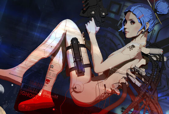
Your illustrations are very well done--do you only do them in Photoshop, or do you use Illustrator as well? It seems like most of them are vector images. Hell, all of your work is very well done, with great attention to detail. I really would like to get into 3D rendering, but I just don't have the time in my life to learn it right now (I'm a graphic designer by trade, but my job limits my creative outlets, and my family and other life things take up the rest of my time).
Regardless, it's very nice work--keep it up, sir.
At least now I can put a face to the screen name.
I must agree with others about the font choice in your logo--if I were you, I would extend the ascender of the "b" just a slight bit above the median (or, I guess, cap height) of the top of the other letters. Not a lot, but just enough to counter the optical illusion that it's not there. It shouldn't break up the cap-height implied line at all, and it would help with the confusion (although with a website typed in the URL line that obviously says "kobalt7," I guess it really is a non-issue).
I can see what people are saying about the "a," but since no other letters touch or overlap, I think you're fine leaving it as is.
As for the site as a whole, I really dig it (I'm viewing on a PC screen). I can't open it on a Mac at the moment to ensure that it all works the same, but I don't see any coding issues or anything that isn't functioning properly. I've always dug the single-page website style, so that's a major plus in my book (and it makes organizing your folders for the website so much easier).
Your illustrations are very well done--do you only do them in Photoshop, or do you use Illustrator as well? It seems like most of them are vector images. Hell, all of your work is very well done, with great attention to detail. I really would like to get into 3D rendering, but I just don't have the time in my life to learn it right now (I'm a graphic designer by trade, but my job limits my creative outlets, and my family and other life things take up the rest of my time).
Regardless, it's very nice work--keep it up, sir.
At least now I can put a face to the screen name.
originally posted by: Mandroid7
Ask what your buyer wants. If they are a company, they want to deal with another company, not some dude named Bob, so I would kinda "de-personalize" and present myself as a company, and stick the personal stuff, like your picture back in the "about us" section.
This is not necessarily true. Sure, large clients prefer the implied accessibility and stability of a company, but many, MANY companies and others (like musicians, fashion designers, etc.) have zero issues with dealing with a single, talented individual, and some actually prefer it, as it's more personal and it allows direct access to the actual artist creating the work and not some creative director or marketing director.
Like you noted, though, it all depends on the target audience, and that's what really matters. I don't get the feeling that Kobalt7 is exactly marketing his skills to supermarket chains and community banks.
a reply to: SlapMonkey
thanks for reviewing everything, I'm trying a few different edits to the font after all the input, if I can change it without re-rendering this week I will. I can agree the building and organization of this one was so much easier then previous because of the one page design. I'm not liking the way it loads without the preload so I'm considering separating the portfolio to its own page and putting the preload back in.
thanks for reviewing everything, I'm trying a few different edits to the font after all the input, if I can change it without re-rendering this week I will. I can agree the building and organization of this one was so much easier then previous because of the one page design. I'm not liking the way it loads without the preload so I'm considering separating the portfolio to its own page and putting the preload back in.
edit on 5-10-2016 by kobalt7 because: grammar
new topics
-
Where should Trump hold his next rally
2024 Elections: 1 hours ago -
Shocking Number of Voters are Open to Committing Election Fraud
US Political Madness: 2 hours ago -
Gov Kristi Noem Shot and Killed "Less Than Worthless Dog" and a 'Smelly Goat
2024 Elections: 3 hours ago -
Falkville Robot-Man
Aliens and UFOs: 3 hours ago -
James O’Keefe: I have evidence that exposes the CIA, and it’s on camera.
Whistle Blowers and Leaked Documents: 4 hours ago -
Australian PM says the quiet part out loud - "free speech is a threat to democratic dicourse"...?!
New World Order: 5 hours ago -
Ireland VS Globalists
Social Issues and Civil Unrest: 5 hours ago -
Biden "Happy To Debate Trump"
2024 Elections: 6 hours ago -
RAAF airbase in Roswell, New Mexico is on fire
Aliens and UFOs: 6 hours ago -
What is the white pill?
Philosophy and Metaphysics: 7 hours ago
top topics
-
A Warning to America: 25 Ways the US is Being Destroyed
New World Order: 16 hours ago, 21 flags -
James O’Keefe: I have evidence that exposes the CIA, and it’s on camera.
Whistle Blowers and Leaked Documents: 4 hours ago, 12 flags -
Blast from the past: ATS Review Podcast, 2006: With All Three Amigos
Member PODcasts: 8 hours ago, 11 flags -
Australian PM says the quiet part out loud - "free speech is a threat to democratic dicourse"...?!
New World Order: 5 hours ago, 10 flags -
Biden "Happy To Debate Trump"
2024 Elections: 6 hours ago, 10 flags -
Mike Pinder The Moody Blues R.I.P.
Music: 8 hours ago, 8 flags -
Ireland VS Globalists
Social Issues and Civil Unrest: 5 hours ago, 5 flags -
RAAF airbase in Roswell, New Mexico is on fire
Aliens and UFOs: 6 hours ago, 5 flags -
What is the white pill?
Philosophy and Metaphysics: 7 hours ago, 5 flags -
Putin, Russia and the Great Architects of the Universe
ATS Skunk Works: 11 hours ago, 4 flags
active topics
-
President BIDEN's FBI Raided Donald Trump's Florida Home for OBAMA-NORTH KOREA Documents.
Political Conspiracies • 35 • : Threadbarer -
Candidate TRUMP Now Has Crazy Judge JUAN MERCHAN After Him - The Stormy Daniels Hush-Money Case.
Political Conspiracies • 813 • : WeMustCare -
University of Texas Instantly Shuts Down Anti Israel Protests
Education and Media • 309 • : cherokeetroy -
Remember These Attacks When President Trump 2.0 Retribution-Justice Commences.
2024 Elections • 58 • : WeMustCare -
2024 Pigeon Forge Rod Run - On the Strip (Video made for you)
Automotive Discussion • 8 • : WhitewaterSquirrel -
Gov Kristi Noem Shot and Killed "Less Than Worthless Dog" and a 'Smelly Goat
2024 Elections • 28 • : cherokeetroy -
Shocking Number of Voters are Open to Committing Election Fraud
US Political Madness • 5 • : AwakeNotWoke -
The Acronym Game .. Pt.3
General Chit Chat • 7756 • : bally001 -
RAAF airbase in Roswell, New Mexico is on fire
Aliens and UFOs • 8 • : Skinnerbot -
Putin, Russia and the Great Architects of the Universe
ATS Skunk Works • 27 • : KnowItAllKnowNothin
1