It looks like you're using an Ad Blocker.
Please white-list or disable AboveTopSecret.com in your ad-blocking tool.
Thank you.
Some features of ATS will be disabled while you continue to use an ad-blocker.

Ebola - my visual charts & projections based on WHO data
page: 18share:
originally posted by: BobAthome
a reply to: ikonoklast
another country for your Chart,
Macedonia,, Skorpji,,
Maybe, thanks. They've sent samples to Germany for testing. Looks like possibly two cases, one of whom died. But the symptoms for the one who died (fever, vomiting, and internal bleeding) definitely sound like Ebola:
SOURCE: The Independent
There have also been reports of possible cases popping up for France (now saying that's negative I think), the Czech Republic, and Australia today, and that's just the ones I've seen so far.
I found this map showing the current reported cases on a world map:
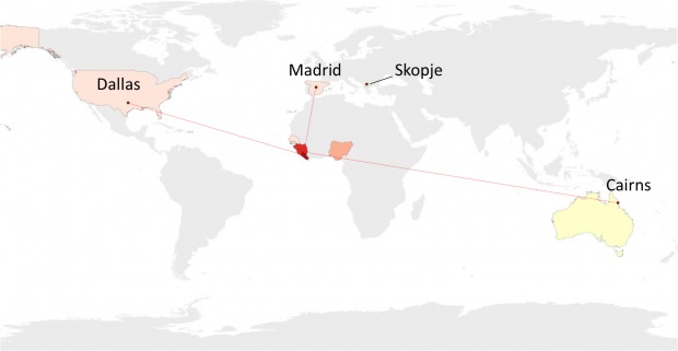
Source
The article states:
...which I think is what we have been seeing.
They go on to further state:
How true!
ETA: And now it seems like there may be a case in Brazil which has sparked the monitoring of 60 additional individuals.
Brazil Announces First Suspected Ebola Case
So long . . . and thanks for all the fish!
Bishop
Source
The article states:
When considering speed of infection, it is spreading fastest in Sierra Leone. The number of cases in the past 21 days as a percentage of total cases was 40 per cent, according to WHO. In Liberia and Guinea, cases during this period represented 34 per cent and 26 per cent, respectively.
...which I think is what we have been seeing.
They go on to further state:
But it is not just people in west Africa who are at risk – in recent weeks, the disease has also made its way to countries outside of Africa, sounding alarm bells for the international community as it already struggles with the burden of trying to eliminate the outbreak inside Africa.
How true!
ETA: And now it seems like there may be a case in Brazil which has sparked the monitoring of 60 additional individuals.
Brazil Announces First Suspected Ebola Case
So long . . . and thanks for all the fish!
Bishop
edit on 10/10/2014 by Bishop2199 because: Brazil
edit on 10/10/2014 by Bishop2199 because: Source
Containment Measures
Hopefully this is not too late. In light of the suspected Ebola case in Brazil, Argentina and Brazil are joining "the US in tightening its port entry procedures."
Perhaps we can slow the progression long enough to mass produce a vaccine for this.
So long . . . and thanks for all the fish.
Bishop
Hopefully this is not too late. In light of the suspected Ebola case in Brazil, Argentina and Brazil are joining "the US in tightening its port entry procedures."
The country has joined Argentina and the US in tightening its port entry procedures for ships that have sailed from West Africa, in an attempt to contain the deadly virus, Reuters news agency reported.
Brazil’s health surveillance agency, Anvisa, said that any ships known to have docked in Ebola-affected countries within the last 21 days will need to provide thorough medical records and logs of medicines used before receiving clearance to dock at Brazilian ports.
Perhaps we can slow the progression long enough to mass produce a vaccine for this.
So long . . . and thanks for all the fish.
Bishop
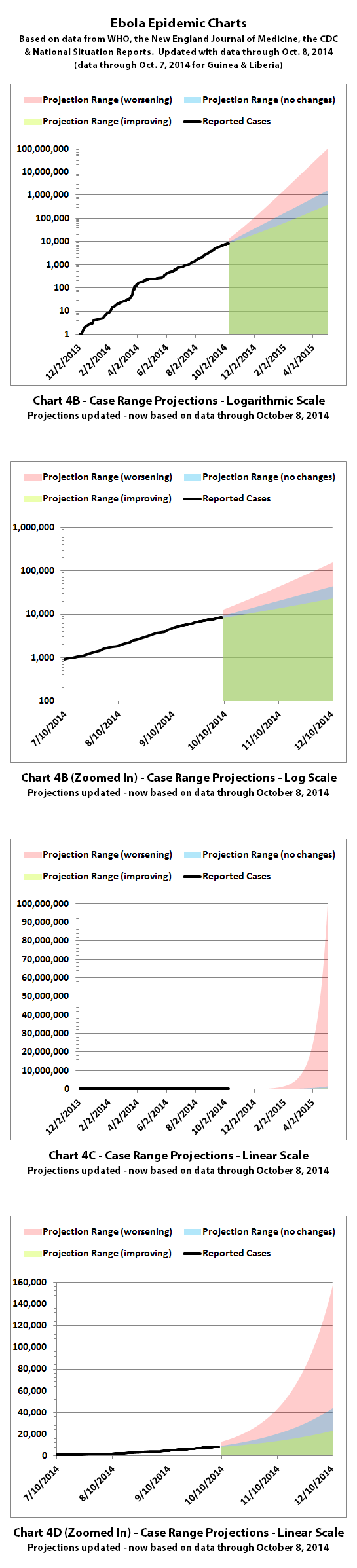
I've updated the Ebola charts with the newest data from the World Health Organization (WHO) published October 10, 2014. According to WHO, through
October 8, 2014 (October 7, 2014 for Guinea and Liberia), there were:
8399 reported cases
4033 reported deaths
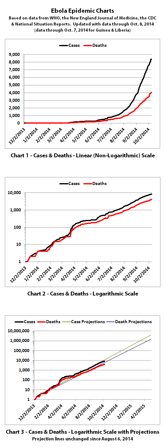
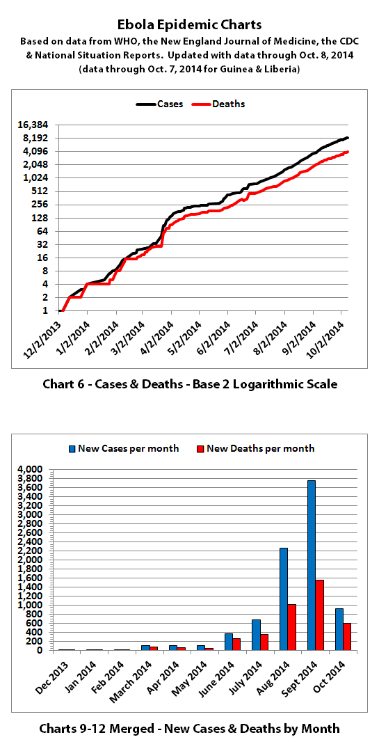
For Guinea, Liberia, Nigeria, Senegal, and Sierra Leone, the WHO data includes confirmed, probable, and suspected cases and deaths.
For other countries, the WHO data only includes two confirmed cases (in Dallas and Madrid) and one confirmed death (in Dallas). Additional probable and suspected cases have been reported in the news, but as of October 8, 2014, WHO is reporting "No data available" for probable and suspected cases outside of the five countries in west Africa.
The numbers also do not include the Congo, as that is allegedly an unrelated outbreak.
According to WHO,the CDC, and many charitable medical organizations such as Doctors Without Borders (MSF), it is believed that actual cases and deaths "vastly" outnumber reported figures. Most believe that there are at least 2 to 5 times as many cases and deaths. Since it is difficult to know exactly what the actual numbers are, these charts rely on the reported numbers.
Also according to WHO, the drop in reported new cases in Liberia over the last few weeks "...is unlikely to be genuine. Rather, it reflects a deterioration in the ability of overwhelmed responders to record accurate epidemiological data."
The same disclaimers and references apply to all of these charts:
Charts and future projections were done by me, not by WHO, except in cases where it is stated that a chart includes WHO projections. I am not an Ebola expert, epidemiologist, virologist, or MD, but I manually compiled the data used to create these graphs from news updates on the following WHO, CDC, and New England Journal of Medicine websites:
SOURCE: WHO website 1
SOURCE: WHO website 2
SOURCE: WHO website 3
SOURCE: WHO website 4
SOURCE: CDC website 1
SOURCE: The New England Journal of Medicine
In some cases, I also filled in data for dates between WHO updates using official situation reports released by the Ministries of Health of affected countries.
Please do not do anything you might regret based on charts or projections. Hopefully efforts to contain, quarantine, treat, prevent, or cure Ebola will eventually be successful, and hopefully sooner rather than later.
8399 reported cases
4033 reported deaths
For Guinea, Liberia, Nigeria, Senegal, and Sierra Leone, the WHO data includes confirmed, probable, and suspected cases and deaths.
For other countries, the WHO data only includes two confirmed cases (in Dallas and Madrid) and one confirmed death (in Dallas). Additional probable and suspected cases have been reported in the news, but as of October 8, 2014, WHO is reporting "No data available" for probable and suspected cases outside of the five countries in west Africa.
The numbers also do not include the Congo, as that is allegedly an unrelated outbreak.
According to WHO,the CDC, and many charitable medical organizations such as Doctors Without Borders (MSF), it is believed that actual cases and deaths "vastly" outnumber reported figures. Most believe that there are at least 2 to 5 times as many cases and deaths. Since it is difficult to know exactly what the actual numbers are, these charts rely on the reported numbers.
Also according to WHO, the drop in reported new cases in Liberia over the last few weeks "...is unlikely to be genuine. Rather, it reflects a deterioration in the ability of overwhelmed responders to record accurate epidemiological data."
The same disclaimers and references apply to all of these charts:
Charts and future projections were done by me, not by WHO, except in cases where it is stated that a chart includes WHO projections. I am not an Ebola expert, epidemiologist, virologist, or MD, but I manually compiled the data used to create these graphs from news updates on the following WHO, CDC, and New England Journal of Medicine websites:
SOURCE: WHO website 1
SOURCE: WHO website 2
SOURCE: WHO website 3
SOURCE: WHO website 4
SOURCE: CDC website 1
SOURCE: The New England Journal of Medicine
In some cases, I also filled in data for dates between WHO updates using official situation reports released by the Ministries of Health of affected countries.
Please do not do anything you might regret based on charts or projections. Hopefully efforts to contain, quarantine, treat, prevent, or cure Ebola will eventually be successful, and hopefully sooner rather than later.
4,033 Deaths.
Thanks for the updates. I read all of them, and follow several Ebola threads, but this is the thread to find "official data", and you are doing a great service for the community.
Keep it up!
Thanks for the updates. I read all of them, and follow several Ebola threads, but this is the thread to find "official data", and you are doing a great service for the community.
Keep it up!
a reply to: Druid42
Thanks, I really appreciate it.
I've been updating some of the projections and will be posting them here in a few minutes. There's another month of data since the last time I did all the projection calculations, which improves accuracy, though they have been amazingly accurate so far. While I was doing the new projections, I also ran them out further forward than I ever have... all the way to the end, if nothing changes. I'll post that too.
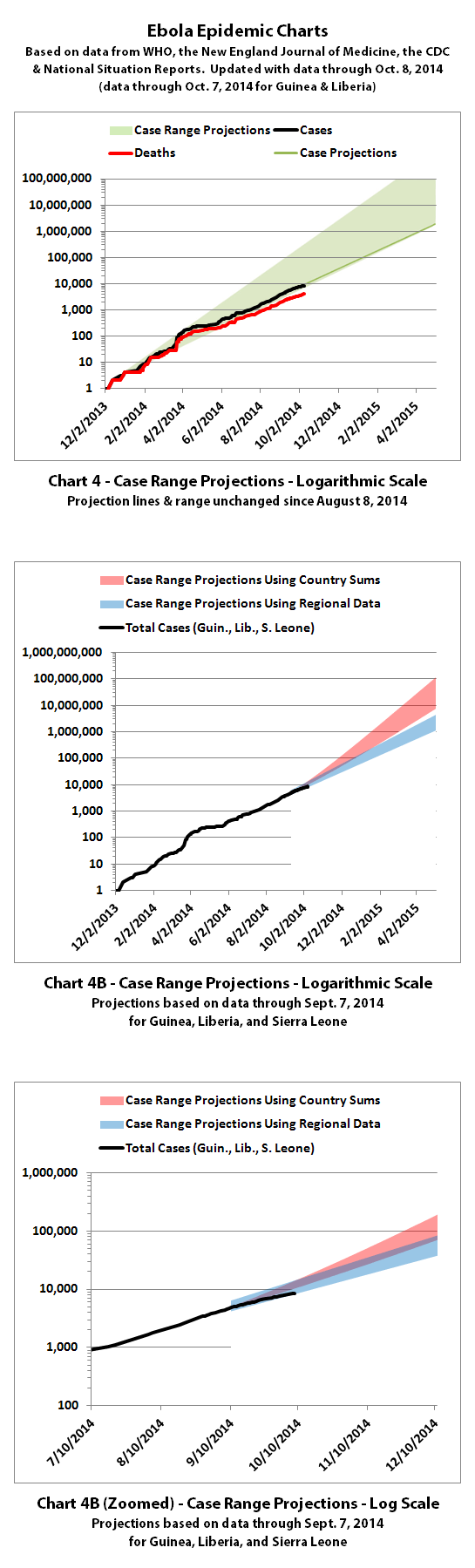
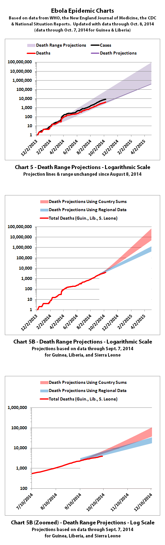
I've updated the Ebola case range projection. We have a month's more data since I calculated those ranges previously, although I had been updating
the actual cases curve as WHO released updates.
There's not too much noticeable change in the new projection range through May 2, 2015 except the lowest edge of the projected case range has gone down a bit. That's due to a drop in new reported cases from Liberia over the last few weeks. That should be good news, but WHO says "...it reflects a deterioration in the ability of overwhelmed responders to record accurate epidemiological data."
You can see the previous and new projection ranges side by side here:
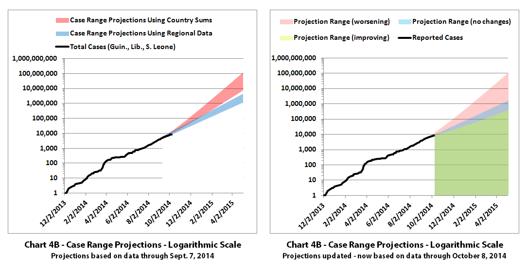
And here are all of the new case range projections:
The same disclaimers and references apply to all of these charts:
Charts and future projections were done by me, not by WHO, except in cases where it is stated that a chart includes WHO projections. I am not an Ebola expert, epidemiologist, virologist, or MD, but I manually compiled the data used to create these graphs from news updates on the following WHO, CDC, and New England Journal of Medicine websites:
SOURCE: WHO website 1
SOURCE: WHO website 2
SOURCE: WHO website 3
SOURCE: WHO website 4
SOURCE: CDC website 1
SOURCE: The New England Journal of Medicine
In some cases, I also filled in data for dates between WHO updates using official situation reports released by the Ministries of Health of affected countries.
According to WHO,the CDC, and many charitable medical organizations such as Doctors Without Borders (MSF), it is believed that actual cases and deaths "vastly" outnumber reported figures. Most believe that there are at least 2 to 5 times as many cases and deaths. Since it is difficult to know exactly what the actual numbers are, these charts rely on the reported numbers.
Please do not do anything you might regret based on charts or projections. Hopefully efforts to contain, quarantine, treat, prevent, or cure Ebola will eventually be successful, and hopefully sooner rather than later.
There's not too much noticeable change in the new projection range through May 2, 2015 except the lowest edge of the projected case range has gone down a bit. That's due to a drop in new reported cases from Liberia over the last few weeks. That should be good news, but WHO says "...it reflects a deterioration in the ability of overwhelmed responders to record accurate epidemiological data."
You can see the previous and new projection ranges side by side here:
And here are all of the new case range projections:
The same disclaimers and references apply to all of these charts:
Charts and future projections were done by me, not by WHO, except in cases where it is stated that a chart includes WHO projections. I am not an Ebola expert, epidemiologist, virologist, or MD, but I manually compiled the data used to create these graphs from news updates on the following WHO, CDC, and New England Journal of Medicine websites:
SOURCE: WHO website 1
SOURCE: WHO website 2
SOURCE: WHO website 3
SOURCE: WHO website 4
SOURCE: CDC website 1
SOURCE: The New England Journal of Medicine
In some cases, I also filled in data for dates between WHO updates using official situation reports released by the Ministries of Health of affected countries.
According to WHO,the CDC, and many charitable medical organizations such as Doctors Without Borders (MSF), it is believed that actual cases and deaths "vastly" outnumber reported figures. Most believe that there are at least 2 to 5 times as many cases and deaths. Since it is difficult to know exactly what the actual numbers are, these charts rely on the reported numbers.
Please do not do anything you might regret based on charts or projections. Hopefully efforts to contain, quarantine, treat, prevent, or cure Ebola will eventually be successful, and hopefully sooner rather than later.
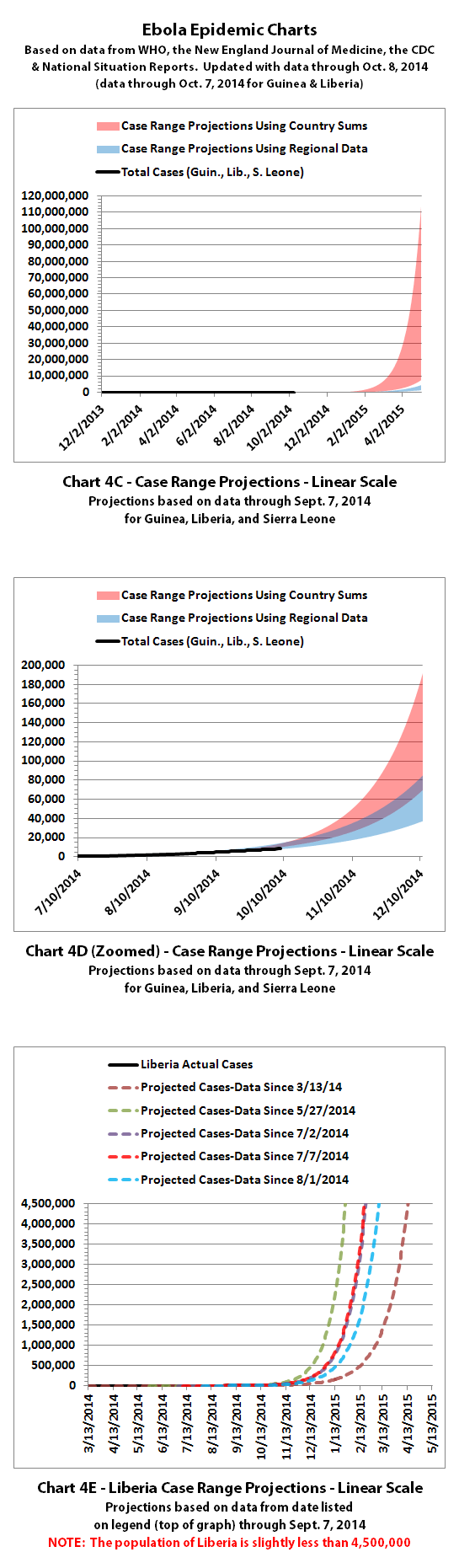
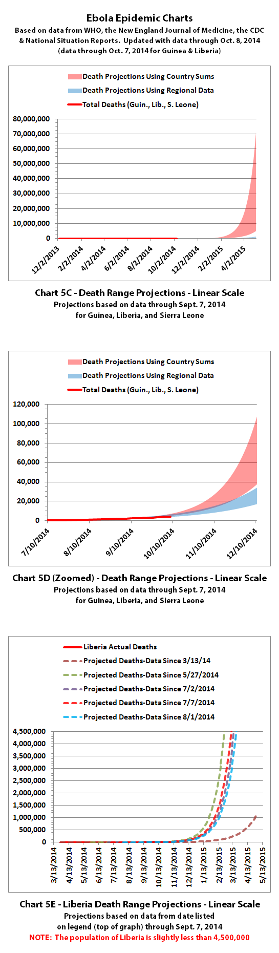
Until now, I don't think I've posted truly doomsday projection charts for Ebola. I was hesitant to project out so far, and maybe I wanted to
believe that it would be handled better in the USA or Europe than Africa. After this past week, I'm not so sure. Something must change, because the
alternative is catastrophic almost beyond imagination.
So for those who've asked (and those who haven't but maybe should have), here is what the projections look like if Ebola keeps spreading like it is now:
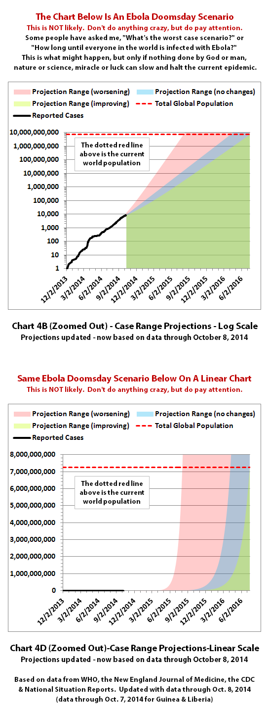
Consider these projections as motivation. Motivation to do something to help fight the spread... Or motivation to prepare to protect your family... Or motivation to simply pay attention as things unfold so you aren't blindsided.
It's likely things will change as time moves forward, hopefully for the better. I'll do my best to keep updating the charts as things change so you can see what's coming, and so I can too.
Charts and future projections were done by me, not by WHO. I am not an Ebola expert, epidemiologist, virologist, or MD, but I manually compiled the data used to create these graphs from news updates on the following WHO, CDC, and New England Journal of Medicine websites:
SOURCE: WHO website 1
SOURCE: WHO website 2
SOURCE: WHO website 3
SOURCE: WHO website 4
SOURCE: CDC website 1
SOURCE: The New England Journal of Medicine
In some cases, I also filled in data for dates between WHO updates using official situation reports released by the Ministries of Health of affected countries.
According to WHO,the CDC, and many charitable medical organizations such as Doctors Without Borders (MSF), it is believed that actual cases and deaths "vastly" outnumber reported figures. Most believe that there are at least 2 to 5 times as many cases and deaths. Since it is difficult to know exactly what the actual numbers are, these charts rely on the reported numbers. But if it's true, it means things are 1-2 months ahead of schedule because it's doubling every 3-4 weeks.
Please do not do anything you might regret based on charts or projections. Hopefully efforts to contain, quarantine, treat, prevent, or cure Ebola will eventually be successful, and hopefully sooner rather than later.
So for those who've asked (and those who haven't but maybe should have), here is what the projections look like if Ebola keeps spreading like it is now:
Consider these projections as motivation. Motivation to do something to help fight the spread... Or motivation to prepare to protect your family... Or motivation to simply pay attention as things unfold so you aren't blindsided.
It's likely things will change as time moves forward, hopefully for the better. I'll do my best to keep updating the charts as things change so you can see what's coming, and so I can too.
Charts and future projections were done by me, not by WHO. I am not an Ebola expert, epidemiologist, virologist, or MD, but I manually compiled the data used to create these graphs from news updates on the following WHO, CDC, and New England Journal of Medicine websites:
SOURCE: WHO website 1
SOURCE: WHO website 2
SOURCE: WHO website 3
SOURCE: WHO website 4
SOURCE: CDC website 1
SOURCE: The New England Journal of Medicine
In some cases, I also filled in data for dates between WHO updates using official situation reports released by the Ministries of Health of affected countries.
According to WHO,the CDC, and many charitable medical organizations such as Doctors Without Borders (MSF), it is believed that actual cases and deaths "vastly" outnumber reported figures. Most believe that there are at least 2 to 5 times as many cases and deaths. Since it is difficult to know exactly what the actual numbers are, these charts rely on the reported numbers. But if it's true, it means things are 1-2 months ahead of schedule because it's doubling every 3-4 weeks.
Please do not do anything you might regret based on charts or projections. Hopefully efforts to contain, quarantine, treat, prevent, or cure Ebola will eventually be successful, and hopefully sooner rather than later.
a reply to: ikonoklast
A few weeks back I heard an interview with the president of MSF who said she believed the figures represented roughly 20% of actual cases. In other words what we 'know' is 1/5th of the possible reality. What I don't understand is why the reported numbers seem to continually reflect that roughly 50% of those diagnosed with Ebola die when apparently Ebola kills up to 90%...?
It is all too possible the 'official' numbers are inaccurate to begin with so we're all left to speculate best guesses on all fronts.
a reply to: wishes
According to the WHO Ebola Response Team, writing in the New England Journal of Medicine, they estimate:
Ebola Virus Disease in West Africa — The First 9 Months of the Epidemic and Forward Projections
A major topic of the article is a discussion of possible answers to your question about the fatality rate, so you may want to read the whole article. Basically, they believe that the discrepancy is partly because the data and follow-up on large numbers of cases is very poor, so statistics are not always reliable. The 70.8% is for those cases that were well tracked and well documented in medical facilities.
People receiving care in medical facilities theoretically received better care as well, so it is likely the fatality rate is much higher amongst cases outside medical facilities.
Exactly. For better or worse, the WHO numbers are likely amongst the best we have even though they likely represent some fraction of the total epidemic. But the WHO numbers are bad enough - and growing quickly enough - that they are a pretty good indication we have a really serious problem that needs to be solved somehow - quickly.
According to the WHO Ebola Response Team, writing in the New England Journal of Medicine, they estimate:
...that the case fatality rate is 70.8% (95% confidence interval [CI], 69 to 73) among persons with known clinical outcome of infection.
Ebola Virus Disease in West Africa — The First 9 Months of the Epidemic and Forward Projections
A major topic of the article is a discussion of possible answers to your question about the fatality rate, so you may want to read the whole article. Basically, they believe that the discrepancy is partly because the data and follow-up on large numbers of cases is very poor, so statistics are not always reliable. The 70.8% is for those cases that were well tracked and well documented in medical facilities.
People receiving care in medical facilities theoretically received better care as well, so it is likely the fatality rate is much higher amongst cases outside medical facilities.
from: wishes
It is all too possible the 'official' numbers are inaccurate to begin with so we're all left to speculate best guesses on all fronts.
Exactly. For better or worse, the WHO numbers are likely amongst the best we have even though they likely represent some fraction of the total epidemic. But the WHO numbers are bad enough - and growing quickly enough - that they are a pretty good indication we have a really serious problem that needs to be solved somehow - quickly.
a reply to: ikonoklast
So, by your projections, it looks like we will see a sharp increase around 15th November?
Hope you are wrong.
I'd rather not look at chart projections to tell you the truth... it looks far too scary!
But there is hope... some in monrovia are surviving and/or seem to be immune to the disease which means tests can be done on those which would maybe help others.
originally posted by: TruthxIsxInxThexMist
a reply to: ikonoklast
So, by your projections, it looks like we will see a sharp increase around 15th November?
Hope you are wrong.
I hope my projections are wrong too. They are not likely to be wrong in the near future (probably not within the next couple months) because the rate at which it keeps doubling is pretty consistent and is not likely to change until something major slows the growth.
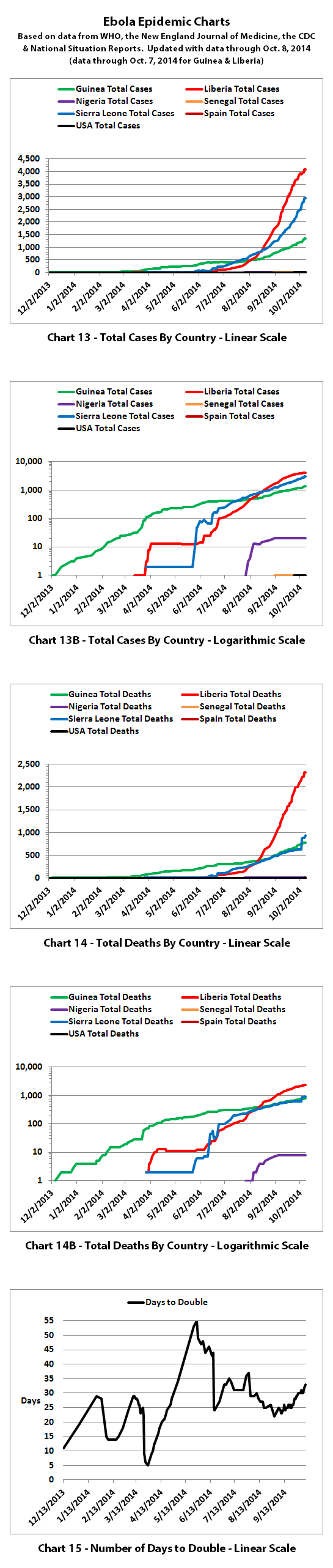
On average, reported Ebola cases have doubled every 23.7 days for the last 10 months. Sometimes it doubles slower or faster, but that's the average and it's been fairly consistent most of that time. Because it keeps doubling, if you zoomed in on any part of the projection charts you would see a sharp increase in the weeks ahead because of the consistent exponential rate of growth.
If you look at a powers of 2 chart, it becomes all too easy to understand.
I think that it's likely to stay in the blue colored range for the foreseeable future and I hope eventually certain actions will bring it down into the green. But time will tell.
I'd rather not look at chart projections to tell you the truth... it looks far too scary!
It is scary. I found it extremely personally disturbing when I ran the projections out to their logical conclusion (if nothing changes). And I knew what I would see, but it's more real when you actually see the charts and numbers of where it's heading - and how quickly it's heading there.
But this is the Ebola charts and projections thread, so if you hang out here you will likely see more scary chart projections until something (hopefully) changes for the better.
But there is hope... some in monrovia are surviving and/or seem to be immune to the disease which means tests can be done on those which would maybe help others.
That is hopeful. Do you by chance have a link to reliable statistics on the percentage of people who seem to be immune?
I also think it's hopeful seeing Nigeria and Senegal apparently manage to contain the outbreaks there. Assuming it's true, that means it is possible to contain if action is taken early enough in an outbreak.
a reply to: ikonoklast
What would be totally cool to see (and I ask for this if it's not too much trouble) is for that dashed red line to drop and match the curves in your chart. I want to see where they begin to intersect realistically as the death toll climbs and population drops off. IOW ... show us that it's worse.
If this does turn into a worst case scenario, I wonder who can help predict when the lights are gonna go off and water stops running. Somebody's gonna have to pull the plugs on the nuclear power plants while there's still time. I keep thinking back to how bad the electrical situation was after something as commonplace as a hurricane hitting the East Coast. It took electrical field techs from all up and down the eastern seaboard if memory serves.
There are lots of things that could change those curves. For example, in the UK, our Walmart is set up for large scale internet food delivery. The
NHS has a well known and well used phone assessment system. Many non essential jobs could be stopped, others completed online. A six week full
population quarantine of all non essential staff would theoretically be possible. If that sounds far fetched, think about the second world war and the
social upheaval accepted at that time. The entire city of London sent its children away to live with strangers in the countryside. There are many
steps that can be taken by a country with the will and ability to work together.
originally posted by: Micksy
There are lots of things that could change those curves.
Absolutely. The projections beyond the current data (like the projections done by the CDC, WHO, and miscellaneous epidemiologists) are based on a fairly worst case scenario where nothing does change the curves. Hopefully that will not be the case. Hopefully something will change the curves for the better. The alternative would be horrendous.
a reply to: ikonoklast
Kudos for focusing on hope. Despite what the numbers say.
PS. Just noticed worst case scenario -linear and algorithmic- the whole world will be exposed/infected by June-July next year [September?]. Sorry - have a hard time with graphs.
Kudos for focusing on hope. Despite what the numbers say.
PS. Just noticed worst case scenario -linear and algorithmic- the whole world will be exposed/infected by June-July next year [September?]. Sorry - have a hard time with graphs.
edit on 13/10/14 by soficrow because: (no reason given)
edit on 13/10/14 by soficrow because: (no reason given)
That is hopeful. Do you by chance have a link to reliable statistics on the percentage of people who seem to be immune?
Na, there aren't really any definate stats on the numbers but as of 5th Sept there were 1,800 who had survived exposure to it. (thats the ones known anyhow, there could be others).
edit on CDTMon, 13 Oct 2014 07:13:10 -0500u3107x110x1 by TruthxIsxInxThexMist because: (no reason
given)
a reply to: TruthxIsxInxThexMist
Thanks. Hopefully it's not going to get so bad that the only people left are those who are survivors and those who have immunity.
Thanks. Hopefully it's not going to get so bad that the only people left are those who are survivors and those who have immunity.
originally posted by: soficrow
a reply to: ikonoklast
Kudos for focusing on hope. Despite what the numbers say.
PS. Just noticed worst case scenario -linear and algorithmic- the whole world will be exposed/infected by June-July next year [September?]. Sorry - have a hard time with graphs.
Thanks. Hope helps me do the charts without freaking.
If Ebola were to continue to spread unchecked at a similar exponential growth rate as it has up to now, the projections calculate it would infect all people (who are not immune) by:
High range: between August 5, 2015 and April 7, 2016
Low range: between April 7, 2016 and July 15, 2016
The ranges above are calculated from the reported numbers so far. If Ebola starts to spread faster, it could get there before August 5, 2015. If it slows down, it could get there after July 15, 2016. Hopefully it never gets anywhere near this bad.
new topics
-
Where should Trump hold his next rally
Politicians & People: 1 minutes ago -
Shocking Number of Voters are Open to Committing Election Fraud
US Political Madness: 45 minutes ago -
Gov Kristi Noem Shot and Killed "Less Than Worthless Dog" and a 'Smelly Goat
2024 Elections: 1 hours ago -
Falkville Robot-Man
Aliens and UFOs: 1 hours ago -
James O’Keefe: I have evidence that exposes the CIA, and it’s on camera.
Whistle Blowers and Leaked Documents: 2 hours ago -
Australian PM says the quiet part out loud - "free speech is a threat to democratic dicourse"...?!
New World Order: 3 hours ago -
Ireland VS Globalists
Social Issues and Civil Unrest: 3 hours ago -
Biden "Happy To Debate Trump"
2024 Elections: 4 hours ago -
RAAF airbase in Roswell, New Mexico is on fire
Aliens and UFOs: 4 hours ago -
What is the white pill?
Philosophy and Metaphysics: 5 hours ago
top topics
-
A Warning to America: 25 Ways the US is Being Destroyed
New World Order: 14 hours ago, 21 flags -
Blast from the past: ATS Review Podcast, 2006: With All Three Amigos
Member PODcasts: 6 hours ago, 11 flags -
Mike Pinder The Moody Blues R.I.P.
Music: 6 hours ago, 8 flags -
Biden "Happy To Debate Trump"
2024 Elections: 4 hours ago, 8 flags -
James O’Keefe: I have evidence that exposes the CIA, and it’s on camera.
Whistle Blowers and Leaked Documents: 2 hours ago, 5 flags -
What is the white pill?
Philosophy and Metaphysics: 5 hours ago, 5 flags -
Australian PM says the quiet part out loud - "free speech is a threat to democratic dicourse"...?!
New World Order: 3 hours ago, 5 flags -
Ireland VS Globalists
Social Issues and Civil Unrest: 3 hours ago, 4 flags -
RAAF airbase in Roswell, New Mexico is on fire
Aliens and UFOs: 4 hours ago, 4 flags -
Putin, Russia and the Great Architects of the Universe
ATS Skunk Works: 9 hours ago, 3 flags
active topics
-
This is our Story
General Entertainment • 2 • : ByeByeAmericanPie -
Mike Pinder The Moody Blues R.I.P.
Music • 2 • : DontTreadOnMe -
University of Texas Instantly Shuts Down Anti Israel Protests
Education and Media • 299 • : CriticalStinker -
Where should Trump hold his next rally
Politicians & People • 0 • : charlest2 -
Candidate TRUMP Now Has Crazy Judge JUAN MERCHAN After Him - The Stormy Daniels Hush-Money Case.
Political Conspiracies • 806 • : Annee -
The functionality of boldening and italics is clunky and no post char limit warning?
ATS Freshman's Forum • 14 • : Encia22 -
MULTIPLE SKYMASTER MESSAGES GOING OUT
World War Three • 99 • : cherokeetroy -
Gov Kristi Noem Shot and Killed "Less Than Worthless Dog" and a 'Smelly Goat
2024 Elections • 25 • : FlyersFan -
Falkville Robot-Man
Aliens and UFOs • 4 • : Kurokage -
Shocking Number of Voters are Open to Committing Election Fraud
US Political Madness • 1 • : YourFaceAgain