It looks like you're using an Ad Blocker.
Please white-list or disable AboveTopSecret.com in your ad-blocking tool.
Thank you.
Some features of ATS will be disabled while you continue to use an ad-blocker.

An Alarming Decline In ATS Page Views
page: 4share:
reply to post by stormdancer777
If you replace the www with 53 before any thread on the address bar it formats in the new style, there should be a message in your inbox with the details.
If you replace the www with 53 before any thread on the address bar it formats in the new style, there should be a message in your inbox with the details.
reply to post by theabsolutetruth
I have the same prob as SD777. Even putting the 53 instead of www asks for a password it refuses to accept.
I have the same prob as SD777. Even putting the 53 instead of www asks for a password it refuses to accept.
reply to post by Chamberf=6
Mine wasn't accepted at first as I put a space between the username ats and number, it works ats**, I tried it again from the message on the old style page and it worked, I copied and pasted the password given on the message.
If you C&P address at the top of any thread page, take off the www and place the number mentioned in the message ** instead , for instance **.abovetopsecret.com/forum/thread968014/pg1 it should work.
edit on 1-9-2013 by theabsolutetruth because: (no reason given)
What I find annoying is the frequency the index or home page refreshes, if your using a tablet like I do when I'm at a coffee shop you've got to be
a speed reader to catch all the titles before it begins to refresh.
reply to post by theabsolutetruth
Tried that. Several times.
Copy and pasted each time too.
Always asks for password when replacing 53 then doesn't accept it.
w/e I don't really care that much.
When the final is done, none of will have any choice but to use the new version anyway.
Tried that. Several times.
Copy and pasted each time too.
Always asks for password when replacing 53 then doesn't accept it.
w/e I don't really care that much.
When the final is done, none of will have any choice but to use the new version anyway.
reply to post by Boomer1941
I find the way the 'home', 'hot' and 'top' pages only show a few titles instead of clearly defined categories with a few threads a bit off putting. I like to see at a glance if there's anything of interest to me, I do not want to need to scroll down and read more than a few words of a thread after the title to see if it catches my interest. Similar to walking into a room and glancing around to see if there is anyone I recognise. I do not want to go round each person individually and look at them close up, one or two at a time.
I guess the purpose is for mobile devices and the technical aspects of getting a lot of information on the screen, but it kind of detracts from the smoothness of the UI IMO.
I prefer the clearly defined topics.
There are certain things in the new style I prefer, like the upload function, it has the ability for multiple uploads and is more intuitive.
Comparative home pages.
old style
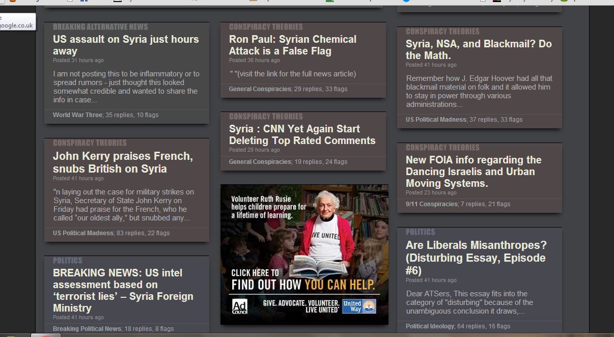
new style

I find the way the 'home', 'hot' and 'top' pages only show a few titles instead of clearly defined categories with a few threads a bit off putting. I like to see at a glance if there's anything of interest to me, I do not want to need to scroll down and read more than a few words of a thread after the title to see if it catches my interest. Similar to walking into a room and glancing around to see if there is anyone I recognise. I do not want to go round each person individually and look at them close up, one or two at a time.
I guess the purpose is for mobile devices and the technical aspects of getting a lot of information on the screen, but it kind of detracts from the smoothness of the UI IMO.
I prefer the clearly defined topics.
There are certain things in the new style I prefer, like the upload function, it has the ability for multiple uploads and is more intuitive.
Comparative home pages.
old style
new style
edit on 1-9-2013 by theabsolutetruth because: (no reason given)
reply to post by MystikMushroom
I honestly think it's becoming obvious that this site's owners don't actually care what the userbase thinks of the site anymore, it's all about the money. Not only did they lock the feedback on the new design because people hated it, but the moderation has been consistently getting worse (and more biased) lately as well.
I honestly think it's becoming obvious that this site's owners don't actually care what the userbase thinks of the site anymore, it's all about the money. Not only did they lock the feedback on the new design because people hated it, but the moderation has been consistently getting worse (and more biased) lately as well.
reply to post by Chamberf=6
I havent seen the new layout. I was never able to log in.
Interesting coincidence though.
I havent seen the new layout. I was never able to log in.
Interesting coincidence though.
new topics
-
George Knapp AMA on DI
Area 51 and other Facilities: 2 hours ago -
Not Aliens but a Nazi Occult Inspired and then Science Rendered Design.
Aliens and UFOs: 3 hours ago -
Louisiana Lawmakers Seek to Limit Public Access to Government Records
Political Issues: 5 hours ago -
The Tories may be wiped out after the Election - Serves them Right
Regional Politics: 6 hours ago -
So I saw about 30 UFOs in formation last night.
Aliens and UFOs: 8 hours ago -
Do we live in a simulation similar to The Matrix 1999?
ATS Skunk Works: 9 hours ago -
BREAKING: O’Keefe Media Uncovers who is really running the White House
US Political Madness: 9 hours ago -
Biden--My Uncle Was Eaten By Cannibals
US Political Madness: 10 hours ago -
"We're All Hamas" Heard at Columbia University Protests
Social Issues and Civil Unrest: 10 hours ago
top topics
-
BREAKING: O’Keefe Media Uncovers who is really running the White House
US Political Madness: 9 hours ago, 23 flags -
Biden--My Uncle Was Eaten By Cannibals
US Political Madness: 10 hours ago, 18 flags -
George Knapp AMA on DI
Area 51 and other Facilities: 2 hours ago, 16 flags -
African "Newcomers" Tell NYC They Don't Like the Free Food or Shelter They've Been Given
Social Issues and Civil Unrest: 16 hours ago, 12 flags -
Russia Flooding
Fragile Earth: 17 hours ago, 7 flags -
"We're All Hamas" Heard at Columbia University Protests
Social Issues and Civil Unrest: 10 hours ago, 7 flags -
Russian intelligence officer: explosions at defense factories in the USA and Wales may be sabotage
Weaponry: 15 hours ago, 6 flags -
Louisiana Lawmakers Seek to Limit Public Access to Government Records
Political Issues: 5 hours ago, 6 flags -
So I saw about 30 UFOs in formation last night.
Aliens and UFOs: 8 hours ago, 5 flags -
The Tories may be wiped out after the Election - Serves them Right
Regional Politics: 6 hours ago, 3 flags
active topics
-
"We're All Hamas" Heard at Columbia University Protests
Social Issues and Civil Unrest • 122 • : DontTreadOnMe -
Alabama Man Detonated Explosive Device Outside of the State Attorney General’s Office
Social Issues and Civil Unrest • 57 • : watchitburn -
Not Aliens but a Nazi Occult Inspired and then Science Rendered Design.
Aliens and UFOs • 6 • : visitedbythem -
Russian intelligence officer: explosions at defense factories in the USA and Wales may be sabotage
Weaponry • 165 • : andy06shake -
Biden--My Uncle Was Eaten By Cannibals
US Political Madness • 39 • : Zanti Misfit -
The Tories may be wiped out after the Election - Serves them Right
Regional Politics • 18 • : alldaylong -
Silent Moments --In Memory of Beloved Member TDDA
Short Stories • 43 • : Naftalin -
What do you do to get to sleep and stay asleep ??
Health & Wellness • 108 • : TheGoondockSaint -
George Knapp AMA on DI
Area 51 and other Facilities • 9 • : nerbot -
MULTIPLE SKYMASTER MESSAGES GOING OUT
World War Three • 28 • : Astrocometus