It looks like you're using an Ad Blocker.
Please white-list or disable AboveTopSecret.com in your ad-blocking tool.
Thank you.
Some features of ATS will be disabled while you continue to use an ad-blocker.

ATS.5/3 Preview Video: see the big changes coming soon to ATS!
page: 4share:
reply to post by SkepticOverlord
Oh cool that sounds awesome. Thanks for all of the info.
Having things more acclimated to phones is great because I do use my phone when Im not around my laptop.
Also when I show people in RL things I typically use my phone because it is much easier to handle and pass around etc.
Note: When using the phone I avoid the app for ATS like the plague. I actually use the real full ATS version exclusively despite the minimal loading times etc. I prefer having all options and it actually works pretty well on 4g networks.
The ATS app or whatever it was took far too much content away and made everything unappealing for some reason. I don't know why but I removed it within 5minutes of messing with it.
I'm not really a tech guy and am more interested in content than anything else, but the new look looks good to me. One suggestion: a larger selection
of emoticons. For some posts the old Technicolor BTS emoticons filled the bill in ways that the regular emoticons couldn't hope to do.
Forgive the indulgence, but this is a good illustration of what I am talking about:
www.abovetopsecret.com...
Forgive the indulgence, but this is a good illustration of what I am talking about:
www.abovetopsecret.com...
Originally posted by ipsedixit
If I'm travelling abroad, the first thing I'm going to drop before I flee my lodgings is my passport.
If I'm a shady organisation, the first thing I am going to do is hang onto the passport of a wanted individual and keep it lying around in my hideout. :bnghd:
If I'm an American intelligence service who wants to make connections between individuals who are not connected, the first thing I'm going to do is lay down a paper trail.
If I'm a knucklehead I'm going to buy all of this.
I'll say it again. I hope there is still a dark theme becuase i hate that grey white theme.
Alright!
Very nice changes guys, can't wait to have it go live! The layout is very smooth and streamlined, the "forever scroll" is something that was long needed lol.
I'll use the white layout probably, but it's nice to know that you can always go back to the dark side
Very nice changes guys, can't wait to have it go live! The layout is very smooth and streamlined, the "forever scroll" is something that was long needed lol.
I'll use the white layout probably, but it's nice to know that you can always go back to the dark side
reply to post by SkepticOverlord
Love the 'forever scroll' on the Recent Posts page but like many I will be waiting to go dark.
Woody
Love the 'forever scroll' on the Recent Posts page but like many I will be waiting to go dark.
Woody
Originally posted by muzzleflash
Originally posted by SkepticOverlord
And yes -- a dark version of the UI will be available, but not finished until the entire site is complete.
Thank goodness because that was the main reason I was so comfortable here. Having dark is really easy on my eyes and I loathe bright websites for that very reason, it blinds me. Especially when I first wake up and my eyes are very sensitive.
I am willing to be patient and thanks for addressing this issue first thing.
That's all I was really worried about.
Can't wait to see how it all works when you guys finish up!
I'm with the dark themed people! The dark looks more mysterious and intriguing, the white is boring and bland and uncreative.
hmmmm........dark meat or light meat
hard choices!!
hard choices!!
edit on 24-6-2013 by olaru12 because: (no reason given)
Originally posted by olaru12
hmmmm........dark meat or light meat
hard choices!!edit on 24-6-2013 by olaru12 because: (no reason given)
Light meat. Dark forum. That was easy!
I haven't seen anyone asking yet, so how do we sign up for the invite-only Beta testing? I, for one, would love to be a part of that.
From what I can see, it looks good. I watched the video, and then watched it again, pausing several times to soak up the changes. Then I just downloaded it to really pick it apart.
All I can say ATM:
AWESOMENESS has arrived at ATS!
Here's a few new features I'll appreciate:
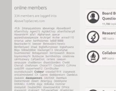
Online members to the left margin instead of having to scroll all the way to the bottom.

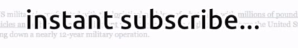
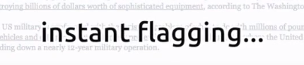
Wow. So much easier to star a post now, no wait for the page to refresh.
Ditto for subscribing to a thread. Many a time I don't want to comment because I am on mobile, and could only fire off a short response. I subscribe to a lot of threads I don't instantly comment on, but read them first page to last page subscribing if the content is interesting. This should help to alleviate all those "commenting so I can read this later" posts. (Yes you can currently subscribe without commenting, but.....)
Wow again, for making all the common functions instant. No page refreshing really shows the "under the hood" design is all modernized HTML5. Sleek and fast from the preview. Loved once past Beta.
As far as the contrast, I'm with most others and I'd prefer the "dark" theme, but you're right SO, It does grow on you. I'm willing to try each.
Things I'm finding missing:
1. The Image Uploader.
2. Chat.
3. A message notification.
4. Search?
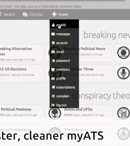
I'm just wondering if those features will survive the re-vamp, and if we will be able to find them on the + MORE drop down.
(Item 3: I'm used to the Yellow highlight on the bottom ribbon, and the drop down green flag if I have more than 1 message. How will we be alerted to new PM's?)
From what I see so far, we are hitting another evolutionary step forward, as far as coding goes. Thanks for bringing us up to 2013 standards. Very much appreciated.
From what I can see, it looks good. I watched the video, and then watched it again, pausing several times to soak up the changes. Then I just downloaded it to really pick it apart.
All I can say ATM:
AWESOMENESS has arrived at ATS!
Here's a few new features I'll appreciate:
Online members to the left margin instead of having to scroll all the way to the bottom.
Wow. So much easier to star a post now, no wait for the page to refresh.
Ditto for subscribing to a thread. Many a time I don't want to comment because I am on mobile, and could only fire off a short response. I subscribe to a lot of threads I don't instantly comment on, but read them first page to last page subscribing if the content is interesting. This should help to alleviate all those "commenting so I can read this later" posts. (Yes you can currently subscribe without commenting, but.....)
Wow again, for making all the common functions instant. No page refreshing really shows the "under the hood" design is all modernized HTML5. Sleek and fast from the preview. Loved once past Beta.
As far as the contrast, I'm with most others and I'd prefer the "dark" theme, but you're right SO, It does grow on you. I'm willing to try each.
Things I'm finding missing:
1. The Image Uploader.
2. Chat.
3. A message notification.
4. Search?
I'm just wondering if those features will survive the re-vamp, and if we will be able to find them on the + MORE drop down.
(Item 3: I'm used to the Yellow highlight on the bottom ribbon, and the drop down green flag if I have more than 1 message. How will we be alerted to new PM's?)
From what I see so far, we are hitting another evolutionary step forward, as far as coding goes. Thanks for bringing us up to 2013 standards. Very much appreciated.
edit on 6/24/13 by Druid42 because: Forgot search till I read The Gut on page three after posting. Added.
Will it break our avatars?
I only ask because I done mine to the pixel level in photoshop to make sure everything lines up correctly.
I only ask because I done mine to the pixel level in photoshop to make sure everything lines up correctly.
Your design concepts have more than taken the sentiments of the community into account.
Very well done. I look forward to it's launch.
Very well done. I look forward to it's launch.
It would be very unfair to go into the new changes with anything but an open mind and willingness to become familiar with the new look and feel a bit
at a time. Clearly, the intent is to rise above the look and feel of "what has come before". As one of the geezers who remember when Compuserve
was state of the art, I look forward to wading in.
Looks like there will be a new edition to the family!
When's the due date?
I've mentioned that I do not like the way so many sites are essentially abandoning the desktop user experience and opting for a more 'mobile friendly' design. It's good to know that, even though you are working to become very 'mobile friendly', you are doing your best to make sure the desktop user experience is not completely trashed.
Nothing can satisfy everyone, but hopefully you are able to please a large majority of the ATS membership.....
It would be nice to see the addition of a new feature... one that provides a list of which members have replied to a specific comment within individual threads.
I've mentioned it before, as a way to see all replies to a particular comment, without sifting through page after page of comments in a fast moving thread and without the need of checking mail and identifying each reply individually.... Kinda like the opposite of 'Member's Posts in Thread' feature, 'In-thread Replies to this Comment'.
Also, this probably won't be available, but it would be nice to have a 'skins' option. A lot of members seem to be concerned about the color (or non-color) of a white platform and, while it's great to have confirmation of an available 'Lets Go Dark!' function, it would be nice to have the option of several colors for a generic background, or 'Platform' skin.
Anyway, I appreciate the effort of everyone who has a hand in the continual evolution of 'AboveTopSecret.com'. It's nice to have a place to go that is up to date. So many websites have become dinosaurs, remaining the same in appearance and function as they did 10+ years ago... but not ATS!
Thanks for That!
edit on 24-6-2013 by esteay812 because: tyops
reply to post by SkepticOverlord
My solution for this is very simple. I just copy and paste the desired text directly into my reply and manually add the [ ex ] and [ /ex ] tags. This bypasses the external text reformatting function and leaves the original spacing and formatting just as it was pasted to the reply.
The wall of text problem will always be an issue for sites like ATS (discussion boards) on certain pages. White space (reduction) and formatting are the best we can do to alleviate it.
My solution for this is very simple. I just copy and paste the desired text directly into my reply and manually add the [ ex ] and [ /ex ] tags. This bypasses the external text reformatting function and leaves the original spacing and formatting just as it was pasted to the reply.
I love everything coming! Except the white, I actually find white makes it difficult for me to read the text (literally "whites out" text for me)
and gives me headaches. I look forward to when I can go back to the dark, though
Also, I have to ask about the forever scroll. What kind of cumulative memory usage might that require for us? I ask because this is implemented on other sites I'm on, and it's murder on my RAM. I seem to hemorrhage memory when I scroll more than a few pages' worth of times. I'm probably in a pretty solid minority with this leak issue, but it doesn't hurt to ask.
Also, I have to ask about the forever scroll. What kind of cumulative memory usage might that require for us? I ask because this is implemented on other sites I'm on, and it's murder on my RAM. I seem to hemorrhage memory when I scroll more than a few pages' worth of times. I'm probably in a pretty solid minority with this leak issue, but it doesn't hurt to ask.
I would like to ask why the link to my website was removed from my signature???
I asked for, and was given, permission by Springer to put it in my signature line. I still have the saved U2U from Springer allowing it.
I asked for, and was given, permission by Springer to put it in my signature line. I still have the saved U2U from Springer allowing it.
Originally posted by SkepticOverlord
And yes -- a dark version of the UI will be available, but not finished until the entire site is complete.
OK, then it's safe to put away my torch and pitchfork and we won't be storming the castle.
One of the things that I don't like about the current ATS website is the way the home page automatically refreshes. This is very annoying and creates
issues on my computer. I'm not sure if this is connected to the way ads reload or what.
Bottom line. I would prefer to refresh the page when it suits me.
Bottom line. I would prefer to refresh the page when it suits me.
new topics
-
An Apology From the Dunderbeck Sausage Company
Music: 8 minutes ago -
Tucker on Joe Rogan talking Kona Blue and UFOs
Aliens and UFOs: 44 minutes ago -
Remember These Attacks When President Trump 2.0 Retribution-Justice Commences.
2024 Elections: 1 hours ago -
Predicting The Future: The Satanic Temple v. Florida
Conspiracies in Religions: 1 hours ago -
WF Killer Patents & Secret Science Vol. 1 | Free Energy & Anti-Gravity Cover-Ups
General Conspiracies: 3 hours ago -
Hurt my hip; should I go see a Doctor
General Chit Chat: 4 hours ago -
Israel attacking Iran again.
Middle East Issues: 5 hours ago -
Michigan school district cancels lesson on gender identity and pronouns after backlash
Education and Media: 5 hours ago -
When an Angel gets his or her wings
Religion, Faith, And Theology: 6 hours ago -
Comparing the theology of Paul and Hebrews
Religion, Faith, And Theology: 7 hours ago
top topics
-
The Democrats Take Control the House - Look what happened while you were sleeping
US Political Madness: 11 hours ago, 18 flags -
In an Historic First, In N Out Burger Permanently Closes a Location
Mainstream News: 13 hours ago, 16 flags -
Man sets himself on fire outside Donald Trump trial
Mainstream News: 11 hours ago, 9 flags -
Biden says little kids flip him the bird all the time.
Politicians & People: 11 hours ago, 9 flags -
WF Killer Patents & Secret Science Vol. 1 | Free Energy & Anti-Gravity Cover-Ups
General Conspiracies: 3 hours ago, 7 flags -
Michigan school district cancels lesson on gender identity and pronouns after backlash
Education and Media: 5 hours ago, 7 flags -
Pentagon acknowledges secret UFO project, the Kona Blue program | Vargas Reports
Aliens and UFOs: 8 hours ago, 6 flags -
Remember These Attacks When President Trump 2.0 Retribution-Justice Commences.
2024 Elections: 1 hours ago, 5 flags -
Israel attacking Iran again.
Middle East Issues: 5 hours ago, 5 flags -
Boston Dynamics say Farewell to Atlas
Science & Technology: 8 hours ago, 4 flags
active topics
-
Predicting The Future: The Satanic Temple v. Florida
Conspiracies in Religions • 7 • : randomuser2034 -
Tucker on Joe Rogan talking Kona Blue and UFOs
Aliens and UFOs • 1 • : NoCorruptionAllowed -
An Apology From the Dunderbeck Sausage Company
Music • 0 • : TheMichiganSwampBuck -
Comparing the theology of Paul and Hebrews
Religion, Faith, And Theology • 1 • : glend -
MULTIPLE SKYMASTER MESSAGES GOING OUT
World War Three • 56 • : cherokeetroy -
Hurt my hip; should I go see a Doctor
General Chit Chat • 12 • : tarantulabite1 -
Remember These Attacks When President Trump 2.0 Retribution-Justice Commences.
2024 Elections • 13 • : xuenchen -
Man sets himself on fire outside Donald Trump trial
Mainstream News • 43 • : Vermilion -
Israel attacking Iran again.
Middle East Issues • 28 • : KrustyKrab -
In an Historic First, In N Out Burger Permanently Closes a Location
Mainstream News • 11 • : TheMisguidedAngel