It looks like you're using an Ad Blocker.
Please white-list or disable AboveTopSecret.com in your ad-blocking tool.
Thank you.
Some features of ATS will be disabled while you continue to use an ad-blocker.

Colombia prepares for imminent eruption of killer volcano
page: 2share:
As I pointed out on another thread after the 7.whatever over in Indonesia the other day, it is interesting, and by no means a theory, that
Colombia/Mexico are the antipode to that eq. The thing is, the volcanoes in the whole of the South America northern region have been showing increased
'restlessness' since the beginning of the year.
I know some are well away from populated areas...thank goodness, but I just find it interesting that over on your eq thread it had been noted that S America had been quiet on the eq score board (SpaceJockey was one who questioned it if memory serves) while a lot of other places went through a flurry of eq activity for a while. I saw the increase in volcanic activity as a release of pressure in that area as opposed to any large eq's.
Your thoughts or have I had a glass too many to celebrate your birthday?
Rainbows
Jane
reply to post by angelchemuel
Like I have said many times, you don't bend the earth with such a massive earthquake as Japan and not have ripples.
Since Volcanoes and subduction go hand in hand I guess it is inevitable that they will get busy with the fizzy when the plates move.
You are still OK if you are not saying I am not as thunk as drinkle peep I am.
reply to post by PuterMan
Thanks Puters!
Slightly OT in respect to the volcano you are talking about, but the geophysics behind this report are interesting..I'm sorry about the source...but they are quoting from another
"April 21, 2012 – NEW ZEALAND – One of the most intriguing unsolved cases for New Zealand geologists is the ancient Taupo super-eruption. Victoria University PhD student Aidan Allan has found new evidence that explains how and why the volcano blew. While the general public is fascinated by the magnitude – the event buried the North Island in debris, with the ash cloud all the way to the Chathams – geologists’ interest lies elsewhere. They are intrigued because the eruption’s cause isn’t open-and-shut – while most super-volcanoes simply explode, with Taupo there was a short hiatus just as things got underway. “There were breaks of weeks to months [in the early stages] and then all hell breaks loose,” Mr. Allan said. As geologists worldwide have to make the life-or-death call as to when an eruption has ended, it’s crucial to know why this super-volcano acted the way it did. The event began in standard fashion, at least in super-volcano terms, with a massive 530sq km pool of magma building up below the surface, under more and more pressure. As the two pools of magma were physically separated by 15km of rock, Mr. Allan suspected a major tectonic force had shifted the magma from the northeast site to the vents of the Taupo super-volcano. With layer upon layer of chemical evidence confirming the presence of two types of magma, it seems he’d found a potential suspect for the mysterious halting of the super-eruption. Caught at the scene of the crime, tectonic forces were now the prime suspect. Today, with both systems believed to be dormant, the forces that caused such problems are no longer suspect, and it’s the profile of the event that’s the most relevant. Super-eruptions are caused by the pooling of magma under the surface with no available domes or vents to release tension. Pressure builds to a saturation point, triggering explosive eruptions thousands of times more powerful than standard eruptions. Super-volcanoes collapse into calderas, where the ground falls into the space left by the erupted magma. Lake Taupo and Lake Rotorua are both calderas. -Stuff"
theextinctionprotocol.wordpress.com...
Rainbows
Jane
Originally posted by PuterMan
reply to post by tracehd1
Thanks for the link. Unfortunately the writer of the article makes the basic error (on purpose?) of cherry picking a nice set of data that fits his theory. You cannot pick from the 'significant' list. That is statistical nonsense.
If you look at the energy and counts since 1960 you find that by comparison the energy is lower and the count of quakes is not increasing particularly.
When I have eaten I will find the 2011 version of that but it does not make a great deal of difference. I will also dig out the 1930 to 2011 one.
If you want to see more information on this you could visit my Earthquake Reports site and take a look at the analysis for 2011. The report for 2010 is there as well.
We are at a peak and probably over that peak now. These cycles come in about 55 year batches and seem to be linked to the Sun and Grand Conjunctions. It should get quieter for the next 20 to 30 years before it builds up to a peak again in around 50/60 years time.
reply to post by Mianeye
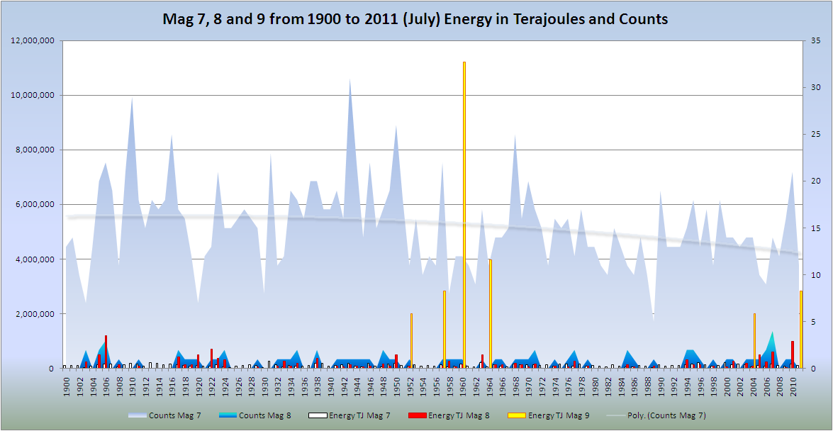
Very true. Did you realise that the one single 9.1 Japan quake put out as much energy as the whole of 2007,2008,2009,2010 and 2011 (excluding the 9.1) mag 6+ quakes and without the 1 quake 2011 would have been one of the lowest years for energy release?
This chart basically says it all. 1900 to 2011 showing the 1960 was tops and this is a much smaller blip at present.

edit on 21/4/2012 by PuterMan because: (no reason given)
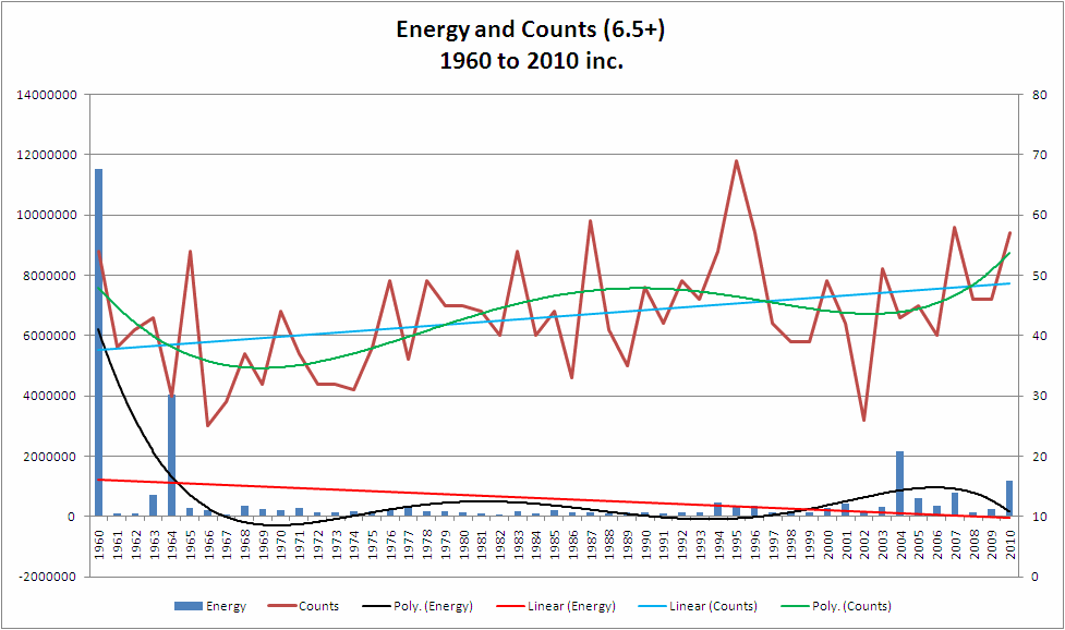
The Blue line marked counts has had a steady increase across the graph of some 20%. Neither of the Y axis is named. The graph only shows energy for 6.5+ and can not show total energy released.
The graph in fact says very little. I am tired of the line "It is all so natural." That is crap.
The problem is now one of when do the 'natural' folk swallow their pride and say Ok time to be concerned. Oh of course, after the event.
P
I was going to say something along the lines of volcanic activity has been increasing,but I have since retracted that thought.
Awareness has increased.
www.volcano.si.edu...
Awareness has increased.
A look at the number of volcanoes active per year, over the last few centuries, shows a dramatic increase, but one that is closely related to increases in the world's human population and communication. We believe that this represents an increased reporting of eruptions, rather than increased frequency of global volcanism: more observers, in wider geographic distribution, with better communication, and broader publication. The past 200 years (see plot below) show this generally increasing trend along with some major "peaks and valleys" which suggest global pulsations. A closer look at the two largest valleys, however, shows that they coincide with the two World Wars, when people (including editors) were preoccupied with other things. Many more eruptions were probably witnessed during those times, but reports do not survive in the scientific literature.
www.volcano.si.edu...
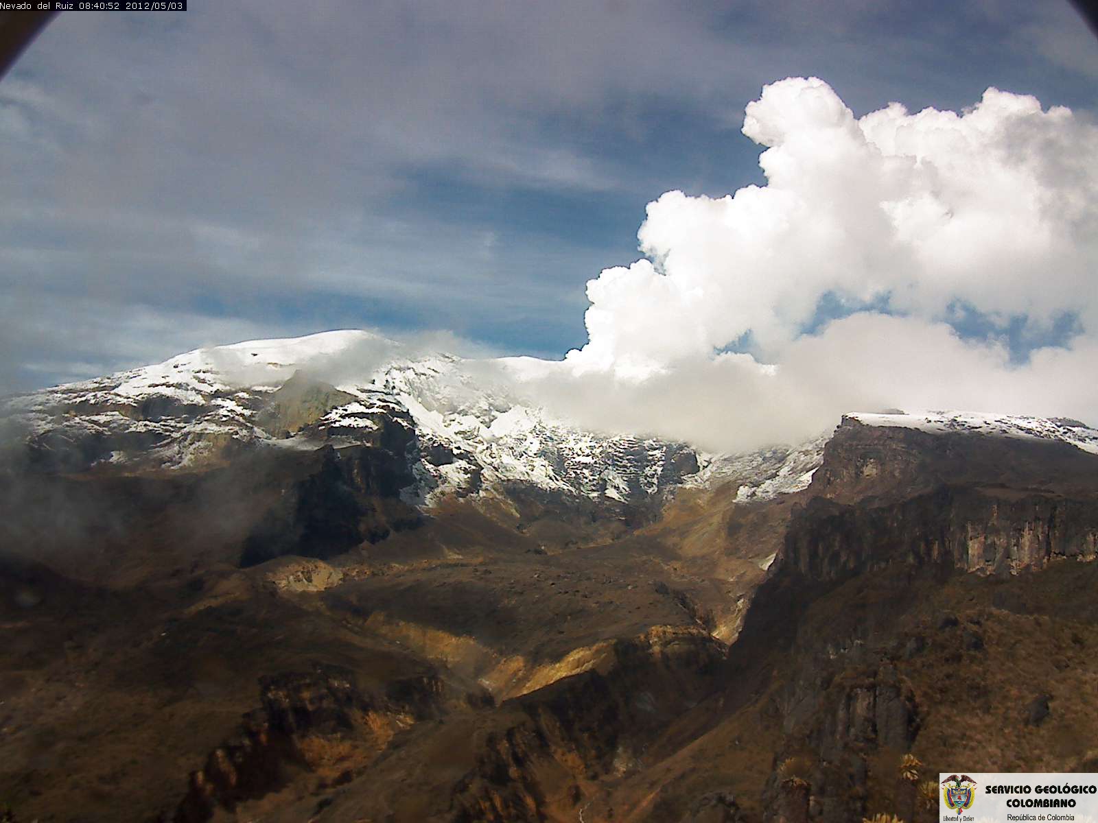
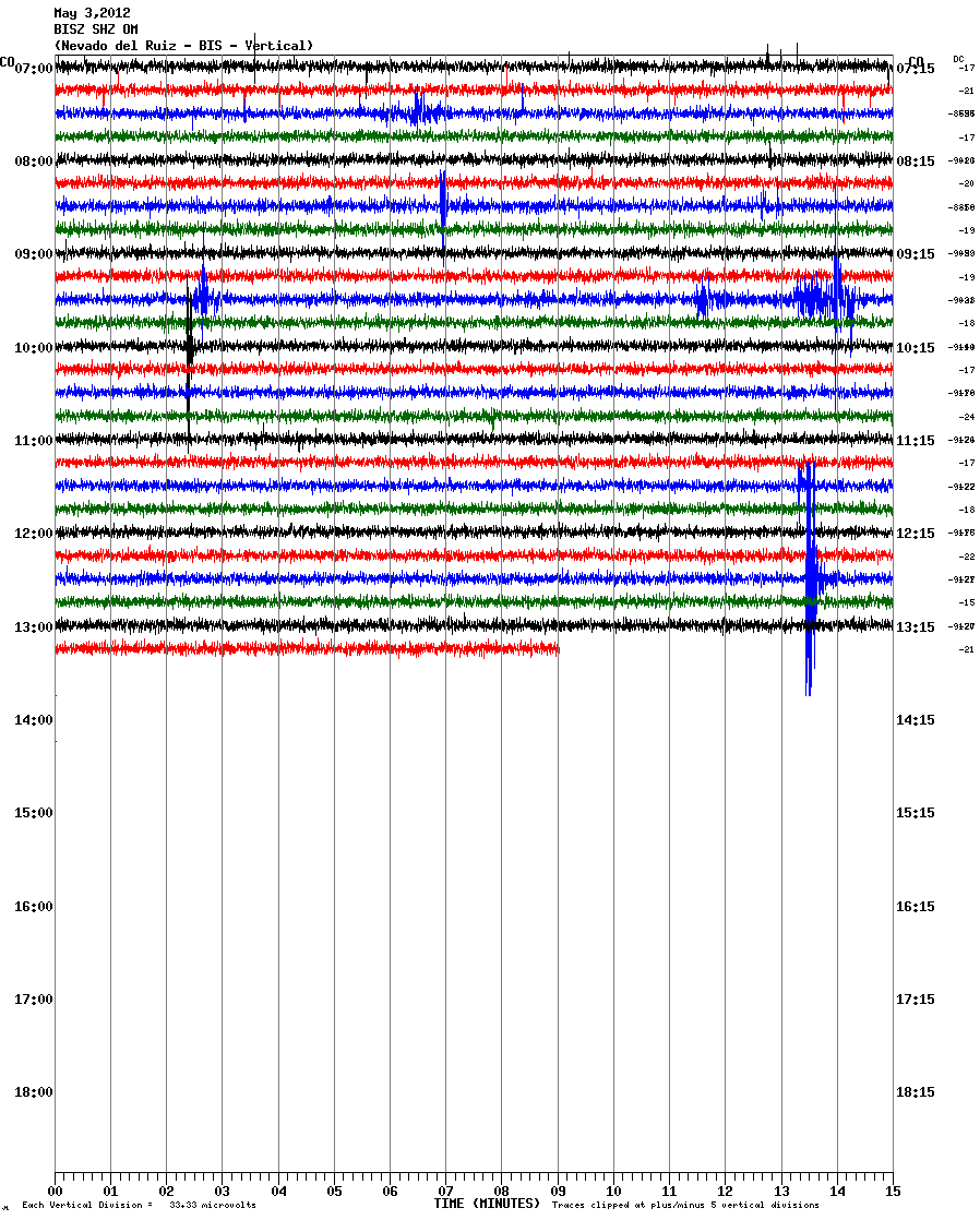
Ahh, victory is mine, lol....I found the links to the helicorders for Nevado del Ruiz.
Online digital seismos
Then, once on the page, scroll down for a list of stations, different levels of detail, short-period, broadband, vertical, north-south, and east-west.
This link gives a map with seismometer locations
We are no longer blind. (if you've already discovered this, please excuse my glee, I'm always late to the party)
edit on 4/22/2012 by
Olivine because: coding error
reply to post by pheonix358
There are three axes actually, X, Y1 and Y2. They are pretty obvious. Y1 is energy (the unit does not matter), Y2 is counts and X is time. Do they actually need to be marked?
Yes the counts show an increase but there is not a corresponding increase in energy so your point on that is?
I guess the graph only says very little if you decline to interpret it. If you are tired of the line "It is all so natural" and believe otherwise why don't YOU do something about proving your assertion? If you think there is cause for concern then document it. I spend a vast amount of time researching earthquakes and the patterns thereof and whilst activity has been higher of later it falls with parameters of normality as far as I can see.
Spend some time yourself researching and until you have done so your opinion of the veracity of the figures has to remain heresay and unfounded. I look forward to the results of your studies.
The Blue line marked counts has had a steady increase across the graph of some 20%. Neither of the Y axis is named. The graph only shows energy for 6.5+ and can not show total energy released.
There are three axes actually, X, Y1 and Y2. They are pretty obvious. Y1 is energy (the unit does not matter), Y2 is counts and X is time. Do they actually need to be marked?
Yes the counts show an increase but there is not a corresponding increase in energy so your point on that is?
The graph in fact says very little. I am tired of the line "It is all so natural." That is crap.
The problem is now one of when do the 'natural' folk swallow their pride and say Ok time to be concerned. Oh of course, after the event.
I guess the graph only says very little if you decline to interpret it. If you are tired of the line "It is all so natural" and believe otherwise why don't YOU do something about proving your assertion? If you think there is cause for concern then document it. I spend a vast amount of time researching earthquakes and the patterns thereof and whilst activity has been higher of later it falls with parameters of normality as far as I can see.
Spend some time yourself researching and until you have done so your opinion of the veracity of the figures has to remain heresay and unfounded. I look forward to the results of your studies.
reply to post by Olivine
Excellent work! Nice find.
Have you seen the size of that map!!! 7000 x 5000 pixels. Yum!
Excellent work! Nice find.
Have you seen the size of that map!!! 7000 x 5000 pixels. Yum!
reply to post by Olivine
Hello there,
Haze envelopes,,,
(Yellowish Dense Fog!)
Tel Aviv.
and central Israel,
(thats the entire City and Region).
due to meteorologic conditions.
"could not uncover the source of the stench".
Today,, a suphuric smell covered most of Central Isael,,a forgotten earhtquake watch area, imo,,
but as you know there are 3 fault lines on a slip ,, could their have been a large enough even in the area,, not much DATA available in that area,,,
can u concentrate on the mount of Olives valley looking,, north west from said position,,
or possible slip,,
seems kind of relavent, cause if the iraelies think that it might be from iran/Hezzballo/Arafat..etc,,,
well they have already sent 22 battalions too the Egyptian/Syrian border,,
so just asking if u might see something in the USGS area.
Thanks,,
p.s
soon?
Me.
Originally posted by BobAthome
reply to post by Olivine
Hello there,
Haze envelopes,,,
(Yellowish Dense Fog!)
Tel Aviv.
and central Israel,
(thats the entire City and Region).
due to meteorologic conditions.
"could not uncover the source of the stench".
Today,, a suphuric smell covered most of Central Isael,,a forgotten earhtquake watch area, imo,,
but as you know there are 3 fault lines on a slip ,, could their have been a large enough even in the area,, not much DATA available in that area,,,
can u concentrate on the mount of Olives valley looking,, north west from said position,,
or possible slip,,
seems kind of relavent, cause if the iraelies think that it might be from iran/Hezzballo/Arafat..etc,,,
well they have already sent 22 battalions too the Egyptian/Syrian border,,
so just asking if u might see something in the USGS area.
Thanks,,
p.s
soon?
Me.
Never mind,,,,
found it,,
Israel 5.5M earthquake.
Me.
OMG a potential eruption......quick guys save the coc aine
can not let the coc aine get erupted on.......snort sniff snort mmmmmmm
can not let the coc aine get erupted on.......snort sniff snort mmmmmmm
reply to post by Mianeye
Dear Mianeya, & Puterman,
I was by coincidence in Columbia in 1985 exactly when the Volcano erupted. I was at that time located in a city at about 250 kms from the crater,and when the explosion happened I awoke abruptly in my bed, opened the eyes and in question of minutes I knew something extremly grave and tragic was occurring.
An entire city was completly buried under tons of debris, ashes and flood comming down in a giant avalanche of melt snow mixed with soil. The scenes transmited by the columbian TV news from Armero, just hours before the disaster, are still in my mind as possibly the most dantesc I ever have seen in my life.
The authorities were perfectly unable to prevent the tragedy, some of them acted with incredible incompetence, there were even good journalist reports in the Columbia TV showing people of Armero that was requesting technicians and expert geologists to come to their town, before the disaster of course, since they were expecting a tragedy might occur, the goverment never sent that help.
That terrible disaster, was determinant in my life, since in great part it is responsible that my gift of psychic premonition gradualy became very focus in seismic events, that year was extremely stressful in many aspects since also I knew that Mexico was going to experience a terrible earthquake weeks before it actually occured, but many friends prevented to dont release publically my insights arguing that no body was going to pay attention to them.
I lost a lot of good friends in Mexico dity earthquake of 1985 in question of seconds, people that really loved and respected a lot.
The two situations, the one in Mexico and in Columbia, in 1985 were very important to decide to never remain in silent again if I got any kind of premonition about natural disasters, since it is horrible to see that just a warning could be used to save lives.
Pls check this:
www.abovetopsecret.com...
President Belisario Betancur used practically this eruption to prevent the collapse of his goverment, that just weeks ago had had to deal with the worst crisis of public order ever experienced by Columbia, when tanks of the army demolished the Justice palace, in the main square of the downtown of Sta Fe de Bogota, where all the members of the Supreme court of Columbia were kidnapped by guerrilla members of the M19, that decided to asault the place in a plot with Pablo Escobar Gaviria against the judicial power in Columbia, that was prosecuting him.
I hope and I have the impression that President Santos have learnt a lot of that so painful experience of the Past to prevent another terrible tragedy as the one of Armero this time in Columbia.
In Mexico also President De la Madrid was many times blamed to be unable to deal with the magnitude of the tragedy, and even there were accusations of corruption that members of his administration profited a lot with the international aid sent by the red cross.
Until now there is no reliable official record of exactly how many people died under the debris of Mexico city, specially in sectors like Tlatelolco. The officlal statistics claim that the victims were around 3500, but unofficlal estimations carried out by the red cross and international agencies claimed that , according with the people that became lost in the tragedy, the real number might be more than 10 times that amount.
Thanks,
The Angel of Lightness
edit on 5/12/2012 by The angel of light because: (no reason given)
new topics
-
Former Labour minister Frank Field dies aged 81
People: 5 minutes ago -
SETI chief says US has no evidence for alien technology. 'And we never have'
Aliens and UFOs: 1 hours ago -
This is our Story
General Entertainment: 4 hours ago -
President BIDEN Vows to Make Americans Pay More Federal Taxes in 2025 - Political Suicide.
2024 Elections: 6 hours ago -
Ode to Artemis
General Chit Chat: 7 hours ago -
Ditching physical money
History: 10 hours ago -
One Flame Throwing Robot Dog for Christmas Please!
Weaponry: 11 hours ago -
Don't take advantage of people just because it seems easy it will backfire
Rant: 11 hours ago
top topics
-
University student disciplined after saying veganism is wrong and gender fluidity is stupid
Education and Media: 15 hours ago, 14 flags -
President BIDEN Vows to Make Americans Pay More Federal Taxes in 2025 - Political Suicide.
2024 Elections: 6 hours ago, 10 flags -
One Flame Throwing Robot Dog for Christmas Please!
Weaponry: 11 hours ago, 6 flags -
Should Biden Replace Harris With AOC On the 2024 Democrat Ticket?
2024 Elections: 12 hours ago, 6 flags -
Don't take advantage of people just because it seems easy it will backfire
Rant: 11 hours ago, 4 flags -
Ditching physical money
History: 10 hours ago, 4 flags -
SETI chief says US has no evidence for alien technology. 'And we never have'
Aliens and UFOs: 1 hours ago, 3 flags -
God lived as a Devil Dog.
Short Stories: 16 hours ago, 3 flags -
Ode to Artemis
General Chit Chat: 7 hours ago, 2 flags -
VirginOfGrand says hello
Introductions: 12 hours ago, 2 flags
active topics
-
SETI chief says US has no evidence for alien technology. 'And we never have'
Aliens and UFOs • 11 • : Hecate666 -
"We're All Hamas" Heard at Columbia University Protests
Social Issues and Civil Unrest • 265 • : KrustyKrab -
The Superstition of Full Moons Filling Hospitals Turns Out To Be True!
Medical Issues & Conspiracies • 23 • : confuzedcitizen -
Former Labour minister Frank Field dies aged 81
People • 0 • : Freeborn -
University student disciplined after saying veganism is wrong and gender fluidity is stupid
Education and Media • 32 • : BedevereTheWise -
So this is what Hamas considers 'freedom fighting' ...
War On Terrorism • 227 • : HopeForTheFuture -
Remember These Attacks When President Trump 2.0 Retribution-Justice Commences.
2024 Elections • 51 • : Justoneman -
British TV Presenter Refuses To Use Guest's Preferred Pronouns
Education and Media • 131 • : FlyersFan -
Spectrophilia - Women Who Have Had Affairs With Ghosts Say Spooks Are Better Lovers Than Real Men
Paranormal Studies • 30 • : FlyersFan -
Breaking Baltimore, ship brings down bridge, mass casualties
Other Current Events • 471 • : bally001