It looks like you're using an Ad Blocker.
Please white-list or disable AboveTopSecret.com in your ad-blocking tool.
Thank you.
Some features of ATS will be disabled while you continue to use an ad-blocker.

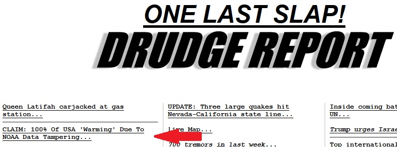
100 Percent Of US Warming Is Due To NOAA Data Tampering
page: 1share:
On drudge report right now:
realclimatescience.com...
Blogger claims NOAA data tampering and missing data account for the AGW scam. Ok. I'm down with that. But I'm mostly into earthquakes and volcanoes, so the more knowledgeable people on this subject can weigh in if you want.
One example in this article:
NOAA with fake data? Oh, you mean like fake news?
A lot of charts are provided. What surprises me more is that Drudge would carry this. I must say, even though what this blogger is saying may have a lot of truth to it, I haven't been too happy with Drudge lately. He's been linking some very annoying sites and tabloids.
This blog isn't too annoying though.
Not unless you're one of those people that comes on to ATS and posts a thread in the Fragile Earth forum that claims anything else but AWG acceptance is total BS. I guess then you might be entirely annoyed. Or well, it was something like that. I can't seem to find that thread or I would have linked it.
ETA: Ahh, found it. I couldn't find it because it was moved:
www.abovetopsecret.com...
realclimatescience.com...
Blogger claims NOAA data tampering and missing data account for the AGW scam. Ok. I'm down with that. But I'm mostly into earthquakes and volcanoes, so the more knowledgeable people on this subject can weigh in if you want.
One example in this article:
The problem with the NOAA graph is that it is fake data. NOAA creates the warming trend by altering the data. The NOAA raw data shows no warming over the past century
NOAA with fake data? Oh, you mean like fake news?
A lot of charts are provided. What surprises me more is that Drudge would carry this. I must say, even though what this blogger is saying may have a lot of truth to it, I haven't been too happy with Drudge lately. He's been linking some very annoying sites and tabloids.
This blog isn't too annoying though.
Not unless you're one of those people that comes on to ATS and posts a thread in the Fragile Earth forum that claims anything else but AWG acceptance is total BS. I guess then you might be entirely annoyed. Or well, it was something like that. I can't seem to find that thread or I would have linked it.
ETA: Ahh, found it. I couldn't find it because it was moved:
www.abovetopsecret.com...
edit on Wed Dec 28th 2016 by TrueAmerican because: (no reason given)
a reply to: TrueAmerican
An open mind would carry some skepticism and look at all available data and interpretations before coming to a conclusion.
An open mind would carry some skepticism and look at all available data and interpretations before coming to a conclusion.
This wouldn't be the first time they have been caught tampering or colluding with media to manufacture narratives. The list of these scandals is a
long one now.
Last month there was also an apparent mistake found in the climate model used for projections linked to CO2. If the mistake is real, then the entire
correlation between temperature and CO2 disappears. The paper that highlights the error and posits a different theory is currently under peer review.
It's still unclear.
What is clear is that the media and some powerful people have pushed one side of an argument as fact, whilst claiming a consensus that does not exist.
It's still unclear.
What is clear is that the media and some powerful people have pushed one side of an argument as fact, whilst claiming a consensus that does not exist.
a reply to: TrueAmerican
Does not surprise me in the slightest.
Here is an example of data tampering to make a warming trend appear to be happening.
This is not a new development.
Does not surprise me in the slightest.
Here is an example of data tampering to make a warming trend appear to be happening.
This is not a new development.
originally posted by: DBCowboy
a reply to: TrueAmerican
An open mind would carry some skepticism and look at all available data and interpretations before coming to a conclusion.
That's the issue DC, "available data", what we aren't being told/shown is just as crucial as what we are. It's complicated to come to any conclusion with all the conflicting computations.
I would point out that this guy is not a scientist,,,
But neither is al gore... so it's cool.
But neither is al gore... so it's cool.
a reply to: jadedANDcynical
That's a good link J&C, thanks. But I didn't exactly put this in Breaking News, I think.... Did I?
That's a good link J&C, thanks. But I didn't exactly put this in Breaking News, I think.... Did I?
When they spoke of "massaging the data", I knew it was a scam.
as of right now, this is a "blogger's claim", so don't be so fast to accept it since it's what you want to hear. IT needs to be verified and
vetted.
But by the same token, criticizing the source without checking the claim is equally ignorant. (IMHO)
But by the same token, criticizing the source without checking the claim is equally ignorant. (IMHO)
a reply to: network dude
Agreed. So ok, who's gonna do the vettin? I have a 93 vette I can lend out to anyone wanting to drive hard and fast to get there.
Agreed. So ok, who's gonna do the vettin? I have a 93 vette I can lend out to anyone wanting to drive hard and fast to get there.
a reply to: TrueAmerican
No, not in breaking news. Didn't mean to imply it was new news. Drudge (and other outlets) will occasionally drop a story of something that has been happening for quite some time and many people think of it as something only recently discovered.
I thought of PuterMan's (4 year old) thread as soon as I saw your title and figured it would be of interest to any who might not have seen it when originally posted.
The narrative that has been pushed for a while now is that we humans are having an effect upon the global climate. I do not know how true that is. I know we make ungodly messes out of things, but to affect the climate on a global scale? I'm not quite sure about that.
let me drive it for the weekend and i'll let you know.
originally posted by: TrueAmerican
a reply to: network dude
Agreed. So ok, who's gonna do the vettin? I have a 93 vette I can lend out to anyone wanting to drive hard and fast to get there.
My post was a pre-emptive strike on the AGW crowd who just discredits the source to avoid meaningful discussion.
a reply to: jadedANDcynical
Yeah, so far I might concede that humans have had a slight effect, but that's as far as I'm going. And by slight I mean 5% or so. The rest is natural climate cycles to me.
Yeah, so far I might concede that humans have had a slight effect, but that's as far as I'm going. And by slight I mean 5% or so. The rest is natural climate cycles to me.
One of the issues is their so called correction factors. Our old local weather station was on a farm about 2 miles from town in a standard shelter
without any shade or wind blocks in a lawn area. The new one is on the roof of the high school right next to the parking lot??? But they have a
correction factor for it???
a reply to: TrueAmerican
Tony Heller aka Steven Goddard apparently has a history of making big claims about fabricated data.
Consider this from 2008:
The Register - Arctic ice refuses to melt as ordered
Notice the editor's note?
at least in this case, he owned up to his mistake (then again, the article was published in The Register not a blog so it might not have been because of any pangs of integrity from Heller)
Goddard made the same claims about the numbers being bogus in 2014 and even his fellow skeptics called him out. Here's a bit from Anthony Watts (WattsUpWithThat) that is directly relevant to the OP:
Reason - Did NASA/NOAA Dramatically Alter U.S. Temperatures After 2000?
I'm no expert but it seems there's a pattern here of dramatic, insubstantial claims. At the very least, I'd be extremely weary.
NOAA with fake data? Oh, you mean like fake news?
Tony Heller aka Steven Goddard apparently has a history of making big claims about fabricated data.
Consider this from 2008:
The Register - Arctic ice refuses to melt as ordered
The problem is that this graph does not appear to be correct.* [See Editor's note, below] Other data sources show Arctic ice having made a nice recovery this summer.
Notice the editor's note?
* Editor's note: Walt Meier, research scientist at the NSIDC, has contacted us disputing the validity of Steven Goddard's methodology, and of his use of University of Illinois data to question the NSIDC's charts. We accept that these two data sets are not directly comparable, and that the University of Illinois data does not provide support for Goddard's charge that the NSIDC data is incorrect. We reproduce Walt Meier's response below. Walt Meier as provided further detail on the calculation of sea ice area and extent in the comments to this article:
The author asserts that NSIDC's estimate of a 10% increase in sea ice compared to the same time as last year is wrong. Mr. Goddard does his own analysis, based on images from the University of Illinois' Cryosphere Today web site, and comes up with a number of ~30%, three times larger than NSIDC's estimate. He appears to derive his estimate by simply counting pixels in an image. He recognizes that this results in an error due to the distortion by the map projection, but does so anyway. Such an approach is simply not valid.
at least in this case, he owned up to his mistake (then again, the article was published in The Register not a blog so it might not have been because of any pangs of integrity from Heller)
Steven Goddard writes: "Dr. Walt Meier at NSIDC has convinced me this week that their ice extent numbers are solid. So why the large discrepancy between their graphs and the UIUC maps? I went back and compared UIUC maps vs. NASA satellite photos from the same dates last summer. It turns out that the older UIUC maps had underrepresented the amount of low concentration ice in several regions of the Arctic. This summer, their maps do not have that same error. As a result, UIUC maps show a much greater increase in the amount of ice this year than does NSIDC. And thus the explanation of the discrepancy. "it is clear that the NSIDC graph is correct, and that 2008 Arctic ice is barely 10% above last year - just as NSIDC had stated."
Goddard made the same claims about the numbers being bogus in 2014 and even his fellow skeptics called him out. Here's a bit from Anthony Watts (WattsUpWithThat) that is directly relevant to the OP:
Reason - Did NASA/NOAA Dramatically Alter U.S. Temperatures After 2000?
Goddard made two major errors in his analysis, which produced results showing a large bias due to infilling that doesn’t really exist. First, he is simply averaging absolute temperatures rather than using anomalies. Absolute temperatures work fine if and only if the composition of the station network remains unchanged over time. If the composition does change, you will often find that stations dropping out will result in climatological biases in the network due to differences in elevation and average temperatures that don’t necessarily reflect any real information on month-to-month or year-to-year variability. Lucia covered this well a few years back with a toy model, so I’d suggest people who are still confused about the subject to consult her spherical cow.
His second error is to not use any form of spatial weighting (e.g. gridding) when combining station records. While the USHCN network is fairly well distributed across the U.S., its not perfectly so, and some areas of the country have considerably more stations than others. Not gridding also can exacerbate the effect of station drop-out when the stations that drop out are not randomly distributed.
I'm no expert but it seems there's a pattern here of dramatic, insubstantial claims. At the very least, I'd be extremely weary.
Seems the only thing that's clear to me is:
The science is NOT settled.
The science is NOT settled.
a reply to: theantediluvian
Ok, fair enough. Maybe if somehow, we could all find a civil way to dissect this, we might actually get somewhere. I'll admit that part of the reason I posted this was to counter that other thread. But I am honestly interested. And yes, with an open mind... lol.... wellllll, sort of. I am so leery of these data wars nowadays I don't who to trust or what to believe anymore. But I appreciate your tone, and the valuable post. Thanks.
Ok, fair enough. Maybe if somehow, we could all find a civil way to dissect this, we might actually get somewhere. I'll admit that part of the reason I posted this was to counter that other thread. But I am honestly interested. And yes, with an open mind... lol.... wellllll, sort of. I am so leery of these data wars nowadays I don't who to trust or what to believe anymore. But I appreciate your tone, and the valuable post. Thanks.
a reply to: TrueAmerican
All you need to do is locate the noaa graph the purple one near the top. The graph is America average temps raising 1.5 degrees. Ok by locate I mean find it directly from noaa.. now look towards the bottom of your link. There is an article from the New York Times. This arrival shows noaa releasing results that the USA has had a net temperature change from the exact period of that other graph of 0 degrees..
That's messed up..
Well the adjustments they made to make the first graph are the same type of adjustments they use for the world data and they find the same temperature increase.
But are those adjustments legit scientific uses of data? It doesn't appear so.
Compare this graph to the link below it:

www.nytimes.com...
My point is not that because USA didn't warm the globe didn't. My point is what's up with the conflicting data ??
I can't trust either side in this..
unless I have direct access to all the data and know how to interpret it I have to rely on the priest class to tell me the "truth"
All you need to do is locate the noaa graph the purple one near the top. The graph is America average temps raising 1.5 degrees. Ok by locate I mean find it directly from noaa.. now look towards the bottom of your link. There is an article from the New York Times. This arrival shows noaa releasing results that the USA has had a net temperature change from the exact period of that other graph of 0 degrees..
That's messed up..
Well the adjustments they made to make the first graph are the same type of adjustments they use for the world data and they find the same temperature increase.
But are those adjustments legit scientific uses of data? It doesn't appear so.
Compare this graph to the link below it:
www.nytimes.com...
My point is not that because USA didn't warm the globe didn't. My point is what's up with the conflicting data ??
edit on 28-12-2016 by Reverbs
because: (no reason given)
I can't trust either side in this..
unless I have direct access to all the data and know how to interpret it I have to rely on the priest class to tell me the "truth"
edit on
28-12-2016 by Reverbs because: (no reason given)
new topics
-
Supreme Court Oral Arguments 4.25.2024 - Are PRESIDENTS IMMUNE From Later Being Prosecuted.
Above Politics: 25 minutes ago -
Krystalnacht on today's most elite Universities?
Social Issues and Civil Unrest: 34 minutes ago -
Chris Christie Wishes Death Upon Trump and Ramaswamy
Politicians & People: 1 hours ago -
University of Texas Instantly Shuts Down Anti Israel Protests
Education and Media: 3 hours ago -
Any one suspicious of fever promotions events, major investor Goldman Sachs card only.
The Gray Area: 5 hours ago -
God's Righteousness is Greater than Our Wrath
Religion, Faith, And Theology: 9 hours ago
top topics
-
VP's Secret Service agent brawls with other agents at Andrews
Mainstream News: 14 hours ago, 11 flags -
Nearly 70% Of Americans Want Talks To End War In Ukraine
Political Issues: 15 hours ago, 5 flags -
Sunak spinning the sickness figures
Other Current Events: 14 hours ago, 5 flags -
Electrical tricks for saving money
Education and Media: 12 hours ago, 4 flags -
Late Night with the Devil - a really good unusual modern horror film.
Movies: 16 hours ago, 3 flags -
Krystalnacht on today's most elite Universities?
Social Issues and Civil Unrest: 34 minutes ago, 3 flags -
Any one suspicious of fever promotions events, major investor Goldman Sachs card only.
The Gray Area: 5 hours ago, 2 flags -
University of Texas Instantly Shuts Down Anti Israel Protests
Education and Media: 3 hours ago, 2 flags -
Supreme Court Oral Arguments 4.25.2024 - Are PRESIDENTS IMMUNE From Later Being Prosecuted.
Above Politics: 25 minutes ago, 1 flags -
Chris Christie Wishes Death Upon Trump and Ramaswamy
Politicians & People: 1 hours ago, 0 flags
active topics
-
University of Texas Instantly Shuts Down Anti Israel Protests
Education and Media • 45 • : CriticalStinker -
Nearly 70% Of Americans Want Talks To End War In Ukraine
Political Issues • 67 • : Consvoli -
Truth Social goes public, be careful not to lose your money
Mainstream News • 129 • : matafuchs -
Krystalnacht on today's most elite Universities?
Social Issues and Civil Unrest • 2 • : marg6043 -
Remember These Attacks When President Trump 2.0 Retribution-Justice Commences.
2024 Elections • 56 • : WeMustCare -
Candidate TRUMP Now Has Crazy Judge JUAN MERCHAN After Him - The Stormy Daniels Hush-Money Case.
Political Conspiracies • 743 • : WeMustCare -
British TV Presenter Refuses To Use Guest's Preferred Pronouns
Education and Media • 148 • : Consvoli -
VP's Secret Service agent brawls with other agents at Andrews
Mainstream News • 44 • : ByeByeAmericanPie -
New whistleblower Jason Sands speaks on Twitter Spaces last night.
Aliens and UFOs • 59 • : baablacksheep1 -
1980s Arcade
General Chit Chat • 27 • : alwaysbeenhere2