It looks like you're using an Ad Blocker.
Please white-list or disable AboveTopSecret.com in your ad-blocking tool.
Thank you.
Some features of ATS will be disabled while you continue to use an ad-blocker.

How about doing a background that isn't terrible?
page: 1share:
It's getting embarrassing.
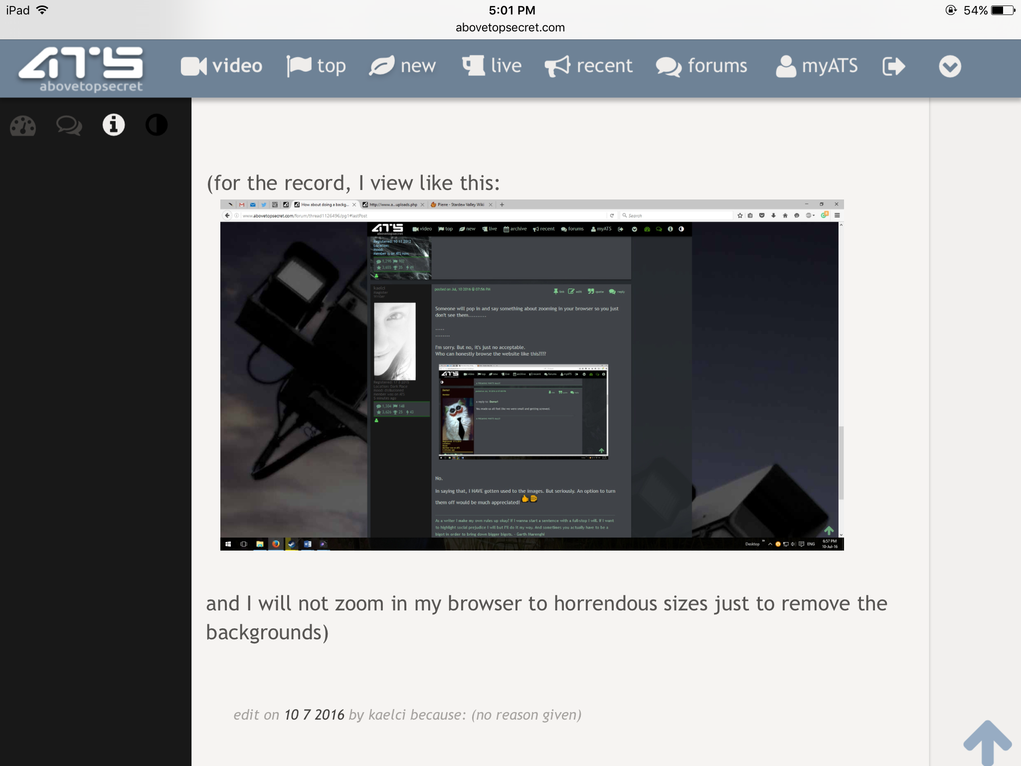
Here...
ATS looks like crap. Stop it. It looks like you're trying to sabotage the site.
The background stuff is terrible, it's universally hated.
Good job dicking with the site and not saying anything during these troubling times.
ATS is embarrassing. Nothing about the shootings of police that I've seen. Changing a crap background is just sad.
I just wish there where a option to turn the background solid black.. its better for my sensitive eyes.
Or just a option to remove the background and make ATS fit the whole screen.
Or just a option to remove the background and make ATS fit the whole screen.
nevermind.
Screenshotception.
screeeeeeenshotception
An option to turn background images on and off.
K. Thx.
Screenshotception.
screeeeeeenshotception
An option to turn background images on and off.
K. Thx.
edit on 10 7 2016 by kaelci because: meh.
a reply to: Chadwickus
Crazy.
Screenshotception.
Crazy.
Screenshotception.
edit on 10 7 2016 by kaelci because: (no reason given)
a reply to: Chadwickus
HA! You win! I thought it was going to take a few more pages.
AND I just realized I got too saucy.
HA! You win! I thought it was going to take a few more pages.
AND I just realized I got too saucy.
Well this is just my opinion, but some people who used to use this site more often (hint hint) kind of stopped due to feature bloat. First off, there
are so many options an not all of us have the time or inclination to figure out what all the links and icons mean or do, or how to turn on and off
things. For example, it's become so cartoonish-looking over the years that some people (hint hint) who might enjoy descreetly browsing this
informative content at a place of work don't feel comfortable doing so because the graphical overload screams: "I am wasting company time on some kind
of entertainmaint site!"
It would be really nice if there was a stripped-down "office-use-friendly and blandly unobtrusive" minimalist version of the ATS interface. For all I know there already is, but there are so many bells and whistles on this thing I don't know where it might be hidden if anywhere. Signal-noise ratio in terms of design has always been my biggest gripe about ATS. The content and moderation remains great as always.
It would be really nice if there was a stripped-down "office-use-friendly and blandly unobtrusive" minimalist version of the ATS interface. For all I know there already is, but there are so many bells and whistles on this thing I don't know where it might be hidden if anywhere. Signal-noise ratio in terms of design has always been my biggest gripe about ATS. The content and moderation remains great as always.
I'm glad I'm not the only one who thinks it's time for something a little more refined.
I offered ATS use of some of my abstract artwork for use as backgrounds some years ago but it seems they still want the conspiracy theme pics.
I find the current ones a little tiresome and bland in colour. I understand the need for low res as they are just backgrounds, but come on.....get a little more creative chaps.
The offer still stands to use my fractal artworks like these and I'm sure they'd work great in low res:


etc
I offered ATS use of some of my abstract artwork for use as backgrounds some years ago but it seems they still want the conspiracy theme pics.
I find the current ones a little tiresome and bland in colour. I understand the need for low res as they are just backgrounds, but come on.....get a little more creative chaps.
The offer still stands to use my fractal artworks like these and I'm sure they'd work great in low res:
etc
I rarely see the background image as I rarely have the browser window maximized.
Just an option to turn it off in account settings would do imo, just like avatars. Whatever background image they choose or let someone else choose will be boring to see after a few times, just like avatars.
Just an option to turn it off in account settings would do imo, just like avatars. Whatever background image they choose or let someone else choose will be boring to see after a few times, just like avatars.
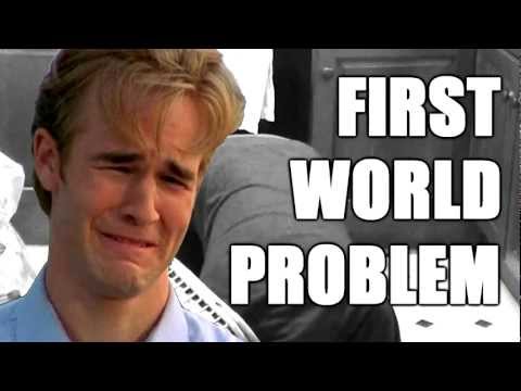
I can't stand the 911 image, it is upsetting and every time it comes up it frustrates me it is even there as a constant visual reminder.
It is not perse a first world problem of course, I'm sure the people from the second or third world will be happy with whatever setting can bring down
their use of bandwidth.
a reply to: zazzafrazz
I have one right now. I have lived within 50 miles of NYC my whole life, I don't need that
I have one right now. I have lived within 50 miles of NYC my whole life, I don't need that
new topics
-
University student disciplined after saying veganism is wrong and gender fluidity is stupid
Education and Media: 2 minutes ago -
Geddy Lee in Conversation with Alex Lifeson - My Effin’ Life
People: 1 hours ago -
God lived as a Devil Dog.
Short Stories: 1 hours ago -
Happy St George's day you bigots!
Breaking Alternative News: 2 hours ago -
TLDR post about ATS and why I love it and hope we all stay together somewhere
General Chit Chat: 3 hours ago -
Hate makes for strange bedfellows
US Political Madness: 5 hours ago -
Who guards the guards
US Political Madness: 8 hours ago -
Has Tesla manipulated data logs to cover up auto pilot crash?
Automotive Discussion: 10 hours ago
top topics
-
Hate makes for strange bedfellows
US Political Madness: 5 hours ago, 14 flags -
whistleblower Captain Bill Uhouse on the Kingman UFO recovery
Aliens and UFOs: 15 hours ago, 11 flags -
Who guards the guards
US Political Madness: 8 hours ago, 10 flags -
1980s Arcade
General Chit Chat: 17 hours ago, 7 flags -
TLDR post about ATS and why I love it and hope we all stay together somewhere
General Chit Chat: 3 hours ago, 4 flags -
Happy St George's day you bigots!
Breaking Alternative News: 2 hours ago, 3 flags -
Has Tesla manipulated data logs to cover up auto pilot crash?
Automotive Discussion: 10 hours ago, 2 flags -
Geddy Lee in Conversation with Alex Lifeson - My Effin’ Life
People: 1 hours ago, 2 flags -
God lived as a Devil Dog.
Short Stories: 1 hours ago, 1 flags -
University student disciplined after saying veganism is wrong and gender fluidity is stupid
Education and Media: 2 minutes ago, 0 flags
active topics
-
University student disciplined after saying veganism is wrong and gender fluidity is stupid
Education and Media • 0 • : Consvoli -
-@TH3WH17ERABB17- -Q- ---TIME TO SHOW THE WORLD--- -Part- --44--
Dissecting Disinformation • 624 • : daskakik -
Happy St George's day you bigots!
Breaking Alternative News • 24 • : BedevereTheWise -
OUT OF THE BLUE Chilling moment pulsating blue cigar-shaped UFO is filmed hovering over PHX AZ
Aliens and UFOs • 46 • : burritocat -
Geddy Lee in Conversation with Alex Lifeson - My Effin’ Life
People • 2 • : DAVID64 -
"We're All Hamas" Heard at Columbia University Protests
Social Issues and Civil Unrest • 246 • : KrustyKrab -
Candidate TRUMP Now Has Crazy Judge JUAN MERCHAN After Him - The Stormy Daniels Hush-Money Case.
Political Conspiracies • 729 • : Oldcarpy2 -
British TV Presenter Refuses To Use Guest's Preferred Pronouns
Education and Media • 117 • : FlyersFan -
Remember These Attacks When President Trump 2.0 Retribution-Justice Commences.
2024 Elections • 43 • : Degradation33 -
Michael Avenatti Says He Will Testify FOR Trump
US Political Madness • 62 • : WeMustCare