It looks like you're using an Ad Blocker.
Please white-list or disable AboveTopSecret.com in your ad-blocking tool.
Thank you.
Some features of ATS will be disabled while you continue to use an ad-blocker.

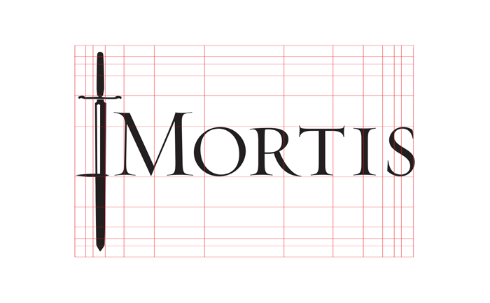
Failed Wordmarks, Logotypes and letters.
page: 111
share:
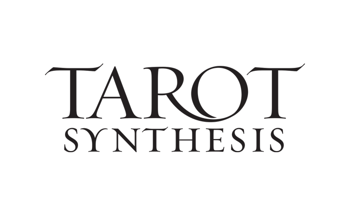
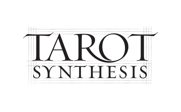
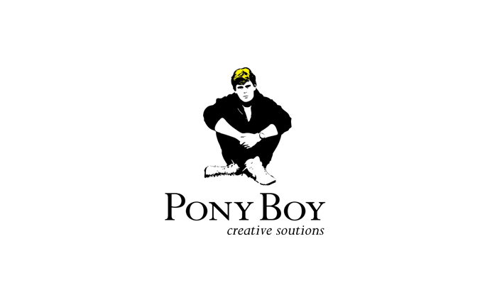
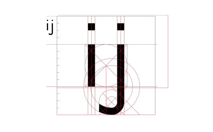
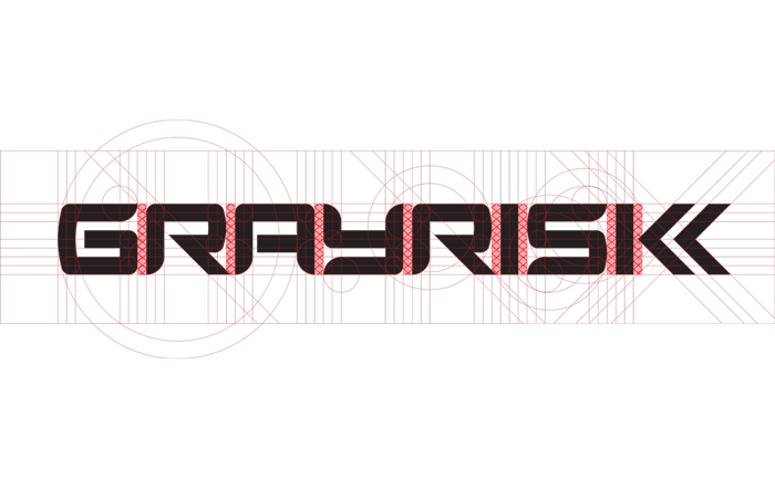
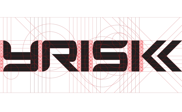
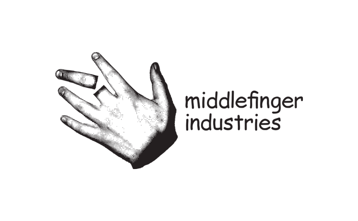
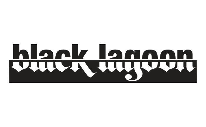
These are some concepts that I've created for a whole medley of small-business logos and some fonts: snowboard startups, metal bands, security firms,
construction, non-profits, apparel, ice cream, designers, photographers, bakeries and even a book on murderers. None of them have been used, and
consequently, none of them will see the light of day.
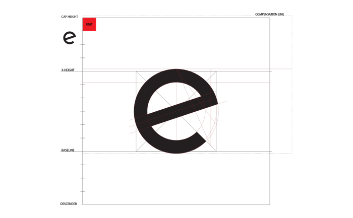
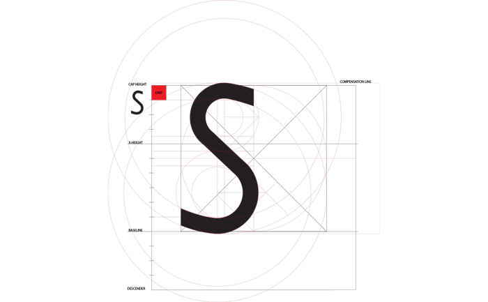
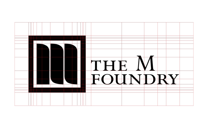
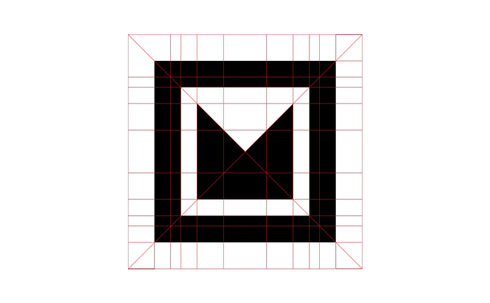
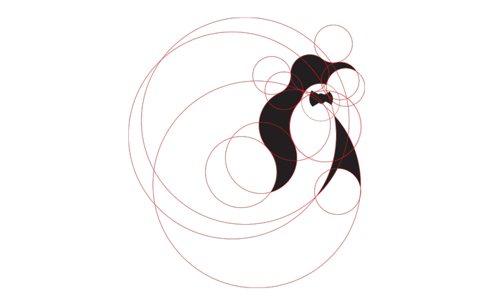
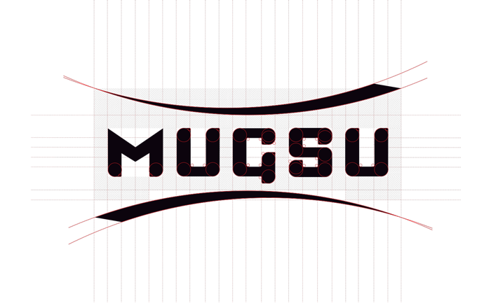
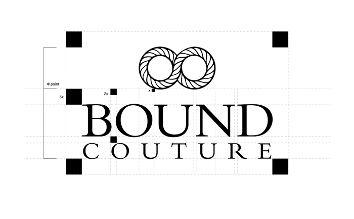
However, despite their relative ubiquity and the annoyance of branding, I wished to detail some of the process that goes into some of this work. Whether for mystical, scientific or purely aesthetic reasons, I build the elements of the word-mark on a gird based on phi proportions, in the hope that it might help the end design and feel. I'm still unsure that this process offers anything to the finished concept, but it has become a habit. And in the end, I find the grids to be quite beautiful in themselves, so I've added them in case someone gets a kick out of it.
Much of this is drawn by hand and reconstructed digitally. I had the lucky chance to study under the great Doyald Young before he passed. He's an inspirational man so I've added a great video of him at the end in case anyone is interested in lettering and typography.
Excuse the rendering and artifacts. I didn't have time to compensate for all of the file types and cmyk/spot colors.
edit on 24-12-2013 by Aphorism because: (no reason given)
Awesome work! You have a really good eye and the ratio concept is really working.
I used to do a lot of logos and lettering when I worked in the offset printing trade before I wandered off to other things. I could never quite get that clean feel your work has, very pleasing effect on the eye.
Thank you so much for sharing, I hope you go far with this talent!
I used to do a lot of logos and lettering when I worked in the offset printing trade before I wandered off to other things. I could never quite get that clean feel your work has, very pleasing effect on the eye.
Thank you so much for sharing, I hope you go far with this talent!
Very inspirational! Five stars, three cheers and two thumbs up!

I feel like I am back in drafting class. Awesome stuff.
I feel like I am back in drafting class. Awesome stuff.
new topics
-
WF Killer Patents & Secret Science Vol. 1 | Free Energy & Anti-Gravity Cover-Ups
General Conspiracies: 58 minutes ago -
Hurt my hip; should I go see a Doctor
General Chit Chat: 1 hours ago -
Israel attacking Iran again.
Middle East Issues: 2 hours ago -
Michigan school district cancels lesson on gender identity and pronouns after backlash
Education and Media: 3 hours ago -
When an Angel gets his or her wings
Religion, Faith, And Theology: 3 hours ago -
Comparing the theology of Paul and Hebrews
Religion, Faith, And Theology: 4 hours ago -
Pentagon acknowledges secret UFO project, the Kona Blue program | Vargas Reports
Aliens and UFOs: 5 hours ago -
Boston Dynamics say Farewell to Atlas
Science & Technology: 5 hours ago -
I hate dreaming
Rant: 6 hours ago -
Man sets himself on fire outside Donald Trump trial
Mainstream News: 8 hours ago
top topics
-
The Democrats Take Control the House - Look what happened while you were sleeping
US Political Madness: 9 hours ago, 18 flags -
In an Historic First, In N Out Burger Permanently Closes a Location
Mainstream News: 11 hours ago, 16 flags -
A man of the people
Medical Issues & Conspiracies: 16 hours ago, 11 flags -
Biden says little kids flip him the bird all the time.
Politicians & People: 8 hours ago, 9 flags -
Man sets himself on fire outside Donald Trump trial
Mainstream News: 8 hours ago, 8 flags -
Pentagon acknowledges secret UFO project, the Kona Blue program | Vargas Reports
Aliens and UFOs: 5 hours ago, 6 flags -
Israel attacking Iran again.
Middle East Issues: 2 hours ago, 5 flags -
Michigan school district cancels lesson on gender identity and pronouns after backlash
Education and Media: 3 hours ago, 5 flags -
Boston Dynamics say Farewell to Atlas
Science & Technology: 5 hours ago, 4 flags -
WF Killer Patents & Secret Science Vol. 1 | Free Energy & Anti-Gravity Cover-Ups
General Conspiracies: 58 minutes ago, 3 flags
11