It looks like you're using an Ad Blocker.
Please white-list or disable AboveTopSecret.com in your ad-blocking tool.
Thank you.
Some features of ATS will be disabled while you continue to use an ad-blocker.

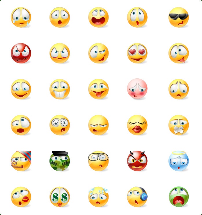
Ugly Smilies
page: 2share:
reply to post by adjensen
Omg I've never noticed... the white version of ATS is horrid so I never go there...
The Orange is repulsive... green is not much better though
Omg I've never noticed... the white version of ATS is horrid so I never go there...
The Orange is repulsive... green is not much better though
reply to post by Akragon
I think "Light Mode" is something that you have to get used to, not "learn to like", lol.
But I think that the orange emoticons are slightly better because there is a bit of a gradient in the middle of them that gives them a little pseudo-relief, while the green ones are pretty much straight fluorescent green.
reply to post by Hellas
You don't have to use them. I pretty much only used emoticons to let some one know I was joking, or occasionally mad. I'm boycotting the new ones as well and have been since they came out.
I asked one of the members about two weeks ago were he and his cohorts stood on the new emoticon format, but I think that they have been told to stop or they just gave up.
I can't give ya a star on this forum, but I can give ya a thumbs up.
reply to post by Klassified
icons-search.com...
you can download any of these... there are lots and lots on this site! They even have halloween smileys in png format for download...
icons-search.com...
you can download any of these... there are lots and lots on this site! They even have halloween smileys in png format for download...
edit on 22-10-2013 by OpinionatedB because: (no reason given)
reply to post by OpinionatedB
Cool! Maybe SO will see these, and check them out. Looks like some good ones on there.
I took a look, but there's still a lot missing that we all use.
Cool! Maybe SO will see these, and check them out. Looks like some good ones on there.
I took a look, but there's still a lot missing that we all use.
edit on 10/22/2013 by Klassified because: (no reason given)
reply to post by OpinionatedB
I'm wondering if these are going to be free for ATS to use as it's own standard set. But even if not, we could upload them to our folder, and use them that way if need be. If you can find a good set, it would be great. We can put the links to them in the emoticon thread, and maybe SO's "SOS thread". *thumbsup*
I'm wondering if these are going to be free for ATS to use as it's own standard set. But even if not, we could upload them to our folder, and use them that way if need be. If you can find a good set, it would be great. We can put the links to them in the emoticon thread, and maybe SO's "SOS thread". *thumbsup*
reply to post by adjensen
Just checked out the light mode.
It's so bright!
Smilies are still goofy looking
Just checked out the light mode.
It's so bright!
Smilies are still goofy looking
reply to post by OpinionatedB
The reason the old smileys went was to preserve bandwith ( I'm pretty sure SO said that was the reason)
These smileys are a font I think.
Although they be ugly as hell. Atleast i'm glad the icon with the gun went out.
The reason the old smileys went was to preserve bandwith ( I'm pretty sure SO said that was the reason)
These smileys are a font I think.
Although they be ugly as hell. Atleast i'm glad the icon with the gun went out.


Theses things are HORRID!!!!!!!! lmao!
They all look grumpy or psychotic, they do more harm then good!
I sure hope they change them soon, worst in existence!
I LOVE the rest of the site though! lol
They all look grumpy or psychotic, they do more harm then good!
I sure hope they change them soon, worst in existence!
I LOVE the rest of the site though! lol
Hellas
I think you guys really put some thought in your new and clean skin for this forum. It's very nice so thumbs up!
But what is up with those ugly smilies/emoticons..?? They don't even fit the whole design!! If I've missed anything regarding those smilies, I'm sorry, but I hope they're not going to look like this from now onedit on 22-10-2013 by Hellas because: (no reason given)
I THOROUGHLY AGREE.
However, since I rarely use smilies . . . I decided it wasn't really a great concern of mine.
However, I find the lot of them quite displeasureable.
The happy to neutral ones are tolerable . . . sort of.
I liked the blue simpler ones that everyone else ranted against. LOL.
There must be better options . . . at least the colored portion now seems in sync with the line drawing portion. LOL.
new topics
-
Electrical tricks for saving money
Education and Media: 31 minutes ago -
VP's Secret Service agent brawls with other agents at Andrews
Mainstream News: 1 hours ago -
Sunak spinning the sickness figures
Other Current Events: 2 hours ago -
Nearly 70% Of Americans Want Talks To End War In Ukraine
Political Issues: 2 hours ago -
Late Night with the Devil - a really good unusual modern horror film.
Movies: 4 hours ago -
Cats Used as Live Bait to Train Ferocious Pitbulls in Illegal NYC Dogfighting
Social Issues and Civil Unrest: 5 hours ago -
The Good News According to Jesus - Episode 1
Religion, Faith, And Theology: 7 hours ago -
HORRIBLE !! Russian Soldier Drinking Own Urine To Survive In Battle
World War Three: 9 hours ago
top topics
-
SETI chief says US has no evidence for alien technology. 'And we never have'
Aliens and UFOs: 16 hours ago, 8 flags -
Cats Used as Live Bait to Train Ferocious Pitbulls in Illegal NYC Dogfighting
Social Issues and Civil Unrest: 5 hours ago, 8 flags -
Florida man's trip overseas ends in shock over $143,000 T-Mobile phone bill
Social Issues and Civil Unrest: 12 hours ago, 8 flags -
VP's Secret Service agent brawls with other agents at Andrews
Mainstream News: 1 hours ago, 6 flags -
Former Labour minister Frank Field dies aged 81
People: 15 hours ago, 4 flags -
Bobiverse
Fantasy & Science Fiction: 12 hours ago, 3 flags -
HORRIBLE !! Russian Soldier Drinking Own Urine To Survive In Battle
World War Three: 9 hours ago, 3 flags -
Nearly 70% Of Americans Want Talks To End War In Ukraine
Political Issues: 2 hours ago, 3 flags -
Sunak spinning the sickness figures
Other Current Events: 2 hours ago, 3 flags -
Late Night with the Devil - a really good unusual modern horror film.
Movies: 4 hours ago, 2 flags
active topics
-
VP's Secret Service agent brawls with other agents at Andrews
Mainstream News • 16 • : matafuchs -
Should Biden Replace Harris With AOC On the 2024 Democrat Ticket?
2024 Elections • 49 • : Therealbeverage -
WF Killer Patents & Secret Science Vol. 1 | Free Energy & Anti-Gravity Cover-Ups
General Conspiracies • 32 • : Arbitrageur -
Is there a hole at the North Pole?
ATS Skunk Works • 38 • : Therealbeverage -
Cats Used as Live Bait to Train Ferocious Pitbulls in Illegal NYC Dogfighting
Social Issues and Civil Unrest • 11 • : charlyv -
SETI chief says US has no evidence for alien technology. 'And we never have'
Aliens and UFOs • 41 • : TheMisguidedAngel -
Naked Eye Supernova Erupting in the T Coronae Borealis
Space Exploration • 13 • : Therealbeverage -
The Real Reason Behind the Sean Combes Exposure
Political Conspiracies • 45 • : ThatSmellsStrange -
Electrical tricks for saving money
Education and Media • 0 • : annonentity -
Late Night with the Devil - a really good unusual modern horror film.
Movies • 4 • : DBCowboy