It looks like you're using an Ad Blocker.
Please white-list or disable AboveTopSecret.com in your ad-blocking tool.
Thank you.
Some features of ATS will be disabled while you continue to use an ad-blocker.

Finally settled on a cover
page: 13
share:
For those of you that contributed to my last post, I'd like to offer a massive thankyou. I just wanted to share that I have finally settled on a cover
design and, while I feel it could be tweaked a little further, I'm pretty dang happy with it, and was hoping to get more thoughts from you guys.
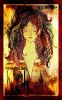
I've applied it to Kobo and Amazon digital copies thus far, and am waiting on the final design for the spine and back cover for the print copy. Look forward to your opinions.
If you're finding it hard to read the title, the series is "The Immortal Tales" and this title is "Kri".
S. J. Vellenga
ETA: Oh, also, thumbnail, so click it for the full view.
edit on 8/10/13 by Scaleru because: (no reason given)
reply to post by Scaleru
Interesting image visually. I haven't a clue what it's trying to say to support the book being unaware of the book itself. That said, my only niggle with the image is the top right text is melding with darkness rendering it unreadable. A little selection of the text, on its layer combined with a selection feather and upping the levels in the area could make it happen IMHO.
Interesting image visually. I haven't a clue what it's trying to say to support the book being unaware of the book itself. That said, my only niggle with the image is the top right text is melding with darkness rendering it unreadable. A little selection of the text, on its layer combined with a selection feather and upping the levels in the area could make it happen IMHO.
minkmouse
reply to post by Scaleru
Interesting image visually. I haven't a clue what it's trying to say to support the book being unaware of the book itself. That said, my only niggle with the image is the top right text is melding with darkness rendering it unreadable. A little selection of the text, on its layer combined with a selection feather and upping the levels in the area could make it happen IMHO.
Agreed. It's unreadable.
You could always stick the S.J. to the of the left of building at bottom, and last name to the right of it.
You could also place say, red or flame colored lettering behind the letters and then place the black lettering on top so it's readable.
edit on
8-10-2013 by OrphanApology because: d
I agree entirely with the text being difficult to read. I've been considering applying a soft outer glow to the text to separate it slightly, just
enough to differentiate it.
reply to post by Scaleru
I think it looks great and had no trouble reading anything but your name though I agree it would be better if the words 'popped' a bit more. Glad you chose this cover over the others. I would actually pick that book up and I'm not trying to be nice. I think you can easily get the desired effect with a few tweaks. I bet someone here could help you if you're not great at editing. Perhaps try the avatar creations thread?
I think it looks great and had no trouble reading anything but your name though I agree it would be better if the words 'popped' a bit more. Glad you chose this cover over the others. I would actually pick that book up and I'm not trying to be nice. I think you can easily get the desired effect with a few tweaks. I bet someone here could help you if you're not great at editing. Perhaps try the avatar creations thread?
reply to post by Scaleru
You might try doing lettering like this. Basically you write the name in whatever font you choose then overlay it with black but slightly smaller in size. It makes it pop but still look like it's black.
This was one cover I worked on.

You might try doing lettering like this. Basically you write the name in whatever font you choose then overlay it with black but slightly smaller in size. It makes it pop but still look like it's black.
This was one cover I worked on.
I mainly use pixlr for editing (a great, web based editor if you've never used it) but I've had an artist do the work thus far. Just waiting for
them to get back to me with the original layered image so I can do some tweaking. I really hope it doesn't take much, as I don't want to be too
invasive with the edits.
Overlaying text is one way, but have you tried outer glows? If you set the hardness to 100%, you achieve a similar affect to what you've made, but it surrounds the text entirely rather than highlighting one side.
Overlaying text is one way, but have you tried outer glows? If you set the hardness to 100%, you achieve a similar affect to what you've made, but it surrounds the text entirely rather than highlighting one side.
reply to post by Domo1
I must say I'm touched! I've had a flood of great feedback so far, and the credit has to go to my cousin who designed the cover from scratch. Kudos to her!
I must say I'm touched! I've had a flood of great feedback so far, and the credit has to go to my cousin who designed the cover from scratch. Kudos to her!
Scaleru
I mainly use pixlr for editing (a great, web based editor if you've never used it) but I've had an artist do the work thus far. Just waiting for them to get back to me with the original layered image so I can do some tweaking. I really hope it doesn't take much, as I don't want to be too invasive with the edits.
Overlaying text is one way, but have you tried outer glows? If you set the hardness to 100%, you achieve a similar affect to what you've made, but it surrounds the text entirely rather than highlighting one side.
I've never done an full outer glow because it didn't fit the genre. This one is science fiction and the shadow/3D look worked better. Kind of gives off that 1980's science fiction feel. Maybe that's just me.
I will try that technique though if I ever run across something maybe in the fantasy genre.
reply to post by Scaleru
Kudos indeed!
I would try this.
Move the townscape further right, have the hill with the tower slope more drastically to the left. I mean move that tower so that maybe you can still see the trees on it's right. Then move it up a bit to fill the space. Like the tip of the tower is a bit to the right of the lowest lock of hair, and a teensy bit higher.
Put the flames behind the tower, not too high, but like everything BEHIND it is burning.
That should open up space behind 'KRI' to add more yellow.
Love the font, but there needs to be more separation between 'The Immortal Tales' and 'Kri'. Don't shrink it too much ('Kri'), just enough there is more than a gnat's hair between.
The tower and the Straight part of the K in 'Kri' should be equal distance from the border. Perhaps the tower doesn't need to be as far to the edge as the long side of the 'K', but close.
Basically if the lettering is one layer, move the background layer (town) up and to the right, redo the flames a tad lower and behind the tower, then you can fill behind 'Kri' with that same cool yellow you have behind the figure in the middle.
I would also change the color on the right, I feel like there is too much yellow in that pillar (pillar of yellow) between the figure and the edge. Gives you an opportunity to add some darker color towards the middle/bottom of that pillar, and have the area behind your name that nice contrasting yellow so it's more readable.
I am just awful at this. I hope you can see what I'm seeing. I spent WAY too long trying to type this out and staring at the cover.
I really want to help because I think this is a neat project and I want you to kick some ass! Feel free to U2U me though clearly I'm not great at expressing what I see.
Best of luck.
new topics
-
Electrical tricks for saving money
Education and Media: 39 minutes ago -
VP's Secret Service agent brawls with other agents at Andrews
Mainstream News: 1 hours ago -
Sunak spinning the sickness figures
Other Current Events: 2 hours ago -
Nearly 70% Of Americans Want Talks To End War In Ukraine
Political Issues: 2 hours ago -
Late Night with the Devil - a really good unusual modern horror film.
Movies: 4 hours ago -
Cats Used as Live Bait to Train Ferocious Pitbulls in Illegal NYC Dogfighting
Social Issues and Civil Unrest: 6 hours ago -
The Good News According to Jesus - Episode 1
Religion, Faith, And Theology: 7 hours ago -
HORRIBLE !! Russian Soldier Drinking Own Urine To Survive In Battle
World War Three: 10 hours ago
top topics
-
SETI chief says US has no evidence for alien technology. 'And we never have'
Aliens and UFOs: 16 hours ago, 8 flags -
Cats Used as Live Bait to Train Ferocious Pitbulls in Illegal NYC Dogfighting
Social Issues and Civil Unrest: 6 hours ago, 8 flags -
Florida man's trip overseas ends in shock over $143,000 T-Mobile phone bill
Social Issues and Civil Unrest: 12 hours ago, 8 flags -
VP's Secret Service agent brawls with other agents at Andrews
Mainstream News: 1 hours ago, 6 flags -
Former Labour minister Frank Field dies aged 81
People: 15 hours ago, 4 flags -
Bobiverse
Fantasy & Science Fiction: 12 hours ago, 3 flags -
HORRIBLE !! Russian Soldier Drinking Own Urine To Survive In Battle
World War Three: 10 hours ago, 3 flags -
Nearly 70% Of Americans Want Talks To End War In Ukraine
Political Issues: 2 hours ago, 3 flags -
Sunak spinning the sickness figures
Other Current Events: 2 hours ago, 3 flags -
Late Night with the Devil - a really good unusual modern horror film.
Movies: 4 hours ago, 2 flags
active topics
-
Cats Used as Live Bait to Train Ferocious Pitbulls in Illegal NYC Dogfighting
Social Issues and Civil Unrest • 12 • : Hakaiju -
HORRIBLE !! Russian Soldier Drinking Own Urine To Survive In Battle
World War Three • 28 • : budzprime69 -
Huge ancient city found in the Amazon.
Ancient & Lost Civilizations • 61 • : Therealbeverage -
The Reality of the Laser
Military Projects • 43 • : 5thHead -
VP's Secret Service agent brawls with other agents at Andrews
Mainstream News • 16 • : matafuchs -
Should Biden Replace Harris With AOC On the 2024 Democrat Ticket?
2024 Elections • 49 • : Therealbeverage -
WF Killer Patents & Secret Science Vol. 1 | Free Energy & Anti-Gravity Cover-Ups
General Conspiracies • 32 • : Arbitrageur -
Is there a hole at the North Pole?
ATS Skunk Works • 38 • : Therealbeverage -
SETI chief says US has no evidence for alien technology. 'And we never have'
Aliens and UFOs • 41 • : TheMisguidedAngel -
Naked Eye Supernova Erupting in the T Coronae Borealis
Space Exploration • 13 • : Therealbeverage
3