It looks like you're using an Ad Blocker.
Please white-list or disable AboveTopSecret.com in your ad-blocking tool.
Thank you.
Some features of ATS will be disabled while you continue to use an ad-blocker.

ATS.5/3 has two core color modes -- light/dark -- there can be more
page: 1share:
Now that the new site is live, and functioning well (for the most part), I want to open things up to give members some input on alternative color
schemes.
We have one project devoted to new emoticons/smilies, if there are members who are capable with CSS3, we can have another for alternative color schemes.
The new scheme must be compatible with our color switching. If there are a few who want to take this on, discuss it here and I'll give detains on how to get it done.
I sit in a very dark room watching ATS... So I would prefer BLACK background and dark grey foreground and grey text.. Same as the "dark" version
already there, just MORE blackness for my eyes sake.
you should call it "Black Night"
you should call it "Black Night"
spacespider
I sit in a very dark room watching ATS... So I would prefer BLACK background and dark grey foreground and grey text.. Same as the "dark" version already there, just MORE blackness for my eyes sake.
you should call it "Black Night"
I second that.
Something very similar to the previous themes level of darkness.
On a side note, why is the new RED so pink looking in my signature?
edit on 9-9-2013 by ShadowLink because: (no reason
given)
I like the new style generally but the text tones are straining my eyes a bit.
Not sure how I can help, apart from my input, but if I can would be glad to, I know a lot of work is being put in on the new design and it is appreciated.
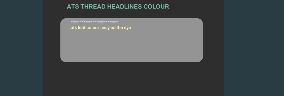
For me, the lime green needs toning down, the light blue colour works well, also the main text in threads seems a bit blurred, perhaps the tonal contrast in the greys of the various borders would sort it and give more definition to the text whilst keeping it easy on the eye.
Not sure how I can help, apart from my input, but if I can would be glad to, I know a lot of work is being put in on the new design and it is appreciated.
For me, the lime green needs toning down, the light blue colour works well, also the main text in threads seems a bit blurred, perhaps the tonal contrast in the greys of the various borders would sort it and give more definition to the text whilst keeping it easy on the eye.
reply to post by SkepticOverlord
I knocked one up quickly using the dev tools built into chrome to get the ball rolling, based on the os x colours and added a bit of opacity to the flag bar
I knocked one up quickly using the dev tools built into chrome to get the ball rolling, based on the os x colours and added a bit of opacity to the flag bar
reply to post by davespanners
I like that too, apart from the white text box being too bright. How do you do that on Chrome?
I like muted colours for reading, something like these
I like that too, apart from the white text box being too bright. How do you do that on Chrome?
I like muted colours for reading, something like these
Is there a way we can get a skin that looks less like a kids site? The text and the icon etc make me want to pull out my crayons. Could we get
something a little more professional as a skin?
I am okay with the new functionality, but I can't get over the childish look.
I am okay with the new functionality, but I can't get over the childish look.
reply to post by theabsolutetruth
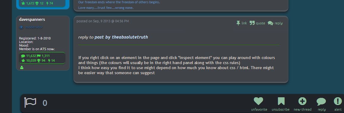
If you right click on an element in the page and click "inspect element" you can play around with colours and things (the colours will usually be in the right hand panel along with the css rules)
I think how easy you find it to use might depend on how much you know about css / html. There might be easier way that someone can suggest
reply to post by davespanners
I can only get it to alter the background colour, it wouldn't alter the text or other colours.
I can only get it to alter the background colour, it wouldn't alter the text or other colours.
edit on 9-9-2013 by theabsolutetruth because: (no reason given)
The skill needed for this is beyond my realm.....but i would be happy to second (or third, etc) the vote for the "Black Night" theme.
Just messing with Chrome, this is what I came up with for coloring:

I darkened the background, message text, message box and the greenery a bit and changed the stats text to a lighter color.
As an aside, I pray to God that someone comes up with acceptable emoticons.
I darkened the background, message text, message box and the greenery a bit and changed the stats text to a lighter color.
As an aside, I pray to God that someone comes up with acceptable emoticons.
reply to post by SkepticOverlord
YEA! HALLELUJAH!
Personally, I'd love to be able to have a dark Navy background. It's far more pleasant, calming and soothing to me. And there's plenty of need for calming and soothing in our era.
It seems to me that there OUGHT to be a workable way to have a range of color tones and values ascribed, assigned to each color background that would kick in when that background was chosen and would automatically switch for users who chose other backgrounds.
I don't know that there'd be a need to have more than a few to several backgrounds . . . but whatever's manageable would be fine with me.
--Dark Grey as now or perhaps somewhat darker.
--Dark Navy
--The new off-white
--perhaps a Dark Green
--perhaps a Dark Brown.
--perhaps a light blue as an alternate to the off-white
--perhaps a light green as an alternate to the off-white
= = = = =
In terms of text . . . I personally have an almost need for a range of text colors from subdued emphases to bright emphases. Most of the time, I'm happy with the light blue that is 6699FF (in my mini-profile) though I realize that on the grey, the contrast is not adequate for some readers. I think it would be against the dark Navy background.
It would be constructive and helpful to have a variety of reasonably high contrast colors for the dark Navy and dark grey backgrounds that were not so high in color intensity as to be garish, and "screaming."
Occasionally a !RED! and other very bright colors ARE very useful for intense emphasis--when warranted.
The LimeGreen is OK and I've gotten used to it though initially it was a bit bright and garish for my taste.
It would be good to have a bright blue, a bright green like the LimeGreen and . . . I guess a bright red, yellow and maybe a rust. The bright Beige is OK but not my personal preference.
I don't know that any other backgrounds would be needed or that popular.
I guess that's about the summary of my input and thoughts on the color stuff.
BTW, is there any mod that could help me revise the TOM CAREY COMPILATION thread to standardize the colors and collect only the answered questions with their answers at the top of the thread? I understand it was not kosher to start a new thread to try and do that but I think it's still worth doing.
I don't have the time or energy to do that and the new one with Mr Swann.
Thanks for all you do for all of us.
Congrats on pulling off the switcheroo in the middle of Swann's AMA without any significant glitch that I observed.
That was one of the most impressive things I've observed in the years since 1976 that I've had a terminal or computer in my home. Very very impressive. Congrats.
.
edit on 9/9/2013 by BO XIAN because: addition left out intended name
reply to post by SkepticOverlord
I like and don't like, for example when you are looking at new post you have to scroll to see what is out there, I like seeing them like before, don't have a lot of time to be scrolling.
DO like the forms when they are opened so you can read what is going on.
I like and don't like, for example when you are looking at new post you have to scroll to see what is out there, I like seeing them like before, don't have a lot of time to be scrolling.
DO like the forms when they are opened so you can read what is going on.
I think a lot of people would be more attuned to the white/light version if it was not so glarey. As monitors continue to get brighter this is a real
problem.
Changing the white to a pastel in blue color ie a light blue, is much better. It is a simple change that can make all the difference.
I wonder if a personal preference could be stored for each user giving background color / text color in account settings. This would be the best solution because it gives the user a choice.
The problem is that some users (such as myself) have vision problems and having choices is the best way to assist us. I have no idea how this site is coded, but I cannot imagine that this would be particularly difficult.
One size never fits all! I am an individual, and I very much like the respect given when people treat me as such.
As an aside, the first two emoticons I understand, the rest are just bloody confusing. I liked the old ones much better.
P
edit on 9/9/2013 by pheonix358 because: (no reason given)
edit on 9/9/2013 by pheonix358 because: boo boo
I think that you put many points very well.
I hope they are given due consideration by the staff.
Congrats.
I hope they are given due consideration by the staff.
Congrats.
pheonix358
I think a lot of people would be more attuned to the white/light version if it was not so glarey. As monitors continue to get brighter this is a real problem.
Changing the white to a pastel in blue color ie a light blue, is much better. It is a simple change that can make all the difference.
I wonder if a personal preference could be stored for each user giving background color / text color in account settings. This would be the best solution because it gives the user a choice.
The problem is that some users (such as myself) have vision problems and having choices is the best way to assist us. I have no idea how this site is coded, but I cannot imagine that this would be particularly difficult.
One size never fits all! I am an individual, and I very much like the respect given when people treat me as such.
As an aside, the first two emoticons I understand, the rest are just bloody confusing. I liked the old ones much better.
Pedit on 9/9/2013 by pheonix358 because: (no reason given)edit on 9/9/2013 by pheonix358 because: boo boo
S.O., Please send me the info and I'll do my best to come up with an alternate theme. If there are theme patterns in the CSS (commonly linked areas
requiring the same values), it will be easier. In a previous life, I did this exact thing for a product of a former employer.
"Give me to tools, and I will finish the job...."
"Give me to tools, and I will finish the job...."
edit on 9/10/2013 by Krakatoa because: (no reason given)
reply to post by ProfessorChaos
I really, really like that! I keep most everything on my compute dark themed and THAT matches my Win color scheme and my Mint color schemes both perfectly.
Awesome!
I really, really like that! I keep most everything on my compute dark themed and THAT matches my Win color scheme and my Mint color schemes both perfectly.
Awesome!
Color switching option is great, font increase / decrease option would be nice too.. If needed I can make a css color theme, just need the files or i
can grab them directly
edit on 10-9-2013 by EV150 because: (no reason given)
new topics
-
Ditching physical money
History: 2 hours ago -
One Flame Throwing Robot Dog for Christmas Please!
Weaponry: 3 hours ago -
Don't take advantage of people just because it seems easy it will backfire
Rant: 3 hours ago -
VirginOfGrand says hello
Introductions: 4 hours ago -
Should Biden Replace Harris With AOC On the 2024 Democrat Ticket?
2024 Elections: 4 hours ago -
University student disciplined after saying veganism is wrong and gender fluidity is stupid
Education and Media: 7 hours ago -
Geddy Lee in Conversation with Alex Lifeson - My Effin’ Life
People: 8 hours ago -
God lived as a Devil Dog.
Short Stories: 8 hours ago -
Police clash with St George’s Day protesters at central London rally
Social Issues and Civil Unrest: 10 hours ago -
TLDR post about ATS and why I love it and hope we all stay together somewhere
General Chit Chat: 11 hours ago
top topics
-
Hate makes for strange bedfellows
US Political Madness: 13 hours ago, 20 flags -
Who guards the guards
US Political Madness: 16 hours ago, 13 flags -
University student disciplined after saying veganism is wrong and gender fluidity is stupid
Education and Media: 7 hours ago, 12 flags -
Police clash with St George’s Day protesters at central London rally
Social Issues and Civil Unrest: 10 hours ago, 9 flags -
TLDR post about ATS and why I love it and hope we all stay together somewhere
General Chit Chat: 11 hours ago, 7 flags -
Should Biden Replace Harris With AOC On the 2024 Democrat Ticket?
2024 Elections: 4 hours ago, 5 flags -
One Flame Throwing Robot Dog for Christmas Please!
Weaponry: 3 hours ago, 4 flags -
Has Tesla manipulated data logs to cover up auto pilot crash?
Automotive Discussion: 17 hours ago, 3 flags -
Don't take advantage of people just because it seems easy it will backfire
Rant: 3 hours ago, 3 flags -
Ditching physical money
History: 2 hours ago, 3 flags
active topics
-
I have accepted I will be single the rest of my days
Relationships • 118 • : seekshelter -
Should Biden Replace Harris With AOC On the 2024 Democrat Ticket?
2024 Elections • 39 • : WeMustCare -
British TV Presenter Refuses To Use Guest's Preferred Pronouns
Education and Media • 120 • : WakeUpBeer -
Remember These Attacks When President Trump 2.0 Retribution-Justice Commences.
2024 Elections • 49 • : WeMustCare -
-@TH3WH17ERABB17- -Q- ---TIME TO SHOW THE WORLD--- -Part- --44--
Dissecting Disinformation • 634 • : RookQueen2 -
Ditching physical money
History • 12 • : CataclysmicRockets -
Joe Biden Just Lost A Primary Election To A Man Nobody Heard Of Until A Minute Ago
2024 Elections • 18 • : WeMustCare -
Breaking Baltimore, ship brings down bridge, mass casualties
Other Current Events • 470 • : IndieA -
One Flame Throwing Robot Dog for Christmas Please!
Weaponry • 5 • : nugget1 -
Hate makes for strange bedfellows
US Political Madness • 37 • : YourFaceAgain