It looks like you're using an Ad Blocker.
Please white-list or disable AboveTopSecret.com in your ad-blocking tool.
Thank you.
Some features of ATS will be disabled while you continue to use an ad-blocker.

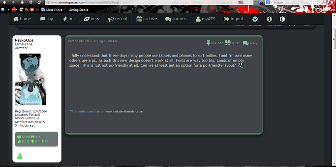
New design and pc-users.
page: 2share:
marg6043
but the new trend of adding all the "APPs"
Nothing like that has been added.
marg6043
reply to post by PsykoOps
but the new trend of adding all the "APPs" and links to what is for me useless site like Twitter, facebook and your tube among others is what gets to me. I do not subscribe to any, I don't even connect to the internet with my phone, that is what my Laptop is for.
Sorry to say that I will never, ever, belong to any social media is a matter of security issues, and that ATS is the only board I post when it comes to issues I care the most.
I agree with you the page lay out is too big, too bulky and is a lot of empty spaces in between.
But I still like changes and will never rob anybody from having their technical site enhanced.
Pretty much my issues as well
But I use PC
Riouz
reply to post by SkepticOverlord
It is way to big.
And a little question.
When did ats have a time traveling team and how can i join up

It is way to big.
And a little question.
When did ats have a time traveling team and how can i join up
reply to post by SkepticOverlord
I have the same issue which is why I was referring to the new look as appearing childish in another thread.

As PsykoOps pointed out, its much more noticeable on the new topics page.
Sorry. I do like the colors and whatnot, but the sizes of the text and icons is crappy and un-ATS like in my opinion.
I have the same issue which is why I was referring to the new look as appearing childish in another thread.
As PsykoOps pointed out, its much more noticeable on the new topics page.
Sorry. I do like the colors and whatnot, but the sizes of the text and icons is crappy and un-ATS like in my opinion.
edit on 5-9-2013 by
ShadowLink because: Ok, others have beat me to it, but now you have another source for an example.
I do not like the new design at all.
If it wasn't broken, why "fix" it?
The old design was far better and easy on the eye, whereas this actually hurts my eyes.
I also find it really hard to read things on here.
It's a big thumbs down from me!
If it wasn't broken, why "fix" it?
The old design was far better and easy on the eye, whereas this actually hurts my eyes.
I also find it really hard to read things on here.
It's a big thumbs down from me!
Hate this new design it is way to big,also how are we suppose to see if we have any messages,i see no message icon
cry93
What is my oddly calculated karma score?
I was wondering that too? What on earth could it be?
reply to post by MysticPearl
Is happening all over the internet, I play games from one particular site that I have been a member since 2007, just recently I was completely left over as a none media site member when the site decided to link everything to Facebook, in other words I can buy games, play them but use of the site pages is only limited to those that have memberships in facebook, even when I pay a monthly fee and non paying members of facebook even have the access I no longer have.
I am upset, you bet I am. Is like the internet has become under the social media control and very soon you can only be able to navigate if you are a member of one of those site, something I will never ever be.
LOL my karma must not be good i am only number 8,maybe it is to say people hate your post are threads,really don't know
Folks, we've been tossing out sneak-peaks for months, have been opening this up to members for about a couple months, and have had an open member
beta test for almost a full week.
Everyone got a U2U urging them to test the new site and provide commentary in this thread:
Open Member Testing: ATS.5/3 Final Release Candidate
If you didn't participate in an unprecedented open test and request for feedback, why are you doing so after launch?
Please stop starting new threads and use this one thread for your comments.
And for the purpose of communicating, yet again, the rationale behind the redesign, here is what was posted in the open test thread...
By now everyone should have received a private message with the username/password that enables access to the Final Release Candidate version of the new ATS.5/3.
This is the fourth round of user testing (first being staff-only, second being invited beta-testers, and third being an open-beta test to all members) and is intended to accomplish the following:
1) final testing of the site UX (user experience) on a wider variety of user scenarios
2) final refinement of of the color scheme of the two UI (user interface) options
3) establish an understanding of the new interface/structure for a less jarring cut-over
4) begin the offered opportunity for a member collaboration on new smilies
This open test is not intended as an opportunity to offer significant alterations to the UI/UX in any way. Months of work, preceded by months of research, and that preceded by months of analysis of existing "upgrades" to so-called discussion board frameworks (XenForo being the best of a lackluster bunch).
The Primary Goal
What you are testing is not "change for the sake of change." Two massively important factors have been the driving force behind such a significant re-think of what a discussion board platform should be.
1) While the number of in-bound new users (roughly 85% of all daily traffic) has remained relatively flat, the user-engagement (content/thread pages viewed) has been falling off for months.
2) Across the Internet, nearly all discussion boards are experiencing a very similar phenomena. The decline in engagement is seen everywhere, even in large long-established video game forums.
The reason, is relatively simple: the audience has changed. The percentage of people comfortable with the rigid/tight discussion board format is decreasing, while the percentage of people accustomed to the more open sensibilities of contemporary flat design is increasing. It's a clearly quantified (and has been) fact of life for online operators.
Our mandate at AboveTopSecret.com, for more than ten years, has been to create and maintain a venue that showcases the quality content created by our members. A big part of that mandate has been consistent attention to search engine optimization. Another big part has been the delicate balance of advertising to provide the revenue needed to support big traffic, our own advertising, and growth. But the biggest part of that balance has always been finding ways to push the boundaries of a discussion board platform so that new users have the best possible chance to discover your content.
Right now, discovery is falling. Action is needed.
So every decision from font-size to color to mobile responsiveness has been from the vantage point of "what best highlights the content." The content is first. The content is second. And the content is third.
I'm not saying your input isn't important
That's why this is the third time we've opened the development site up to members. But if we didn't place a high priority on ensuring your content is both discovered and lingered-over, all we'd be doing is talking amongst ourselves and no one would have encountered the long-list of content that you created, that became important on thousands of other websites and hundreds of news sources.
This IS for you.
this thread is closed.
reply to post by SkepticOverlord
I'm using Firefox. Test the site when logged out. There were also some flow issues when logging in and out such as messages displaying incorrectly. I don't normally log in when browsing the posts.
The argument is correct. Way to much wasted space. I would rather look through something similar to the live feeds to quickly find the latest and greatest.
Folks, we've been tossing out sneak-peaks for months, have been opening this up to members for about a couple months, and have had an open member
beta test for almost a full week.
Everyone got a U2U urging them to test the new site and provide commentary in this thread:
Open Member Testing: ATS.5/3 Final Release Candidate
If you didn't participate in an unprecedented open test and request for feedback, why are you doing so after launch?
Please stop starting new threads and use this one thread for your comments.
And for the purpose of communicating, yet again, the rationale behind the redesign, here is what was posted in the open test thread...
By now everyone should have received a private message with the username/password that enables access to the Final Release Candidate version of the new ATS.5/3.
This is the fourth round of user testing (first being staff-only, second being invited beta-testers, and third being an open-beta test to all members) and is intended to accomplish the following:
1) final testing of the site UX (user experience) on a wider variety of user scenarios
2) final refinement of of the color scheme of the two UI (user interface) options
3) establish an understanding of the new interface/structure for a less jarring cut-over
4) begin the offered opportunity for a member collaboration on new smilies
This open test is not intended as an opportunity to offer significant alterations to the UI/UX in any way. Months of work, preceded by months of research, and that preceded by months of analysis of existing "upgrades" to so-called discussion board frameworks (XenForo being the best of a lackluster bunch).
The Primary Goal
What you are testing is not "change for the sake of change." Two massively important factors have been the driving force behind such a significant re-think of what a discussion board platform should be.
1) While the number of in-bound new users (roughly 85% of all daily traffic) has remained relatively flat, the user-engagement (content/thread pages viewed) has been falling off for months.
2) Across the Internet, nearly all discussion boards are experiencing a very similar phenomena. The decline in engagement is seen everywhere, even in large long-established video game forums.
The reason, is relatively simple: the audience has changed. The percentage of people comfortable with the rigid/tight discussion board format is decreasing, while the percentage of people accustomed to the more open sensibilities of contemporary flat design is increasing. It's a clearly quantified (and has been) fact of life for online operators.
Our mandate at AboveTopSecret.com, for more than ten years, has been to create and maintain a venue that showcases the quality content created by our members. A big part of that mandate has been consistent attention to search engine optimization. Another big part has been the delicate balance of advertising to provide the revenue needed to support big traffic, our own advertising, and growth. But the biggest part of that balance has always been finding ways to push the boundaries of a discussion board platform so that new users have the best possible chance to discover your content.
Right now, discovery is falling. Action is needed.
So every decision from font-size to color to mobile responsiveness has been from the vantage point of "what best highlights the content." The content is first. The content is second. And the content is third.
I'm not saying your input isn't important
That's why this is the third time we've opened the development site up to members. But if we didn't place a high priority on ensuring your content is both discovered and lingered-over, all we'd be doing is talking amongst ourselves and no one would have encountered the long-list of content that you created, that became important on thousands of other websites and hundreds of news sources.
This IS for you.
this thread is closed.
Everyone got a U2U urging them to test the new site and provide commentary in this thread:
Open Member Testing: ATS.5/3 Final Release Candidate
If you didn't participate in an unprecedented open test and request for feedback, why are you doing so after launch?
Please stop starting new threads and use this one thread for your comments.
And for the purpose of communicating, yet again, the rationale behind the redesign, here is what was posted in the open test thread...
By now everyone should have received a private message with the username/password that enables access to the Final Release Candidate version of the new ATS.5/3.
This is the fourth round of user testing (first being staff-only, second being invited beta-testers, and third being an open-beta test to all members) and is intended to accomplish the following:
1) final testing of the site UX (user experience) on a wider variety of user scenarios
2) final refinement of of the color scheme of the two UI (user interface) options
3) establish an understanding of the new interface/structure for a less jarring cut-over
4) begin the offered opportunity for a member collaboration on new smilies
This open test is not intended as an opportunity to offer significant alterations to the UI/UX in any way. Months of work, preceded by months of research, and that preceded by months of analysis of existing "upgrades" to so-called discussion board frameworks (XenForo being the best of a lackluster bunch).
The Primary Goal
What you are testing is not "change for the sake of change." Two massively important factors have been the driving force behind such a significant re-think of what a discussion board platform should be.
1) While the number of in-bound new users (roughly 85% of all daily traffic) has remained relatively flat, the user-engagement (content/thread pages viewed) has been falling off for months.
2) Across the Internet, nearly all discussion boards are experiencing a very similar phenomena. The decline in engagement is seen everywhere, even in large long-established video game forums.
The reason, is relatively simple: the audience has changed. The percentage of people comfortable with the rigid/tight discussion board format is decreasing, while the percentage of people accustomed to the more open sensibilities of contemporary flat design is increasing. It's a clearly quantified (and has been) fact of life for online operators.
Our mandate at AboveTopSecret.com, for more than ten years, has been to create and maintain a venue that showcases the quality content created by our members. A big part of that mandate has been consistent attention to search engine optimization. Another big part has been the delicate balance of advertising to provide the revenue needed to support big traffic, our own advertising, and growth. But the biggest part of that balance has always been finding ways to push the boundaries of a discussion board platform so that new users have the best possible chance to discover your content.
Right now, discovery is falling. Action is needed.
So every decision from font-size to color to mobile responsiveness has been from the vantage point of "what best highlights the content." The content is first. The content is second. And the content is third.
I'm not saying your input isn't important
That's why this is the third time we've opened the development site up to members. But if we didn't place a high priority on ensuring your content is both discovered and lingered-over, all we'd be doing is talking amongst ourselves and no one would have encountered the long-list of content that you created, that became important on thousands of other websites and hundreds of news sources.
This IS for you.
this thread is closed.
new topics
-
VP's Secret Service agent brawls with other agents at Andrews
Mainstream News: 5 minutes ago -
Sunak spinning the sickness figures
Other Current Events: 46 minutes ago -
Nearly 70% Of Americans Want Talks To End War In Ukraine
Political Issues: 57 minutes ago -
Late Night with the Devil - a really good unusual modern horror film.
Movies: 2 hours ago -
Cats Used as Live Bait to Train Ferocious Pitbulls in Illegal NYC Dogfighting
Social Issues and Civil Unrest: 4 hours ago -
The Good News According to Jesus - Episode 1
Religion, Faith, And Theology: 6 hours ago -
HORRIBLE !! Russian Soldier Drinking Own Urine To Survive In Battle
World War Three: 8 hours ago -
Bobiverse
Fantasy & Science Fiction: 10 hours ago -
Florida man's trip overseas ends in shock over $143,000 T-Mobile phone bill
Social Issues and Civil Unrest: 11 hours ago
top topics
-
Florida man's trip overseas ends in shock over $143,000 T-Mobile phone bill
Social Issues and Civil Unrest: 11 hours ago, 8 flags -
SETI chief says US has no evidence for alien technology. 'And we never have'
Aliens and UFOs: 14 hours ago, 7 flags -
Cats Used as Live Bait to Train Ferocious Pitbulls in Illegal NYC Dogfighting
Social Issues and Civil Unrest: 4 hours ago, 7 flags -
This is our Story
General Entertainment: 17 hours ago, 4 flags -
Former Labour minister Frank Field dies aged 81
People: 13 hours ago, 4 flags -
Bobiverse
Fantasy & Science Fiction: 10 hours ago, 3 flags -
HORRIBLE !! Russian Soldier Drinking Own Urine To Survive In Battle
World War Three: 8 hours ago, 2 flags -
Late Night with the Devil - a really good unusual modern horror film.
Movies: 2 hours ago, 2 flags -
Nearly 70% Of Americans Want Talks To End War In Ukraine
Political Issues: 57 minutes ago, 1 flags -
VP's Secret Service agent brawls with other agents at Andrews
Mainstream News: 5 minutes ago, 1 flags
active topics
-
VP's Secret Service agent brawls with other agents at Andrews
Mainstream News • 1 • : budzprime69 -
Nearly 70% Of Americans Want Talks To End War In Ukraine
Political Issues • 5 • : Irishhaf -
President BIDEN Vows to Make Americans Pay More Federal Taxes in 2025 - Political Suicide.
2024 Elections • 115 • : budzprime69 -
HORRIBLE !! Russian Soldier Drinking Own Urine To Survive In Battle
World War Three • 25 • : Freeborn -
Definitive 9.11 Pentagon EVIDENCE.
9/11 Conspiracies • 422 • : Zanti Misfit -
Breaking Baltimore, ship brings down bridge, mass casualties
Other Current Events • 482 • : IndieA -
How ageing is" immune deficiency"
Medical Issues & Conspiracies • 30 • : annonentity -
Remember These Attacks When President Trump 2.0 Retribution-Justice Commences.
2024 Elections • 55 • : Zanti Misfit -
SETI chief says US has no evidence for alien technology. 'And we never have'
Aliens and UFOs • 36 • : anthelion -
Truth Social goes public, be careful not to lose your money
Mainstream News • 124 • : lilzazz