It looks like you're using an Ad Blocker.
Please white-list or disable AboveTopSecret.com in your ad-blocking tool.
Thank you.
Some features of ATS will be disabled while you continue to use an ad-blocker.

Is this new hotness here to stay this time?
page: 15share:
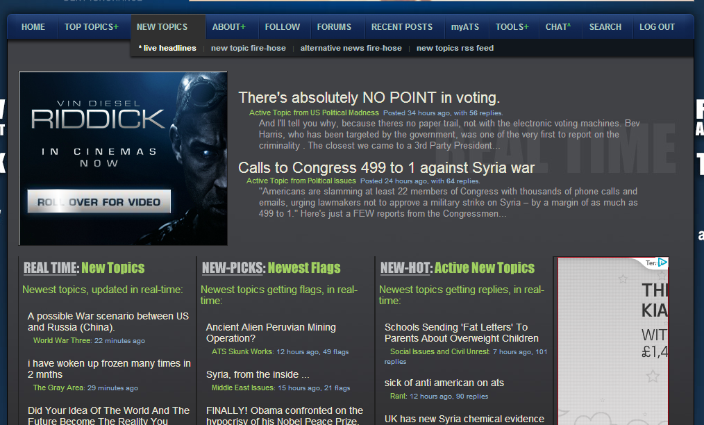
It was really nice this morning when the big type of the new ATS went to the nice, well laid out, clear, concise, old style ATS, much easier on the
eye. It was like a magnifying glass with extra glare had been removed from my screen.
I really like the squared borders and tonal definition of the old style, cleaner, more professional look, a site for grown ups that isn't eye achingly headache inducing in its big-button-brassy-big-type-rounded corners-all the same tone-kid style of the new style.
This isn't mocking either or griping, I know a lot of work and effort has gone into the new style, and the need for a mobile version, though in practicality it didn't translate well on PC, especially the content, because it was causing too much eye stress and UI matters.
As for the demographic, I would rather a forum of serious posters using PC's than a plethora of one liner posts from juvenile transient mobile users that will be gone as soon as the new flik-book-face-insta-time appears.
I am glad the comments are being taken on board, issues looked at and tweaking done, looking forward to seeing the revised edition.
reply to post by theabsolutetruth
ATS is ATS... no matter what format. I'll scratch on rocks if that's what it takes.
I hear ya there... Although there may be some diamonds in the rough.
ATS is ATS... no matter what format. I'll scratch on rocks if that's what it takes.
As for the demographic, I would rather a forum of serious posters using PC's than a plethora of one liner posts from juvenile transient mobile users that will be gone as soon as the new flik-book-face-insta-time appears.
I hear ya there... Although there may be some diamonds in the rough.
edit on 6-9-2013 by Zarniwoop because: (no reason given)
Originally posted by stormdancer777
Yeah, it was one thing to have to scroll down, but now I have to scroll right and left too? I'll try my best over the weekend, but it's feeling like a little more trouble than it's worth. I'd put a sad face here, but I don't like them.edit on 9/5/2013 by jiggerj because: (no reason given)
Press ctrl and - at the same time.
have you tried it, there is a lot of space and scrolling though.
I went to bed before trying it and now the site is back to normal. Thanks for the tip though.
Me points from the other thread. My friend and I have both seen and navigated the newer version and both had the same complaints. First is the
facebookish appearance. Seems so
many websites are trying it and its awful. Having the poster and avatar in separate bubbles ot whatevet is confusing and an attempt to change what is perfect about the current version (posters avatar and info to the left of their post.
The mobile version is terrible and the avatars cut off, I actually prefer the normal full version of the site to a basic mobile with less options up front. Also, important, mobile versions should slowly start disappearing rather than becoming more common because mobile phones are becoming more and more capable , bigger screens, fast net, theres really no need for them as phones become bigger and faster. I navigate the current ats on my galaxy s3 with ease.
I like the current version (what we have had for a while)better and I'm not someone who avoids or dislikes change. I love ATS and have thousands of posts and flags, and a lot of these are from mobile. Not out of spite but just knowing, if they switch the mobile version from what it is to anything like what I've seen I will probably not use it nearly as much. I understand the strive to be more contemporary and stylish butt this site is easily navigable as is.
As for suggestions: sometimes I don't get notices about my inbox, but also the box that pops up is annoying. So maybe just have an icon like a mailbox flag that you can see if uou have new messages and people will see it as the switch through pages
Also, giving the OP of a thread an extra signatory border in all their posts throughout their threads (could even allow them to choose a color with the exception of gold and silver) so posters know without having to go to the first page.
There are always search weaknesses.
Finally, I suggest workibg ob the page and making slow transitions rather than drastic changes in the site. You can eventually transform the sitw completely over time, but you don't want to make it alien and unfamiliar to regular posters by changing it over night. People shouldn't have to relearn a website and companies lose their customer base doing that. You can still get where you want to go, but at a pace that eases the users in. Like when the icons changed and so on, easy to adjust to, but some of the versions that have popped up lately have had me play on the site just a small percentage of the time I would normally and I found myself leaving and checking later.
edit on 6-9-2013 by GogoVicMorrow because: (no
reason given)
edit on 6-9-2013 by GogoVicMorrow because: (no reason given)
reply to post by Zarniwoop
The new style was hurting my eyes and giving me a headache. If it was just cosmetic I wouldn't mind so much.
The new style was hurting my eyes and giving me a headache. If it was just cosmetic I wouldn't mind so much.
The new version is cool , it might need different colours though for the people who are crying . Just add a few extra colours for the backgrounds and
what not .
Ahh, kinda glad it has rolled back to the old version, although i'm sorry to hear about the mountain of bugs. As a developer myself, I feel your
pain.
Anyway, to clear up confusion, the page I was referring to was this: Please can we have something similar in future revisions of 5.3? I understand if this is not possible for initial release, but this was a good feature of the old version and it would be a shame to lose it.
Anyway, to clear up confusion, the page I was referring to was this: Please can we have something similar in future revisions of 5.3? I understand if this is not possible for initial release, but this was a good feature of the old version and it would be a shame to lose it.
edit on 6-9-2013 by MattC because: Picture added wrongly
Hi. I have a bug, clicking on the New Topics+ tab results in a 404 error.
Which was the tab I used most often.
Any idea when it might be back?
Which was the tab I used most often.
Any idea when it might be back?
reply to post by SkepticOverlord
AW man, I logged in and it is back to old ATS, oh well, sooner or later it will change....as all things do....
Love ATS either way
AW man, I logged in and it is back to old ATS, oh well, sooner or later it will change....as all things do....
Love ATS either way
Originally posted by thedoctorswife
tothetenthpower
reply to post by thedoctorswife
Honest answer? No.
Snarky Answer? Press HOME on your keyboard
~Tenth
That's ok. I asked for it, Im an idiot with computers, but a goddess in the kitchen. Should you ever take the mick out of my chocolate fondants id probably remove your appendages with a blunt knife,
I love chocolate fondants.
Oh no., sorry tenth Ive gone off topic again. Remove my post again if you desire.
edit on 6-9-2013 by greavsie1971 because: (no reason
given)
All this tapping 'home' And 'ctrl' Is really a pain on mobile devices. Thought this was optimized for mobile devices.
I give up with this.
BRING BACK JOHNNY ANONYMOUS AND RABBIT. That would make me happy again with ATS.
I give up with this.
BRING BACK JOHNNY ANONYMOUS AND RABBIT. That would make me happy again with ATS.
I'm very happy to see the old style back. Its less cluttered, simple, and concise, just the way I prefer everything set up, well organized, and easy
on the eyes, logical and concise. The emoticons are good too, we just need some more, like giving a heart, or a kiss, and a shill one....
Originally posted by all2human
Excuse me for not thumbing through all the comments, and great job on the layout, real nice
how does one find a specific post ? I mean I can navigate to a general page of my past posts but wont "land" on the exact post (having difficulty even explaining it)edit on 5-9-2013 by all2human because: (no reason given)
I had the same problem. It took 4 posts about it to get an answer, but I got one.
Click on the time stamp to the right of the thread link, to go directly to your post.
My only complain about the new look is the font and contrast with the darker option.
Perhaps ATS can add a user customizable options besides the white and dark it currently offers. I know a custom font option would make it harder to test and control user presentation, but it would be up to the user how they hang themselves or possibly limit it to just color preferences , size options and bold capability.
I would have liked the new version to have incorporated the following as well
1. easier alert mechanism to inform the user of when he received a reply.
2. alert mechanism when the users comment is either flagged or Starred.
Other than the font and contrast I like the new look.
Originally posted by SkepticOverlord
The thread-view spacing has been tweaked a bit, mostly within the mini-profile area. Now, the new ATS.5/3 site uses about 2% less vertical space than the old ATS.2010 site.
Click to open full-size viewedit on 6-9-2013 by SkepticOverlord because: (no reason given)
Fantastic!
It may seem like a minor adjustment, but it makes a difference to me.
Can't wait to see the new tweaks applied.
Originally posted by jiggerj
Originally posted by stormdancer777
Yeah, it was one thing to have to scroll down, but now I have to scroll right and left too? I'll try my best over the weekend, but it's feeling like a little more trouble than it's worth. I'd put a sad face here, but I don't like them.edit on 9/5/2013 by jiggerj because: (no reason given)
Press ctrl and - at the same time.
have you tried it, there is a lot of space and scrolling though.
I went to bed before trying it and now the site is back to normal. Thanks for the tip though.
welcome
BTW where did the new hotness go?
interupt42
My only complain about the new look is the font and contrast with the darker option.
It's been tweaked quite a few times during member testing. Is it possible to be more informative? Darker text? Lighter text? Darker background? Lighter background?
The new ATS.5/3 site and UI WILL be launching soon. The opportunity for general feedback beyond things that are broken is over. The rationale for the needed change has been explained exhaustively. Objects at rest tend to stay at rest.
Originally posted by DiabolusFireDragon
It may seem like a minor adjustment, but it makes a difference to me.
Actually, it is on the "minor" side of things.
Before the tweak, the ATS.5/3 site was only 9% taller for full threads than the current ATS.2010 site.
Originally posted by SkepticOverlord
interupt42
My only complain about the new look is the font and contrast with the darker option.
It's been tweaked quite a few times during member testing. Is it possible to be more informative? Darker text? Lighter text? Darker background? Lighter background?
Sorry about that,I should have clarified.
For me I like the darker background as I tend to view the site at night right before bed. I didn't have an issue with the background on the new dark format. I would prefer to have a thicker font (perhaps bold) for the white foreground text or maybe change it to a more contrast type text color like yellow,cyan,etc.
Also I recall that the color font combination to identify the user that posted the thread was also a bit hard to read at night on my android tablet. I would have preferred a more contrast for that as well.
reply to post by SkepticOverlord
Yes, we read your illogical logic.
Alienate 70% of the desk top members to cater to the 30% of the mobile users.. your numbers, not mine.
The rationale for the needed change has been explained exhaustively. Objects at rest tend to stay at rest.
Yes, we read your illogical logic.
Alienate 70% of the desk top members to cater to the 30% of the mobile users.. your numbers, not mine.
new topics
-
Ramblings on DNA, blood, and Spirit.
Philosophy and Metaphysics: 2 minutes ago -
4 plans of US elites to defeat Russia
New World Order: 1 hours ago -
Thousands Of Young Ukrainian Men Trying To Flee The Country To Avoid Conscription And The War
Other Current Events: 4 hours ago -
12 jurors selected in Trump criminal trial
US Political Madness: 7 hours ago -
Iran launches Retalliation Strike 4.18.24
World War Three: 7 hours ago -
Israeli Missile Strikes in Iran, Explosions in Syria + Iraq
World War Three: 8 hours ago
top topics
-
George Knapp AMA on DI
Area 51 and other Facilities: 13 hours ago, 25 flags -
Israeli Missile Strikes in Iran, Explosions in Syria + Iraq
World War Three: 8 hours ago, 16 flags -
Louisiana Lawmakers Seek to Limit Public Access to Government Records
Political Issues: 16 hours ago, 7 flags -
Iran launches Retalliation Strike 4.18.24
World War Three: 7 hours ago, 6 flags -
Not Aliens but a Nazi Occult Inspired and then Science Rendered Design.
Aliens and UFOs: 14 hours ago, 5 flags -
Thousands Of Young Ukrainian Men Trying To Flee The Country To Avoid Conscription And The War
Other Current Events: 4 hours ago, 4 flags -
12 jurors selected in Trump criminal trial
US Political Madness: 7 hours ago, 4 flags -
The Tories may be wiped out after the Election - Serves them Right
Regional Politics: 17 hours ago, 3 flags -
4 plans of US elites to defeat Russia
New World Order: 1 hours ago, 2 flags -
Ramblings on DNA, blood, and Spirit.
Philosophy and Metaphysics: 2 minutes ago, 0 flags
active topics
-
So I saw about 30 UFOs in formation last night.
Aliens and UFOs • 26 • : xWorldxGonexMadx -
Ramblings on DNA, blood, and Spirit.
Philosophy and Metaphysics • 0 • : BrotherKinsMan -
Fossils in Greece Suggest Human Ancestors Evolved in Europe, Not Africa
Origins and Creationism • 62 • : whereislogic -
-@TH3WH17ERABB17- -Q- ---TIME TO SHOW THE WORLD--- -Part- --44--
Dissecting Disinformation • 538 • : cherokeetroy -
4 plans of US elites to defeat Russia
New World Order • 6 • : andy06shake -
Silent Moments --In Memory of Beloved Member TDDA
Short Stories • 44 • : Encia22 -
Mandela Effect - It Happened to Me!
The Gray Area • 110 • : BeTheGoddess2 -
Vogt and the twelve thousand year cycle
Fragile Earth • 27 • : Lanogaxeh -
12 jurors selected in Trump criminal trial
US Political Madness • 22 • : Disgusted123 -
British TV Presenter Refuses To Use Guest's Preferred Pronouns
Education and Media • 65 • : nugget1