It looks like you're using an Ad Blocker.
Please white-list or disable AboveTopSecret.com in your ad-blocking tool.
Thank you.
Some features of ATS will be disabled while you continue to use an ad-blocker.

Interactive Map Color-Codes Race of Every Single American
page: 13
share:
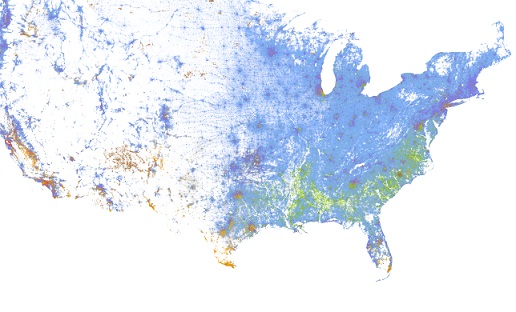
University of Virginia academic Dustin Cable has designed an interactive map that color-codes the geographic distribution of every single American,
using the 2010 census.
The Racial Dot Map
One Dot Per Person for the Entire United States
A map of New York City, Long Island, and New Jersey colored to represent the race of every person living in the region.
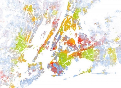
Purple denotes diversity.
Even President Obama is accounted for, if you zoom in on 1600 Pennsylvania Avenue in Washington, five green dots (which represent black Americans) become visible, representing the President, his wife and two daughters, and his mother-in-law.
If you want to interact with the map click here
Link 1
Link 2
The Racial Dot Map uses 308,745,538 blue, green, red, and other colored dots to represent the race of every American in the place that person lives.
In what some bloggers have called a work of demographic pointillism, the new map allows users to scroll across the United States and zoom in on any area to view its racial mix. Dustin Cable, the map’s creator and a senior research associate at the University of Virginia’s Weldon Cooper Center for Public Service, says the graphic adds a level of engagement that’s absent when scrolling through hundreds and hundreds of tables from the 2010 census.
“It puts complex data into context—you are a point on that map somewhere,” he says. “You can look yourself up and look at yourself in the context of that neighborhood.”
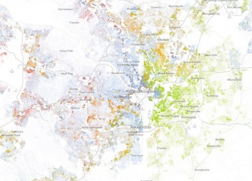
The Racial Dot Map
One Dot Per Person for the Entire United States
A map of New York City, Long Island, and New Jersey colored to represent the race of every person living in the region.
Purple denotes diversity.
Different shades of purple, teal, and other colors can therefore be a measure of racial integration in a particular area. However, a place that may seem racially integrated at wider zoom levels may obscure racial segregation at the city or neighborhood level.
Even President Obama is accounted for, if you zoom in on 1600 Pennsylvania Avenue in Washington, five green dots (which represent black Americans) become visible, representing the President, his wife and two daughters, and his mother-in-law.
If you want to interact with the map click here
Link 1
Link 2
I always knew I never trusted blue people...now I know why.
...and Native Americans should be red...and not that ugly brown/mixed race color...yeuuch
...and Native Americans should be red...and not that ugly brown/mixed race color...yeuuch
Originally posted by rival
I always knew I never trusted blue people...now I know why.
...and Native Americans should be red...and not that ugly brown/mixed race color...yeuuch
I'm sure if they used red for them, some liberals would come along and cry racism.
Pretty interesting map....
WHAT THE? My House is BLORANGE!
This is really cool! Still need to figure that one out maybe something missed when I did my family history? LOL
This is really cool! Still need to figure that one out maybe something missed when I did my family history? LOL
edit on 21-8-2013 by abeverage because: (no reason given)
reply to post by abeverage
'Blorange' lol did you zoom all the way in?
Yeah I love maps, found this interactive one pretty cool and I dont even live in America.
'Blorange' lol did you zoom all the way in?
Yeah I love maps, found this interactive one pretty cool and I dont even live in America.
edit on 21-8-2013 by Lady_Tuatha because: (no reason
given)
Now .......Still believe Whites are becoming a minority in the United States?
Hey that's kind of interesting!
Well except that you're black whether you're from Africa or Puerto Rico, and you're Hispanic whether you're from Mexico or Cuba, and I'm "white" except I'm 15 nationalities including native american. So I think it's cool, but our way of measuring these things seems a little wonky to me.
Well except that you're black whether you're from Africa or Puerto Rico, and you're Hispanic whether you're from Mexico or Cuba, and I'm "white" except I'm 15 nationalities including native american. So I think it's cool, but our way of measuring these things seems a little wonky to me.
reply to post by Visitor2012
Certainly not where i live....blue as the sky
Guess i shouldn't be surprised, i never liked living here anyway.
Too many racists.
Certainly not where i live....blue as the sky
Guess i shouldn't be surprised, i never liked living here anyway.
Too many racists.
edit on 22-8-2013 by Thorneblood because: (no reason given)
It seems where I live is very diverse. Which isn't surprising at all. Now I wonder if I would be represented by the brown dot because I come from a
multiracial background or orange for Hispanic or whatever. Hum? a real mystery indeed.
reply to post by RedCairo
They probably go by whatever you put down on census form,
I agree that they probably need more colours for representation purposes.
They probably go by whatever you put down on census form,
I agree that they probably need more colours for representation purposes.
new topics
-
Who guards the guards
US Political Madness: 59 minutes ago -
Has Tesla manipulated data logs to cover up auto pilot crash?
Automotive Discussion: 2 hours ago -
whistleblower Captain Bill Uhouse on the Kingman UFO recovery
Aliens and UFOs: 7 hours ago -
1980s Arcade
General Chit Chat: 9 hours ago -
Deadpool and Wolverine
Movies: 10 hours ago -
Teenager makes chess history becoming the youngest challenger for the world championship crown
Other Current Events: 11 hours ago
top topics
-
Lawsuit Seeks to ‘Ban the Jab’ in Florida
Diseases and Pandemics: 15 hours ago, 20 flags -
Starburst galaxy M82 - Webb Vs Hubble
Space Exploration: 17 hours ago, 13 flags -
CIA botched its handling of sexual assault allegations, House intel report says
Breaking Alternative News: 12 hours ago, 8 flags -
15 Unhealthiest Sodas On The Market
Health & Wellness: 17 hours ago, 6 flags -
whistleblower Captain Bill Uhouse on the Kingman UFO recovery
Aliens and UFOs: 7 hours ago, 6 flags -
1980s Arcade
General Chit Chat: 9 hours ago, 4 flags -
Deadpool and Wolverine
Movies: 10 hours ago, 3 flags -
Teenager makes chess history becoming the youngest challenger for the world championship crown
Other Current Events: 11 hours ago, 3 flags -
Who guards the guards
US Political Madness: 59 minutes ago, 1 flags -
Has Tesla manipulated data logs to cover up auto pilot crash?
Automotive Discussion: 2 hours ago, 0 flags
active topics
-
-@TH3WH17ERABB17- -Q- ---TIME TO SHOW THE WORLD--- -Part- --44--
Dissecting Disinformation • 609 • : Justoneman -
whistleblower Captain Bill Uhouse on the Kingman UFO recovery
Aliens and UFOs • 7 • : pianopraze -
CIA botched its handling of sexual assault allegations, House intel report says
Breaking Alternative News • 6 • : watchitburn -
They Killed Dr. Who for Good
Rant • 63 • : grey580 -
Scientists Say Even Insects May Be Sentient
Science & Technology • 52 • : Scratchpost -
House Overwhelmingly Passes Funding for Ukraine, Israel and Taiwan
US Political Madness • 58 • : IndieA -
A Better Choice I Think
2024 Elections • 30 • : SchrodingersRat -
Michael Avenatti Says He Will Testify FOR Trump
US Political Madness • 60 • : Justoneman -
The Superstition of Full Moons Filling Hospitals Turns Out To Be True!
Medical Issues & Conspiracies • 17 • : Scratchpost -
1980s Arcade
General Chit Chat • 9 • : theatreboy
3