It looks like you're using an Ad Blocker.
Please white-list or disable AboveTopSecret.com in your ad-blocking tool.
Thank you.
Some features of ATS will be disabled while you continue to use an ad-blocker.

ATS.5/3 24 Hour Member Beta Test
page: 17share:
Originally posted by Dumbass
reply to post by SkepticOverlord
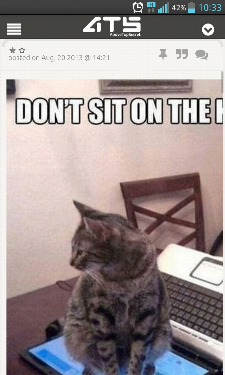
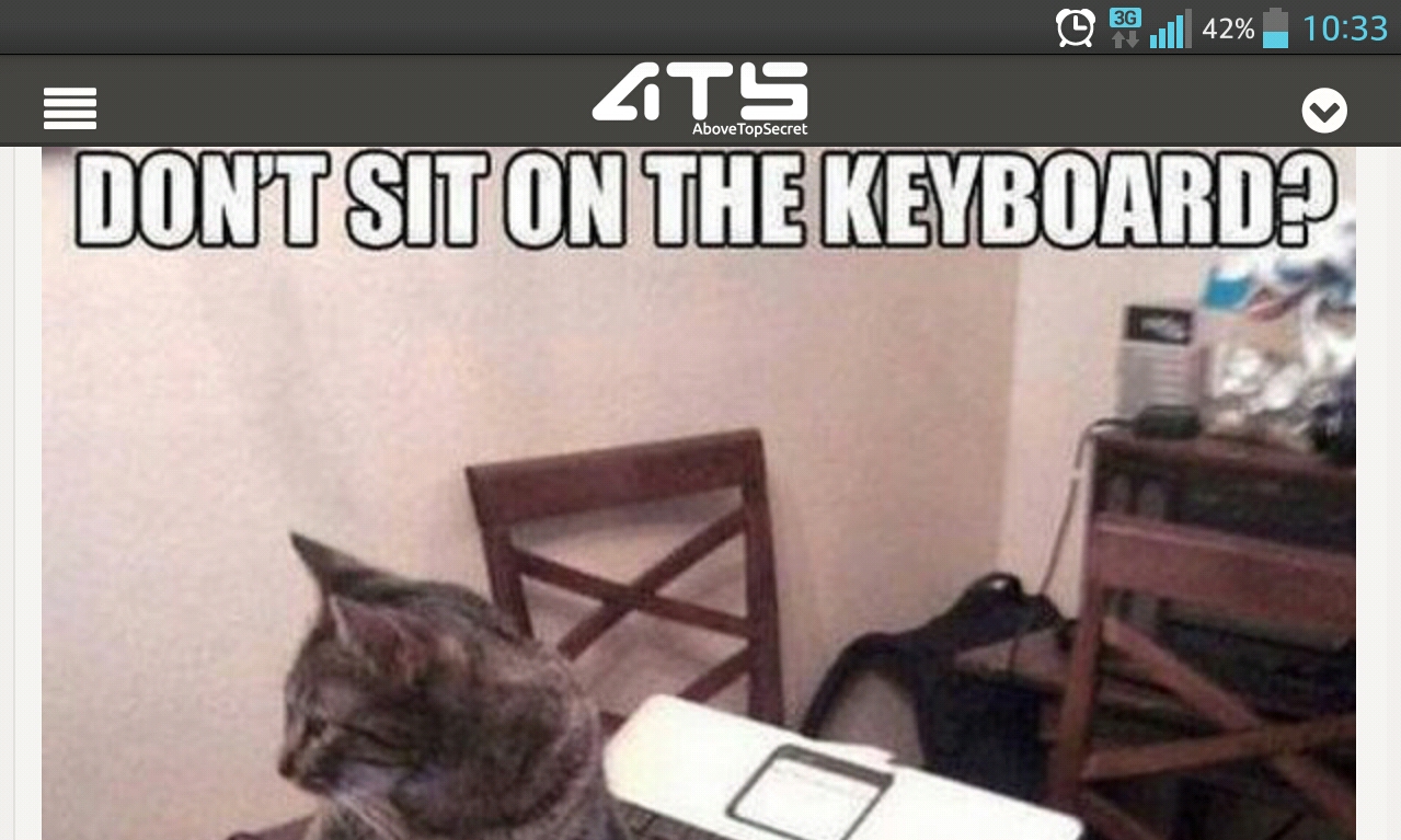
One thing I noticed on mobile is that I can't zoom in or out. When I was reading a thread about funny pics (yeah I know that is really above top secret ) I did not see the whole picture in portrait and I couldn't slide it from left to right. So in landscape I could see the whole picture but it didn't fit from top to bottom.
Example:
Some feedback on the design...
1. The quote boxes are far too big.
2. The floating tab with "home, top, hot, new etc" buttons on top... is rather distracting.
3. The "new thread" and "reply" buttons are too small... compared to everything else on the page.
Will post more later.
1. The quote boxes are far too big.
2. The floating tab with "home, top, hot, new etc" buttons on top... is rather distracting.
3. The "new thread" and "reply" buttons are too small... compared to everything else on the page.
Will post more later.
reply to post by SLAYER69
reply to post by sonnny1
200 pixels wide for mini profile backgrounds and it looks like 500 pixels high based on a test I did.
(((((((TENTH)))))))
Could you find out the new beta Kbs sizes and dimensions for:
1. Avatars
2. Gifs
3. Maximum Image size for posts before the scroll bar is introduced.
this info will come in handy for the BTS Avatar Creations thread.
edit on 21-8-2013 by Sublimecraft because:
Looks nice. It took a while to find the white/black toggle as it looked like a link. As a suggestion that probably should be relocated. I like the
floating top bar as that was drastically needed. Now you don't have to scroll the mouse button to the top of long threads to navigate.
edit on
21-8-2013 by sean because: (no reason given)
reply to post by SkepticOverlord
It would take more than an hour to list everything that needs changing. The one thing I will mention, however, is that the light scheme is so monotony that it is strenuous on the eyes - that is not even a matter of preference - it is a must change.
It's very off-putting, sorry.
It would take more than an hour to list everything that needs changing. The one thing I will mention, however, is that the light scheme is so monotony that it is strenuous on the eyes - that is not even a matter of preference - it is a must change.
It's very off-putting, sorry.
Originally posted by SkepticOverlord
Darkblade71
It makes sense,but it would be nice if you could get access to all 4 upload galleries with the "Insert image from your library" quick link when you are making a post.
The methodology for bringing in the popup with your images relies on JavaScript to communicate between the popup and the post form. We have a lot of "AJAX" (asynchronous _javascript and XML) in the new ATS that provides functionality without page reloads, however, to get a new image library in that popup, I'd need to load it via JavaScript/AJAX. The problem is, a dynamically loaded JavaScript cannot communicate back to the original in-page JavaScript without jumping through hoops that would jeopardize site security. So I needed to pick one library.
"I see" said the blind man.
I like the quick access
I had to reorganize a little, but needed to do that with the mess in my uploads anyways
I can't seem to access it using Safari on my iPad with iOS 6.1.3. I have to use another browser.
reply to post by SkepticOverlord
Don't know if this is intended or not, but the forum icons with each thread title on the ATS homepage does work as a link. It seems like this would be a good feature if it isn't already intended.
And although I like the present white on black color scheme in general, this new version does seem easier on the eyes and should allow some colored text to show up better. Also like the look/interface of the myATS page.
wtf is it with americans and guns????????
i was showing my girlfriend the (horrible) new smiley's and the first thing she said was "why is there one with a gun?" i had no answer for her
why is there a smiley with a gun?
you spelt "favorite" wrong - favourite
other than that, all good. but why is there a smiley with a gun?
i was showing my girlfriend the (horrible) new smiley's and the first thing she said was "why is there one with a gun?" i had no answer for her
why is there a smiley with a gun?
you spelt "favorite" wrong - favourite
other than that, all good. but why is there a smiley with a gun?
Are you still going to be able to go to the last post in a new tab? Or is it going to just open in the same window to the last post? I've gotten
used to being able to have lots of tabs open.
reply to post by SecretKnowledge
English spelling v American ...
Colour v Color etc.
It is what it is ... use knowledge gained to ... go with the flow .
English spelling v American ...
Colour v Color etc.
It is what it is ... use knowledge gained to ... go with the flow .
As others mentioned, the light version of the new site is difficult to use. I don't have any real problems using it technically, however it's just
way to bright overall to use for extended periods of time. (This could be just me, however I'm used to relatively bright websites and have no
issues.)
I haven't been around much latel (been busy) so I haven't been able to test ATS on all my devices. But on my iMac, Macbook Pro, Windows craptops, the site seems to work rather well.
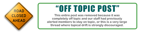
I also noticed in a couple of posts above this one, a reply was removed. The quoted text for the reason of removal was hard to read using the dark theme. (Pic attached) Maybe have the font a little lighter.
The image with dark text:

I also have a quibble regarding the formatting options. Many bulletin boards have shortcuts that I like to use, for example; pressing "CTRL+i" would give you italic text. That doesn't work here on the new site nor the old one. Since this is a "ground up build" (I'm guessing) of a custom bulletin board, I understand why it hasn't been put in place. But would there be any possibility to do so? Would make writing feel more seamless when you don't have to move your hand away from the keyboard to insert formatting.
Thanks for the hard work though, I am enjoying the various other improvements made to the site!
I haven't been around much latel (been busy) so I haven't been able to test ATS on all my devices. But on my iMac, Macbook Pro, Windows craptops, the site seems to work rather well.
I also noticed in a couple of posts above this one, a reply was removed. The quoted text for the reason of removal was hard to read using the dark theme. (Pic attached) Maybe have the font a little lighter.
The image with dark text:
I also have a quibble regarding the formatting options. Many bulletin boards have shortcuts that I like to use, for example; pressing "CTRL+i" would give you italic text. That doesn't work here on the new site nor the old one. Since this is a "ground up build" (I'm guessing) of a custom bulletin board, I understand why it hasn't been put in place. But would there be any possibility to do so? Would make writing feel more seamless when you don't have to move your hand away from the keyboard to insert formatting.
Thanks for the hard work though, I am enjoying the various other improvements made to the site!
I'm still hoping that a
RETURN TO THE BOTTOM, LATEST POST on a page would function on refresh vs always having to scroll down again on refresh.
It appears that there's been an increase in allotted characters. I don't know if that is general or due to somehow being earned with stars, flags and applause or what. Quite welcome, however. Very needed for long multisourced thread OP's.
A laughing emoticon would be good. I suppose in keeping with the T&C it should somehow convey cheerful laughing vs laughing at??? LOL. Don't know that such is very doable in a clean lined emoticon. Should be with clever enough artistry.
I still think a website is like herding cats. Y'all deserve tons of applause and a good long vacation. Tahiti? NZ?
reply to post by SecretKnowledge
on page 3 I asked the same Question; European here as well. The icons are custom made so it was a choice. Honestly I don't get it myself. Given recent shootings and the touchy subject it seems kinda... I don't know... Out of place.
Also I don't see how it has to be used in a post.
Edit: Is it just me or did RATS disappear? Can't seem to find it
edit on 21-8-2013 by Senduko because: (no reason given)
Originally posted by truejew
I can't seem to access it using Safari on my iPad with iOS 6.1.3. I have to use another browser.
Your in the same boat as I am. I tried following all the steps, with no luck. There's no 'share' button on my home page, and I've not been able to ever read my mail....iPads are not that great for flash or some other things!!!
reply to post by Senduko
Gun emoticon?
Oh. Now I see it. Had to shrink my setting size a bit to see it.
For most Americans . . . a gun is a necessary TOOL OF FREEDOM AND LIFE.
It is a symbol and tool of survival and freedom, independence in a dangerous world.
Particularly rural Americans are dismayed, disgusted and incredulous about a mentality that wants to essentially take guns away from the law abiding and insure that only the corrupt and criminals have guns. We see that as the inevitable result of all gun control efforts--all of them.
So we have a different attitude and feeling toward guns . . . and tend to believe that the other perspective is muddle headed at best.
In terms of an emoticon . . . I likely would rarely to never have use of it . . . unless it came to wanting to shoot down the ideas and plans of the tyrannical globalist oligarchy.
Nevertheless, I'd hate to see it missing. It's still a sign of freedom and life insurance, to me.
It would be great if I knew that logging out from that could lead to log out ATS.
I think it could be great if you had put different RSS for different forums.
Thanks btw.
I think it could be great if you had put different RSS for different forums.
Thanks btw.
edit on 21-8-2013 by mideast because: (no reason given)
reply to post by BO XIAN
Not to go off topic, but *star for the time explaining*
Not saying I understand or agree though. Still Star for you.
They should add a like button, A star gives the assumption you agree,
A like button would be handy just top point out you read the massage and you thank the person for posting a reply. Whether you agree or not.
Or like a Nod button lol.
reply to post by Dumbass
I am really liking the new layout!
I like the stationary bar at the top with "home" and all the other tabs. It's nice not to have to scroll to the top for those!
Will we be able to see our friends threads like we had on the old layout? I really liked being able to just go to the tab where my friends threads were. I follow a lot of members who write threads I find interesting.
Also will ignore ever come back
new topics
-
University of Texas Instantly Shuts Down Anti Israel Protests
Education and Media: 1 hours ago -
Any one suspicious of fever promotions events, major investor Goldman Sachs card only.
The Gray Area: 4 hours ago -
God's Righteousness is Greater than Our Wrath
Religion, Faith, And Theology: 8 hours ago -
Electrical tricks for saving money
Education and Media: 11 hours ago
top topics
-
VP's Secret Service agent brawls with other agents at Andrews
Mainstream News: 13 hours ago, 10 flags -
Cats Used as Live Bait to Train Ferocious Pitbulls in Illegal NYC Dogfighting
Social Issues and Civil Unrest: 17 hours ago, 8 flags -
Nearly 70% Of Americans Want Talks To End War In Ukraine
Political Issues: 13 hours ago, 4 flags -
Sunak spinning the sickness figures
Other Current Events: 13 hours ago, 4 flags -
Electrical tricks for saving money
Education and Media: 11 hours ago, 4 flags -
Late Night with the Devil - a really good unusual modern horror film.
Movies: 15 hours ago, 2 flags -
Any one suspicious of fever promotions events, major investor Goldman Sachs card only.
The Gray Area: 4 hours ago, 2 flags -
University of Texas Instantly Shuts Down Anti Israel Protests
Education and Media: 1 hours ago, 1 flags -
God's Righteousness is Greater than Our Wrath
Religion, Faith, And Theology: 8 hours ago, 0 flags
active topics
-
Nearly 70% Of Americans Want Talks To End War In Ukraine
Political Issues • 47 • : andy06shake -
University of Texas Instantly Shuts Down Anti Israel Protests
Education and Media • 9 • : Vermilion -
Should Biden Replace Harris With AOC On the 2024 Democrat Ticket?
2024 Elections • 50 • : YourFaceAgain -
New whistleblower Jason Sands speaks on Twitter Spaces last night.
Aliens and UFOs • 57 • : baablacksheep1 -
HORRIBLE !! Russian Soldier Drinking Own Urine To Survive In Battle
World War Three • 39 • : crayzeed -
President BIDEN Vows to Make Americans Pay More Federal Taxes in 2025 - Political Suicide.
2024 Elections • 138 • : grey580 -
Sunak spinning the sickness figures
Other Current Events • 15 • : angelchemuel -
British TV Presenter Refuses To Use Guest's Preferred Pronouns
Education and Media • 147 • : Annee -
So this is what Hamas considers 'freedom fighting' ...
War On Terrorism • 260 • : network dude -
Hate makes for strange bedfellows
US Political Madness • 43 • : network dude