It looks like you're using an Ad Blocker.
Please white-list or disable AboveTopSecret.com in your ad-blocking tool.
Thank you.
Some features of ATS will be disabled while you continue to use an ad-blocker.

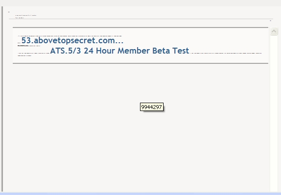
ATS.5/3 24 Hour Member Beta Test
page: 11share:
On the iPhone we don't see any titles at all, such as moderater, site owner...
Or the thread title - I could easily be typing onto the wrong thread if I had another page open.
There's also a ats banner across where I'm typing right now, unmovable, so if the last couple of sentences have atrocious spelling or don't show up it cause I couldn't see what I was typing
And yeah, don't like the new emoticons either.....
Could you add a "Ignore" button like other forums have? And if no, why not?
reply to post by xuenchen
yes I'm using Firefox too, and I can't see the stars or anything on the page. I can see the avatars
yes I'm using Firefox too, and I can't see the stars or anything on the page. I can see the avatars
Darkblade71
Erongaricuaro
Not bad. I have it all sized and configured and peacefully co-existing with my other sites and applications now. I can live with the funny-looking icons and all.
Still missing all my ATS points. That's what I get for complaining, I guess.
I just noticed the points are gone once you pointed it out.....
Will there be no more ATS points?
At the moment there is not, or they are hiding. What do we get for Applause instead of points? Or are they discontinued too, along with Friends and our other niceties that are not included in this version we're testing today?
But, yes, it looks funny but size issues are worked out. I tried to fire up my phone to try this but it denies access for me. Pity, it might actually be an improvement on that but really loses out on the desktop. The price we pay for progress toward a more mobile society. It will make the Bug-out Bag more exciting when it comes down to that, I guess. Otherwise, I am not blogging and texting when I am driving or just out and about. This "improvement" kind of gets me where I live.
edit on 20-8-2013 by Erongaricuaro because: (no reason given)
So far it seems to be ok the emoticons lol hmm liked the moving ones but understand the amount of memory they take up so it will take some
minor adjustments.
The signature line is it possible to shrink text size or the lines spacing between sentences?
As another poster shared will we have our images remaining?
Its still good ATS keep up the good work. If anything else is noticed 1 shall share...
NAMASTE*******
The signature line is it possible to shrink text size or the lines spacing between sentences?
As another poster shared will we have our images remaining?
Its still good ATS keep up the good work. If anything else is noticed 1 shall share...
NAMASTE*******
reply to post by SkepticOverlord
On an android tablet and wow it loads really slowly. That is alarming, it is a ten inch tablet and has no problem loading heavy pages. It was very noticeable.
The Bot
On an android tablet and wow it loads really slowly. That is alarming, it is a ten inch tablet and has no problem loading heavy pages. It was very noticeable.
The Bot
Ok just found the darker option! So that answers my one question.
I can't find BTS or chat. I'll have to keep going thru the thread.
So far I like it. I do like how the old layout had more color to it in general.
I can't find BTS or chat. I'll have to keep going thru the thread.
So far I like it. I do like how the old layout had more color to it in general.
reply to post by mblahnikluver
BTs is the smiley Icon on the recent posts page.
Chat link hasn't been integrated yet.
!Tenth
BTs is the smiley Icon on the recent posts page.
Chat link hasn't been integrated yet.
!Tenth
No signatures showing either
It's like what I would see by NOT logging in, except that I can post....
iPhone safari.....
I can't tell if I like it at all, 'cause I can't see what I'm used to seeing - avatars, sigs, etc
It's like what I would see by NOT logging in, except that I can post....
iPhone safari.....
I can't tell if I like it at all, 'cause I can't see what I'm used to seeing - avatars, sigs, etc
tothetenthpower
reply to post by mblahnikluver
BTs is the smiley Icon on the recent posts page.
Chat link hasn't been integrated yet.
!Tenth
Thanks! I found it once I went to the dark side lol
I like this layout actually now that my eyes and OCD are adjusting
reply to post by snowspirit
Nope, there are no signatures in the mobile version, nor avatars.
Just the content. So far anyway.
~Tenth
Nope, there are no signatures in the mobile version, nor avatars.
Just the content. So far anyway.
~Tenth
Originally posted by tothetenthpower
reply to post by snowspirit
Nope, there are no signatures in the mobile version, nor avatars.
Just the content. So far anyway.
~Tenth
Hopefully we get the option.
We'll still get the ads, they're a lot harder on bandwidth than avatars.
So far, its not as nice as the current site.
It (the current working site) shows up nicely on a phone screen.
The new version, not so much
couple things, would like to see the font, the same size as this version... The one I am on now, not beta testing, and for god sakes lets change the
resolution...
I guess both of those request go hand in hand..
All in all, good job, not so sure if I like the apple ios appearance, I get outta the look, but I think if I can change the resolution I will really like it.. I feel like I am old or something reading font at like 16 or so...
I guess both of those request go hand in hand..
All in all, good job, not so sure if I like the apple ios appearance, I get outta the look, but I think if I can change the resolution I will really like it.. I feel like I am old or something reading font at like 16 or so...
edit on 20-8-2013 by Bicent76 because: (no reason given)
Originally posted by WhoDat09
reply to post by xuenchen
yes I'm using Firefox too, and I can't see the stars or anything on the page. I can see the avatars
Figured it out !!
Firefox>
Tools>
Options>
Content>
Advanced>
Check "Allow pages to choose their own fonts ...... "
edit on Aug-20-2013 by xuenchen because: (no reason given)
There's a weird empty box underneath the comment preview in dark mode. Distracting more than anything else. Anyone else see that?
And as others have noted, the layout is pretty cool but very spartan. A little more color (not much more) would be appreciated.
And as others have noted, the layout is pretty cool but very spartan. A little more color (not much more) would be appreciated.
edit on
8/20/13 by NthOther because: (no reason given)
I had no problems with Chrome.
However IE 8 (yes some peeps still use it) had the following problems.
viewport: 1259 x 610 | document: 1280 x 5377
Win XP SP3. Using IE 8
Area containing private messages etc.
There are four symbols. None of them display what they are for! Nothing via mouse hover either.
Also message panel is srewed.
Main menu bar.
The dropdown on the far right causes mouse to change to carrot.
New topic area.
Too much scrolling!! Old system of parralel lists was better.
While I like the idea of showing the name of the poster in this area I cant help but wonder if some people will avoid posts made by members they dont like.
Viewing a thread.
Page doesnt expand to full width.
Making a post.
HUGE FONT!!! Whats that all about? lol
Also Blocks not showing correctly.
I use Firefox on a Windows 7 computer.
The bulk uploader for the new ATS uploads seems a little buggy. The first time I tried it, it only loaded the 1st 3 pics. I figured it must have a limit so I tried only 3 pics the next time and it double loaded the 1st pic but, not the other two.
I experimented with different numbers of pics and had inconsistent results; one time I got all 3 to load but mostly, it would only load the 1st pic or double load the first pic. It seems to be hit or miss.
One thing I do like is that I can start a YouTube vid and continue throughout the thread starring posts I like without interrupting the vid.


I still miss the old smileys, the new ones just don't compare.
The bulk uploader for the new ATS uploads seems a little buggy. The first time I tried it, it only loaded the 1st 3 pics. I figured it must have a limit so I tried only 3 pics the next time and it double loaded the 1st pic but, not the other two.
I experimented with different numbers of pics and had inconsistent results; one time I got all 3 to load but mostly, it would only load the 1st pic or double load the first pic. It seems to be hit or miss.
One thing I do like is that I can start a YouTube vid and continue throughout the thread starring posts I like without interrupting the vid.
I still miss the old smileys, the new ones just don't compare.
viewport: 1579 x 809 | document: 1579 x 10887
Right now Using an HP monitor x20LED on a win7 box, firefox 17
I switched to the darker background as the soft contrast on the lighter one was hard on my eyes.
The darker one looks nice to my eyes but I think the light text could be a bit lighter for more contrast. Maybe switch the colors for the 'stars,etc' icons in the profile with the text of the values for them.
Various functions seem to be working normally.
edit on 8/20/2013 by roadgravel because: (no reason given)
I will miss this also; 
the new page is missing the authors' names
the new page is missing the authors' names
I also noticed my way cool gold colored border went away.
Does this mean the WATS list is a thing of the past?
Does this mean the WATS list is a thing of the past?
new topics
-
Ditching physical money
History: 45 minutes ago -
One Flame Throwing Robot Dog for Christmas Please!
Weaponry: 1 hours ago -
Don't take advantage of people just because it seems easy it will backfire
Rant: 1 hours ago -
VirginOfGrand says hello
Introductions: 2 hours ago -
Should Biden Replace Harris With AOC On the 2024 Democrat Ticket?
2024 Elections: 2 hours ago -
University student disciplined after saying veganism is wrong and gender fluidity is stupid
Education and Media: 5 hours ago -
Geddy Lee in Conversation with Alex Lifeson - My Effin’ Life
People: 6 hours ago -
God lived as a Devil Dog.
Short Stories: 6 hours ago -
Police clash with St George’s Day protesters at central London rally
Social Issues and Civil Unrest: 8 hours ago -
TLDR post about ATS and why I love it and hope we all stay together somewhere
General Chit Chat: 9 hours ago
top topics
-
Hate makes for strange bedfellows
US Political Madness: 11 hours ago, 18 flags -
Who guards the guards
US Political Madness: 13 hours ago, 13 flags -
University student disciplined after saying veganism is wrong and gender fluidity is stupid
Education and Media: 5 hours ago, 10 flags -
Police clash with St George’s Day protesters at central London rally
Social Issues and Civil Unrest: 8 hours ago, 8 flags -
TLDR post about ATS and why I love it and hope we all stay together somewhere
General Chit Chat: 9 hours ago, 7 flags -
Should Biden Replace Harris With AOC On the 2024 Democrat Ticket?
2024 Elections: 2 hours ago, 4 flags -
Has Tesla manipulated data logs to cover up auto pilot crash?
Automotive Discussion: 15 hours ago, 3 flags -
One Flame Throwing Robot Dog for Christmas Please!
Weaponry: 1 hours ago, 2 flags -
Don't take advantage of people just because it seems easy it will backfire
Rant: 1 hours ago, 2 flags -
Geddy Lee in Conversation with Alex Lifeson - My Effin’ Life
People: 6 hours ago, 2 flags
active topics
-
University student disciplined after saying veganism is wrong and gender fluidity is stupid
Education and Media • 21 • : YourFaceAgain -
Candidate TRUMP Now Has Crazy Judge JUAN MERCHAN After Him - The Stormy Daniels Hush-Money Case.
Political Conspiracies • 737 • : WeMustCare -
Remember These Attacks When President Trump 2.0 Retribution-Justice Commences.
2024 Elections • 46 • : WeMustCare -
Ditching physical money
History • 2 • : GENERAL EYES -
Breaking Baltimore, ship brings down bridge, mass casualties
Other Current Events • 468 • : IndieA -
Mood Music Part VI
Music • 3093 • : TheDiscoKing -
Should Biden Replace Harris With AOC On the 2024 Democrat Ticket?
2024 Elections • 29 • : WeMustCare -
Don't take advantage of people just because it seems easy it will backfire
Rant • 3 • : worldstarcountry -
One Flame Throwing Robot Dog for Christmas Please!
Weaponry • 3 • : GENERAL EYES -
Why did Phizer team with nanobot maker
Medical Issues & Conspiracies • 19 • : Zanti Misfit