It looks like you're using an Ad Blocker.
Please white-list or disable AboveTopSecret.com in your ad-blocking tool.
Thank you.
Some features of ATS will be disabled while you continue to use an ad-blocker.

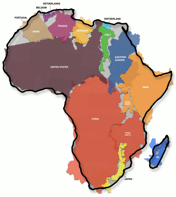
The True Size of Africa An Erroneous Map Misled Us For 500 Years
page: 1share:
The map shows how Africa (30,3 million km²) is larger than the combination of China (9,6 million km²), the US (9,4 million km²), Western Europe (4,9 million km²), India (3,2 million km²) and Argentina (2,8 million km²), three Scandinavian countries and the British Isles (map gives no surface for these last two areas).
The Peters Projection World Map is one of the most stimulating, and controversial, images of the world. When this map was first introduced by historian and cartographer Dr. Arno Peters at a Press Conference in Germany in 1974 it generated a firestorm of debate. The first English-version of the map was published in 1983, and it continues to have passionate fans as well as staunch detractors.
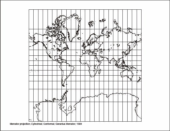
Traditional world maps such as the Mercator often exaggerate the scale towards the poles, giving an erroneous picture of the relative sizes of different countries. For example, Mercator maps show Greenland to be roughly the same size as Africa, when, in reality, Africa is actually fourteen times larger. Africa also looks considerably smaller than Russia on a Mercator map, even though Africa is actually 33% larger. However, generations of navigators weren't bothered much by Mercator's misrepresentations, since they cared most about longitude and latitude, which the Mercator projection handles rather well.
We all know this;
But, in proper proportions, this one is much, much more accurate;
And just to throw you for a loop;
Now, I just learned all of this not too long ago, and to some of you this might be common information, but to see the proper proportions on a real map is amazing.
I don't know why, I just never thought it would be that drastic of a change, if any. To see how big the western countries have become, it's hard to see how this has nothing to do with suppression; to make us believe we are 'bigger' and 'on top'.
Anyway, I hope I taught you something today, because I just thought this information was crazy.
Any thoughts?
Pred...
The first time I found this out (in high school ) it blew my mind.
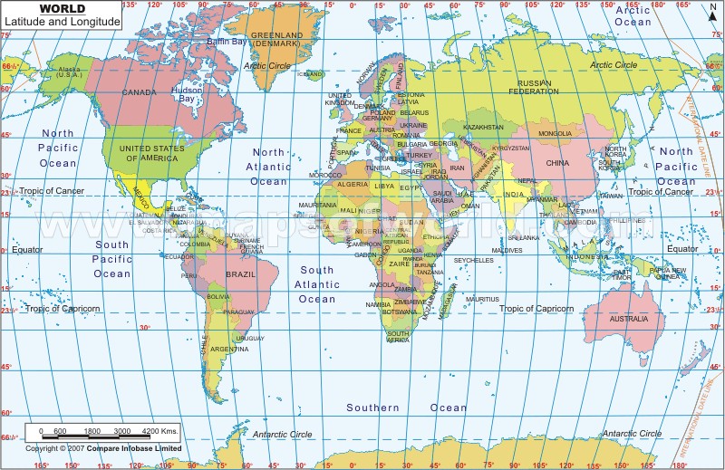
There's a real problem trying to project a sphere onto a flat surface so compromises have to be made depending on what you what to use the map for.
For navigation you'll want to use a Mercator. If you want to get the areas to be "real" you'll want to use a cylindrical projection.
Here's a gallery of some odd, but "accurate" possibilities.
jalopnik.com...
There is a solution though. Use a globe.
Here's a gallery of some odd, but "accurate" possibilities.
jalopnik.com...
There is a solution though. Use a globe.
I didn't realize this until recently. I was under the impression that Africa was much smaller than it actually is.
reply to post by Phage
I agree and understand that, but you have to admit, that North America and Europe are quite big when compared to Africa...
Distortion is fine, but the other map solves that for making the countries appear in the proper proportions.
Pred...
I agree and understand that, but you have to admit, that North America and Europe are quite big when compared to Africa...
Distortion is fine, but the other map solves that for making the countries appear in the proper proportions.
Pred...
Originally posted by Phage
There is a solution though. Use a globe.
Yep.. just have a look at Google Earth ( I just did) . Africa is easily seen as being HUGE. You can even use the ruler to measure the countries/continents.
I'd also say the maps above distort all of Eurasia and make it look smaller, but not on Google Earth, it's Huge too.
edit on 30-7-2013 by
JohnPhoenix because: sp
reply to post by predator0187
Tissot
I find the whole "controversy" pretty childish actually. My country is bigger than yours. neener neener
On a Mercator projection, yes. But that is not the only projection used.
I agree and understand that, but you have to admit, that North America and Europe are quite big when compared to Africa...
Actually, the Peters map doesn't really do that. No map can. The Peters map gets close to showing the correct relative sizes of land masses but it messes with the shapes. This shows those distortions. The less circular the spot, the more distortion.
Distortion is fine, but the other map solves that for making the countries appear in the proper proportions
Tissot
I find the whole "controversy" pretty childish actually. My country is bigger than yours. neener neener
edit on 7/30/2013 by Phage because: (no
reason given)
Originally posted by Phage
reply to post by predator0187
On a Mercator projection, yes. But that is not the only projection used.
I agree and understand that, but you have to admit, that North America and Europe are quite big when compared to Africa...
Actually, the Peters map doesn't really do that. No map can. The Peters map gets close to showing the correct relative sizes of land masses but it messes with the shapes. This shows those distortions. The less circular the spot, the more distortion.
Distortion is fine, but the other map solves that for making the countries appear in the proper proportions
Tissot
I find the whole "controversy" pretty childish actually. My country is bigger than yours. neener neeneredit on 7/30/2013 by Phage because: (no reason given)
You and your "science".
(I'm joking. I love you Phage.)
...and considering all of that land mass and the whole "out of Africa" theory, why no smart homo sapien settlements that predate the ones that are
being unearthed in Turkey or Asia...Conspiracy???
Or simple fact due to evidence that civilization may be Asiatic and the fact that anyone has yet to unearth the ultimate primate progenitor to settle the debate.
Or simple fact due to evidence that civilization may be Asiatic and the fact that anyone has yet to unearth the ultimate primate progenitor to settle the debate.
I run into this stuff all the time doing UV Mapping for 3D models to get texture templates for painting the textures on. It is nerve wracking trying
to decide on the proper projection and flattening to get an accurate representation of a 3d surface projected onto a 2d one. Like Phage said before
me compromises have to be made. I find it amazing that the ancient navigators and map makers before the 18th century were able to do as good as they
did. It is no wonder so many of them sailed off the edge of the world.
This is one of the dumbest threads I've seen in a while.
How on earth does a Mercator map "mislead us for 500 years", when
- There are a whole bunch of other projections in use,
and
- **GLOBES** of the earth are as common as dirt.
This thread makes about as much sense as insisting that Ferrari has mislead us for 80 years that cars are red.
How on earth does a Mercator map "mislead us for 500 years", when
- There are a whole bunch of other projections in use,
and
- **GLOBES** of the earth are as common as dirt.
This thread makes about as much sense as insisting that Ferrari has mislead us for 80 years that cars are red.
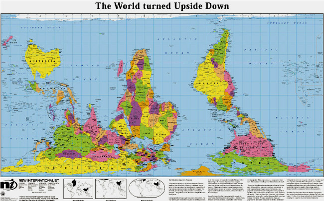
My world has been flipped upside down....literally
Great video clip.
Similarly, some old Chinese maps change the centralized focus of the map to provide a different prospective on the world. I am not sure what the current adaptations are.
How we view our world is all a matter of perspective
Great thread
Great video clip.
Similarly, some old Chinese maps change the centralized focus of the map to provide a different prospective on the world. I am not sure what the current adaptations are.
How we view our world is all a matter of perspective
Great thread
edit on 31-7-2013 by MDDoxs because: (no reason given)
Originally posted by MDDoxs
My world has been flipped upside down....literally
Great video clip.
Similarly, some old Chinese maps change the centralized focus of the map to provide a different prospective on the world. I am not sure what the current adaptations are.
How we view our world is all a matter of perspective
Great threadedit on 31-7-2013 by MDDoxs because: (no reason given)
I as under the impression every part of the world has their global maps centered on their on country.
Also the size of their own country is exaggerated, i know that the UK is bigger on UK maps than it is shown on most global maps - quite significantly bigger in most actually.
edit on 31-7-2013 by Biigs because: (no reason given)
Originally posted by alfa1
This is one of the dumbest threads I've seen in a while.
How on earth does a Mercator map "mislead us for 500 years", when
- There are a whole bunch of other projections in use,
and
- **GLOBES** of the earth are as common as dirt.
This thread makes about as much sense as insisting that Ferrari has mislead us for 80 years that cars are red.
Somebody got one too many globes for their birthday
I think its silly that you have the gall to say this is a "dumb thread" when a good number of people can barely locate their own country on a map, let alone the neighboring countries. I find this thread and the propositions being made as interesting and important.
However, I will agree that the claim we have been mislead for 500 years is a bit dramatic, but still relevant. As mentioned by another member, each nation/culture has a similar trend of orienting their maps with their home states centralized and with grandeur.
Just like we thought the earth was the center of the Universe yes?
edit on 31-7-2013 by MDDoxs because: (no reason given)
Originally posted by MDDoxs
My world has been flipped upside down....literally
Great video clip.
Similarly, some old Chinese maps change the centralized focus of the map to provide a different prospective on the world. I am not sure what the current adaptations are.
How we view our world is all a matter of perspective
Great threadedit on 31-7-2013 by MDDoxs because: (no reason given)
*NOW* who's the "Great Evil West"!
I love this damn thread, absolute great links contributed by everyone.
I'll give Google Earth a go today and examine me some Africa.
Dear OP. I think your thread is mistaken. As Phase mentioned comparing the size of 3D objects on a 2D object cannot be accurate.
If you really want to compare the size of Africa find out the area in square kilometers.
If you really want to compare the size of Africa find out the area in square kilometers.
the area of Africa is 11.67 million square miles where North America is a t 9.54 million. Africa is larger, but not quite on the scale presented.
Russia is at 6.6 million, so just combining North America and Russia makes a lrger land mass than Africa.
reply to post by predator0187
Yeah I always kinda thought Africa was large. I never really was under the impression the U.S. was larger to begin with. So why is this an issue again?
Yeah I always kinda thought Africa was large. I never really was under the impression the U.S. was larger to begin with. So why is this an issue again?
new topics
-
God's Righteousness is Greater than Our Wrath
Religion, Faith, And Theology: 2 hours ago -
Electrical tricks for saving money
Education and Media: 5 hours ago -
VP's Secret Service agent brawls with other agents at Andrews
Mainstream News: 6 hours ago -
Sunak spinning the sickness figures
Other Current Events: 7 hours ago -
Nearly 70% Of Americans Want Talks To End War In Ukraine
Political Issues: 7 hours ago -
Late Night with the Devil - a really good unusual modern horror film.
Movies: 9 hours ago -
Cats Used as Live Bait to Train Ferocious Pitbulls in Illegal NYC Dogfighting
Social Issues and Civil Unrest: 10 hours ago
top topics
-
VP's Secret Service agent brawls with other agents at Andrews
Mainstream News: 6 hours ago, 9 flags -
Florida man's trip overseas ends in shock over $143,000 T-Mobile phone bill
Social Issues and Civil Unrest: 17 hours ago, 8 flags -
Cats Used as Live Bait to Train Ferocious Pitbulls in Illegal NYC Dogfighting
Social Issues and Civil Unrest: 10 hours ago, 8 flags -
Electrical tricks for saving money
Education and Media: 5 hours ago, 4 flags -
Bobiverse
Fantasy & Science Fiction: 17 hours ago, 3 flags -
HORRIBLE !! Russian Soldier Drinking Own Urine To Survive In Battle
World War Three: 14 hours ago, 3 flags -
Nearly 70% Of Americans Want Talks To End War In Ukraine
Political Issues: 7 hours ago, 3 flags -
Sunak spinning the sickness figures
Other Current Events: 7 hours ago, 3 flags -
Late Night with the Devil - a really good unusual modern horror film.
Movies: 9 hours ago, 2 flags -
The Good News According to Jesus - Episode 1
Religion, Faith, And Theology: 12 hours ago, 1 flags
active topics
-
Nearly 70% Of Americans Want Talks To End War In Ukraine
Political Issues • 12 • : Asher47 -
VP's Secret Service agent brawls with other agents at Andrews
Mainstream News • 39 • : Asher47 -
Electrical tricks for saving money
Education and Media • 4 • : Lumenari -
Cats Used as Live Bait to Train Ferocious Pitbulls in Illegal NYC Dogfighting
Social Issues and Civil Unrest • 19 • : WeMustCare -
New whistleblower Jason Sands speaks on Twitter Spaces last night.
Aliens and UFOs • 54 • : Ophiuchus1 -
DONALD J. TRUMP - 2024 Candidate for President - His Communications to Americans and the World.
2024 Elections • 514 • : WeMustCare -
The Acronym Game .. Pt.3
General Chit Chat • 7744 • : bally001 -
Truth Social goes public, be careful not to lose your money
Mainstream News • 128 • : Astyanax -
Sunak spinning the sickness figures
Other Current Events • 5 • : glen200376 -
SETI chief says US has no evidence for alien technology. 'And we never have'
Aliens and UFOs • 44 • : MikeDeGrasseTyson