It looks like you're using an Ad Blocker.
Please white-list or disable AboveTopSecret.com in your ad-blocking tool.
Thank you.
Some features of ATS will be disabled while you continue to use an ad-blocker.

ATS.5/3 Preview Video: see the big changes coming soon to ATS!
page: 8share:
Was unhappy until I saw at the bottom of your post that there will be a dark version. So with that said, looks awesome! Making it easier for mobile
devices is gonna be awesome. There are very few sites I use on my phone because it's such a pain so it will be nice to add this one to that list.
Good job!
Thank God there will be an option for the dark version. It really does make a huge difference. I have seen other sites change to light versions and
they were never the same after.
Honestly, it looks really good to me. Normally I tend to be resistant to changes or at least, not crazy about them until I get used to the changes,
but this looks nice and I look forward to being able to check it out for myself!
I'll give the light version a try for sure and see if I prefer that or the dark version. Anyway. Looking forward to it.
I'll give the light version a try for sure and see if I prefer that or the dark version. Anyway. Looking forward to it.
edit on 7-7-2013 by DirtyLiberalHippie because: (no reason given)
Originally posted by TrueBrit
reply to post by SkepticOverlord
Reckon I will be awaiting the Dark UI with anticipation... White backgrounds are murder on the eye. Also, the uniform colour scheme in terms of the forum icons is more... well... uniform and all, and probably will win an award for design, but its easier at a glance to go to the one you want if you dont have to stare at it for a few seconds before realising which shapes are involved. The multicoloured ones will probably be more user friendly, allowing for faster recognition.
Other than that, fair enough.
Agreed. Need the dark background instead of the white. Everything else looks good though. White background is a really bad idea though.
Honestly, when I think "ATS," I think BLACK. I've always associated ATS with black because it's part of the visual and
psychological character of the site that struck me from Day One and it has left this imprint in my mind ever since. ATS is about occult things:
secret knowledge, government conspiracies, aliens, ghosts and other things you're not meant to talk about. Black is the automatic color that comes to
mind when you think of that stuff. It's all the things hidden in the shadows that intrigues us into deep, interesting conversations. This is the
essence and the personality of ATS.
Also, black is bold and powerful while white is bland. Bold and powerful hits you and stays with you, while bland doesn't hit you or stay with you. I've seen many sites, small and large, deviate away from something original and memorable to this same bland gray or white scheme that's appearing everywhere lately. I don't want to look at bland white on ATS as well. When I come to ATS I want lots of BLACK and contrasting white to smack me in the face!
Also, black is bold and powerful while white is bland. Bold and powerful hits you and stays with you, while bland doesn't hit you or stay with you. I've seen many sites, small and large, deviate away from something original and memorable to this same bland gray or white scheme that's appearing everywhere lately. I don't want to look at bland white on ATS as well. When I come to ATS I want lots of BLACK and contrasting white to smack me in the face!
LoneCloudHopper2
Honestly, when I think "ATS," I think BLACK. I've always associated ATS with black because it's part of the visual and psychological character of the site that struck me from Day One and it has left this imprint in my mind ever since.
It's time to step into the light.
There are several good usability, experience, and cognitive reasons for the light design UI. If you give time, you'll soon understand why.
reply to post by SkepticOverlord
Honestly, I'm not crazy about the color scheme either. But the other features make up for it in spades!
Honestly, I'm not crazy about the color scheme either. But the other features make up for it in spades!
People will always have personal preferences and for sites I am drawn to the darker more mysterious and creative side. Glad we will have that option.
I have seen other sites change to the light side like LoneCloudhopper said and it left much to be desired.
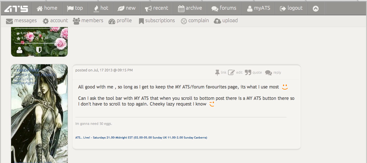
All good with me , so long as I get to keep the MY ATS/forum favourites page, its what I use most
Can I ask the tool bar with MY ATS that when you scroll to bottom post there is a MY ATS button there so I don't have to scroll to top again. Cheeky lazy request I know
Can I ask the tool bar with MY ATS that when you scroll to bottom post there is a MY ATS button there so I don't have to scroll to top again. Cheeky lazy request I know
zazzafrazz
Can I ask the tool bar with MY ATS that when you scroll to bottom post there is a MY ATS button there so I don't have to scroll to top again. Cheeky lazy request I know
There have been some significant changes. myATS is now in the main menu, and the drop-down is horizontal with a much more simple toggle.
Also, the image uploader has been completely rewritten from the ground up. Here's a look at the new (but familiar) UI for uploading images.
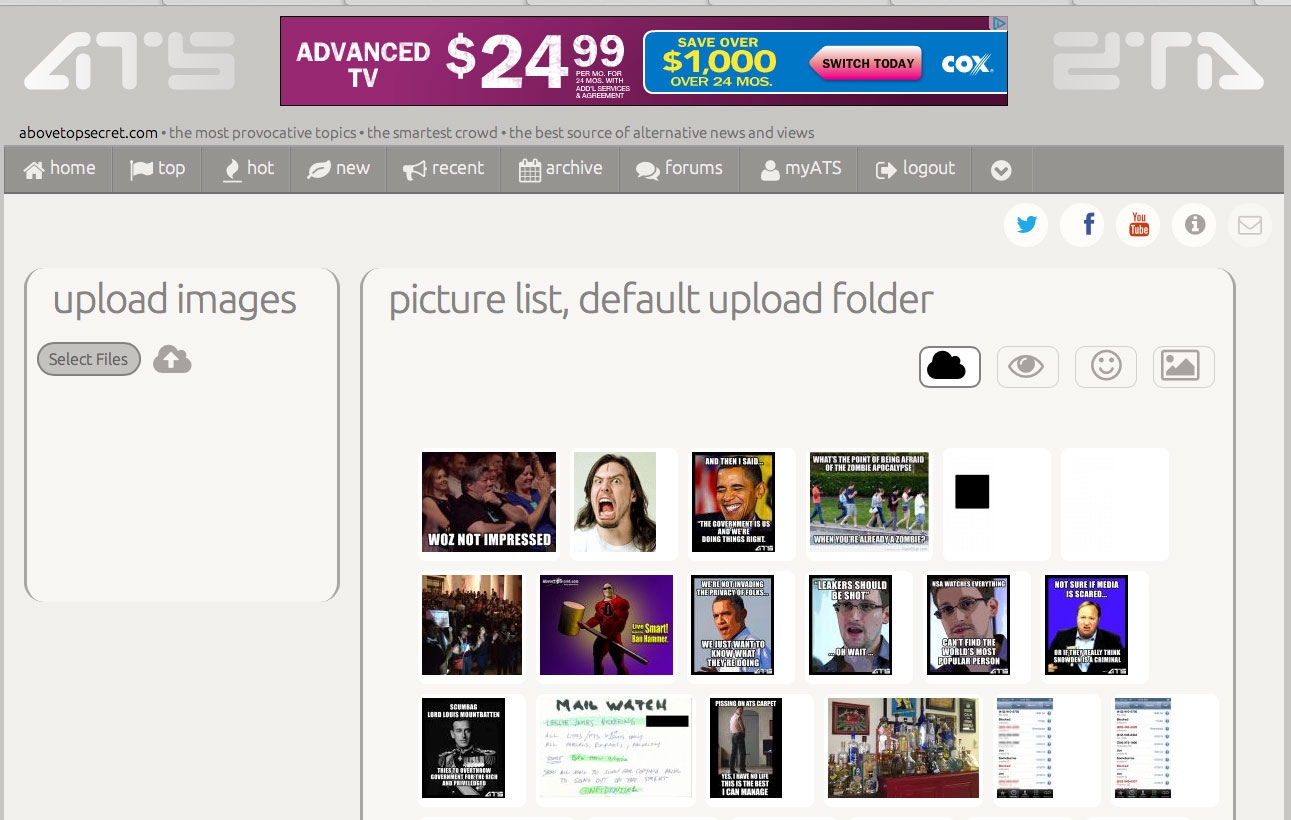
A key change is the ability to upload up to ten files at once:
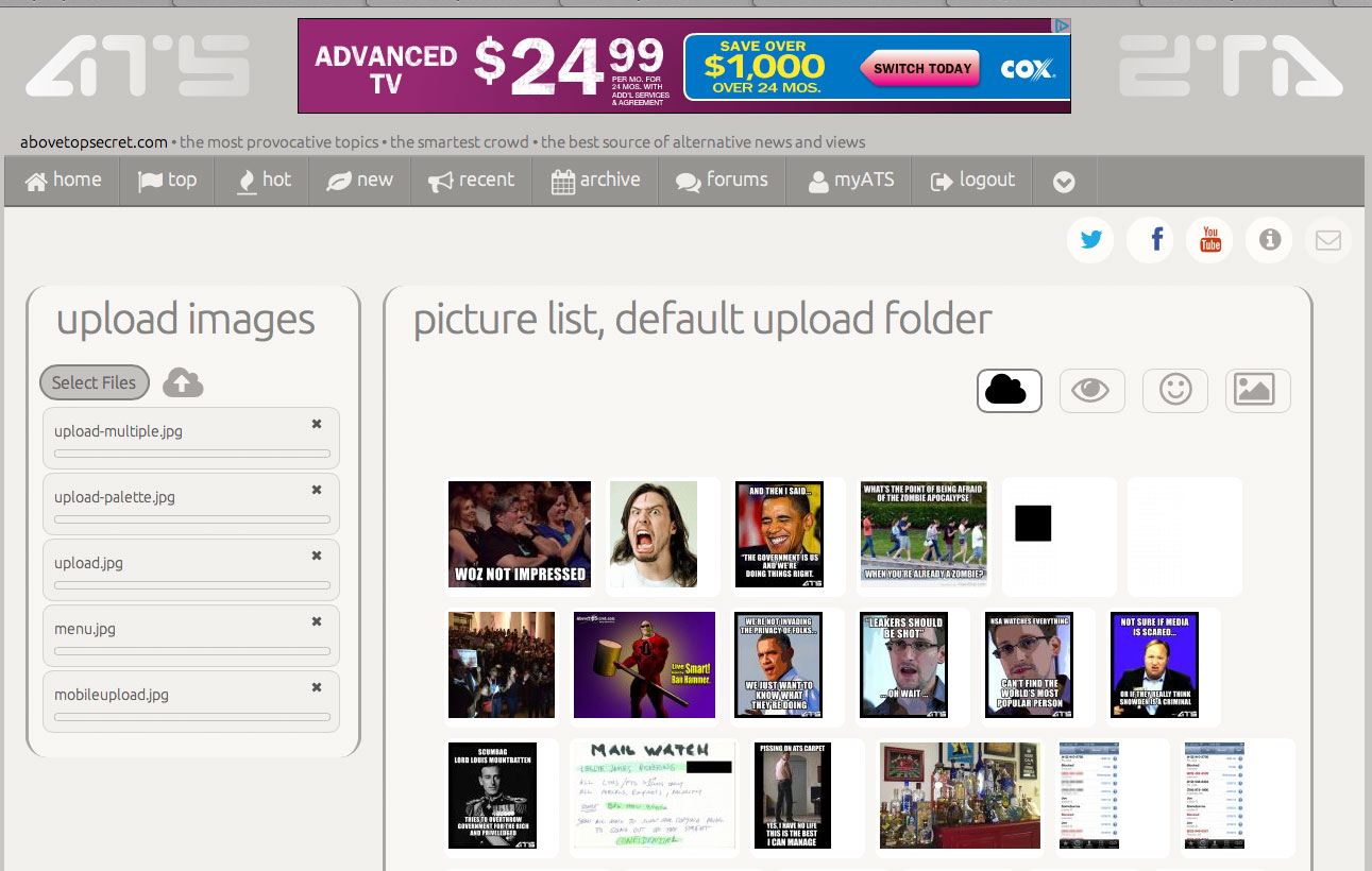
And, instead of clicking the button, if it's easier for you to drag-and-drop a bunch of files into the upload zone, that works too.
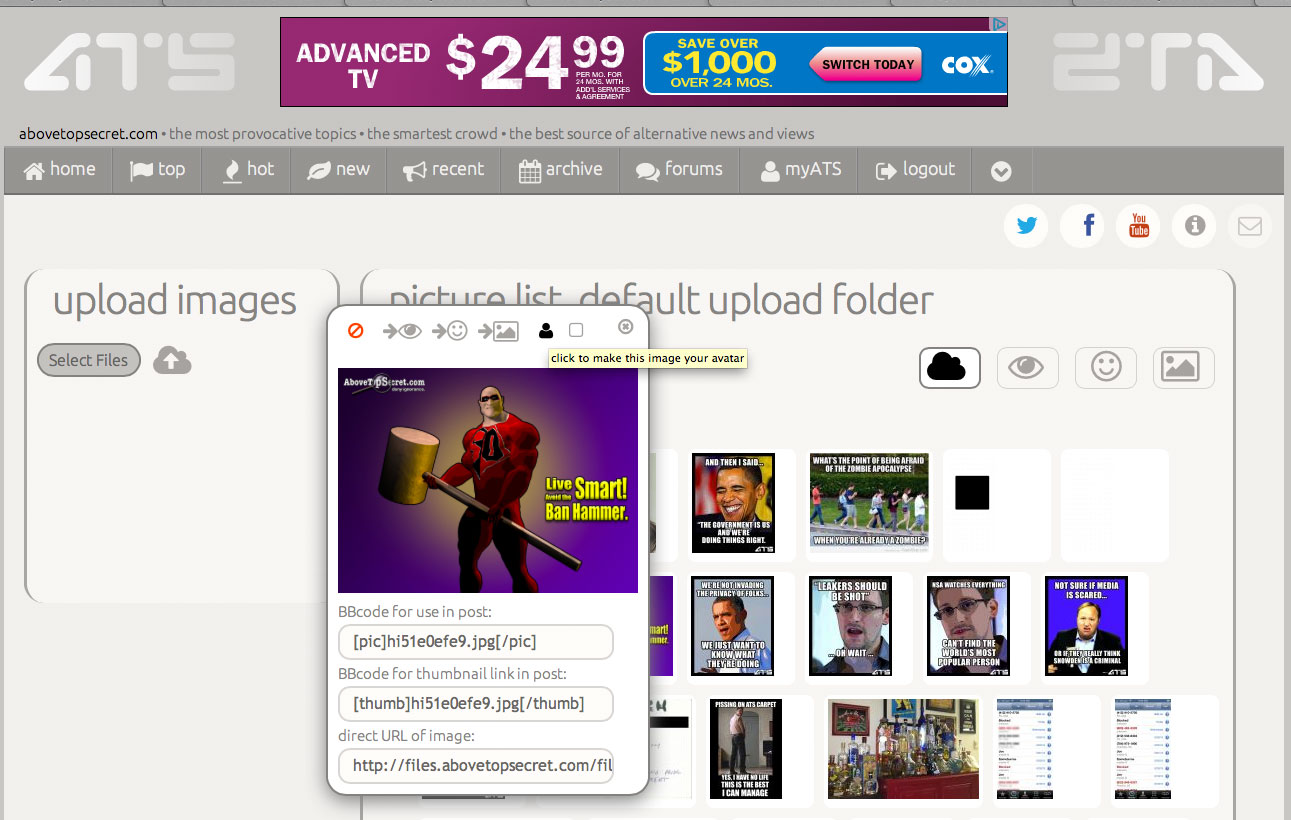
There are also a few more easy-to-use features of the new uploader. When you click an image, a simple palette pops up that lets you change the folder, delete the image...
...or... ...wait for it...
assign the image as your avatar or mini-profile background, instantly, right from the uploader UI.
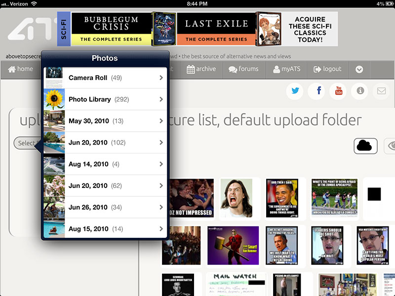
And this all works on mobile devices without any need to download an app from an app store. Here it is on my iPad with iOS 6 (most 4.0+ versions of Android also work fine).
And finally... the coup-de-grad -- when posting, when you click the little image icon in the BBcode shortcuts, a palette pops up with the most recent uploads from your uploads folder.
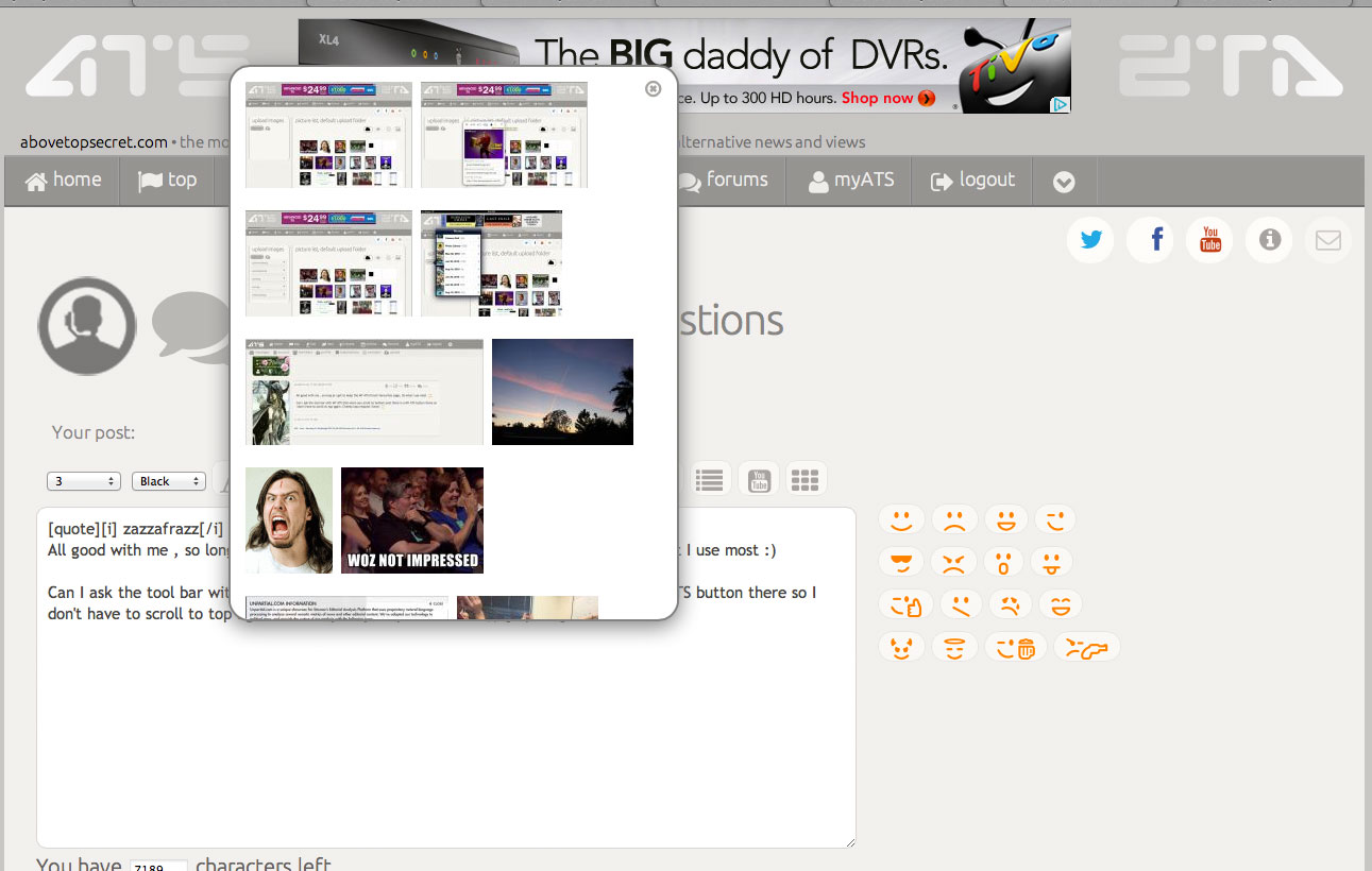
Just click the image and the window disappears, leaving behind the BBcode for that image where ever you placed your cursor in the post you were authoring.
A whole new ATS is one the way!
(right-click, and select "open in new window" to see the full-sized version of the above images)
edit on 17-7-2013 by SkepticOverlord because:
(no reason given)
that looks great Bill. I hope people appreciate how much work you have put into the rebuild.
I also hope you will be doing a live group tutorial for us decrepit old ones
I also hope you will be doing a live group tutorial for us decrepit old ones
Is it just me or is this place a blacker shade of black? If so, did this just happen or am I really losing my eyesight so badly that it took me while
to notice it? I thought of a separate thread but it's not that big of a deal and could be a part of this whole change thing a going on.
It's like, how much more black could this be? and the answer is none. None more black.
Forever Scroll, Yes.
Instant Flag Star Fav Suscribe, Yes!
Nicer, smoother, less-bunchy aesthetics, Yea.
Easy access to dog-eared pages, MyATS Yes.
All this is a good change and I will continue to use ATS
IF there is indeed an option for Dark theme. A CUSTOMIZABLE option if your dark is numerically mid-range.
What about the site statistics, etc, stuff at bottom of current pages? I enjoy keeping up w/the factoids re:posts, members, threads, guests online; now & most in a day, etc.
The Japan Forum should not be taking prime real estate at top right of Forums page. Honestly now.
Dont know if \"Sports\" should be part of a Forum Section title.
Date & Time posted & by whom is invaluable & should remain w/every titled thread link.
Thanks for continuing the upkeep of this site. I come here most nights to read.
This thread got me searching for info on black vs white websites, measuring cost/savings re:energy. I came upon this argument on Slashdot:
m.slashdot.org...
\"Power-Saving Web Pages: Real Or Myth?\"
There\'s some number-crunching, one estimate was $1.2 million saved yearly if google was black. Which some argue as so trivial an amount it renders the topic practically moot.
At any rate, the option to save eyesight & money & energy is real enough to me. (Actually, I just want to read ATS in bed & not disturb my spouse.)
Apologies if this is offtopic, but I think there are some people here who really would enjoy that coversation over there... a website clad in snowy white, btw.
Originally posted by tothetenthpower
reply to post by Kryscent
I've been using nothing but the 'beta' site now for almost 2 weeks and I can hardly go back to the current site to be honest. The new features and the layout, even the white on black look is actually VERY awesome.
I'm sure you guys will really enjoy it, even if there wasn't a dark option.
~Tenth
Same here. After beta testing the last two weeks honestly the only time I go back to the old site is to compare something with the new site that might still have a bug or something. The lighter site is actually not bad at all and grew on me. I use the dark every now and then but find myself going back to the light.
I think the majority of members will enjoy the new sites color palates, features, and clutter-less appearance. The phone and tablet features with drop down menus, etc is pretty cool. Not to mention the emoticons are more crazy and less "smilie" than the current site!
Once it goes live, people will see that the lighter colors are actually appealing to the eye. Not everyone can be pleased at once, but SO put alot of effort and hours into this and the end product is starting to show it.
Fantastic changes!
Im glad to have helped in my own small way through posts and reading the advertisements
Thanks SkepticOverlord, Mods admins and everyone in between, keep up the good work (but have a good, well deserved rest after this goes live)!
Im glad to have helped in my own small way through posts and reading the advertisements
Thanks SkepticOverlord, Mods admins and everyone in between, keep up the good work (but have a good, well deserved rest after this goes live)!
The HTML5 is exciting for me. I have been hoping that more sites start using HTML5 as it really is going to be the future of the web in general. Steve
Jobs knew exactly what he was talking about and he has been proven to be right about it.
The instant flagging, stars and sub might take a little getting used to but I like where this is going.
A lot of things have been cleaned up. I look forward to actually trying it out.
The instant flagging, stars and sub might take a little getting used to but I like where this is going.
A lot of things have been cleaned up. I look forward to actually trying it out.
I sure would prefer the Dark UI as the default choice.
At first, I didn't mind as I have my login set to the dark UI, but now it's getting really annoying as I don't always like to log in.
Often, I just peruse the site for new posts and that White UI is just glaring and off-putting immediately.
I've happily adjusted to everything else, but this isn't going to go away.
new topics
-
TLDR post about ATS and why I love it and hope we all stay together somewhere
General Chit Chat: 34 minutes ago -
Hate makes for strange bedfellows
US Political Madness: 2 hours ago -
Who guards the guards
US Political Madness: 5 hours ago -
Has Tesla manipulated data logs to cover up auto pilot crash?
Automotive Discussion: 7 hours ago
top topics
-
Hate makes for strange bedfellows
US Political Madness: 2 hours ago, 12 flags -
CIA botched its handling of sexual assault allegations, House intel report says
Breaking Alternative News: 17 hours ago, 11 flags -
whistleblower Captain Bill Uhouse on the Kingman UFO recovery
Aliens and UFOs: 12 hours ago, 10 flags -
Who guards the guards
US Political Madness: 5 hours ago, 9 flags -
1980s Arcade
General Chit Chat: 14 hours ago, 6 flags -
Teenager makes chess history becoming the youngest challenger for the world championship crown
Other Current Events: 16 hours ago, 4 flags -
Deadpool and Wolverine
Movies: 15 hours ago, 4 flags -
Has Tesla manipulated data logs to cover up auto pilot crash?
Automotive Discussion: 7 hours ago, 2 flags -
TLDR post about ATS and why I love it and hope we all stay together somewhere
General Chit Chat: 34 minutes ago, 2 flags
active topics
-
1980s Arcade
General Chit Chat • 18 • : visitedbythem -
Candidate TRUMP Now Has Crazy Judge JUAN MERCHAN After Him - The Stormy Daniels Hush-Money Case.
Political Conspiracies • 691 • : Threadbarer -
The Fight for Election Integrity Continues -- Audits, Criminal Investigations, Legislative Reform
2024 Elections • 4142 • : IndieA -
Hate makes for strange bedfellows
US Political Madness • 20 • : Cvastar -
SC Jack Smith is Using Subterfuge Tricks with Donald Trumps Upcoming Documents Trial.
Dissecting Disinformation • 107 • : WeMustCare -
What do you guys think of this UFO footage?
Aliens and UFOs • 12 • : Cvastar -
Fast Moving Disc Shaped UFO Captured on Camera During Flight from Florida to New York City
Aliens and UFOs • 21 • : Cvastar -
New York Governor Hochul Assures Business Owners that ONLY Donald Trump is being Targeted.
General Conspiracies • 94 • : WeMustCare -
TLDR post about ATS and why I love it and hope we all stay together somewhere
General Chit Chat • 1 • : network dude -
Russia Ukraine Update Thread - part 3
World War Three • 5714 • : stu119