It looks like you're using an Ad Blocker.
Please white-list or disable AboveTopSecret.com in your ad-blocking tool.
Thank you.
Some features of ATS will be disabled while you continue to use an ad-blocker.

It’s Time to BAN Republicans, Poor People and the Working Class
page: 3share:
reply to post by TsukiLunar
Which part????
If I pointed to it then I believe it to be true.
There has to be some truth to a lie or NOBODY will believe it.
You’re still not being specific!
Keep dancing! Everybody sees it for what it is! I've been completely open.
Then why did you try to point out that statistic if you also believe it didn't exist.
Which part????
If I pointed to it then I believe it to be true.
There has to be some truth to a lie or NOBODY will believe it.
You’re still not being specific!
Keep dancing! Everybody sees it for what it is! I've been completely open.
edit on 3-5-2013 by seabag because: (no reason given)
Originally posted by seabag
reply to post by TsukiLunar
Then why did you try to point out that statistic if you also believe it didn't exist.
Which part????
If I pointed to it then I believe it to be true.
There has to be some truth to a lie or NOBODY will believe it.
You’re still not being specific!
Keep dancing! Everybody sees it for what it is! I've been completely open.
edit on 3-5-2013 by seabag because: (no reason given)
I am afraid for you sir. You should visit your doctor. I clearly quoted the post in which you defended the line of reasoning you are now denouncing. I can't be clearer than that. It must be a problem on your end.
Let me help muddy the waters a bit.
www.examiner.com...
Maybe background checks only for liberals?
A few years ago, the Bay Area Center For Voting Research listed the most conservative and most liberal cities in the United States. They did this by looking at how every American city with a population of at least 100,000 voted in the 2004 presidential election.
Cities with the highest percentages of conservative votes were deemed the most conservative cities, and cities with the highest percentages of liberal votes were deemed the most liberal cities.
The national average is four violent crimes/1,000 residents. Every one of the 15 most liberal cities in the US has a higher violent crime rate than the national average. Twelve of the 15 have a violent crime rate that is at least double the national average. Two of them have a violent crime rate that is six times the national average.
You'll notice that eight of the 15 most conservative cities have violent crime rates at or below the national average. Only two of the 15 have violent crime rates that are twice as high as the national average. The most dangerous conservative city (Lubbock, Texas) is safer than all but four of the liberal cities.
www.examiner.com...
Maybe background checks only for liberals?
reply to post by seabag
I would love to see the math behind this propaganda. First off, African Americans compose 70% of gun violence I the US. 75% of African Americans associate themselves politically with the Democratic Party. So tell me again how these numbers work.
Always check the math of any study. Every college grad knows this basic rule of studies, I
"If they do not show you the math, it generally means there is something wrong with the math"
"Instead of a war on poverty, they have a war on drugs so the police can bother me."
Originally posted by Tattiio
Always check the math of any study. Every college grad knows this basic rule of studies, I
"If they do not show you the math, it generally means there is something wrong with the math"
Exactly like Mitt Romney and Paul Ryan's plan to fix the economy.
It really shouldn't matter your political affiliation. What they were saying about the economy was ludicrous. They kept acting like they had some secret way to fix it and balance the budget but refused to show the math. remember that?
Originally posted by seabag
I found some interesting stats on gun violence that I’d like to share. I think some of you might find it interesting.
link
It is commonly assumed that mental illness or stress levels trigger gun violence. But that's not borne out at the state level. We found no statistical association between gun deaths and mental illness or stress levels. We also found no association between gun violence and the proportion of neurotic personalities.
Images of drug-crazed gunmen are a commonplace: Guns and drug abuse are presumed to go together. But, again, that was not the case in our state-level analysis. We found no association between illegal drug use and death from gun violence at the state level.
Some might think gun violence would be higher in states with higher levels of unemployment and higher levels of inequality. But, again, we found no evidence of any such association with either of these variables.
So who is to blame for the gun violence?? Obviously republicans, the working class and poor people!!!
Is it a coincidence that you could draw a line across the middle of that chart and just label it as follows:
Above - Republicans = BAD
Below - Liberal Progressives = GOOD
So who is behind the US anti-gun agenda? Based on the chart above I think it’s quite obvious that elitist liberals are behind the gun grab (but we knew that already). It’s the poor, the working class and the non-Obama voters who are to blame for gun violence! Obama voters, immigrants and college graduates are safe!! Imagine that!!
There you have it, folks! We are being fed even more propaganda to bolster the two-party divide and class warfare!
Let the flames begin in 3.....2.......1.......
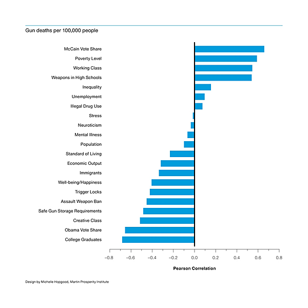
OK Folks, I found the mathematics for a Pearson Correlation Chart, but I've drank too much "tea" and I'll leave it to someone more mathematically inclined to interpret the inputs in real world data (datum?)
en.wikipedia.org...
Also, the Michelle person has her own webpage and according to that, she only designed this particular chart.
martinprosperity.org...
edit on 3-5-2013 by NightFlight because: More info...
They left something off the charts.
LEGAL drug use.
People on "happy pills".
Not necessarily mentally ill. But Docs often prescribe mood leveling drugs like candy.
LEGAL drug use.
People on "happy pills".
Not necessarily mentally ill. But Docs often prescribe mood leveling drugs like candy.
Originally posted by seabag
reply to post by TsukiLunar
This disagrees with what i think should be true! It can't be correct for that reason! LALALALALA
It isn’t about me…
This chart goes against the facts that have been presented in this thread and others…and it goes against common sense (of which some people may be lacking…..).
Urban areas have more violence than rural = FACT
Urban areas overwhelmingly supported Obama = FACT
Did you have a point to contend or were you just flaming?
edit on 3-5-2013 by seabag because: (no reason given)
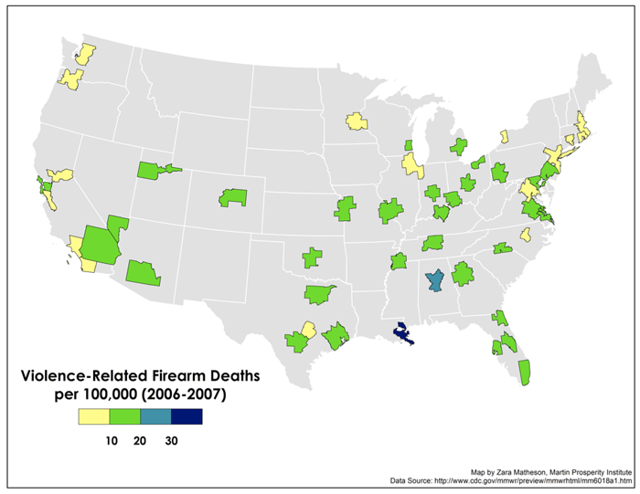
Actually, the chart isn't incorrect, but it is certainly misleading. Note that they computed their correlations based on the other charts in that article, meaning on a *per state* basis. So you could easily have a "McCain state" where the vast majority of gun deaths were inner city in the major cities in that state. Take Louisiana for example - it was a "McCain state", and yet the majority of its gun related deaths happened in New Orleans. Interestingly enough, this Richard Florida did another similar article after the Sandy Hook incident, but instead did it by metro area instead of states - note New Orleans:
www.theatlanticcities.com...
Anyhow, I actually agree with seabag - this was misleading at best, and actually kind of stupid to break it down between "McCain" and "Obama" states.
Originally posted by TsukiLunar
Originally posted by seabag
reply to post by TsukiLunar
Then why did you try to point out that statistic if you also believe it didn't exist.
Which part????
If I pointed to it then I believe it to be true.
There has to be some truth to a lie or NOBODY will believe it.
You’re still not being specific!
Keep dancing! Everybody sees it for what it is! I've been completely open.
edit on 3-5-2013 by seabag because: (no reason given)
I am afraid for you sir. You should visit your doctor. I clearly quoted the post in which you defended the line of reasoning you are now denouncing. I can't be clearer than that. It must be a problem on your end.
I've seen a lot of ignorant trolls on ATS trying to derail a thread, and that's obviously what your trying to do, or your just ignorant. Are you a paid poster sponsored by some liberal/progressive group or are you just another person that likes rubbing Obamas but?
Good post Seabag and thanks for exposing the misleading liberal BS.
Pladuim
Great work, this chart confirms what we knew all along..
The gun grabbing ass holes are wrong!!!!\\\\\\\
The gun grabbing ass holes are wrong!!!!\\\\\\\
reply to post by charles1952
That was an excellent contribution as always, Charles. I wish I had found that before you!
The facts you presented demonstrate how intentionally misleading the chart in the OP is. The summary at the end of that article says it all and supports the position I took early on about higher crime in urban areas and urban areas voting for Obama!
Thanks!!
That was an excellent contribution as always, Charles. I wish I had found that before you!
The facts you presented demonstrate how intentionally misleading the chart in the OP is. The summary at the end of that article says it all and supports the position I took early on about higher crime in urban areas and urban areas voting for Obama!
link
So there is a clear correlation here: Cities with a lot of violent crime tend to vote Democratic, while cities with relatively low levels of violent crime tend to vote Republican. But what is behind this discrepancy? Is it that conservative cities have tougher anti-crime laws than liberal cities, which work to deter violent criminals? Is it that conservatives are more likely to be armed than liberals, so cities full of conservative citizens act as a deterrent against violent crime?
Or is it simply that Democratic voters themselves are just more likely to commit violent crimes than Republican voters?
Thanks!!
reply to post by redtic
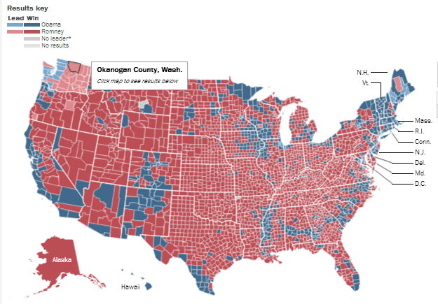
Excellent point! To illustrate your point, check out this 2012 election map by county and compare it to the chart by Richard Florida showing metro area firearms deaths.
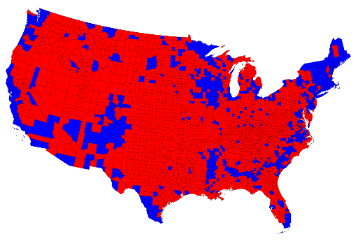
Does anything stand out!
Actually, the chart isn't incorrect, but it is certainly misleading. Note that they computed their correlations based on the other charts in that article, meaning on a *per state* basis. So you could easily have a "McCain state" where the vast majority of gun deaths were inner city in the major cities in that state. Take Louisiana for example - it was a "McCain state", and yet the majority of its gun related deaths happened in New Orleans.
Excellent point! To illustrate your point, check out this 2012 election map by county and compare it to the chart by Richard Florida showing metro area firearms deaths.
Does anything stand out!
Wow.... That study and suggested supporting logic is some of the most political twisted and biased I believe I've seen since the days before the 2012
election. That's saying something, considering the absurd lengths both sides went to for that period. Whew..... I think I needed a 'Happy Pill' myself
after reading this thread, just to maintain sanity! (Munches some more M&M's with a big smile. )
Now they look at the national map and discount every factor ..or flat out ignore other major ones, save one. Political affiliation as a general constant. To their thinking, because a few obvious ones don't correlate, affiliation must be the answer!
Well.... I'm FAR from the only one at ATS with a solid working knowledge and understanding of statistical sampling or projections and how this is all accomplished to come up with a load of crap like that. ...and crap it is.
Since the Study writers are so hip-hot for focus exclusively on Red/Blue, I'll take that glove off the the floor and slap them with it. Lets DO look at red/blue and see...just what there is to see, shall we?
That would be the ultimate break down of county by county political affiliation across the United States of America as evidenced by the voting of the citizens in the 2012 election. Some may note the rather..AHEM...warped nature of that map vs. the official outcome? I'd just remind everyone, we don't live in a Democracy. We live in a representative republic. Usually, the two have little difference. Sometimes, that difference is breathtaking...such as the map above. (The source was Politico in post election analysis).
You'll also notice something else, since the study writers are absolutely obsessed with the concept of red/blue for something like gun violence...and it's something you CANNOT see on a dishonest representation simply running by entire state. Even within the Red States, there be Blue islands. Those Islands generally represent the major population centers within a state. (i.e., those areas that come to define high crime on the FBI Statistical charts, nation wide).
In specific example, their map shows Arkansas to be among the worst tier of states with Missouri in the next teir. What their....creative...use of national mapping of statistics fails to note is that the bulk of crime in Missouri is concentrated in two places. The Kansas City Metropolitan area and the St Louis Metro area. See those little blue dots on either side of the North of Missouri? The left one is Kansas City and the right one is St. Louis. Likewise, see that blue dot, roughly center in Arkansas? That is the Little Rock Metropolitan area. The blue concentration on the right side of Arkansas is the West Memphis metro area, abutting Memphis, Tennessee. Those two areas hold a good % of the crime stats for the state of Arkansas.
Despite the HONEST specifics I note above, they still dishonestly portray them as simply red/blue categories for their study. Now, I use terms like Honest and Dishonest ...which, themselves, don't precisely fit. What they did here was, technically speaking, accurate. It's technically proper by statistical methodology.
^^^ and THAT is the problem. THAT is why you *NEVER* *EVER* look at a study and just say 'Doh! it says so, and kinda sorta makes sense! So, gee whizzy, it must be so!". Unless you've looked at the way the numbers were collected, used, abused and reassembled to the agenda of the man making the result? The study is meaningful only as general reference in larger opinion. Not much else.
In this case? I wouldn't even call it THAT worthwhile. Oh.... There is another thing, and it's a big one. Since they seem to focus on Arizona a hair more than ought to be?
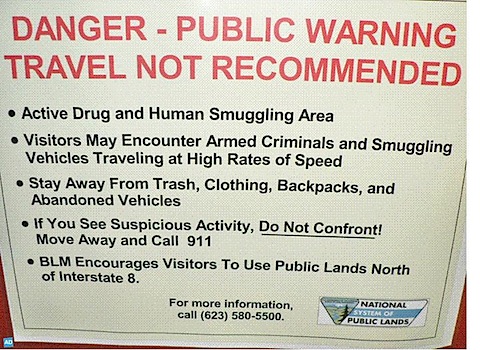
^ ^ ^ Those signs appear along Interstate 8 in Arizona and a variant for the last line changed, they appear south of Phoenix along at least 2 secondary roads I've personally seen. Ya think that might have a TINY bit to do with why an otherwise fanatic state regarding Law and Order is hitting the top spots for gun and other violent incidence? Well...the people who wrote this study sure don't seem to.
Critical thinking is about the Motto to this website. Deny Ignorance ....by knowing what it looks like when you see it.
Now they look at the national map and discount every factor ..or flat out ignore other major ones, save one. Political affiliation as a general constant. To their thinking, because a few obvious ones don't correlate, affiliation must be the answer!
Well.... I'm FAR from the only one at ATS with a solid working knowledge and understanding of statistical sampling or projections and how this is all accomplished to come up with a load of crap like that. ...and crap it is.
Since the Study writers are so hip-hot for focus exclusively on Red/Blue, I'll take that glove off the the floor and slap them with it. Lets DO look at red/blue and see...just what there is to see, shall we?
That would be the ultimate break down of county by county political affiliation across the United States of America as evidenced by the voting of the citizens in the 2012 election. Some may note the rather..AHEM...warped nature of that map vs. the official outcome? I'd just remind everyone, we don't live in a Democracy. We live in a representative republic. Usually, the two have little difference. Sometimes, that difference is breathtaking...such as the map above. (The source was Politico in post election analysis).
You'll also notice something else, since the study writers are absolutely obsessed with the concept of red/blue for something like gun violence...and it's something you CANNOT see on a dishonest representation simply running by entire state. Even within the Red States, there be Blue islands. Those Islands generally represent the major population centers within a state. (i.e., those areas that come to define high crime on the FBI Statistical charts, nation wide).
In specific example, their map shows Arkansas to be among the worst tier of states with Missouri in the next teir. What their....creative...use of national mapping of statistics fails to note is that the bulk of crime in Missouri is concentrated in two places. The Kansas City Metropolitan area and the St Louis Metro area. See those little blue dots on either side of the North of Missouri? The left one is Kansas City and the right one is St. Louis. Likewise, see that blue dot, roughly center in Arkansas? That is the Little Rock Metropolitan area. The blue concentration on the right side of Arkansas is the West Memphis metro area, abutting Memphis, Tennessee. Those two areas hold a good % of the crime stats for the state of Arkansas.
Despite the HONEST specifics I note above, they still dishonestly portray them as simply red/blue categories for their study. Now, I use terms like Honest and Dishonest ...which, themselves, don't precisely fit. What they did here was, technically speaking, accurate. It's technically proper by statistical methodology.
^^^ and THAT is the problem. THAT is why you *NEVER* *EVER* look at a study and just say 'Doh! it says so, and kinda sorta makes sense! So, gee whizzy, it must be so!". Unless you've looked at the way the numbers were collected, used, abused and reassembled to the agenda of the man making the result? The study is meaningful only as general reference in larger opinion. Not much else.
In this case? I wouldn't even call it THAT worthwhile. Oh.... There is another thing, and it's a big one. Since they seem to focus on Arizona a hair more than ought to be?
^ ^ ^ Those signs appear along Interstate 8 in Arizona and a variant for the last line changed, they appear south of Phoenix along at least 2 secondary roads I've personally seen. Ya think that might have a TINY bit to do with why an otherwise fanatic state regarding Law and Order is hitting the top spots for gun and other violent incidence? Well...the people who wrote this study sure don't seem to.
Critical thinking is about the Motto to this website. Deny Ignorance ....by knowing what it looks like when you see it.
edit on 4-5-2013
by Wrabbit2000 because: (no reason given)
Seems like he is doing some creative work with the statistics. I do not understand where much of his "data" comes from. For instance how does he
know that a higher percentage of working class jobs is associated with firearm deaths? Here in Arizona we have lots of mountain bikers. Does that
mean they too are associated with firearm deaths? Here in Arizona we have lots and lots of homeless living in the desert. Does that mean that they
too are associated with firearm deaths. Here in Arizona we have lots of hispanic people. Does that mean that they too are associated with firearm
deaths. Here in Arizona we have lots of entertainers and celebrities living here. Does that mean that they too are associated with firearm
deaths.

reply to post by Wrabbit2000
WOW! Great post, Wrabbit!
It looks like a few of us are on the same page with using the map as a clear indicator of the truth. The original chart was intentionally misleading to achieve a political agenda (propaganda).
As you stated...
WOW! Great post, Wrabbit!
It looks like a few of us are on the same page with using the map as a clear indicator of the truth. The original chart was intentionally misleading to achieve a political agenda (propaganda).
As you stated...
What they did here was, technically speaking, accurate. It's technically proper by statistical methodology.
^^^ and THAT is the problem. THAT is why you *NEVER* *EVER* look at a study and just say 'Doh! it says so, and kinda sorta makes sense! So, gee whizzy, it must be so!"
reply to post by groingrinder
Come on, man!!
We all know you can’t trust those damned mountain bikers!! They’re all a bunch of armed hot-heads just waiting to explode in a rage of gunfire!
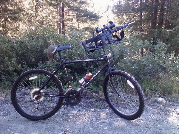
Here in Arizona we have lots of mountain bikers. Does that mean they too are associated with firearm deaths?
Come on, man!!
We all know you can’t trust those damned mountain bikers!! They’re all a bunch of armed hot-heads just waiting to explode in a rage of gunfire!
edit on 4-5-2013 by seabag because: (no reason given)
reply to post by seabag
I'm happy to post some helpful information when it comes to the Gun debate in the US. Especially when so much is so badly warped by political and policy agendas. I'd so badly wanted to post something last night, but after waking up to find an imprint of my keyboard across my pretty fur, as I seem to have used as a pillow for awhile? I figured retreat and regroup was required before wading in to throw my two cents into the jelly jar.
Great thread, as always!

new topics
-
Are you ready for the return of Jesus Christ? Have you been cleansed by His blood?
Religion, Faith, And Theology: 1 hours ago -
Chronological time line of open source information
History: 2 hours ago -
A man of the people
Diseases and Pandemics: 4 hours ago -
Ramblings on DNA, blood, and Spirit.
Philosophy and Metaphysics: 4 hours ago -
4 plans of US elites to defeat Russia
New World Order: 5 hours ago -
Thousands Of Young Ukrainian Men Trying To Flee The Country To Avoid Conscription And The War
Other Current Events: 9 hours ago
top topics
-
Israeli Missile Strikes in Iran, Explosions in Syria + Iraq
World War Three: 12 hours ago, 17 flags -
Iran launches Retalliation Strike 4.18.24
World War Three: 12 hours ago, 6 flags -
Thousands Of Young Ukrainian Men Trying To Flee The Country To Avoid Conscription And The War
Other Current Events: 9 hours ago, 6 flags -
12 jurors selected in Trump criminal trial
US Political Madness: 12 hours ago, 4 flags -
4 plans of US elites to defeat Russia
New World Order: 5 hours ago, 2 flags -
A man of the people
Diseases and Pandemics: 4 hours ago, 2 flags -
Chronological time line of open source information
History: 2 hours ago, 2 flags -
Ramblings on DNA, blood, and Spirit.
Philosophy and Metaphysics: 4 hours ago, 1 flags -
Are you ready for the return of Jesus Christ? Have you been cleansed by His blood?
Religion, Faith, And Theology: 1 hours ago, 1 flags
active topics
-
12 jurors selected in Trump criminal trial
US Political Madness • 34 • : Vermilion -
Russian intelligence officer: explosions at defense factories in the USA and Wales may be sabotage
Weaponry • 174 • : Oldcarpy2 -
BREAKING: O’Keefe Media Uncovers who is really running the White House
US Political Madness • 18 • : interupt42 -
Israeli Missile Strikes in Iran, Explosions in Syria + Iraq
World War Three • 65 • : CarlLaFong -
911 emergency lines are DOWN across multiple states
Breaking Alternative News • 7 • : mysterioustranger -
Are you ready for the return of Jesus Christ? Have you been cleansed by His blood?
Religion, Faith, And Theology • 7 • : chiefsmom -
Academia Has Become a Cancer in American Society
Education and Media • 8 • : FlyersFan -
Fossils in Greece Suggest Human Ancestors Evolved in Europe, Not Africa
Origins and Creationism • 66 • : Consvoli -
So I saw about 30 UFOs in formation last night.
Aliens and UFOs • 32 • : Arbitrageur -
Two Serious Crimes Committed by President JOE BIDEN that are Easy to Impeach Him For.
US Political Madness • 17 • : TheSemiskepticII